Photo
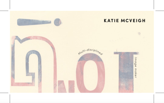
FINAL BUSINESS CARDS
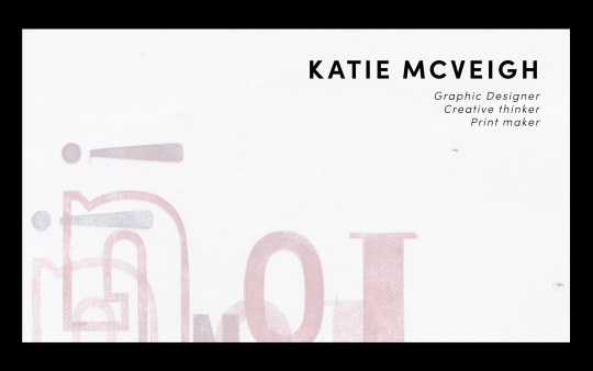
Using my letterpress experiments from my FMP project to add some fun playful backgrounds and also emphasise my style and love of letterpress/print. I am happier with using a simple typeface (Sofia bold) for the title and smaller italics for my contact information.
0 notes
Photo
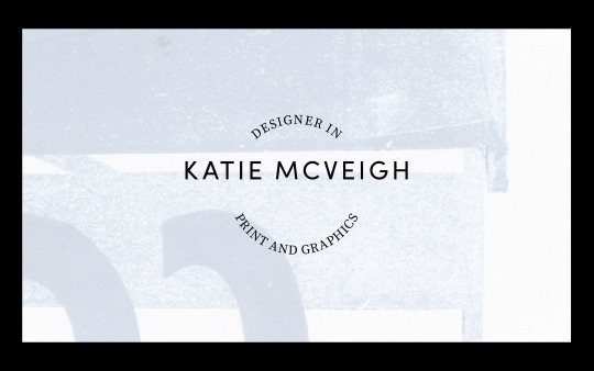

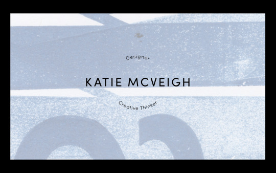





BUSINESS CARD DEVELOPMENT
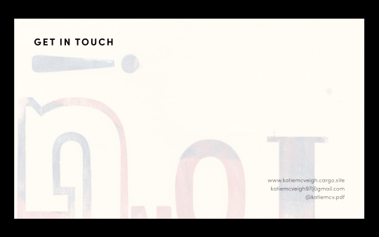
I wasn’t happy with the linocut experiments so I started to think about using my previous prints and using them as backgrounds with digital type overlaid. It felt necessary to include my prints are this is where my passion is and the sort of design I like to create. It didn’t seem right to do a digital logo or overly graphic design card as I don’t feel that would represent me or what I am like as a designer. Instead, I kept it playful and fun using the angles and shapes in the prints to highlight the experimental nature of my design.
0 notes
Photo
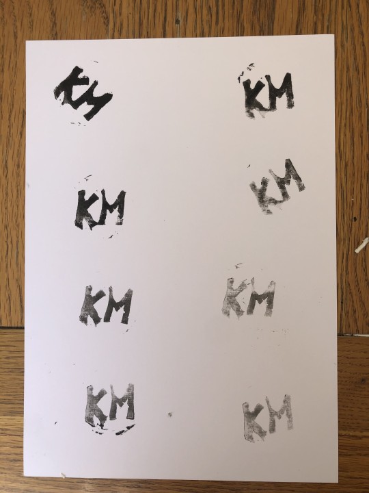
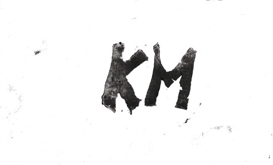
LINO CUT INITIALS
Business card experiment
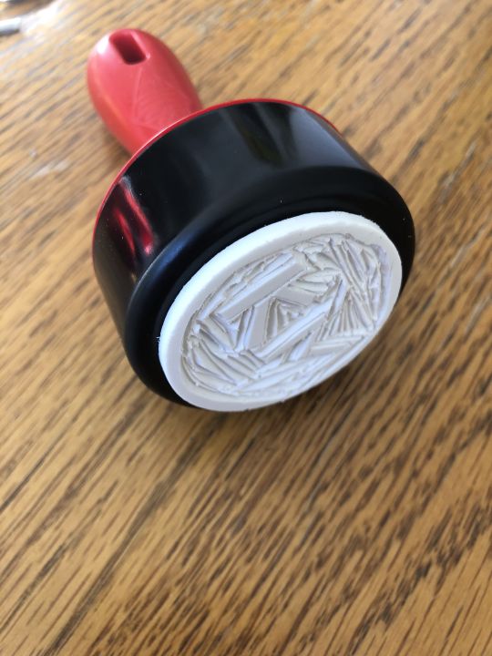
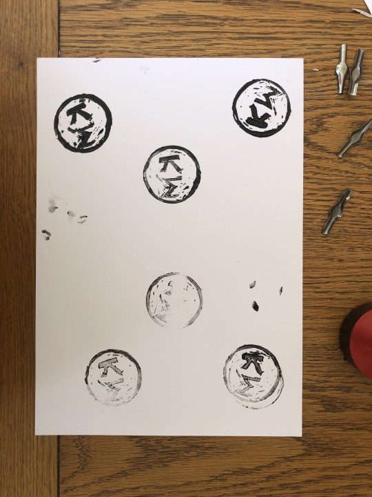
I thought I’d experiment with using linocut stamping to create my business cards however it proved really hard to get the detail and precision on such a small scale. I am happy I tried it out but its not right.
0 notes
Text
EVALUATION (FMP)
I have really enjoyed this project. I knew quite soon in I wanted to explore a personal route or project that interested me but also work on my typographic knowledge and skills. This has been the perfect way to do whilst also exploring and developing my passion for print!
Print
Experimentation at the start was vital to me finding the suitable printing method for my project but also how i would visulalise this huge topic. I enjoyed getting to grips with letterpress but it was clear very soon in it did not provide enough flexibility to produce prints that had a real variation in context and structure. Screenprinting however was very flexible and offered endless possibilities for layouts and typefaces. It also meant I had a huge breadth of experiments and designs to work with that could be edited and chosen or discarded. Linocut was also a useful technique that I could incorporate for my final slang term- I am happy I did not limit the printing to just one type and instead used a variety.
COVID-19 most definitely has impacted my work and restricted my printing process however I feel it really pushed me and made my learn new skills at home quickly. I have a much better knowledge of screenprint now because of the print induction with Eugenia and having to buy a home kit. My work flow was effected but given the situation, I’m proud of the outcomes!
If I had more time, I would have kept going with the print experiments and done 10 possibly looking at a wider time frame and maybe ones that have come into play recently such as Miley Cyrus (Corona Virus).
Editorial
I am happy with the books. The accompanying book (All things Cockney) seemed necessary given the wide breadth of context and background to every print I did. I feel the book does give a real explanation behind the rhyming slang and provides the necessary information on typeface history, people of the time and slang’s emergence.
Dave’s book (Growing up a cockney) was another side book that I felt I had the time to do if I pushed myself. His words alone provided a lot of details to research however sending over the nostalgic photography really brought it to life.
I feel ISTD really enabled me to develop my type handling and editorial skills for FMP. The precision and detail for the submission meant I could begin my editorials with more knowledge, control as well as confidence.
If I had more time and resources, I would have looked into the stock of the books as well as various other formats and layouts. Although I do feel they work as a set, I feel there could have been even more experimentation in their design and how they correlate and contrast. I would have liked to look into the notion of having a collection of prints and the editorials in one place to show the different segments of the project all together- I.e in a hand crafted box or pack.
0 notes
Photo
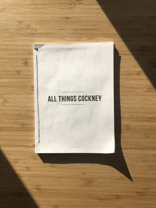


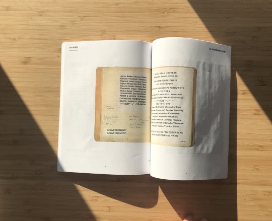

ALL THINGS COCKNEY
Printed out
I am really happy with this book. It took time to cut and bind but like the other book, it was worth it and to see the editorial in a physical format is completely different to an online flip book. The book would have been better with a thicker stock- I would have explored using a cream or cartridge but given the circumstances and limitations I am happy.
0 notes
Photo


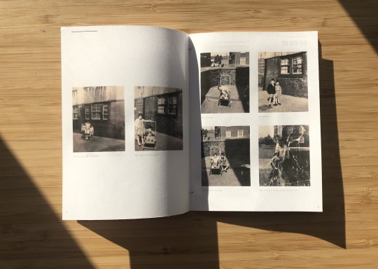
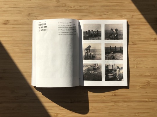

GROWING UP AS A COCKNEY
Printed out
My favourite pages of the small book on Dave photographed. I am happy that I pushed myself to print and bind the book. I used a simple grey thread to side stitch but it was effective. The format and structure can really be seen and the small intimate nature is clear too. On reflection, if I could make changes, I would make the outside margins slightly larger as the titles and page numbers are quite close to the edge.
0 notes
Photo


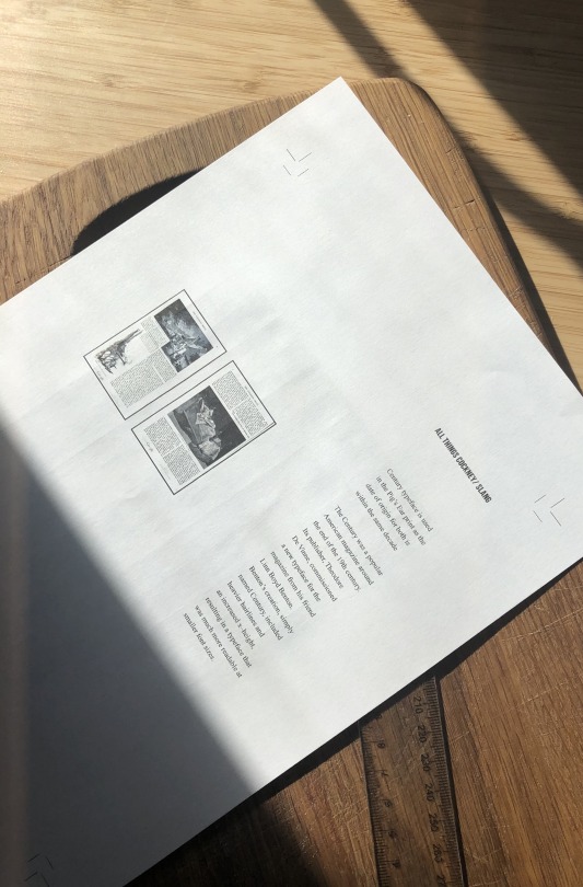

PRINTING OUT EDITORIALS
I didn’t plan on printing and binding the book but felt I had the time to and I wasn't completely happy with the books in an online flip book format- you could not get a feel for their format or size. Printing out and cutting each page using a home printer and then the binding kit I ordered was time consuming but worth it. I used plain A4 pages due to the amount of pages and lack of resources but feel it still works well and has the opacity that I wanted- you can see the lines slightly through pages. If I had the right stock, I wouldn't have done any thicker than 120gsm.
0 notes
Photo
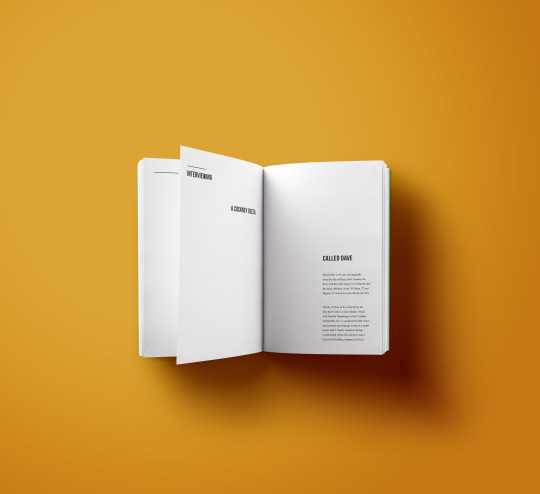

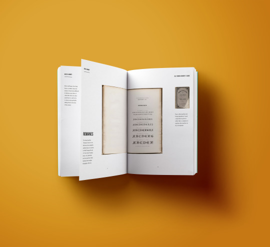
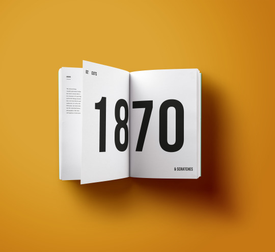
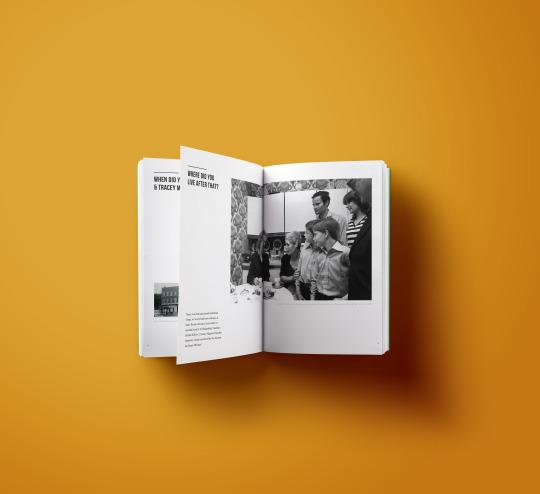
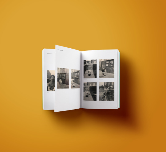
EDITORIAL IN TEMPLATES
As I am unsure if I will have the time to print and bind both editorials, I have put my books into a template using the most successful pages full of type and image.
I am happy with the outcome however do feel it is hard to really gage the size and format of the books- the growing up cockney editorials is much smaller than all things cockney however due to the inability to get exact sizing, it is lost here.
0 notes
Photo

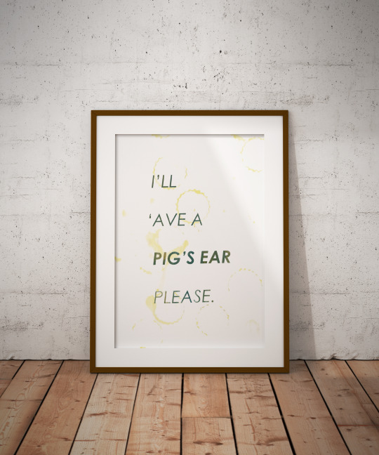


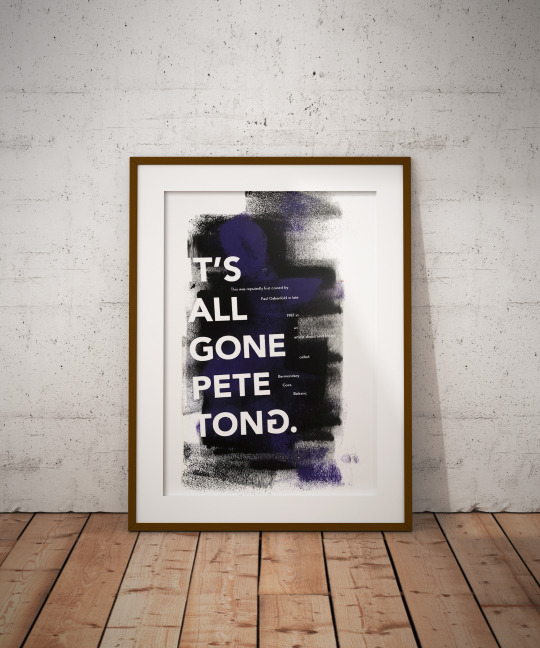
FINAL 6 PRINTS
Framed Templates
If I had the resources, I definitely would have pushed myself to frame the final posters myself and look into the wood workshop facilities at uni. However this just wasn't feasible and instead I used a mock up template to get the feel of the posters in a framed wall setting. I am really happy with how they look in a formal frame- I used one of the prints I was most happy with that was included in the editorial booklet for each term.
0 notes
Photo
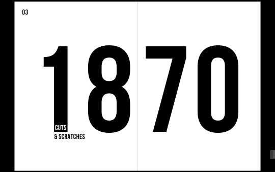

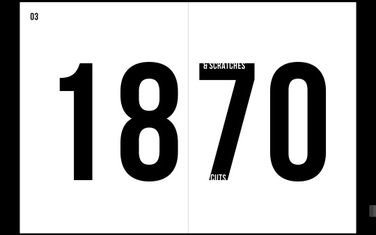
CUTS & SCRATCHES
Title page experiments
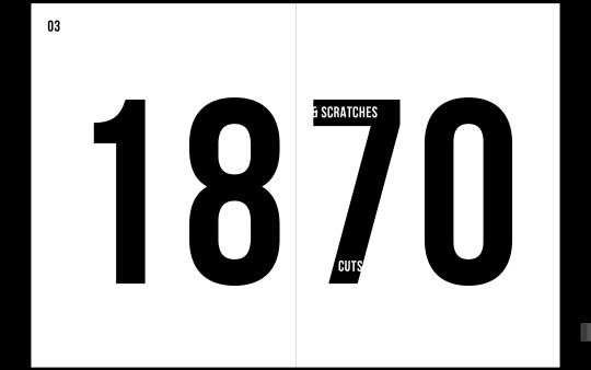
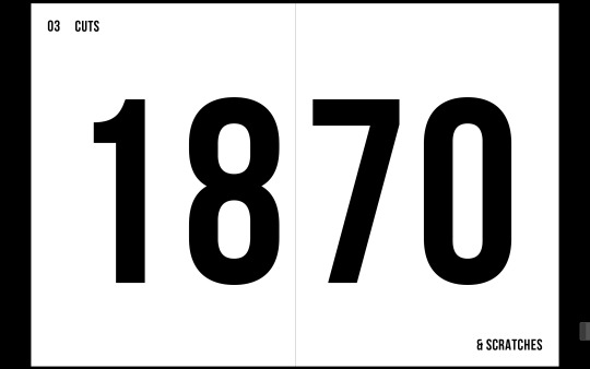
The titling of cuts and scratches didn’t seem fitting so I explored using the inverse and actual number to place the ‘cuts’ phrase. I feel it works well.
I also explored having the type cut off due to the white type fading into the white backdrop. Although I like the concept as it falters to the term, I don’t feel it is as successful and the words get lost.
There is the possibility of changing all terms to a simple structure where the titles are in the same position for each new chapter title page- top left next to number, and bottom right if a two worded title.
0 notes
Photo


COCKNEY EDITORIAL
Editing dates and imagery
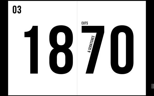
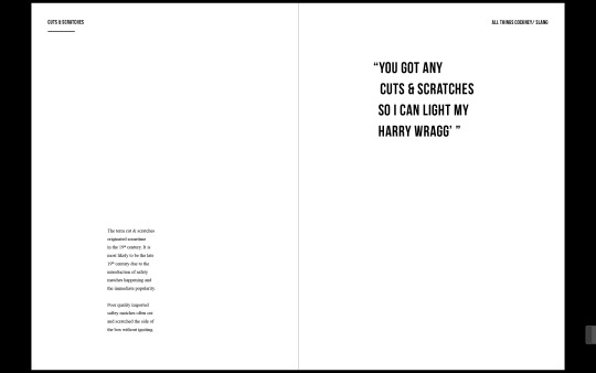
Editing the layout to ensure all titles are the same distance to the body copy. As well as this, I played around with the title page- how can cut and scratches be shown?
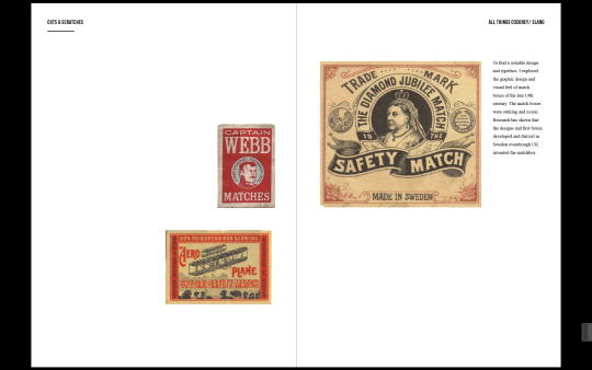
Also ordering images to keep a different composition and more variation and not continuing to use left page for the main information and title in pages. I feel the lino cuts work well as a set of 4 rather just one or two enlarged. The matchbox inspiration behind the design means smaller and more works better than one large like a poster.
0 notes
Photo



COCKNEY EDITORIAL
Addition of cuts and scratches
Adding Cuts and scratches to the editorial. It’s time of emergence means I needed to do a reshuffle and put it as chapter 3 after Pig's ear (1800). Like all the chapters, I have had an origins double spread and design inspiration page (the matchboxes)
0 notes
Photo






CUTS AND SCRATCHES
Linocut prints
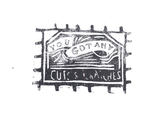
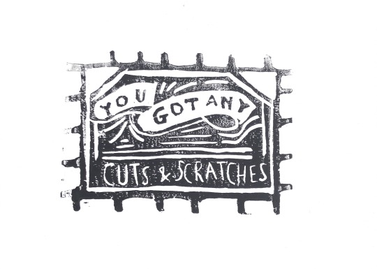
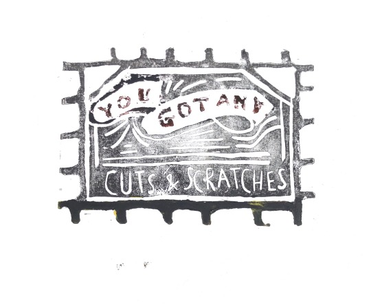
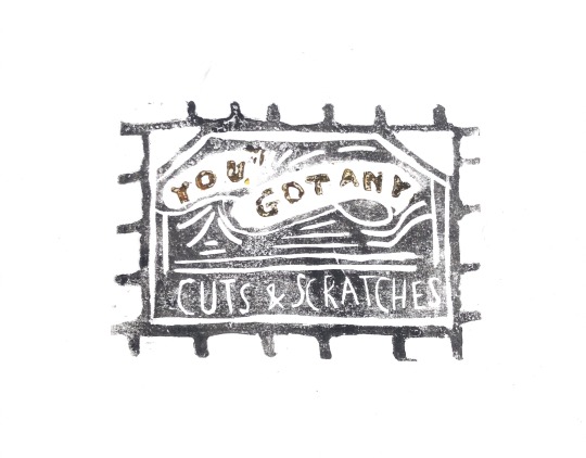
Using the match box design from the late 19th century designs as the driving force for the aesthetic and I feel they work. Using a banner visual for ‘you got any’ and cuts and scratches underneath has worked but on reflection, I would've explored other routes to show the cuts and scratches rather than just thin letters. I am happy with these.
I mainly used black ink as this was the one I was able to buy during isolation but I did experiment with the yellow and red acrylic ink from screen printing however it didn't come out as well as the black.
0 notes
Photo

LINO CUT COMPOSITION
Using the banner style visual and a simple type underneath for ‘CUTS & SCRATCHES’
On reflection, if I could make cutting changes to the box design, I would have ensured there was a thin line round the outside to keep it a box shape. I also would possibly flip the type layout so that the ‘you got any’ was more simple and the cockney term was what was in a banner and most important.
0 notes
Photo


Safety matches
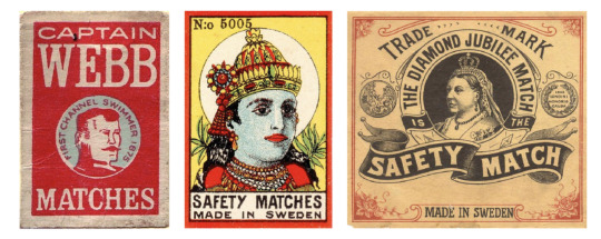
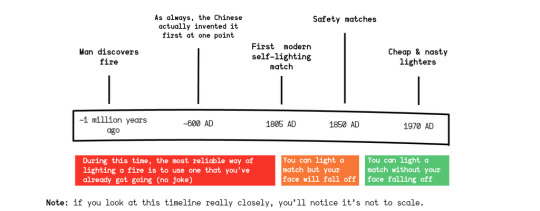
The origin of the slang is said to be due to poor quality imported saftey matches often causing often cut and scratched the side of the box without igniting. To find a sutiable design and typeface for my next print, I looked into the match boxes of the late 19th century when itis believed the term came into society. The match boxes were striking and iconic and I’d like this to come through in my designs. Research has shown that the designs and first boxes developed and thrived in Sweden eventhough UK invented the matchbox.
https://www.keapbk.com/blogs/keap/matchboxes-phillumeny-collectors
0 notes
Text
Cuts and Scratches- Matches
Research
In the 19th century poor quality imported saftey matches often cut and scratched the side of the box without igniting hence the name given. This term most probably came into play in the late 19th century so that design will be similar to that of the pig’s ear design/ century typeface.
Example: ‘You got any cuts and scratches so I can light my Harry Wragg’
https://www.theguardian.com/education/2014/jun/09/guide-to-cockney-rhyming-slang
0 notes
Photo


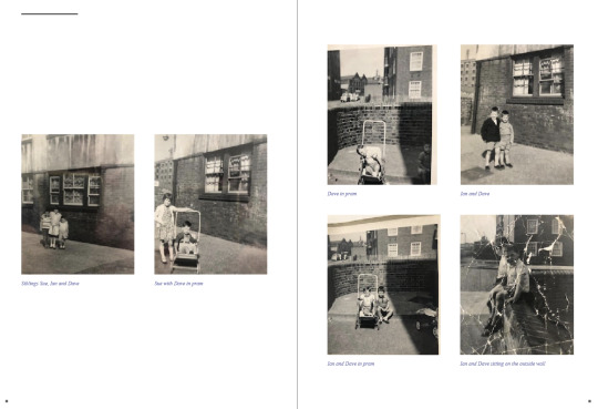



CAPTIONS
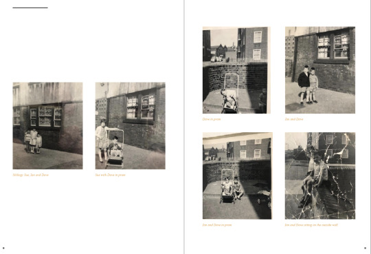
Going through and adding relevant captions to every photograph to ensure consistency. I have kept one line between all photographs and captions so there is a structure throughout.
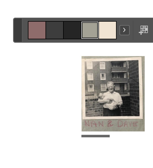
I have been using 70% black for captioning but was inspired my research using captions in another colour. An addition of colour to add vibrancy and fun. The images above show my exploration of yellow, orange, red and purple as a way of adding colour.
I also explored using the colour picker to get the exact colours of the photo book which were in the background of many pictures- I particularly like the muted green ivy colour. It is not too distracting but also is more fun than just a grey.
0 notes