
katerinadj
kat d-j year 4: illustration & visual media
Katerina Demetriou-Jones
198 posts
Don't wanna be here? Send us removal request.
Last Seen Blogs


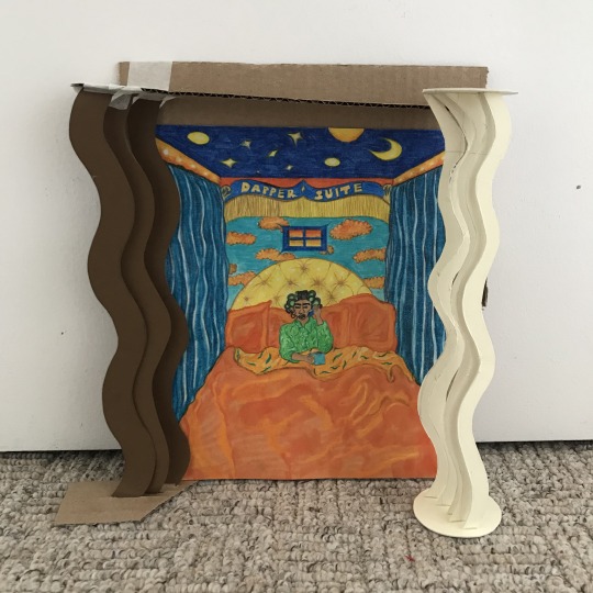
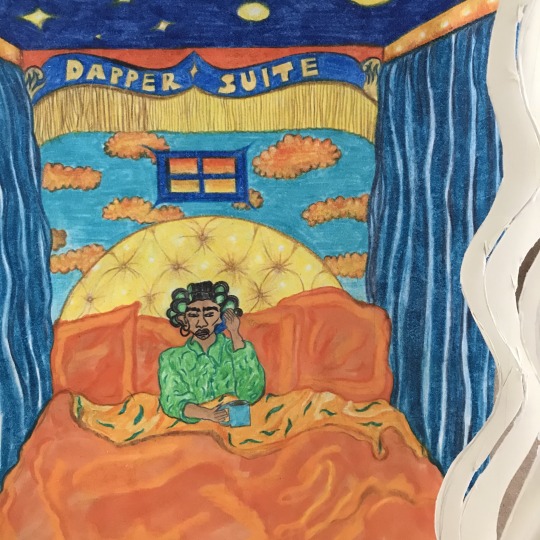
Photo
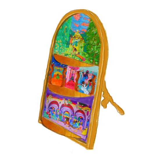
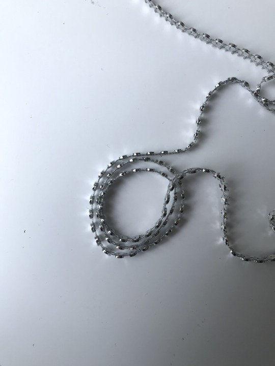
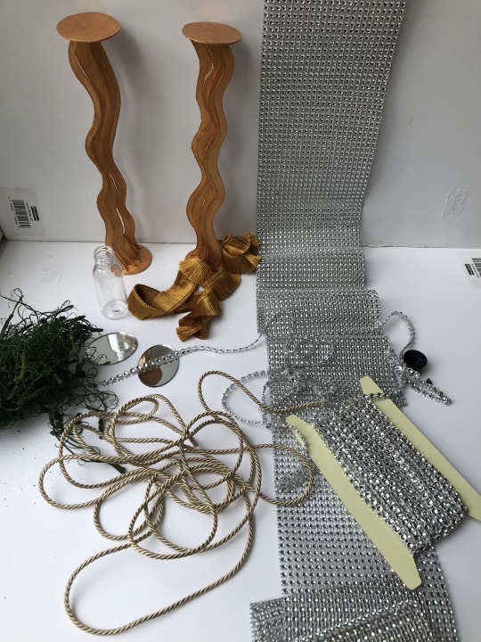
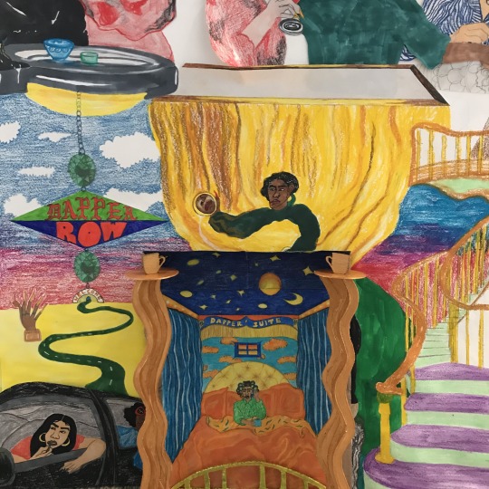
Mock-up of what my frame could look like!!!
Plus some props I got that I wanted to use for my 3D elements! Maybe I can use these in future if we do get to have a final show!
4 notes
·
View notes
Photo
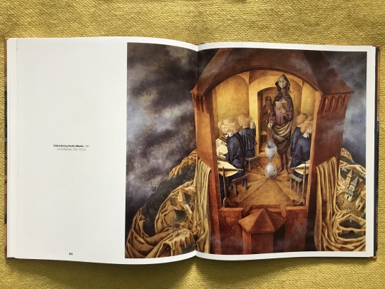
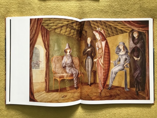
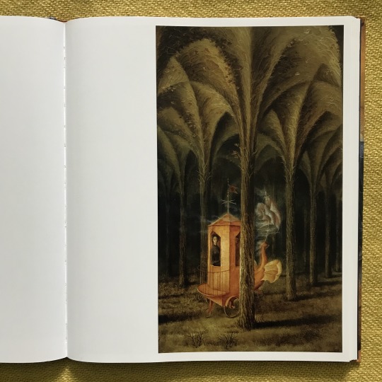
I also used these other Remedios Varo paintings as inspiration:
Embroidering Earth’s Mantle (1961)
Unsubmissive Plant (1961)
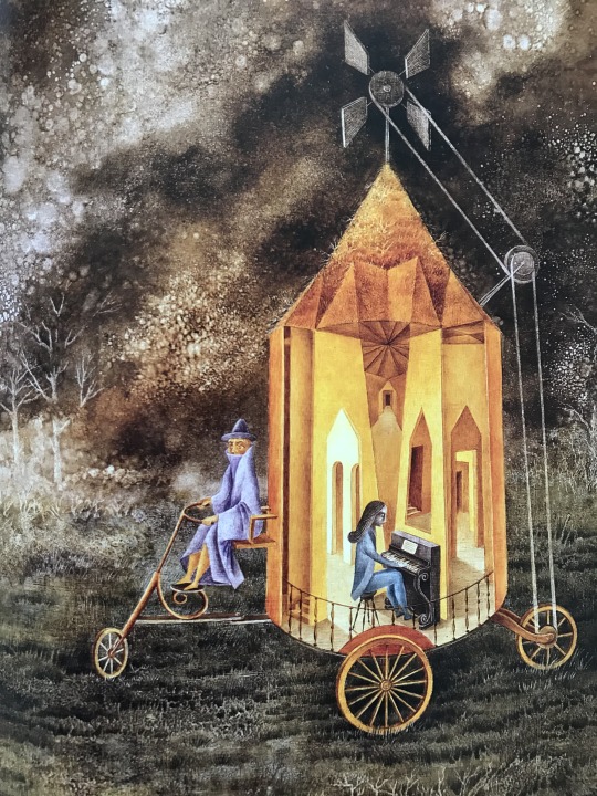
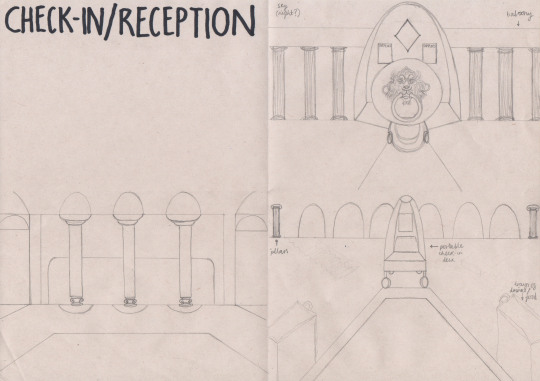
Roulotte (1955) - I like how she paints vehicles in so many forms - her house-like structures often have wheels and I love this idea - again of everything being interconnected and working for a particular character. It’s like everything is personified for the character’s specific needs. I used this idea in the Check-In lady’s image where her check-in desk is more like a portable cart - so she can just drive around checking people in!!!
0 notes
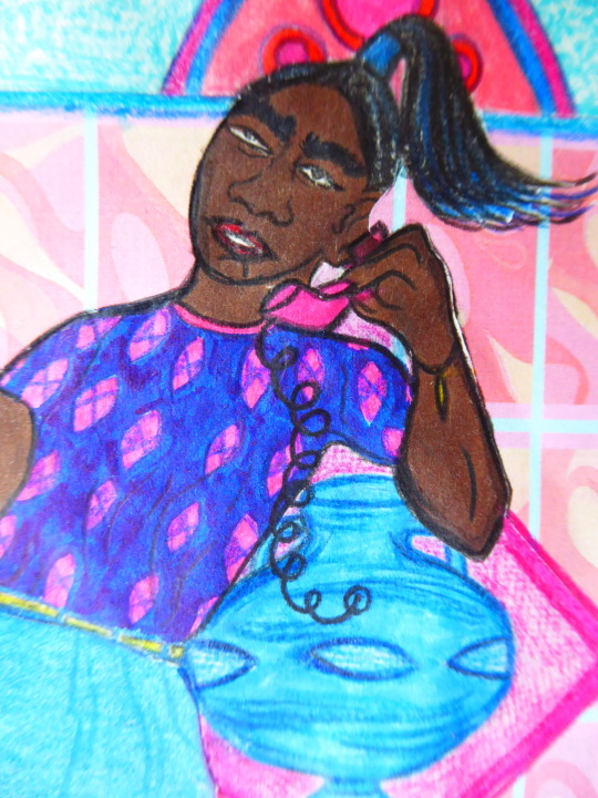
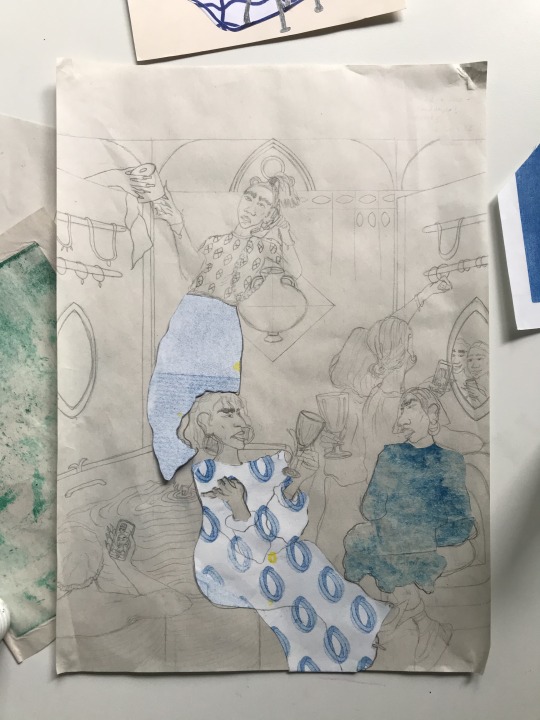
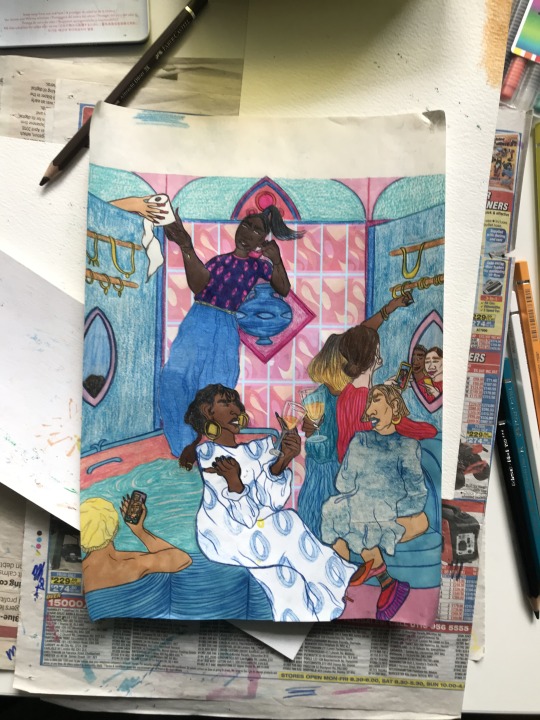
Photo
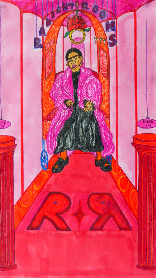
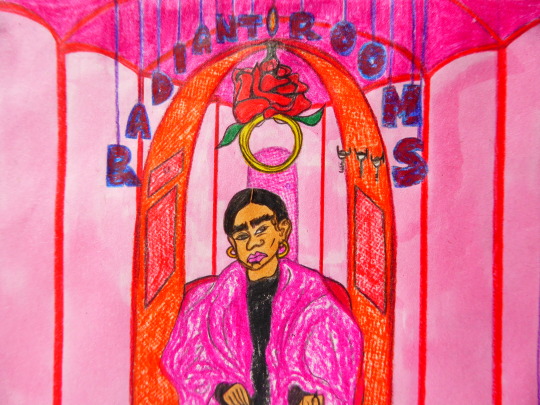
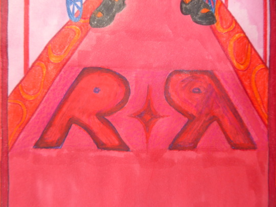
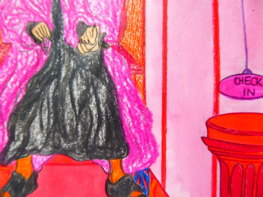
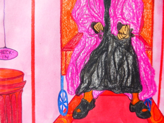
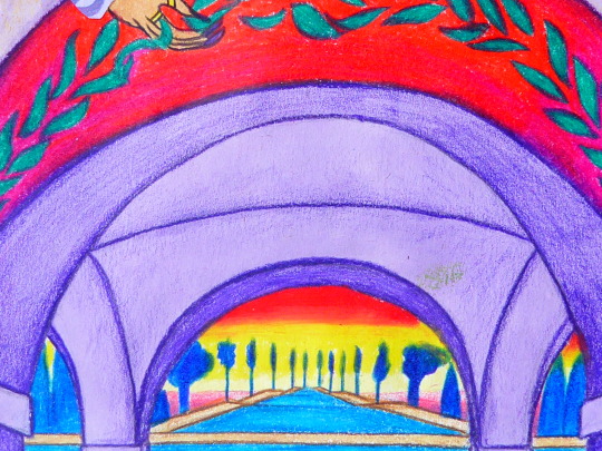
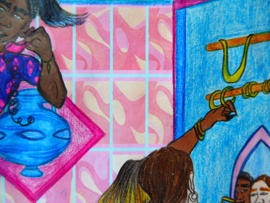
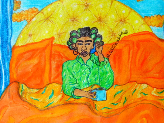
Check-In / Hallway combined!
‘Round Cut’
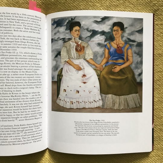
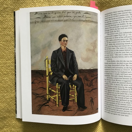
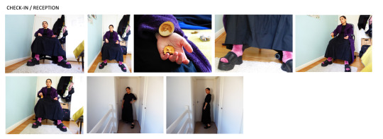
Due to time constraints I combined the Check-In scene with the Hallway! Here I used the painting ‘The Two Fridas’ for inspiration for the strong and powerful stance of the Check-In lady here. This also reminded me of my research about women wearing suits, and reminded me of one of Frida Kahlo’s self portraits where she’s wearing a suit entitled ‘Self-Portrait with Cropped Hair’. In the beginning I felt reluctant to use pink but because of the connotations it has towards being girly (not that there’s anything wrong with being girly), but then I realised if I didn’t use pink for that reason, I’d just be honouring the binary ideas towards pink for girls and blue for boys, so I used it instead and to my suprise it all still looks fierce. Love it
0 notes
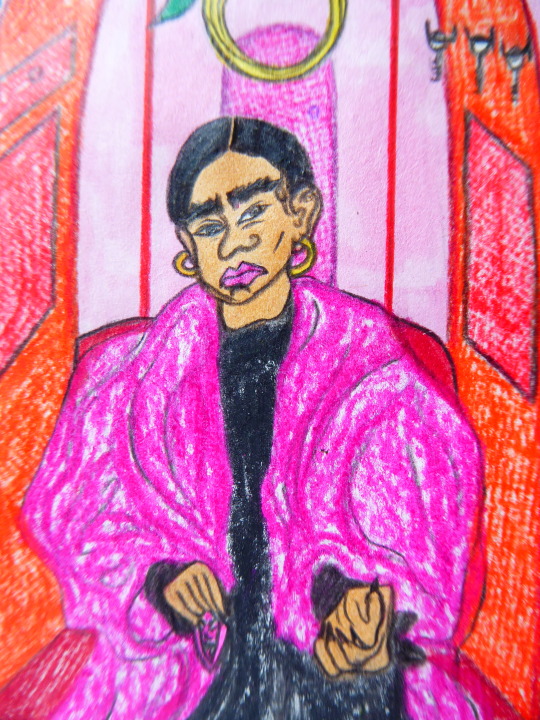
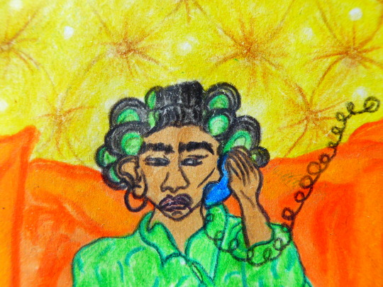
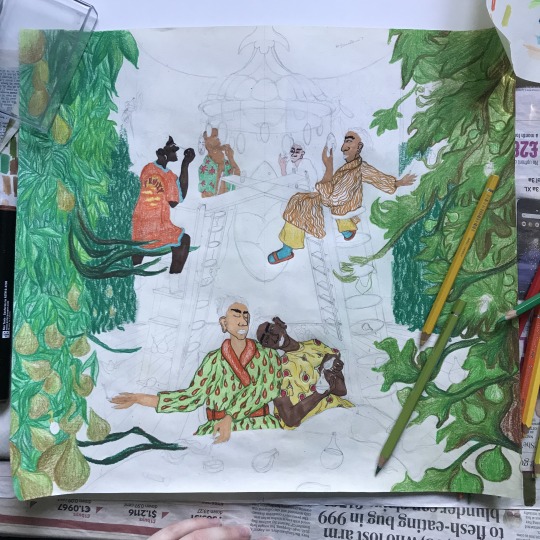
Photo
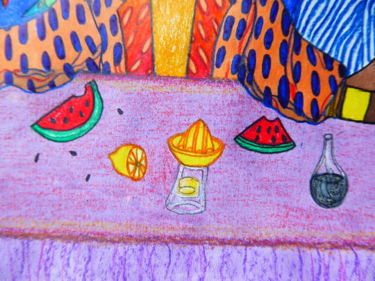
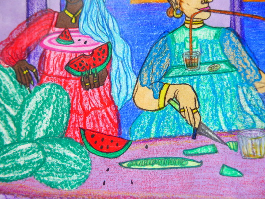
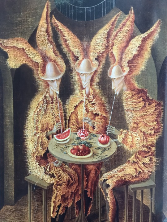
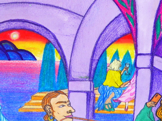
More close-ups!
I continued to enjoy the use of straws within Varo’s work, particularly in ‘Vegetarian Vampires’ (1962) which I adore!! Varo doesn’t normally use such vibrant colours in her works so I’m really fond of this one. Also one of them is drinking from a rose!! Love it!!!
0 notes
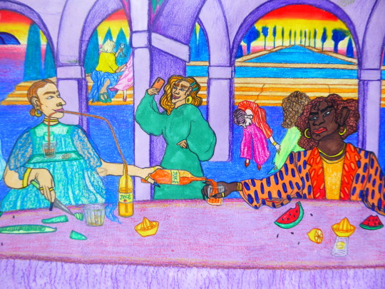
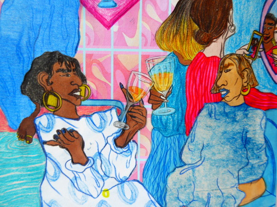
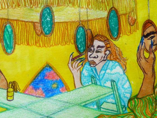
Photo
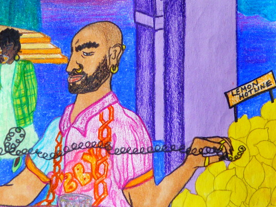
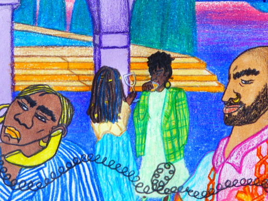
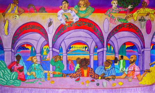
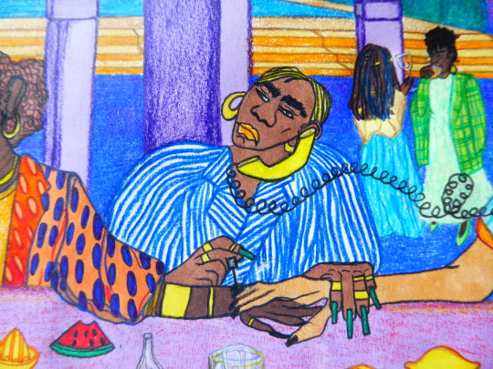
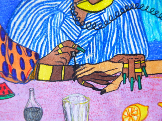
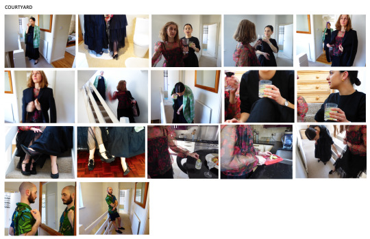
More close-ups! The painting ‘Tailleur Pour Dames’, 1957 (Varo) gave me so much inspiration for the Courtyard too! The second character from the right is drinking out of a glass that’s placed on a tray that’s attached to/part of her outfit! I LOVED this and used this idea for two of the characters to the left of my Courtyard scene. Again this is reference to how everything is connected, and something so simple as making clothes work for you - which links back to wearing whatever you want and being unapologetic about it, regardless of the gender you identify as.
0 notes
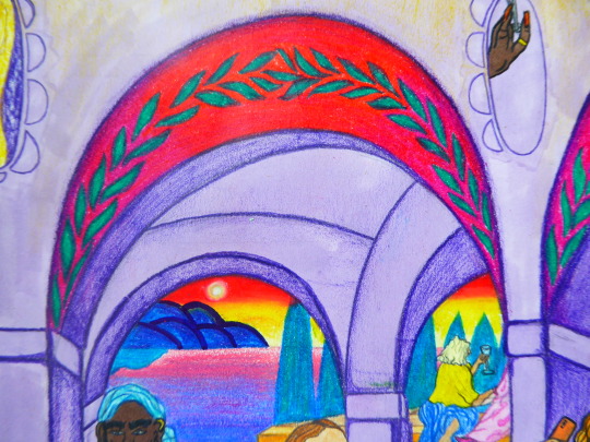
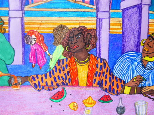
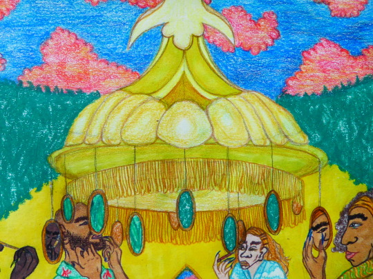
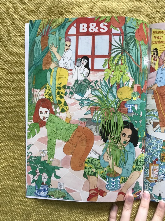
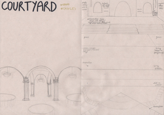
Photo

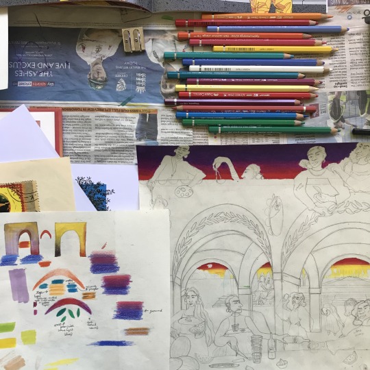
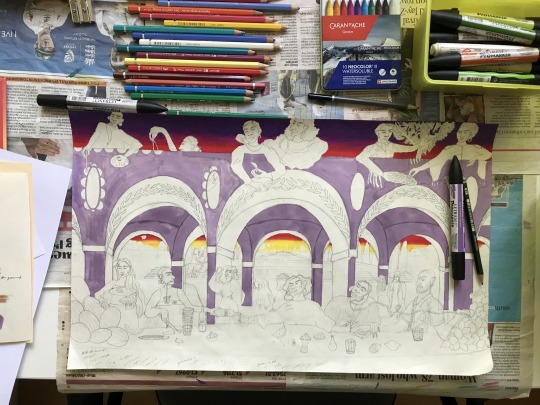
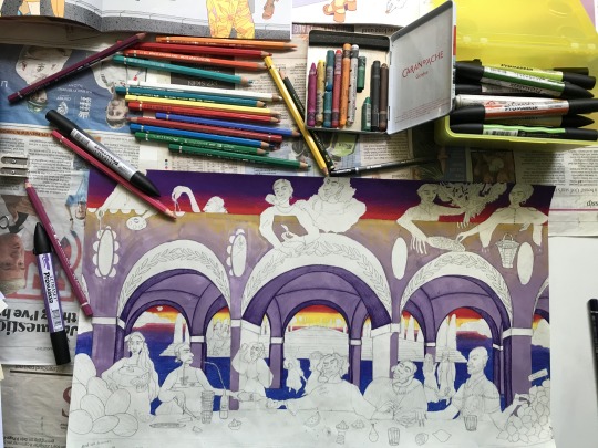
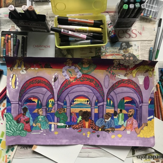
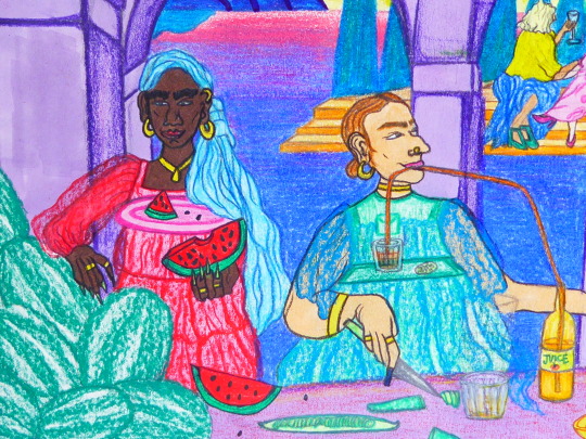
Courtyard
Oval Cut
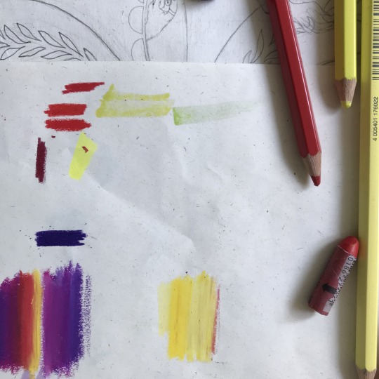
I looked at Illustrator María Medem’s work here especially for the colours. She has a way of using vibrant colours such as red but never making it overpowering. It’s always just right and leaves me feeling warm. In particular I looked at her book ‘Cenit’ and an illustration she did for NY Times about listening.
I used wax pastels for the sky because they blend seamlessly and I’m really happy with the overall effect. This landscape feels particularly dreamy. Laura Callaghan’s illustrations also helped me out with colour choices here. Seeing how she keeps to a colour palette helped me become aware of what colours I should and shouldn’t use, just to keep me in check so I didn’t make a mess of it by using every colour under the sun! Her illustrations were also helpful for drawing lots of different women.
https://www.nytimes.com/2020/02/11/well/family/listening-relationships-marriage-closeness-communication-bias.html
https://mariamedem.tumblr.com/post/190770020754/illustration-for-nytimes-for-a-very-interesting
0 notes
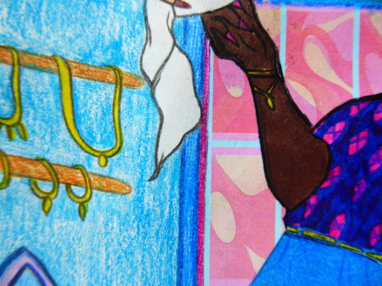
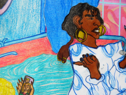
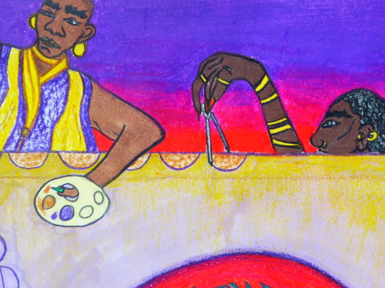
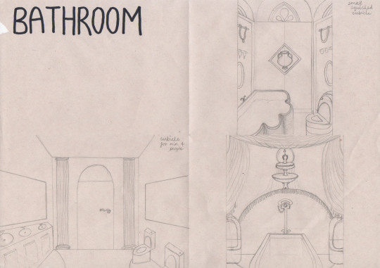
Photo
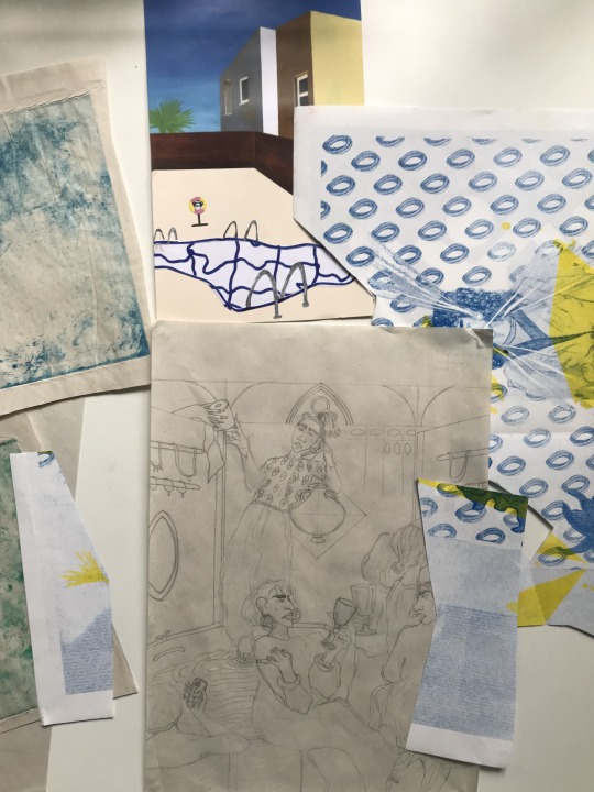
The Bathroom
Marquise Cut
The bathroom involved some collage including a wallpaper pattern I made on Photoshop from a series of screenprints I did in first year!
https://www.77diamonds.com/marquise-cut-diamonds.html
0 notes
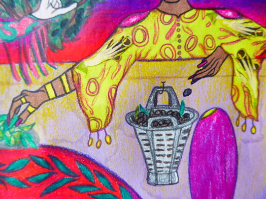
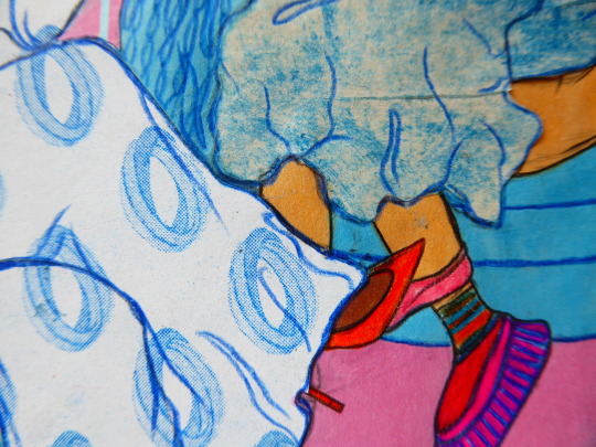
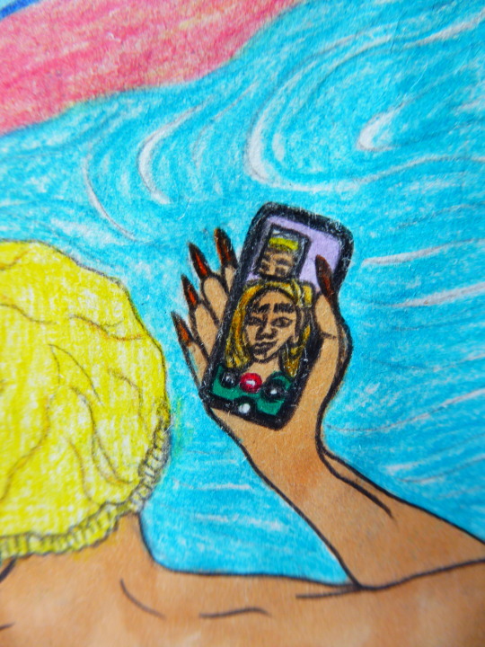
Photo
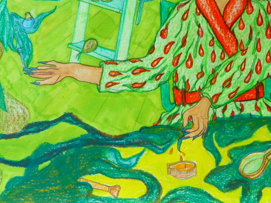
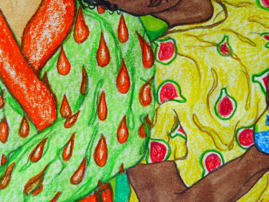
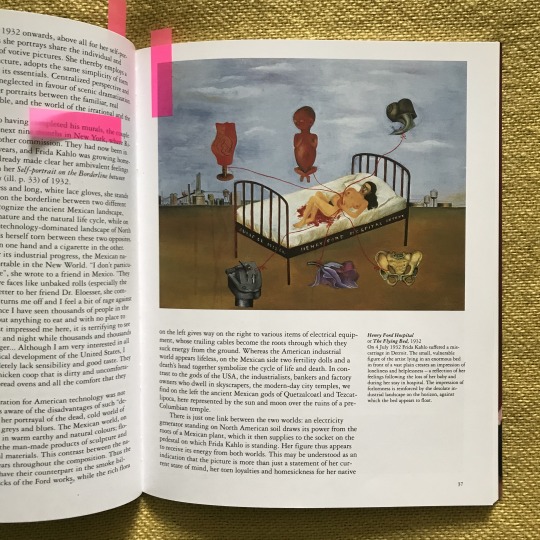
Close-ups!
Frida Kahlo - The painting ‘Henry Ford Hospital’ inspired the extracting of the nail varnish from the vines, I wanted my work to be like how everything is connected in Frida Kahlo’s paintings!
0 notes
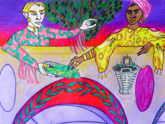
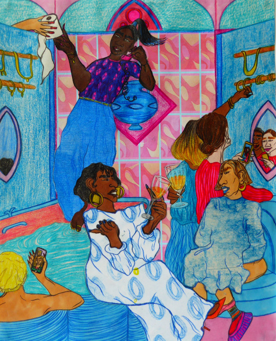
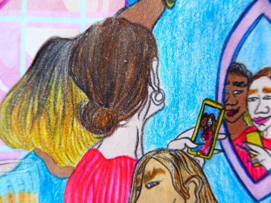
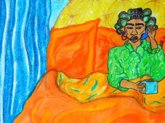
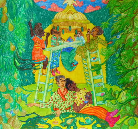
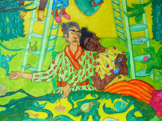
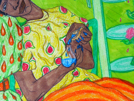
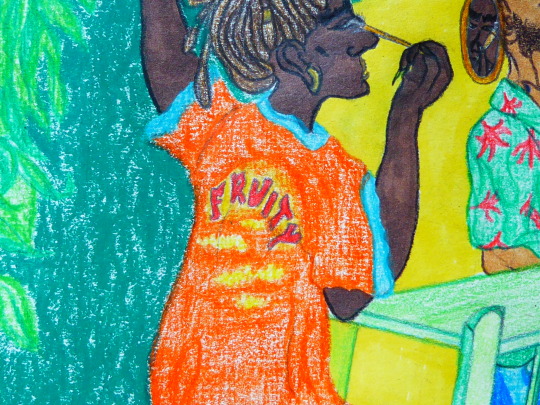
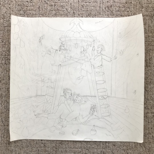
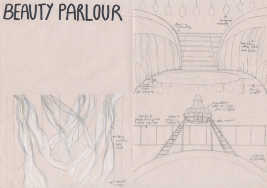
Photo


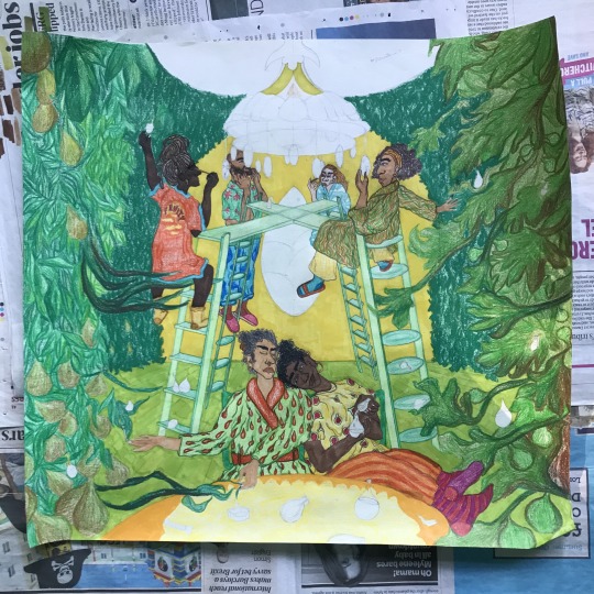
Beauty Parlour
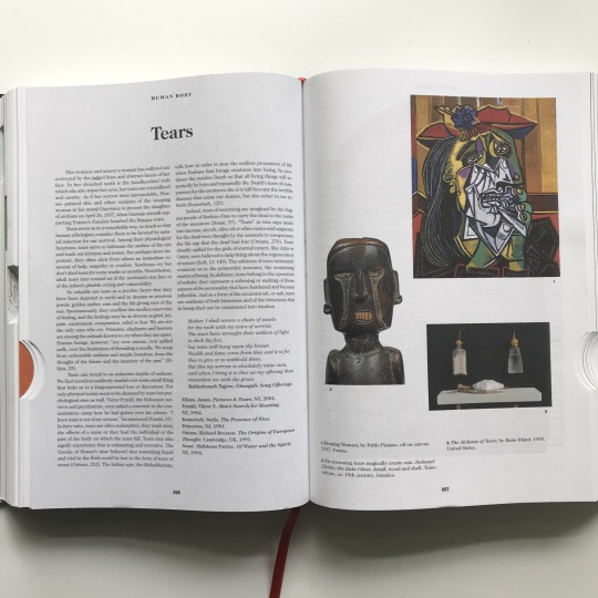
Pear-Cut or Teardrop Cut (see also ‘TEARS’ pictured in Book of Symbols above)
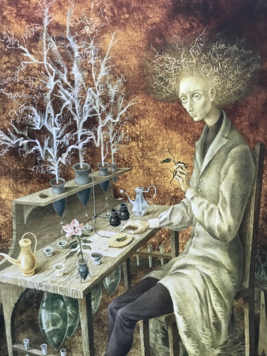
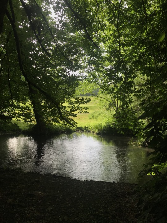
The beginnings of this composition started from a visit to my local park with my sister, where we sat under some trees (see top) and they were like a roof over our heads. This reminded me of a painting by Remedios Varo called ‘Vegetable Cathedral’ (1957) where the giant vegetable leaves form the roof of the space. I wanted to transport this idea of being surrounded by nature but somehow inside within my drawing, and the end result looks like half room half jungle.
I also really wanted to incorporate alchemy to further emphasise the magical feeling and looked at the painting ‘Discovery of a Mutant Geologist’ (Varo, 1961) for the shapes of these alchemical objects. In my drawing, the things that look like glass science beakers are holding nail varnish for the characters, while some of its leaves paint their nails. The main figure on the left is then extracting some nail varnish from a vine to then put in a pear-shaped pot. I wanted this idea of everything going in a cycle and working together.
Laura Callaghan’s work also helped me with the colour scheme for this scene!!!
0 notes
Photo


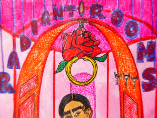
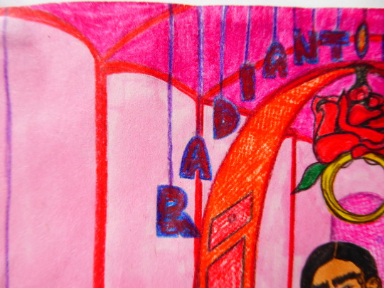
After thinking about the meaning of this proj, I tried coming up with a name for it to help more for when it came to drawing, and for clarity. I made another mind-map for this (the right page of the mind-map on the previous post) and focused on words like multidimensional and multifaceted, as I feel these encompass my project well because I want to show everyday actions but in a different way and also show scenes and portrayals we wouldn’t normally see. Basically that not everything has to be one specific way.
I liked the word ‘faceted’ a lot and thought about how diamonds are faceted to be as sparkly as possible, which I felt was a good metaphor for the meaning of this project. After some research into this I discovered the type of facet-cut with the most facets is called the ‘radiant cut’ with about 70 facets! Then the name RADIANT ROOMS was born. Then I thought each room could be themed around a different type of cut! There’s so many; princess cut; emerald cut; oval cut; pear cut etc.
https://www.77diamonds.com/princess-cut-diamonds.html
Fonts found online:
https://www.vecteezy.com/vector-art/86904-free-golden-alphabet-with-diamonds-vector
https://www.textfx.co/
0 notes
Photo
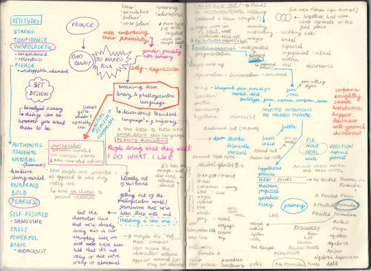
I also took some time out (when I was having my writing block) to think about the actual meaning of my project, as I was feeling foggy about it. Through mind-mapping I worked out that what I love about the male musicians e.g. Prince, Queen, Bad Bunny etc is that they freely express who they are, despite the constraints of a patriarchal and phallogocentric society and language that we’ve been given. It took me back to my dissertation ‘How Have Western Notions of Science and Religion Influenced the Representation of the Female Body within Western Art?’ where I analysed the umbrella of controls placed over the female body including language, religion and science. In this current project I’ve expanded to look at how this too is relevant for men given that phallogocentric language also glorifies binary gender roles for them too. So I think rather than just being based on gender fluidity, this project is about dismantling the phallogocentric language, binary gender roles and the belief that everything has to be rational and nothing can be emotional, because I think the possibilities that come with this dismantling can be endless. We can be emotional and rational and irrational too, nothing is out of bounds within this context.
I think it’s about visualising a new world that hasn’t yet been, it’s like a speculative future. So slowly I’ve been weaving the characters from my photoshoot into each scene, and they’re gradually interacting with it and becoming part of a new world.
0 notes
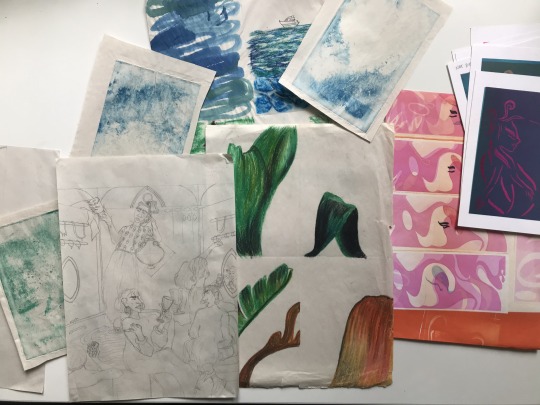
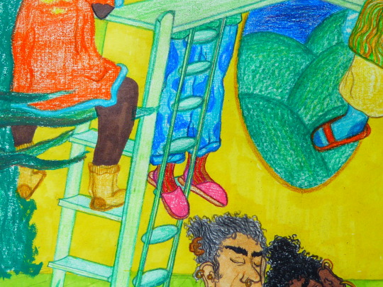
Photo


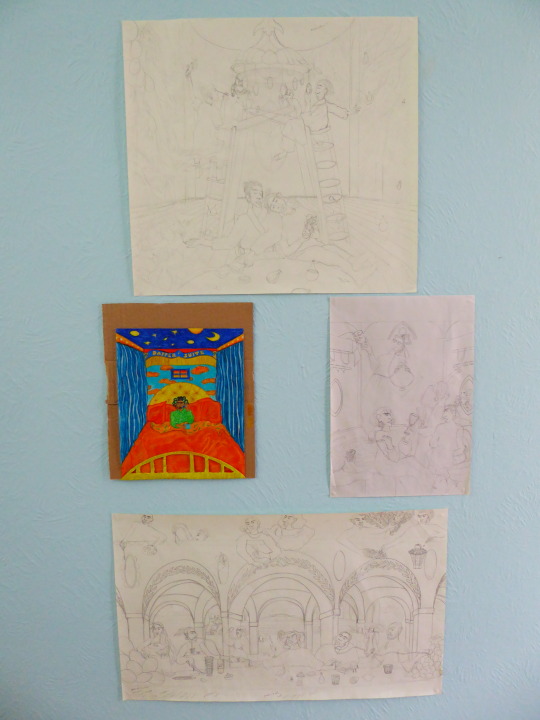
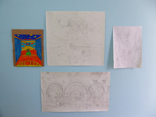
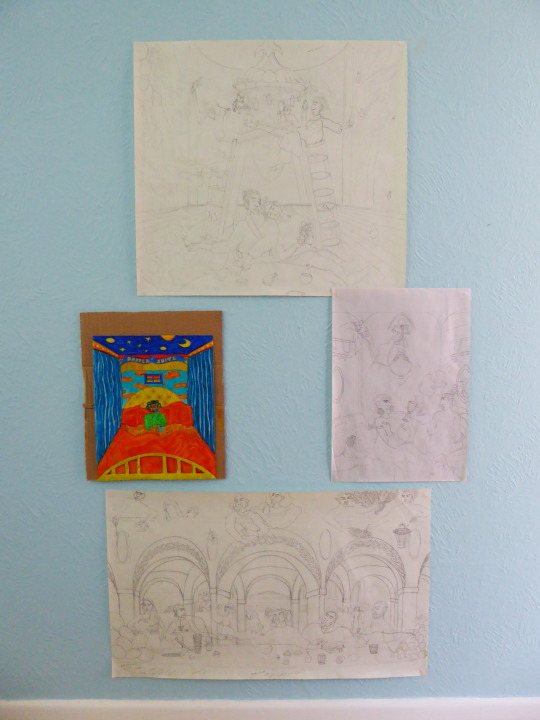
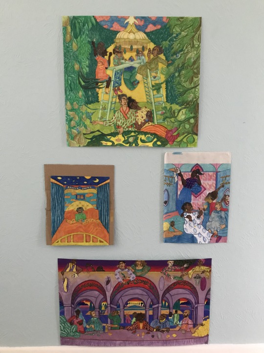
Last week my drawing just wasn’t flowing, but luckily this week it’s been a lot better. I’ve developed the Beauty Parlour, Bathroom and Courtyard scenes, and I’ve put the drawings together to see how they might look as a group.
I didn’t like how long the composition was in the first grouping of drawings, as I wanted it to be more rounded, so I moved them closer together in the second composition but I felt there needed to be space between the Beauty Parlour and Courtyard. So I went back to the longer composition and made a slightly wider space in the middle, which I think I’ll have one fifth and final drawing of the Check-In and Hallway combined!
Then I’ll colour everything in and design the frames from there. I’m aware that once I’ve coloured everything in the composition may change, but I’ll go with it for now.
0 notes
Photo
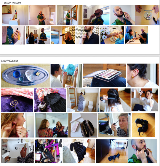
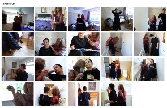
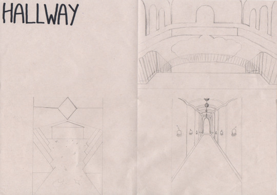
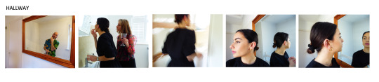
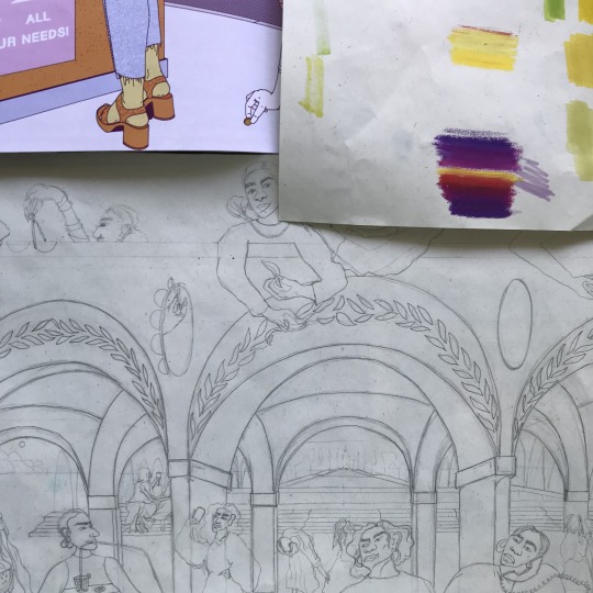
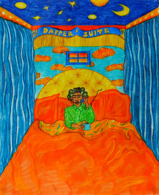
3 x sketches for each of the other 5 rooms / spaces. At the moment I know the Beauty Parlour and the Courtyard will be the biggest scenes, the Bathroom will be around the same size as the Dapper Suite and the Hallway & Check-In will be the smallest. I also sorted all my pictures from the shoot into the different rooms to help with drawing characters and what kind of actions they’d be doing.
0 notes
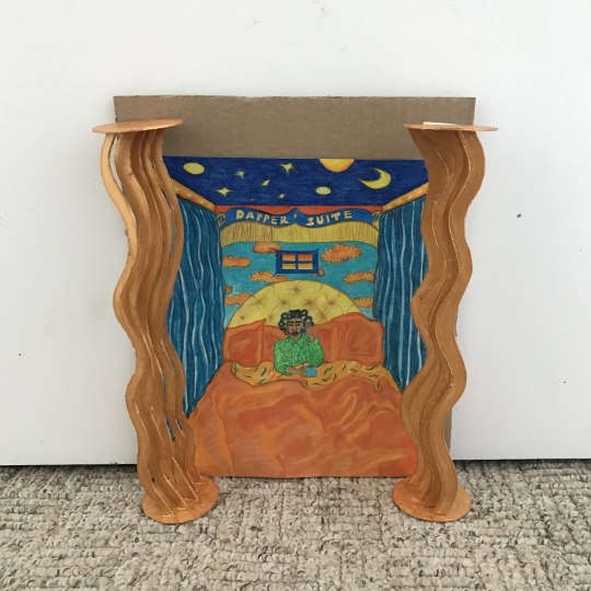
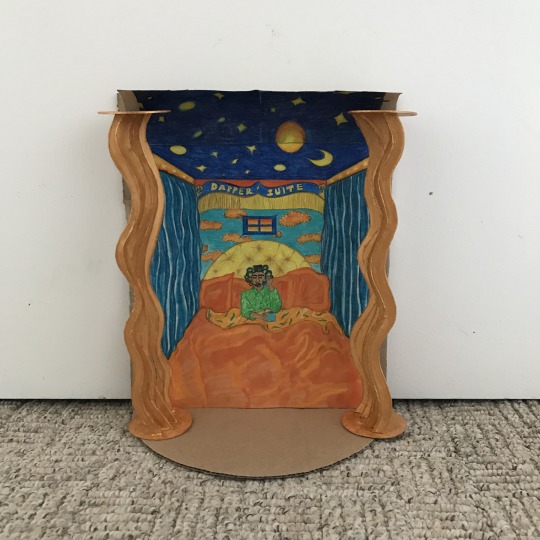
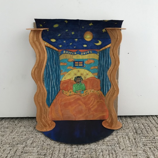
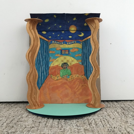
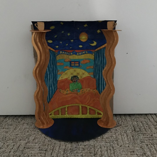
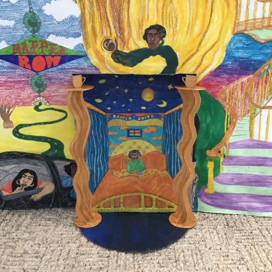
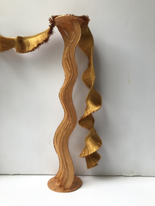
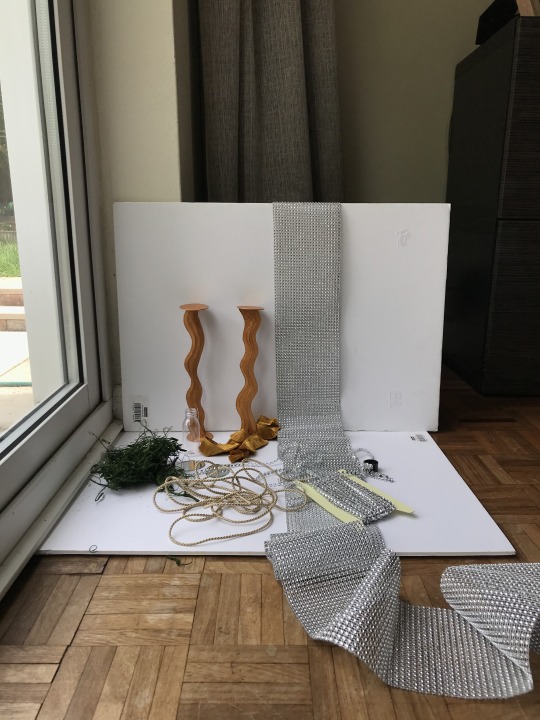
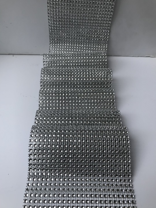
Photo
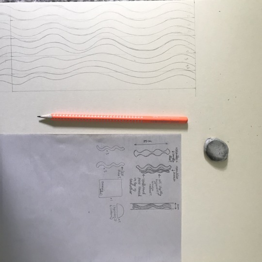
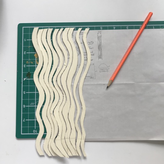
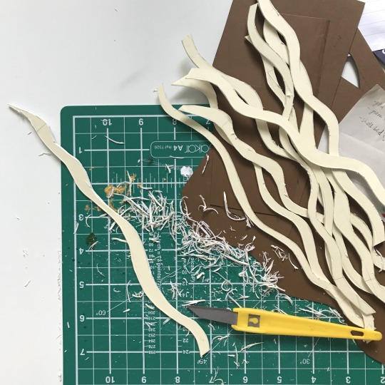
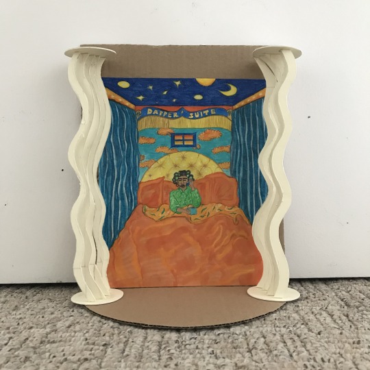
Attempting to make a more professional looking frame with mountboard instead of cardboard
0 notes