
k00288674
𝔸𝕠𝕚𝕗𝕖 𝕆'𝕊𝕙𝕖𝕒 ❀
1st year art and design LSAD -
PAINTING
136 posts
Don't wanna be here? Send us removal request.
Last Seen Blogs

shitty-music-blog
Musics

voids-fics
Void writes fics

misslongcep
All About The Nerd Thing
frozen-horsemeat
_frozen_horsemeat_

jasonshousewife
Jason's housewife
Text
Painting - artistic statement
I have thoroughly enjoyed the last 5 weeks of my project. My chosen subject, "Passenger princesses", was to portray my relationships with myself, my friends and my family, to show how they are healthy, and that they are not one-sided.
I quite enjoyed creating work filled with happiness, fun and imperfections. There is something much more interesting about a painting when it is imperfect I feel, a rather true portrayal of humankind.
I feel my painting theory and practice has developed greatly over the past 5 weeks too. I feel I have become more comfortable and better at drawing a life model, something of which I had not done till coming to college. I also found the teaching of colour theory to be very interesting and wise to know.
Overall, I am proud of myself for the work I have created, and thankful for the guidance from lecturers Eoin and Sylvia.
1 note
·
View note
Text
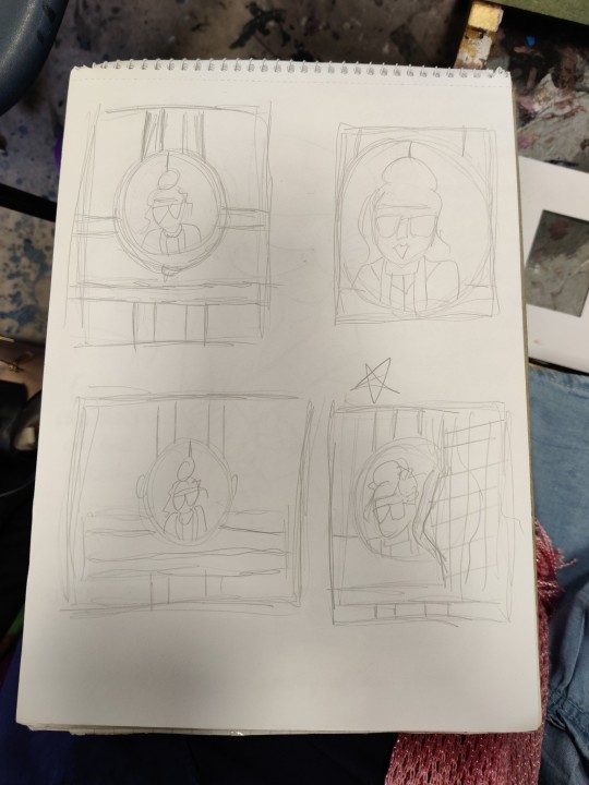
Painting - sketchbook work
(mind maps and small sketches, idea developments)
1 note
·
View note
Text
Chantal Joffe
(artist research)
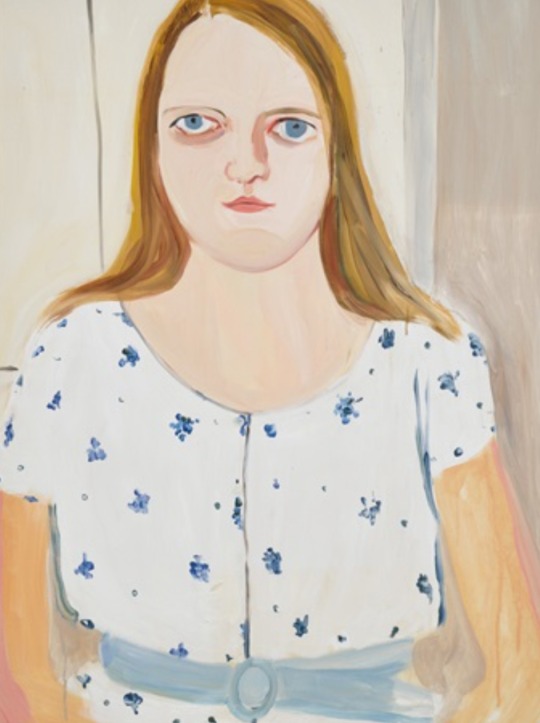
I have also been studying the work of Chantal Joffe, a portrait painter.
I enjoy the imperfections of her work, how the figures are distorted to some degree. This makes her work more distinguished I feel and also makes me engage with it more.
I feel it portrays a more natural feminine figure, these distortions, as I feel society's feminine figure can lean into a more perfected look.
I also like, how her brushstrokes are thick and easily noticeable, but add interest to the pieces.
I have enjoyed viewing her work.

2 notes
·
View notes
Text
Painting week 5
Tuesday
Today, I made some books and finished my zine. I also made a copy of my zine into a book, with a transparent cover.
Lecturer Eoin helped me and showed me how to make the books. I found it really useful, as it allows one more ownership over there work.
Here is a video of them.
3 notes
·
View notes
Text
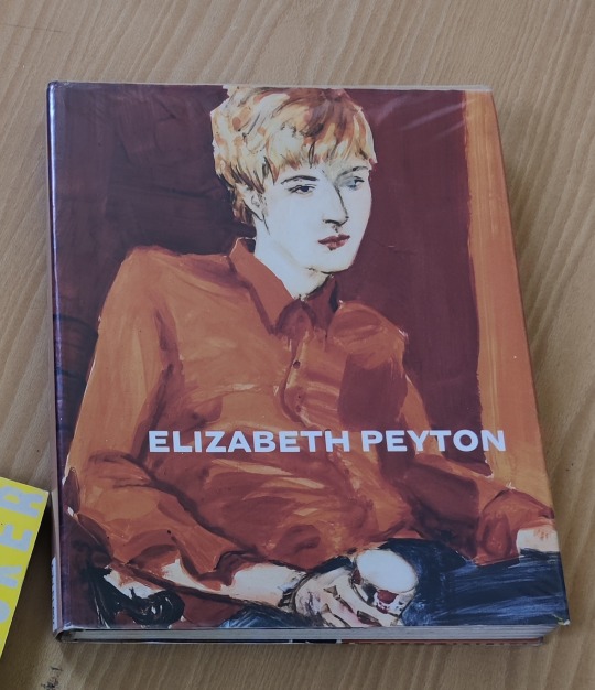
Elizabeth Peyton
(Artist Research)
I have been looking at the work of this artist, after being recommended a book in the library by Sylvia and really like her portrait works.
I like how her brushstrokes can be easily seen in her paintings but yet do not make the portraits harder to read. If anything they add a more interesting quality to the pieces.
I also like how her colours are quite saturated but yet there is still a soft feel to the paintings as a whole, I feel.
I admire as well how she paints her friends and family around her (as well as the painting famous people).
Her work has inspired mine.


1 note
·
View note
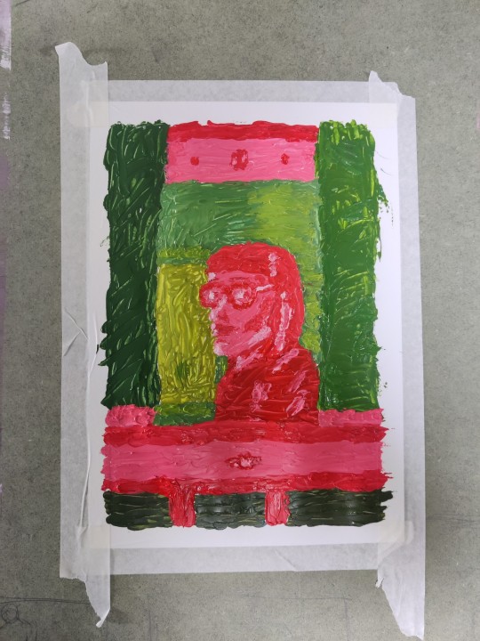
Text
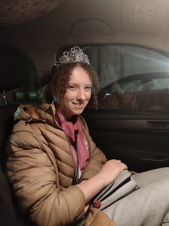
Painting week 5
Monday Part 3
To end the day then, I went back to the painting studio, to do some painting.
I had already started painting a portrait of one of my friends in my car, with leftover paint from Thursday.


So I continued this, adding more details and fun to the piece, through changing colours of background and outfit and recreating her to look like royalty, like a princess is.
I also added rhinestones and pearls, to add fun and glam the work. I also enjoy a 3D quality to my pieces.
Here is finished work.
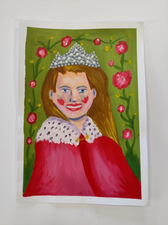
It is also inspired by artists Chantal Joffe and Elizabeth peyton.
1 note
·
View note
Text
Painting week 5
Monday part 2
In the afternoon, I then decided to do the zine workshop in the publication studio, since all students were welcome.
I was kinda unsure what I exactly wanted to make but Fiona helped to guide me throughout what I could do. When she mentioned the risograph machine, I instantly knew I wanted to use that to make work, as I had enjoyed the look of previous works I done from it before.
So I started off making the folds with a template Fiona provided.

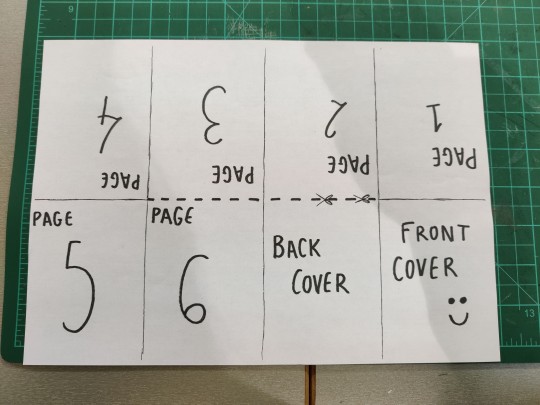
I then got work, collaging with my own prints and pieces from magazines, and using tracing paper to highlight what I wanted.
Work before and after risoprinting.
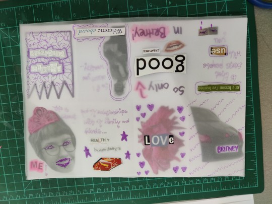

I feel good about how it turned out. I decided to make the zine as a way of introducing my project, for when I exhibit it.
I feel in hindsight now, I should have probably gone in earlier so as to have more time to create. Also should have used a darker pen/marker in some areas as they are lighter, harder to read
Folding it tomorrow so as to let it dry overnight!
1 note
·
View note
Text
Painting week 5
Monday Part 1
Today was a busy day for me.
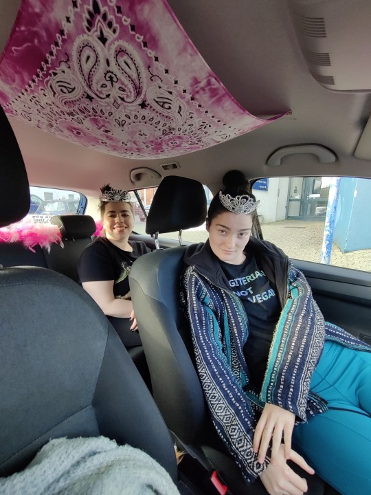
I began the day by going to the clay room and making some simple portrait tiles. I wanted to do this as a way of experimentation, having a new object other than paper to paint on.
I used two reference images of my friends in my car, to create the faces.
I rolled out the clay to flatten it and added more to take the shape of the nose, eyes and lips, smoothening them into the flattened clay.

It was fun to play with the clay!
Once it is out of the kiln on Thursday, I'll start painting it!
**
Work is also inspire by an ceramic artist called Louise fulton, who creates face tiles as homewear pieces.

1 note
·
View note
Text
Painting week 4
Friday
I had told Sylvia that I was coming in this day and she gave me a task to do.
To paint in the same style as artist Lucian Fried, using one of his own pieces as a reference.
I found it to be overall a challenge that was both enjoyable and frustrating.


Quick sketch and finished work, with reference image above.
Mine has similarities to freud's work I feel but its main difference is its colours. While Freud's are more muted, mine are more vibrant. I tried my best to keep mine more muted but the constant mixing tired me out, leading to me speeding up and placing colours on without care.
I feel, to do this again, I would have to learn to be more patient and take more breaks, to avoid becoming frustrated.
That being said though, I do like my work. I do enjoy myself vibrant colours in paintings.
Also going forward, I feel to implement colour theory better, I would mix my tertiary colours at the start, so that I have them ready to use.
2 notes
·
View notes
Text
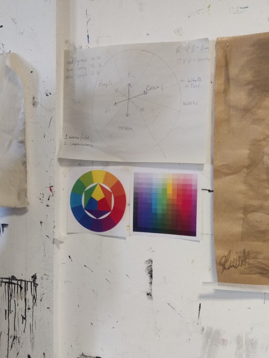
Painting week 4
Thursday
Today, We had another workshop on colour theory.
This time, we set up a background with coloured cards, that were complimentary to the clothes we had on and our skin.
This was then reflected on a mirror, with ourselves also to be seen, to do a portrait painting of ourselves.
(see set up, thumbnails and sketch below)
Sylvia commented on how beautiful a piece I had was and recommended I include it in my piece.
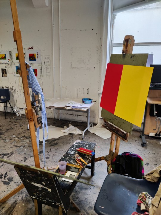
I realise halfway through my work that the mirror I had picked was too small, and didn't allow me to see the background fully behind me, which kinda ruined the point of the exercise.
But I still feel it was beneficial painting.

See finished work above.
I kept painting to a simple aesthetic, the most detailed aspect of it was the checkered fabric, which I feel I painted very well.
Next time, in doing this, I'll defo consider the size of the mirror more.
7 notes
·
View notes
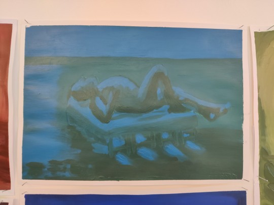
Text
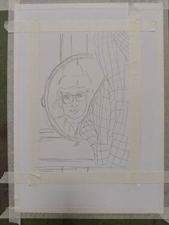
Painting week 4
Wednesday
After the talk, I decided to do some painting. From being off the week before, and seeing others work from then, I wanted to try to do it myself; a palette knife painting using opposite cold and warm tone colours only.
I know that it is better to do it with the lecturers about, but I do plan on getting them to view the finished painting and give me feedback on Thursday.
I started off setting the space; a mirror on an easel, while I sat on a donkey. I then used a viewfinder, to focus on what I wanted to sketch out to paint.
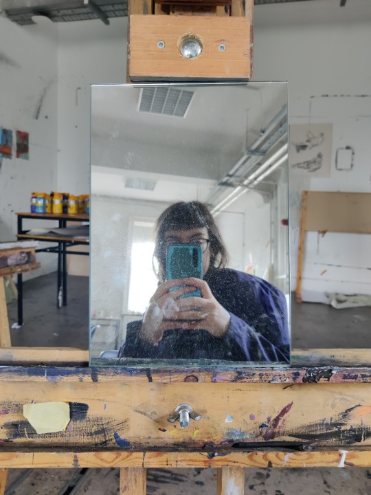

I then began painting and took it slow, learning from last time, when I mistakenly started too fast.
Here is the finished work;
I feel it is a good improvement since the last time. I am able to understand and accept better the thick impasto strokes, how they add a different sense of detail, from what you would be able to create with a brush.
I feel that I did good with colour use too. My only concern is if I was right to add in the box window behind me, does it complicate the background. I personally like it but I will eagerly await my lecturers opinion.
3 notes
·
View notes
Text
Painting week 4
Wednesday: Visiting artist presentation: Nick Miller
Today, I went to a talk where artist Nick Miller was introducing us to how he made artworks.
I feel I really engage with what he had to say. Here are some notes I took.


I was very interested in how he made huge life size scale drawings. It helped remind me that drawing is just as good of an art form as is any and does not need to be for just sketching ideas and doodles only.
I think my favourite pieces of his was a sculpture he made, using his sketchbooks. I found it to be a fascinating use of his ephemera to create art to represent himself.

I was also really drawn to the drawing of jaguar he did during a residency in Dublin zoo he did. I found the scribbled, imperfect drawing to be cool, giving a childish, fun elemental to the drawing. This is something I want to portray in my own work, a fun feel.

I am really happy that I got to meet him!
3 notes
·
View notes
Text
Painting week 4
Review of Mondays work

My life painting work from Monday had fully dried and lecturer Sylvia placed it out in the hall. She spoke to me and another student who's painting was under mine, about her placement choice.
My mind tone and dark tone dried very similar as expected, so the painting is quite hard to read. But the placement of it enhances it and makes it more readable.
This is quite interesting to learn, that something as simple as placement can be so important; it can help to promote a painting much more.
5 notes
·
View notes
Text
Painting week 4
Tuesday part 2
In the afternoon, we did a workshop that would again help us learn colour theory.
This time, we were tasked with painting a still life of fruit, behind a background made of coloured cardboard paper.
We used viewfinders provided by Sylvia to sketch out a focused area to paint.


There was a challenging aspect to painting this, as we had to really look at the colours in the still life set up and how they bounced against each other. Something which a person normally would overlook.
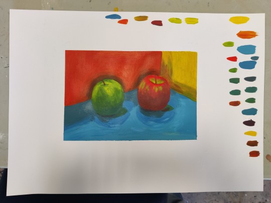
My finished work I feel is good. My only concern is with the shadows on the orange background, I feel I made them much more darker than what I saw them as.
The swatches of colours around the painting are all the different colours I mixed and used in the work (I forgot to label how I made them).
5 notes
·
View notes
Text
Painting week 4
Tuesday Part 1
At the beginning of the day, we had to do presentation on an artist we picked a few weeks back to research.
I picked Elizabeth Magill.
Here are some pictures of my PowerPoint:


I feel I did well presenting. I spoke as clearly as I could while making eye contact with the crowd.
I keep my points straightforward too so as to not end up waffling and boring my audience.
I found researching her to be a delight, I became very interested in how she uses her imagination to make her landscapes very interesting and noticeably her own.
Thanks again to everyone who was there listening!
3 notes
·
View notes
Text
Painting week 4
Monday part 2
After Sylvia's workshop, I decided to do Lecturer Eoin's workshop too.
This was due to leftover paint I had and also due to being missing the week before.
Eoin had Jeff, the model, do some 30 - 20 min poses, so I painted each of them.
I used 3 brushes, one skinny, one medium and one thick. I wanted to experiment with them, see which I could capture Jeff shape best.


Overall, I am happy with my work. I really wanted to capture the figure to its exactness as best I could. I feel I have achieved in this, while also experimenting with brushes and brushstrokes.
A great start to the week.
3 notes
·
View notes
Text
Painting week 4
Monday part 1
I unfortunately missed week 3 of painting due to illness.
But I am back now and am focused on getting lots of work done.
My day today began with Lecturer Sylvia's painting workshop. She taught us colour theory and helped us mix palettes through this.
I picked blue and mixed in a bit of orange to make it darker.

We then set up and began painting Jeff, our life model.
See progress work (background):
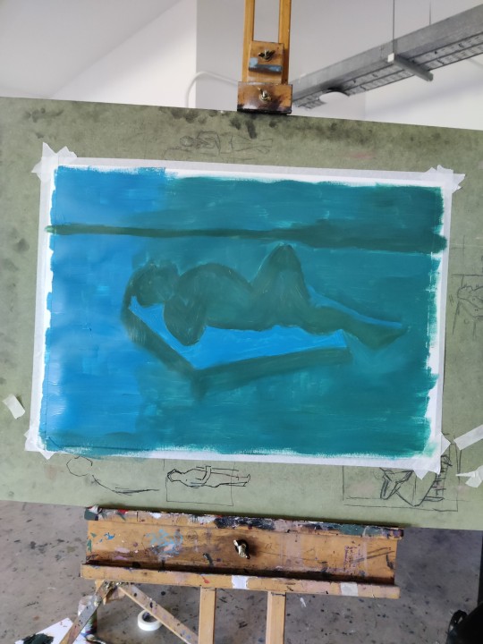
See finished work after:

I made the mistake of having my mid tone colour and dark tone colour too similar, which dulls the painting, making it hard to register.
But this has helped me to learn for the future to mix them with stronger and distinct difference in shade.
The light tone blue really pops out though and I capture the figure lying down really well, so all is not lost.
Part 2 to follow.
7 notes
·
View notes