
k00267544
Clodagh Dunne
LSAD Year 1 - Exploring the movement of light and distortion of perspective
38 posts
Don't wanna be here? Send us removal request.
Last Seen Blogs


Text
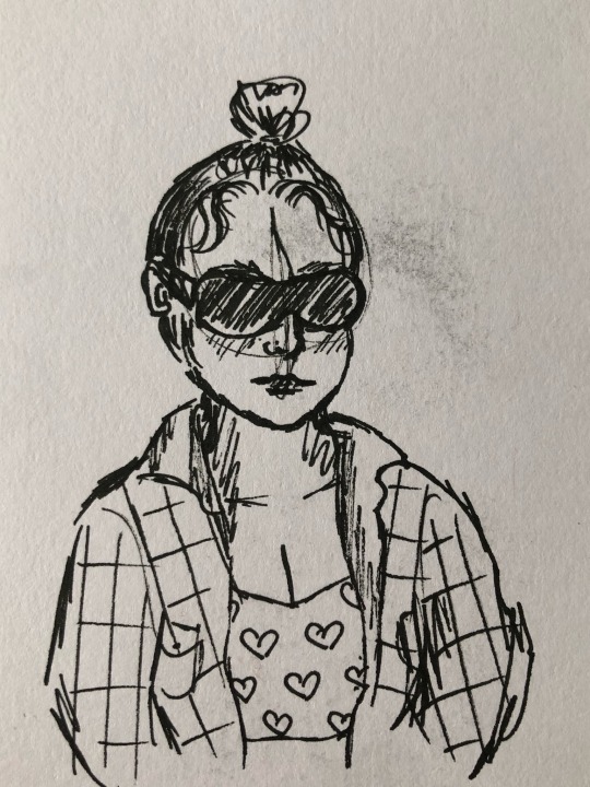
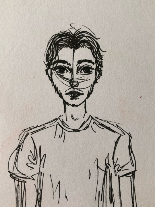


some sketchbook pages from last weeks workshop. we all went outside with our sketchbooks and had to draw our surroundings. I decided to draw the people i was sitting with.
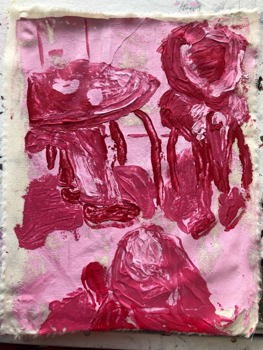
when we went back up to the studio, we did some painting inspired by what we observed that morning. i decided to use a palette knife to push paint around to recreate one of my sketchbook pages
4 notes
·
View notes
Text
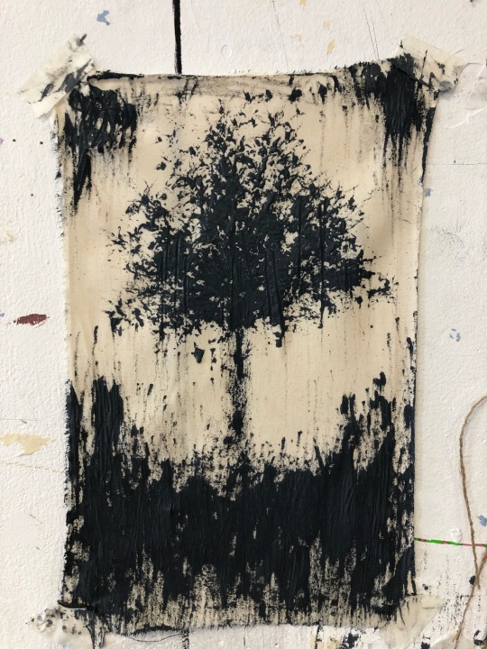
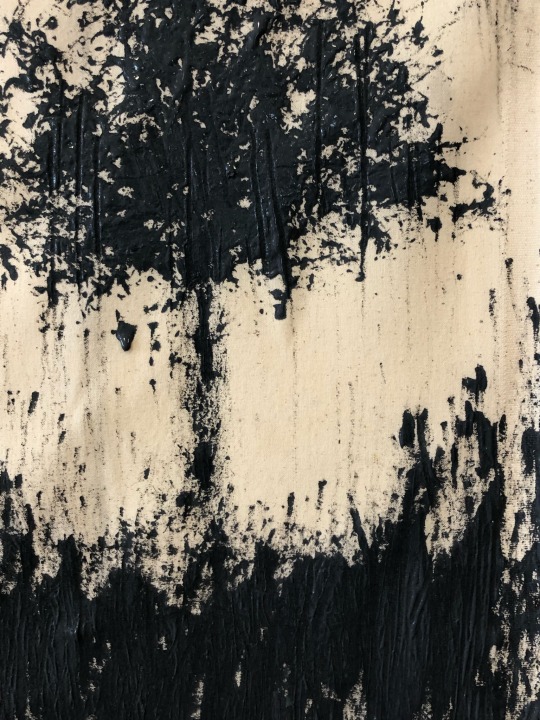
Some of the experimentation from eoin’s first mark making workshop! We walked around the college and collected materials that could be used as unconventional painting tools.


3 notes
·
View notes
Text

A watercolour painting I did of one of my reflection on one of the railings in my bathroom. I wanted to paint how it distorted the entire room and changed the whole perspective
2 notes
·
View notes
Text
Movement - Project Statement
At the beginning of the project, I was leaning towards exploring the movement of light and how it reflects and refracts. I found the painting workshops I did very helpful with this as we had to study how the light hits the body as we paint it.
I ended up moving more towards movement of perspective and scale during the end of the project, using pictures with a fish eye lens, and experimenting with the 0.5 wide angle iPhone lens. I found it interesting how distorted I could make everything when I experimented with scale.
The electives I chose were painting, sculpture and fashion. I feel like I lacked in the fashion elective, and I think I should have chosen a different elective that would inspire and produce more ideas.
2 notes
·
View notes
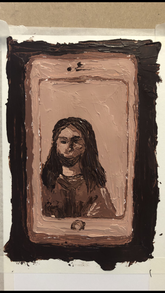
Text
I created these two paintings inspired by the wide angle lens pictures that I took. I wanted to paint how the camera distorts them, and makes certain features huge and other features tiny.

4 notes
·
View notes
Text
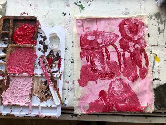
Pushing Paint Around Workshop
This week I did the Pushing Paint Around Workshop with Sylvia. This was my first time using a palette knife aswell, so I wasn’t really sure if I’d enjoy it or not.
First we mixed our paint and set up our easels. I was going to use a small mirror but I couldn’t stick it on the drawing board so I went with my phone. We did rough thumbnail sketches to experiment with the composition of our painting, to help us decide. I ended up choosing the bottom right one.

We had a dark tone, middle tone, and light tone mixed on our palette. First we painted the background, and then filled in the foreground. I learned to be generous with the paint and to not worry about being detailed. I really loved this workshop as it was a different way of painting than I usually would.
3 notes
·
View notes
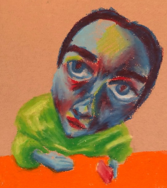
Text
I took some pictures of my friends with the 0.5 wide angle lens on an iphone. This completely distorted the lens and the pictures. I loved how it looked when I played around with the perspective in the pictures.
Here I did an oil pastel drawing of one of those pictures. I decided to use bright colours on the shadows and highlights
4 notes
·
View notes
Text
Painting Task 3/3
‘The Garden, Giverny’ - Claude Monet

This painting is oil on canvas. What I love about this painting is how the light travels through the leaves on the trees and creates a pattern on shadows on the ground. The edges of the painting are surrounded by plants and flowers, making the viewer feel like they are in the painting.
3 notes
·
View notes
Text
Painting Task 2/3
‘Journeys of Transgression’ -Navjot Altaf

This piece is acrylic on canvas. Navjot Altaf is a feminist artist from India. The thing I like most about this painting is the composition. I find it interesting how it looks like there are layers to the painting. I also think that the decision to leave an empty space on the right is very interesting.
4 notes
·
View notes
Text
Painting Task 1/3
‘Not Finding a Pose’ - Marilyn Hallam

This piece is oil on canvas. This caught my eye because of the striking colours and patterned brush strokes on the garment that the woman is wearing. I also think that the perspective of the painting is interesting. It’s like the viewer is in the top corner of the room, looking down on the woman.
5 notes
·
View notes
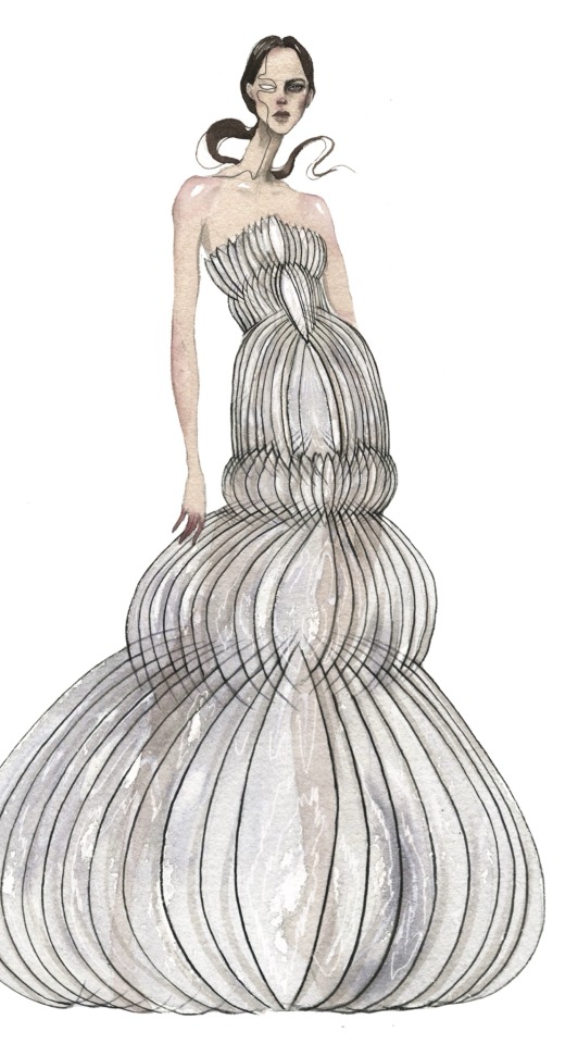
Text
Artist Research - Iris Van Herpen
Iris Van Herpen is a dutch designer that combines modern technology with high fashion. She pioneered the use of 3D printing to create materials. I love how her finished garments can also be considered a sculptural piece, as the designs have a range of different textures and shapes.

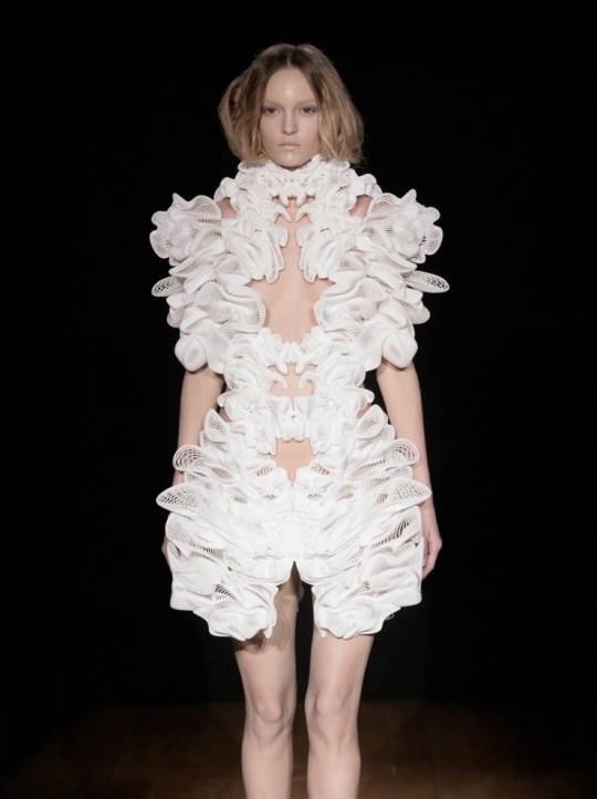
I find it interesting how the garments aren’t really worn, instead they’re displayed on the body.

3 notes
·
View notes
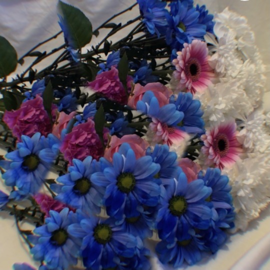
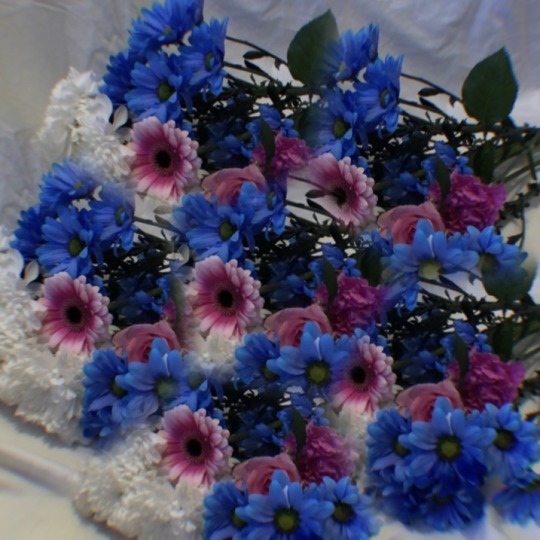
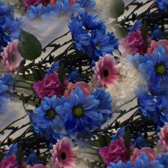
Text
I had a bunch of flowers at home that I took pictures of. I wanted to edit the pictures with a kaleidoscope effect, to chop up and distort the image.
This was one of the original pictures that I took⬇️

And these are a few of the final pictures. The kaleidoscope edits on the pictures remind me of a shattered mirror, and how the different pieces come together but still look warped
The colours of the flowers went really well together, and I want to create some paintings inspired by this colour palette
0 notes
Text
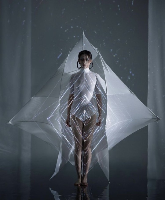
Artist Research - Fanrui Sun
Fanrui Sun is a Chinese fashion designer and artist. She designs futuristic and abstract fashion pieces, as well as rendering digital designs. I love how she combines fashion with other elements of art including sculpture, to tell a story.
In her project below, titled ‘SHELTER’, she collaborates with visual artist Niu Tong to create an installation, using fashion and light displays to tell a story about personal freedom amid chaos.


2 notes
·
View notes
Text
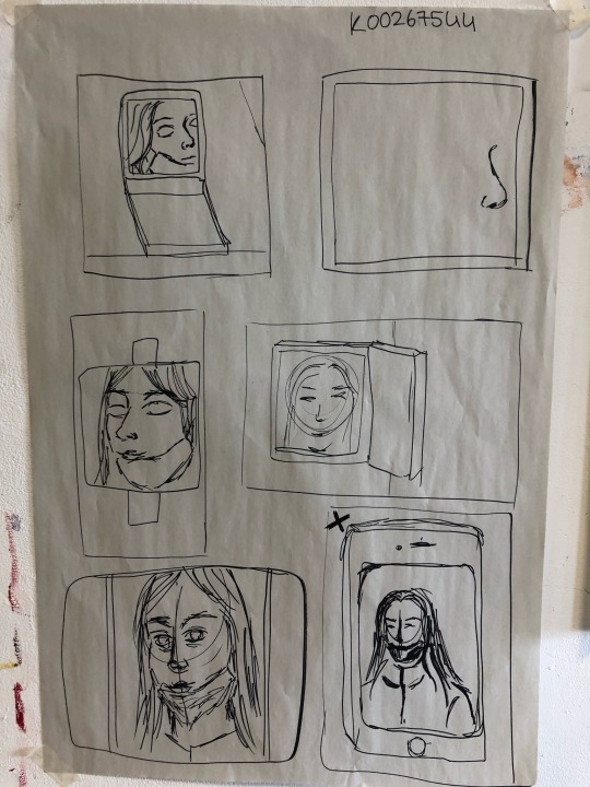
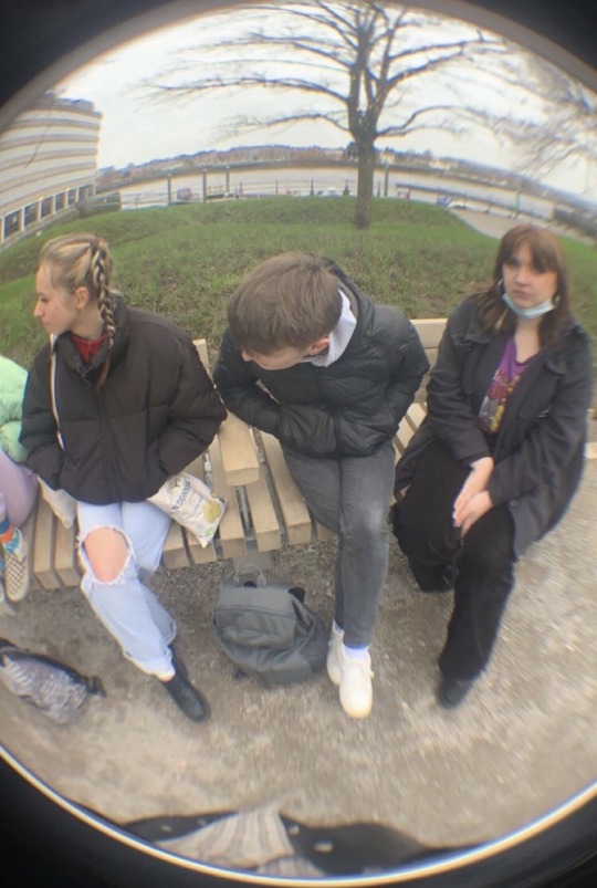
sketchbook pages
here is a sketch I did to try inspire some ideas. I used reference pictures taken with a fish eye lens which distorted the scale and proportions.

another rough sketch I did ⬇️

4 notes
·
View notes
Text
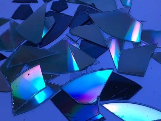

Some cd discs that I broke with wire cutters. I taped some blue transparent plastic to a light to create a cool glow. I love how the light bounces off the shards in different colors and the colour palette it creates. I did this to try inspire some ideas that i’ll work on soon
2 notes
·
View notes
Text
Rebecca Horn
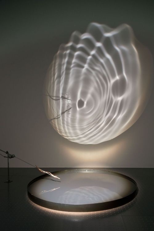
In her installation “Gesang des Lichts”, Rebecca Horn uses water and light to reflect and project a moving image. I love the idea of using light itself as a medium in art, and the distortion/refraction of it when it passes through different materials
2 notes
·
View notes
Text
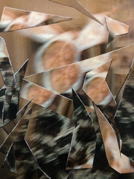

Today I made a collage and tried to make the pieces of paper look like a shattered mirror/broken glass. I used a white ballpoint pen to draw fine highlights on the edges to make them look like sharp shards.
3 notes
·
View notes