
Last Seen Blogs
bitchvania
Count Dykeula
funkyplantguy
august

deadio
Deadio
vixxruinedme
what
rosydraws
Rosy Draws 🌼
Photo

Our design process began with all of us inputting design ideas from our posters which were on family and the pursuit of knowledge. eventually we decided on the idea of cooking with family as it is knowledge that is being passed down from the older to younger generations
Alicia began work on the storyboard shortly afterwards of this idea then Angelica took photoss showcasing our ideas in the storyboard so that it can be translated into a stop motion video,
After angelica uploaded and sent me the photos i began work on Adobe after effects working on the stop motion video based directly of our Storyboard shown in the Image above
0 notes
Photo


Poster 2 Design Process
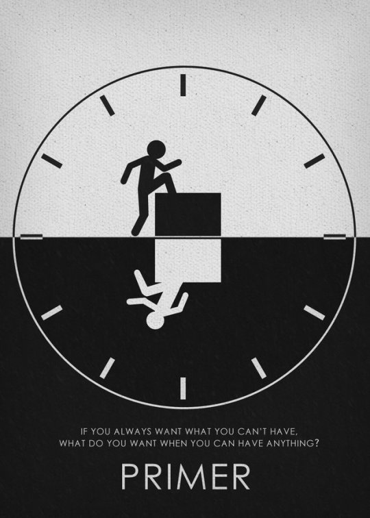
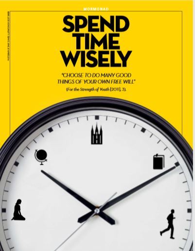
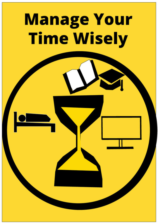
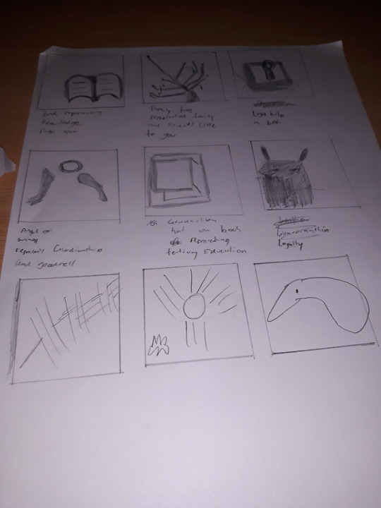
I decided to focus on the health habit on time management which relates to my overall target audience of University students as time management is important when trying to balance studies, sleep and other activities outside of university. The next step i took was to look at posters which will help me with inspiration for my second poster with the idea of a clock representing time with the use of other graphics which is a main use of inspiration for my second poster.
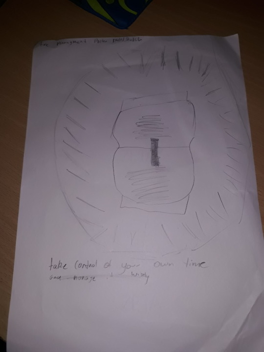
For my sketches for my Precedents i focused on drawing clocks,hourglasses and also other images such as Books,Hats man in a bed, and a TV to represent things we need to balance in our files such as Technology,sleep, and studies i then applied this for my poster sketch with contains all of this arranged in a clock.
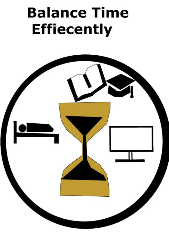
I then decided to start my Illustrator version while making changes from the sketch through the use of visual graphics, consistent color scheme and typography i was able to accomplish this through the colors of gold,black, white as it contrasts with each other throughout my poster.
The feedback for this poster was mostly positive just like the first one where the theme and ideas behind my poster were praised but the use of typography and fonts could been improved which i refined in my final version in the last Image where i have also changed the color of the clock to white so that it can contrast more with the book pages and white space used in the poster to make it more consistent and stand out more to create a more chill poster for my target audience.
2 notes
·
View notes
Photo
Poster 2 Design Process
I decided to focus on the health habit on time management which relates to my overall target audience of University students as time management is important when trying to balance studies, sleep and other activities outside of university. The next step i took was to look at posters which will help me with inspiration for my second poster with the idea of a clock representing time with the use of other graphics which is a main use of inspiration for my second poster.
For my sketches for my Precedents i focused on drawing clocks,hourglasses and also other images such as Books,Hats man in a bed, and a TV to represent things we need to balance in our files such as Technology,sleep, and studies i then applied this for my poster sketch with contains all of this arranged in a clock.
I then decided to start my Illustrator version while making changes from the sketch through the use of visual graphics, consistent color scheme and typography i was able to accomplish this through the colors of gold,black, white as it contrasts with each other throughout my poster.
The feedback for this poster was mostly positive just like the first one where the theme and ideas behind my poster were praised but the use of typography and fonts could been improved which i refined in my final version in the last Image where i have also changed the color of the clock to white so that it can contrast more with the book pages and white space used in the poster to make it more consistent and stand out more to create a more chill poster for my target audience.
2 notes
·
View notes
Photo


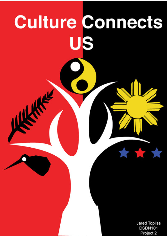
Poster 1 Design Process
My Target audience is University students like myself who are struggling with their own identity or the idea of trying to connect with people who are from different cultures and my idea is that even though people are different through these it can also bring them closer together
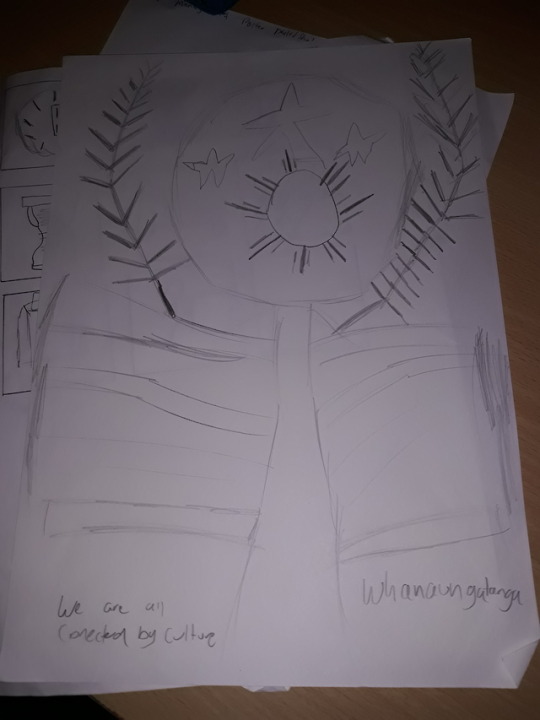
For my first poster i decided to start of researching different values and drawing different precedents such as a kiwi and a tree before deciding to choose value 2 which is about family and close connections and deciding to add my own cultural background since i am half Filipino and half new Zealander.
I then decided to do a sketch with the use of a tree and roots branching out containing my cultural backgrounds such as a kiwi a fern and the Filipino sun which symbioses that part of my heritage before deciding to do my work in Adobe Illustrator.
The process in Illustrator was a bit tricky and first but i managed to generate my precedents from paper to Illustrator after watching some tutorials to gain a understanding on how to create these graphics while incorporating my own message for my poster which was that culture connects us together linking back to value 2 which was family and cultural roots
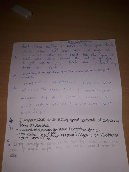
In the second to last image i had received anonymous feedback from classmates regarding my first poster which also applies for the second in regards to how i have used colors fonts and graphics etc.
i had received positive feedback regarding my overall ideas and messages about my poster in regards to the contrast of elements between my cultural heritage but many stated could change my fonts for it to stand out more and be more commanding to the users and my target audience which is university students
For my final first poster i decided to refine this and do some editing and changing my font so that it would standout more to my target audience
3 notes
·
View notes

Photo


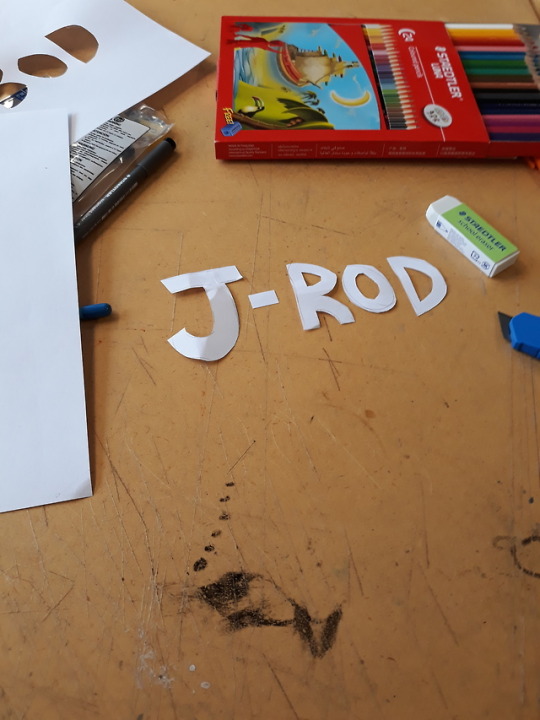
Today in my first studio leason for DSDN 101 my studio group were given our first PBA task. Which involved us first having to describe, three hobbies we love doing then, the person siting next to us had to draw a logo based of the three hobbies we wrote down and i had to do the same for one of my classmates as seen in the pictures. And finally having to create symbols for our classmates names which were based of the logos we are given, in the images above, i have some of the drawings they did for me and one, i did for my other classmate. Overall i did enjoy this task as we got to know our clsssmates better and also got my creative mind thinking and processing my ideas onto paper as its a first step out of many for my design course
0 notes