
jordantaneimagemaking602
Authentic Image Making And Application
GRAD602 Jordan Tane
55 posts
Don't wanna be here? Send us removal request.
Last Seen Blogs


Text
Final Website
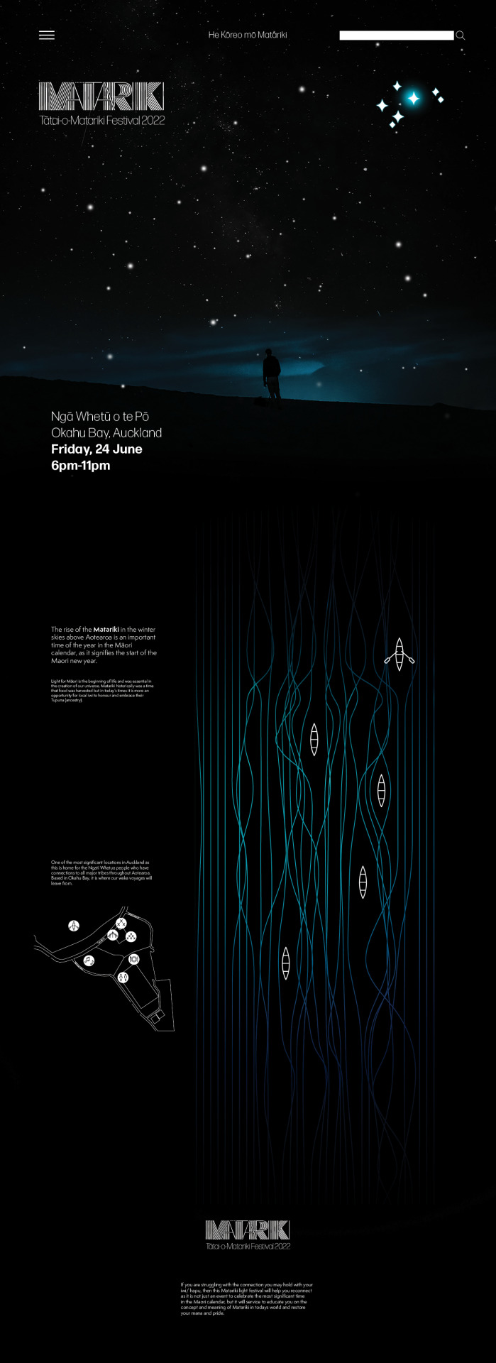
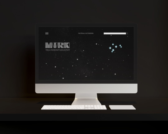
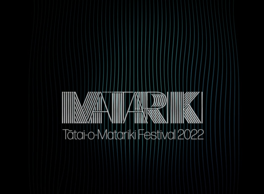
My final website layout and as can be seen the readers eyes are slowly drawn down the page. From the sky down to the ocean, the reader will get the idea that this is not only about learning about Matariki, but it will also be a personal journey. I have kept colour to a minimum as Matariki is only visible at night and the stars and text contrast better against black.
The page is not too overwhelming and have kept text to a minimum and spaced out so the reader does not feel like there would be a lot of information to read so would tend to stay on the page and take notice.
Looking down the page, the viewers eyes are led from the stars and logo to the date of the event (which I have purposely made bold to stand out) to the icons showing what would be happening on the evening. This is all that is needed to stay in someone’s memory whether they read the text or not and be more likely to attend the festival.
0 notes
Video
Final GIF
As line work was such an integral part of my entire design system, I wanted my GIF to predominantly feature this. Matariki is all about paying homage to ancestors and celebrating them and the Maori new year. Urban Maori in todays time are disconnected from their iwi/ hapu due to living away from their people and the environments that they traditional occupied such as their marae’s. Some Maori today do not even know which iwi they belong to. Whilst I cannot give each person this information at a festival, I can give them the incentive to want to find out.
This festival is about education but also about reconnection and the lines symbolise this reconnection. Having this GIF playing around the festival and through apps that can be downloaded will strengthen this resolve and drum into peoples minds that thy need to reconnect and find who they are and who their people are.
0 notes
Text
Final Signage
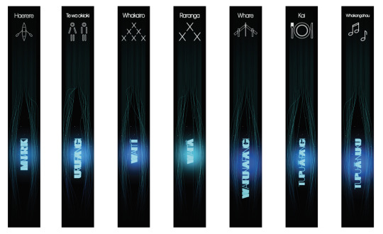
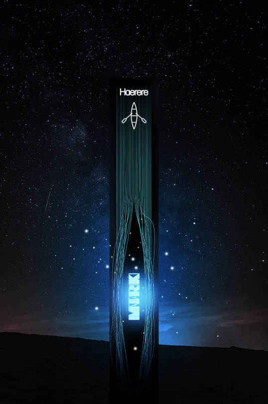
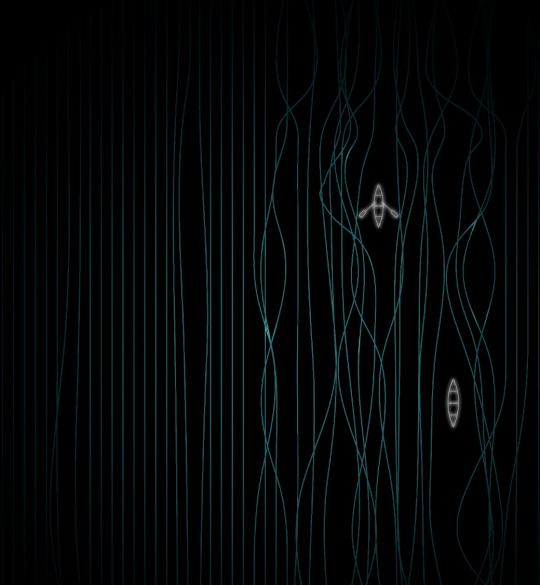
Wayfinder signage is important at any venue and as I have an evening event and light was an important feature, my signage needed to be visible from a distance without the need to have to be able to read it. The star cluster names that have already been linked to the area’s at my festival through my brochure will feature on the sign shining brighter than the stars. At the head of the sign will be the image (which in th above case is the waka ride) accompanied by the the Maori word that represents this activity.
Against the night sky, it will act like a beacon for festival goers to find and move towards when they are ready for that activity.
0 notes
Text
Final Brochure

The brochure is the knowledge area and the item that will help them navigate their way at the festival. Maori people traditionally used imagery to pass on their messages and stories so I did not want to overload my brochure with information that could be found out on the night. An example here is that on the waka ride there will be waka guides calmly informing and educating the occupants on the history of Matariki and and the stories of the ancestors. People will hear these stories like they did hundreds of years ago so there is no reason to write them down.
The only information on the brochure are brief blurbs about Matariki itself and what the festival is about, the location and brief information about each star in the cluster, as well as which activity this is linked to at the event.
The remainder and majority of my brochure is about imagery. The line work which is about reconnecting and then the stars. To be able to hold this brochure up to the sky to align the stars will be moving and when festival goers hear from the waka guides the story of each of the stars, this will be moving and they will learn so much more than reading it in a book.
The contrast of the white text on the black background matches the stars against the blackness of the evening sky. the final result is that a festival goer will not just dump it in the trash can at their first opportunity as it has a purpose and is interactive so will have meaning.
0 notes
Text
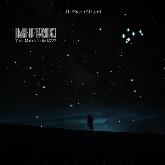
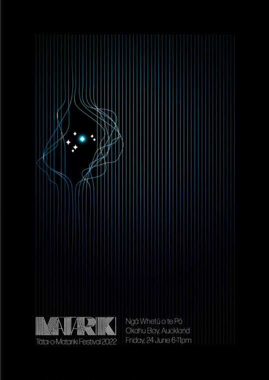
Final Poster

I have kept text to a minimum on the poster as I wanted it to be a visual. Most people are familiar with the word Matariki as it has been in the limelight over the past few years. So much so that it will be marked as a public holiday from next year. I have recorded that it is a Matariki festival as well as the date and location.
This reinforced by the Matariki star cluster against the black background is all that is required to advertise the event. Those viewing the poster may wonder what the lines are about but by the time they have attended the event, this symbolism of reconnecting will be more apparent.
0 notes
Text

Development of my Website. I wanted my logo as a feature as well as the star cluster. I purposely have kept this very plain but effective, as it needs to capture the reader and make them want to know more. Too much information at this point would be overwhelming. I also wanted the home page to be somewhat of a journey and the story of Matariki begins with the stars. As the reader journey’s down the homepage, they will find more of the story.
Here I introduce the notion that this is a journey for each person that learns about Matariki. Each person will take away something different, but the main aim is to bring them back to their roots, their iwi/ hapu and that leads us to the below images.
As the reader navigates their way down the home page, they will get the idea that this is a journey that they will need to follow to find out where it is going to lead them.

The introduction of the blue lights of the line work will reinforce that this is a Matariki light festival. The reader will perhaps wonder what the waka’s are about and want to learn more about it so stay on the website.
0 notes
Text
Website Development

When planning my website, I knew I wanted to keep it simple, but also for it to be like a journey from the top of the page to the bottom. The less details I have on the site the better as I do not want it cluttered and I did not want the viewer to be bombarded with information.
Traditionally Maori learnt about their ancestors from stories told and passed down from one generation to another. They also told their stories of their ancestors through artwork such as carvings so I did not want to go against this quality. I knew I needed to keep my text information to a minimum and use visual images instead.
I decided to do some research at this point around the layouts of websites to see if I was on the right track and how I could rech out to my target market. I found a website that explained the Top Web designs for current times.
The first element was to engage with dark mode which contrasts light coloured text on a darkened background. As my festival was about Matariki, I knew that having a black background was essential for my site as the stars are visible against the black background. It was good to hear that this was one of the top trends.

It then discussed the need to keep the site as minimalistic as possible which was already my aim. It next discussed the colour palette and that black and white was in tune with the minimalistic feel. I agreed with this so decided that I would keep my blue to a bare minimuma nd to just strengthen the sky quality and nautical theme.
It was when they discussed luminous colour schemes that I knew I was on the right track as it did report that there was a growing trend to use luminous colours and in particular blue, purple and pinks which make it more modern.

It explained the importance of a human element so suggested hand drawn elements which I would agree with in many situations and did consider this throughout my process but in the end, I wanted my imagery to be about the stars which shine bright so did not want to include any other images (besides the images of the events of the night).
The next element was to use bold type which I intended to but I also wanted my logo to feature the line work in it as I wanted to incororate the reconnection quality.

There were other trends noted but felt they were not relevant to what I wanted and I knew from these first five, that I was definately on the right track and my website would ultimately appeal to many including in particular young urban Maori as the above trends would appeal to them.
PopArt Studio. “Top 11 web design trends to rule in 2020”. Medium. Retrieved from https://medium.com/nyc-design/top-11-web-design-trends-to-rule-in-2020-912e0a5bac8e
0 notes
Video
Further GIF development. I have clipped it so the flashing in of the logo can be seen which is right at the end of the GIF. I made it appear as though waves where emitted from the text which is in line with the nautical theme and the fact that waka rides out on the water were the main feature of the festival.
0 notes
Text
Signage Development

I had previously thought I did not need a title to explain each of the areas at the festival as they are self explanatory but felt I was missing an teaching opportunity here so decided I would add a word in Maori that explained the area. This way, the public would learn the Maori name for each area as they already knew what the area was by the image. I decided however, that this would need to be done in a simpler font.

Tring to tie my images into the signage, but again felt the line work in my image of a marae was too much and did not make it stand out.

How my signage would work and an example of how the image that festival goers would recognise, can now be associated with the Maori word which in this case, Harere means travel.
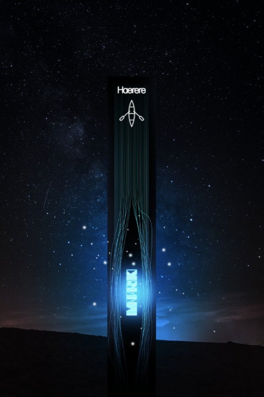
The above is the wayfinder signage of how festival goers would find the point where the waka rides would leave from. These will be highly visible in the night sky.
0 notes
Text
Websites
When looking at what makes a good website, I found that there are 5 main elements;
Content – Needs to be the best content possible and include videos, relevant news and imagery
Usability – The user should easily be able to tell where they are on the website at all times and the site should anticipate what and where the user wants to go
Aesthetics – Brand image – Must reflect the business or event and be able to visually connect with the user
Visibility – Through digital marketing, decide what platforms to target to reach the correct audience
Interaction – The user must be engaged and the site should be able to hold their attention.
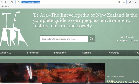
I found the below explanation of Matariki on the Te Ara government site which offers translations for any txt in Maori. This was under the Te Reo section which I thought was a great feature. I think it’s important to have the Home page in English however as if someone was not fluent in Maori, having a home page in Te Reo could be intimidating and offputting. As my main target is Urban Maori, the chances are they are not fluent in Te Reo so I would need to keep to English.

I found a Matariki Festival website that was a good source of material to educate people about Matariki and seemed to follow the 5 main elements of a good website. The Home page was eye-catching and the site was easy to navigate. It was uncomplicated and the colour contrast was very effective with blue in the night sky which gives the nautical element of how Māori voyaged using the stars to navigate and the orange on the home page. The image of the Marae under the night sky also tells a lot about Matariki itself.

Matariki Festival. “Matariki Festival 2021”. Retrieved from https://www.matarikifestival.org.nz/
Resource Techniques. “5 Basic Elements of Web Design”. Retrieved from https://www.resourcetechniques.co.uk/news/web-design/5-basic-elements-of-web-design-100152
Te Ara. “Kōrero: Matariki – Te Tau Hou Māori”. Retrieved from https://teara.govt.nz/mi/matariki
0 notes
Text

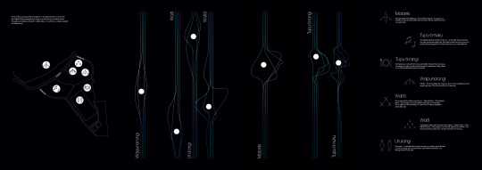
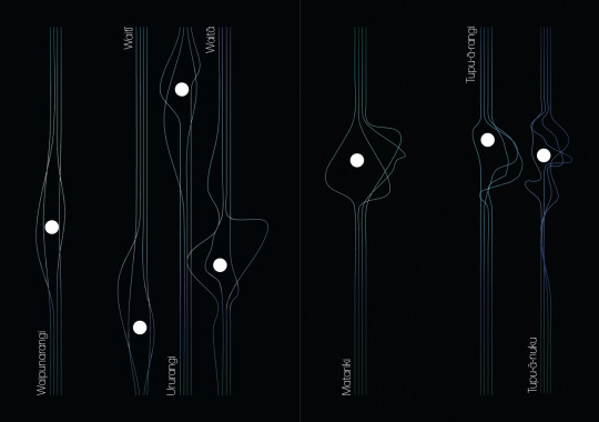
I had previously had the notion that I wanted each of the areas at the festival associated by one of the seven stars so wanted signage to reflect this. This is how I developed the idea to have wayfinder panels as per the above sketches that would be at different heights and the height would match the height of each star in the sky (as per their position in the cluster). Each panel would have the image of that particular area (whether it be the rest room area or workshop areas).
People would be familiar with the different areas from reading my brochure so just using the star names and the above images on the wayfinders would be all that festival goers would need.
Again I wanted to include the line work that was common throughout my entire design system on this signage. It would also light up so could be easily seen.

The idea of the gaps in the lines was so the star names could be featured at each wayfinder,
I thought possibly I could introduce some other imagery as earlier thought but decided it was too much and would detract from my overall theme.

I wanted to carry forward the style of my logo font of Matariki to each star name to again reinforce my entire design system
I had an idea to use the line work to show the images lit up on the signage but felt it was overcomplicated and not readable. I felt it would be too much with the lines up and down the signage panel and the font of the star names as well. It needed to be simple to stand out more.
0 notes
Video
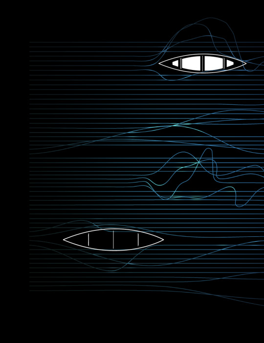
My development of my GIF. Previous research had shown me how line work was associated with reconnecting so I knew straight away that I needed to highlight this in my GIF. It was such an integral part of my design system at this point so having it around my festival site would tie this whole reconnection theme together. My biggest challenge however was getting the correct speed.
I also considered at this point incorporating my logo into my GIF but was not sure at this point how I would do this and whether it needed to be there throughout the entire GIF.
0 notes
Text
Brochure
The placement of the holes to show the placement of the stars which can be seen when holding it up to the night sky. I felt this was a good way to reinforce where each of the stars are in the cluster and again because of the lines, reinforces the value of reconnection.
On the flip side of the brochure. I realised I did not want the holes to be in the waka’s so placed them in strategic breaks in the line work. Placing the images small images of the waka’s symbolises not only the journey the festival audience would go on physically, but what they may go on psychologically as they are empowered by the knowledge they will learn.

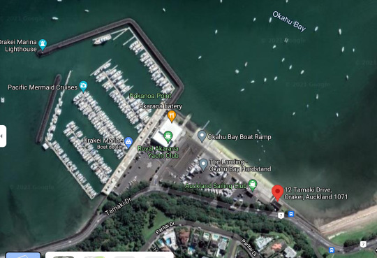
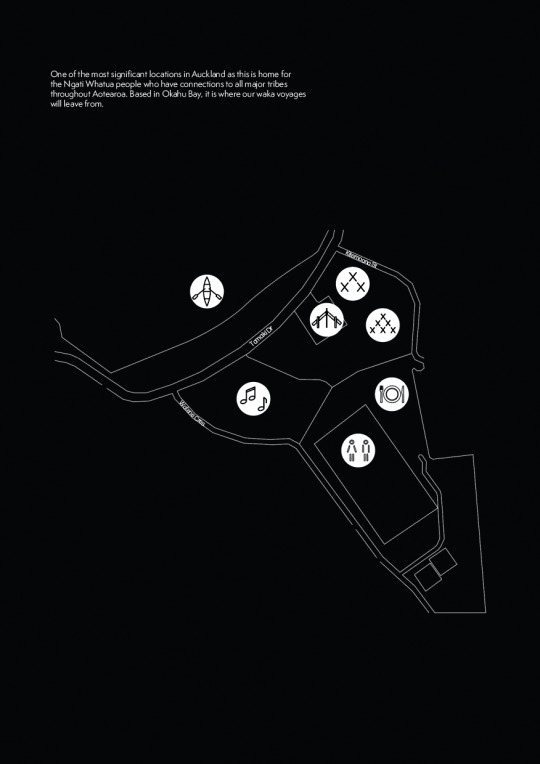
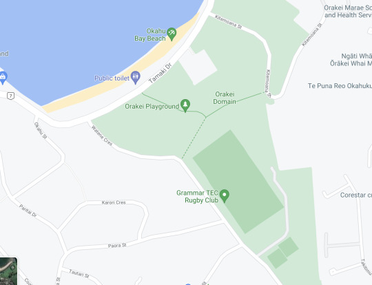
When first looking at the Okahu Bay area on google maps, the above looked an ideal site for my festival as it was right next to boat ramps (for the waka rides), but when I looked at the aerial shot, I realised that this was not possible as there was no land available that I could have the festival on. This is why I had to change the site locaion slightly to the Orakei Domain as there was a lot more open space, but it was in close proximity to the site that the waka’s would leave from.
The other highlight of having the festival in the domain was the fact that it was right next to the Marae (which I wanted involved in my event).

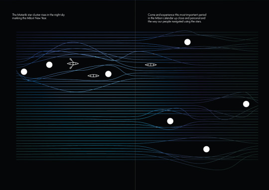
What will appear on the brochure and a simple way using my images to highlight where each area is. I felt no words were necessary in this image as they speak for themselves.

Test Printing my brochure half scaled (A5).I wanted to see what it would look like printed out. I soon realised that I would need to print it on A4 as the text on A5 was too small. I also realised it printed out quite dull s had to go through adobe again and adjust the brightness.

Experimenting with my design system. Obviously I needed to insert the proper explanations at this point, but also wanted to tie each of these stars into an area at my festival such as where to find food or where the toilets were. I felt the above too plain and there needs to be the inclusion of images to make it more visually appealing and easily recognised.

Brief description of each star and what the values are for each of them. I also included details of what was at each area. It is my intention to have the associated star for each area as signage lit up so people can easily find it. I like the above but realise it is too wordy and people would not necessarily read it all. I decided to condense it further. I am also not happy with the layout of the above information as the audience would tend to just take in the images and maybe the star name due the visual hierarchy of the type, but not be interested in the text.

The above which will appear in the brochure is a lot more visually appealing and conjusive for reading instead of just looking at the images. I reduced the amount of text so the reader won’t be offput and actually read the material. I have varied the placement of the images so the readers eyes are drawn around the page. This way they are more likely to read the material.
What can occur with a zig-zag layout is that the points of the zig-zag provide pause spots to the reader so the brain will absorb more detail (and more likely to read text this way).
Because I have laid it out this way, the images will firmly be implanted in the readers mind so they will easily be able to navigate their way around the event by means of the wayfinder signage.
Namboothiry, A. “Understanding the Split Layout in Web Design”. Webdesign. Retrieved from https://webdesign.tutsplus.com/articles/understanding-the-split-layout-in-web-design--webdesign-9551
0 notes
Text
TOP 10 WAYFINDING SOLUTIONS
What is apparent looking at this website is that a wayfinder does not always have to be a map showing people where to go. This site shows multiple ways to lead people where they need to go. The idea is sometimes think outside the box away from simple maps or arrows.
I particularly like the way different coloured lines on the floor will lead people where they need to go. I also admire the signage of TNT where is matches the architecture of the building and in this case the stairs. The hospital on this site had a unique way of associating different floors not only with different colour but with different themes such as River and Ocean.
What is evident from the examples given is that you have to take the environment into consideration when designing your wayfinder. In my case, my venue will an outdoor venue so it will be easier to see most areas so my wayfinder can afford to be more artistic so I will look for a way to incorporate the theme of Matariki into it.
Fuzeinteriors. “TOP 10 WAYFINDING SOLUTIONS”. Retrieved from https://fuzeinteriors.co.nz/10-best-wayfinding-systems/
0 notes
Text
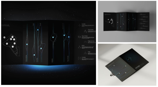
Brochure Development

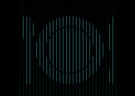
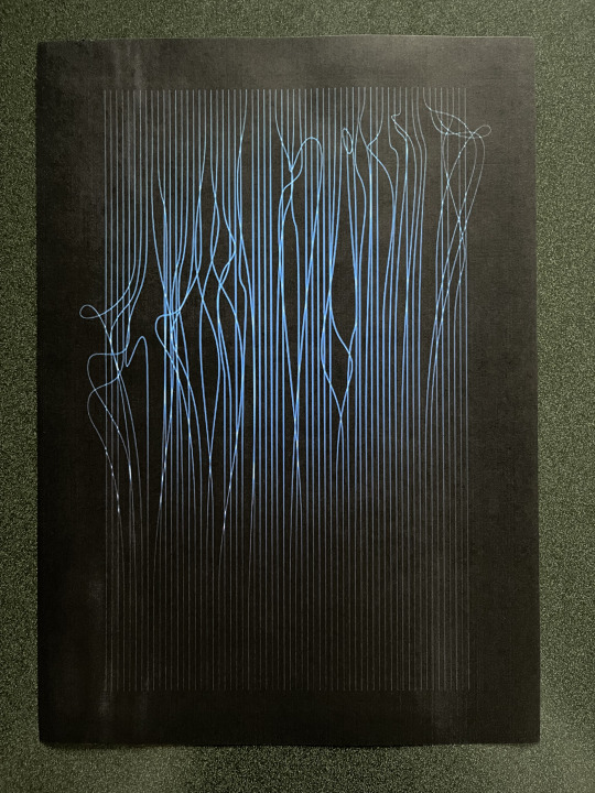
Exploring ideas of different folds that I could have for my brochure. In the end however, I decided to go with a zine fold out as I decided I wanted to have holes in the brochure that matched the formation of the star cluster and that way, when people were out on the waka’s looking at the star’s, they could hold the brochure up to the sky and see the star cluster through the holes.

The above is part of the brochure showing the 7 stars in the cluster and where there are breaks in each set of lines would be where the holes would be in the brochure.
The other side of the brochure showing the waka’s. I would need to match these waka’s positions so the holes would match up with them. I need to ensure the holes would appear in the middle of the waka’s so placement of them is crucial to the final effect.

Each of my areas at the festival is linked to one of the seven stars so I wanted an image that could be identifiable.
Matariki Boat voyage
Tupu-a-nuku Entertainment
Tupu-a-rangi Kai
Waipunarangi Hub
Ururangi Wind down area/ Rest area
Waita Workshop 1
Waiti Workshop 2
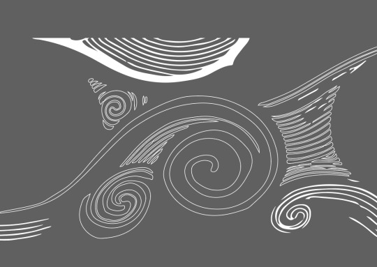
I also decided on using line work rather than block images as this was a part of my deisgn system.
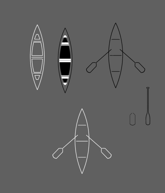
Exploring different options for the image of the waka. I felt the bottom version was more readible as the others were a bit too complicated. I wanted to keep these images simple.
0 notes
Text
Poster Development

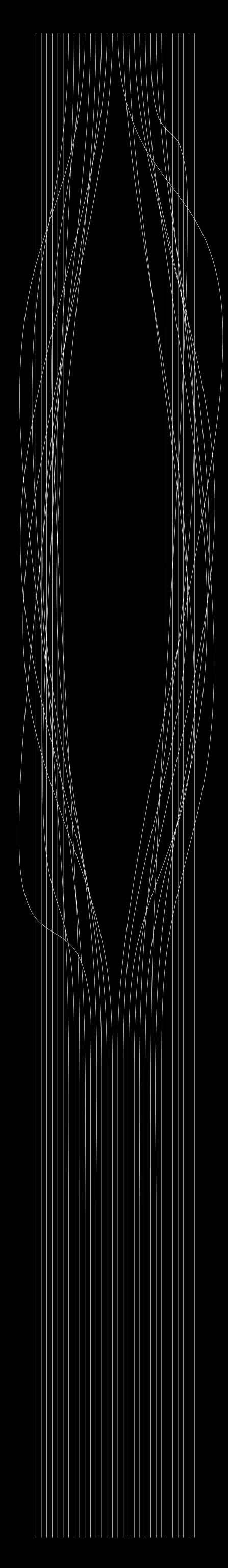
My first develoment for my poster. I have included the colour palette and shows the intent of reconnection. As previously stated, blue gives the nautical theme but is also calming. The fluorescent quality matches the festival which is a light festival (as bright as the stars). I realised I needed to incorporate the Matariki star cluster as this is a vital element of the festival.

The introduction of the Matariki star cluster and to highlight the year of my festival. I felt my line work was too random however. I have introduced the term Ngā Whetū o te Pō as this translates in this sense to ‘historical connection of stars in the night’. I felt this gave a deeper meaning to Matariki.

Putting the Matariki star cluster behind a break in the lines was visually a lot more appealing and symbolises the opportunity to peak through and learn about Matariki and become more connected through the newly acquired knowledge of Matariki that will happen after the festival. It is an opportunity for people.

Test Printing my poster during class only to discover that the colours were off and the ‘highlights’ within the line movement were just pure white and not what I was aspiring for. Also got feedback on my actual logo with the ‘K’ specifically (Getting rid of the dot in the middle of the K).
I felt having the year 22 highlighted to the right of my image put too much emphasis on the year it was happening instead of Matariki itself so took it out. Through rule of thirds, the viewer is drawn to the star cluster first and then around the page. Hierarchy also draws the eyes after the star cluster to the word Maitariki and then to read the details of the festival.
0 notes
Text
Poster Development and Design System


I did a lot of experimentation for my design system. I kniw I wanted to feature the line work but was trying to introduce more imagery into the design. I felt it was too much and detracted from the message that people need to reconnect with their people more.
0 notes