
joannetriesdatavis
joanne amarisa
grap2199 - communication design - rmit university
76 posts
Don't wanna be here? Send us removal request.
Last Seen Blogs

lazystatesmanfireghost-blog
Girls_FH

awungsteaksauce
Steak and Root Beer

aliena587
Alcmene

simplesynopsis-blog
Simple Synopsis

sexy1173
Exceptional angels
Link
Week 14 | Through Blood, Sweat, and Tears
Setting this up onto GitHub was so challenging and confusing, but here we are!
Question I’m throwing out there: Does anyone know how to connect a Github Page into a custom domain that I already own?
I nearly successfully did it this morning but with all the DNS reconfigurations and CNAME additions it still didn’t work out - I eventually spent hours but to no avail.
Another bug that I’m facing (and a mighty annoying one) is that my song doesn’t always play. I seem to have to rely on page refreshes (but for an audience, this wouldn’t be ideal.) I’m also still working around how I can make this window-resizable so as not to make the sketch too large on some laptop displays.
So all in all, it’s nothing perfect but it’s done and it feels like that’s a start.
1 note
·
View note
Link
Week 14 | Wrapping Things Up
Finally finishing up with the elements of my virtual garden!
Now I can focus on the presentation - which will be a long and nerve-wracking process in and of itself, but here’s to hoping I make it out intact.
On my to-do list: My Artist’s Statement, and figuring out how GitHub actually works in order for me to present my work.
0 notes
Text
This is really impressive!! I love the look of those colour blocks, like the computer just distilled your images on their own! Stef after this project is over (and I know we’ve discussed this previously, but) we GOTTA find a way to swap our knowledge and learn from each other’s work. I would love to implement this method into something - how cool is it that computers can do that!
Process development #6: Scanning my images to an algorithm.

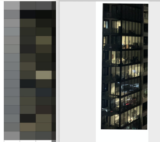
With the help of Karen I was able to get her algorithm to read my photos to see if it can automatically tell me when the lights are on and off. The output gave me colours where the ‘lighter’ colours would determine the light is on, and ‘darker’ colours would be off. This was a really cool experiment to see if scanning images to see where light is was possible - and it is! Not sure if i’ll go down this route, but i’ll see!
2 notes
·
View notes
Photo
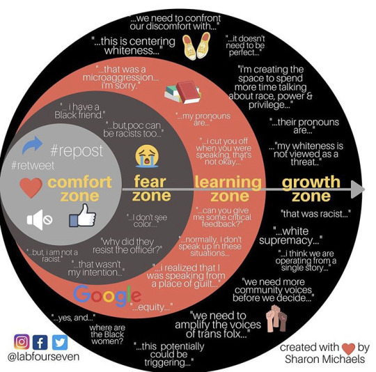
This is Data Vis Too: Black Lives Matter
Addressing racism and prejudice within us is often more unsettling and difficult compared to addressing it in the world out there. But I feel that this is an excellent way to measure the levels (or “zones”) we step into, in this pivotal moment of history where we learn, and, dare I say it, change.
1 note
·
View note
Link
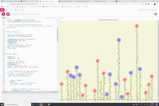
I nearly wrote this as A Mother of my Garden’s Concerns, so I think that encapsulates my dwindling level of sanity at this stage of the project.
I’m very pleased with how everything is coming together (and so grateful for all of the guidance Karen has given. I’m pretty sure I’ve well surpassed the 100 Questions to Karen mark, if there was one.)
All that’s left to do for me now is figuring out my hover functions (which is strangely isn’t working, but I have the whole day tomorrow to figure it out) and to transfer it to a GitHub page if I can!
0 notes
Photo
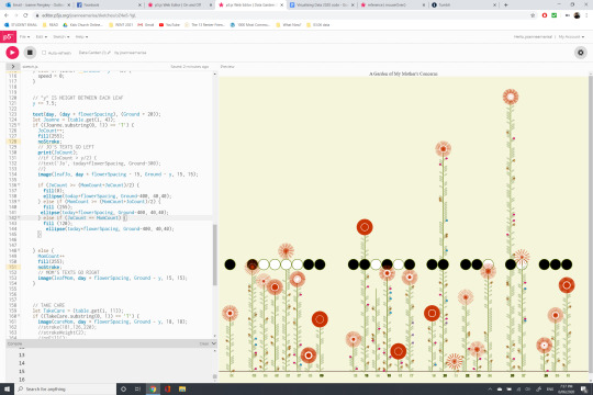
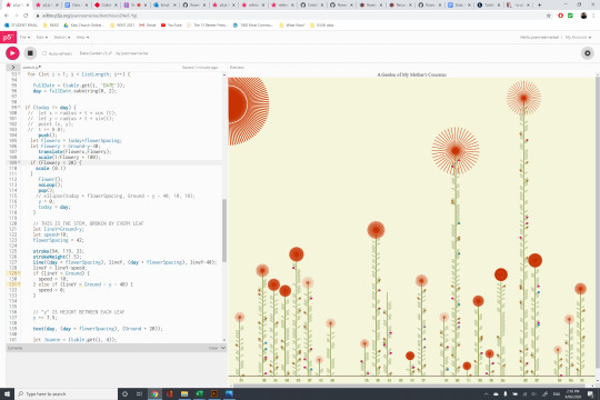
Week 13 | Guess it’s A Garden of..... My Concerns?
My attempts of calculating counts of my mother and I’s texts, with mathematical function. (Aaaaannndd it turns out I talk more than she does, I guess???)
0 notes
Photo
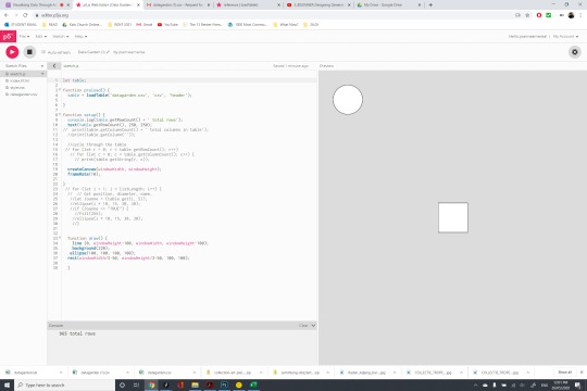
Week 13 | Where We Are Now
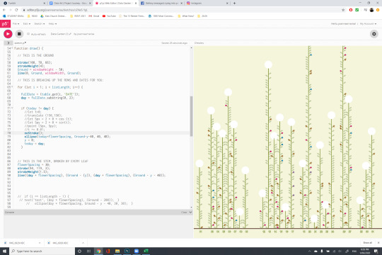
There was unbridled joy when I figured out a strip of code that could generate random flowers for me. However, again, followed by disappointment knowing it wouldn’t run on my actual garden sketch.
Right now, I’m just working on troubleshooting my code (as in the giant flower acting as the sun + the missing flower on Day 14), which becomes clear when I tell the console to print the variables I’m giving it. Also, I’m hoping that as I wrap up this week for presentation, that I can also add on the finishing touches such as hover functions etc that I would need in order for my garden data to fully communicate.
This is far from what I imagined at the beginning, but then again maybe with the given time and circumstances, this will have to suffice. Here’s to hoping it’s good enough for presentation by Monday!
3 notes
·
View notes
Video
youtube
youtube
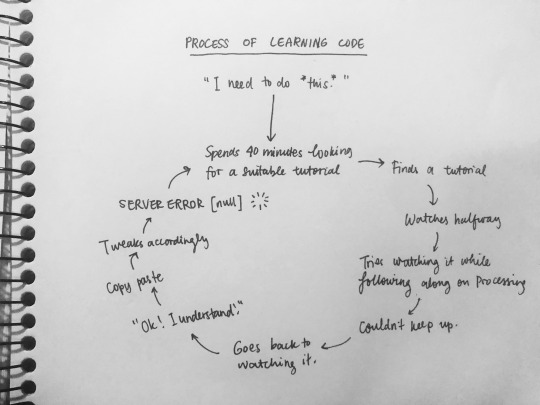
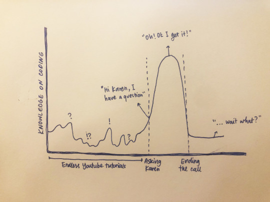
Week 11-12 | My Love-Hate Relationship with Online Coding Tutorials.
I have a love-hate relationship with coding tutorials (on YouTube, Vimeo, and endless other 2013 forum threads...)
I spend hours on them. Sometimes (most times) bearing no fruit after the long, arduous minutes of trying to figure out what they’re saying.
They are undoubtedly helpful, of course. God bless these two guys for singlehandedly tethering my coding brain gears. My two online coding teachers are Daniel Shiffman, who runs a channel called The Coding Train. I’ve named him the Excited Coding Guy, because he’s very passionate and enthusiastic about teaching code. The other guy is named Matthew Epler, who also comes with his own sense of humour - although, unlike Daniel, he’s quite more sarcastic with a more “whatever” approach. I guess you can say Daniel is a dog person and Matthew is a cat person....
Where was I going with this?
So. In these tutorials, I learn things such as:
- How to create objects
- What arrays are
- How to incite random functions
- How to write your own functions
- Etc etc etc...
The guys both have made Processing and p5.js tutorials, all of which are divided into very clear, categorised videos with levels, which make them easier to understand and follow through. Their teaching is also great - I have to say they are the only tutorial providers I’ve come across, but for good reason. They deliver these materials very well.
I have to say, though, that as amusing and life-saving these tutorials are, they, of course, wouldn’t always be able to help me troubleshoot my own code. Sometimes sitting through four different 18-minute tutorial videos still couldn’t answer my one simple question that still lingers at the end of everything.
Bottom line? I was never a fan of online learning, but online learning while trying to adopt a new skill and that skill being programming or creative coding, takes a significant toll...

It is impossible for me to scavenge the Internet for tutorials on “I want flowers to grow in a garden and I want the flowers to be specific colours oh also it’s all based on a Table and I want the flowers to sway in the wind and to be clickable.... while a song is playing.” Right?
So often, I find myself going around in circles, with 10 tabs open, my brain fried, attempting to understand & learn what they’re teaching, but also to not take everything as copy-pasted knowledge. The most critical skill to apply here is to analyse their code, and incorporate it in our own project.
At least, ideally that’s how it would go...
But at the crux of Week 12, I found myself going in circles trying to get some answers from these tutorials and make my way through this project on my own. Sadly, most attempts have been to no avail, and this drove a wedge in the flow of my progress.
I’m not blaming Daniel nor Matthew though (who knows where I’d be without them), but I think it’s important to acknowledge that these are very unorthodox design challenges we’re facing: The challenge of looking past ourselves and sitting with the less-ambitious, more realistic goals of our project, and then the challenge of gauging whether or not relying on online resources is the way to go.
At this point, though, whatever comes of my project - whatever those flowers turn out to look or “grow” like, and whatever makes it to the final submission in the end - I still see myself visiting these two coding gurus even after this course is over. This isn’t an easy subject to tackle (and that I’ve made clear), but I want to learn more of it. I think four weeks (minus the two weeks of total tutorial-watching time, to be honest), is, as any creative project, not a mighty long time. But after this semester, with the extended timeframe, I want to actually watch those tutorials, this time not to gain something for my garden, but to follow in their footsteps attentively to create new, different messes on my own.
We’ve made it so far in this class, and I don’t think I want to stop learning just yet.
2 notes
·
View notes
Photo
Week 11 | The Big Leap
Thanks to Karen’s input and guidance on our first p5.js workshop, I was finally able to apply the system she taught me about into my other categories (as opposed to just the leaves.)
After I applied them, I substituted the simple shapes I had in place of these into custom SVGs that I had made in Illustrator (because, you know~ aeSthEtics.) Once that was put in place, I was astonished by the result. It was finally coming together! There is still a lot of ground to cover from here, no doubt (not to mention the many dead ends I keep finding, regardless of what I’m trying to achieve), but this gives me hope that the project might finally be coming to life.
0 notes
Photo
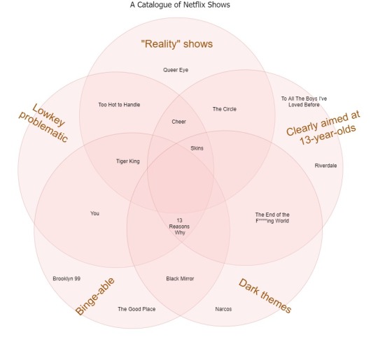
Week 10 | A Catalogue of Netflix Shows: Pop Culture Data Vis
Just before commencing the earlier stages of our project we were broken into groups and were told to make a data visualisation (so a chart, infographic, diagram, graph, etc) of a pop culture reference. It can be song lyrics, films, shows, etc...
My team went with Netflix shows! I love class exercises in this class and I especially love that we still got to have one even while online learning. In this activity, my two peers and I constructed a five-circle Venn diagram (which, by the way, was harder to make than I thought!) where we found common threads between the myriad of TV shows that Netflix offers to us, and then found which shows fell into these specific categories.
The challenge was definitely finding which shows were, say, reality but dark, or dark but clearly aimed at 13-year-olds. So the most important takeaway I got from this activity is that diagrams are really not as simple as it looks. At face value I just figured if we had common themes that ran along many shows and fitted those shows into the in-betweens, we’d be good, but many factors matter! i.e.... Replacing the position of the Problematic category with Binge-able would present a different challenge. Same goes with choosing what categories to include, actually (we didn’t end up thinking of any show that was all five). And there are a whole other ways a diagram can go wrong. So data vis really should not be taken with shortcuts. I feel like in any way or form, its approach has to be strategic, or at least approached with a good enough understanding of the subject matter.
0 notes
Photo

Week 11 | Diving into Code: I Only Know What I’m Doing About Half the Time
Prior to Week 11 I’d been following endless Processing tutorials, trying to see how I can set up my “system”. At this stage I am prioritising setting the counting and the variables and loops in place. (Now I’m just spewing out coding jargon...)
And there I thought, “Oh the drawing’s just the easy part! I’ll get to that later...”
On May 26th, I leaped at the chance to join in Karen’s p5.js workshop, because now that I think about it it would be much more useful, as my data drawing plans to be a website, public-facing interface - so I perhaps should’ve jumped into p5.js sooner. Getting my hands dirty with Processing was good enough to get me started though.
I was really grateful for that initial p5.js workshop, as that essentially became my springboard to get my coding started. Although at first I made silly mistakes such as misplacing lines of code and only knowing how to make a square and an ellipse, in this process, it’s so important to be persistent and manically optimistic.
0 notes
Photo
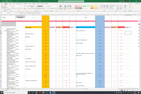
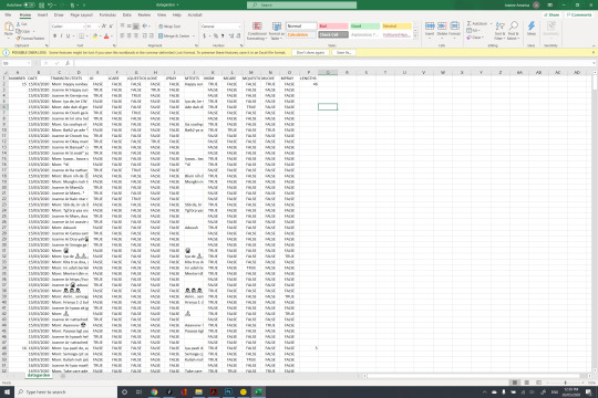
Week 10: Learning Excel. Should I Be This Bad at Microsoft Office?
Here we are, fancy schmancy designers who can do backflips on Adobe Suite, but the minute we step into Microsoft Office we forget how buttons work.
This week's progress was fun and satisfying. I scavenged the web for Excel functions that will help me build my data and help it make sense, transforming it from a cluttered chat text file into a spreadsheet! Woohoo technology!!
In this spreadsheet, I parsed my data into...
- Identifying which chat inputs were mine, and which were my mother’s.
- Using “classified text” functions to flag where in these long conversations can I find, say, heart emojis or question marks.
- Separating the transcript from the timestamps.
- And counting the lengths of each date!
I have to say at many points I was blown away - mind you, I’m very new to all of this, but also I had no idea of just how much Excel was capable of. I’ve only scraped the surface here, but I’ve always, always wanted to know how to work around spreadsheets and really "boring” things that I wouldn’t have otherwise learned as just a creative practitioner or artist.
Right now it’s just an ugly amalgamation of Trues and Falses, but I’m very pleased with how much it has helped set my project on track.
I would like to thank that one tech-savvy businessman who took the time out of their day back in 2017 to leave that one comment in that one chat forum to help them do that one specific thing on Excel. All hail community forums.
0 notes
Photo
Week 13 Musings
(Is it just me?)
2 notes
·
View notes
Link
Oh boy, I forgot to keep this Tumblr updated! Alright, here’s where we’re at..
BACK IN WEEK 9, we started off this project with a Milestone Review, to present the concepts of our projects in order to explain to Karen, the class, (and honestly, OURSELVES) of what our project was going to be about.
I had doubts about undertaking a topic that was personal, and seemingly more sentimental than others’, but as an artist I have come to realise that this is my strong suit. I thrive when being asked to lift stories of human-ness, relationships, connections, and emotions. This solidified my goals and so, I finally decided upon my data narrative.
0 notes
Video
youtube
How coronavirus charts can mislead us | Vox
A detailed analysis of how the popular case count chart can visually mislead us, if we don’t assess how data bias may have significantly played a part in its formation.
Vox does it again. An amazing explanation of the importance of clarity and proper contextualisation in data visualisation, but also done with an unrivaled quality of work.
0 notes
Photo

Week 6 | The Final Piece
We have finally reached it!
Using materials and fabrics we were able to gather from our own homes – using our linens, sweaters, shirts – we constructed a digital quilt that was meant to represent the emotional cycles of the worldwide audience in response to this pandemic.
RATIONALE: We chose this topic to analyse and interpret society's attitude and behaviour in the wake of a global pandemic, to see how we as individuals subsist with untouched territory via social media. When an unknown, rampant abnormality arises… how do we walk this new world?
The current generation has access to spreading awareness through the wires of social media; whether it’s via information/resources, being an emotional outlet, or attempting to follow a ‘trend’. It allows us as individuals to feel an amplification of interconnectedness, and to be in tune with the world/one another (in this case where choices for connection are limited). Being reassured via an emotional connection – where there is a common ground between fear, desolation and anxiety arising, helps us to not feel so isolated anymore, in a (currently) isolated world.We recorded individuals’ emotions during different times throughout the day to monitor multiple parts of the world – taking into consideration the idea of a ‘global’ pandemic. This was also done to observe how distinction between times of day affected what was posted – as day by day situations shifted.
The so called ‘blanket’ we have created is an impactful visual metaphor for 'emotionally blanketing' ourselves via social media. Taking images of fabric swatches; we used physical materials digitally as a representation of how we physically feel on a digital platform. Weaving individuals’ feelings side by side revealed juxtaposition and parallels. These were integrated together, so when you view the artwork as a whole – it’s as if you can almost hear/see people talking over one another, as an inordinate number of emotions intertwine. By there being no space between each fabric square, it produces a claustrophobic, overwhelming sense of having no room to breathe. This both outlines the overlapping of feelings and voices; but also creates a paradox for how this ‘emotional blanket’ is used as a tool for comfort, and in contrast, being somewhat ‘smothering’.The different textures of fabrics represent the minute nuances of each of our experiences, individuality and emotions. The wrinkles and crumples add to this effect; adding a sort of ‘reality’ to the situation that has been displayed on a flat screen. Generating different intensities for each colour measured how arduous each post was, again to monitor the nuances of our emotions and the sensitivity towards this topic.


Afterthoughts...
Group projects are challenging. Especially in creative projects where all members are assigned to be the “head” of the process, and there is no hierarchy or gap between who “only” does this and who “only” does that. It might’ve been the way we framed it in the beginning – I must admit another group handled it better, the way they worked on the same dataset, but explored different locations and interpreted it in each their own different ways – or it might also be, of course, the impossible circumstance that fell upon us in the weeks this project unfolded.
In all honesty there are still a lot I would’ve approached differently. Nevertheless, I am still proud of what we accomplished, and how our WIIP turned out. I think this little group assignment has provided a valuable lesson in how to better delegate and organise group projects, as well as the importance of having a good framework that I can *believe in* before moving forward any further. Data needs direction!
And aside from all that, I am so keen to just start learning things! I’ve devoured a few readings out of Karen’s list, but I’m still clueless on where to even begin, handling all this data stuff. Would love to learn some generative tools that can help me communicate even more datasets in a much more concise, polished fashion.
Ah, so much to learn!
Weirdly enough I still have so much heart for this subject.
0 notes
Photo

Week 5 | Assembling Pieces
For our Group Assignment, my team and I decided to do a synthesis art (of a digital quilt) made up of the emotional responses of people all around the world in the topic of #coronavirus.
God, I hate saying that word.
Anyway – each of us were assigned a time of day where we would check into the hashtag, then collect data based on what sort of discussions and posts were being shared on Instagram. We analysed the context in which these were uploaded, along with the emotional response attached to it.
After collating this, we noticed patterns of how people’s emotions regarding this pandemic and global situation really fluctuates between immense happiness and sadness, with dots of confusion, anger, and a healthy dash of comedy.
We spent the week after this data collecting stage figuring out how to best assemble the pieces together, making decisions as to which parts of the data set were more important to present than others. Everything onwards was our progress of completing the data and crafting the quilt together.
And look at all this clutter!
Reflection: It is challenging, of course, to gather this sort of data without the help of generative tools that can help us scrap the Internet or chosen platform according to what we needed. Alas, this was done manually with the help of collective effort and a handy spreadsheet. So important to notice here that larger-scale, effective data can only be extracted with the proper tools, and with a solid framework in place.
I must admit this stage left me feeling a little lost as to what it was we were actually looking for. But of course, we’ve already delved into it and so - marching onwards it is!
0 notes