
jennheerkens1-blog
"Art speaks where words are unable to explain"
This is art work done throughout my years at visual communications program at Medicine Hat College
20 posts
Don't wanna be here? Send us removal request.
Last Seen Blogs
sfelicitysmoak
you’ll never find another like me

exigencelost
Let Every Person Out Of Prison Right Now

zarnazarna
Untitled
todoenadiccionesysaludmental-ac
Todo En Adicciones Y Salud Mental A.C.
streetkittyclaws
*~street kitty~*
Text
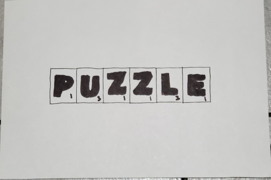
Reflection on puzzle
When asked to pick a word to create something fun, I picked the word puzzle I thought I could come up with different things and be creative with my ideas. If I had to pick something I would choose to do differently it would be to choose a different medium, paint would have been fun and brighter to use. I did love the word I choose but I would have loved to have tried different words and come up with more creative ideas. I typeface that I used for all the letters was Franklin gothic by designer Morris Benton. This assignment was definitely fun and I really feel I should challenge myself more especially when trying to draw letters. I was feeling defeated during this process as I'm not a good drawer and didn't want my assignment to look bad.
0 notes
Text
Here is my puzzle scrabble piece. I was going to colour it but decided not to. It was fun to create.
0 notes
Text
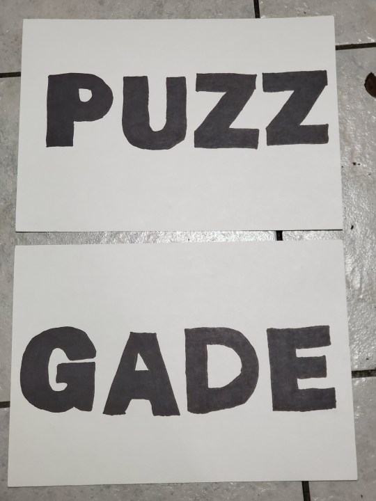
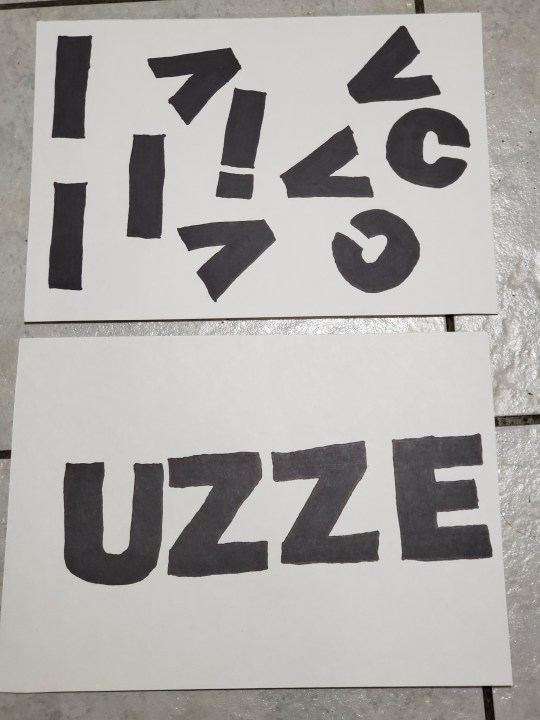
Some of my ideas and final product.
Puzz was puzzle with the letters LE taken out.
Gabe is also puzzle in French.
Uzze was for wheel of fortune with missing letters
And the other one is actually puzzle taken apart.
0 notes
Text
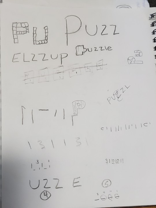

I put some ideas down in my sketchbook and and played around with different ideas. Alot of them were fun but also illustrated which we could only have 1 that could be illustrated so I decided that I really wanted to have the word puzzle in scrabble pieces as my illustrated one. I thought it would be really cool to have that one as I have used scrabble pieces in my every day life as a photographer, using scrabble pieces as props for clients and as well as for my photo shoot before my daughter was born.
0 notes
Text
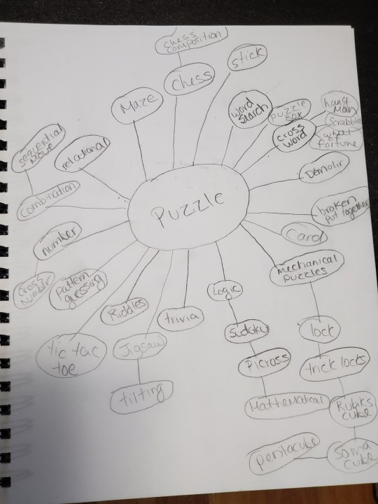
For typography assignment we were asked to pick a word and come up with something fun, something that presented the word in different ways. So I did some brainstorming and this is what came to mind. Alot of process and dedication went into this. I did research on google to find different things that puzzle tied into and the research was endless. It definitely was hard to choose what I wanted to do. But I finally choose the 5 different things I could come up with, with the word puzzle.
0 notes
Text
News Gothic by Morris Benton
Morris Benton was an american typeface designer who headed the design department of the American type founders (ATF), for which he was the chief type designer from 1900 to 1937. Morris was born into the type business because his father, Linn Benton was a type founder and the inventor of the matrix cutting machine which revolutionized printing. Morris’s designs such as his large family of related sans-serif or “Gothic” typefaces, including Alternate Gothic, Franklin Gothic, and News Gothic are still in everyday use. He is also credited as American’s most prolific designer of metal type, having with his team completed 221 typefaces.
http://en.m.wikipedia.org/wiki/morris_fuller_benton
0 notes


Text
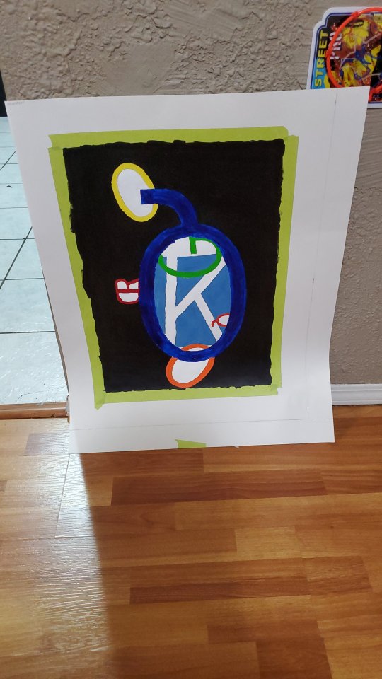
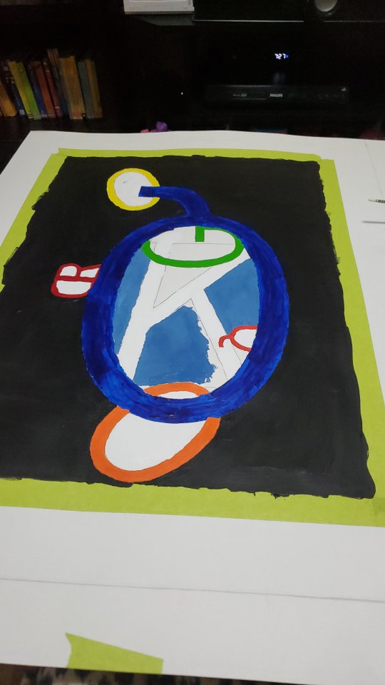
Reflection on counter space letters
Reflection
During the assignment I did research and found news gothic by type designer Morris Benton. I choose the letters with his type design because they I liked how they looked. I choose the typeface because I really like the way it looked. It had a very interesting way of how the letters were, they were bold, and stood out to me. The things that worked well was the way the letters worked together on illustrator, I was able to connect the Q and O together and it just really looked unique. I found that playing with the pen tool was a challenge for me because it was very frustrating, I think I would definitely want more time to play with the pen tool. I really like how illustrator can really help you become creative, and it really help me bring out a bit more of my creative side. I would want to play around with illustrator a bit more, figuring out the tools especially the pen tool to come up with some more creative ideas and play around with the counter space of the letters. I would also love to use the other fonts that my type designer created.
0 notes

Text
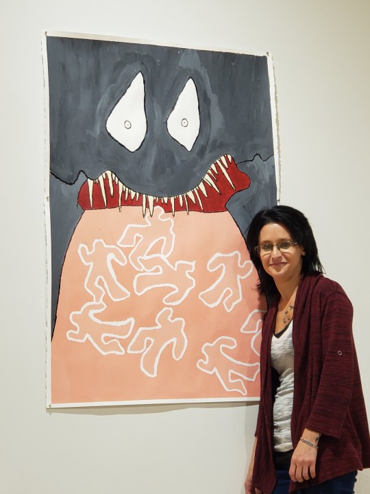
Proud of myself that my painting is displayed in the one on one gallery in Medicine Hat College 😊
0 notes
Text
5 Serif Typefaces
Times Roman
Courier
New Century Schoolbook
Palatino
Caslon
0 notes
Text
5 Sans Serif typefaces
Helvetica
Avant Garde
Arial
Geneva
Futura
0 notes
Text
Serif
Serif is a smaller line attached to an end of a bigger stroke in a letter within a font or a bunch of family fonts.
0 notes
Text
Sans Serif
Sans Serif are used for headings and used on computer screens for displaying of text. These are fonts used in printing.
0 notes
Text
Typography
Is a design to make written language readable and interesting when displayed for everyone to see. Typography is typefaces, point sizes, etc.
0 notes

Text
"Art is something that makes you breathe with a different kind of happiness"
Anni Albers
0 notes