
Last Seen Blogs
ceestudies
걱정하는 거야?
metanonsense
...
shoplbvb-blog
La Bella Vita Boutique
amilee24
Love Is All

ca1000
waddup
Text
Final Evaluation
Jay Gyoury
‘Balance’ - Final Major Project
Candidate Number: 9089538177
The ‘Popaganda’ project brief requires an exploration of the younger demographic and how graphic arts can be used to inspire and motivate happiness amongst this audience. The main aims I drafted upon reading the brief included exploring how media can promote positivity and working within a specialist area of graphic arts to hone in and develop a specific skill set. The themes of happiness and a younger audience were the main two key parts which I extracted from the brief. What I inferred from this was the cultural impact that my outcomes could possibly have on the most impressionable demographic. My idea was initially to create a series of posters which could be easily accessible and showed a positive nature in their message.
Research and Influential Artists
At early stages of the project I briefly looked at some examples of typography and illustrative-based artists which I then collated on a springboard to talk about the future plans of my work. Mapping them out visually notified me on how similar the work I had chosen was. It initially wasn’t a conscious choice to choose work with similar visual language, but this goes to further demonstrate the effect of creating work with a specific style and how that can be received. With the rise of digital media in only recent years, most of the work I have showcased as inspiration has had the very clinical and almost mathematical approach to it which can only be truly achieved digitally. On one hand, this makes it less familiar to a younger audience, but it could also help intrigue them because of this exact unfamiliarity. After exploring the fundamentals of their work and creating my own outcomes based on the stylistic research, I feel like I have been successful in not only reflecting the style I wanted to achieve from the beginning, but also in a way which isn’t a direct copy.
Experimentation and Practical Skills
As my project developed, at a later stage I introduced the idea of combining illustration and typography to create something direct at the same time as being visually exciting. Towards the end and closer to finishing my outcomes, illustration was no longer as much of a plausible idea to work in synergy with typography due to how effective type had proven to be alone in previous workshops and case studies. Due to digital graphics being a personal strong point, I have consistently struggled in the past, previous projects as well as the current, with implementing hand-rendered techniques to my digital work in a way which isn’t destructive. However with lettering, there is an opportunity to use both mediums to my advantage to create something which works seamlessly in a vector graphic setting whilst still maintaining the original hand lettering shape and texture. It is exactly this property of the versatility of type which encompasses what the field can offer. My primary research talk with designer and letterer CJ Rosamond taught me how different processes and materials can effect the style of type that is created. I aimed to showcase a contrast between the rigidity of digital based graphics and the fluidity of hand-rendered graphics, and my outlet for this was the bevelled/cursive style.
Conclusion
At this point, I have researched artists, created mimicry of the work by extracting fundamentals of each artist and finding common ground and overall I am satisfied that my final outcomes represent the work I have put into creating something functional in meeting the brief’s requirements. The series of four posters work in unison but each have their own personality which is fuelled by the unique quote and colour they hold. I believe they successfully meet the main requirement of the brief - to encourage happiness in young people. My planning has assisted me tremendously in achieving a successful outcome. The qualities I said I needed to have were: engaging to a younger audience and including a message that was direct enough to be understood widely. My final posters in my opinion meet both of these criteria well. For instance, the use of the vibrant but restricted colour pallete creates an effect which is easy to digest and this is especially relevant for the younger audience. The typography itself also is engaging as each poster features an exciting hand-written word which helps to grab the short attention span of a younger person. This kinetic look for the cursive text is further contrasted and shown by the unyielding nature of the bevelled text. With this, and my constant reflection and linking to the brief which I may not have done as well at in past projects, I believe the effect has shown through my more reasoned responses to tasks. Despite my numerous successes in my opinion, there is also the other side being what I would want to improve on. My initial proposal included illustration as a prominent specialist, but due to the difficulty I found with implementing it in an effective way, it became less of a part of my project. I do wish, reflecting on my original prospects, that I could’ve used more illustration, even if it was a minimal amount like the Noma Bar inspired posters I made previously.
0 notes
Text
Final Outcome Development
Materials and Tools
Crayola marker
Paper
A4 scanner
Mac
Photoshop
Illustrator
Planning
At this point in my project, I had prepared a range of skills and research which I could apply for a final outcome. For these, I chose to do a series of posters with a matching style but each being it’s own variation showcasing a different colour and quote. Since the start I have wanted to implement:
Typography: Due to it’s direct nature in communicating a message, typography alone can be used in countless ways to to inflict different reactions from people. With the theme of promoting happiness, using type as a way to cause an emotional response from an audience will mean I can portray the message of my project in an easier way.
Illustration: This has long been an answer to transforming a dull subject into something exciting. Engaging an audience with Illustration means they feel more connected to the work.
Process
After my mid-project project review and looking at the potentials of combining both of these together, I knew illustration wasn’t going to be as prominent as I initially anticipated at the start of the project. Due to this and the fact of having no precursory idea of any specific ideas for illustration in my posters, I thought it would be valuable to sketch several ideas roughly first, before sketching less, more finalised designs. This is mainly to plan out how I could use illustration as a tool, rather than just a criteria to meet.
ILLUSTRATION SKETCHES HERE
The typography exploration I did at an earlier stage helped me establish the main styles of type I would use: bevelled text and cursive brush lettering. With this decided, the next step was to choose the quotes to use for each poster. I wanted to have something direct and promoting a change in lifestyle, whilst not being too firm and perhaps being confused as aggressive. The quote’s I chose were:
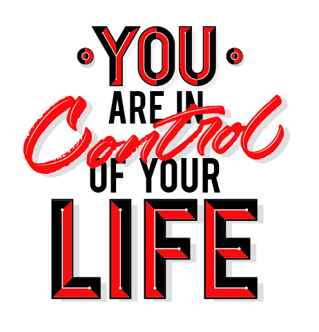
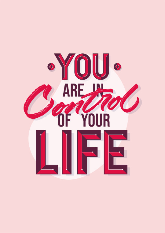
“You are in control of your life”
“It is Ambition that shapes your future”
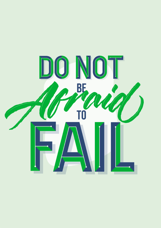
“Do not be afraid to fail”
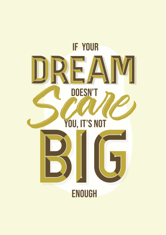
“If your dream doesn’t scare you, it’s not big enough”
Afterwards, I sketched the typography, which I kept as separate sketches from the illustration so I could combine them together in the most effective way.

What was important when sketching out the quotes was how it read. The hierarchy of the type needs to prioritise the most important parts of the quote. Therefore varying the size, colour and style of the type means it won't read as a neutral and perhaps ‘boring’ piece of text.
With my talk with CJ Rosamond, I was given insight into how a specialist works. Reflecting this, I would try to work in a similar way which is why I chose the process I did. Firstly sketching, then creating the lettering, and lastly creating a final composition with colour choice.
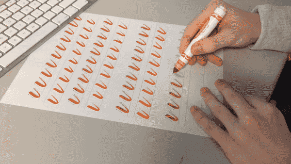
The two tools I practised were the Tombow dual tip brush pen and the crayola broad marker. As well as being mentioned by CJ as a good option, they are two which I have some past experience with using so I would be more comfortable with these.
Tombow Brush Pen

The tip of this pen is thick and soft, allowing for powerful strokes resulting in a bold word being formed. The consequence of this is altering how the word reads, from something elegant to something that holds it’s own power in the way that each line is formed. Although colour will be irrelevant once I vector the lettering, its also important to highlight how bold the colour is, and this ultimately does effect how smooth the lines turn out in illustrator. This is another aspect of how the Tombow brush pen creates something unique, because with something that creates a softer fill, the vector version will have more of a rough quality to it.
Crayola Broad Tip Marker

This in my opinion gave me more control on the letterforms and line weight. The only downside to this it how the marks created aren’t as strong as those created with the tombow, meaning I would have more of a change of struggling to vector the Crayola lettering and coming to something I liked. When using image trace to vector a bitmap image, textures may become over-simplified and the original texture may be distorted or even lost completely, so I had to keep this in mind.
I decided to use the Crayola after experimenting with the versatility of both of the pens. Not only am I more comfortable with this, but I could also use the texture it created to my advantage to add a more hand-rendered quality to the overall poster, creating another level of contrast; this time between the two mediums of digital and analogue graphics.
Final Lettering Development
Now I had everything prepared (sketches, tools and quotes to use) all that was left was to create the final type for each poster. Making sure to keep in mind the hierarchy of the type, I used the typeface “Bebas” for the smaller and less important words with a small point size, so that they could still be read easily but they weren’t the main attraction of the posters. Before focusing on colour at all, I wanted to get the composition of the type to be the main thing making it effective. So choosing a generic colour scheme for all of the posters beforehand meant I could make sure the lettering works in itself.
I used the same process I did in the bevelled text exploration to create the bevelled text in my final outcomes. Firstly creating the base letterforms, then separating these into different smaller sections which imply a bevelled shaped. After this, I used a two colour, colour scheme to draw the colour back as much as possible. The last step which was what separated this text from my previous explorations was the line work I added on top. I did this in order to create a divide between each side of the letter, whilst still keeping it flat colours meaning it didn’t become too complicated as this was a fear I had beforehand.
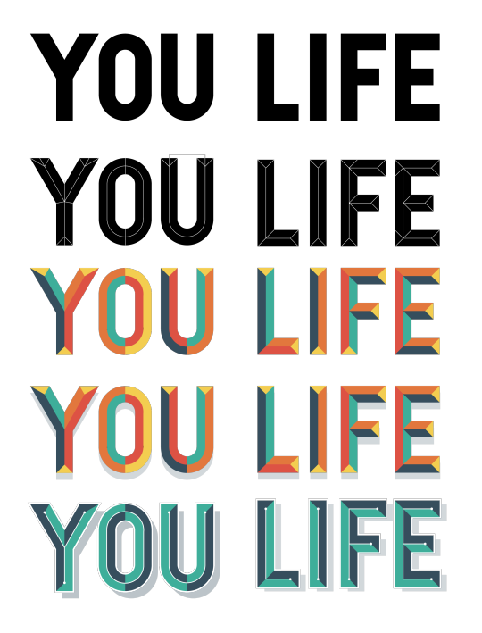
With the bevelled text completed to what looked like a final standard for the current time, I began on the cursive text. After repeating the words until I found something I was happy with, I used the image trace feature in Illustrator which allows for a bitmap image to be converted to vector paths. The ‘silhouette’ option converts the most black parts of the image to a black fill and the white-most parts to a white fill. This is perfect for lettering in a single colour as it acts as a way to segregate the lettering from the background. After image tracing the lettering and fixing up some minor discrepancies, all that was left was to combine the two styles of type and combine them together along with the more subtle typeface in between.
Choosing a Concept
With the text at a mostly final stage, now it was time to start implementing the various ideas I sketched and now using the actual type and seeing how it would work when applied with illustration. At this point it was unrealistic to work on the 4 concepts at once, so I focused on the first poster and would just recreate the style with the following 3 posters. Some unused concepts are:

The hand featured in the last two examples was an illustration idea I had to signify power. The bold outlines were a style I hadn’t worked on previously, but with the hand I felt like it was necessary and worked best with a strong key line. I have also looked at artists which used bold outlines well, so I didn’t anticipate this being hindering at all.
In a similar fashion the shadowing and highlights were created to be just as powerful as the line work so as to not have one of them be over-powering above the other.

The reason none of these unused concepts were chosen is a mixture of not being satisfied with how they looked in general, but most importantly, I thought thy were bordering on the side of over-complication and almost becoming too much to take in. The illustration definitely takes away from the main quote which these posters demonstrate.
After looking back at workshops such as the ‘Post Up’ typography workshop and the Saul Bass case study, I remembered I had learnt about how minimalism can be just as, if not more effective than something which looks ‘cool’. I have also been telling myself not to make the same mistakes at the beginning of the project by focusing on the look of an outcome rather than the function. Stripping the concept back to just the type alone allows it to be read in it’s full effect. With illustration on top, I feel like both aspects begin to lack and this is why I concluded with this concept.

Final Posters

0 notes
Text
Typography - Style Development
In response to my talk with CJ Rosamond, I trained my hand lettering skills with “drill” sheets he introduced and then writing out simple words. Now, I had to make my hand lettering digital so I could implement it in my final outcomes in a vector format.
Materials and Tools
Paper
Crayola marker
Scanner
Mac
Illustrator
Pentool
Shape Builder tool
Cursive
To create a clean, clinical line like the examples I have looked at, I used the pentool with the smallest amount of points to create the smoothest shape for each path. Lowering the opacity of the original scan allowed me to focus on the shapes I was creating but whilst still being able to see the letter underneath.
After the pentooling, I wanted to replicate some of the effects I had seen and researched. This includes 3D extrusion, sharp line strokes and shadowing. By using the pentool to create the strokes/fills, and the shape builder tool to remove parts of the shapes which I didn’t want to include, I ended up with something I was happy with which also reflected the style of work I have wanted to produce.

After this, I wanted to push this style further but also experiment with drawing back in terms of the effects. To achieve this, I tried “One” and “Two”, both being short words allowing me to focus on the effects I added and not over-complicating the lettering itself.
I used the same process: using a Crayola marker for the lettering, using the pentool in Illustrator to vectorise and lastly adding the stylisation. Meanwhile, I remembered to always restrict the colour palette, in this case only using 2-3 colours to reflect my artist research.


Bevelled Text
This is the second style of type I looked into originally, and found it to be a good contrast between the cursive brush lettering and having its own power which was exclusive from the other versions of type I have looked at.
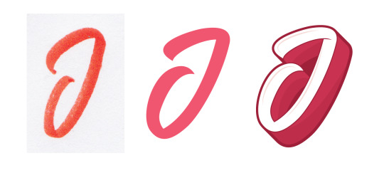
To create this effect, I first made the form of the ‘J’ out of rectangles by using the rectangle shape tool and shape builder tool to combine multiple shapes into one as well as removing segments that were created but not part of the ‘J’ itself. I then separated this shape into the individual segments which would give it the bevelled aesthetic.

At first I was hesitant as to what parts to separate or keep together, so for this I used some secondary imagery as inspiration for how bevelled text is formed. Stock typeface sheets were a large part of understanding the structure of bevelled text, but I tried to create something with my own illustrative twist as opposed to completely replicating the style of a stock image.

Once I had separated the J into the smaller segments and changed the colours to easily distinguish each peace, I used the same colour scheme as the cursive ‘J’ I made before so I could compare the two as a pair. I used a pink background, with white text but for each segment I would slightly lower the opacity at varying levels, giving it a transparent look. However, because of the bright background there was a chance the lowering of opacity could be mistake for different tones of pink so I added a flat shadow underneath which showed through the more transparent parts of the ‘J’.
The bevelled text juxtaposes the cursive text. The cursive lettering has a rough feel to it which communicates an authenticity that most hand-rendered work does. In contrast to this, the bevelled text has a rigid structure (parallel and perpendicular lines for instance) which communicate a systematic and almost mathematical shape.

Review
Overall, these two styles of type are what I am planning on using for my final piece. Together, despite being an unorthodox combination allow for a more engaging read as the overall piece won't be saturated with one style of type. This development was a success as it allowed me to become confident on a style which is much more specific than anything I have settled with previously. It also allowed me to further practice my technical skills which ill be the largest aspect of my final outcomes.
Linking to the Brief
Having to engage a younger audience, it’s important to create type that is visually exciting. I believe this experimentation has succeeded and it’s the furthest I have come towards a final concept. Once I apply these styles to full words to create a typographic posters, I think the effect will be even stronger as the contrast will be visually obvious. However there is a chance with the different use of styles it may become too crowded with illustration, so I need to withdraw the complexity of my type if this does happen.
In conclusion, this has allowed me to create something which meets two key criteria I have set myself:
Creating a direct message which effects the audience in a positive way
Being visually engaging to attract a shorter attention span of a young person
0 notes
Text
Primary Artist Research - CJ Rosamond
Due to CJ Rosamond being a former student of the college, I had the opportunity to get in contact with him and ask him a series of questions relating to my project. It is important to get specialist opinion as they can offer a point of view unavailable from anyone else, and being in a position of experience their opinion is valuable to progressing to a final outcome.
Below are the questions I asked, followed by the answers CJ gave.
How did you learn lettering?
So if you’re just starting out, the best thing to do is to look into calligraphy. When I started out I didn’t really understand the whole vertical stroke being thick, and the horizontal lines are thin, so to begin with I’d say look into the basics and fundamentals of calligraphy. This will give you a better understanding of how each letter form can be constructed and will help the most.

I have just practiced brush lettering, do you have any other processes you like to use?
In terms of process, I use to copy other people’s work (I never shared this). I did this to get use to applying pressure with brush pens - there are some “drill” type exercises you can do in order to perfect this. My process now always changes - I love to experiment. Sometimes I’ll do some outlines in pencil then use a brush pen ontop. I mean it really is down to practice.
I also use a light pad sometimes, not so much now, but I’d do a quick brush lettered piece and then go over it until I was happy with how it looked. If you can get used to using a pen and being able to apply pressure correctly it’s really easy from there.

Do you have any personal tips in achieving a better outcome with lettering?
Experiment with different pens (I use Crayolas, Tombows, paint and brush, faber castells), anything that is a brush tip I probably have! Just try everything see what works for you. It’s pretty mad how each pen can give you it’s own unique result though.
But overall, start with the basics, look into calligraphy and go from there and that alone will help tremendously.

Action
In order to achieve consistency in my lettering, muscle memory will be huge part in achieving this. To assist me with this I used the “drill” techniques CJ mentioned to practice the fundamental letter forms.
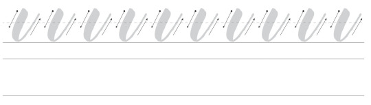
The technique I used to create the letterforms was brushing directly over the examples, using the fundamentals of creating thick lines for downstrokes and thin lines for upstrokes, before doing the same form underneath in order to get a certain shape set in my head of how each segment should look.
Reflection
What I learnt from this is that consistent practice is the best, and only effective way to produce effective lettering. Not just routinely writing words but also taking part in exercises which help develop a muscle memory for how each letter is formed.
In the future, I am looking to expand what tools I use to create lettering. One thing CJ mentioned which I haven't had any experience with previously is sketching the letters first before finalising with one of the brush pens he uses. Sketching I’ve seen has been more and more important to me as I learn more about typography. Getting an idea set before making a final mark allows for for more experimentation of style.
0 notes
Text
Mid-Project Review
Project Summary
I am proposing to create a series of typographic posters which encourage a change in lifestyle to further push the motive of happiness. With the style of work I produce, I hope to encapsulate the attention of a younger demographic in order to make an influence from an earlier point in peoples’ lives.
Showing My Best
In order to achieve the best possible grade, I plan on evidencing the following aspects of the brief by:
Good technical skills: The obvious demonstration of my technical skills will be in my outcomes for workshops and final outcomes. Other than this, the documentation on my blog as to the process I chose and why I made the decisions I did will help me show I didn’t just make something because it ‘looks good’.
Broad range of processes: Experimentation is key with this aspect of the brief. Not only experimenting with different processes, tools, mediums and research, but making links on my blog in terms of comparing the effects of each one to show I have made reasoned decisions.
I have the ability to work to an industry standard: Being put under a time frame with a broad brief which I myself can narrow down is already an indication that I can work in the industry. However in terms of showing this, my blog needs to be kept up to date and I need to have all the necessary work.
I can present my work in a professional manner: Keeping my backing work on my blog with correct spelling, grammar and punctuation will show that I haven’t rushed anything and that I can present something professionally.
Research
The artists I have looked at with varying depths of detail are:
CJ Rosamond
Kirill Richert
Parham Marandi
Lillie Carre
Oliver Jeffers
Eleni Kalorkoti
Luke Pearson
Dale Edwin
Saul Bass
Noma Bar
Anthony Burrill
Developing a Potential Outcome
To make sure my series of posters are successful and work as a collective, I need to maintain a style throughout which I stick to whilst only changing minimal features such as colour to slightly separate all of them. One thing I have slightly overlooked as well which is crucial to a quality outcome is how I print the posters. As I’m going to be making them digitally, I need to make sure they have the same effect when printed, before the final prints are made.
Goals And Grades
To achieve a grade I’m satisfied with I need to have a good quality of work which is consistent throughout my entire project. If there is one part which is lacklustre, that will ultimately affect my whole grade. I need to show a high level of understanding, technical skills, research, experimentation and self-reflection so I meet all of the criteria at all parts.
Potential Errors/Mistakes
The above paragraphs are what I plan to contribute towards my final project. However coming with this could be an assortment of failures which have a possibility of hindering or even changing my grade completely. These include:
Not staying up to date with work
Forgetting about outstanding work and not including it in my final submission
My concepts not turning out as I planned and my project lacking because of it
Not enough documentation of what I do
Too eager to complete something, meaning my research and backing work lacks
Tutor Assessment

To review my progress so far, I highlighted my current confidence levels in each of the units of the brief. This is my reasoning behind my choices:
Context: So far I feel like I have talked about context consistently. To improve, I need to link each post together with the brief, cultural references and social influence.
Research: I have some research which I feel like is up to standard in terms of my workshops, however I am clearly lacking my own personal research which shows how it fuels my ideas. To push this value up I need to go into more depth with specific case study examples of artists, with primary research included. The research itself I have used effectively, but in terms of documenting it I need to catch up on unfinished blog posts for example.
Planning and Production: I was undecided on how well I was doing with documenting my planning and production on my blog as I had no other examples to compare it to. So I looked at blogs from other people in the year, as well as year 2, to compare with my own blog and found areas I could definitely improve upon, such as making contextual references or reviewing my own success/failures more often. To raise this score I just need to continue comparing with other examples around my course and take elements I am missing and apply it to my own blogs.
Practical Skills and Problem Solving: The reason this is at the high end of the scale is because this is the area I am most confident it - actually making the work itself. I feel like I have enough work from workshops and experiments to back up whatever I make with reasoning, putting it to the higher end of the grading level.
Evaluation and Reflection: So far I am yet to do the main evaluation as that will be at the end of my project, rounding off how successful I think I have been. I do feel like I have used evaluation well at the end of my blog posts as a miniature review for what I did, but raising the level of this will come with my final evaluation mainly and refining hitting key criteria with my evaluation.
Comparison
For a more specialised outlook on how I am doing as well as another level of reflection to see if I am over/under confident in myself, my tutor graded me on the same areas using the same scale and I used this to compare with my own judgement. I found that most of the options were relatively similar, with ‘context’ and ‘practical skills and problem solving’ being the main ones I were too confident with. The main feedback I got was the practical skills also encompasses the recording of the process, and I then understood how I could raise this grade by putting more focusing into the backing work supporting my practical outcomes. In terms of the context, the main thing I need to do is link workshops, research, development and analysis altogether using consistent themes and ideas. On top of this, always linking back to the brief to evaluate how I could use what I have done to meet the brief requirements.
0 notes

Text
Illustrator Further Exploration - Dale Edwin Inspiration
Influence
Dale Edwin is the main inspiration I’m taking for this development. I again, looked at some examples of his work, and extracted what I thought to be the most important aspects he consistently uses in order to make my own work in a similar style.
The checklist of qualities I had to implement were:
Vibrant but restricted colour palette. 4 main colours or less
Minimal texture, but some elements of subtle grain to portray a depth
Use geometry to your advantage to create clinical shapes
Abstract familiar shapes but not beyond recognition (body parts etc.)
Materials and Tools
Pencil
Paper
Mac
Scanner
Illustrator
Rectangle Tool
Elipse Tool
Shape Builder Tool
Pentool
Process
Firstly, I sketched out a few ideas of characters whilst looking at Dale Edwin’s work as a reference. Because I was just sketching at this point, colour wasn’t yet a factor I had to consider, meaning I could solely focus on the shape of the characters. I tried accentuating certain body parts to give the character a inhuman like feature, but making sure not to go too far and make something bordering mutant. After the rough sketches, I then chose one which I thought had the most potential of working, before scanning this and taking it into Illustrator.

Once I had the sketch in Illustrator, I used it as a reference in a similar way I used the artist research as a reference when sketching. For instance, constantly looking at the sketch, making adjustments to my work, and repeating frequently. The first part of the character I started on was the head. I remember from my ‘Gods and Monsters’ project that starting on the head of a character (which in that case was a sculpture) immediately gives it that human quality which otherwise it would lack with just a lifeless body. Making the head first allows me to instantly establish an emotion and life to the character I was making. For this step I was yet to pick a colour scheme, so I just again focused on getting the form right and then applying colour afterwards.
To make the shape of the head, I started with a rectangle by using the rectangle shape tool, and then building upon that, adding to the shape with new points to define more detail on the face. I kept to just using the rectangle and circle tools in order to portray the geometric look I picked up upon originally. By using the shape builder tool, I removed smaller shapes I didn’t want as well as combining multiple shapes into single shapes. This made it easier along the process to build on the face step by step.

The only aspect I felt lacked at this point in bringing the character to life was the colour and tone (with shadows and highlights). Therefore I put together a colour palette which I couldn't steer away from as this would defeat the rules I came up with earlier. I picked these colours in particular as I felt they had enough contrast to reflect the style of Dale Edwin. With the red being a ‘hot’ colour and the blues being ‘cold’ colours.

Lastly, in terms of the shape of the face, I rounded any corners which I thought were too sharp. I wanted the character to be innocent, so by rounding any corners it would keep the line smooth enough to not be perceived as harmful at all like sharp corners might be. To do this, I used the direct selection to select the corners to round, and by using the markers which appeared, dragging to create a bezier curve in the selected corners.

After I had a final illustration for the face, I continued with the body. In the same way as I made the face, I used a mixture of the rectangle, ellipse and direct selection tools to create the main shape of the body. Branching from this came the limbs, which in this case using the ellipse tool and pen tool meant I could get the most natural look for the shape of them. This is the same for the shoes and hands, which was then followed by adding the rest of the shadows to remove the complete 2-dimensional look to it.

As a final extension in an attempt to explore other directions I could take my illustration, I added another colour to the palette (purple), which I applied to some surrounding shapes. I felt like this further pushes the lifelessness across, by having some setting and therefore context to the figure.
Review
In conclusion, I feel like this outcome was more effective than my ‘Simple Folk’ workshop outcome. This is because I allowed myself to expand on certain ideas I had for my outcomes in reaction to the brief, and also got me to try another style of illustration which was still similar but has it’s unique qualities. I found that geometry
Linking to the Brief
The reason Dale Edwin’s work is so effective to both me and an audience relevant to the brief is because of the specific traits of visual language he uses as a tool to create an atmosphere in his work. This atmosphere is uses vivid, striking colours at the foreground of the work, along with often crowded frames to maintain the initial excitement for longer. The cultural impact of work like this could be shown in the ‘boom’ of technology. With hyper-activeness being increasing in younger people, illustration has taken it’s shine with it’s implementation in user-interface design. Becoming integrated into many popular applications, YouTube being an example, the style of illustration Edwin reflects clearly is used for that reason.

0 notes
Text
Repeater Workshop
Context
A pattern is something which is predictably repeated multiple times. In the case of this workshop, I looked at visual patterns, which tessellated seamlessly. Patterns appear in all types of forms, from audio patterns like a tempo, to patterns in nature such as a spiral in a sunflower head. It’s important I consider how effective patterns can be, and why they are effective.

Other areas where patterns are commonly used are architecture, mathematics, textiles along with countless other areas. Patterns often inflict a comfortable feeling, and I believe this is due to their predictable nature. Once you observe and recognise a pattern, you then know how the pattern will behave in the future. Considering this, this links together well with the theme of happiness in the brief on top of the younger demographic.
As disordered as my following outcomes of this workshop may be, once they are turned into patterns they are then seen as organised and more comfortable to grasp. The effect of this: turning the pattern into something more tranquil than the isolated image.
The task for this workshop was to create a tessellating pattern in Photoshop which was seamless. The pattern layer which we create could be used to map the patterns onto other layers to then create interesting textures easier.

Tools:
Mac
Photoshop
Illustrator
Pentool
Offset Adjustment
Brush Tool
Solid Colour Fill Layer
Pattern layer
Process:
Firstly, a document is set up in Photoshop which is 6000 x 6000 pixels in size, with 72 dpi resolution as it’s going to be kept as a digital image. This initial canvas is where the first design of the pattern would be made. I started by using the pen tool to create various abstract shapes. I didn’t want to over-complicate it for myself, so I used flat colours inside the shapes and kept them apart from each other.

Making sure the whole design had enough negative space around it and was centred to again keep things simple, I merged all of the shape layers into one single layer which made the following offsetting stage easier. To ensure the design would tessellate, it couldn't exceed any edges of the canvas in the slightest otherwise once the pattern is repeated it wouldn't line up properly. For the offsetting step, there was two options:
Whilst selected on the layer with the design, go to the filter window and select ‘offset’. Change the values to half of the canvas size (in this case 3000 pixels horizontally and 3000 pixels vertically) and confirm.
Use the rectangle marquee tool and rulers to slice the layer including the design in to two vertical halves. Then swap the positions of the two halves, merge the layers and slice them in two vertical halves before swapping their positions and finally merging the layers.

Because I kept enough negative space around the design, after offsetting it, it created an area in the centre large enough for another design. So using the same process of the pentool, I created other shapes in the same style as the others in an attempt to make the pattern as seamless as possible. Once these had been added, the pattern design was complete, and the next step is to make it into a pattern layer. For this, I went to edit, and selected ‘define pattern’. Now I had a pattern which I could choose quickly from the pattern layer window.

For the second design, this is where I crossed over the use of Illustrator and Photoshop. I find Illustrator to be easier to use in terms of creating shapes, so I figured doing this first before making them into a pattern allowed me to have more freedom in what ideas I produce. I still wanted to maintain the flat, vibrant look, so I restricted my colours to only shades of red and blue.

Once I had the colours to use, I stuck to the geometric theme but instead of creating random soft shapes I used six triangles in a regular formation to create a hexagonal shape. I then used the offset filter to make the shape into a tessellating tile, and found there was space in the centre which I felt could benefit from having a smaller version of the hexagon I made. Adding this turned the pattern from something spacious and regular into something that looked more cluttered. Because of the contrast between the smaller and larger shapes, they work in unison when repeated across a surface.

For the last pattern, I went for a more random route and increased the amount of shapes I used. I still chose a restricted colour palette, this time with 4 colours but wanted to push the disordered feeling further by complicating the pattern.
For this pattern, I went back to Photoshop so I wouldn’t create and shapes which were complex in Illustrator. The two light blue stripes intersecting in the centre could also act as a border for the shapes once this design is repeated. I liked this effect because there is a juxtaposition between the large divisions of blue and small geometry surrounding them.
The difference between the effect of these colours in comparison to the first pattern for example is that these colours portray a more classical graphic look, which could be linked to things like 80s graphics. The first pattern consists of softer colours reflecting water-colour tones which gives it an essence of innocence which the others lack.
Reflection
Using patterns is something new to me, and this workshop helped me grasp how and where they can be used. I tried to make a range of outcomes so the workshop demonstrated the versatility of pattern-making. I believe I was successful in my outcomes, as there were different colours, shapes and arrangements which all portrayed different things. It helped me realise the effect of changing something as simple as colour from vibrant to less saturated for example, and seeing how the audience for my outcomes is younger, colour will be one of the most important areas of visual language to consider in my opinion.
Reviewing the Potentials
Patterns are very helpful when applied to things like wallpapers - covering a large area with one design. A more digital application could include mapping a pattern over a flat colour to give an illusion of texture but in the case of my project I need to consider whether using patterns will be positively effective. There is a line between using patterns effectively and using them excessively which I need to keep aware of. There is always a possibility that if I use a pattern for the background of a typographic piece, the typography will become less prominent and not read as direct as it would with a simpler backing. The ‘Post Up’ workshop was what told me how just typography alone could be effective in itself, so I don’t want to make the same mistake I did in that workshop and over-complicate the design, causing it to become less powerful. If I were to use a subtle pattern, I do feel however this has more potential to be applicable in my work, in the way that it won’t be too distracting. As well as this, something like flat illustration can be completely changed with the use of texture, and I could perhaps use patterns to help me create this.
Linking to the Brief
The tranquility of patterns allows them to influence almost everyone. If I want to be making something which encourages a change in someone’s life its going to have to be positively received. With patterns being used correctly this could definitely be the fuel in making a poster exciting, however it isn’t the only method, which is why I’m hesitant on over-using patterns from this point forward.
0 notes
Text
‘Simple Folk’ - Flat Illustration Workshop
Artist Influence
Before getting into any practical work, I wanted to establish a list of key principles in which I could use for my own work. I did this in my Saul Bass case study and found it to be very effective in taking direct influence from something. To get these, I looked at the following artists which have a flat and sometimes minimalistic art style.
Lillie Carre
Oliver Jeffers
Luke Pearson
Eleni Kalorkoti

Mirroring the Saul Bass case study, I made a list of rules to follow in order to maintain a similar style with the outcomes of this workshop. These rules were:
No gradients, just use flat colour to build tonal value
For texture, only use a subtle grain
Leave plenty of negative space to draw focus to the main subjects.
Throughout all of the work, these were the aspects of visual language that caught my attention as they are consistently used effectively.
Materials and Tools
Pencil
Paper
Scanner
Mac
Illustrator
Rectangle Tool
Ellipse Tool
Pentool
Direct selection tool
Pathfinder Window
Shape Builder tool
Process
The first task was to sketch someone and try to simplify their face as much as possible. The person I chose as my subject was Bob Ross. As well as being arguably one of the most influential artists, his hair is an iconic feature which is largely associated with him, so I thought this would make it easier for me to illustrate something which could be recognised as Bob Ross. Whilst sketching I kept in mind that geometry was a large part of the artists’ work I looked at beforehand. So my method of simplifying was to just construct the facial structure from circles and lines, and I feel like this is what mainly gave them their ‘cartoony’ effect much like the artists I looked at.
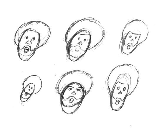
This is an important part of developing an idea because it allows for a quick way to generate lots of variations of one idea you may have in your head. So for this task I gave myself a very limited amount of time for each small sketch which made me make decisions I wouldn’t have thought of if I gave myself more time to sketch one idea. As an example, after a few times at sketching the beard, I found it quicker to use a shape which resembles a rounded rectangle for the top, which not only made it easier to repeat but in doing so I simplified my first idea further.
At this point, I had a simplified version of my subject which follows the rules I set myself before. Now I could take this into Illustrator as a reference and start the process of making a digital illustration with various shape tools.
I scanned the sketches in, and cropped the one I think worked best at showing the construction of shapes for the head, in this case the top left sketch. After this, beginning the digital process, I started with a rectangle by using the rectangle tool, which I then built up the different features on top. The hair was the next feature as this was the main feature which was going to decide how similar the illustration would look to Bob Ross. For this I just used a singular large circle using the Ellipse tool, but by holding “Shift” whilst dragging the tool I was able to keep a 1:1 ratio and therefore a perfect circle. Following this was repeating the use of these two tools, along with the direct selection tool to select individual points of paths to adjust the position of to create all of the other facial features (beard, mouth, nose and eyes). At this stage I had used an outline for all of the shapes so I could easily see where everything was placed, as with a fill certain shapes may get hidden under others. Once I had the general structure, I selected all of the shapes, and used the Shape Builder tool to combine shapes or get rid of unwanted areas, to create a combination of more complex shapes which would then take the shape of the final face. However I was still using outlines, and at this point I was satisfied with the shape and positioning of the face and features, so I added colour which then made it easier to see it was a person and separate the large areas of skin from the large areas of hair.

At this point I was happy with how the face had developed, but I thought there was an element missing between what I had created and the examples I looked at in the beginning of the workshop. Because of this, I looked back at my rules and the examples of work to find shadow and highlights were something I had not included, which at this point I thought would transform it into something closer to the artists’ work.
The next step was a personal extension to the workshop, as the workshop didn’t ask for anything more than singular flat colours. For the shadows and highlights, instead of using shapes to construct them, I used the pentool in an attempt to get more organic lines and create a juxtaposition between the geometry of the face and liquidity of the tone above it. With the highlights, instead of creating fill objects with the pentool, I created a single path which I added a stroke to in order to make it as accurate as possible. This was to not redirect the face from it’s original geometric aesthetic.

Reaction
Overall, this workshop was a success for me. I learnt how to simplify someone into a character which could be used for a huge range of things. Because it is in vector format, it is perfect for print or large scale digital use. As well as this, from the start of the project I have wanted to explore illustration and how that could be used in my final outcomes. With this style of simple flat illustration I feel like I can apply these skills to work in the future without ignoring my initial artist research. The styles of my original artists show through this workshop so I am confident this has helped me develop skills I can use effectively to create something I will be happy with.
Looking forward, I am planning on further exploring illustration in similar but varying styles. Maybe using more abstraction in terms of the visual language (colour, line etc.) to create something with more inhuman qualities.
Linking to the Brief
Illustration has always been something I’ve wanted to explore, so it was good for me to do so whilst looking at a key style. The artists I’ve previously looked at I’ve found rarely use patterns, so finding a link between this workshop and the pattern workshop was quite difficult. As a primary aspect of their work, patterns would deter the audience from the work itself, which further solidifies my point of using excessive pattern will make something less effective in communication. Lillie Carre is the most noticeable use of pattern out of the examples I chose. Her pattern usage however is completely hand-made, making it more authentic than the digitally produced patterns. The hand-rendered quality is portrayed well and this is complemented by the roughness of the patterns, which still tessellate but not perfectly systematically. This is a perfect example of how they can be used subtly but powerfully.
Lillie Carre also makes work tailoring to a younger audience, which makes her work all the more relevant to the brief as I am also aiming to do so. Book illustration is a good example of how culturally, this type of work can influence a group of people. The illustrations featured in books is exactly what turns them from a book into a story; an experience for a young person.
0 notes
Text
Saul Bass Case Study
Saul Bass is a graphic designer who was most renowned for his logo and Illustration work. In this workshop, we used his work as a case study because of its timelessness, and how it still remains contemporary until today.
Tools:
Pen
Paper
Mac
Photoshop
Illustrator
Shape Tool
Shape Builder Tool
Selection/Direct selection tool
Pentool
Read
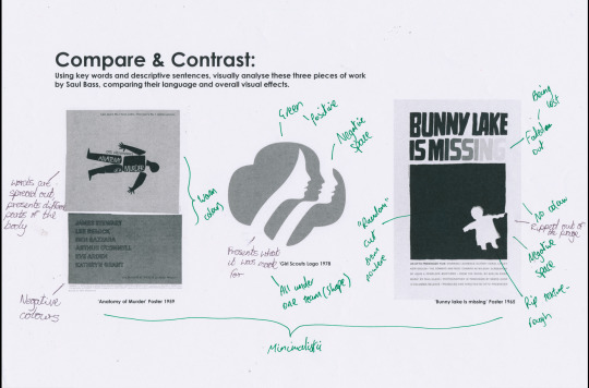
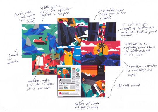
For the first activity, we were given three examples of work from Saul Bass, which we annotated with comparisons between their visual language, overall message and look. The first thing I noticed, was the dates in which the work was produced. Considering all the examples were all made over 30 years ago, they still have a contemporary feel to them which makes them just as effective at communicating their message. It’s this timeless quality of Saul Bass’ work which I tried to analyse with a peer.
‘Anatomy of a Murder’ Poster
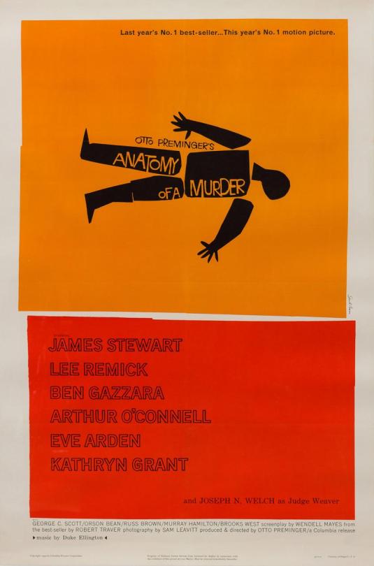
The story of ‘Anatomy of a Murder’ is implied through the poster, where the different parts of the cartoon body are all disassembled and spread out sporadically. Along with this, the type has no structure which, combined with the spread out body parts, portrays a story about a malicious murder. In terms of the visual language, Saul Bass uses boxes with warm colours and rough edges effectively to separate the imagery and the information. Red has a direct implication to blood, which further pushes the imagery of murder.
Girl Scouts Logo

The Girl Scouts logo consists of three female faces constructed of both positive and negative space, which are all contained within a singular shape which resembles a tree or clover of some sort. This, and the neutral green colour choice all amalgamate to carry the message of the Girl Scouts: unity, diversity and naturalness. Because it is so effective, this logo has stayed as an effective brand image for the girl scouts up until the present, with only little changes in the colour and depiction of the girls.
‘Bunny Lake is Missing’ Poster
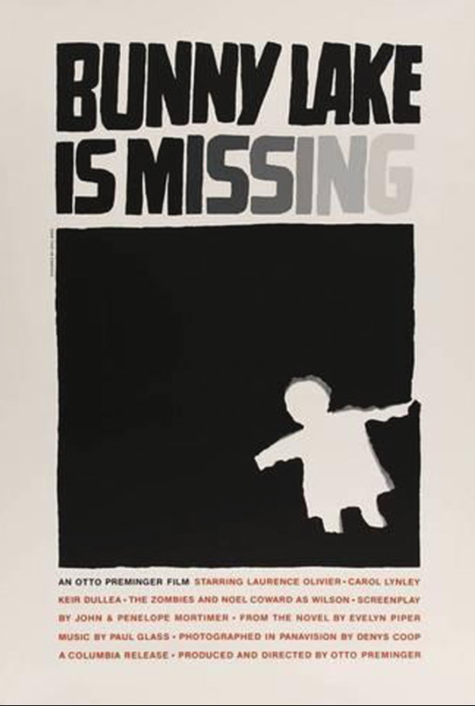
In the same way he does in the ‘Anatomy of a Murder’ poster, Saul Bass uses a solid block of colour to draw the viewer into the main focus, which in this case is a rip out of a child figure. The ‘Bunny Lake is Missing’ poster however uses a lot less vibrant colour, which implies a more sinister tone to the poster. The lack of regular composition is most direct with the placement of the ripped out figure. It doesn't line up with anything, it’s placed in what seems to be a random place. Also with this is the way the title fades out towards the end. With the text and the random rip out of a child, the poster communicates what the story is about, someone or something going missing and the search for it.

After the breakdown of how each piece was created and why, I came up with a small list of rules which would be used to determine what I would need to do to the visual language to recreate the work. By looking at Saul Bass’s work, as well as three other artists which drew influence from him (Noma Bar, Cody Hudson and Olly Moss), the rules I came up with were:
Flat, subtle colour usage with a restricted pallete
Avoid over-complicated forms
Use negative space to draw focus onto the main subject
Make it universally accessible
Identifying these key components of the visual language was helpful and proved helpful once I started the practical work. If I found myself diverting from the influence of Saul Bass too much, I could refer back to these rules and use it as a checklist to see what element I haven’t followed.
After this, we then looked at Saul Bass’ 4D work. Specifically his movie title screens: ‘Anatomy of a Murder’, ‘Psycho’ and ‘Seconds’. It is important to do so, so I can look for qualities of the other types of work Saul Bass creates and make my own inferences as to how the effects are produced.
Anatomy of a Murder

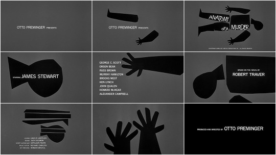
In a similar way to the poster, each of the body parts have been separated, except with the addition of time-based graphics, they are now given movement which wasn't present in the 2 dimensional poster. Saying this, the movement featured in the sequence is very choppy, but in a way with obvious intent. The transitions were instant, and the animation of the body parts was linear, which portrayed the lifeless aspect of the body. One other inference I made from this movement is the link between the sudden expressions of the body parts and the sudden finding of a piece of information. Being a mystery film, discovery is going to naturally be a large theme throughout. So the rapid appearances of all the titles is a way to subtly imply that discoveries are being made.
Complimenting this is the music. It also is sharp and abrupt, and the movement is cut to the sudden beats of the music making them in sync. This works so well because the elements of sound and vision are fused so that the viewer has an experience of the scattering of the body. The music also helps set the tone, and this is all the more evident with the other examples and how the music choice for those affect the overall atmosphere.

‘Psycho’ has a slightly similar tone to ‘Anatomy of a Murder’, in both the story and the movie title. Saul Bass implements more smooth movement in this title screen, where sequential lines are a core part of the revelation of the type. The lines appear from random segments of the screen and have a straight directory across the entire frame. Merged with this is how the text is revealed. Sometimes it is carried with the animated lines, but there is also text which is isolated, and follows a similar linear animation, being gradually revealed. The effect of this, also due to the speed of which all this occurs, is an element of confusion whilst watching. The viewer doesn't know where the next title will appear from, how it will appear or even if there will be one at all. This links to the title ‘Psycho’ which can be described as an instability, in the same way the animation has an element of uncertainty when its played through.
The music for ‘Psycho’ works in a similar way to the music in Anatomy of a Murder in the way that it syncs with the motion picture. However, it’s the bass which is synced, but this is overshadowed by a higher, louder constant melody which dominates the sound. In consequence, the viewer becomes more intimidated by the strong deafening notes. It certainly doesn’t have the slight light-hearted element to it like the ‘Anatomy of a Murder’ screen does, and that reflects how different the two stories are in their innocence.
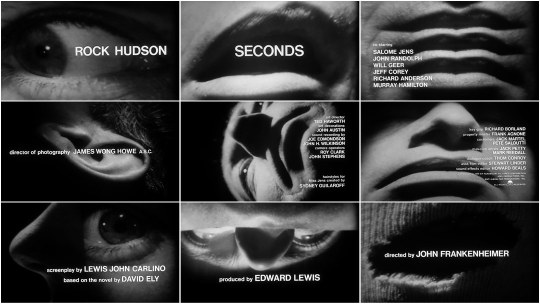
I found the ‘Seconds’ title screen to be the most intriguing. Whilst the other two had similarities, I initially found it hard to make links between this and anything I had seen beforehand. First of all, the video shown in ‘Seconds’ was of an extreme close-up of a man, and because of how strong it had been manipulated, I only could conclude this after watching a sizeable amount of the title screen. Juxtaposing to ‘Anatomy of a Murder’ and ‘Psycho’ where ‘cartoony’/geometric shapes are used conservatively, the whole frame is constantly filled with an area of the unknown man’s face, and this definitely inflicts discomfort. Complimenting this eerie video sequence is the music which Saul Bass uses. With both together, there is still no emotion which causes the viewer to sense an inhuman piece to the subject. This title sequence doesn’t reveal a lot about the story of the film, other than setting a tone to leave viewers confused, and Saul Bass has executed it with the motion effectively.
Practical Development
After looking at the range of examples, I then started working on creating various outcomes in a similar style, whilst sticking to the rules I made in the second activity. I chose to do a series of posters promoting health for the NHS as this allowed me to explore the subject I am choosing for my project. The main inspiration I took out of the four artists was Noma Bar. His work in particular stood out to me with the use of clever negative space, so I wanted to attempt to explore this idea of mixing two subjects together to create a visual double meaning. As well as this, Noma Bar’s work was very clinical in terms of the clean lines and restricted colours, and I found his style to be closest to what I wanted to create in my final outcomes.
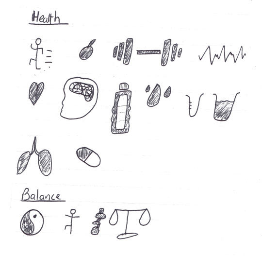
Before making any of the posters, I sketched out several ideas which came to mind with how I can mix two things together whilst relating to the themes ‘health’ and ‘balance’. It is at this stage where I decided to not use negative space like Noma Bar, but instead make a link in a more direct way in an attempt to make it more obvious.
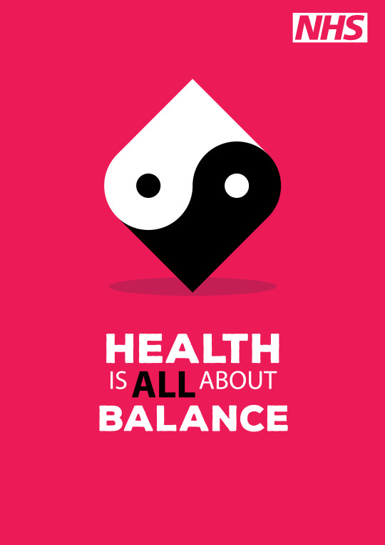
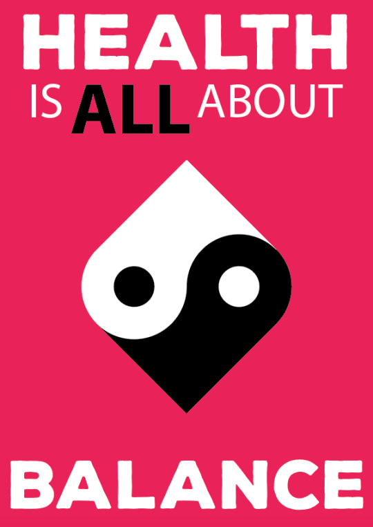
This first one mixes the symbol of a heart with the ‘Ying-Yang’ symbol by intertwining a white heart and a black heart to reveal the iconic structure of the Ying-Yang.

I feel like this is my least effective poster in terms of presenting the link between the two objects. I also got feedback from some peers, and the overall feeling was that the heart element wasn't obvious enough. Saying this, some elements worked very effectively in my opinion. I wanted to be as geometric as possible, with this illustration, so I constructed the main image with a grid consisting of a square and two circles.

Then, by using the shape builder tool, I merged certain areas to create the two areas of black and white. I later changed the small circles to even smaller upon looking at reference images of the ‘Ying-Yang’ symbol. After this, all that was left was to rotate by 45 degrees so the hearts were shown to be vertically stacked, and add a cartoony shadow with a simple ellipse.

The last thing I found to be especially effective was the colour usage of the poster. Because I had a black and white illustration, I couldn't use either for the background as sections of the illustration would be drowned out by the similarity in colour. Therefore, I used a soft pink/red which I think works effectively in catching someone’s eye, along with linking to the imagery of the heart.
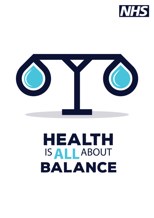
For the second, the mixture between health and balance is portrayed through the water droplet and the scales.
For the construction, I used Illustrator paths with a thick stroke to keep the line work consistent throughout. The pentool was the main tool I used to create all of the shapes, as it allowed me to keep more control.
After I made the basic shape of the scales, I moved onto the outline of the basket which I would then duplicate and use for the water droplets. I wanted the perimeter of each shape to be parallel so they seemed to be conjoined, as opposed to having them look like separate objects with irregular shapes. The spacing between the two proved to be a hard decision for me to make. Whether I would remove the spacing completely, or keep the gap relatively large. In the end I chose quite a large spacing for the simple reason of it fitting the cartoony style better than any other option. I also didn’t want each end of the scales to feel ‘cluttered’ with too much going on, and I think this subtle spacing helps to prevent that.
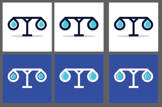
Lastly, the colour palette was obvious to me from the start, as I was dealing with water, restricting myself to just use blues seemed to work. However when it came to how I would use the blues, I wasn’t quite sure. A bright colour in the background was very successful in my first poster, so firstly I tried a blue in the background with white scales. However what I found to work the best in my opinion is a white background with dark blue scales, as all the components of the poster are clearly visible, whereas a brighter background I thought was distracting from the main focus.
I approached how I made the last poster differently to the previous two. My aim for the workshop was to produce one or two posters, so once I had finished the first two with a considerable amount of time in the session left, I started experimenting with shapes in Illustrator. I knew I wanted to use the symbol of someone balancing, so I started here.

By using rectangles for all of the body and a circle for the head I made the rough shape of the person. Then, by using the shape builder tool, I merged the shapes into two shapes, the body and the head. The last step to making the symbol was rounding certain corners with the direct selection tool to give it a more cartoony look. Once I had this figure, the rest was unplanned, so I began placing it in situations that would make sense (for example, a tightrope) whilst trying to make connections along the way.
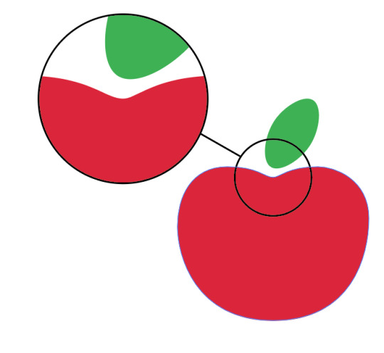
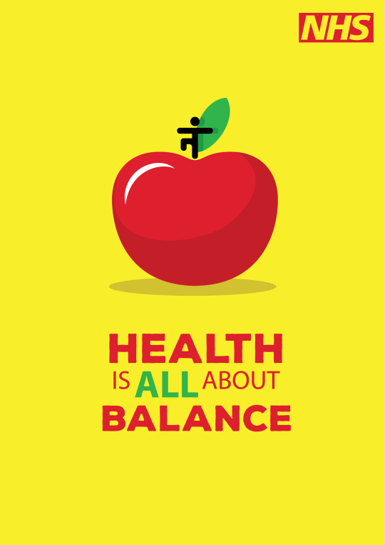
In the end, I used the dip in the top of an apple to link with the dip in a tightrope. So for the poster, I put the figure of the person on top of the apple dip to make it look like someone balancing.
My first concept consisted of the type being the primary subject of the posters.
However, I had to reconsider how I used type because I felt myself straying away from the influence of Saul Bass too much. All of the examples I looked at contained text as a secondary element. This creates a subtlety to the posters which mine definitely lacked to begin with. In reaction, I rearranged the type to occupy a smaller amount of the poster and to all be grouped together, in a similar way to the ‘Anatomy of a Murder’ poster.

Now, there is a lot more negative space which at first I instinctively wanted to fill, but after opinions from peers, I found it to be more effective with more negative space and smaller type.
Context
The style of my outcomes were heavily influence by the designer Noma Bar, however it’s important to consider the context of his work as well to further pick apart the fundamentals. Saul Bass and Noma Bar have different styles of their own, but the element that links their work together is the minimalism which I picked up on in the first task. Having this allows me to draw influence from the work without directly replicating it, as I am just applying what I have picked up on as common elements of the artists’ work.
The examples I looked at remain contemporary because of exactly this, so for a poster promoting happiness it will need to have the qualities Saul Bass and similar artists use to remain effective for as long as possible. This has shown me how powerful research can be before creating work in direct influence. Without the research, you are solely recreating what you see, but with it you can make similar reasoned decisions to the original artist which help build a better understanding for the work you are creating.
Linking to the Brief
With the checklist I made at the start, I considered how this could link to creating work specifically to meet the brief’s demands. The main thing to look at is the minimalist approach and how that can translated into something which can be understood by a larger range of people. The young demographic of the brief isn’t going to connect with anything with complex imagery (such as large colour palletes, intricate line work, lots of detail etc.) Minimalism has been a large theme in the work I have looked at. It is the quality that separates a piece of artwork from a graphic which focuses on an audience reaction.
0 notes
Text
Proposal
Rationale
Up until this point, I have been applying skills learnt in workshops as well as previously developed skills to allow me to become more confident in my ability to produce meaningful work. At the start of the year, I was confident in my digital skills but had no trust in my analogue work. I have found the various analogue workshops (such as print, collage and photocopier) to be the most valuable to me, as this has allowed me to transfer the outcomes from these and merge them with my digital work to create something which I am confident in but still has the authentic texture quality to it. It is also because of this reason as to why I most enjoyed the analogue workshops. At first, I struggled but after seeing how I could apply the work from them it served the most help to me. Throughout the Popaganda project, I want to expand on this cross-over with new art-styles such as typography and Illustration. To make the best possible project, I need to focus on meaningful research which will allow me to apply the effective techniques to my own work. Along with this is recording the step by step process, as opposed to spending all of my time making outcomes with little explanation behind them. It is important for me to do this as it shows a backstory behind the work, about how the idea was formed, who was the inspiration and the techniques I used to produce it.
Project Concept
Popaganda is all about exploring the mix of “pop” and “propaganda” to produce something which promotes happiness across younger adults. My project, in particular, will delve into health and wellbeing; and branching from this mainly focusing on mental health and promoting balance. For me, it’s something I wish I was more prepared for, and I hope to help tackle the issue of mental health by starting to promote a healthy lifestyle from a young age. My initial research includes mind-maps exploring possible ways I need to manipulate the visual language of my outcomes to attract someone with a younger attention span. This ranges from bright colours to things like a direct message. By highlighting how I need to make my work first, this helps me hone in on what I need to do in workshops and personal experimentation, and this is why I find it important working to prioritise initial research at the early stages of a project. The idea of typography came from me thinking about how to directly portray a message, and this is also where a typography workshop, featuring Anthony Burrill as the inspiration, helped me realise the importance of typography and how it creates a reaction from an audience. Because of this, the idea I'm looking at for my final outcome is a series of typographic posters. Some areas of typography I want to expand on are cursive brush lettering and three-dimensional type.
Evaluation
Not only is research crucial in my project, but also the evaluative work after is just as helpful. I aim to be as critical as possible, as well as gathering primary research from people closer to the demographic of the project. Things like questionnaires focusing on work I have produced in order to see what works best especially with younger people. On top of this, I will constantly update my blog with regular structured evaluations so that I always have a means to reflect on recent work. I think this will be important because if I am always criticising my work, along with insight from other people I will always be improving/adapting my work, whereas without the evaluation process, I would have a finished stagnant outcome.
0 notes
Text
‘Zine’ Magazine Workshop
A ‘zine’ in this case is a small collection of work collated into a small booklet in order to give an insight into the publishers work. Zines are commonly formed with the use of a photocopier, to make the pages of it.
Context
Zine’s have long been used by artists to market their work as small visual booklets to showcase a range of work. The process of using a photocopier to create the zines separates the artist’s work from more modern options such as professional printing. Due to this, zines have been adopted as a more authentic approach to collating your work together, signifying more of a relationship between artist and art.
The artistic use of zines stretches back to when the technology of producing them was first available. Zines originate from literary examples, such as published opinions or informative pamphlets, but has been picked up as a means for perhaps less well established artists to showcase their work in a non commercial way. Their undemanding nature causes zines to commonly made from simple collage techniques, before being photocopied and collated into a final booklet. This is because this style is accessible to almost anyone, bringing the work inside to a relatable level to the viewer.
Graphic zines have attained an associated style with the work inside. When referencing zines, artists often look at the abstract implications as being influenced by the Dada movement.
Dadaism
During the 1900s, Dadaism became prominent due to the social rejection of the ideals of society at the time. The capitalistic setting was abruptly opposed by the Dada movement, and the artists who followed the movement looked to display elements of randomness and almost stubbornness in order to reject the social climate. The name itself “Dada” doesn’t have any real meaning, or any descriptions of the word bearing no relevance to what Dadaism entailed - which is why it reflects the movement so well.
Process

Because I was going to use a photocopier to produce the file, I had to stick to a multiple of 4 number of pages, with a minimum of 8. By using multiple pre-existing magazines as a source for assets to use, I collaged many sections from many different areas of interest in order to create something new with a complete different meaning. Throughout I tried to maintain the imagery of work I had seen so as to not let my own influence take control of the outcomes.
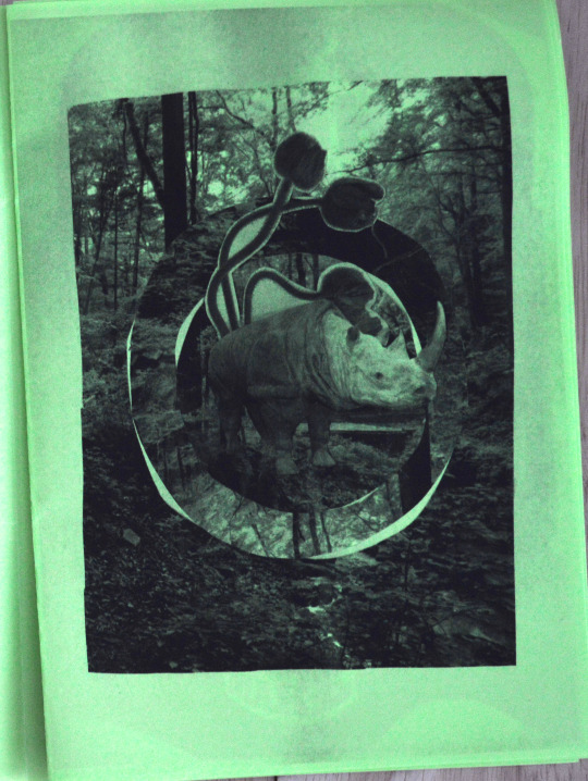
The first page I made consists of a forest picture, which I cut two different-sized circles into before rotating the larger circle to create a mirrored effect in only that section of the circle. This simple cut and rotate technique allowed for the image to be turned from something ordinary and calm into something that didn’t make sense. The inspiration for this effect comes from the geometric photo-manipulations of Victoria Siemer.

The cutting process of physically manipulating the image, unlike the digital manipulation that Siemer carries out in her work, means there is a lost/torn element of the circles. I believe for this page, the roughness worked to its advantage as it fits together with the other rough aspects, such as the plants and Rhino which I placed on top of the forest. The goal of the Rhino’s position was to make it seem as if it was in the original background image, but without getting effected by the cut and rotation of it, making it become more isolated to what’s around it.
Overall, I found this page to be my most successful, and that is why I put it at the front of the Zine, to ensure all viewers would see it.
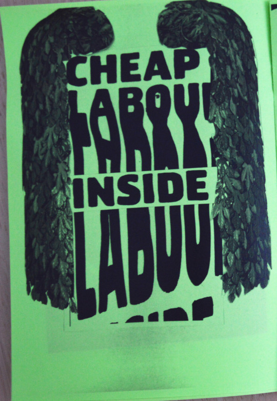
The second page I produced was the first to demonstrate the use of the photocopier to manipulate a shape. The original magazine section read “Cheap Labour Inside” with no variation with the text. Therefore by placing it over the top of the scanner, and moving the piece of text across the glass as it scanned, I managed to create an interesting warp which was also unique to that version due to the nature in which it was created. In contrast, if I had used a digital tool to warp something such as the Photoshop puppet warp tool, the effect created would be much easier to replicate due to how concise the warp would be. Because the theme throughout this workshop seemed to be the sporadic nature of creating work from just simple resources, I found the photo-copier warp to be much more effective than any digital warp I have had experience with.
After I had the newly edited version of the quote, I used the original to cut ‘Inside’ from it to place over the top of the warped version, so that the text was still comprehendable. What this also did, which was something unintentional but worked very well in my opinion, was making the warped text seem ‘pushed’ back by the ‘Inside’ text being firmly stuck above it. I feel like this worked well with the rough warp to make it seem like it was fading//drowning out of the surrounding picture.
The last addition I added was the bushes which worked well in surrounding the text. I did this to create an enclosed feel in the quote as a whole, and to also create a contrast between the randomness of the warped text and the nature aspect the bush creates.
I found the third page to be where the cut and place process to be most prominent. However after making the main collage, I used the photocopier warp technique to add a filter to the entire piece. In terms of the initial collage, it is entirely made out of random cutouts/remade parts of magazine pages. Things from walls, to lights, and random textures.
The top and bottom sections use instructive text surrounded by various ‘doodles’ made from a marker which further pushes the confusion of the rest. The text was, like the other assets in this piece, recycled from text extracted from magazine pages.
Overall, I found this page to be the hardest to become happy with. I feel this is because I like working organised and structured, so when faced with something as sporadic as this I struggle to find inspiration in what to create. However after arbitrarily placing some sections together I feel like I did a good job in portraying the random feeling.

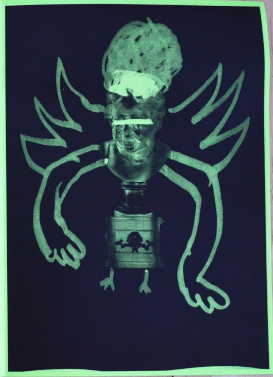
At the point of starting to produce the fourth page and onwards, time management became more of a priority. Therefore this is where I really didn’t think about what I was doing and just made unplanned decisions. I think this shows in pages four and five, where they both use the same initial collage concept but are taken in two completely different directions with the use of the photocopier once again. For the initial collage, I only used one image of a statue of a child, with an unnatural, eerie expression. To compliment this I used the marker heavily around it to create child-like ‘doodles’. Covering the eyes with a stroke, adding features which didn’t fit or make any sense (large hair and arms, tiny nonhuman feet and legs, and wings) were all done to take away the person aspect from the statue even further.
After this was done, I carried out multiple photocopier manipulations including warping, adjusting levels of colour and inverting the colour. In the end, I had two options which were quickly made from one initial experimental piece. This effectively made the fifth page the quickest to produce, and was the main thing which allowed me to see the importance in recycling ideas whilst still manipulating them enough to create something new.
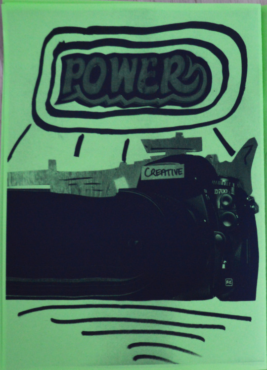
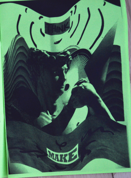
Continuing onto the sixth page, I was starting to run out of ways to implement the processes I was using. Because of this, I just repeated what I have done but with different assets, which allowed for more experimentation. The first thing I did was gather an image of a camera and a gun, by again cutting them from magazines. After some time trying to fit the two cuts together, I found it hard to make them look part of the same page as the gun was facing a different way to the camera. What I did because of this was flip the gun horizontally, revealing the texture on the other side of the page. Because of this, I had the shape of a gun revealing a rough metallic texture as opposed to a gun with all the realistic details included, which allowed for me to add my own simple details with the marker once again to push the implied image of the gun. For the camera, the lens didn’t extend as far as the nose of the gun did, so I used a photocopier warp again to elongate it in a weird way. Next, I cut the words ‘Power’ and ‘Creative’ so that they could be linked to the objects, and added some more doodles surround the objects to bring focus mainly to the large ‘power’ text and the camera.

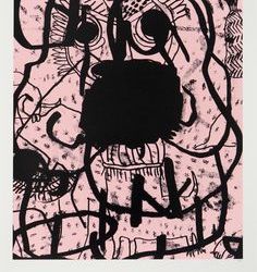
The penultimate page - ‘save yourself’ was one of the least powerful out of the zine in my opinion. When collating the type together I didn’t anticipate the blacks to merge as much as they did, and this caused the text to become less legible and ultimately less striking (which is the effect I wanted). The thought process behind this was to create something with a sinister message with as little indication as possible. So the first thing was creating the main ‘save yourself’ text. To do this I used the photocopier warp technique for “save” and over the top of this using a marker to write “yourself”. For the backdrop I used a random page of a book which makes the handwritten text above look written in desperation, as the underlying structured text has been ignored.
The strips of displaced text in the book page underneath were created to imply a deterioration of the words. I thought this would further push the idea of desperation in the hand written text above it, if the surface itself looked as if it was fading. The reason I don’t think the panic was portrayed as well as I anticipated, is because once all of the ideas I had for the piece were joined together, it became more confusing than powerful. In order to prevent this confusion, I had to take it back to the basic principles of the collage style and persist with that.

For the last page I wanted to redirect the interest of my outcomes to something more relevant to the context of how zines have been used previously. Because of this, I chose a topic which is very relevant in the current political climate (gun violence) as it reflects how the Dada movement was a platform for artwork to have political influence. For this, I also used an external texture - masking tape which adds more depth than just the collage and photocopying aspect of the zines. The imagery of the sales token taped on top of the dangerous looking gun portrays that the gun is easily accessible, just as easy as any offer someone would turn down whilst browsing a magazine. I like this page in particular because I feel like I’ve successfully made a link between the ease of access to coupons and the ease of access of guns, whilst making it obvious that this is the message. Overall, it also represents the origin of zines, with a rough impromptu style commenting on a serious current issue.
The main things I had to keep in mind, was what I made would be scaled down into A5 size, and be translated into black and white images. Cutting and pasting sections from the supplied magazines created the entirety of the outcomes, and because of this the contrasting themes and imagery created a random effect throughout the final zine. As a whole, I think I was successful in this workshop in terms of communicating what I found in my research through my outcomes. I feel like there was an improvement here from past workshops where I would focus on the outcomes, but I realised it’s important to have reasoning behind the choices I make.
The ‘Post Up’ workshop being the only other workshop I’ve taken part in during this project means I can easily reflect upon the successes/failures of both. In both workshop, colour was limited heavily, so it allowed me to focus on the composition of my work for the most part. Typography feature in both workshops, but I do feel like the type I used in my zine, being more abstract or organic, makes it less like a computer generated graphic and more like something which has been made by hand. The effect of this is clearly making the message easier to be affected by, and therefore making the artwork more powerful.
Linking to the Brief
Promoting happiness is the main theme of the brief. I don’t however believe I have demonstrated this as much in the zine workshop. I think the link back to the brief comes with the accessibility of the outcomes. Restricting myself to just a few techniques which are easy to replicate, I have made work which can relate to an audience more than something created entirely digitally for example. The reason this links to what the brief is asking is because my work needs to be accessible in order to connect with the young audience. If I am going to promote happiness or change amongst younger people, they will need to be positively influenced by my outcomes, and an effective way of doing this is making it relatable to them or their interests.
Mental health/health is something I want to tackle in my project, even if it’s on a small scale. Encouraging a change in lifestyle will come easier if I’m encouraging it through a means which the person is familiar with. So for this case in particular, seeing a zine full of collage artwork may inspire them to try it for themselves, as the techniques are so easily reproduced.
0 notes
Text
‘Post Up’ - Typographic Poster Workshop
Context
Anthony Burrill is a British Graphic artist who is most known for his typographic print work. His work is a perfect example of how typography exclusively can be used in a powerful way. His posters commonly include vast type which expands across the canvas in a dominating way. It’s this simple but effective way of portraying the message of the type which makes Burrill a relevant artist to research for this project.

His most well known piece is his “Work hard & be nice to people” print. This demonstrates the two ways which his posters are perceived: from a long distance and from close up. From afar, the message is still prominent. Due to the size of the type, the poster is still accessible from any distance, and once looked at, the message is instantly recognised. From close up, the type has a texture to it which is subtle. Digital processes make the creation of type extremely concise, with fonts using vectors to create identical letterforms. But Burrill’s work creates a contrast to this with the use of print, and this texture is the tell-tale sign.

Materials and Tools:
Paper
Font sheets
Scalpel
Cutting mat
Glue
Pencil
Ruler
Photocopier
Brush pens
Photoshop
Process:
By using a mixture of hand-rendered and digital techniques, my aim was to produce a typographic poster which showcases a quote promoting happiness. By using Anthony Burrill’s work as the main example, I made one version with a physical printed typeface, which I photo-copied for duplicate letters and one with a mixture of hand-rendered type and digital compositing.
Along with this, for the second poster I created various assets of brush lettering with different types of brush pens. I used one starting to run out for a rough dry brush look and a newer brush pen for the more refined lettering. After I was satisfied I had enough assets to compile the full quote, I scanned them all in and used Photoshop to manipulate the assets together to make the full type poster.
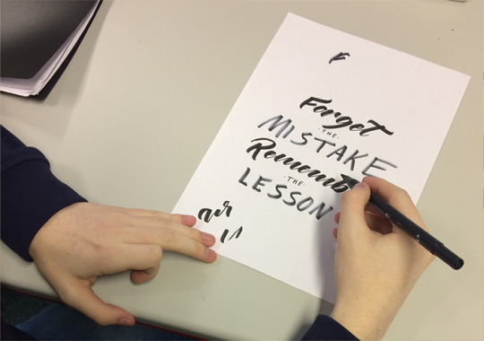
For the first poster, measuring the leading/kerning as well as the centre line of the page meant that once the letters were arranged, the outcome would have a mixture of organisation and roughness. Without the measurements, it wouldn’t reflect the style of Anthony Burrill which is what I wanted to achieve at first. The rough element came from the letters themselves being made from a block-relief print. This ensured that the visual language of the poster didn’t too closely reflect a digital process and maintained the authenticity created from an analogue process. After making all of the initial measurements on the A4 page, I started to isolate the letters of the type sheet, and for duplicate letters using the photocopier. Then I laid the letters in the position of the quote reading “Forget the mistake. Remember the lesson” before gluing them in place. The initial layout was fairly simple to do, and I thought it reflected Burrill’s style well.
For the next poster, I used a mixture of hand rendered and digital processes in order to accomplish a consistency in the composition whilst maintaining the authentic hand-rendered quality aspect. It was only until i attempted a fully hand-rendered poster that I realised it would be difficult to make accurate, as one mistake meant I had to restart. I made sure to restrict the colour to just black and white, and just add the colour later in the photocopier step. This was to make sure the workshop wasn’t over-complicated, and I didn’t go too far away from the Anthony Burrill references. To solve the issue of irregularity, I create each word separately, using a mix of marker pens and brush pens, before scanning them into photoshop and laying them out how I want to. What stood out to me at this step was how easy lining this up was digitally, as opposed to using rulers and pencils on paper, which was more time consuming and not as accurate.
After I created the initial black and white versions of each poster, with the photocopier I created distortions and different variants of them to experiment with how colour and composition effected the overall mood of the type. In contrast with digital warps on Photoshop for example, the photocopier technique allows for unique, authentic distortions which allows more room for experimentation.

As well as this, the roughness isn’t lost as it would be with a completely accurate digital warp. The colours were used after to show a contrast with how a simple colour change could completely change the effectiveness of a poster. One other thing I tried was the ‘venetian blind’ on the first poster. I previously looked at this from the work of Romek Marber (the artist responsible for the Penguin Crime Series covers). However in this instance, as I already used the photocopier to warp the type, I cut the poster into small slices and offset them to make a more sharp transformation. The effect of this was similar to the warp, but creates the disordered feeling in a more explicit way, with cuts instead of bends.
I found this workshop to be relatively easy, as typography is something I have familiarised myself with previously. However, as the workshop progressed and I moved away from the Anthony Burrill influence, I found it became increasingly tough to add my own twist to it. The hand-rendered and more abstracted areas of graphics are where I find myself to be least comfortable in creating something I’m satisfied with. I definitely felt this in the photocopier step the most, where I took a while to ‘loosen up’ and not worry about what the warp would do to it. I think in my work is a visual representation of my slight discomfort. In my second poster, I had the chance to use techniques I had learnt beforehand. But in the end, the class found my first one to be more effective at communicating the quote as they viewed it from the other end of the room. I tried to compensate for my lack of confidence with splatters, brush strokes and cursive lettering, which then distracted from the message of the poster.
What I have learnt from this is workshop is that a graphic doesn't have to be technically advanced to be effective. Moving forward I need to focus more on the audience, as that is what primarily concludes how effective something is. The audience in this brief being a younger audience means I also need to keep the element of excitement in my work to attract them to it as well as keep them interested.
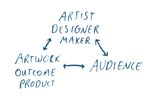
This is a diagram I made upon reading the brief and breaking down how to ensure the work I make will be effective. This workshop proved to me how making this diagram will be relevant when self-reflecting. In this case, reviewing the link between the artist, audience and artwork showed me where my work lacked in comparison to an effective piece of work.
Peer Review
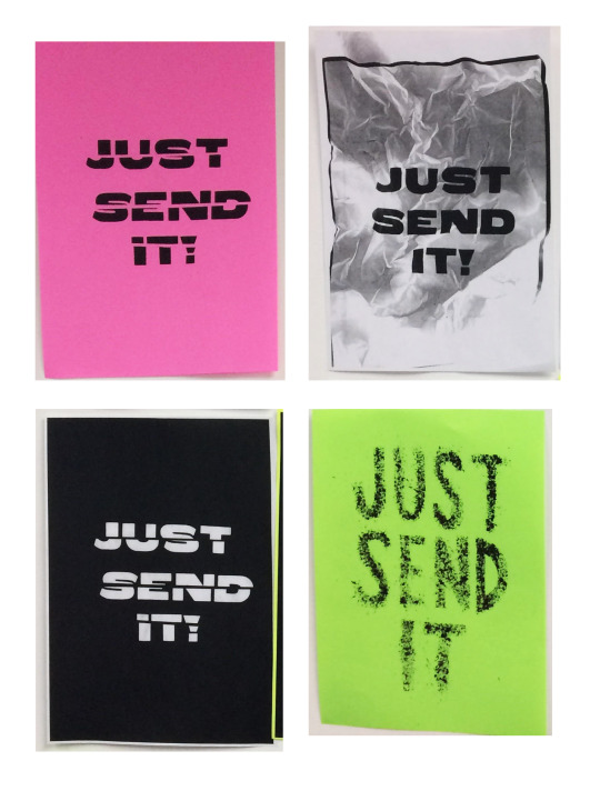
I find these “Just send it” posters to be the most effective out of the class. I find this because of the way the text has been manipulated to give a new effect to the way it’s read. The phrase is very direct, but after being dissolved/split there becomes an element of desperation in the line. It turns from an empowering message to a despairing one, which compliments the roughness of the textures created. There is a clear hand-rendered quality to the posters, which allows them to be seen as if they were original versions rather than photocopies.
In contrast with my own, where overall I gave a clean and readable approach, my outcomes (especially the original cut and stick version) seem to be more neutral and lifeless. With the photocopier, I created an effect which I believe the ‘Just send it’ posters do not. After warping the poster with the photocopier, it loses its accessibility with the viewer. By this, the text is no longer read as lines going down a page, but instead the words have been seemingly stretched sporadicly which causes the type to lost some eligibility. However because of this, a similar desperation that can be seen in my peer’s posters is created, even with a different process.
Where all of the peer examples above were created using mainly analogue processes, this shows how an outcome can differ when a digital process is used. Specifically my last poster variant. Because I made the composition in Photoshop with analogue assets, I only focused on how it looked on screen. Not taking note of how it would draw attention on a wall at a smaller size. Because of this, I think my fully analogue poster with the cut outs of the letters and all of the versions of that were more successful than my digital/analogue one, and I feel like this is due to the fact that I saw how the analogue poster would be applied as I was making it.
Moving forward, I need to evaluate how typography differs from digital viewing and physically seeing it on a wall for example. As well as this, although I thought about the audience with the first set of analogue posters, I got carried away with the digital element of the last poster, which meant it became less effective. So I just need to keep the audience in mind at all times in the future.
Linking to the Brief
The brief asks us to tap into the demographic of the younger generation, and I have broken down in my research how I can effectively do this and create something which connects with a younger adult. This workshop demonstrates something which I picked up on as a strong point in communication: making the message as direct as possible. The message in this case is always uplifting and inspirational, which is also a large theme throughout the brief. The direct nature of Anthony Burrill’s posters is what makes them so well received, and it is this quality which I wanted to carry forward, as previously I have sacrificed my outcomes’ function in order to make it ‘look better’. The aspect which I think could be implemented better, in terms of linking to the audience I am tailoring to, is colour. I feel like brighter, more vibrant colours would work better to attract someone to the message, especially someone who is younger. Burrill’s work does use appropriate colours, but in this workshop I restricted myself to black and white to focus on the composition.
0 notes
Text
Initial Research
After getting an understanding of what I was being asked to do, I started looking into past projects from other artists which promoted happiness through some sort of campaign or even just the style of their work. Whilst doing so I also kept in mind the visual language, so I could later analyse it further and extract elements which I could use in my own work. Taking part in research as early on as possible allows me to achieve a standpoint where I can make decisions which are backup up by an explanation. Without any research, all of the work I do towards my project becomes less valuable as it isn't backed up with any real context or reasoning.
The three campaign examples I chose were:
Leo Burnett - Homelessness Awareness Campaign
Coca Cola - Happiness Case Study
Noma Bar - Lyft Poster Series
I chose these in particular as I found them visually exciting and found similarities between these and the style of work I want to create.
Leo Burnett Worldwide

Leo Burnett is the world’s oldest advertising agency, being founded in 1935. They are based in America, but have an extensive number of offices and clients worldwide which makes them at the forefront of marketing. The campaign I looked into was commissioned by RaisingTheRoof and delves into the issue of homelessness. The project spans across many different mediums in which their message is portrayed. From street shops to donation boxes, the aim of this campaign was to shift focus towards children 15 and younger and the origin of homelessness in youth. Although the campaign spanned across a range of applications, the examples I have chosen to review are the Christmas cards. Being released around the Christmas holiday time, the cards incorporate the use of ‘christmassy’ colours on one half of the card, while the other half contains neutral read text with information about homelessness. The two sides juxtapose each other heavily, and in multiple ways as well. Firstly, the type. The left side uses cursive, monoline lettering being used as display type, whilst the right side is made up of a sans serif font being used as a read type. The effect of this is that the initial reaction to the card is exciting and uplifting, but upon reading the next page, there is a realisation that there is a serious issue in question. This is further solidified with the other elements of visual language. Next is colour. As mentioned previously, ‘christmassy’ colours such are red, green and gold are highly prominent. Red and green are distributed across the first pages of the cards, whilst the gold is restricted to the read text. This further creates a divide between the two styles.
As a contrast, the majority of homelessness awareness campaigns feature dark and gloomy imagery which is used to inflict empathy from the audience.
However what Leo Burnett has done is used bright-eye catching colours with the theme of Christmas to draw in a viewer, who is only lead to an informative paragraph. How this work grabs the attention of a viewer is extremely effective because of the way it uses the audience’s presumptions. The audience assumes that the card they are a looking at contains a classic warm message, but a shock factor comes with the turn around message on the second page. Another reason I think they chose the visual language they did was because of the nature of the audience. Being centred around a younger audience much like my project is, it is important for the cards to be visually tailored to a younger person. My moodpboard details the importance of keeping in mind the shorter attention span of the target audience. I think this is especially relevant in this example due to the way the visual language had been manipulated effectively. This could be something I look into with what I make in the future in terms of using bright colours to lead attention to a serious topic.
CocaCola

CocaCola did a full case study on happiness in the younger generation. I chose this as a research area as the audience of this study is the same as the audience that I am focusing on. The visual outcome of the study was an informational booklet (which can be viewed on their website) along with an infographic comparing generations. The illustrative style of this booklet is a minimalistic 2D style with a restricted colour palette only containing red, green, black and white. The effect created because of this is that it’s easy to read, and using plenty of negative space to hone in on the important information. This work is an example to me of how simplicity can enforce a message very effectively. Not only this but how to use very few colours to maintain a style whilst keeping the legibility of the illustrations.
Having stood for happiness and optimism since the foundation of the company, CocaCola has always been at the front of terms of popular culture. The youth represent the change in society, so it is important to encapsulate their support to maintain a long term dominance in a market. This case study acts as an informational commissioned study in order to understand CocaCola’s largest market, and along with this, being one of the first surrounding this topic.
The reason I find value in CocaCola’s research, is because it poses many questions which I hope to explore in my project. The most obvious link between this and my work is the promotion of “happiness”. Although this theme is relatively vague, CocaCola hones in on where happiness comes from in teens and the value of maintaining it.
The overall finding of the study which stuck out to me was how teens are now choosing to achieve happiness, rather than wishing it upon themselves which explains the ‘Choose Happiness’ campaign title.
This signifies a control which teens are taking over their own lives, and this is something I’d like to promote with my work.

Noma Bar
In a very similar style to the CocaCola work, an illustrator called Noma Bar uses flat simple colours. However what makes his work different is how he cleverly mixes objects together, and the cleanliness of the objects are Illustrated solely with digital processes. The intelligent crossover of two themes could be accomplished through the use of negative space to create an implied shape. Such as the oil poster, where he mixes the words ‘oil’ and ‘pinpoint’ with the shape of the hands creating a droplet in the negative space. A more direct example is in the first Lyft poster “bust a commute” where he replaces a shoe or a foot with a car. The effect of this is quite light-hearted, and gives Noma Bar’s work a trace of playfulness. This is also complimented with the style of his work which contains the use of simple shapes and colour schemes making it easier to digest. This is the reason I chose to look into his work, as its the style of work itself which causes a happy emotion, whilst in a similar way to the CocaCola illustrations, it connects especially with a younger audience especially.
Being inspired by this modern minimalistic style, I looked into other places where it was present. The first thing that came to mind was the evolution of emojis.
Emojis
Emojis are something which have become part of culture do to their extensive use in communication, predominantly between younger people. The most common have been stamped in society as icons for certain emotions. Most notably in the nature of emojis, is how they are visually constructed. The first design of the emoji, by Apple, consisted of vibrant colours and gradients to imply a 3 dimensional structure to the icon. As more companies started producing similar emojis, a more simple approach to the design became evident. This is where there is a link between the modern approach to icon design and Noma Bar’s work. I believe the visual language of them is so successful with young people due to its ease of communication.

Comfort Zone
This task was something I did to highlight what my current strengths and weaknesses are, as well as what makes me feel comfortable and what doesn't.

The inner circle, representing my ‘comfort zone’, contains:
Wealth
Learning/Experimentation
Digital Processes
Freedom/Security
Competitiveness
Illustrator
Photoshop
Advertisement
Typography
Logo Design
The outer circle, representing things I am not comfortable with, contains:
Confidence/Self-Confidence
Ceramics
3D
Future Careers
Physical Processes
Drawing/Illustration
Health
Paranormal
Focus
Procrastination
Talking
What is clear from this, is that I am confident at doing the work, but presenting it for a project is something I feel less confident in. In terms of this project, in order to get the best grade possible I need to sustain a high level of work throughout all areas, including presentation. Because of this, my actual outcomes are going to become less of a priority in comparison to the research and experimentation that goes into the work before it is finally produced. The main areas of design I feel least confident in are 3D and Illustration. Having already attempted 3D, I feel like incorporating some illustration into my final major project will allow me to come out my comfort zone whilst applying skills I have. Doing things outside of the comfort zone allows for me to find and grow new skills, which is crucial in design. The ability to adapt is critical with a constantly evolving target audience and market, which is why I plan on experimenting with Illustration in this project.
0 notes
Text
‘Popaganda’- Review of the Brief
Deadlines:
Proposal: 03/05/18
Practical Work: 31/05/18
Any Exhibitions: 09/06/18
Production Files/A5 Sketchbook and Blog: 15/06/18
Requirements:
Springboard Presentations: Recorded as a video and presented on my blog.
Project Proposal: This needs to be submitted for spelling and grammar checks on Thursday 3rd May 2018
Production File/A5 Sketchbook/Springboard of Images/Loose Work and Physical Objects.
Final outcomes presented in a professional manner.
Weekly blog evaluations/ final 500-1000 word evaluation.
I need to:
Develop and refine project outcomes ready for presentation
Explore how graphic arts and media can be used to promote positivity
Plan and present a visual outcome or campaign
Work on developing areas with specialist interest
Potentials:
Use of bright colours to engage a younger audience.
Motivational quote/imagery
Messages to do with well-being (health, mental health, self-confidence) - empowering.
Processes could include illustration, animation, poster design, advertisement etc.
Key Terminology:
Pop (Popular Culture): Current trends based on what is popular with the majority of people.
Propaganda: In the case of graphics, propaganda is visual information that lacks objectivity and is of a biased or misleading nature. Used to promote a political cause or point of view. This word has negative connotations as the most notable types of propaganda were from the second world war.
Subjective: Something which comes from someone’s feelings or opinions.
Objective: Something which comes from fact, no emotion or opinion is used to influence it.
Throughout this project I will focus on how what I create will effect how the audience views it. Helping me with this will be how I carry out my research into various artist techniques. Research is something I consider a weak point so I aim to diversify how I collect information through different types of sources. Along with this, how I choose to tailor my work based on the information I collect as opposed to researching without a purpose. As well as this, I want to develop my illustrative skills and perhaps use illustration within my final outcomes. This is because I feel comfortable with digital processes and feel like I can use analogue processes to create unique assets for my work. Which leaves illustration and analogue sketching/drawing as a weak point for me. The brief states that the young audience and positivity factors are major, meaning as I go through the project I need to ensure I keep these in mind. In my opinion, the influence of the younger audience will come down to how the visual language of my outcomes communicates with them. I aim to experiment widely with how each aspect of visual language (line, colour, shape, form, size and scale, texture and tone) will all impact the effectiveness of my work.
The main thing I have learnt over the previous projects that I will apply to this project, is how I need to focus less on making the outcomes look good, but rather communicating a message in the right way.
0 notes
Text
Development
Book Cover
Out of my initial concept sketches, the final idea I chose was the space idea. Being the setting at the climax and end of the story, I chose my book cover to revolved around it. I also chose blue as my main colour, as it complimented the multiple Iron Man figures and gives a lost feeling. As well as this, The Iron Man is described turning blue when he is given lots of food.

I used a block printing process to produce the Iron Man figure, and after separating it’s body parts in photoshop into separate layers, I used the puppet warp tool to make multiple positions of the Iron Man’s pose. Then, I placed them around the edge of the book to give focus to the middle contents as well as solidify the lost atmosphere.
Promotional GIF
The GIF was made as a promotional piece to promote the book’s release. Because of this, I designed it in the same style as the book cover itself. The animation of the Iron Man consists of him taking his own head off his shoulders, before throwing it loosely back into place. This links to the opening scene where the Iron Man becomes completely separated and manages to put himself back together. I tried to make the gif also have an element of childishness, so that children (specifically between the ages of 7-11) will be more attracted to the promotion.
0 notes