
Last Seen Blogs

foto50mm
50 millimetri

blacksbuildings2
Blacks Buildings

townofenvy
Bob 4 life

antares-ct-9905
Antares CT-9905

Photo
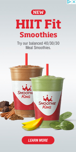
In this ad we see text in bright red at the top that reads “NEW HIIT FIT Smoothies” followed by “Try our balanced 40/30/30 Meal Smoothies” With a photo of two smoothies, the back left being a brown color with chocolate and cinnamon placed in front of it. The front right having mango and spinach in front of it. Lastly, we see a bold red button that reads “LEARN MORE”. The first thing I noticed was the number 40/30/30. At first glance I assumed it was a date for a promotion, however this isn’t possible. The ad contains little context clues as to what they might mean other than being health related. After looking at the site I found they were referring to percentage of calories from carbohydrates, fat, and protein. This vagueness may have been intentional, to get you to go to the site to find the meaning. It would also seem they are trying to reach a non-dieting market with the inclusion of a sweeter smoothie, and by referring to the product as “meal smoothies” instead of diet or fitness. The name choice however is strange as “HIIT FIT” doesn’t give a good idea as to what the product is trying to achieve. Also, by creating their own word they may confuse people searching for the product online who may type “HIT FIT” or “HILT FIT” instead.
0 notes
Photo
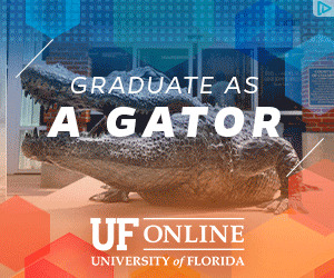
In this ad we see italicized text “GRADUATE AS” followed by bold “A GATOR”. Below this is the University of Florida online logo. In the center of the ad we see an alligator statue with what appears to be a campus building behind it. Framing the ad are various blue and orange transparent hexagons with an assortment of lines and dots, giving the ad a technology vibe reminiscent of the movie Tron. The ad serves as a heavy reminder that the University of Florida is home to the renowned Florida Gators football team. The colors used at the top and bottom of the ad are also the college’s colors, blue and orange. Overall the ad appears to be trying to dispel the taboo surrounding getting an online degree, by implicating that you still “graduate as a gator” by doing their online degree program. This ad is targeting teens and young adults with its aggressive imagery choices and colors. The ad then cycles the text to show various awards and favorable stats about the university in an attempt to further persuade those on the edge or not moved by the name recognition alone. It is notable that one of the stats are about the university itself, and not its online program, in somewhat of a misleading move.
0 notes
Photo

In this ad we se a dinosaur getting up close and personal with an African American man, wearing a Universal Orlando Annual Passholder lanyard with a UOAP ticket located inside. Below this is stated “Florida residents save up to $75 on all passes; Find your pass” followed by the universal logo. The image itself is actually a gif and features movement of the dinosaur and man. It’s interesting to note that the man is a young adult African American looking scared, as this goes against what Disney marketing, which usually features two mid-age white adults and small children having the time of their lives. Having been to both parks I would say the former is the more accurate of the two. The wording below is rather misleading as it states, “save up to $75 ON ALL PASSES”. In reality, savings vary from $20 to $75 depending on what tier of pass you purchase. Also of note is how the wording is setup. “SAVE $75” is bolded, and if you read from top to bottom it reads, “save $75 passes” all adding to the misleading marketing. Finally, it’s worth noting that the photo shown here is not actually feasible, that is the raptor shown is only found under a covered awning, not directly outside as shown.
0 notes
Photo

This ad shows a pool with palm trees with two lodge style buildings in the background. It is clear that they are targeting Florida/Georgia resort style living. I recall seeing in an article that pools were the number one amenity for a hotel, so it makes sense that it is featured so prominently here. It would also seem they are targeting a young introvert population, given the name and modern minimalist logo, and not showing anyone on the property. They are also targeting a more upscale market, as the ad implies the property is newer and heavily maintained, showing a clear pool without any particles floating and a deck that does not have any cracks in it. Adding to this is the fact they show them having separate buildings instead of one, or multiple, large towers. Lastly they choose to lease rooms on the property instead of rent, further adding to the value.The color scheme blue and white is very heavily represented in this ad in the logo, text, and photo, showing a blue sky and pool and white stones and buildings. White is likely used to promote high quality and cleanliness, and blue is used to promote relaxation and calmness.
1 note
·
View note