
Last Seen Blogs

yuppie-devil
Untitled

shadowchild13
Shadowchild13

kevcob
🌙

bunchofjjjjjjjjjjjjjs-blog
Jjjjjjjjjjjjjj

hydragoon42
Hail Hydra!
Text
Week 12 - Quick Final Change
After finishing my other assignments I had time to spare before the hand in cut off. So I did some reflection and decided to make a quick change to the sound. I unsubmitted and changed it so the sound at the end fades out better also made it so that when the triangle zooms in its at the same time as the whistling. So it sounds like the whistling/blowing is pushing the triangle forward
0 notes
Text
Week 12 - Hand In!!!!
What I did this week.
This week was hand in week and all that was left was to add sound, make any final changes and make a quick change to my type specimen book.
Sound
Finding a sound was difficult as I wanted to use a traditional Māori sound to match the theme. However, a lot of traditional Māori music is very slow and it didn't seem to match the rythm of my animation which is very fast (I have included one I experimented with in this post). The one I experimented with is being played by a Kōauau (Māori flute). However the one I ended up choosing is being played by multiple taonga puoro (different māori wind instruments) it also is still a very slow rythm however it is less like a song and more of a relaxing sound. I just felt that it fit right. The sound name is "He Whakae Kotahi / In One Breath" by Judy Bailey and Richard Nunns. I paid $2.50 for the usage of this sound
Time
My final animation was 5 seconds over time. However, this was done intentionally because I wanted the end credits to come on slowly in a typewrite motion and stay there for a while. This will stand out against the fast moving text from before from my pepeha. So I checked in with David and as long as it’s done intentionally it doesn’t matter if it’s even ten seconds over.
Transitions
I also changed the way the pepeha text transitioned. Previously each line appeared with a different animation. However after reflecting and having a conversation with David I decided to change it so that all the text came in with the same animation. This will give the animation a more cohesive look and look more purposeful.
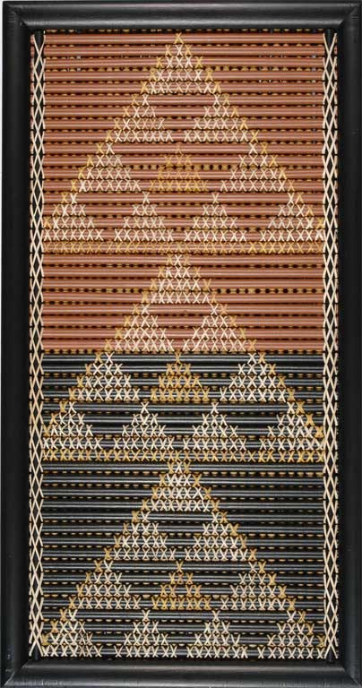
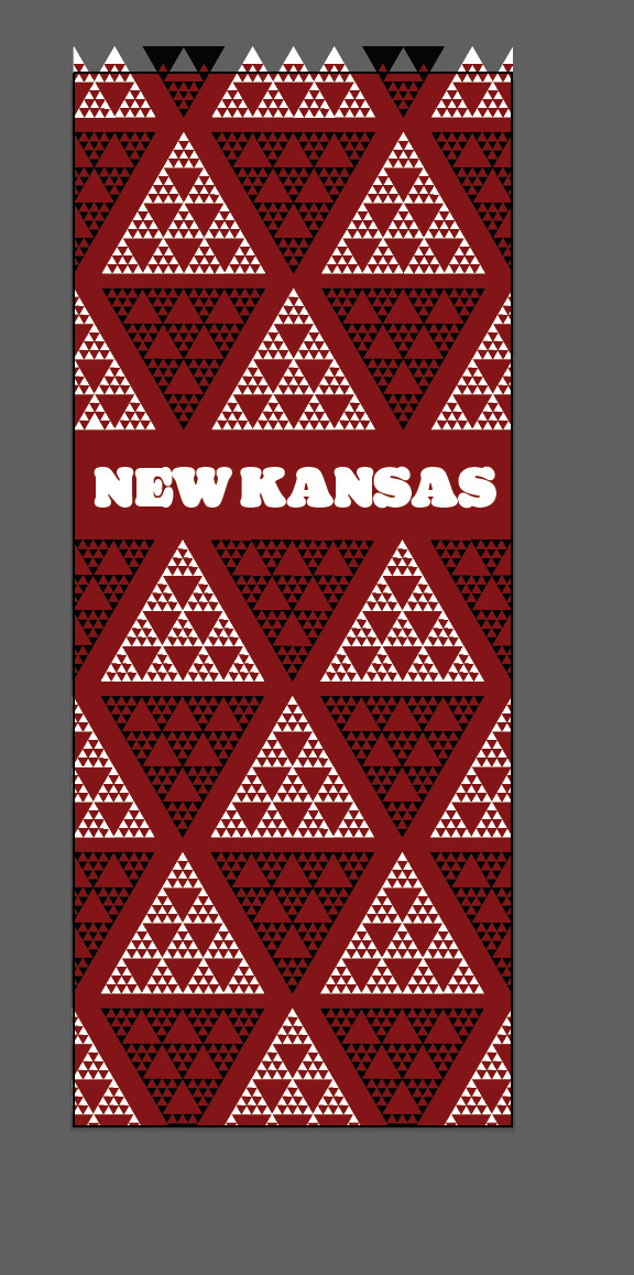
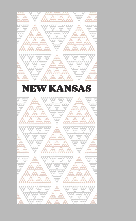
What the Triangles mean
I feel that I need to touch on the use of my triangles more than I have previously as they make up a major part of both my assessments, so I did some more research.
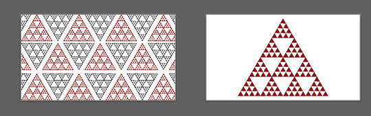
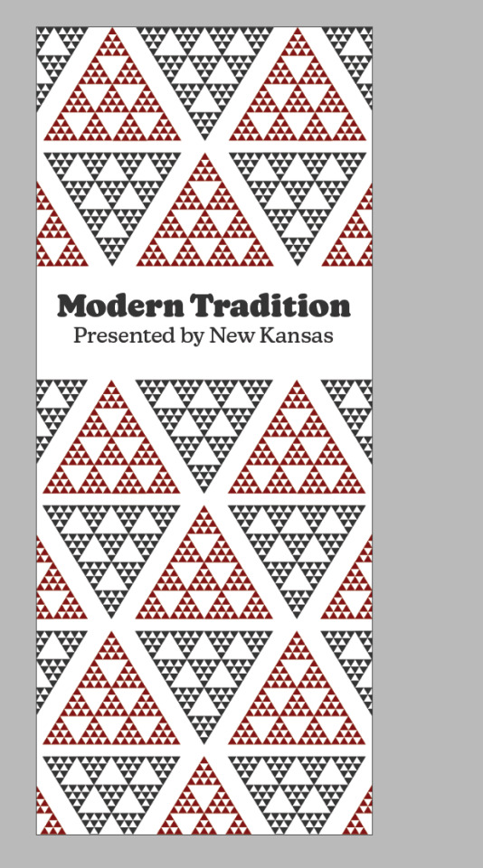
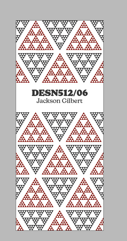
The pattern is called nihotaniwha (meaning dragons teeth and is a connection to the realm of mythology and the traditional māori stories that are told) and is designed from the traditional weaving pattern (photo attached of the pattern in a marae).
Specimen Book Update
I made on quick small change based on the feedback from my formative. Which was to move to rational pages to page 2 and 3. The other feed back was to make the text all the same font size (which it already was). Other bit of feed back was to increase the leading to increase the space within the text. But from a design perspective this would have meant that it wasn't perfectly square and in line so I decided to keep it as is for the design aspect.
Reflection
... And breathe. Wow what a semester. It just flew by so quickly and I can't believe how much I learnt. From never using In Design and After Effects to producing two different assessments using those programmes. Assessments that I am very very proud of. I can already see the improvement in my design thinking and I love the way the two projects connect and how it connects to my whakapapa. Not only have I learnt design skills. I have also learnt more about Māori culture along the way and more about my whakapapa which was very enjoyable.
Overall this has been a wonderful experience and I can't wait for next semester.
0 notes
Text
Week 11
What I accomplished this week
This week was all about adding type to my animation and finishing it with the credits. I knew what I wanted to happen for the first line of type from my hand drawn plan. That being the zoom into triangle zoom out of 'A', which turned out way better than I thought and look wicked. The next lines of type from my Pepeha I had no clue on how I was going to introduce them. I also had done nothing with type before in After Effects with my learning earlier on. So I went to work and watched ALOT of youtube tutorials to learn about the different ways to animate text in AE. After doing research on the different types of animation for type. I decided to keep a style of simple but effective ones. AE is amazing and you could honestly make one whole animation just animating one word. I felt the animations I used on the type were simple but effective and I amde sure to change the way each line is animated to keep it interesting and engaging.
Overall I am very happy with how it turned out and I think it looks great
Title
I also needed to come up for a title for my animation. I wanted it to be a Māori phrase so it looks like it belongs following my Pepeha. My whole theme for my animation is talking about who I am and I wanted to represent this in my title. So for my title I decided on the Māori phrase "Ko Wai Au?" meaning "Who Am I?". I think this really represents my animation and is a good title. It also matches well with the repetition of each line starting with Ko.
Next Steps
All that is left for my assignment is to touch base with David/Ezra to see if their is any last minute changes they think and get some feedback. I'm slightly worried that my type element is too small or simple so it will be good to get feedback on that.
After making any final changes to the Animation I then have to write me 1,000 word statement.
0 notes
Text
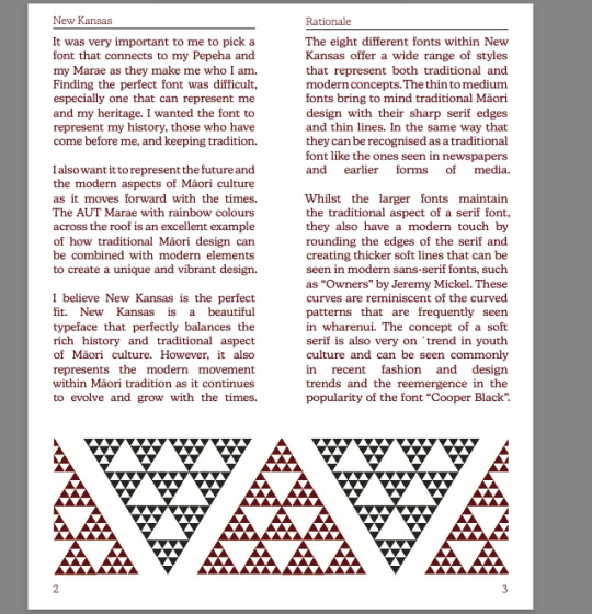
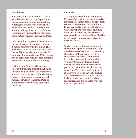
Hand In Rationale
It was very important to me to pick a font that connects to my Pepeha and my Marae as they make me who I am. Finding the perfect font was difficult, especially one that can represent me and my heritage. I wanted the font to represent my history, those who have come before me, and keeping tradition.
I also want it to represent the future and the modern aspects of Māori culture as it moves forward with the times. The AUT Marae with rainbow colours across the roof is an excellent example of how traditional Māori design can be combined with modern elements to create a unique and vibrant design.
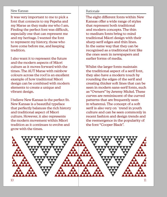
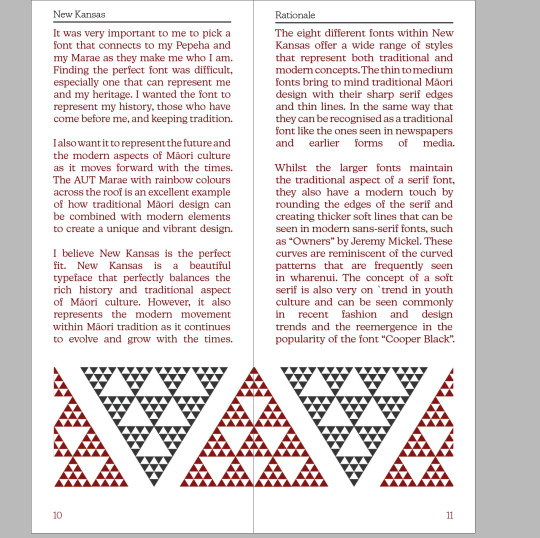
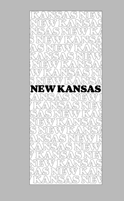
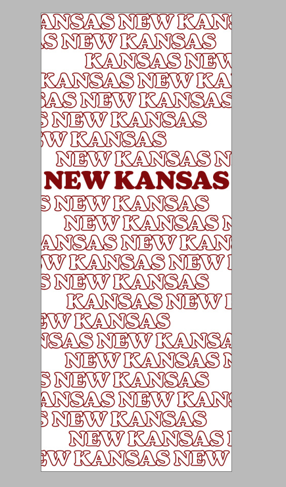
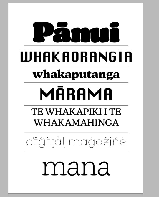
I believe New Kansas is the perfect fit. New Kansas is a beautiful typeface that perfectly balances the rich history and traditional aspect of Māori culture. However, it also represents the modern movement within Māori tradition as it continues to evolve and grow with the times.
The eight different fonts within New Kansas offer a wide range of styles that represent both traditional and modern concepts. The thin to medium fonts bring to mind traditional Māori design with their sharp serif edges and thin lines. In the same way that
they can be recognised as a traditional font like the ones seen in newspapers and earlier forms of media.
Whilst the larger fonts maintain the traditional aspect of a serif font, they also have a modern touch by rounding the edges of the serif and
creating thicker soft lines that can be seen in modern sans-serif fonts, such as “Owners” by Jeremy Mickel. These curves are reminiscent of the curved patterns that are frequently seen in wharenui. The concept of a soft serif is also very on `trend in youth culture and can be seen commonly in recent fashion and design
trends and the reemergence in the popularity of the font “Cooper Black”.
0 notes
Text
Week 10
What I accomplished
This week was all about creating the first stages of my animation. As discussed previously I wanted to bring back my pattern from type specimen book. Before then bringing in type elements. This first part took way longer than I expected it would. However, I am understanding that this will take time as it is my first project using After Effects so there is a lot of learning.
Despite this, I am happy with how it coming along and I think it has a very smooth look. The only issue is that it is already 15 seconds long. So I might look to slightly speed it up to give myself more time for the type elements.
Throughout the week I was slack at taking progression screenshots as I was so concentrated on just doing the work. I'll make sure to improve next week.
Next Steps
Next week is all about adding type to the animation. I know how the first line of my Pepeha will be introduced from my initial plan. However, I have no experience animating type so I will need to do some research and experimentation to complete this.
0 notes
Text
Week 9
This week I decided I'm going to change my idea for my animation. After talking to David I felt that my previous idea was too complicated and that I would spend so much time just learning the technical aspects of After Effects trying to do it. It would take too long and overall the animation would suffer from it. I decided to use my pattern from my type specimen book and develop it into an animation.
It makes a lot of sense to use the triangles as my animation is about representing who I am. The triangles do this as I'm linking my animation to my Marae and this pattern can be seen in many Marae and it lots of tradition Māori design
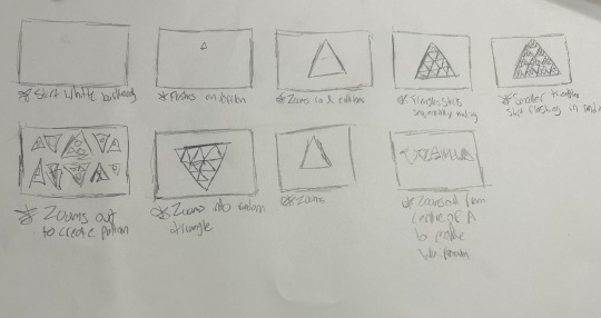
Since I am starting from scratch I created another new drawn plan of the animation and how I want it to play out. I wanted to build up the triangle from scratch and then have it duplicate into all the other triangles. I then created all the digital assets and shapes in illustrator that I will need to create the animation.
Overall I'm very happy with my new idea and am confident it will actually turn out better than the old one and am looking forward to starting the animation this next week.
0 notes
Text
Week 8
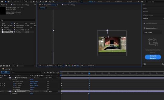
This last week has been all about learning the technical aspects of After Effects. Since I've never used AE before it was important that I caught up with the class so I have the technical ability to complete the assignment.
What I found very helpful was the LinkedIN Learning tutorial of intro to AE. I followed along to the tutorial to make a small animation (Top Video). This was VERY USEFUL. I was able to learn about movement across video, making it smooth, adding transitions to this and changing colour. Super helpful and i'll be able to use this in my assignment.
I then created a very simple draft of my idea for my animation. I was able to do it roughly but it's not very smooth. I think if I illustrate the Marae it may give it a smoother look than the photo. I also need to learn how to animate the perspective.
Overall I am really enjoying this however it hard to get started when you don't know the programme
0 notes
Text
Week 7
Just to clarify, although it is week 7, I am starting it as a week 1 for the second half of the semester as it is easier to keep track of.
(UPDATE) - I just fixed it and made it normal
This week was all about breaking down what is expected for the second half of the assessment.
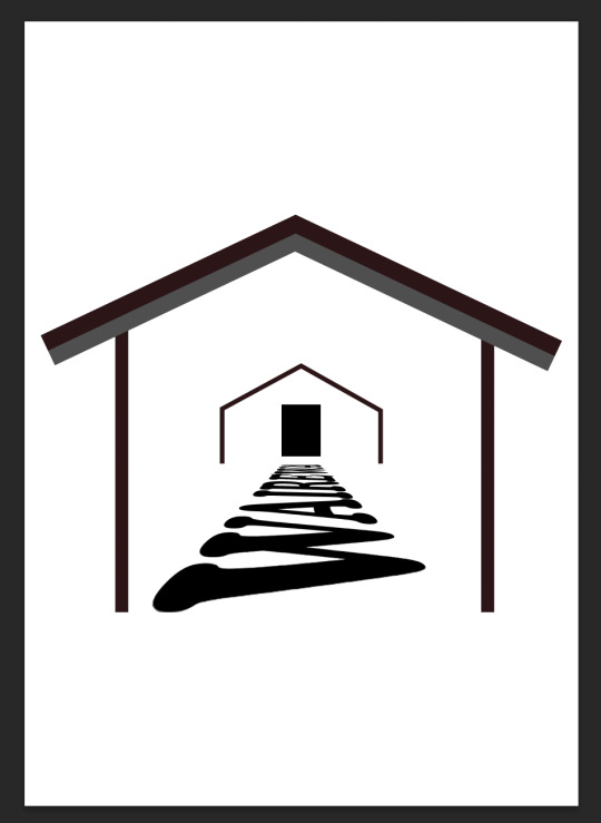
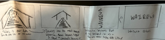
I started the initial planning for the animation. I wanted to continue to link my Marae to my typeface so it was important to find a way to link the two. I ended up deciding on using the word Wairewa (The name of my Marae) as the path from the Waharoa (Waiting area before being welcomed on) to the Marae itself. And then in the animation you will "Walk forward" over the path to the Marae and as you walk forward the word Wairewa will raise up to the centre of the screen as the Marae in the background fades up. The word Wairewa then rotates to become the main focus in the middle.
Overall I'm happy with this idea but i'm unsure if it will be enough and if I will have the technical ability to do it since i've never used after effects before.
0 notes
Text
Week 5-6 Update
This is a mixed blog of week 5-6. Since technically my week 4 blog was posted in week 5 about week 4-5. Sorry if it's confusing.
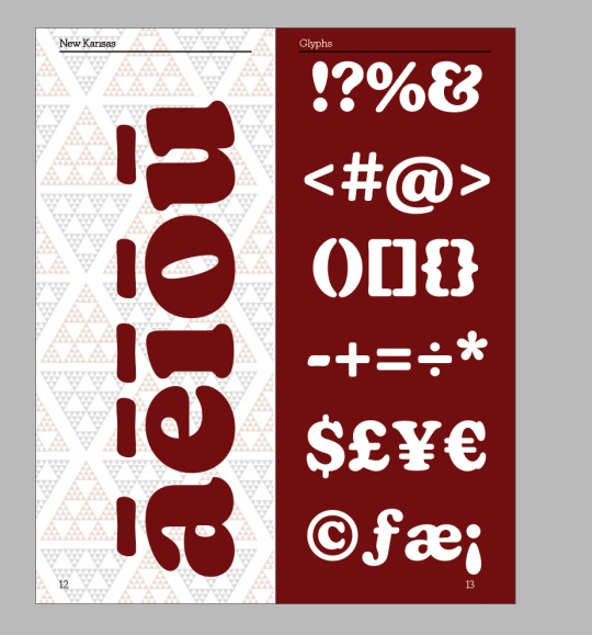
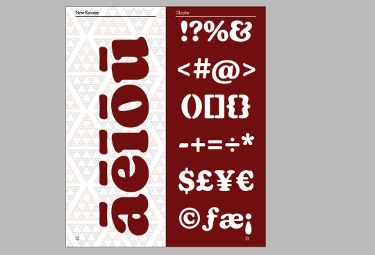
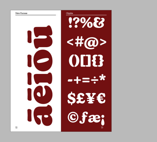
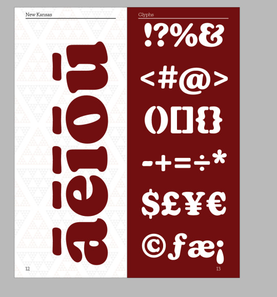
Glyph Page
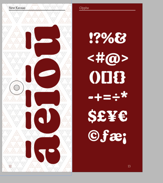
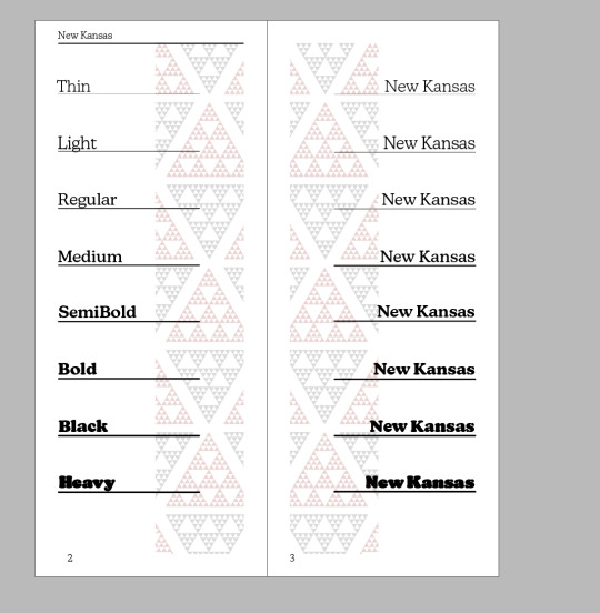
For the glyph page I had an idea from the start about what I wanted to be portrayed on it due to my thumbnail sketches. This made it very quick and easy to lay out the page. The next problem was making it cohesive with the theme and design of my book. I experiment with the āēīōū page and wether to go red on white or have my design in the background with low opacity. I ended up deciding the low opacity. Also after talking to David I decided to make the glyphs on the glyph page smaller as it was quite full on and in your face.
Body Test Page Revisit
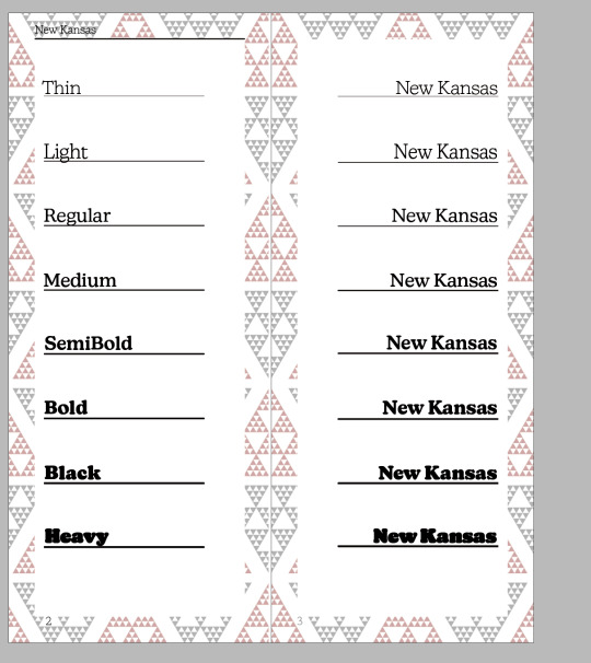
I did a quick experiment of adding my pattern to the background to the pages. It became too much to look at so I left it as it was.
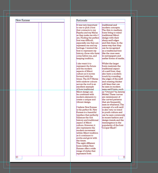
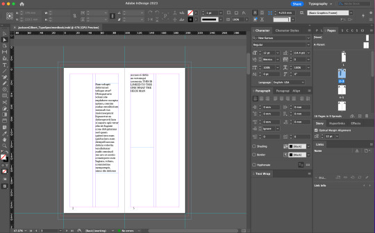
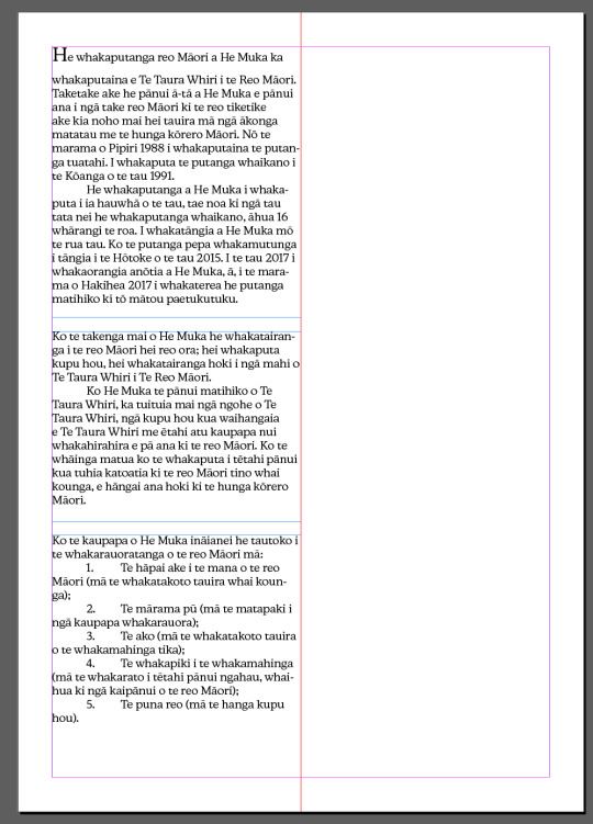
Rationale Pages
Now this was a struggle, finding a way to display 300+ words that is not only easy to read and follows design conventions. But also works as a design aspect. After lots of experimenting I decided to go for a single column on each page and justifying it fully to make it in a rectangle. And then adding a rectangle of triangles (if that makes sense) at the bottom out counter the lots of text above. I think these two together works well and i'm very happy with the final result
Design Pages
Somewhere in my book I wanted a page more about design using the typeface than actually breaking down or displaying the individual fonts etc. I did this so that people who are looking at the font can see it being used in a design aspect. This was really quick and easy as I used one of my concepts for my cover page and adjusted it for the double page spread and added the triangle pattern to the background and putting it on an angle to make it stand out against the repetitive horizontal text used for my rationale in the page before.
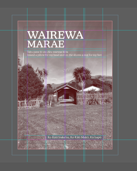
Front Page Revisit and Final Page
I revisited my front page and changed the name of the book to "Modern Tradition". As I felt it matches the font well and the reason I picked the font in the first places (it represents traditional Māori culture but also has modern aspects - read my rationale for more in depth analysis.)
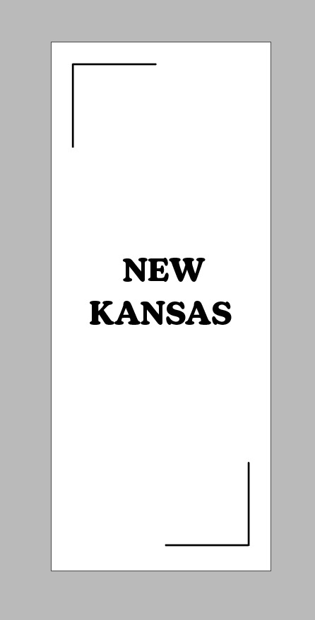
For the back page I kept it the same as the front page, so when it is printed it should wrap around and flow nicely together giving it a cohesive look. I kept the text simple with the paper number and my name.
Final Reflection
Overall I am very very happy with how my book came out, at this point in time there is nothing I would change. However, I am looking forward to getting some feedback and improving on it even more in the second half of the semester
0 notes
Text
Week 4 Blog Update
This week was a very productive week but was very full on however it was very productive. I'm currently 7 pages through my Type Specimen book and have a few of the next pages roughly planned out. I'm going to do a run through each page and my experimentation process for it following the order of the screenshots
Page 1
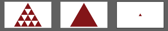
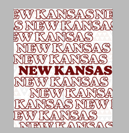
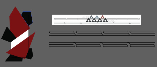
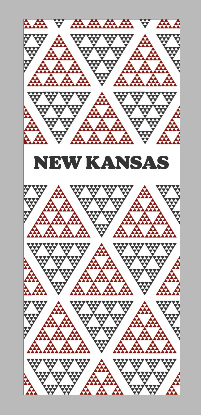
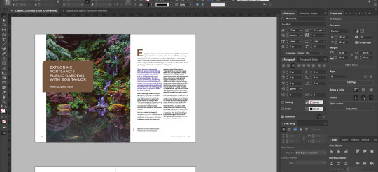
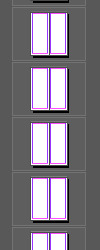
Page 1 is the cover for the book so it has to be strong, catch attention, represent what is going to be in the book and demonstrate my font well. I settled very early on for the colour theme of Dark Red, Black and White. This is because I'm connected my book to my Marae, my Pepeha and my Whenua. I first experimented with different random shapes in a Red and Black pattern also with repeating text but I wasn't happy with that. After doing some thinking and research I decided on going with the repeating triangle in a triangle pattern that can be seen in traditional Māori designs. With the final and biggest screenshot of this being my final/favourite choice at the moment.
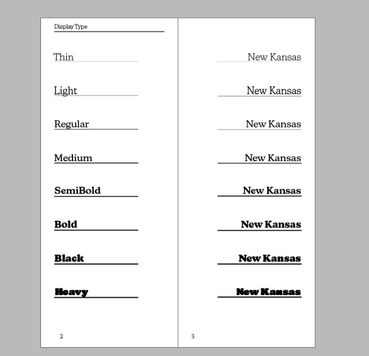
Page 2/3
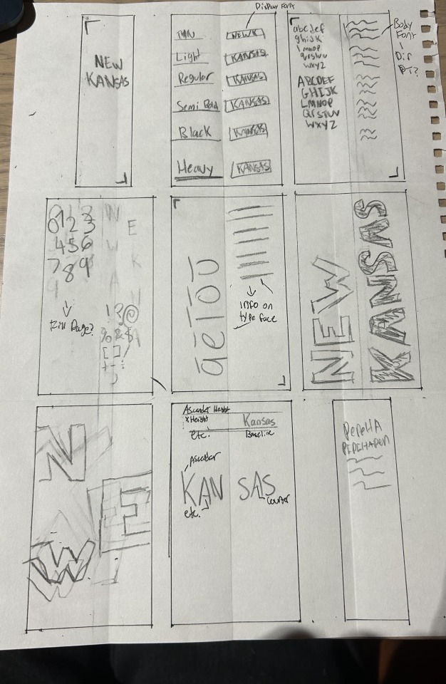
Next was the pages displaying the different typefaces in the family as display text. This was relatively quick and easy to do since I already planned out the page in the Thumbnail exercise last week (Which I found very useful). The next problem was figuring out a way to incorporate my design/theme into this page to keep the book looking cohesive. I ended up going for a pillar on each page with the triangle pattern. It represents the pillars that can be seen in a Mārae and also connect these two pages to the theme.
Page 4/5
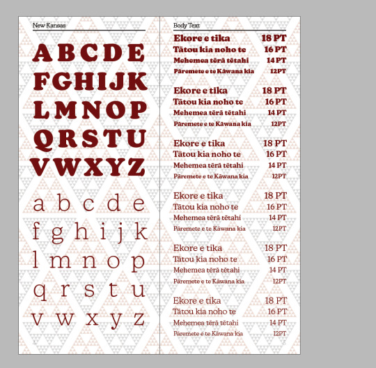
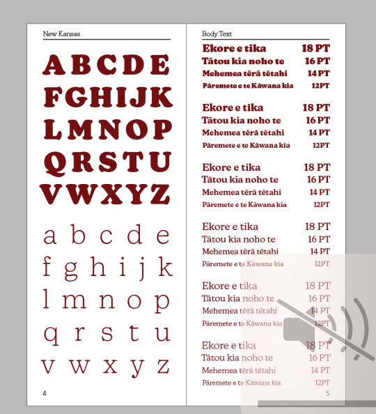
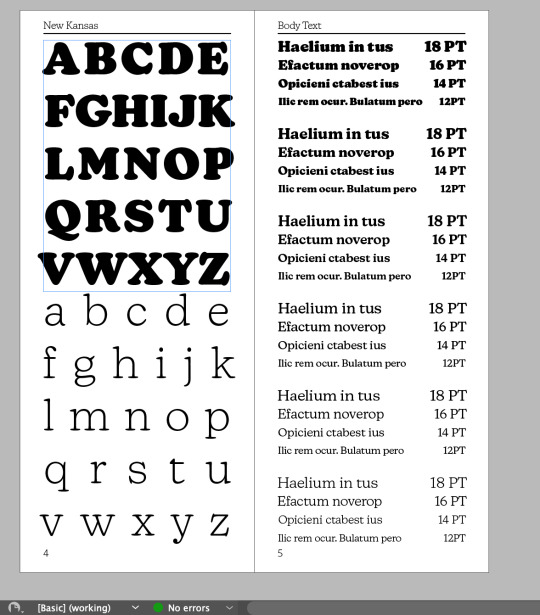
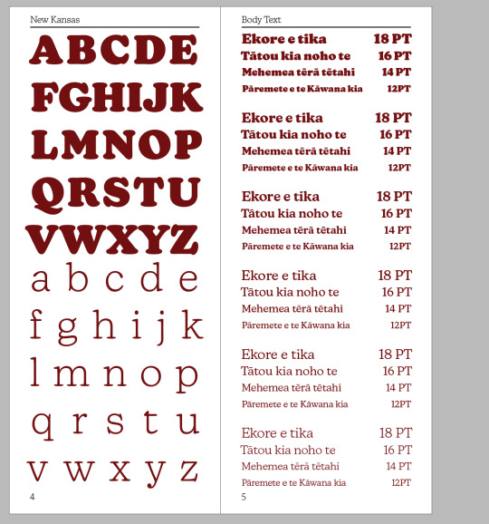
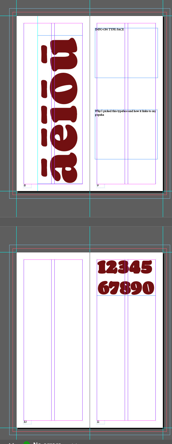
These two pages were about showing the alphabet in capital and lower case of the font and also showing the different families in different PT sizes. Due to the size of the page I had to leave out the biggest typeface and the smallest (Heavy & Thin). I don't have an issue with heavy not being displayed as it is more of a Display font than a body one and is illegible when used in body text. I wish I could show the thin font but I couldn't find a way to make it work. But as a solution I used the Heavy and Thin as the font for the two alphabets so they are still shown. The next thing for these two pages was making it match the theme as it was currently black and white. To do this I changed the colour of the text to the dark red I was using for the triangles. I also changed the filler text from Latin to Māori as it better fits my theme
Page 6/7
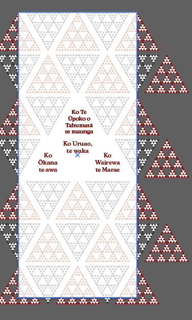
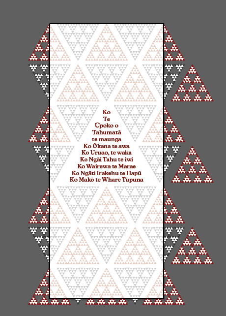
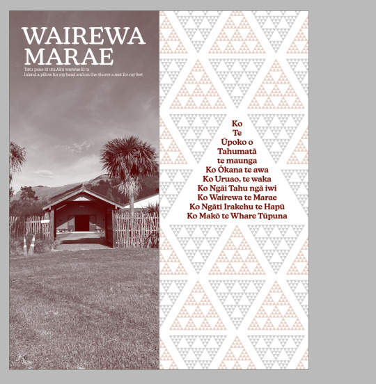
For these two pages I wanted a way to show my Pepeha with text and also image. So for page 6 I used aspects of my A3 Poster that I completed for SDL to show my Mārae. For page 7 I then used the triangle pattern to incoperate my Pepeha. With the Pepeha being the main triangle in the middle. The reason for this as I felt it looks similar to the entrance to my Mārae, therfore connecting to the two.
Page 8-10?
I then just did a very quick rough outline plan for the next few pages as I was on a good train of thought but it was getting late. This means when I come back tomorrow I can pick up where I left off.
Summary
Overall it was a very productive week completing just under half of my book which means I'm on track for submission next week. I'm also very happy with how its coming along
0 notes
Text
Week 3 Blog Update
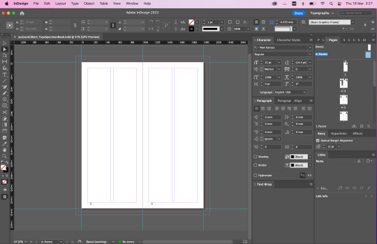
During class time we continued to develop our knowledge of typography and looked at some exemplars of some famous typographers and their typefaces they've created. We then looked into the science of layout. Wether that be laying out a poster or a type specimen book. We then in class used what we had learnt to lay out our type specimen book to the correct sizes and set the right bleed and margins etc.
We also learnt about parents pages which was extremely useful. I had already created my type specimen book file last week. But I started again and made a new one as there was new things about Indesign I learnt in the class that I wanted to apply. It also meant I could follow along with what was happening in class.
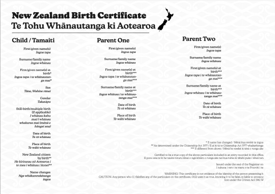
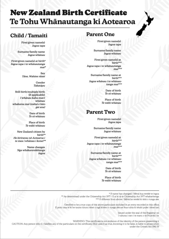
For SDL I completed the two New Zealand birth certificates. For my ones I wanted to keep it simple black and white to keep it professional as it is a legal document. But also have a bit of creativity in it that also links into New Zealand culture. With one having a silver fern pattern in the background, and the other a Māori traditional patter. In terms of what I added technically I changed the phrasing from Mother and Father to Parent One and Parent Two. This was so that it was more inclusive of all kind of parents and couples. I also added a Gender option underneath the Sex. This was so that if they want the Gender they identify with to be different from their Birth sex they could do so.
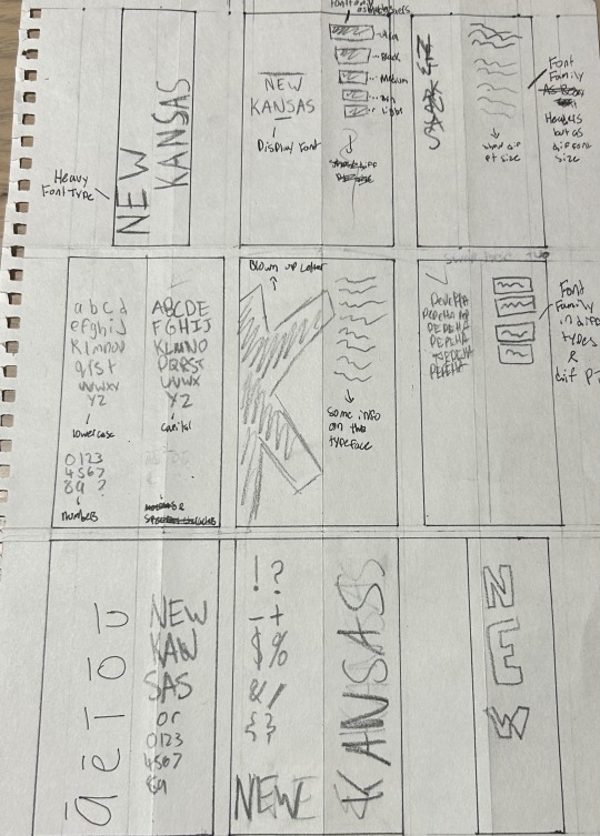
For SDL I was meant to complete four thumbnail sketches for my type specimen book. But due to poor time management and lack of creativity I only completed two. However, I am happy with the two I created and it helped me develop my understanding of what I need to put in my book and the kind of style I want to go for.
0 notes
Text

DES512 - Week 2 Update
Here is an update of what was covered and what I learnt in the second week.
Firstly in class there were two parts that really stuck out to me.
First was the technical breakdown of a font. The different technical aspects that make up each letter and sentence/font. This was quite interesting
The second part was the learning of using InDesign. I had zero previous experience with InDesign before this was so it was good to get my head around it however it is quite similar to other adobe suite software such as Illustrator and Photoshop. You can see the experimenting we did in class in the two first photos.
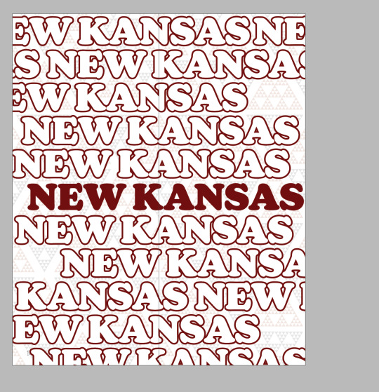
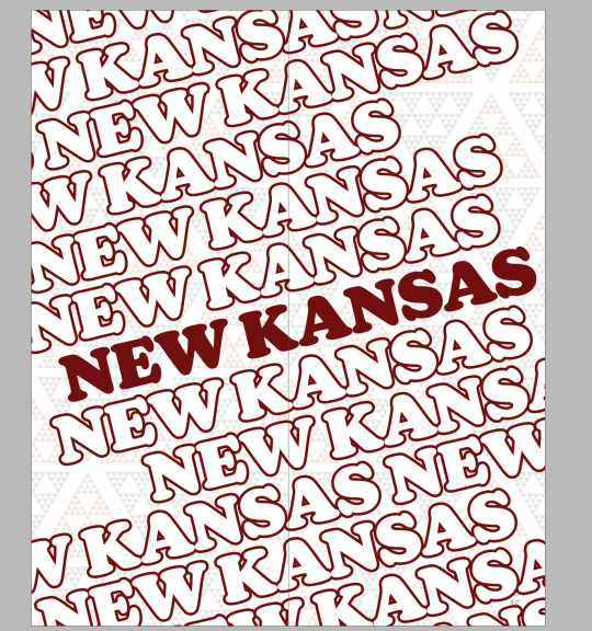
I then decided to change my my main font / type family that I was going to be using. As my previous one "Veneer" had no other family e.g Weight or Italic. Which made it very narrow to use. So I changed to a new one "New Kansas" as the difference between the Heavy and the Thin font are very different and can display different emotion and purpose but can also work well together.
For SDL I watched the first two chapters of the Linkedin Tutorials on using Design. I found it easy to follow and useful but it was also very simple.
To finish my SDL I created the 16page Type Specimen Document following the brief instructions. And also created four different pages for my Pepeha and experimented with using different Weight, Italic and Size.
0 notes
Text
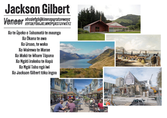
A3 Mood-board that represents me.
I chose the font Veneer due to it's imperfections inside of it. From afar it looks full and complete, but the closer you look the more you see the missing parts of it. I felt the font represented where i'm from -Christchurch. A city still healing from the earthquakes.
2 notes
·
View notes
Text
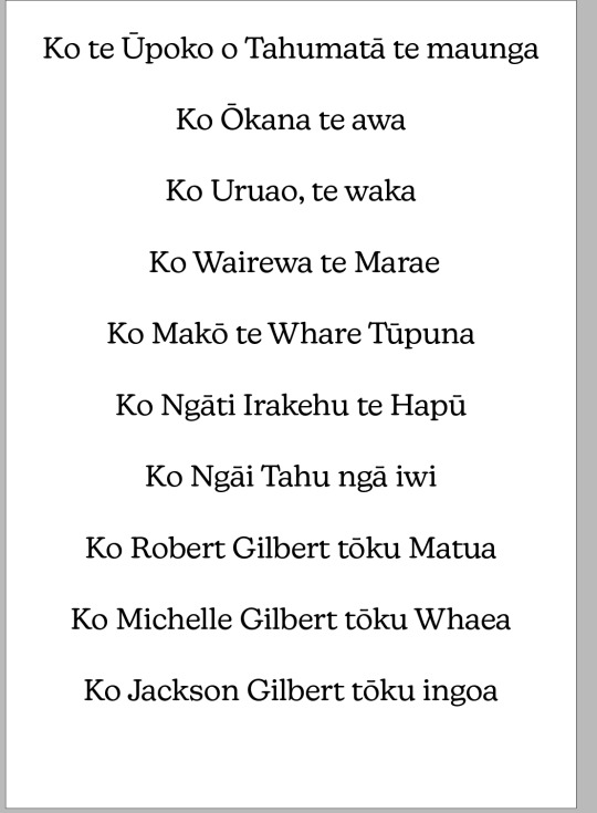
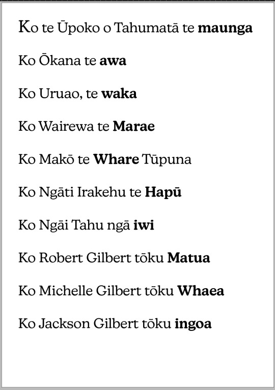
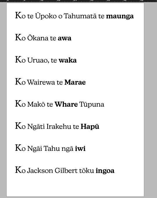
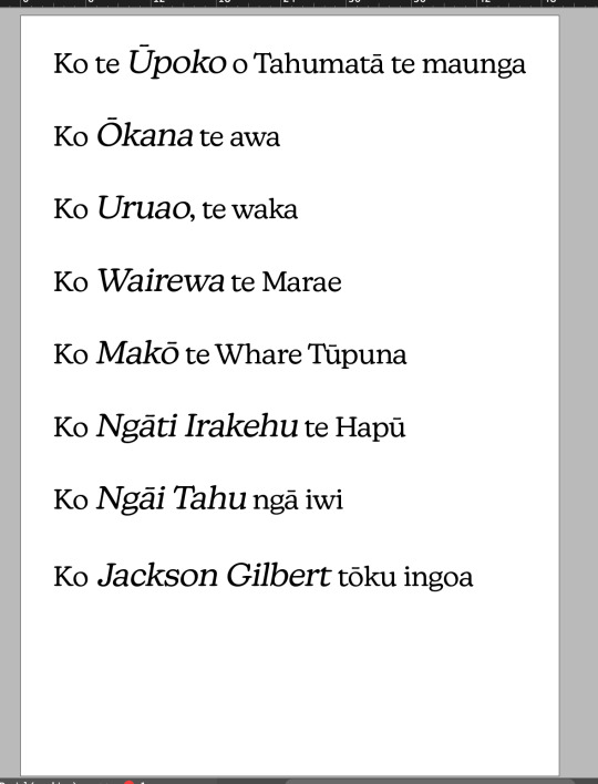
Pepeha
Ko te Ūpoko o Tahumatā te maunga
Ko Ōkana te awa
Ko Uruao, te waka
Ko Wairewa te Marae
Ko Makō te Whare Tūpuna
Ko Ngāti Irakehu te Hapū
Ko Ngāi Tahu ngā iwi
Ko Robert Gilbert tōku Matua
Ko Michelle Gilbert tōku Whaea
Ko Jackson Gilbert tōku ingoa
2 notes
·
View notes