
jackhenrydesign-blog1
Designography
Graphic Designer | Photographer | Amateur Curler | I am a Graphic Designer from Toronto, Ontario. I write about and comment on the Design and Photography I see in my daily travels. To see some of my work check out my website at www.jackhenry.ca.
5 posts
Don't wanna be here? Send us removal request.
Last Seen Blogs

thatguy2110
30 - Bi - Married - TX

kedu-love
Kedu Love

johnathan2010
Untitled

visfotovideo
IT Wedding Photography

diaryofarunninglady-blog
Run,Yoga,Vegan, Love
Photo
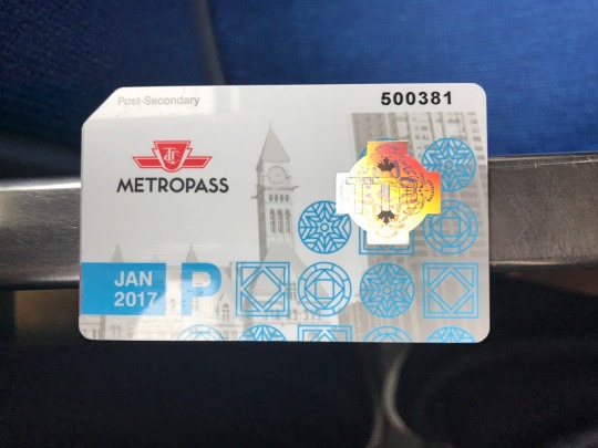
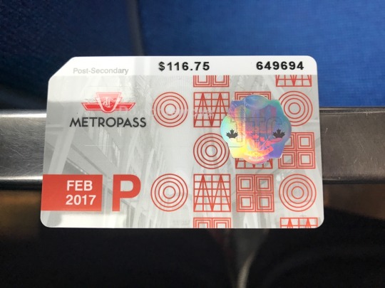
Print - TTC Metropasses (Yet Again)
How can the TTC get it so wrong (see my last post regarding the Union Station Mural) but also get it so right at the same time? Two years ago on the old Designography Blog I posted about the good design of the TTC Metropasses and then last year they got even better and now they have gotten even better.
This year the TTC is featuring a different architectural landmark in Toronto similar to last year however they are putting that landmark in the background and decorating the foreground with simple geometric patterns found in the architecture of that landmark. So far the passes have featured Old City Hall and the TD Tower.
I think that this is a great way to showcase some of the great buildings we have in Toronto while keeping the Metropass designs fresh and exciting.
I am excited to see what landmarks 2017 had in store, what landmarks should be on the Metropasses this year? Let me know by tweeting to @J_C_Henry!
1 note
·
View note
Photo
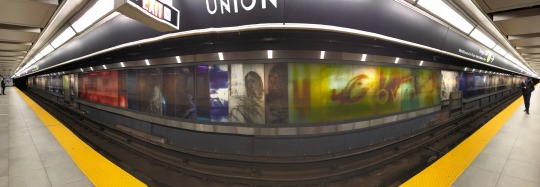
Environmental Graphic Design - Union Subway Station
Can we talk about the giant glass Elephant in the room at the Union Subway Station? The new platform and renovations to the TTC access hub completed almost two years ago and everything still looks decent for the most part but the Elephant in the room is the big glass mural designed by an Environmental Design Professor from OCAD University, yes, my school!
I have given the installation every chance to “grow on me” since it’s installation and even waited for the station to be finished before saying anything. I am finally saying it doesn’t work, it’s depressing, it’s dark, it’s bleak and it’s gloomy.
Now my friends in art might say not to bash an artists work until you’ve read the artists statement, so I did some research. This is a quote from the artist from an article in the Toronto Star, ‘The artist himself explains that his goal was to create an authentic reflection of what it’s like to ride the subway, by capturing both its lighter and more melancholy moments. “It’s a bleak world down there,” Reid said in an interview. “I wanted to make it beautiful in some way, but I didn’t want to make it phoney beautiful.”’ and 'Reid likened his piece to listening to the blues when you’re already feeling down. “It meets you where you’re at and deepens that experience,” he said. “We are constantly in this world of being distracted by ads to the Bahamas and promises of advertising … This is to say, ‘here’s where we are, this is our life.’ ”’ Ok thats fair, the artist wanted to remind commuters how depressing riding the subway can be? That’s great but speaking as one of those riders, we don’t need to be reminded of that.
I’m not saying that the piece itself is a bad piece, it’s conceptually and technically a strong piece of art, but that’s exactly what it is ART not Environmental Graphic Design. It is better suited for the walls of the AGO than the walls of Union Station.
1 note
·
View note
Photo

Print - TTC Products Ad
Riding the TTC recently I have noticed a series of ads for TTC related products such as coffee cups, laptop cases and pillows. These ads are different from the standard Print Material that I have seen and along with the new Metropass designs, they are leading the way to giving the TTC a more modern feel.
I think that the minimalist and cleanliness of these posters really work well especially in the environment of the Subway Car where there are so many, busy poorly designed advertisements trying to get your attention. The TTC uses a shot of their products from dynamic angles and pairs those with a clean sans-serif type face that uses the colour Red to really grab your attention on “taking the TTC home” and causes the viewer to think about taking the TTC home in a different sense.
What do you think of this shift towards a more modern approach to the TTC’s brand? Comment to @J_C_Henry
0 notes
Photo

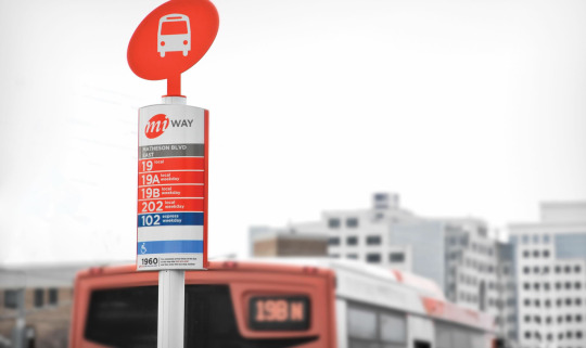
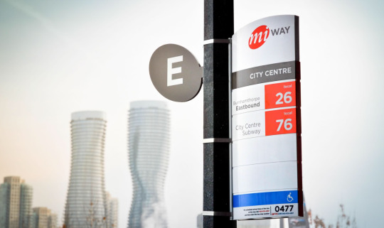
Branding - miWAY
Entro Communications
I was born and raised in Scarborough in Toronto’s East End so going across the city to Mississauga for an interview is a big thing, especially since I was taking Public Transit. On my way there I noticed something that many locals may not pay much attention to, the brand of miWAY, Mississauga’s Public Transit System.
The miWAY Identity System was designed by Entro Communications’ Toronto Office whose other notable works include the UP Express Brand, the VIVA and VIVA Next Brand and Union Station’s Environmental Graphic Design.
miWAY’s brand position was to offer “an easy and stress-free” Transit experience. The name “miWAY” is simple and memorable and allows riders to take ownership of their Transit System.
The design is a clean, modern, unpretentious approach to Transit Agency Branding. The brand comes across is friendly and casual and is integrated into every aspect of the system right down to the Bus Stops.
The Bus Stop markers are well crafted pieces of design on their own, quickly and concisely giving the viewer information as to the stop name, what routes stop at that location, what direction they are headed (eg. Eastbound to Burnhamthorpe) and whether the route is Local, Express or Weekday Only Services.
Entro has created a Corporate Identity System that works together in all the places where it needs to. In contrast the TTC branding with the Red Ribbon and serif font on the initials comes across as stuffy and outdated and the Bus Stop markers don’t communicate what routes they service or when those routes run which makes traveling the system confusing for those that may be new and unfamiliar to the area they are in or to the system as a whole.
Over all, Entro created a successful Identity System for miWAY that makes it easy for those like me that are new to the system to find the proper Bus Route and get to the interview on time.
Comments? Tweet me at @J_C_Henry.
#missisauga#miway#entro#communications#entrocommunications#transit#branding#corprate#identity#graphic#design#environmental#graphics#wayfinding#signage#public
1 note
·
View note
Photo
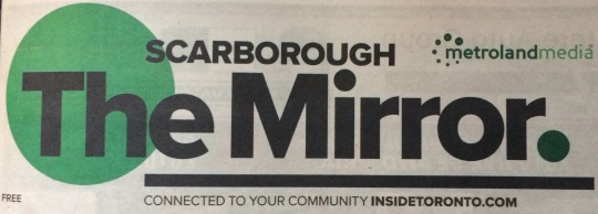
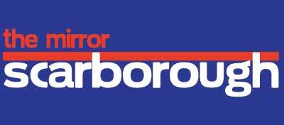
Branding - The Scarborough Mirror
I just recently noticed that the Logo on the front of one of our Local Newspapers The Scarborough Mirror was different than it was. The new logo is above at the top and the old above at the bottom. The Mirror is owned by MetrolandMedia who operates Mirror Newspapers in other communities such as East York.
The most interesting thing that I notice in the new design is the change of hierarchy. In the old design the community that the paper was circulated in was the first thing you read whereas with the new logo shows the name of the paper more prominently which I think takes away from the message of being a Community Newspaper if they put the brand before the community name. They also have gone to a standard Black and Green colour scheme in the new logo where as they had a different colour scheme for all the communities that they published in and I think that that gave each community a unique identity.
I do think that the logo needed to be redesigned to be more modern but I think that there were better ways that it could have been done. They could have kept the individual colour schemes and hierarchy of the original logo and modernized the font and design to something like the new logo to update it.
Let me know your thoughts, Tweet me at @J_C_Henry to join the conversation.
0 notes