Last Seen Blogs

roper1974
Boots, bondage and gear.

somefandomsandpuns
booh

lemon-dem0n
кривые рисунки🧼

silversolutions
Silver Solutions

Text
Post #3
Source: https://www.pentagram.com/work/design-research/story
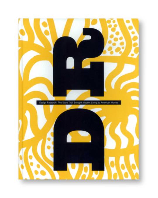
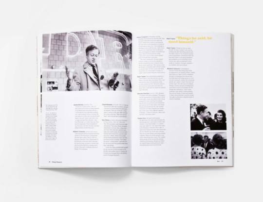
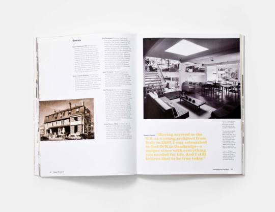
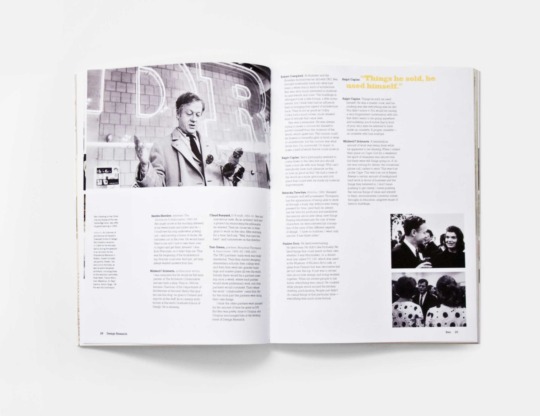
This book is full of work from postwar America and is built to tell the story of the designers that created "Design Research". This book is broken into a 3 grid system and uses boldness and colored text to emphasize hierarchy. Some images run off the page and some follow the margin. The book seems to be very unpredictable when each page is turned.
This project is about the story of Design Research and how it was the first retailer that made good design available to everyone. It is made from scrapbook findings and written and edited by Jane Thompson.
I really like the colors used in this design. The photos are black and white because they were taken from postwar American times, but the yellow gives it a vibrant pop and the vision of hopefulness. This book us very unique in it's color choice.
The design of the cover and the layout of the pages is what compelled me to choose this book to write about. It is a very appealing design and I think it tells the story of the beginning of "Design Research" very well.
– Hanna Cope
0 notes
Text
Pentagram - Post #3


Source: https://www.pentagram.com/work/design-research/story
This book is full of work from postwar America and is built to tell the story of the designers that created "Design Research". This book is broken into a 3 grid system and uses boldness and colored text to emphasize hierarchy. Some images run off the page and some follow the margin. The book seems to be very unpredictable when each page is turned.
This project is about the story of Design Research and how it was the first retailer that made good design available to everyone. It is made from scrapbook findings and written and edited by Jane Thompson.
I really like the colors used in this design. The photos are black and white because they were taken from postwar American times, but the yellow gives it a vibrant pop and the vision of hopefulness. This book us very unique in it's color choice.
The design of the cover and the layout of the pages is what compelled me to choose this book to write about. It is a very appealing design and I think it tells the story of the beginning of "Design Research" very well.
– Hanna Cope
0 notes
Photo
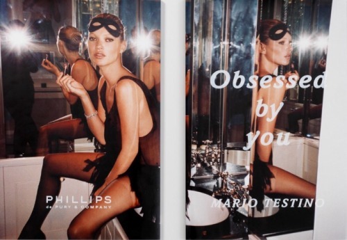
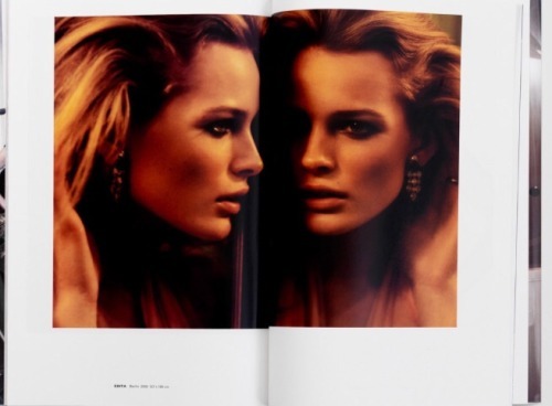
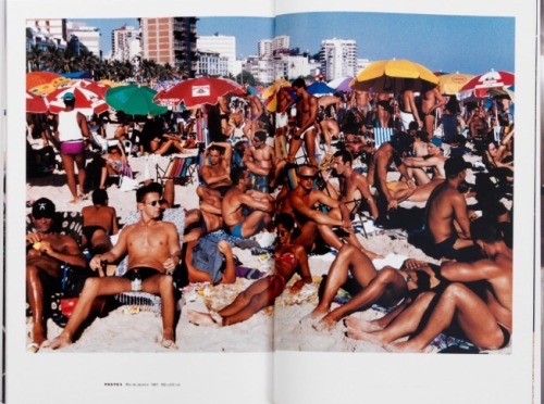
Obsessed by you
http://www.morganstudio.co.uk/project/phillips_de_pury_exhibition_catalogues
The exhibition was a collection of Mario Tedtino’s work from books, and advertising from VanityFair, Vogue, the Face and Visionaire. The art work consists of models such as Kate Moss, bathing models, and landscapes.
The bottom margins are larger than the others but not to big to create dead space. There is no folio. There is a two column grid. All caps and bold font help with hierarchy. John Morgan created this exhibition catalog. The full page spreads give the images a monumental feeling.
Kathleen Moneyhon
0 notes
Photo
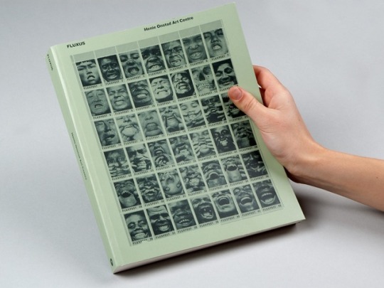
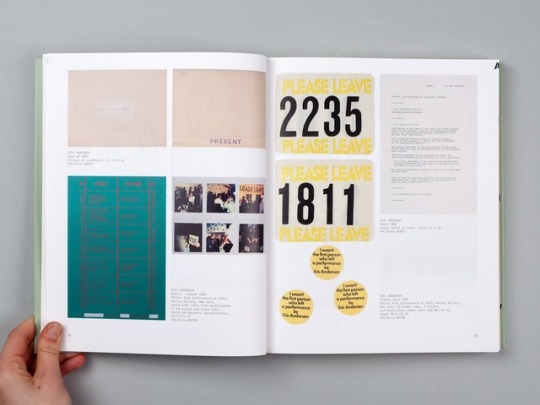
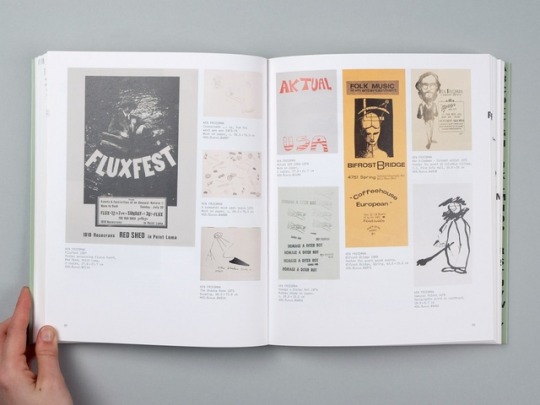
nhttp://nodeberlin.com/archive/fluxus
This catalog documents art from the fluxus movement. An international and interdisciplinary group of artists, composers, designers and poets that took shape in the 1960s and 1970s. This catalog serves as a reference tool. It has a 6 column grid. It shows off the the art while keeping the information suttle and contemporary. It's very aesthetically pleasing yet easy to read and navigate through. This catalogs target audience is probably artists who like niche art movements.
0 notes
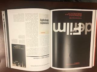
Text
Erin Ckodre - Post 3


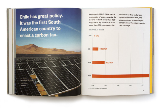
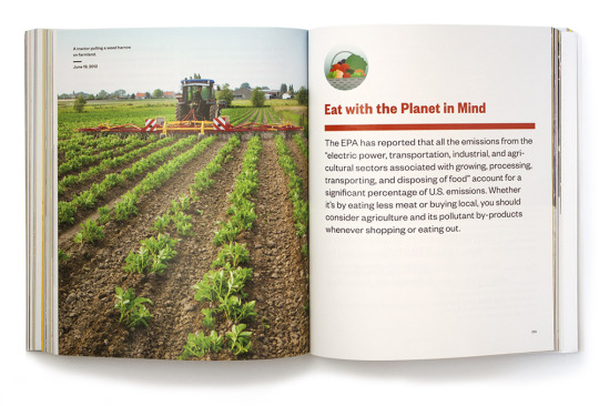
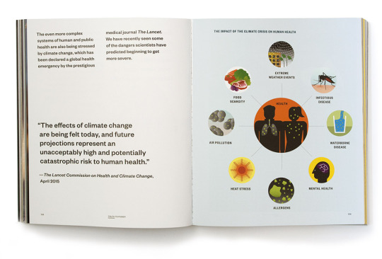
An Inconvenient Sequel - Truth to Power by Al Gore explains the science of climate change and how we can help as citizens. This exhibition catalog was designed by MGMT’s Melcher Media team for those who want to be the change they see in the world.
The layout and design uses full-spread photos and graphics; overall there aren’t that many words per page. This book is supposed to be easy to read for the layperson to understand the science behind global warming, and I think the layout reflects that.
I can’t pinpoint the exact amount used, but I would guess that it is either 5 or 6 columns judging by how flexible the grid is. The page is 500 × 678 px, the margins are 3p0, position of folio is on the outside bottom margin while the title lies center bottom, and the typeface is a sans serif with varying weights.
Source: http://www.mgmtdesign.com/work.html?id=1,8,253
0 notes
Photo
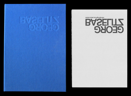
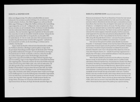
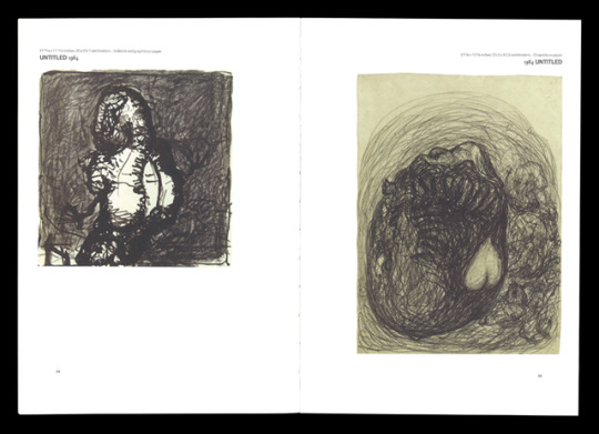
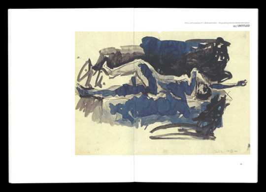
“Georg Baselitz.” Hillary Greenbaum, hilarygreenbaum.com/projects/georg-baselitz/.
Featured content is text by Baselitz’s friend and scholar, Siegfried Gohr, and Baselitz’s work from his 2007 show at Nyehaus. On the text pages, the header is bold and all caps to separate itself from the main body text, and the folio is placed in the bottom outside margins. The pages with photographs are very much the same, however the header features both a san-serif and serif typeface to separate the different pieces of information, such as title and year (using Old Style). The inside margin is larger than the outside margin, pushing the text almost outside the catalog, while avoiding the loss of text to the gutter. Overall each page on a spread, regardless of the type of content is organized in a mirror-like structure. This idea is supported through the concept of presenting the exhibition and catalog as a bilingual body of work. Even so, just as the act of translation doesn’t always carry a message’s original intent, the text differs for each language through the use of a serif for the German writing, and a san-serif for the English translation. In terms of a grid, text and images remain aware of the consistent outer, inner, bottom, and top margins, as each object seems to align accordingly to touch these margins.
The project is about German artist Georg Baselitz and his work from the 1960’s to 70’s, as featured at Nyehaus in New York in 2007. The catalog features an essay by the aforementioned Siegfried Gohr. The catalog was designed by Hilary Greenbaum during her time at Helicopter LLC, under the direction of Ethan Trask and Joshua Liberson. The audience includes fans and critics either visiting the exhibition or those unable to attend.
The treatment to address the exhibition’s bilingual nature is what I find makes the catalogue unique, particularly through the reflected pages and use of san-serif and serif. The cover is another demonstration of this idea as it turns the title upside down and letterforms remain recognizable, showing another way our brain translates messages across languages.
In terms of reading experience, I find the structure and design to be fairly helpful in the readability of the content. Enough white space is given to the appropriate margins, allowing the eye to locate and focus on the given content, ultimately as well as rest. I appreciate that the content is allowed to be viewed in its own setting, as it takes up the most space it can on a page and as the margins act as a frame.
- Katia
0 notes
Photo
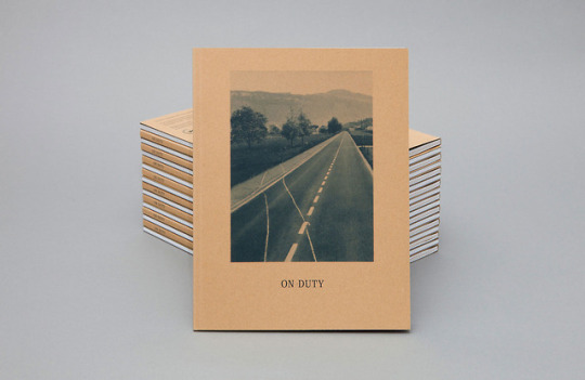
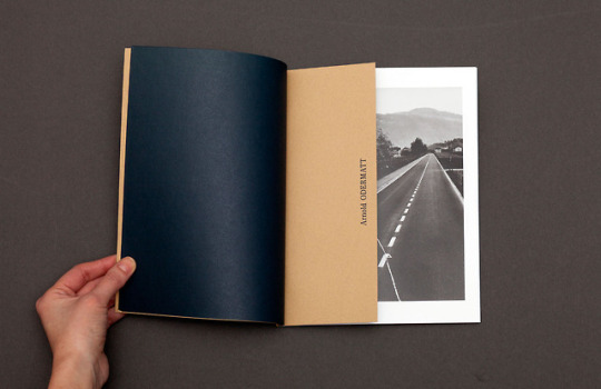
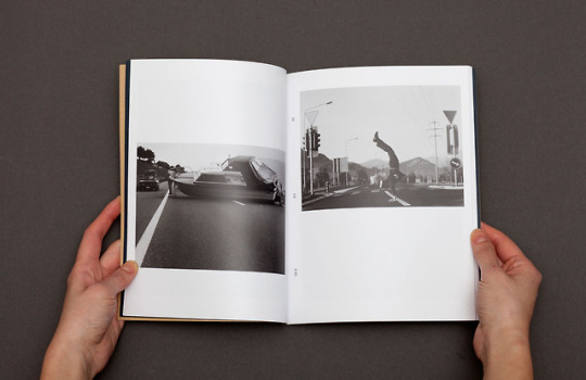
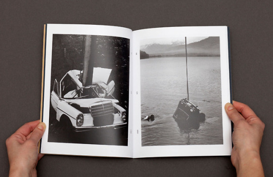
Edited by Leo Koenig and Derneberg publications --- On Duty is a collection of photos taken by three unique individuals: A Swiss police man, a Mexican photojournalist, and a photographer from New York. The photos they take depict the incidents and/ or accidents they see when they are on duty.
The lack of description or caption under the photographers allows the viewer to imagine and wonder about the stories that lead to these freezes in time. I think this catalog could speak to photographers, filmmakers, painters, and anyone who tells stories through art.
The catalog starts with the forward. It informs the reader of past artists who made stories out of everyday items, each of the photographers’ intents in the catalog and the specific style of each of the photographers. The main content of the book is a showcase of the photographs taken by each individual. The placement and size of each image is different across the spreads. Spreads with shorter images allow for more white, empty space. The designer made use of the white space by creating balance, hierarchy, and dynamic layouts.
Text that is not in the forward, is presented vertically in the inside margins of the pages. It is also placed on brown half sized flaps. I think the designer chose to orient the text this way to add to the verticality of the book and all its content. Many of the visually elements in the book are presented vertically with a long and skinny look; elements such as the photographs, the 2 columns of the forward, and the half sized flaps dividing the book into different sections.
The way these bizarre photographs fit into a modern and orderly structure makes this catalog unique from other catalogs.
The structure of this book conveys a mysterious mood. Elements such as the road leading to no where on the front cover, the absence of captions, and the nature of the black and white photos add to this feeling of mysteriousness.
Lauren Carter
0 notes
Text
Jazmine Beatty Post#3
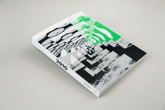
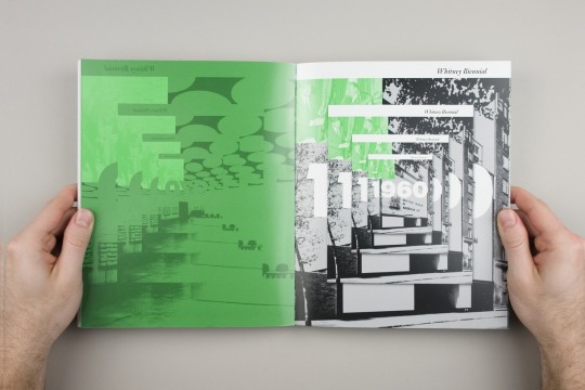
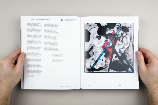
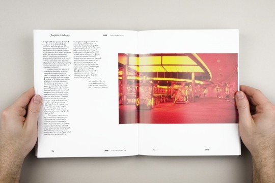
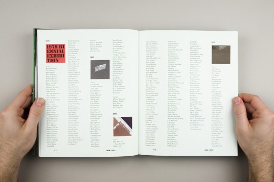

http://in-fo.co/projects/2010_whitney_biennial
0 notes
Photo
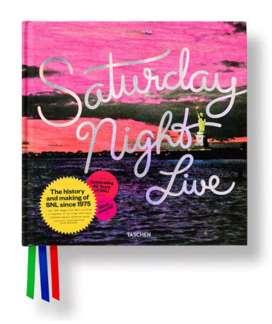
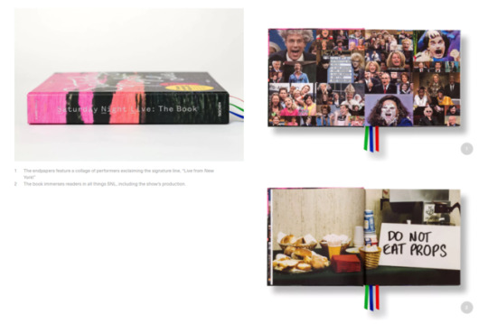
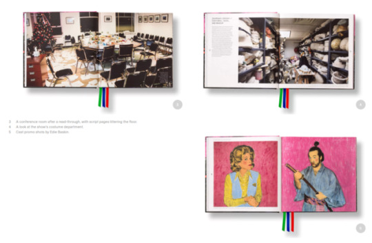
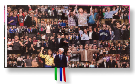
“Saturday Night Live: The Book” Exhibition | Lizy Ainsworth
Source: https://www.pentagram.com/work/saturday-night-live-the-book?rel=sector&rel-id=4
Analyze: In this exhibition, we can see there are numerous images taken on the SNL set through the years. They’re organized by using clear hierarchy, for instance on one page we see there is a clear header and body text, set left with an enlarged image to the right. On the spreads that aren’t filled with images, there are small margins. Position of folio is placed on the outside center of each page.
About: The exhibition is a documentary styled book about the SNL cast over the years.
Author: Alison Castle
Designers: Pentagram design team
Unique: It’s elegant, bold, and accurately portrays the liveliness of the show and the audience. The images easily portray the messiness of SNL, but are constrained by a clean design, rendering an aesthetically pleasing contrast that invites the reader in.
Layout: SNL is famous for making each episode within 6 days of the week, which is exactly why “the book uses the course of the week as its organizing structure.” This helps create hidden meanings within the book as well as help organize it in a manner that stays true to the show’s own organization techniques.
0 notes
Photo
Dominique Fuentes
Matthew Rezac
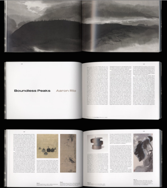
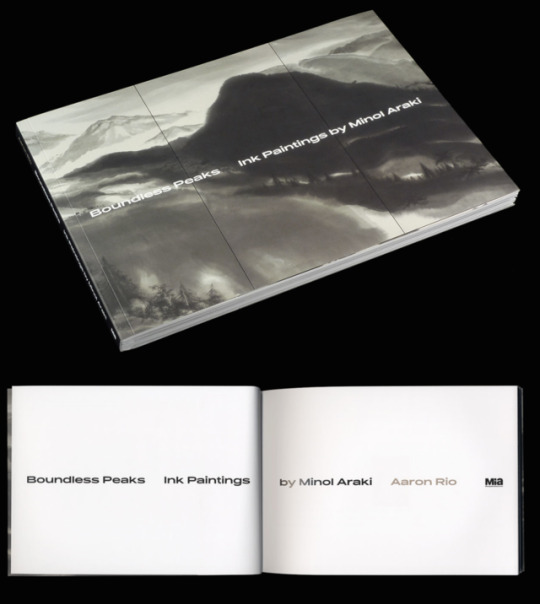
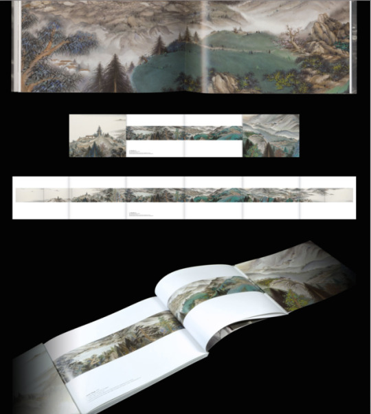
http://matthewrezac.org/Boundless-Peaks-Ink-Painting-by-Minol-Arak
This catalog contains the ink paintings by Minol Araki and explanations of the individual paintings along with some history on Araki during the times he created his artwork. Then it delves into the paintings which has the name, medium, size, and description.
It uses a 3 column grid system. The outside, inside, top margin are all smaller than the bottom margin with the top margin being the smallest. The bottom margin allows for breathing room on the page and an overall good composition. The folio is placed at the top of the pages and centered the middle of the 1st column on the left page and centered the 3rd column of right page. The placement of the folio allows for the explanation of the ink painting at the bottom of informational pages about Araki and other descriptional information.
This catalog is about the ink paintings of Minol Araki and the author is Aaron Rio. The designer is Matthew Rezac. I believe the audience is for art history enthusiast and people who have a desire to learn about different types of ink painting techniques/examples.
The grid system and the use of a full bleed pictures with a mix thin strips of photos is really dynamic and nice to look at. Overall, I really enjoy the use of the 3 column system and the way the photos are laid out. It allowed me to navigate through the catalog easily
0 notes
Text
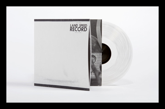
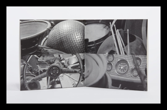
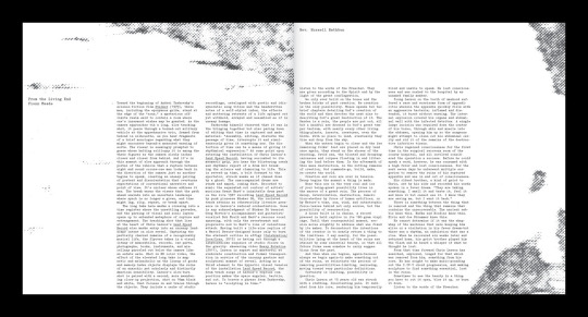
http://www.matthewrezac.org/Chris-Larson-Land-Speed-Record
This exhibition catalogue is called Land Speed Record designed by Mathew Rezac. The project is a "vinyl LP exhibition catalog”, it is an exhibition catalog for an album. The audience is the artists fans and listeners.
Land Speed Record is unique because it is much like a typical record sleeve, however, it also includes the exhibition catalog.
I believe Land Speed Record utilizes a 3 column grid. Typographic hierarchy is show with the size an placement of text. The bottom margin is very small and the top margin is very large. No folios are used. The text used is a slab serif.
The text used seems small (but that could be because I'm viewing it on a computer). Overall, i think the layout is successful.
I think the design is very strong. It expresses the mood and feeling of the band.
0 notes
Photo
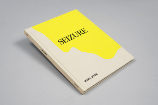
Nicole Gonzalez Blog post 3
Source: http://in-fo.co/projects/mark_wyse_seizure
Analyzing: The content is mostly images, some by the author with others from different sources. There are some textual elements to emphasize the books content. There doesnt seem to be a grid from the single text page ive seen, but I also dont know for sure. The paragraph style is flush left, and the images interchangeably bleed and do not bleed off the page.
What its about: The catalog is about “..juxtaposing disparate images as a means of exploring modes of photographic—and personal—meaning.” The book tries to get you to feel a certain way by looking at photographs.
Author: Mark Wyse
Designer: Mark Wyse (?)
Audience: People who are interested in photography.
Unique: I think what makes it unique is the the different ways pictures are shown throughout the book, they’re not completely the same and the intermitten breaks of text throughout.
Overall: In my opinion, since there are mostly images its very simple to navigate throughout the book. The white on the pages with the image gives a break between images while also giving time to contemplate the meaning behind them, and I enjoy that the white margins arent the same on every page.
0 notes
Photo
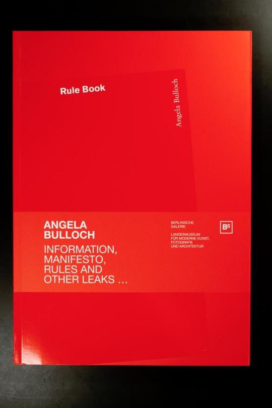
Source: https://www.printedmatter.org/catalog/30087/
Analyzing content: The content includes bibliographic information in two different languages as well as colored photographs from Angela Bulloch’s exhibition. The information seems to be following a three column grid that has been rotated on the page. The paragraph style is justified and the position of the folio is close to the gutter. I don’t see much typographic hierarchy displayed in the text. The images are also within the margins and do not bleed off the page.
About: The catalog is about Angela Bulloch’s “Information, Manifesto, Rules and other leaks…”, exhibition which examines the complex operation of rule systems in society. Angela Bulloch chose ten texts from a collection of rules, regulations, and norms and transformed them with a new design into monumental wall paintings, DIN A1 prints, and a poster.
Author: Angela Bulloch
Designer: Anja Lutz
Audience: People interested in the operation of rule systems in society or design.
Uniqueness: What makes it unique is the way the content is placed in the catalog and the way the grid is used.
Overall: The structure is very interesting and makes me question how it may relate to the exhibition and why the designer decided to go with this layout. I think that the reading experience is different which I think goes along well with its exhibition.
Nayeli, Type Blog Post 3
0 notes
Text
Margaret Bauar Exhibition | Grace Booth


Source: http://margaretbauer.com/projects/Imagine/c1.html
Margaret Bauar is using 6 column grid and uses it different on most of the pages. She has some pages with one column used for text and others with 3 or 4. She uses a bold heading for hierarchy.
The author is Emily Wei Rales and Jeffery Weiss. This project is about Glenstone's second exhibition which features painting, sculpture, and photography by American and European artists from the Glenstone collection dating from 1959 to 1989. It examines the trajectory of overlapping aesthetic tendencies including Process art, Arte Povera, and Conceptual Art .
It is unique because it specifically covers the Glenstone Foundation.
Her use of the grid is very enticing and makes me want to continue to look through the book. The pictures are well taken and high quality. The layout might look better with 3 columns and the titles typography should change. But, overall, the book has a good experience.
0 notes
Photo
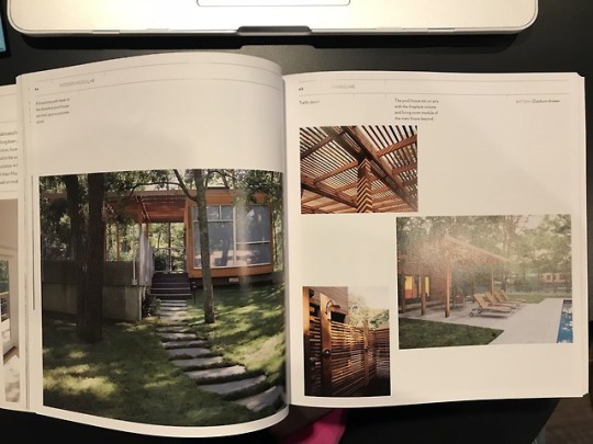
Source: Modern Modular by Joseph Tanney and Robert Luntz
The typeface found throughout the book is a sans serif- possibly of the neo-grotesque sans classification like univers.
The book is all about modern archetectire inspired by Bauhaus Design. This book was published in the early 2000's to showcase the process of building 14 modern styled homes. These houses as well as the Bauhaus inspiration are ideal for bridging the gap between art and industry. This modern architecture is clean, open and technological. They use many geometric planes and open windows ensure the modern design of the homes.
This book is organized in a grid system of 5 columns. The typography and images sometimes break the grid to help contribute to the modern design of what the book entails. There is lots of open space left in the pages much like there is open space in modern architecture.
Hanna Cope
0 notes
Photo
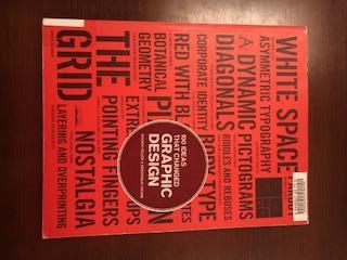
Book: "100 Ideas That Changed Graphic Design," written by Steven Heller and Veronique Vienne
This book was set in Swift, a serif, and Gotham, a sans serif. The book was written by designers for designers, which goes over major design points in history that changed graphic design.
The layout of the book uses 6 columns and has an asymetrical design. There are very small margins and the designer, NAME, also makes smaller images fit into the grid system. The titles are bolded and set in Gotham, a sans serif, in all caps, which contrasts well with the Swift serif body text. There is also a summary on every page that spans across two columns and helps create more of a dynamic. The layout repeats itself on every page, except it will occasionally switch which side of the page has the huge photo and which side has the words/body text.
0 notes