
igniakino
India’s Film Blog
They/Them | 21 | Film student | Average Mads Mikkelsen enjoyer
29 posts
Don't wanna be here? Send us removal request.
Last Seen Blogs


openclimate
openclimate
timdoesphoto
Tim Does Tum
alatushours
sincerely, mari.

jockbrah
Property Of Rhys
Text
Lola's Room - Proposal of Intentions
Featured in my pitch
Witchcraft, fantasy and the occult have always been fascinations of mine, so I have been longing to work for a film like this for quite a while. The research that goes into production design is one of my favourite parts, and to be able to read, learn and create my lifelong interests along with this fantastic team is a privilege.
Production design is a huge part of this film and the atmosphere we want to create. Both the set and the props will tell the stories of these two girls and their journey through adolescence, as well as showcase their witchy rituals. I want this film to feel both realistic, a messy teenage bedroom, and liminal, strange books and lit candles. I plan to source props from the crew and from our friends, as well as hunt in charity shops for decor that fits early-2000s aesthetic. Me and Abbie (Art Dep) plan to make a lot of prints and posters to cover the walls and make the place feel lived in, cherished and loved. We also plan to do a photoshoot with the actors in lots of different location and outfits to make the impression they have been best friends for a long time. This will help to solidify to theme of female friendships and love that weave through Lola’s Room. The contrast between the average objects you can find in a teenage girls room, like makeup and hair products, and the occult, spellwork ingredients and tarot cards, is something I have really enjoyed planning. The two go hand in hand, balancing each other out and highlighting the fine line between girlhood and fantasy. I've taken the most inspiration from The Virgin Suicides (1999), The Craft (1996) and The Love Witch (2016).
I can’t wait to make this film look and feel as stunning as possible!
0 notes
Text
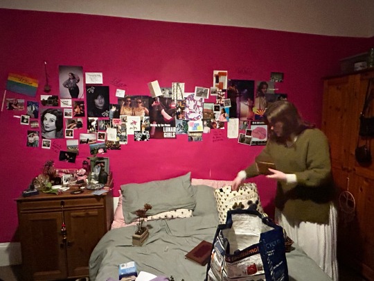
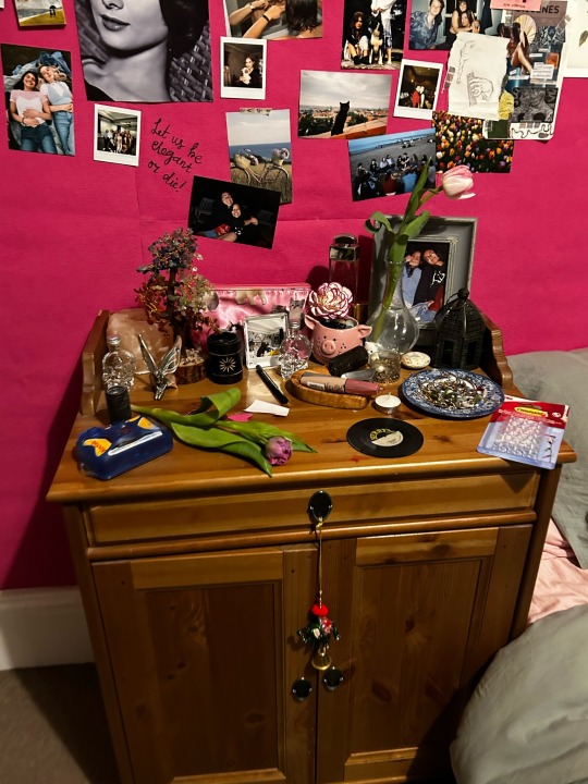
LOLA’S ROOM
Wall closeups
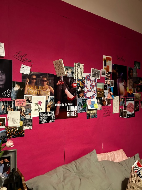
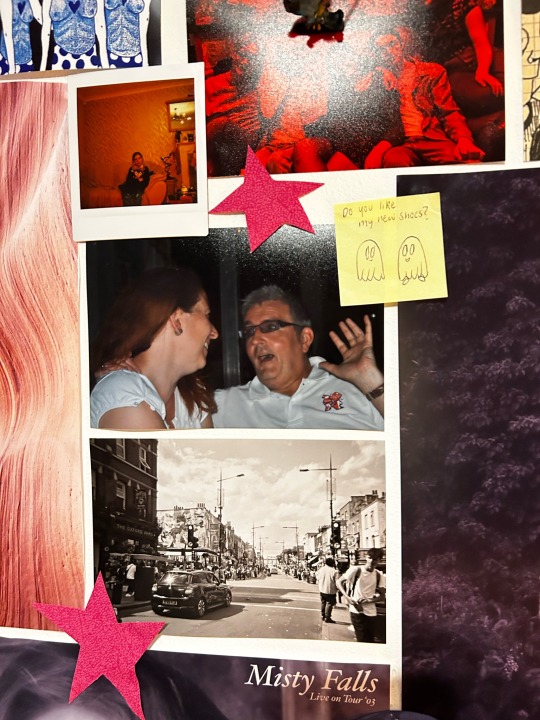
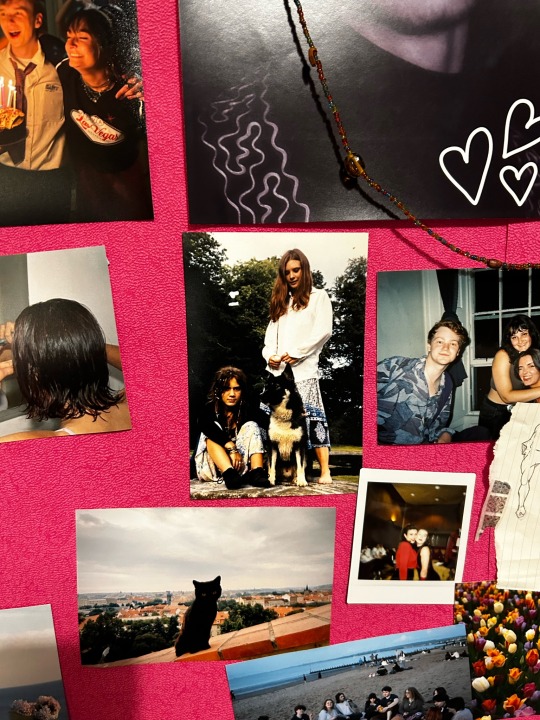
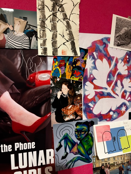
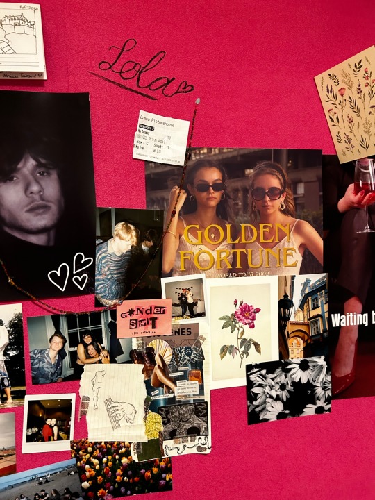
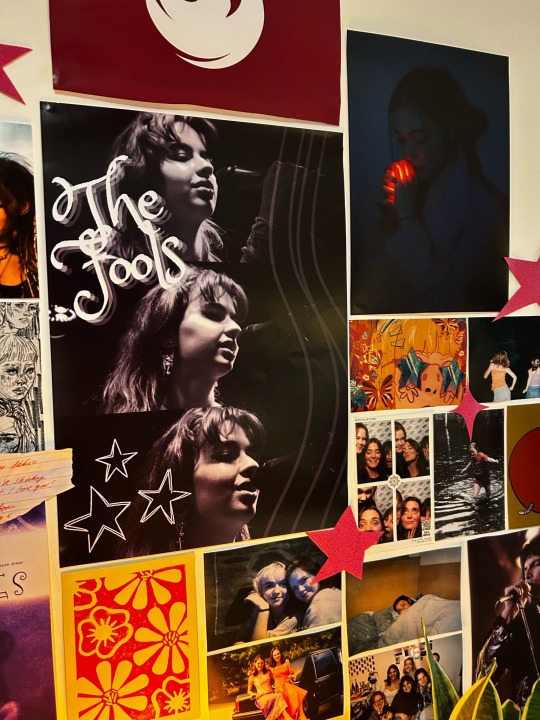
The posters consist of family photos, holiday photos, friend photos, art made by me/abbie/friends, a few photos from the public domain, band posters made by me/abbie, posters of our friends made into fake celebrities, dried flowers, stickers, beads, tickets and cut out stars
It felt really great to have 99% of everything on the way made by me, abbie or our friends as there’s such a lovely sense of community and love that resonates from shared photos and art that I think echos in the film!
0 notes
Text
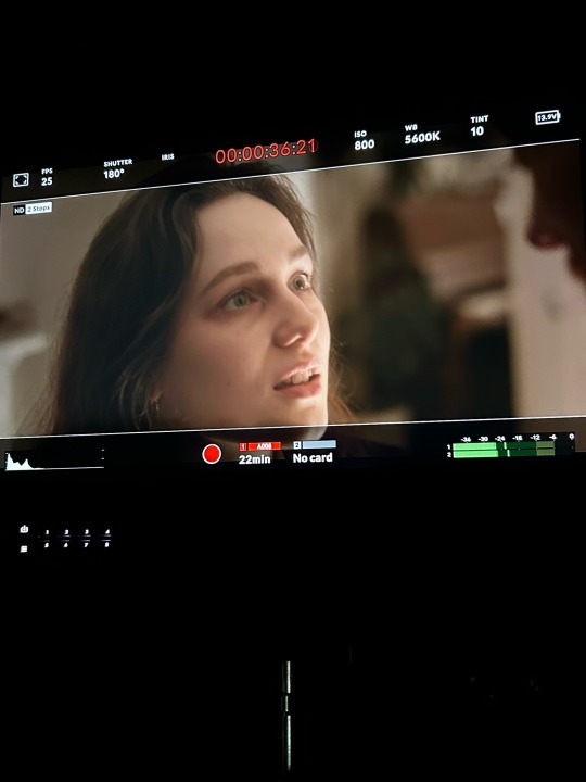
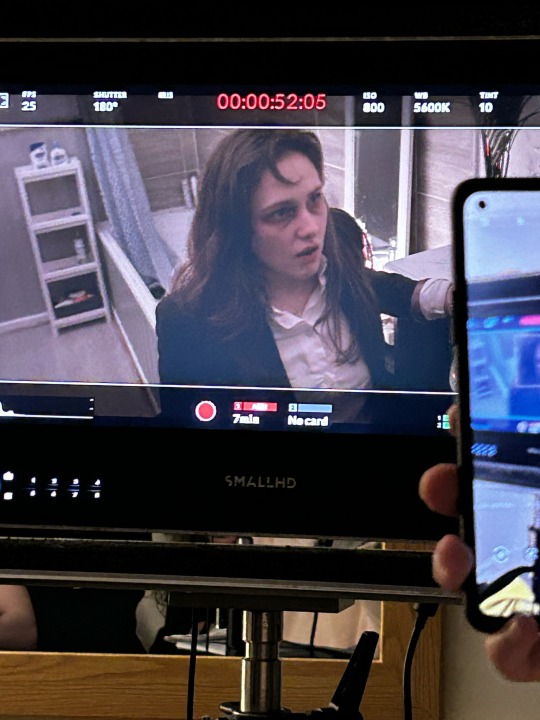
ROADKILL
Makeup Artist
I was very excited to be asked to join the team of Roadkill as a their makeup artist! This isn't something I had had much experience of in the past, just doing bruises and SFX type makeup at Halloween, but it is always something I have been interested in. I thought this would be the perfect opportunity to hone the few skills I had and do something semi-professionally.
My main task was to make they look exhausted and depressed to emphasis the toll not only this situation is having on both the characters, but their whole lives. They have been living in this turbulent relationship together, near breaking point before the accident even happened, and their faces have gone gaunt and haggard from stress. The accident has just bough this on tenfold!
Below I have linked the Pinterest board I used for references during the shoot:
I was on set for all 3 shoot days, helping out here and there. Keeping on top of the makeup was fun but stressed me out quite a lot as I kept trying to recreate the same look everyday for continuity. Eventually I had to accept that I couldn’t make it 100% accurate and some scenes called for less makeup with if there was more intense lighting, so I had to constantly make changes.
It was really interesting to learn more about colour theory through this shoot, and to see how lighting effected the look of the makeup through shadows or bright lights etc.
It was a really really fun shoot and I hope I can get involved with makeup again! I really enjoyed doing it.
Some pictures from the first day, mostly eye bags and red rims. I constructed this look with eye shadow, as it’s a really simple medium to work with. My method was a very light red base to imply the area is swollen, a darker red with some brown to add shadows and depth to the eye, a touch of purple directly under the eyeliner to look as sleepless as possible, a red/purple/brown mix following the shape of the face to create pronounced eyebags and a brighter red in the corners of the eye to create the illusion they are irritated as if the characters have been rubbing at them (either to dry tears or to drive away exhaustion). I repeated this each day and added more/took away as required.
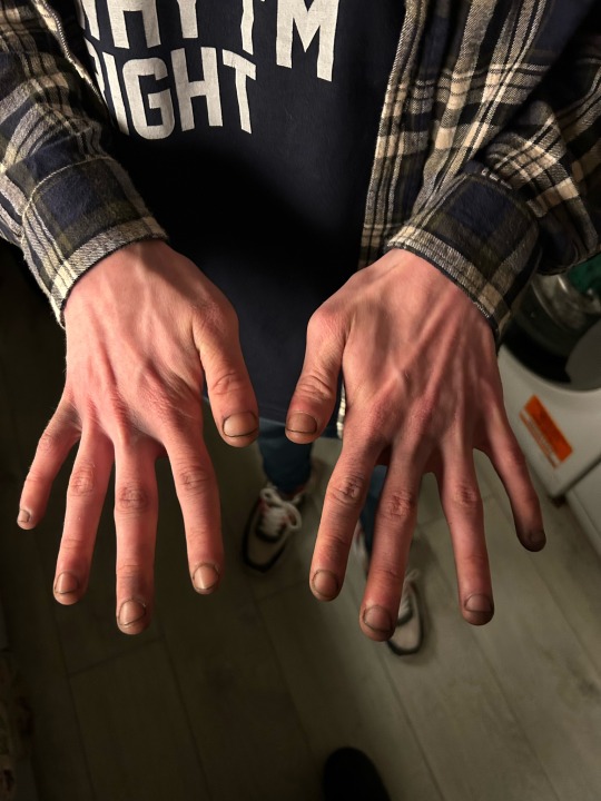
I was also in charge of the dirt under Louis’ fingers, to imply to the audience that he did the burying. I did this with makeup too, black and brown under the nails (although I did cover Louis’ hands in soil for one of the more intensely lit shots)
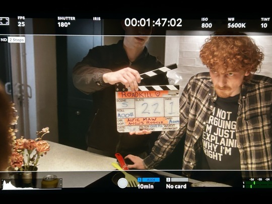
Some BTS pictures!
0 notes
Text
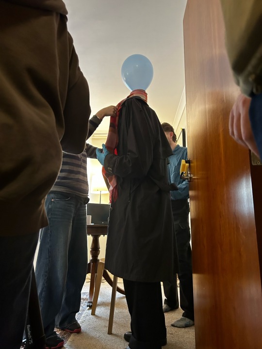
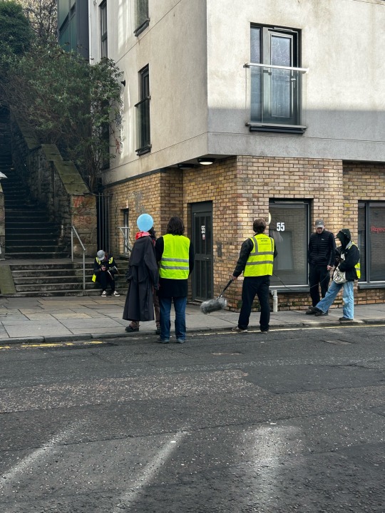
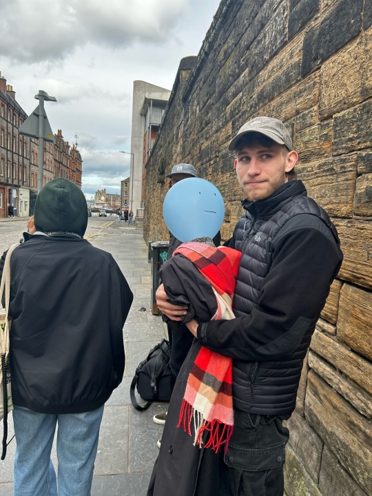
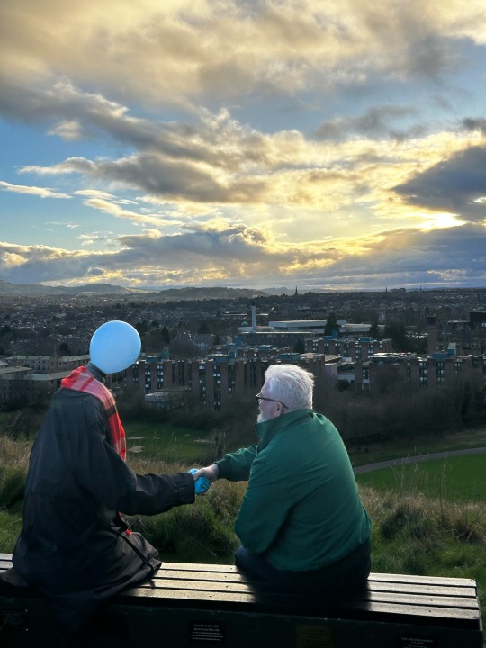
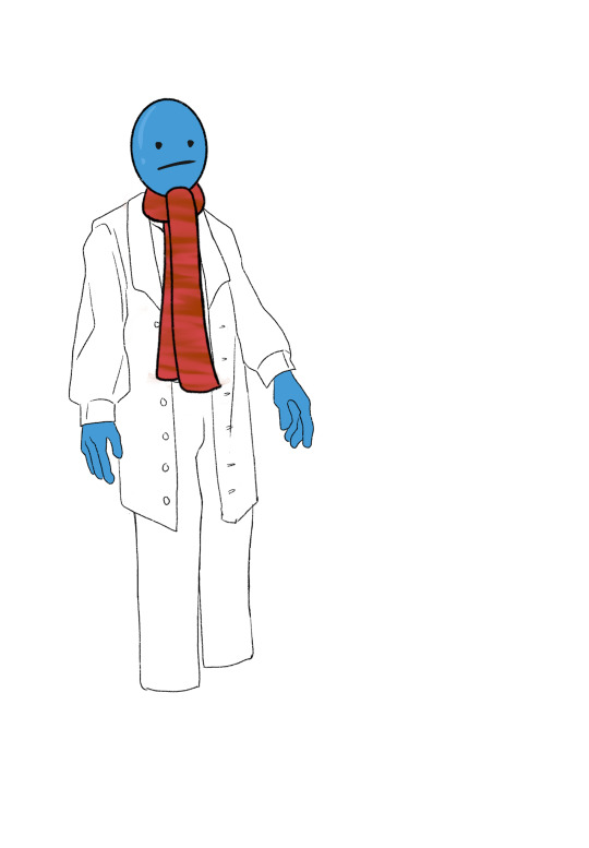
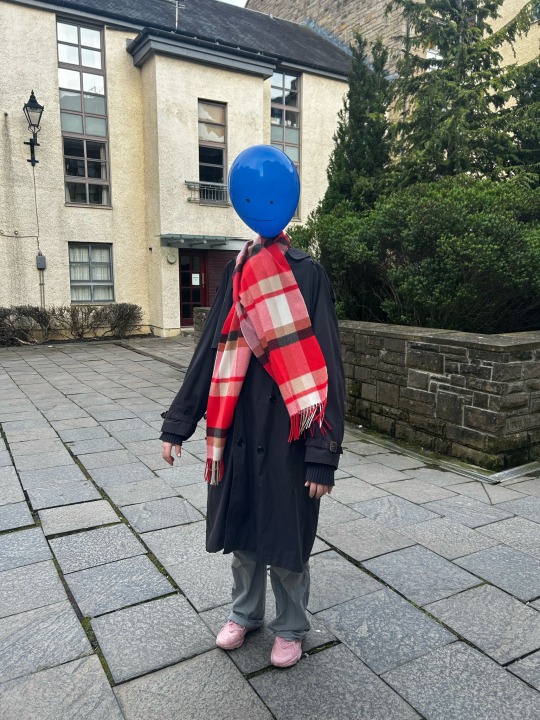
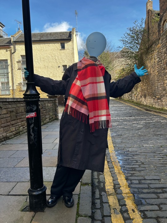
Mr Balloonhead Man
Art Department
I was very excited to be offered an art department role on Mr Balloonhead Man, as I thought this would be a tricky but rewarding project to be apart of. I had never done anything like this before, and the challenge of putting together the puppet-like costume was a task I took head on.
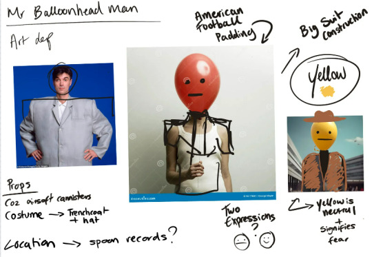
Lili (HOD production design) and I had many many ideas and tests for how Mr Ballonhead Man was going to work. We bounced around plans to make it a Talking Heads-esque suit or something with american football shoulder pads, anything with a wide base so we could balance the balloon on top of a rig of some kind. There was a lot of concern about how the balloon would stay attached and upright, so we had to think of a working system of attachment for the rig that would be safe for the actor. It was a system of trail and error, but we had so much fun trying to figure it out!
In terms of the set, I helped Lili plan out the apartment and what kind of props we wanted to be there. The idea was to have all sharp corners covered in padding, as Mr Balloonhead is deathly afraid of falling and popping, so we ordered a bunch of washing up sponges online to line any dangerous angles. We also discussed the sorts of objects he would own in his apartment to show off his personality, like adventure books and maps to show he dreams of travel and excitement or lots of family photos to show he reminisces on the safety of his past. It was a challenge, but a lot of fun trying to navigate Mr Ballonhead’s personality and how we wanted to show it in the setting.
Linked is the pintrest board me and Lili shared for set inspiration:
Pictured here is my initial planning document after our first group meeting:
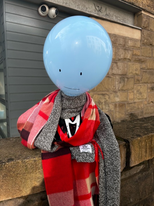
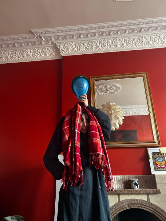
The colour of balloon and the costume was figured out not long after our first plans. We figured a blue balloon would work best (both because of the colour connotations with blue and because it was the the writers original vision) and that the costume had to somehow hide the face of the person as well as the entire constriction. The suit idea was (unfortunately) not viable and we instead went for a long trench coat that could cover the actor entirely and a thick scarf to comfortably sit over their face during filming.
Below is a quick concept art sketch I drew for our costume meetings!
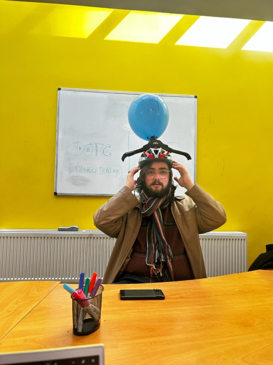
Timeline of planning, with pictures
Our first attempt - using our producer Saskia as a stand in, we began with the basics to try and craft a clear vision. This costume consisted of single coat hanger that the balloon was attached to balanced on Saskia’s head. It was not very comfortable for her, so we needed to think of ways to pad the head area for extended use
A couple of meetings later, with our first breakthrough of attaching multiple hangers together and sticking them to a helmet. This gave a solid structure a big coat could rest upon, giving the illusion of shoulders, and fixes the padding problem to make the whole rig a lot more comfortable on the actors head
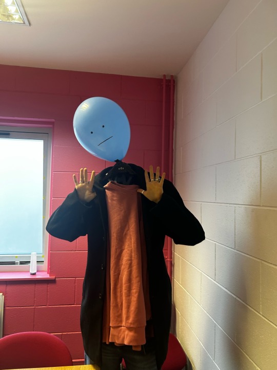
Our first attempt with the actual actor, Lev, with the finished rig. We wanted to test how secure the costume would be when actually worn by the intended person, and to see which adjustments could be made. We also bought along various potential wardrobe pieces, but we learnt we needed something a lot bigger and a lot lighter that Lev could comfortably act in. As Lev’s arms had to go through the sleeves of the jacket (which were held up by the hangers sitting on their head) we needed something large with a bit of give, otherwise their arms were just stuck stiffly above them.
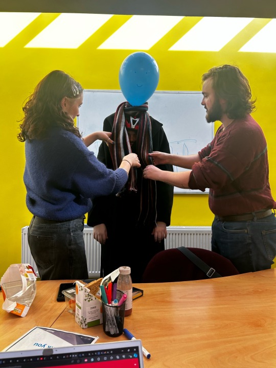
Lili and I go shopping for the perfect coat, which we found in a charity shop. It was huge and made of thin, light and breathable material. Perfect for Mr Balloonhead! We also found the perfect scarf that was wide enough to cover Lev’s face.
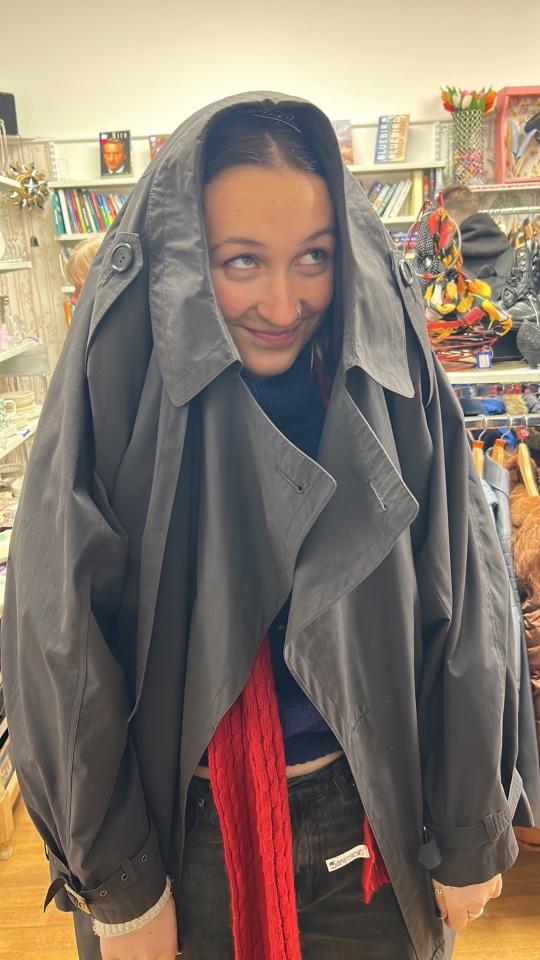
Dress rehearsals with the actor before the shooting took place. We had the whole outfit together at this point and just wanted to see if there were any last minute changes to be made to make Lev’s job easier.
Shoot days
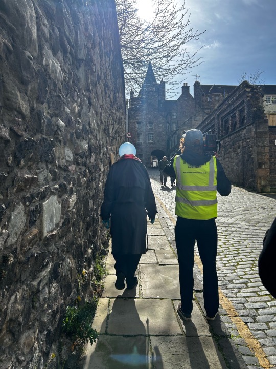
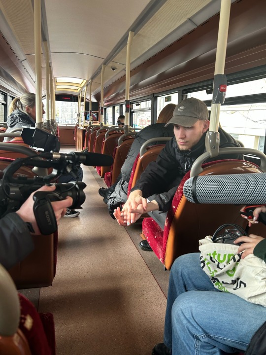
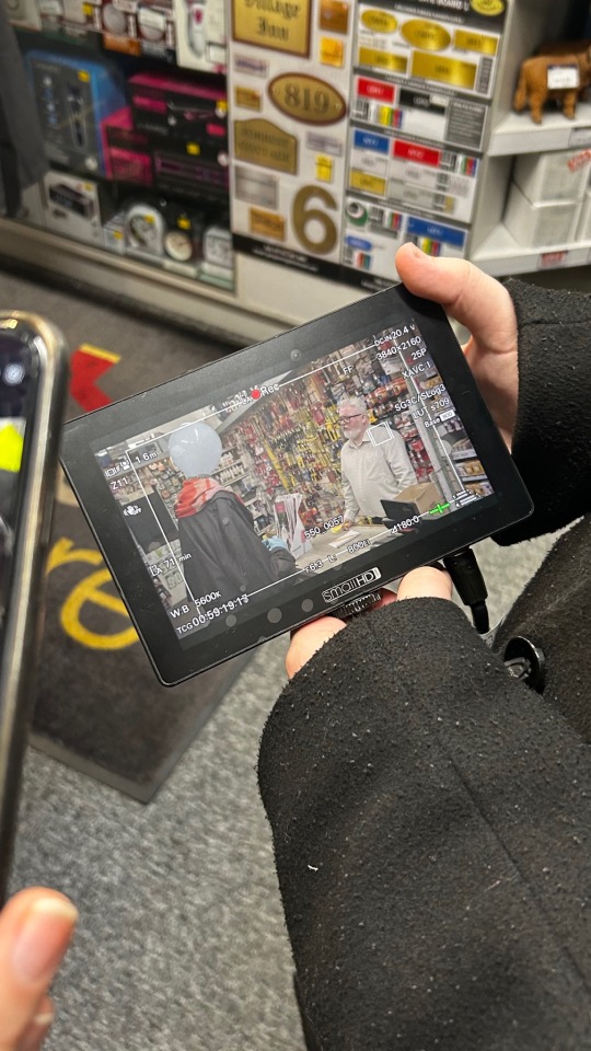
Most of my time on set was spent making sure Lev was comfortable and checking for continuity errors. I was on everyday of the shoot, so by the end I had a very clear image of what the costume should look like, how the material hangs, how long Lev could be in the rig ETC. It was very important to stay on top of costume continuity for this shoot, as Mr Balloonhead Man is so prominent in every scene that any outfit changes would be very noticeable. As much of the film took place outside I didn’t have to worry much about any prop continuity, but I kept my eye on them all anyway - especially for the hardware store were we had to change stands around to fit cameras in small spaces! I took Lev out of the costume between every scene change, and sometimes between takes as it could be quite taxing on their neck. My number one priority was their well-being, so I became an expect at undoing the rig at lightning speed and then putting it all back on again.
I cant talk highly enough about my time on set. It was such a great atmosphere and I had loads of fun crafting the costume, as stressful as it was at first to try and figure out the rigging from scratch! I would love to try and make even more complicated characters in the future, and I think this film really have me a want to get stuck into much more creative and out there concepts.
0 notes
Text
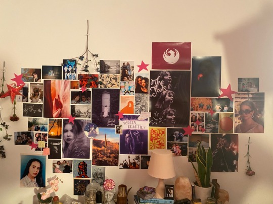
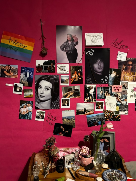
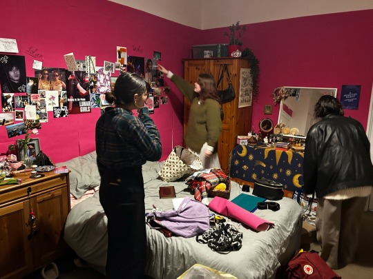
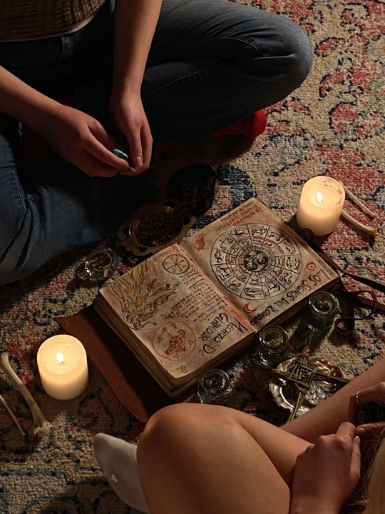
BTS on Lola's Room
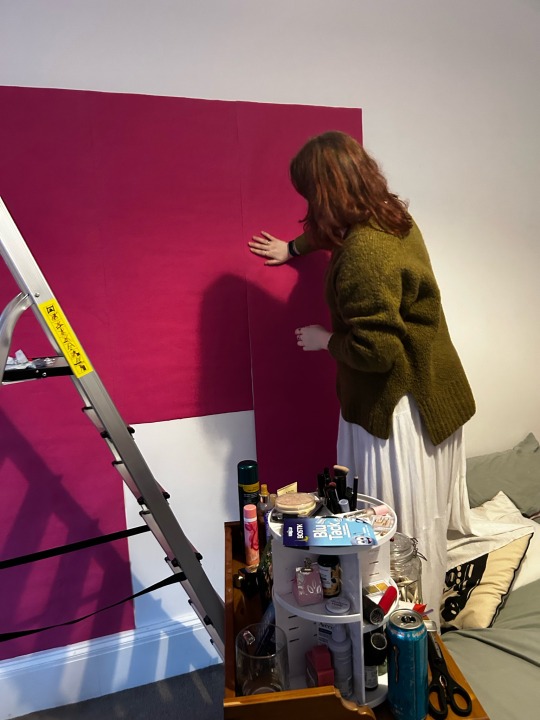
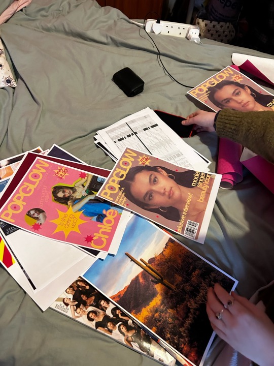
Constructing the set before shoot - Putting up the wallpaper and choosing the best positions for the posters (plus magazine making!)
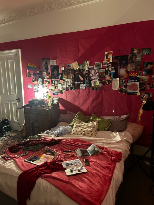
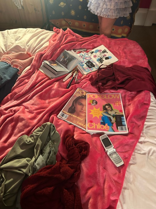
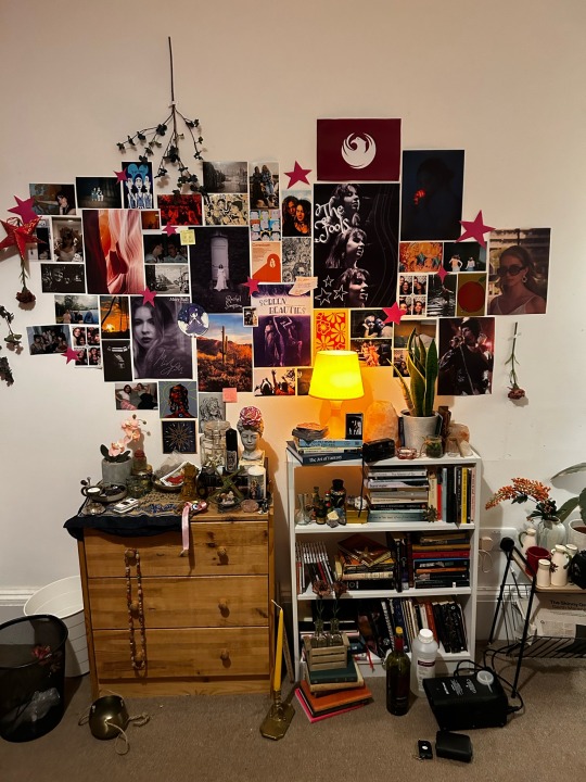
Some pictures of different areas of the set - I wanted a kind of In Media Res effect with the props, with clothes and makeup brushes strewn around the room to insinuate that we caught them right in the middle of a frantic rush to get ready for the party.
0 notes
Text
LOLA'S ROOM
HOD Production Design
Lola's Room is my most ambitious project to date and it required a lot of work from both me and my art department (Abbie) to pull off. I am super super proud of the final look and I couldn't be happier with how much we managed to create!
As soon as I heard the idea for the film I was hooked. I knew immediately that I wanted to work on this project because of the subject matter and the people who were already on board. Witchcraft and the occult has long been an interest of mine and I have always wanted to work on a film that included these themes, especially if they are used to explore human connection and girlhood. I am very grateful that the crew wanted me to be part of this, as I was able to fulfil some of my dreams of creating fantasy objects and strange atmospheres.
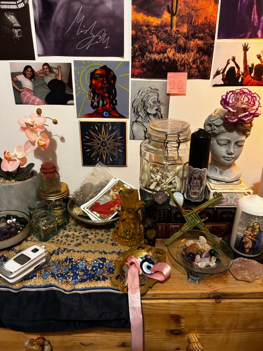
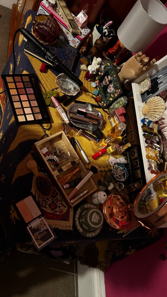
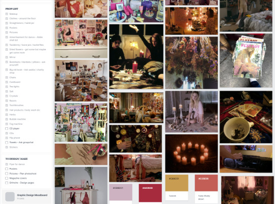
The first thing me and Abbie did was create a list of all the props we needed. I wanted to strike a balance between normal teenage girls bedroom (messy, colourful) with the occult (bone jars, tarot cards), so I planned to have all kind of props and items littered around the space. We wanted clutter, but not too much that it distracts from the characters and we wanted weird, but not so much that it overshadows the light-hearted, girly atmosphere of the project. The pink wallpaper was an early idea that stuck through the whole of preproduction, as we wanted to fully transform our location and give a pop of colour to the whole room. This would make both our and the DOPs jobs a lot easier, as the more colour we worked with the easier it was to set everything else to fit the mood.
I have linked below the Pinterest board I created to gather inspiration for the set:
My main movie references were The Virgin Suicides and Ladybird, as these are perfect examples of pink, pretty teenage bedrooms with an edge of strangeness. I also took a lot of inspiration from films like The Craft and The Love Witch to see which kind of witchcraft and spellwork items worked best in the setting.
I also had the extra task of making the bedroom seem like it was from the early 2000s, so I sourced props like flip phones, old cameras and items from my childhood to subtly slip the film into that timeframe. It was a lot of fun to source all these different props, but it was a bit of a nightmare on set keeping track of everything (and don't get me started on the continuity and having to reset about 7 million props before every take!)
Here are some screenshots from the production design pages of the crews Mila note to show some of our planning:
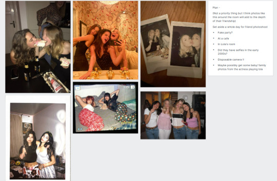
I wanted to do a photoshoot before filming took place of both our actors hanging out in different places to make their friendship seem more legit. I would print these photos out and stick them around the room, giving the impression they have been best friends for a long time. On the day of the photoshoot I downloaded a few digital camera apps so I could recreate the look of an authentic 00s camera, adding another layer of believability to the props.
I also got Lola's actress to bring in baby pictures and family photos so I could place them around the room too, giving the room a much more personal touch.
I have linked the mood board I created and sent to the actors so they could have an idea of the kind of outfit they should wear to shoot. I wanted it to be casual, but something believably from the early 2000s:
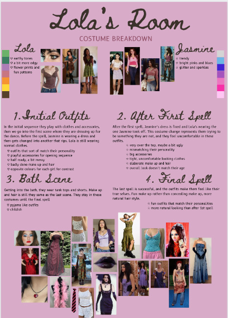
The costumes in the movie themselves were selected by me and the director, and since there are three costume changes in the project we had to have a very specific vision for all of them. The plan was for a casual outfit for Lola at the beginning, over-the-top frilly dresses for both of them after the first spell, tank tops and shorts for the bath scene and finally simple, but personality fitting dresses that they both felt comfortable in. Every costume represents something different in the film, from uncertainty in your skin to serenity in yourself, which completely captures the themes of the film itself.
I will now detail some of the more intricate props and the process I went through in making them:
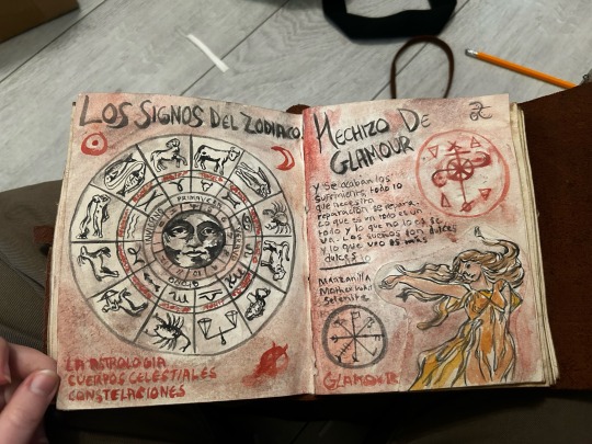
The Spellbook
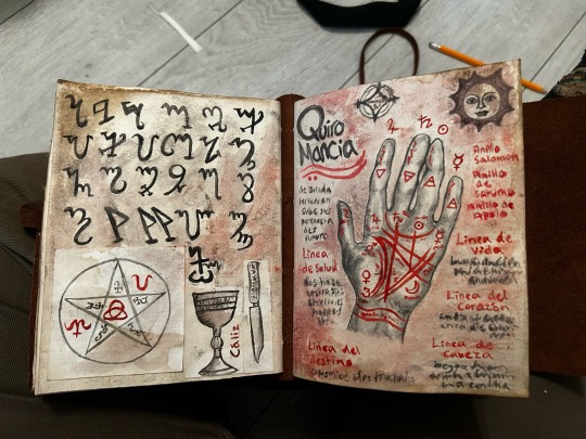
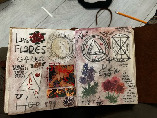
One of the most crucial props in Lola’s Room was the spellbook. It’s the catalyst for the film and has a big, atmospheric presence, so I knew I had to create something to match the importance of how it was written.
I started by researching grimoires, both featured in films and real-life objects. As it was Lola’s grandmother's, it had to be believably old and tattered, but not so much it didn’t feel magical, so I searched online for faux leather bound books with interesting patterns. I didn’t want it to be gaudy and jewelled, just subtly spiritual, so I picked a lovely book with a tree on the front. I thought the tree was the perfect symbolism for the film, representing growth and connection.
To make the book look older and well-loved, I soaked it in coffee and hung it up to dry for a few days. I then painted the pages I wanted to use with a thin layer of brown/red paint as if it was smudged in ink or colour had bled through.
I knew I had to do 6 pages, two sets to flip through and one to land on, so I set about creating my book. I wanted to make it accurate to Lola’s ancestry, so I asked my Dreams and Visions lecturer where I could find notes and references for Spanish witchcraft and she left me some resources, sending me the work of Spanish authors like Pio Barjoa. I asked Paula for the spell Lola will be reading translated in Spanish and then translated the rest of the book myself.
The pages contain typical Wiccan practices like Palmistry, sigil work, herbology, and the study of the zodiac wheel. Most of the sigils I have included are real Wiccan symbols and spells, and the “witches alphabet” on the first page is also the real Wiccan symbol alphabet. The only one I created myself was the sigil on the page that Lola uses, which I created myself after researching the different symbols for beauty, radiance and glamour.
I am really really proud of how this book turned out and I think it looks great in the film!
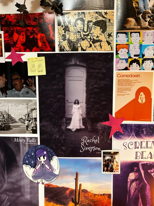
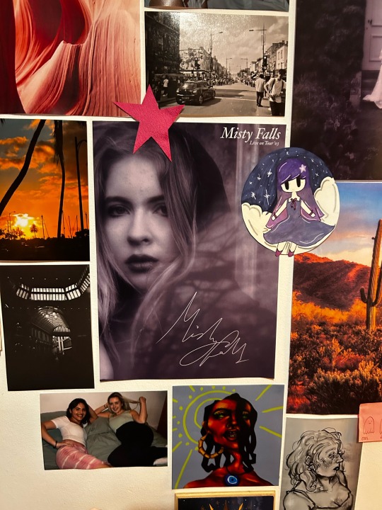
The Posters
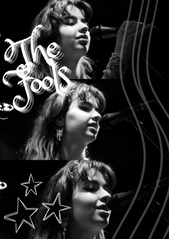
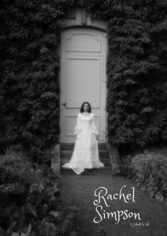
We knew from the start that we wanted to cover the walls in posters, art and photography. Not only would all these props solidify a life for Lola outside of the walls of the film, but they would give a unique visual style to our project. The only problem was that we couldn't use any copyrighted material, so Abbie and I got to work creating posters for fake bands and made-up celebrities that would exist within the world of our film.
I went through a lot of my old photography and selected images that could easily transformed into believable band merch before editing them in Canva to feature fake names and album titles. I researched posters from around the 00s to try and make them as accurate as possible, using similar fonts and graphic designs to fit the artistic choices of the time. Abbie also made fake magazines out of the pictures I sent her, bringing more of that 00s teen fantasy life. I honestly had so much fun creating these posters and I wish I had done way more of them, maybe covering an entire wall in these made-up famous icons!
Below I have featured my favourites of the ones I created, including GOLDEN FORTUNE (made from a picture of my two friends I took a few years ago), Rachel Simpson and her album Widow's Wall (made from a photoshoot I did of my friend in a wedding dress inspired by Wurthing Heights) and The Fools (an actual band my friends are apart of, and the pictures are photographs I took of the lead singer Elle at their first concert)

I was on set every day and was in charge of every area of the production design departments. It was quite stressful, as there were a million props and keeping on top of continuity was a bit of a nightmare as everything kept moving around (wether I wanted it to or not!) but the hardest parts for me during shoot was the dress rip and the bathroom spell. The dress rip, even though it only takes up about 3 seconds of the film, was a very complicated ordeal that took three pairs of hands and a lot of tugging to complete. The dress just didn’t want to budge, even after I took a stitch unpicked to the seams. We ended up creating a rip in the dress before a take and then pulling as hard as we could to give the illusion it had ripped on screen. This did not end well, however, as the whole back of the dress ripped open and the zipper broke! This was bad news as we still had to use the dress in some future scenes, so I spent all of the next break sewing up the back of the dress again to make it useable for the next takes.
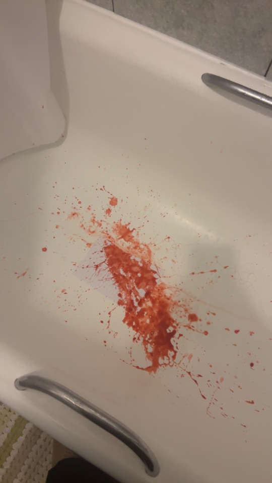
The bathroom spell was difficult as it was not how I originally pictured the set to be. I wanted to mess up the room, throw a couple empty shampoo bottles around and stain the sides of the tub to make it feel more believable and lived in, but I couldn’t do that as we ended up using a show bath in a store. I bought along a lot of props, but we were not able to use a lot of them as there wasn’t really a lot of area we could work with and we couldn’t start to mess around with a bathroom area the shop intended to sell to customers. Because of this I feel like the bathroom scenes feel quite detached from the rest of the film, too clean and devoid of colours, and doesn’t quite fit the overall aesthetic. I definitely could have done more to fix this, perhaps bringing along tapestries or a rug to add more depth and colour to the room, and next I have such a drastic change of location in a film I will plan ahead a lot more. What was fun about the bathroom sequence was getting around the challenge of the bath itself. We couldn’t fill it with water, as it wasn’t actually attached to any pipes, so between scenes me and Abbie would go in and wet the actors hair and faces to appear as if they had just dunked their heads into the water. The scenes of the bath water itself were actually filmed in Abbie’s sink in her flat! I created this witchy soup by adding milk to water, along with flowers, glitter and spellwork herbs I purchased from an occult shop. I think this created a really lovely, magically quality to what could have been just normal bath water!
There is so much I could talk about with this shoot, all the intricate details and the effort it took to bring it all together. It was a big task for all of us, especially since we all had other projects ongoing during the preproduction of this shoot, and I couldn't be prouder of how much that effort shines through in the final product. I would love to take on another project like this, and my only regret with this one is I feel I didn't do ENOUGH occult stuff to balance out the girly attitude. In the future I will make sure to go all out on the fantasy strangeness, but overall I am over the moon with how this turned out and I am proud of all the hard work I put into it.
0 notes
Text
Film Project
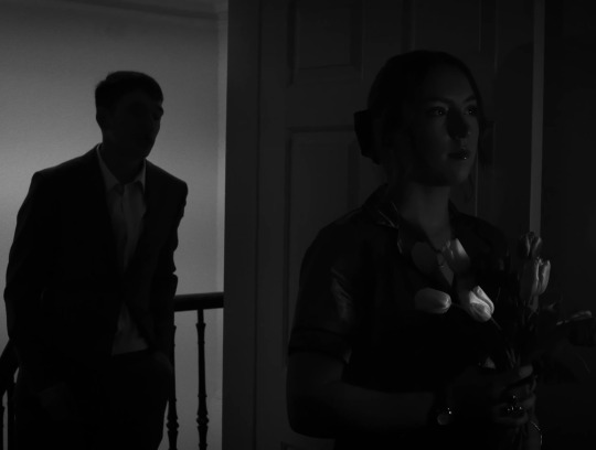
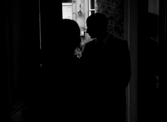
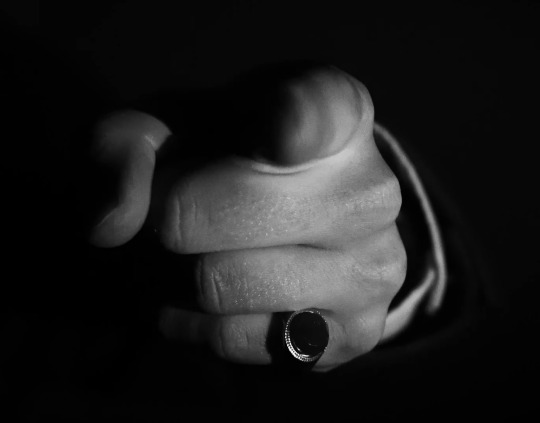
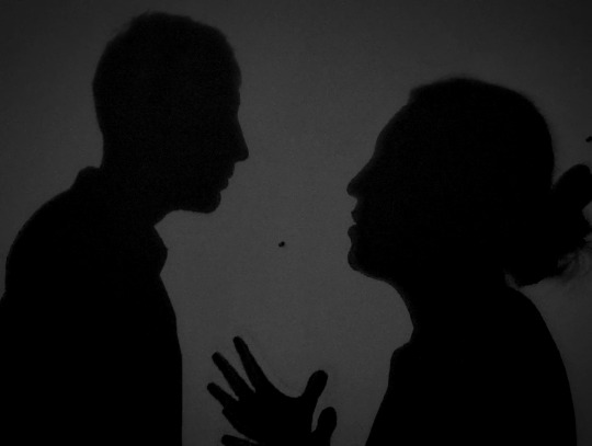
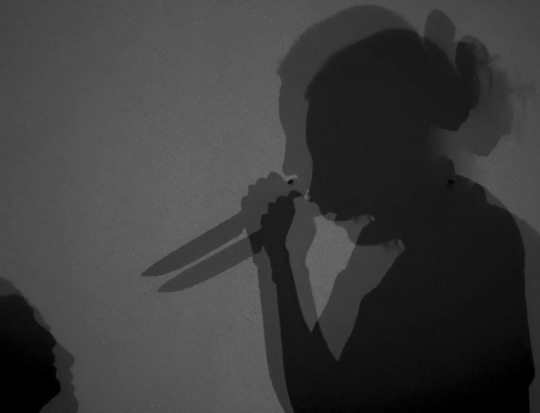
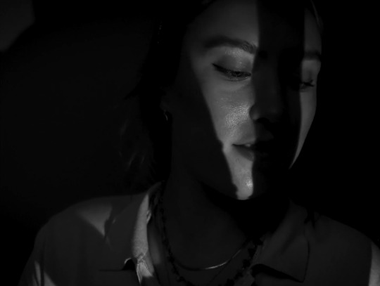
Creative Exercise one - Silhouette Task
youtube
For this creative exercise, we had to include at least two silhouettes, with both natural and unnatural light, in a 2-minute short. We had to think about how to use these silhouettes in our visual storytelling to create a story-driven narrative and challenge our creativity.
My group, Alana, Cat and Paula, decided to create a black-and-white femme fatale story, as we felt this would be a fun way to include all kinds of silhouettes and shadows. Our lead character is a serial romantic with a taste for shiny jewellery, who will go as far as to kill her lovers to get her hands on their precious items. To emphasize that she feels no real love for her partners, only their possessions, we covered the supporting actors face in shadow, only showing him through silhouettes and tight frames. It doesn't matter who he is or what he looks like, he is simply another vessel adorned with what she truly wants. This contrasts to when rings are in frame, both the one he proposes with and the one he wears, which are spotlighted against the blackness.
1 note
·
View note
Text
Film Project
Creative Exercise 1 - Production Design Research
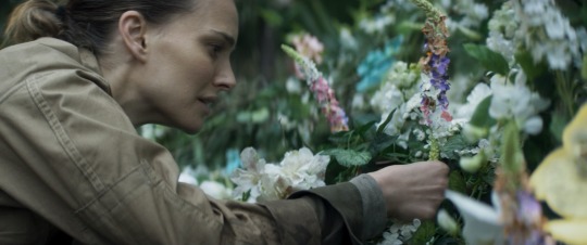
Annihilation is a fascinating, beautiful film with some of the best production design I have ever seen, transforming Windsor Great Park into a biochemically altered Louisiana. Lovecraftian Horror is extremely hard to pull off on screen, as the whole point is that you are not supposed to see or understand the horrors in front of you, but Annihilation manages to succeed in a spectacularly bone-chilling way, and the incredibly detailed set design is a major part in how they pulled it off. Michelle Day and Mark Digby crafted such an immersive atmosphere through their thorough research and creativity that truly brings this film to life.

The extensive study that the set designers went through to make their alien paradise seem so realistic is apparent in the plant life that surrounds the characters. To make their own species of biologically tampered flowers, Digby and Day turned to actual mutated plant life found around historic nuclear fall out sites. “We found reference for these near Fukushima and Chernobyl. A few years after the accidents, the plants started to grow in weird shapes and duplicate themselves. They still have the core essence of daisies or sunflowers, but they’re skewed. So we replicated that.” (Mark Digby in a SDSA article).
1 note
·
View note
Text
CRIT OF FINAL FILM
HEADLINE
After watching the finished film I feel like it is a good, story-driven project that the more simplistic set design lends itself to. Nothing distracts from the characters having their moments of development, instead subtly enhancing the setting and explaining the situation without either character explicitly explaining the situation. Mostly, I am pleased with how well these elements come together to tell a tight, cohesive story.
The feedback I received from the crit was very positive, with Paul commenting on the costuming, mentioning how it effectively contrasted the characters, and the set, especially how compelling the dishevellment of the space was. I really like how the costumes exhibit the positions of power (or lack thereof) that each person has, a professional business suit and scruffy layers meant to protect. Saskia and I did a good job in making the room look messy and abandoned without having to damage any property, handling the limitations of the location well and sticking to the producer's guidelines.
However, Paul did comment that the sheet in the background covering the window seemed out of place, and I do agree. I think a weakness of my work was that some of the elements didn’t invoke a reason for being there, or tie together with the rest of the set as well as I wanted. The sheet was supposed to both set up an in-universe reason of Robert not wanting to be seen as well as shaping the light, but this may not have come across to audience members, just like the radio could have come across as strange for a man on the run to want to take with him. I think if I had added more elements, perhaps newspaper on the glass, the reasoning for objects being where they were would come across better. I think at some points the production design is too simple and the room could do with being even more messy and filled with rubbish, then maybe the sheet wouldn't have been too out of place
Overall, this film is strong and conveys a certain tone and atmosphere. The production design really backs up the story being told gives it life, although I think there could have been a lot more props to enhance the setting and give more reasoning to seemingly random choices.
ONE MORE DAY
What I really loved about this project was being able to show off the personalities of each character in subtle ways around the bunker and trying to tell the story of their lives. I really think this is something that shines in the movie, and I am so proud of the production design as a whole and how much it elevates the film. I think the finished movie is great and sets a palpable tone and aesthetic that carries the story along, with the bunker feeling like its own character.
In the crit, Paul brought up the attention to detail and how fitting the set dressing is in creating the atmosphere of the film. He also praised the work on the dog food cans which I am very happy about. I have definitely honed my skills of prop-making during the course of this project and will continue to sharpen them up in the future. Saskia and I worked really hard on every element of the decoration and thought about the meaning behind every piece, so to hear that the detail is appreciated is great. I really wanted viewers to get to know the characters and their struggles, and I especially like how we set up the existence and fate of Sarah’s character with the setting instead of words. I also really like how the makeup I did on the actors looked in the screening as it adds to the impression of helplessness in the characters and helps the audience understand how long they must have been trapped. All the small elements and the props create a world that exists beyond the movie and I am really happy with that.
I do wish he had gone a little more out there and really dirtied things up and transformed the space even more, as this would make it feel more authentic. Everything looks a little too clean and if we had more time I would go all out on the set and more efficiently establish a sense of time and atmosphere of loneliness in that bunker.
0 notes
Text
CRITIQUE PROCESS
HEADLINE (HoD Production Design)
I was HoD for this project so I oversaw all production design elements including props, costumes and setting.
I spent a lot of time on this film trying to figure out how to effectively create the setting of a squatted-in showroom house without upsetting the owners or making the film look too boring. It was a hard balance to find, but I think what I have produced works nicely. It was a hard process of working through and learning limits, trying to weave in between them and find new paths, but overcoming them felt great and I will continue to use this skill in my future projects.
I felt like I worked very hard on my creative ideas and was a good communicator, constantly having meetings with my cinematographer and director and creating mood boards to help inspire the process. I made sure I had a voice in decision making as well as taking in suggestions from other crew members which helped me gain many new perspectives. Having so many get-togethers with the HoDs was very beneficial to my learning and hearing feedback on my props and costumes whenever I had new ideas was amazingly effective in improving the quality of my work.
What I could definitely improve on is time management, as I struggled slightly with getting everything in order on time and working around my other projects. Having the set design ready is integral to the director's blocking and shot list, so I need to make sure I keep on top of all my work in future and have everything ready to go when needed. I also need to be prepared to change my ideas at a moment's notice, as the change of profession to the character threw off my train of thought much harder than I anticipated.
vimeo
ONE MORE DAY (Art Department)
My responsibilities on this film included mostly prop work and makeup. I was so excited to get creative on this project that I instantly started planning what would be needed and making rough mood boards, trying to challenge myself in the things I could make.
Teamwork was truly a shining aspect of the process of this film. Saskia (HoD Production Designer) and I spent many hours together creating the setting and we always communicated our ideas on new prospects together. Like Headline, we had many meetings with the director and cinematographer to plan blocking and colour which really helped our creative decisions. Cooperation was key to creating the organised chaos of the bunker, and when it came to decorating before the shoot we had a lot of fun planning and theorising which props went where. I am very proud of how hard we both worked in preproduction to get everything taken care of properly and how we both excelled in our separate tasks.
Making the dog food cans was a highlight of my time in the art department. I do wish that I had started on them earlier and made them a little less cartoony, but the process felt quite rushed and again time management was a factor. I also feel like I was holding myself back from some ideas because I thought they were stupid or silly, but now I wish I had mentioned them. In the future, I need to get better at speaking my mind when I am not a HoD as even if my idea is not taken I could inspire by putting suggestions out there.
vimeo
0 notes
Text
ONE MORE DAY
Behind the scenes
The first two pics is the room before we started setting up and the last two are the beginnings of our set up. It’s crazy how much a bit of decoration changes the room!!
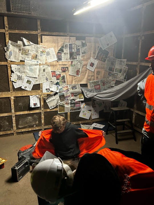
+ some extra screengrabs from the film
0 notes
Text
ONE MORE DAY
Pre-Production, Set-up, Shoot and Post Thoughts
PRE-PRODUCTION
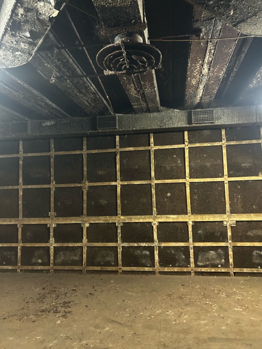
I was very excited to be asked to be the art department for One More Day. I felt there was so much that could be done with an empty bunker and I really wanted to flex my creative muscles, there was so much to make!
When I went on the first location recce I was instantly sold and started thinking about the kind of props we would need to make this space feel real and believable. There was so many options to show the passage of time and the lifestyles these two characters would have to adapt to and me and Saskia (HoD Production Designer) got straight to work on how we could achieve the wanted mood and atmosphere.
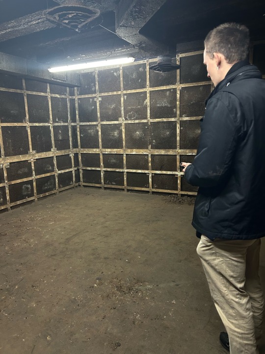
It was difficult to choose a room as there was so many amazing locations we could have chosen, but we settled for one with blank, black walls that was easy to get filming equipment in. This choice was made because the walls were the perfect canvas to layer things on without a distracting clash and was dark and dingey enough to give the definitive feeling of despair.
I have linked the Pinterest board we used as a mood board below:
The day before the shoot Saskia, Vanessa and I cleared the room of the rubble lying around so our actors could be comfortable and the filming equipment was safe. We then started to decorate and create the set you see in the final movie, which I am very proud of. We worked really hard on the production design as it was pretty integral to the story of One More Day, and I think it really ties the film together.
COSTUME AND MAKEUP
In group meetings it was debated whether we wanted it to be hot or cold in the bunker. Me and Saskia had a vision of sweaty tank tops and boiler suits if it was stuffy and humid in down there, but our director decided that the bunker would be a cold, unforgiving place. To suit this Saskia prepped the actors by telling them to bring jumpers, coats and beanies as well as fingerless gloves.
I had a lot of fun doing the makeup on set! Before we started shooting I sat both the actors down and dirtied up their faces, using eyeshadows to create the effect that grime was clinging to them. I also made them have prominent bags under their red ringed eyes, driving home the idea they are both exhausted and hopeless. I used makeup to hollow their cheeks out slightly so they looked a bit more sunken in, as well as messed up their hair and dirtied their clothes.
I decided to give Ben's character Cam dirty fingernails, applying eyeshadow around and under the nail to look like he hadn't had a good wash for a long while. I had to keep going in and reapplying this makeup between most takes as it kept rubbing off easily, but I loved the effect and didn't mind the task
PROPS
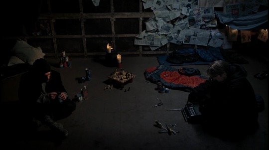
Me and Saskia spent a long time designing the props for One More Day. In the days before the shoot we got together and tore apart newspapers, magazines and fabric to cover the walls in decoration, both to act as insulation in this freezing space and to give the characters some entertainment. We filled in all the crosswords, wordsearches and sudoku sections in the papers, as well as covering some sheets in noughts and crosses and random ramblings to give the impression that this was one of their only forms of entertainment in the bunker, with some particular sections giving off an aura of cabin fever.
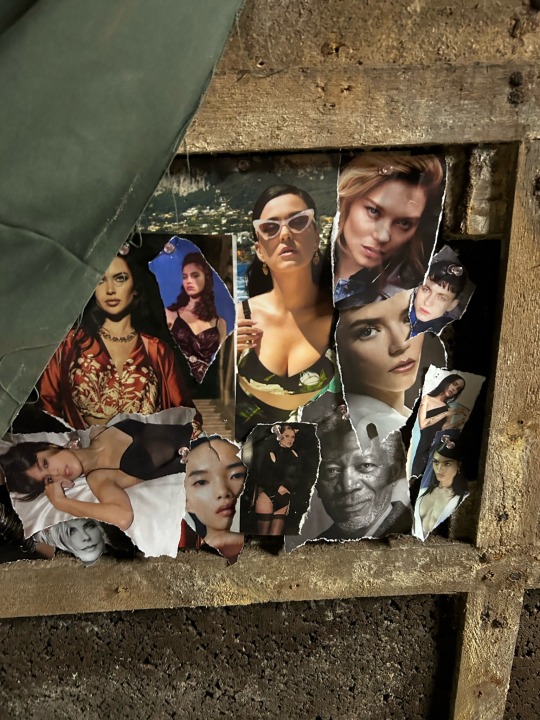
I had the idea to cover a section of Cam's wall with beautiful women ripped out of a magazine. In my head he was the kind of character who would need a bit of release as a lonely guy cooped up in this small space, only pictures of models to keep him company. Its a little hidden in the movie, as its definitely not the main focus of the set, but I thought it was a nice character touch to give Cam some personality.
In the middle of the two characters we set up a half played chess board, with Cam's side winning. This was is to foreshadow the events of the movie and give another form of how these two passed the time. We replaced some of the pieces with small bottles I had found, some batteries and a small panda bear figure to show that over time they had either lost the pieces or the chess board was found without them in the wreckage.
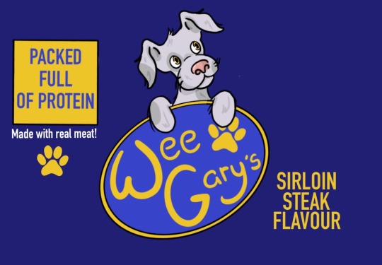
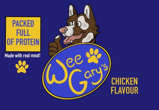
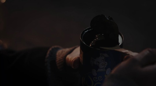
The dog food can is another prop I am very happy with. I was asked by the director to create two kinds of flavours for a dog food brand so we would not get copyrighted by an existing company, one being sirloin stake and the other chicken. I used a digital art software to create these two labels and stuck them around empty cans, making them just small enough that we could keep whatever ingredients packaging was already printed on the back of the cans. This was such a fun task to do and I love how they turned out! I will definilty be creating more props like this in the future.

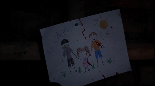
Other items in the room included the sleeping bags, food cans and child's drawings. It is implied in the movie that a child character called Sarah used to be in the bunker with the two men, but she has passed before the events of the film start. There is an extra sleeping bag on the floor and a small corner of the room still occupied with her drawings and fairy lights.
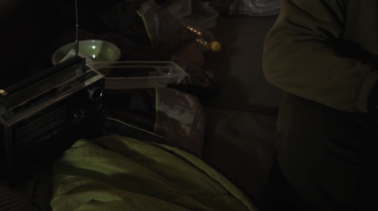
The blood at the end of the movie that splatters across Sarah's drawing to Cam was made by me before the shoot. It consisted on soy sauce, water, fake blood and coca powder. I wanted to make a realistic looking fake blood as it is a pet peeve of mine when blood in movies is not an accurate colour or consistency, so I tried to make it look as close as possible to the real thing. When I was told I would have to spray it across the drawing at the end of the film I made sure to do a few splatter tests in my bath at home to get the angle right, though when it came to it on the day it was still a very difficult task to get right. It was difficult to get close enough to the drawing that the blood would actually land on the drawing and look good, but be far enough away that my shadow wouldn't get in the frame. It took a few tries and a few drawings but eventually we got the money shot! I also added blood to the radio at the end to show the messy consequences
Evidence of splatter tests + a good look at the fake blood!

SET
Me and Saskia used fabric to create the impression that Cam and Robert had separate corners of the room, draping the material along the walls to make a shelter for them. We also added some candles to have a logical in world reason for the orange light that shone on our protagonists faces. It was so much fun producing this set and I am very very proud of the atmosphere we achieved.
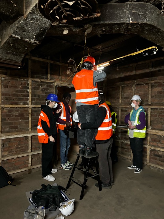
SHOOT DAY
We filmed over one day and it hardly felt taxing at all! The whole crew was really on the ball and got everything we need quickly and efficiently with no incidents. We all had to take regular air breaks to save our lungs from the dusty bunker, even if we were wearing masks, but it wasn't a problem to get the film finished in time. Me and Saskia kept on top of continuity and I often reapplied makeup or fixed clothes, but most of the time we enjoyed watching the scenes play out in front of us. From beginning to end the crew was on roll and it truly went so smoothly. The only thing I had trouble with was the ending blood shot!
If I could have changed anything I would have added even more set dressing and made everything a bit grimier. They have been down there for at least a year and a half, and in my opinion everything looks too clean. I wish I had dirtied up my dog food cans slightly more! Everything needed a bit more of a layer of dirt. I also wish the blood shot had been slightly better, but I am very happy with what we have.
Overall a fantastic experience that really gave me the chance to be creative and expand my skills in production design.


1 note
·
View note
Text
HEADLINE
Pre-Production, Set-up, Shoot and Post Thoughts
PRE-PRODUCTION
I took on the role of HoD production designer when asked by the producer, Esther. I thought the script sounded very interesting and wanted to take on the challenge of transforming a lived-in space to an abandoned room. The reference images I was originally given consisted of shots from Requiem For a Dream, which is a film I really admire the set design for and wanted to emulate so I agreed to work on this project.
Link to my Pinterest board that inspired by ideas:
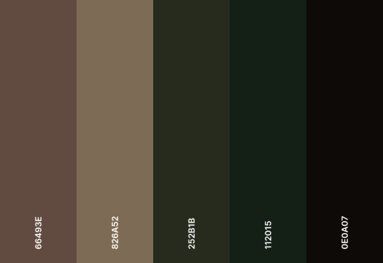
Here is the colour palette I was working with:
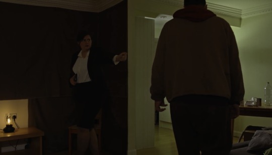
Originally, the script called for a policewoman and a mostly abandoned house. I had many ideas on how we could find a setting like this and how I could dress the frame. However I ended up having to change my ideas a lot when the character was transformed into an estate agent to fit the script better. This meant that I had to rethink a lot of my established ideas as it wouldn't make sense that this estate agent was trying to sell and maintain a house that was falling apart. This made things a little harder for me as not only did I have to take into consideration that whoever's house I would be transforming would be a landlords property (so unfortunately I couldn't destroy any furniture or tear up the wallpaper), I also had to think about how logically in disrepair this room would be if an estate agent was trying to sell it.
This meant I could not do as much as I had hoped in terms of set design. I couldn't destroy things or dirty them up too much or batter the walls or even stick my own wallpaper to them. The director wanted the room to be almost like a show-home so it ended up being more barren than I had wanted, however I still enjoyed the project and I am happy with what I achieved. I had many meetings with both the cinematographer and the director to make sure we were all happy with how the film would look and how the set would influence colour and mood.
We visited two locations. The first we felt was too small for everything we wanted to achieve and we were not allowed to pin anything to the walls or move much the furniture around. The second location was much more spacious and we could change what we wanted (within reason of course). Once we were set on our shooting space I went about planning how the room would look with Saskia, my art department, and started to complete costume.
The day before the shoot everything was moved out of the living room. All unwanted furniture was relocated, all posters were taken down and the curtains were removed. Everything from the kitchen was also moved out of shot so we had a complete blank slate to work with. All the rest of the set up was done early the day of the shoot.
COSTUME AND MAKEUP
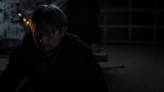
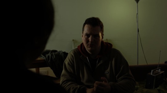
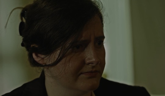
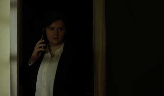
Costuming was relatively simple for both characters. I knew I wanted a typical estate agent outfit for our female character so I went with a pencil skirt, tights, a smart cream shirt (white would have been too bright and clashed with the camera) and a blazer. I was very happy with the shoes, though they are not shown much in the movie, as I thought they were the perfect style of professional heels and added a lot to the outfit. For hair and makeup I also wanted simplicity so as not to distract from any of the conversation. I asked the actress to wear light foundation and wear her traditional day-to-day makeup, bringing setting powder with me just incase the makeup was too shiny on the screen. Hair was put into a simple claw clip, neat and tidy at first and then becoming more messy and loose as the film goes on, showing her character letting down her defences to the protagonist.
For Robert it was just a case of layering him up in plain clothes. I wanted him to be bundled up like he had been wearing the same outfit for a while, no style needed just warmth and necessity. Makeup wise I used red, brown and a tiny bit of purple to give him slight eye bags and feed into the exhausted look.
PROPS
I had the most fun on this project creating the newspaper prop. I was given an article by our writer Duncan and created a front page of a made up tabloid to symbolise the films name and the situation Robert is in. I used Canva to create the article, visited a local print store to get it to the right size and stuck it to the front of an actual newspaper to give it depth. Lots of fun was also had when I had to write the neighbouring column, choosing to write a vapid segment about a fake celebrity breakup to contrast the horrible news of manhunt after a suspected "mother killer".
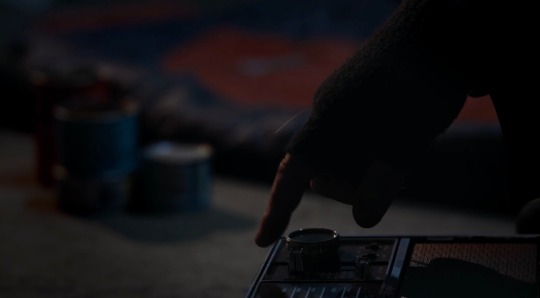
The radio was bought off of ebay and the sleeping bags were borrowed from other crew members. I gathered all the takeaway boxes I could find in my house, along with cans and plastic bottles to decorate the room. I thought this would make sense logically in the story as he would have no place to cook, so takeaway food would be his only option. This made the area feel more lived in and gave the impression he had been at this location for a while. Other props consisted of blankets, pillows and other miscellaneous items that would bring our protagonist comfort while also hinting at his life on the run.
SET
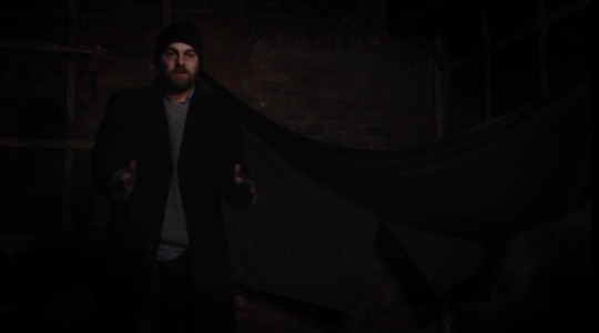
I bought a lot of green fabric to cover one of the walls, as the director did not want all an all white setting. This helped with shaping the room and adding depth as well as colour. I also bought a few sheets that it used to cover the windows on the day of the shoot. This worked both within the world of the story, as it makes sense for Robert to want to cover the windows to avoid being spotted, and to enhance the lighting our cinematographer wanted. It was an effective way to shape the light in the room and give it atmosphere.
SHOOT DAY
We only had one day to film and though it was very long it was a lot of fun and went smoothly (apart from a camera incident!). It was a great crew to be apart of and everyone was very professional, listening to my ideas and asking me or Saskia before they moved any of the props. I spent most of the filming time out of the room as there was not enough space for the whole crew to be in the same space, but every few cuts I went in to check continuity with Robbie, our script supervisor/ editor, and reapply any makeup that seemed to be rubbing off. The only issue on set production design wise was figuring out how to pin the green fabric to the wall in a way that looked believable and not like someone had gone up and stuck some random fabric on the wall. I think we achieved this as it looks natural works well to apply some more colour to the film. I cleaned up as much as I could after the shoot and removed all pinned wall pieces carefully. The next day I returned to the flat we were shooting in to rearrange their furniture and return the room back to normal.
A few behind the scenes pictures!
All in all, Headline was a very smooth and professional shoot! I wish I could have done a little bit more with the production design, as I would have loved to find a truly abandoned place and craft the film around that. I also wish you could see a little more of the props I created, but I know the main point of the film is not the setting, but the story being told. I am proud of my contributions to the film and think I pulled it off creating the look of a runaway man's living situation effectively.
0 notes
Text
Class Exercise
Dressing a dinner party
In our on set production groups we had practical exercises to test our production design, lighting and cinematography skills.
The main objective of these tasks was to create a dinner scene with a script Andrew had given us, bringing the appropriate props and dressing for the setting.
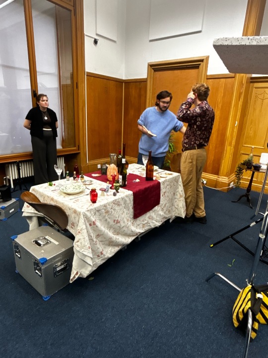
When we were given this task Cara, Abbie and I created a Pinterest board so we could organise our ideas and plan the aesthetic we wanted to achieve with our dinner table.
We also organised a couple online meetings to coordinate our ideas.
At the time of the first creative exercise I was without a flat and couch surfing, so I didn’t have anything to bring along, but Cara and Abbie had plenty of props to set the table effectively.
In class we had to mark up the script as a group, planning the lighting, camera and production. Once we had initial ideas sorted we split up and got to work.
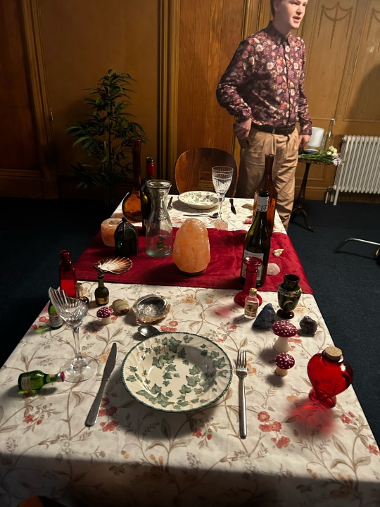
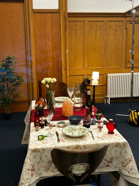
Cara and I dressed the table with our props. We wanted to give the feeling of chaos, as our character, played by Max, was a little bit insane (trying to poison their date!). We used reds and greens to add vivid colour and give the impression of poisonous plants. Gemstones, pots and small statues gave the impression of something mythical, eccentric - a vibe of witchcraft or greek tragedy. We had accidentally broken a glass setting up, but we used the cracked prop to symbolise the fate of the unseen guest. We also dressed their side of the table with more poisonous imagery, including mushrooms, a red heart jar and strange vials.
On the opposite side of the table we placed large vases and bottles that would frame Max’s face and give him a sense of power.
I really enjoyed this task and had a lot of fun learning how to dress a scene with symbolism and appropriate props. It taught me how to make a sense of chaos without creating clutter and helped me understand how to bring a characters intentions across with just the set.
0 notes
Text
Asian Cinema - Seminar
I decided to do my Asian Cinema seminar topic on Park Chan-Wook's Vengeance trilogy and how the Korean concept of Han changes the narrative of their national cinema.
I had a lot of fun making this presentation as I am in love with Park Chan-Wook and his filmography. He is one of my biggest inspirations and this particular topic deeply interests me, so it was no chore to create this project.
If you are interested in learning more about The Vengeance trilogy and the history of South Korean revenge cinema I have included the link to the seminar below.
0 notes
Text
On Set Production
Creative Exercise 2 - Production Design Research
The set design in Succession never ceases to amaze me. It's so subtle how these people flaunt their wealth, even if every set is dripping in fancy artwork and designer furniture, and it is clear that everything was expertly chosen to create an atmosphere of detachment. The surroundings clearly reflect the Roy’s disconnected family and how their private affairs and dealings are nothing more than a show for more shareholders. Even though these are their character’s living spaces they do not feel inhabited, instead they are almost clinical, more museum than home.
The only spaces that actually feel like they are lived in are their office, which is where the Roy’s truly reside.
In an interview with the SDSA, set designer George DeTitta Jr said "We didn’t want to draw overt attention to the family’s wealth with the decoration of the show, instead selecting a mix of pieces, both contemporary and antique, to tell the story of their elevated place in society more subtly."
The spaces engulf the characters, making them seem tiny against the sky-high ceilings and polished windows. It is a visual representation of how their wealth and success has eclipsed all else in the Roy's lives and swallowed them whole, digesting whatever remnants of themselves exist outside their public persona. There is no inner world to these characters that isn't flayed publicly for someone else's gain. They exist to be seen, in their luxurious homes and towering office blocks, not understood.
“There’s a very polished sheen. It’s one of the things about all these characters’ environments—it doesn’t feel like they put down deeper roots and have a lot of their personal history somewhere …. There’s a bland interchangeability that’s pleasant and beautiful, but doesn’t get deeply character-oriented.” - Executive producer Scott Ferguson
0 notes