Last Seen Blogs
ace-and-the-rpg-horrors
my personality is pandemonium
blindmanbaldwin
blindmanbaldwin

therainb0wpaladin
“Hey, Man...”
animewayy-blog
BOYSLOVE♥
Text
Started something new :)

There's actually a second half to this that I forgot to take a picture of, but I'll get that tomorrow.
Also here's this

0 notes
Text
Haven't posted here for a while and for good reason, I haven't actually fucking finished anything
So here's a comp of my unfinished stuff :)


Here are the things that aren't technically done but they're done enough

#don't know how much of this I've already showed before#but this is all there is rn#haven't actually been drawing much#or writing for that matter#been in the big 'ol 5 month depression phase#leaving me artistically inept for the most part#sorry lol
0 notes
Text
OK
Character design stuff
There's a lot that goes into it, so everything is gonna be kinda brief.
There's the few main points I'm sure most already know about: color, shape, representation of character, silhouette, etc.
What I'm here to do is to ease some of the expectations on character design.
First point; not everything about your character has to be included in the character design. Not every aspect of their backstory, not every personality trait, not every power they have. Many things can be easily summarized, and understanding context of the world the character is in is equally important.
On top of that, there needs to be an understanding that different aspects of the character have to be displayed in multiple different ways
Here's an example: I had a character that was sinister and manipulative, they loved to torment people and acted as a sadistic manipulator. Backstory is that they're a fallen god who preys on making people suffer to get by
I was advised to make the character look more grander and powerful since they're a god, now let me tell you why that's actually not a good idea. It would undermine the rest of the character's aspects. Say I put them in a lavish suit of armor, or built them up in some way to seem extremely powerful, then does that give you the same manipulative impression? Would a big hulking character give you the sinister impression the character is supposed to have? No.
So how do you show their backstory? Well it can be done in several ways, be it actions, certain character traits, world context, anything. In order to avoid cluttering up a design, understanding the different outlets in which expression can be shown is very important.
On top of that, body movement, facial expression, etc. those are all a part of character design. Say a character is in an action shot of using their power, but they look anxious, in pain, or stressed, a fearful expression on their face while the things around them are destroyed. This tells you one of two things, either the situation, or that the character has immense power that they can't control. Both these things can be represented in the same moment, and that shows the characters immense power without having to focus on making them look grand or overwhelming. Context is important for character design and how that character interacts with their own world. So don't stress about fitting everything into the design aspect, and develop the character further within the world.
Next idea is a silhouette, and this also pairs heavily with shapes: the idea is to be able to pick out a character out of a cast. Note the latter part of that statement, out of a cast. Meaning the character doesn't have to look totally unique, it just has to be so among your other characters. Say you have a character with a ponytail and a hunter getup. That's a pretty common fantasy character, and compared to other silhouettes might not stand out as much. However within in universe characters, is almost always uniquely different, and that's what's important.
On top of that, silhouettes again have a large part in body positioning. A character can be infinitely easier to identify if their body language differs from the rest of the cast in their silhouette, or even just aspects of it. Take this example, say you have two characters, both with long hair, one is supposed to be calm and one is supposed to be crazed. If you just draw them both standing there, yeah they might look the same, but that's not doing the character any actual justice. The calm one might have a stiffer or straighter posture, feet together and arms in front of them. The crazed one might be bending over, their hair might be flaring up, they might be clasping their face with their hands, anything. And now once that distinction is made, the two silhouettes become entirely different, and you can easily pick out the two. So again, the idea is to calm down, take a breath, and understand you can have two similar shaped characters, because there's other ways to make distinctions and show expressions.
This brings us to shapes. Main point YOU DONT NEED TO OVER FOCUS ON ONE SHAPE AND YOU DONT HAVE TO OVERDO IT. A lot of advice I get is "oh that character is evil? You need to put a bunch more points on it." This is actually terrible advice. Again, expression is important; body language, color, story and world context. There is so many ways to show a character is evil rather than just cluttering a design with points. Do shapes work? Yes, that's why it's a focus, do people overdo it? Absolutely yes.
Go back to the fallen god character I had. Their hair fluttered out into points, the had a dress that had pointy frills. Their eyes and eyelashes were sharp, they had a horn, and fangs. That is plenty of points to get the general motif of the character. However I was advised to add more, issue was there wasn't anywhere to add more. On top of that, if I wanted to follow the prior advice of making them more grand and imposing, then I'd need to use blocky squares, so again completely undermining the shape representation.
You do not need to over do it on shapes, hell they don't even have to be protruding out and be a part of the silhouette. Look and Jinx from league, she has X's, (or maybe it was V's idk) all over her design, and this ties in heavily with the characters backstory and personality. However, it's rather hard to make out any of those shapes in her silhouette, and that's because they don't need to be. She has unique body language, a unique body type, identifiable weapons and hair, so the shapes weren't actually necessary in her silhouette, and yet she's proclaimed an extremely good design, just think on that.
Now, let's revisit this idea of not having to over focus on one shape. How about we go to an extremely iconic character, Cloud strife. He's got spikey hair, a blocky sword, and round shoulder pads with cylinders coming out. Literally, all over the place, but this is alright, why? Because one shape is still predominant, which is the spikes. Hair is most forefront, the sword still comes to a point, and the cylinders role as spikes register before the shape does. It's ok to incorporate other shapes into a character's design, and remember that shapes mean different things in different contexts. Again, cloud has a lot of spikes, is he evil? No. He's just kinda sarcastic, aloof, and cold, and those are just basic traits that leave more to be discovered as you learn about him through the games.
Note that: leave room for character growth and discovery within the character design. You don't have to completely change their design every time they change (altho it's still alright and sometimes better. Again, the whole point is to show that there's options)
Either way, different shapes mean different things in contexts. Points don't always mean evil, aggressive, or angry and dangerous. Circles don't always mean bubbly and safe. Squares don't always mean large and in charge.
Another use for shapes isn't even representing the person of the character, but rather their role. Take for example any defender or Paladin in a game. Normally, they have a huge ass rectangle shield, right? That's exactly it. Now take Hoshiguma, a character in Arknights for example: her shield (as she's a defender) is a triangle. Why is that? Because a huge part of her archetype is she is a defender who doubles in dealing physical damage. If you look at Hoshiguma's actual character, she's actually rather carefree, playful, but also cares heavily for companions. Is her design bombarded with circles? Nope. That's told and discovered through her words and actions. On the other hand, a big solid shape shows she's a big tanky defender, and the points represent her niche of physical damage. Shapes can mean several different things, so use them in variety.
Next point: colors. I really hate talking about colors, because people get real pissy about it. I'll put this first and foremost, but the idea that two colors don't go together is a complete lie. Correct, some colors don't compliment eachother as well as others do, this does not mean you can't use them together. This is especially important in character design. When it comes to colors, which ones are used heavily depends on their moderations. Think of any basic color combination, and I'm going to guarantee there is some iconic character, or mascot, or smthn that has that palette.
You can say red and Orange don't mix well because they're both warm colors right next to eachother BUT THAT IS FALSE. When using colors like that, they both have to be equally dominant to work, or there has to be another tier. Both red and Orange would have to be equal, or there'd have to be layers like mainly red, with secondary white, and orange accents. The issue is when orange is the secondary, because that makes the portion's awkward.
As important as it is to understand good color palettes, it is equally important to understand color proportioning and harmony. You can use literally any colors you want, they just have to be proportioned correctly. Or you can just use complimenting colors idk and idc do whatever you want, that's the whole point.
Final topic: just like shapes, colors also have different meanings. Easy example: red. It can mean angry, it can mean bad, it can also mean warm and comforting. Color context is important in the same ways with everything else is. Say again you have a calm and crazed character, if both of them wear red, that red now means completely different things.
Alright, that about wraps it up for what I'm willing to say cuz I'm getting tired. Main takeaway is again to reassure you that there are options, there are so many ways to express a character, and so when it comes to the design itself you can take it easy. Do what feels right, and incorporate the rest some other way. The idea is to give the design life, not to break it down in every which way. Not everything has to be crystal clear or even represented at all in the design.
I also want to clarify that you don't have to worry about checking everything I talked about. You don't have to run down some checklist of whether body language is correct and communicates well with the shapes and if the shapes communicate with the colors and the colors to the body language and that this and that and whatever. Calm down, take a deep breath. Remember, all of these are options. The main idea is simply just consistency within the character. Do what feels right, look over it and edit it, and then plan out whatever else you want.
You have to understand how to tell the character in order to design them, not the other way around. Design is to express your character, not the design itself. This is why some designs that over reference other things come out lifeless and hollow. There's a very beautiful dignity in simplicity when it comes to design, and a lot of people overlook that. Look to the main cast of Hori-san to Miyamura-kun (idk if I spelled that right), they all just look like your average slice of life school characters, but they're all deeply expressive in their own ways. Their designs are simple, but they're absolutely amazing. You have to understand the character to make the design.
Alright, I'm going to actually finish this off with a character design analysis of my own in order to further demonstrate everything I've said. I swear this is the end so bear with me.

Alright, here's the character. They're from Arknights, their name is goldenglow, and let's break down their design.
First things first, easiest thing to see is the waves around her. This indicates she is currently using her ability in this depiction. Now, take a look at her expression. What I see is anxiety. Now take a look at the broken objects around her. This directly tells you that she cannot control her power, an example I used earlier.
Let's dig deeper. She has cats around her, ears and a tail. This is simple, she's a part of a feline race within the Arknights universe. Now, take a closer look at her tail and hair, it's all frizzed up. That tells us that her power has to do with electricity. Now also notice the random shards or pointy glass like items around her. This tells us that they are also a factor in her power. Whether she strikes with them or through them can't really be told.
If we go by shapes, the spikes on her design clearly show she's powerful. Not evil or aggressive, they're simply a comment on her power level. So what shape shows her character? Well, she has an orb on her staff, round eyes, rounded out knees and tail, the top of her head is specifically round as shown by the dropping ears. From this, we can assume any of the attributes associated with roundness as her character. Which exactly? Unknown.
Obvious point out, the broken objects around her show she lives, or at least is within, a city. On top of that, look at the grime and rust on the objects, doesn't seem like a very well kept city. Let's dig a little deeper, look at her clothing choices. Firstly, heavy duty coat. This can mean a variety of things, she lives in a cold area, perhaps she lives in a violent area, perhaps she lives in a dirtier area, etc. Heavy duty coats often represent blue collar working areas in designs such as this, so maybe she lives near a factory, which is then supported by the surrounding items.
Then she has a semi casual formal shirt, a name tag, and dark partially transparent skirt. This says that she's maybe in school, but the name tag would be out of place, so maybe it's a place of work? Like a bar or restaurant? Due to the transparency of the skirt, we can say it's not too formal, so probably a bar.
Lastly, let's look at colors. Main colors, pink and purple, yellow accents on her and a primary blue on her powers. First thing that comes to mind, pink, and how it helps clarify the circle shape representation. This tells me it's less in the happy go lucky airhead kinda circle, and more that she's probably just a kind person. This is supported by the purple that compliments it, as purple often represents passion, meaning she probably really cares for the people around her. Then let's be clear that the yellow is kinda orange or dark, so this is less of a happy color and more of a hardworking color. Lastly, the blue, coupled with what we know from her expression, helps emphasize the size and brutal intensity of her power, like a blue fire, or rather in this case, lightning.
Do you see how everything comes together? How everything is used and communicates well? The shapes are consistent, the colors help express what the shapes say, her body language gives context to the colors, and her clothing choice does too. Everything is consistent, and everything communicates.
Now, let me ask you this, how much of what I was able to deduce, do you think was planned when designing her? I'd guess not even half. Her expression and the surrounding broken objects were absolutely planned. The yellow? Just accents. The blue? Aesthetic. The circles? They're rather subtle so honestly kinda a stretch lol. The whole thing about her working out of a bar? I could just be speaking out of my ass. You don't have to plan everything out, because people don't break down characters like I just did. The design is to give expression, life, and impression, not give every little detail about the character.
I'll be honest, I don't know if a single thing I deduced about the character is correct, don't really know anything about them I didn't pay attention to their story. If I did get some stuff right, then it's a good character design, if I didn't, then that doesn't mean it's bad. Maybe I don't have a certain context, maybe my interpretations are misguided from the original intentions. The design doesn't have to spell everything out. If it can, and can still then look good, then that's awesome. If it doesn't, then that's alright too. Don't stress about designing the perfect character, because all the pieces will fall into place if you let them. Golden glow is a good design because it communicates enough, is well portioned, and leaves a meaningful impression of the character. It gives the character life. I'm sure if I knew her story, then the design would just come to life even further. Let the character live, don't smother them with the design. Simplicity can be good and bad, but either way it is always underestimated.
#alright#done#I spent too long writing this#and you spent too long reading this#why?#because I felt like it
0 notes
Text
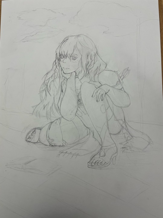
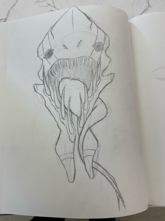
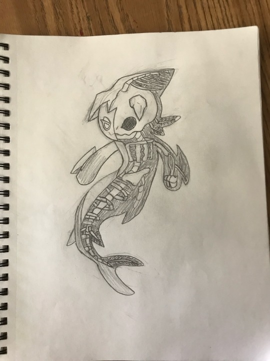
TW: gore stuff? Pretty much
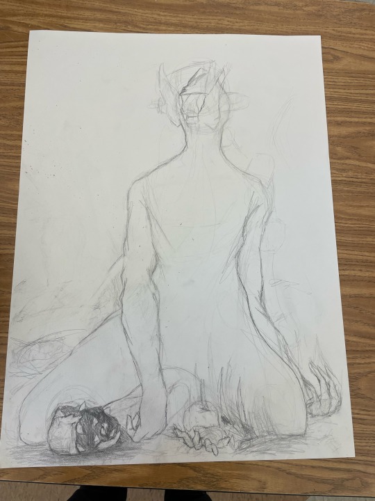
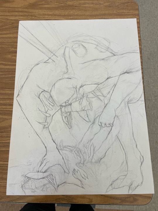
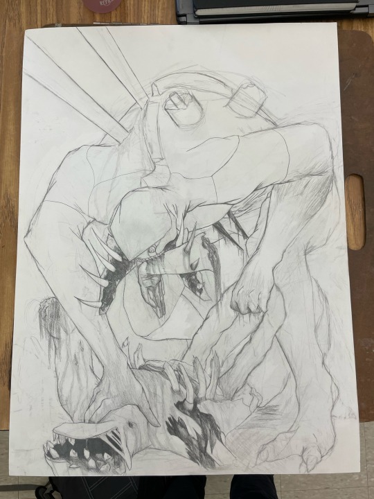
Oh hey yeah these exist. The first was the original idea, that was then abandoned and turned into the next, and the last obviously being how far along it's gotten.
And wings does still exist but is on hiatus for right now. Here's the latest on it

0 notes
Text
Oh hey, forgot to mention that I finished this.
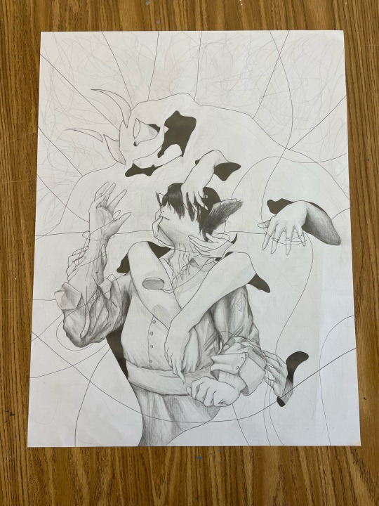
Also, this now ties in heavily with my current DND character, which I will post more about on the writing blog sometime.
BUT in the meantime, this is the next project!


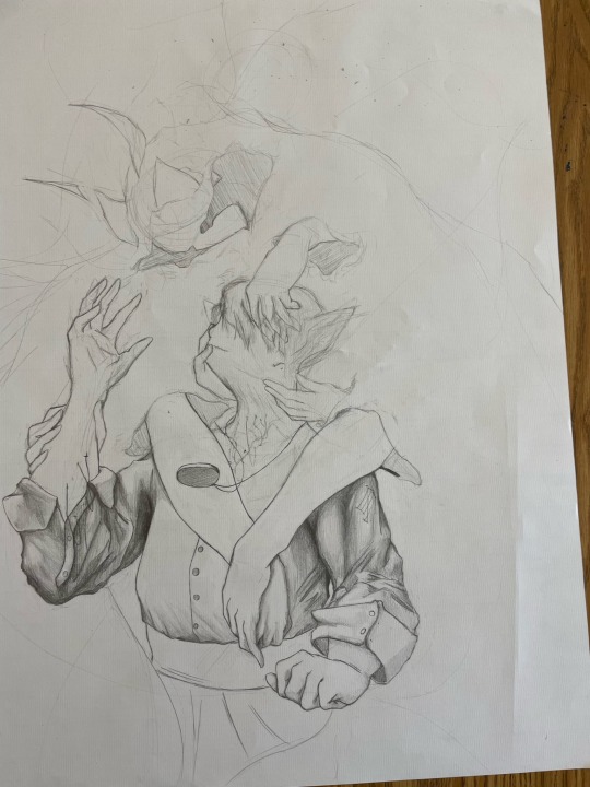
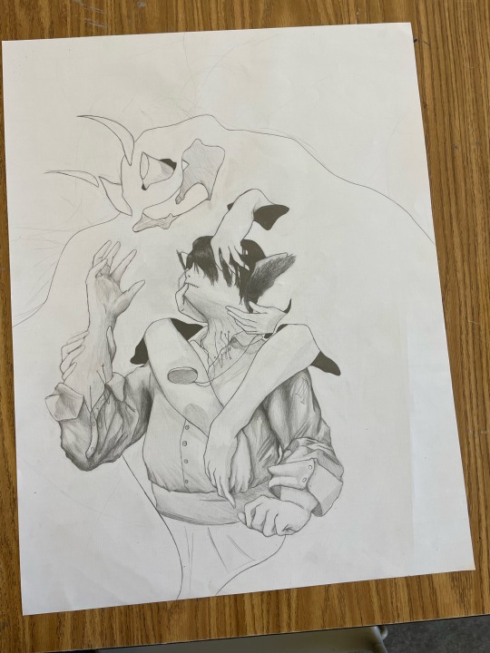
Wings are hard and I don't like it :)
Tried the anatomically correct wing thing in the left image. Didn't look good, tried combining three wing types at once, just overall not good. Then I said fuck it and did whatever's on the right, which technically is right.
But it looks cool, and they're pretty fun when you don't focus on being anatomically correct. So lesson of the day, stop worrying about accuracy and just make it look fucking dope, don't draw what you see, don't draw what you know, draw what you want my guy.
#also yes#it is another evangelion interpretation#that show has so many great designs that are just perfect for redesigning#not because the original designs are bad but fun#but rather they just let you go ham and do whatever you want#it is so easy to redesign something from that show and it will always look good#unless it's the plug suits#fuck the plug suits#I'm not good enough at anatomy for that#but everything else is great :)
2 notes
·
View notes
Text
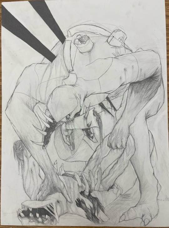
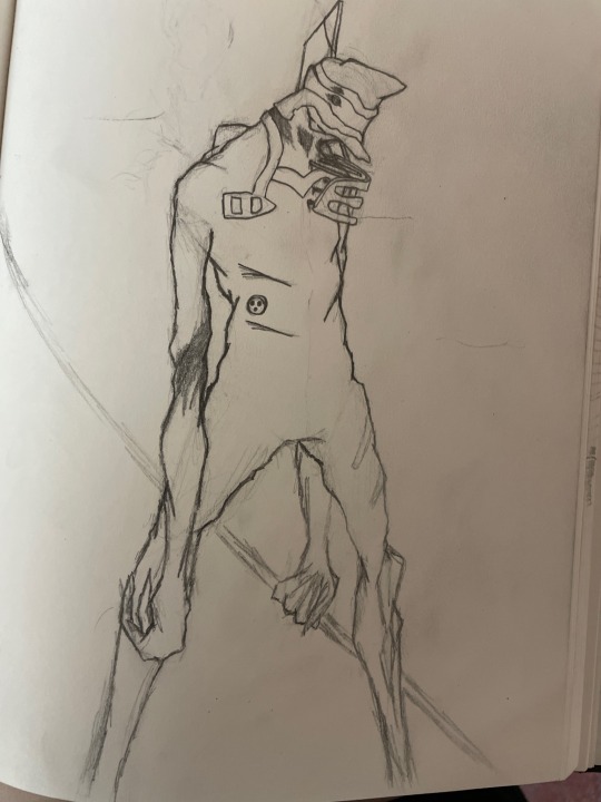
Also update to this. I did a little bit, but I did barely anything over the summer lol. Just continued shading the body and started on the other leg while refining the face a bit
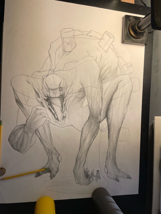
Oh yeah, forgot to mention for a whole month, my final art project was just a sketch of that last designed monster I showed
Here's how it started

And here's how it's going

School is out and I didn't finish, so am I? Idk lol, maybe, if I do I'll show it and maybe some updates along the way. But I've been out for like a week and a half and haven't done anything lamo
Also yes, it was inspired by evangelion :)
Haven't actually watched the rebuilds tho lamo
2 notes
·
View notes
Text
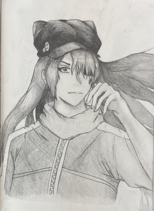
Howdy hey, I'm Threa, and damn that feels good to say again. Either way, here's some drawings I made that I forgot to update last time
First, larger drawing that I've been working on for a week and a half and should be able to finish on like Wednesday
And then, smol worm doodle because I got a shiny giritina in Pokémon omega ruby recently :)

#if you're wondering how I got it#there's this thing in Pokémon black and white/Pokémon black 2 and white 2#the servers for that game are shut down#meaning a lot of the online features are no longer available#HOWEVER#this also means that all previous mystery gifts gotten via internet are now available#some of those gifts include the shiny gen 4 trio#and so I got them and transferred them up to omega ruby via Pokémon home#I love shiny giritina with all my heart and I have claimed them as my daughter#my wife having taught me this has also taken responsibility and now we are worm parents :)
1 note
·
View note
Text
HEY While I was gone I did some little art things in a smaller sketch book I have, so here's what's completed or to never be worked on again
1 note
·
View note
Text
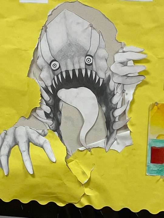
Oh yeah, forgot to mention for a whole month, my final art project was just a sketch of that last designed monster I showed
Here's how it started
And here's how it's going
School is out and I didn't finish, so am I? Idk lol, maybe, if I do I'll show it and maybe some updates along the way. But I've been out for like a week and a half and haven't done anything lamo
Also yes, it was inspired by evangelion :)
Haven't actually watched the rebuilds tho lamo
#also that thing on the ground is a cable#not a pool of something#ok?#can we get that straight?#also not too into evangelion surprisingly#but I read the manga in a day lol#and my wife likes it#and I like drawing monsters#so here we are
2 notes
·
View notes
Text
Have I really not posted here in two months? Damn ok. Take this art dump


#yeah this is pretty much all that's worth showing in these last two months lol#everything else is just sketches#and any project has not been finished#so yeah lamo
2 notes
·
View notes
Text
My wife isn't a furry, but they made a fursona. Needless to say I'm confused, but I drew this

1 note
·
View note
Text
Howdy hey, I'm Threa, and I redesigned the angel from last post, and frankly like it's 10x better lamo
1 note
·
View note
Text
Hey I drew this and it's neat, kinda.
Shading and proportions are off, and overall the design is kinda meh, but I also think if I continue and redesign them a couple times I'll get something good.
1 note
·
View note
Text
HEY! Made another character
They do the wooshy fire thing
#I started this drawing with the shoes#needless to say#it shouldn't have turned out as good as it did
2 notes
·
View notes
Text
HEY hi, remember way back when when I got MediBang on my phone and was able to download a bunch of brush there but not on my laptop?
Guess what, WEVE FINALLY GOT THEM ON DESKTOP!
Yes it has been literal months, and yes I have been struggling without texture brushes and paint brushes, BUT NO MORE!
I can now like, make actual digital art without having to pain stakingly mull over detail by detail by the pixel. I can like, maybe actually get into digital art now instead seeing it as a bother.
Next goal, the program not crashing every time I use the fill tool or magic wand. That'd be great, but we've got one of the three issues solved, so I'm happy.
#it's about damn time#but hey#I might start posting more digital art#who knows#but maybe first I should just start posting more in general#lamo
1 note
·
View note
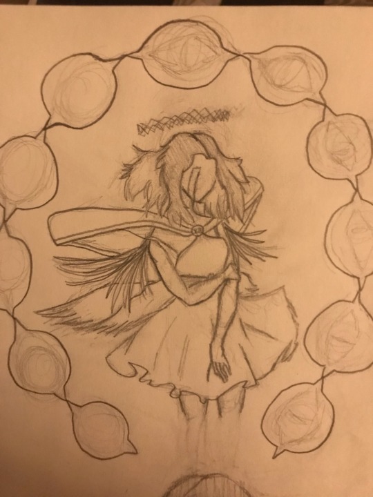
Text
Ok, now this one is interesting. So to preface the character is a demon type being. The main struggle was making them such without making them overly edgey in all the stereotypical ways. The reason I wanted to make this is because my SO had drawn an angel and I wanted to make the foil to it. I would show you it since they're actually amazing at art, but sadly I don't have a picture :/
Anyways, the design, let me tell you, I REALLY didn't like it at first. Here's the original concept.


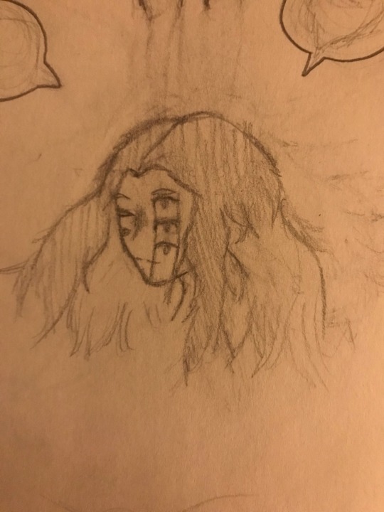
I tried it twice in similar poses, and I just really didn't like it. Because of the supposed empty gap in the pelvis the legs looked and were attached weird, the mouths all over the head looked dumb and didn't match the energy of the character, and outside of that it was just a meh design overall.
Not a good silhouette, no good or consistent shapes, couldn't get a decent pose or body language, and the list goes on.
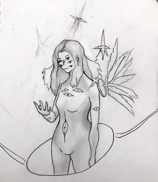
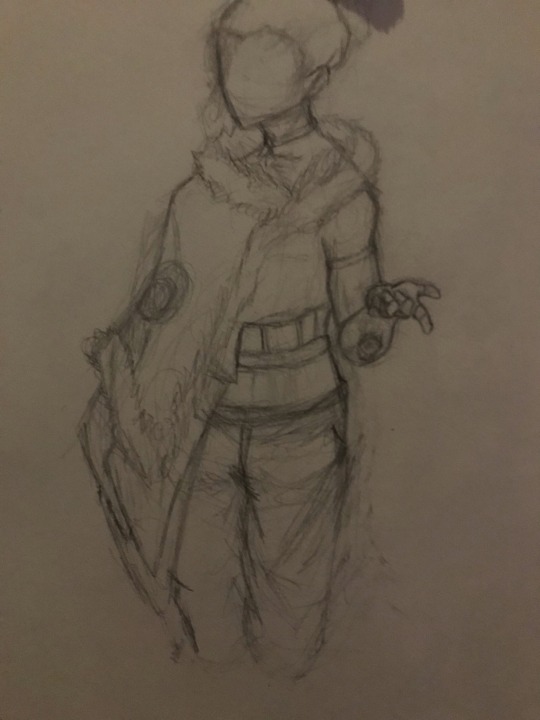
This one was about to be scrapped like the others, that is until I made a decent model, and decided to revisit an older idea, and I got this

Hell of an upgrade right? The old idea was using smaller wings for the hair, and it really worked. It also provided more sharp triangular shapes, and it adds more to the silhouette. The triangles around them also add some good simple shapes, add more to the design without making it too cluttered, provided I spread them out more next time, and help even further with the silhouette.
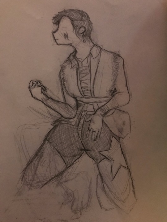
So I continued with this, and made some concept art, first of which is this.

Here is where I focused on the wings. I'm going to add more to them later, but what I really wanted to focus on was a thin, narrow, spidery frame yet massive hulking wings. It just gives a nice intimidating contrast. Also, triangles are more spread out so the design isn't as cluttered as it was before.
Then there is more concept art, and mainly only a hand at facial expressions. For the most part they're all meh, but I made this one which I just adore.
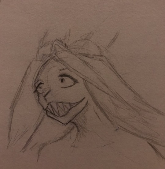
The jagged facial structure, sharp mouth and teeth, crazed eyes, fluttering wing hair, it all just works so well.
There's a couple of things I should explain about the design though, firstly the character can shape shift to a certain extent. They're features bend a twist according to their mood, hence the jagged facial structure and expression before, and the two mouths becoming one larger one. Only when under extreme stress can the characters whole body and features change entirely, but either way with this mood shifting it allows for a lot more freedom of character expression.
Some lore about the character is theyre not entirely a demon, but rather called Corrupted Light, an in universe species I created because yes I created a whole universe for this single character, what else would I do with my time, English homework?
Either way they belong to a faction called the Kings, and which is a sub faction they lead called the Rulers. After being imprisoned almost for a long ass time they can finally escape after making the triangles.
The triangles are almost like a catalyst of stored power made from God cuz he's dead in this universe cuz why not. So the power of God is spilt among the triangles, and while it is infinite power it is not infinitely powerful, so they'll never run dry but they can't like destroy everything in an instant.
The character is extremely playful and sarcastic and a little mean to everyone, and seems to get comfortable easily with strangers, but they've got trouble forming actual bonds with people and are scarred of abandonment or people sacrificing themselves for them. They're an optimistic nihilist if you remember when I talked about that, and they want ✨revenge✨ for reasons I'm too tired to explain right now.
#so this is the final character I'll be working with for this project#I really like them#and I might start writing another story around them#just more for the writing blog then huh#I'll update that blog sometime tonight or tomorrow as well#but too tired to do it now#anyways#really like this character#and I'm happy it worked out well#also pro tip#EXPERIMENT WITH OTHER ART STYLES#trust me#just do it#might explain why later#or not#Idk#but just do it
1 note
·
View note
Text
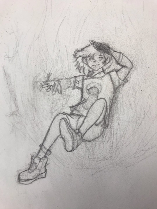
Ok, current project and I've got a lot, before I get to the design I decided to do the project on let's go through a few others first.

First is these two. Honestly not the worst, but I had no idea what to do with the head and since I have done a study in fashion design I kinda struggled with these. Not my favorites, but not bad either. There's also a lot I would need to explain for why things are the way they are, but I didn't feel like it so this one was scrapped.
Then there was this one. Honestly really like this one for some reason, it's a little out of my comfort zone but it works really well. The main issue was deciding a color scheme, and so this was scrapped since nothing fitted. But the story behind this one is theyre a trans boy who can't afford a binder, so they opened up a garage band called the "Narcissists" in trying to both raise money and pursue their passion. Might go back to this one later, but as for now it's good.
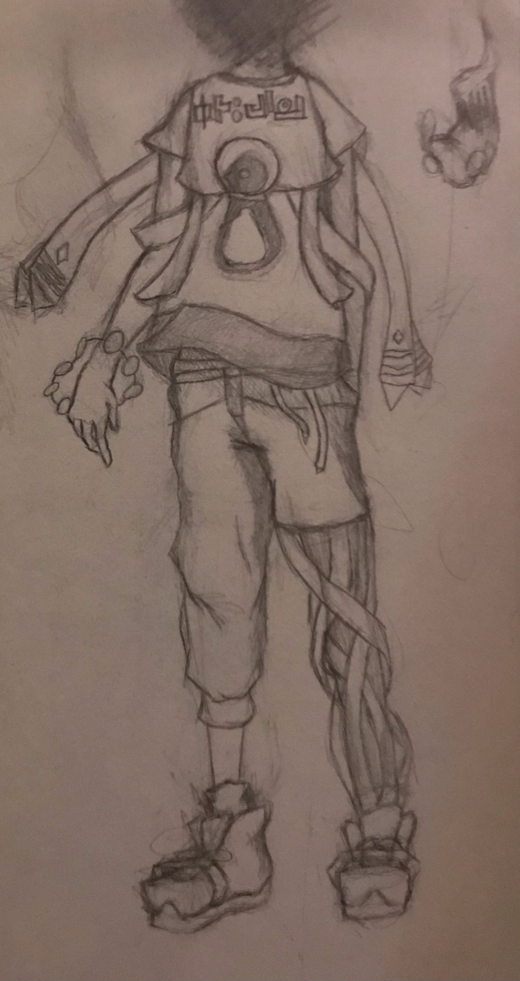
And lastly, oh boy the man the myth the legend. I made this one off on a whim and had to think of a backstory later, but basically they're a exorcist. I like this one since I got a bit experimental with the clothing construction, but it's a bit cluttered and I couldn't draw a head so he was scrapped. Also penguin logo, pretty much my insignia at this point lamo.
So that's the three I started with but scrapped. Again each for a different reason, clothing construction too weird, cant get a good color scheme, and too cluttered, but overall none of them are inherently bad. Some aren't well drawn, the first one, but the designs are decent overall. Honestly wouldn't hate going back and redoing them sometime, but that would only be when I have free time lamo.
#next up is what I decided on#and this next one went through a hell of a ride#so I'll put it in a separate post#the next one lamo
1 note
·
View note