
holliegibbsbavcdblog-blog
Hollie Gibbs
A blog to record my work from the BA (Hons) Visual Communication Design course at Sussex Coast College Hastings, provided by University of Brighton.
141 posts
Don't wanna be here? Send us removal request.
Last Seen Blogs
hufflepufftribute
WE ARE STAR STUFF.

xx-romantic-pup-xx
Angel | he/she/they | 18
ogpzthunderboltsblog
Intentionally Present
tiffleee
Tiff Leee

strampelmaxe
Unbetitelt
Photo
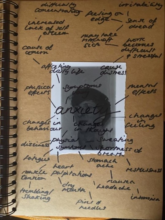
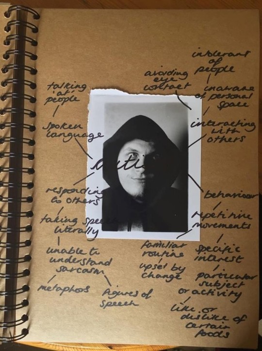
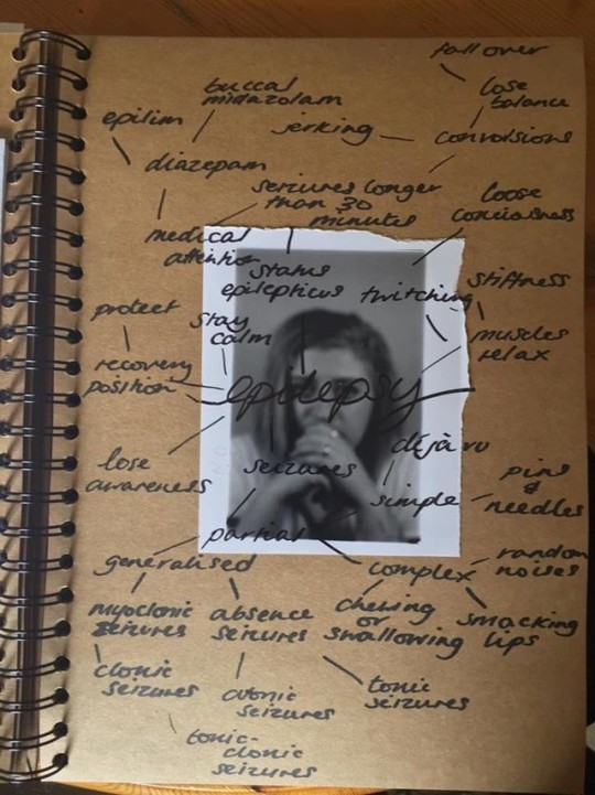
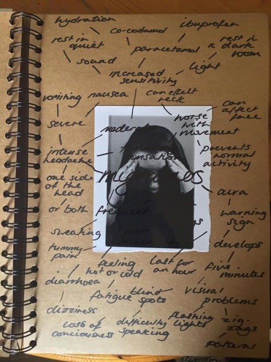
Diagnosis and symptoms - another experiment mind mapping the symptoms of the disorders directly over the 5x4 darkroom prints. I feel as though this will be too much information to take in at once. They were also created in my sketchbook and look very messy.
0 notes
Photo
Previous to making mock ups of my exhibition pieces, I also experimented with writing the diagnosis directly onto the film negatives and then exposed the images onto 5x4 sheets. I enjoyed the process and the results that I got from it but I didn’t really achieve the outcome I wanted. Also, I have permission from my sitters to portray them this way, but I feel including the ‘suicide’ image may be too personal to display in the exhibition.
0 notes
Photo
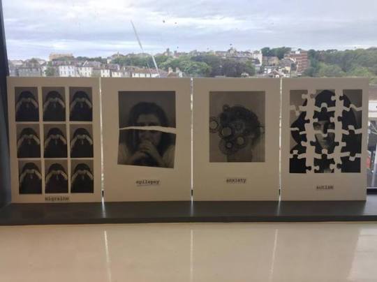
Second mock up of my Analogue exhibition pieces (A4). Created with the same concept as before although it was suggested I try a smaller size (5x4 on A4 foam board) as it’s more engaging with the viewer and I lose the rawness from the smaller prints as they are torn on the sides which adds to my concept. I am unhappy with the labels beneath the images - the font doesn’t work and it is far too large. Going to be looking at entomology labels for inspiration.
0 notes
Photo
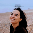
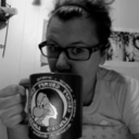
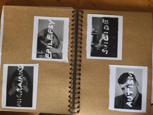
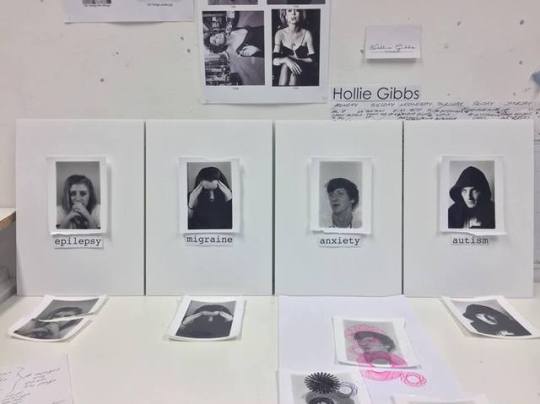
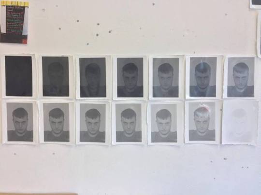
First mock up of my Analogue exhibition pieces (A3). My aim is to convey a diagnosis for the sitters depicted in the portraits, myself included. All my sitters suffer with their diagnosis which made it easier when it came to composition. These images are fixed with masking tape to create a floating effect, giving me the option to change them at any time. I am looking at using pins to secure both the images and text and black box frames to simulate an entomology display. This will almost contain the disorders and offer contrast to the pure white, clinical foam background.
Migraine - x9 of the same exposure to represent a visual aura growing in one’s field of vision - a common symptom associated with migraines.
Epilepsy - One intentionally blurred exposure to represent an absence seizure and a tear through the image to represent a sudden flinch or jerk.
Anxiety - Black spirograph patterns drawn onto a portrait to represent what is described as ‘brain fog’ - a psychological symptom associated with anxiety.
Autism - One exposure cut into 12 jigsaw pieces - the jigsaw piece associated with autism to represent the complexity of the disorder.
0 notes
Link
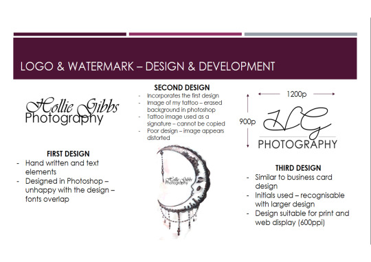
Also designed as part of the Professional Practice unit. I enjoyed the process of creating something from scratch that represents myself and the work I do.
0 notes
Photo
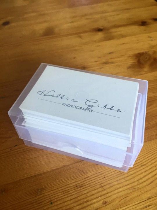
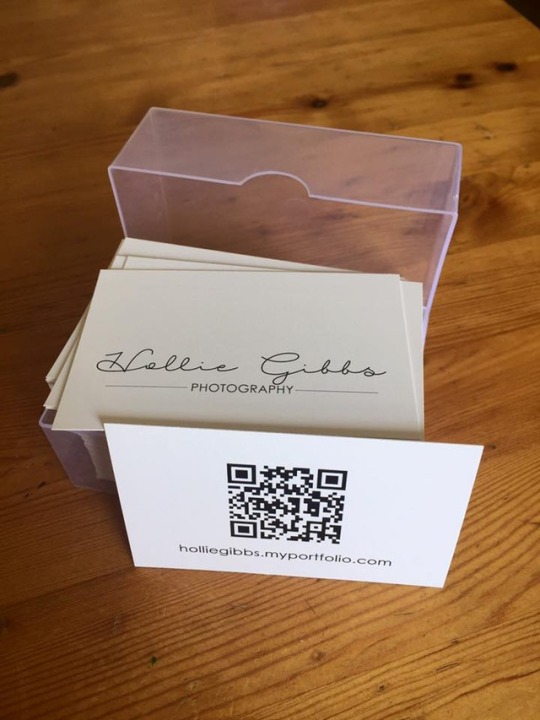
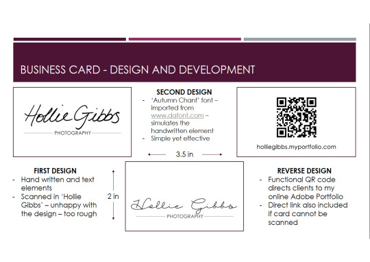
The business cards I designed as part of the Professional Practice unit turned up yesterday. Got 100 of these to distribute during the end of year exhibition at the end of June. 100% recommendation for Banana Print, they did a fabulous job for a great price.
www.banana-print.co.uk
0 notes
Photo
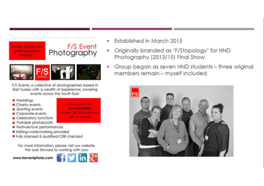
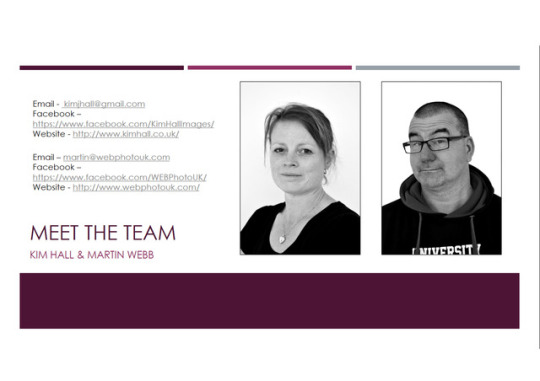
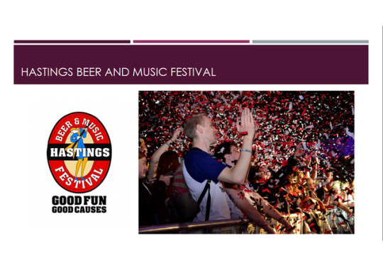
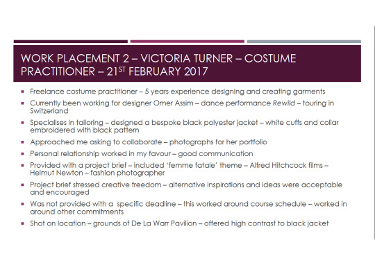
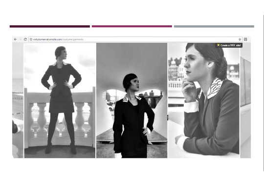
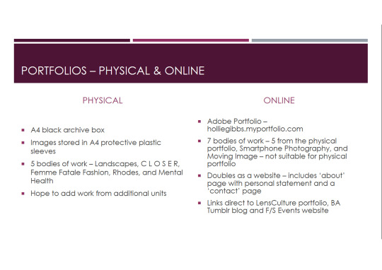
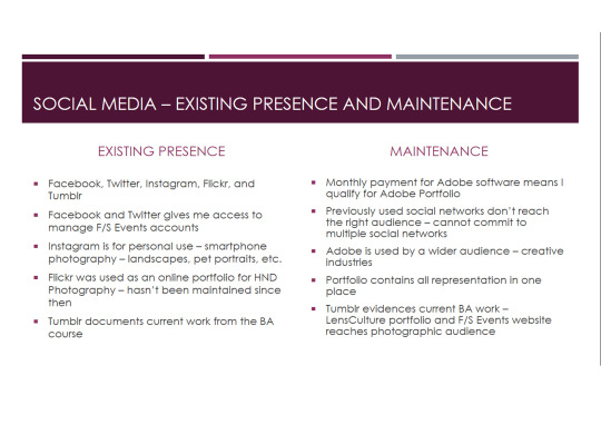
My presentation for the Professional Practice unit. Includes my two work placements, logo and business card design, my porfolios (physical and online) and my presence within social media.
0 notes
Photo
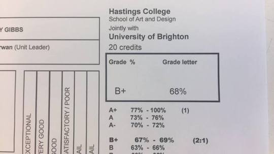
Got a 2:1 (B+) on my dissertation. This was better than I expected as before the deadline, I just had dribs and drabs of writing. It took a solid two weeks of sitting at a computer to get the bulk of the dissertation written, with a complete bibliography and list of figures.
0 notes
Photo
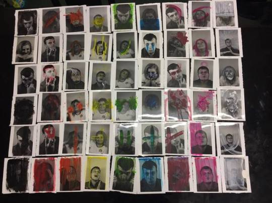
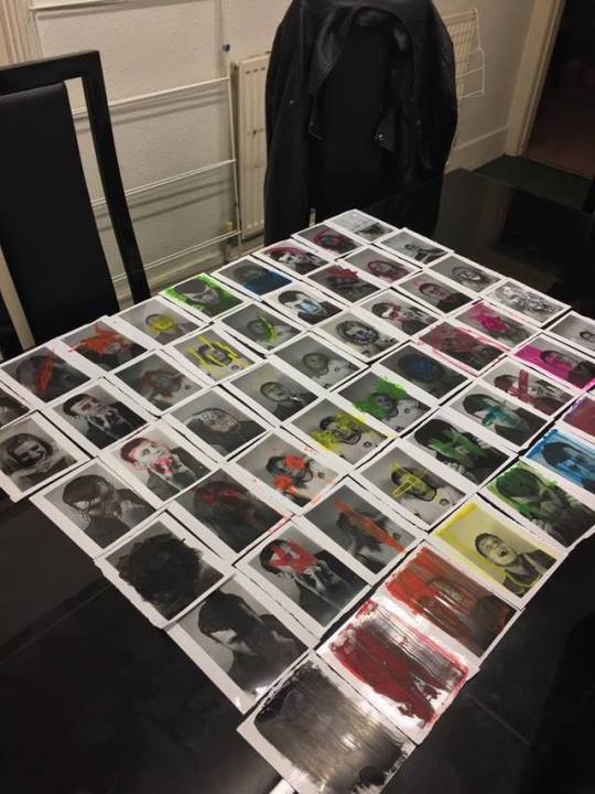
Experimenting with colour and human emotion. Research includes 6 artists who destroy, paint over, or layer over portraits in order to convey human emotion - Maurizio Anzeri, Arnulf Rainer, Stina Persson, Aliza Razell, Helena Almeida and Gerhard Richter. 6 techniques to apply to my analogue portraiture and 9 colours I experimented with - 54 5x4 prints in total. I think they work well organised in this layout and I would have used them for my exhibition piece but the more I experimented, the more I lost interest.
0 notes
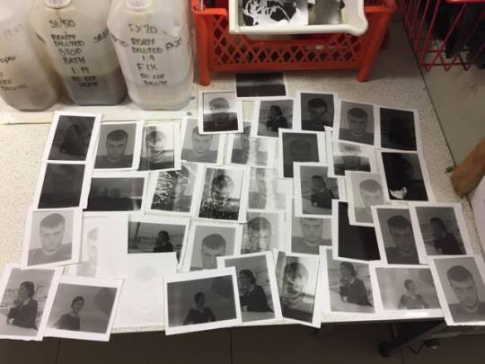
Photo
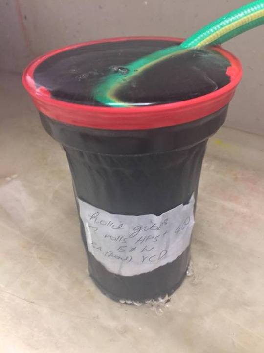
x2 rolls of Ilford HP5 + 400 black and white film, shot on a 35mm Praktica MTL 50 camera - successfully developed! Got a new found love for darkroom processing. Fully exposed during a portraiture shoot, associating colours and emotions for the Analogue project. Experiments to follow...
0 notes
Photo

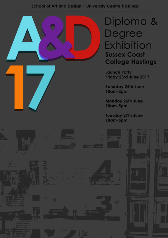
My designs and concepts for advertising the final show at the end of June - ‘Art & Design 2017′ - Poster (A3) and invitation (A5). The colours chosen for the title represent the colours designated to each floor at Sussex Coast College Hastings. The blank spaces are left for appropriate logos which become available to the winning designs. The end of year exhibition is a chance for students to creatively showcase their achievements throughout the duration of their courses.
1 note
·
View note
Photo
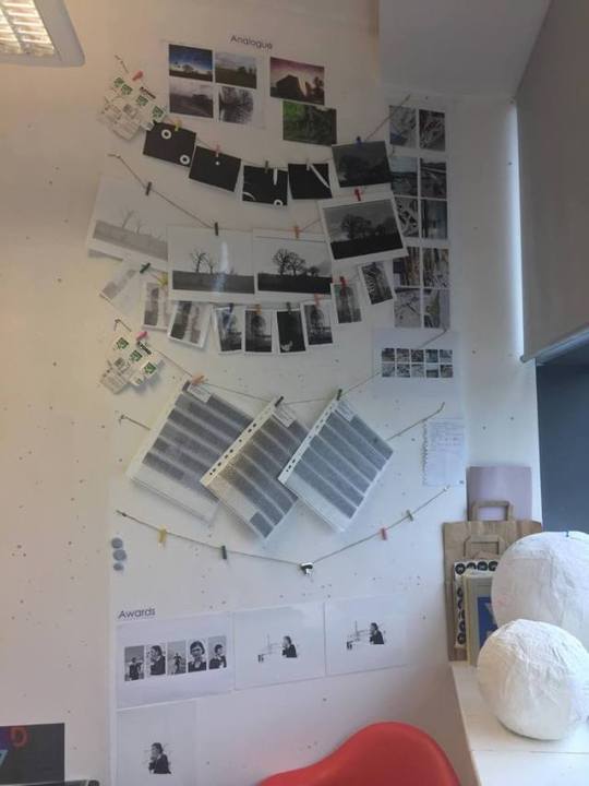
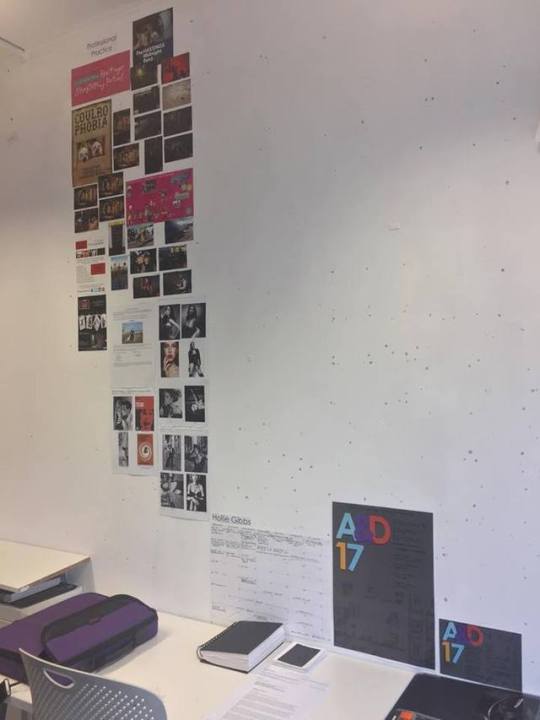
The state of my wall from two weeks ago. Since then I have developed 2 more rolls of film and been quietly working on the Creative Response project in the background. Will get more work up for that project and take another snap to update on my progress. I created a timetable to help manage my time efficiently and effectively. The A3 and A5 designs seen at the bottom of my space are the designs I submitted to an open competition for the production of the final show. Only a week to go before final hand in.
0 notes
Photo
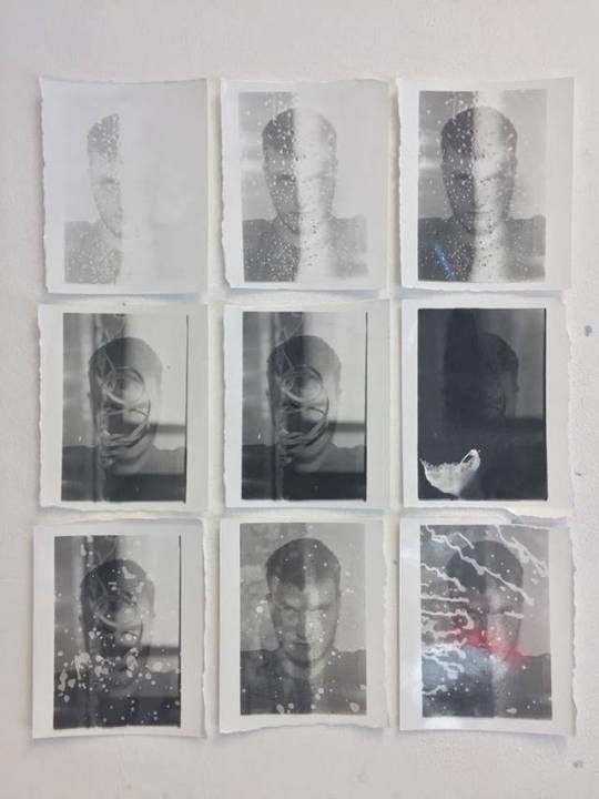
Some favourites from my fourth roll of Ilford HP5 + film. Practising with exhibition layouts in my studio space - quite fond of the grid layout. Also working by cutting 8x10 sheets of gloss paper into four 5x4 sheets. Like working with smaller images. I feel this size will engage the viewer more as opposed to larger images for impact.
0 notes
Photo
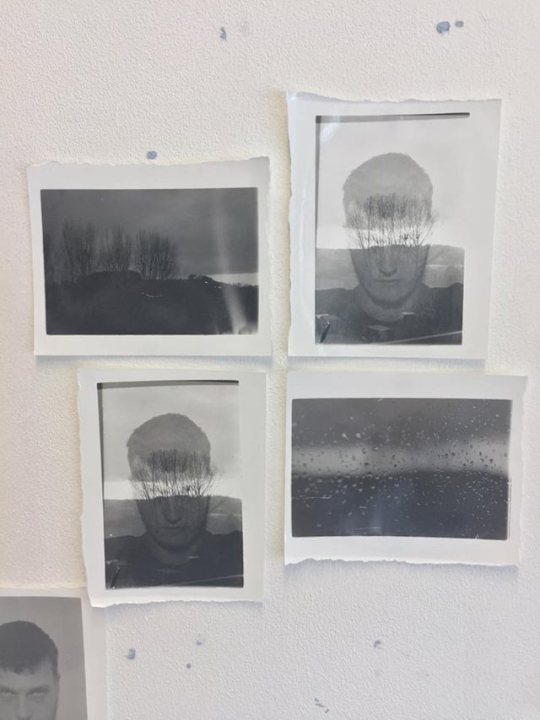
Spent the day in the darkroom developing an old roll of HP5 + and making small prints by cutting 8x10 sheets into 4. The roll featured portraits from a fashion shoot, portraits taken in my home studio, abstract landscapes, silhouettes and surfaces. The images seen here are for both Analogue and Awards, two projects from the Studio Practice unit. Also managed to create some interesting double exposures.
0 notes
Link
Peter Quinnell - Visiting Lecturer - 19/04/17
Collage and assemblage illustrator – popular and successful
30 years’ experience
Work displayed in and around Hastings
Works from Black Winkle Studio in Hastings, East Sussex
2D and 3D illustrations
Record labels, fashion magazines, newspapers, TV companies, advertising, shop window displays, etc.
Appeared in several books on illustration and collage
Prides himself as ‘experienced, fast and inexpensive’
0 notes
Link
Clare Playne - Visiting Lecturer - 30/03/17
Clare Playne – Creative Director
Company offers creative solutions
Graphic design industry – founded in 2004
Diverse range of clients – Macmillan Cancer Support, Black Dog in New York
Branding, signage, corporate manuals, annual reports, book and publication design, packaging, exhibition design, and web design
Experience in print and publishing
Freelance and editorial team
0 notes
Link
My LensCulture student portfolio account. It’s a work in progress but it includes my work up to date.
0 notes