
Last Seen Blogs

Photo

another example of designing for friends. These are some initial emblem designs of a few of the characters in a book my friend is writing. Unfortunately due to the heavy work load of thus module, I haven’t made as much as progressed as I would have wanted.
1 note
·
View note
Link
Artist and models&theories of practice research video collection
0 notes
Text
Secret 7″
I underwent the secret 7″ brief earlier on in the module but unfortunately due to the stress revolving around the beginning of the corona virus outbreak, I missed the original submission deadline. I have written up about what was going on with me at the time in my sketchbook which should be present in my documentation. However by my understanding it has now bee postponed until September.

My first attempts was through collage-ing for the song Foffee by Toast. Rather than trying to find a deep meaning to translate visually or trying to represent the lyricism, I simply wanted to try to emulate the mood I feeling whilst listening to the song. A sort of summery nostalgia, chilling in the park with some mates. Really nice, warm memories. Basically just trying to recreate an in-the-moment feeling, just listen to the song and be. Yet again I find it a a satisfying and natural way to get the mess of ideas in my mind out into the open. And as such they do end up a little surrealist, a bit abstract. But that leaves the viewer with the power of bringing meaning to it.
All the following pieces were created around the song Blind Willie McTell by Bob Dylan. (they are all in black & white as I felt this was the mood I was feeling off the song, not wanting to burst in with any colours)

Next I moved on to some mark making and painting as I thought I hadn’t done it in quite a while and needed to breathe-in some fresh air. The initial pieces are evidenced in my documentation as these have subsequently been scanned in and edited. Desaturated, combined, intertwined, overlayed, rearranged to help convey my emotions I was feeling during the song. I’m not sure exactly what they were, but maybe I don’t need to.
Next came something born out of accident. As I was scanning in the previous bits and bobs, i clumsily left my hand on the scanner as it was scanning. I decided to roll with the idea and recompose it properly, trying to add a little more emotion, movement and meaning to it. I have titled it “Mains d'Œuvres” in French as ‘main’ is hand and ‘oeuvre’ means body of work or piece of art and both combined means labour or workforce. I though it quite fitting in reference to the song as it talks about slavery.


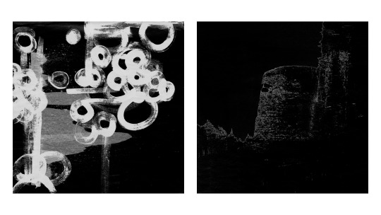
And lastly is a collection of pieces entitled ‘photons’ exploring and revolving around the subject of blindness. Personally not being hindered by loss of vision, I tried to represent what I imagined it to be like to not see. The closest I can get to it is having my eyes closed in a dark room just before drifting off to sleep. Prior to falling into the surreal and colourful dream world, I’d just stare at my eyelids. It’s not pitch blackness. Never. Those little darting lights are called phosphenes. Apparently it’s light that’s just bouncing around in your eyes, emitted by the atoms that constitute your retina. This means that if you weren’t born blind, then in most cases you can always see them. Blindness is a very complex and personal topic so I don’t even pretend to know even the tip of the iceberg on the subject, I am merely very intrigued.
So to try and recreate these phosphenes I used only black materials: the base being black card, I then did some mark making with black paint/ink. To add more contrast I etched into the paper’s surface with a screw. The pieces themselves are very textural, reminiscent of braille in a weird way. However I was looking to achieve the visual aspect here, so they’ve been scanned in and edited to reach the darkest shades I could achieve without loosing too much detail.
Research on that topic:
https://scienceline.org/2014/12/why-do-we-see-colors-with-our-eyes-closed/
https://www.bbc.co.uk/news/blogs-ouch-31487662
0 notes
Photo

Evidence of how the design of Beige progressed.
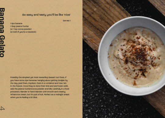
As soon as this covid stuff has blown over (or sooner) i really want to get this printed properly for people to own. And I really just want it to be a physical object, i am missing that tactile part of making work since lockdown started. I have in mind that it won’t be a hardback because as far as i’m concerned they really aren’t optimal in the kitchen, maybe more durable but too big and chunky. It needed to be of a decent size to be able to glance at it quickly when cooking but not too large either. And for affordability when printing i wanted it to fit onto A3. (i went through various design choices/ideas in my sketch book) I ended up choosing the dimensions of my first wooden chopping board i got for making fresh pasta a couple of years back to add that extra touch of meaning.
I based the entire grid system and character sizes on the golden ratio to subtly and subconsciously appeal to the eye. This had to be the trick after all to make beige look nice, as David rightly brought up. But i was confident in Jacob’s photography skills to really nail that too.
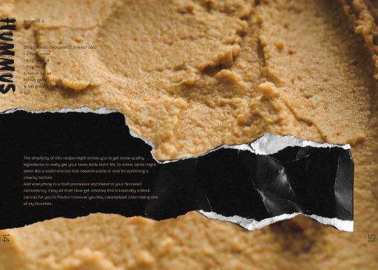
I was finding at the beginning and after my first chat with Ian, that the design was too solid and plain, even with the grid system in place. I knew i wanted to push for something more ‘collage’ in style to give it a more organic feel. Overall considering the situation that i am in, I am pleased with the result. I would of course have enjoyed refining it further if I had more time. I would also like to push more into seeing how best it get it printed and distributed. My best pal Tommy’s brother is getting into publishing himself so maybe there is someway we can sort something out, even if it is just him giving me some pointers.
As far as it’s success as piece is concerned, based off the feedback from people I have shown, it’s very positive. I was aiming to entice the viewer to pick it up, have a flick through and be motivated to cook or at least try a few recipes. To attract a wide audience, I aimed to make it contemporary yet different from the norm, gritty but clean, to a professional standard but friendly. I really pushed that last part in my writing. I wanted the text to convey myself as a person, my personality i guess, as if I was right there cooking alongside them. Basically I just wanted it to be enticing enough for people to try something a little out of the ordinary.
In this project I was also trying to test my not comfort levels, but maybe more my boundaries. Use this colour that I dislike and make something out of it. As normally i think i’d use elements, textures, colours, shapes, etc.. that i find interesting, pleasing and such to create work. So it was a bizarre but gratifying to change it up.
2 notes
·
View notes
Photo


what I have been trying to continuously do during this module is take on relevant small jobs from friends and connections of mine. Here is another one for my DJ pals Alistair (who mixed at VisMas) and Ashley’s livestreams. Ever since lockdown we have not been able to attend any house parties or nights out and as such that whole part of our socializing has been cut off. The two of them would always be mixing at our friends parties and as such have decided to try to translate this into an online digital format.
For the design I was aiming to keeping the style similar to that of their aesthetic, being well into sreet stuff, so keeping it grungy, a little graffiti. My idea was to combine a can and a vinyl into one shape. I used a grid underneath to keep everything proportional and inline. It also ended resembling a speaker so happy accidents. I like it when something unexpected like that turns up in a design only adding further meaning and intrigue to it. Another funny detail was when I randomly selected that grey it ended up have the RGB hex code of #2B2B2B much like in a DJ set when you have to back to back (B2B). I then also created some little name titles to keep visual consistency on the stream’s design. I really enjoy working, even it is for very little or basically free, for people I know as I would like to think that I am helping them seem more legit, more recognisable or quirky than if i hadn’t been involved.
0 notes
Text
online presence and work experience
during Employability fortnight, I was already in the midst of updating my online presence. I ditched wordpress as i found it very clunky and not very logical for Wix like we used for our group blog for 501. I wanted something speedy, ready to present to possible employers asap. This is why I opted for a free website hosting platform like wix as i knew this was somewhat of a temporary setup before i can properly invest some time in a neat site of my own. So helvexit.wixsite.com/portfolio has been up and functional since sometime in January, having been finessed and altered based of feedback from tutors and peers. Alongside this, I rewrote my CV which desperately needed some updating and based off the sessions we had one CVs during the fortnight, made it more coherent to being a creative practitioner.
My plan to contact employers and such to gain work experience or a placement over the summer kind of took the back burner after a few attempts as i began getting more invested in live briefs and projects. I find it an extremely demoralising and little-rewarding process to go through as it feels like slamming my head against a brick wall. I’ve been through the tedious experience before coming to uni when i was looking for an apprenticeship and so i think my brain has very little motivation to push for it as it seems so fruitless. And then when COVID came around i pretty much gave up. I don’t know if it’s my mind playing tricks on me to get away from doing it but I would much prefer opportunities to come up more organically. That being said one of the design firms i contacted has gotten back saying they currently wouldn’t be able to do anything in this situation but would organise a Q&A style online call to still asks questions and gain insight into how they function.
I have also been doing small logo and design projects for friends and family to keep me going and build my body of work and to support them of course. There may also be an opportunity of paid work from a freelance mate of mine for a project he doesn’t have the time to complete which is exciting. I have also been thinking as everything is online now, I could get on fiverr and at least get some stuff there as I know Damon is doing that quite successfully.
As other online presence is concerned, I have www.instagram.com/helvexit_design for most of my work and keeping people up to date. And then mostly as just somewhere for me to dump my photography and have an online gallery is www.instagram.com/grisaille_35mm/
Also ever since Steven’s workshop, I have been toying with a few ideas to create an ‘identity’ for myself. I have always found this extremely hard to do. Summing up my personality and who i am as a creative practitioner is really hard to do in just one image. I’ve spent the better part of like 4-5 years doing it. It always changes and I’m never happy with it. So this time I tried to just create something quick (as I’ve discovered recently that sometimes when I simply let myself create without putting thought into, I am really content with the results) using basic shapes and don’t attach too much meaning to them immediately.

this is the result. I played around with some doodles I’d drawn in a little sketch book of mine. I can now in retrospect probably try to explain why I made these choices and the meaning behind them. The circle represents the dot to ‘i’ in my name symbolising myself. The triangular shapes depict mountains, back in Switzerland where i grew up, where my roots are as an practitioner and a person. (I’m finding it hard to use the word ‘home’ in reference to there at the moment since I really don’t know where my home is at the moment) The dividing line represents a fracture or a separation, not sure what of yet. The angular momentum to the right hints to a movement forward, towards progression and change. Again everything is proportional to each other, playing of maths (which is weird because i find maths hard to wrap my head around yet know of it’s importance and presence in the human and natural world so I nearly feel obliged to remain attached to it).
See. I can make things work: from a few shapes i made haphazardly in a few minutes, I can attach meaning and ultimately see myself in it.
0 notes
Photo


Due to me being not being able to use the facilities at uni, trying to recreate a collage style for my cookbook, Beige, I had to get a bit crafty with finding ways around it. Since I couldn’t print out photos and collage them or even scan bits in, I would have to do everything digitally. I borrowed my mates camera and had a little first set up (image 1) where i used a solid background colour (to help with background removal in photoshop using colour select, see image 2) and laying a bit of plexiglass to flatten the pieces. However this failed for several reasons. Firstly the green was present in the shadows adding more problems to the already overwhelming colour grading down the line. The camera also couldn’t focus properly on the details through the plexi resulting in a blurry image.
So i switched it up (image 3-4) using a white background and had a bounce board thing and went to the brightest place in the house to properly illuminate everything and flatten the shadows. This allowed for much more detail and clarity and was able to cut out the background quite easily with a few photoshop tools. However the nightmare that was colour matching all the beige’s throughout the photos to maintain a somewhat similar tone, i will not forgot. will definitely keep this in mind for next time to try and figure something better out. But it got the job done.
0 notes
Photo

I attended one of Film Buddy’s online calls where Sarah Lawrence was guest speaker.
Much like during Careers and Employability fortnight, it was really interesting to gain her insight into how she got into the industry, the paths she took and what what makes her tick as a creative. I think that is the biggest thing i took away from those weeks back at the beginning of the module, was that there are so many ways to get into the industry, there is no straight way or formula, it often whittles down to lots of hard work, having the connections and being in the right place at the right time.
I really resonated with the way Sarah talked about the benefits of having a multifaceted skill set, allowing her to have more doors open to her. I totally agreed with her point of enjoying doing different tasks all the time rather than the same day in, day out. I also need that variation in my life, I hate to stagnate. Variation is key to keeping things fresh and motivating.
She also mentioned the fact that she gravitated towards smaller companies allowing her to actually learn more via experience as she would end up doing many different tasks since there wasn’t always one set person dedicated to each job. She strongly advised to find a work that gives you the bug to push for more constantly, otherwise it way not be the one for you as you aren’t giving your all. Along the same lines she recognised the importance of having a good community around you with whom you work well, who inspire you, keep you motivated, push you further.
On the side of getting employed, she said that personality makes up the biggest chunk of whether you actually get hired. She estimated it at roughly 30% technical skill set and 70% on you as a creative. As in how well you fit in with the team and the environment, your ideas and creative visions.
Lockdown has pushed her to get very creative with solutions to getting around things like for example she was putting on a play but since everything is closed at the moment she was going to be doing it online via Zoom.
She also had some advice to give herself now if she could which were: to create her own opportunities sooner, send questions to people we are interested in to gain insight, just generally be curious, get interested, build, recreate.
0 notes
Photo

(photography by Jacob Talbot)
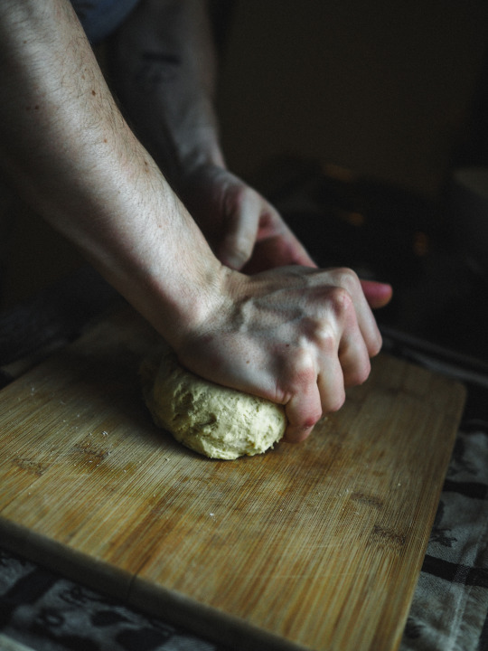
working with my housemate Jacob Talbot (on BA photography) has been a great experience. Coordinating between timings, set design, plating was crucial to making sure this was a success. due to the current situation, we had to improvise with what we had, for things like lighting, we only had only unfold-able bounce board and the natural light coming through the kitchen window, and plate-ware and ‘set design’ was very much limited to the capacity of our small student kitchen. I had originally planned on shooting as many dishes as once in a single setting with Rhianna, however it was established that still life/cooking wasn’t really her focused photography field. And then I don’t know why I hadn’t really thought of it but I live with Jacob who does much more experimental stuff but has a great eye especially for composition. So it turned out being in lockdown together sort us out perfectly. I then basically cooked 2-3 of the dishes a day over the period of about three weeks, constantly updating recipes in my notebook, rearranging the ‘menu’, swapping out dishes and then in the end when i was content with one, would invite Jacob in to photograph the end results.
It’s made me much more organised in the kitchen as for shoots I would need all the ingredients prepped, things mad, chopped in advance. but most importantly what this project has taught me in cooking is keeping track of what I’m making. Normally I just eyeball things, knowing/guessing from experience what will and won’t work, which is great for experimentation but here what is more important is repeatability, making sure someone else can recreate what I made. i need to make sure that measurements and ratios are spot on. So quite a few few took a lot of trial and error, evidence in notebooks. I think from now on this has taught me to be more aware of my cooking, on the quantities i am using, the ingredients and how they work together, how i can push myself to try new variables and most importantly to document this process.
0 notes
Text
briefs of interest since the beginning of 502
secret 7′
Ecuador Bienal Poster Design
Leeds Opera Festival Promotional Imagery Design
Uni t-shirt design
Uni Sustainability Award
https://99designs.co.uk/logo-brand-guide/contests/design-clean-simple-logo-appeals-travelers-995506/brief
viscompetitions.weebly.com
0 notes
Photo


this is dating back a few months ago now, but one afternoon just to get my mind of big projects and have a bit of fun, I decided to come up with some logo concepts for if i were to become a barber, as my housemate Jacob and I have joked about for a bit since we started cutting each others hair. We used to live in flat 4.3.2 at liberty park, hence the name ‘432′. I was looking for a geometric contemporary look, using shapes to represent numbers and meaning. I find the center image most successful as it has multiple facets: it has the numbers 4 3 2 represented by the different length clipper attachments all fitting together to form a hair clipper. Left, the lettering i created i find satisfying yet lacks a little depth and right is nearly so open ended it could be anything, but i enjoy that sometimes.
0 notes
Photo


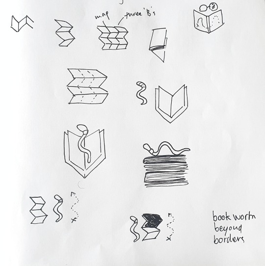
My sister just started her new blog, Bookworm Beyond Borders, and came to me looking for help designing her a logo. she already had in mind that it could feature a backpacking worm. So i started doodling knowing I would like to abstract her idea slightly to give the viewer a little more to decipher and find in the image. I decided it would be quite nice to use the assonating three ‘B’s for laying out the triptych of symbols to representing the name. I then came up with the idea of using an unfolding map to be the grid for this layout giving a zig-zag B definition to each illustration (see bottom left image). She was looking for the logo to be cute a fun so I gave the imagery a playful hand drawn look to them. After I was done with that, I liked the photo she used as a banner image (bottom right image) for her website so I asked if she wanted me to illustrate it in a similar manner, also asking her if she wanted me to personalise her wordpress theme further wherein I also found her a matching typeface: Comfortaa.
All in all this was a really fun project to undertake and I’m happy with the knowledge that I hopefully helped professionalize my sisters blog, at least aesthetically.
0 notes
Photo

very excited by the prospect of working with Jacob as his photographic style and experimentation is pretty much exactly what I was looking for, let alone the luck that he is my housemate for this lockdown. So far it has been great getting his input for the image making, final plating presentation and also taste testing.
0 notes
Photo


some quick initial test shoots to get an idea of what i was looking for in the photography
1 note
·
View note
Text
beige
cooking over the passed few years has been a really big part of my life, so this project came quite naturally to me. Below I’ve added a few links to resources that I find interesting or have inspired me on along this process. Since I am self taught, asiding from reading, I mostly watch cooking videos so over time I have compiled a playlist of 200+ videos.
Here is the link to my idea pitch
Avant Garde Vegan
pinterest board
Satisfaction: mug
Icheon Ceramics
Ceramists in action
Playlist of recipes
0 notes
Photo

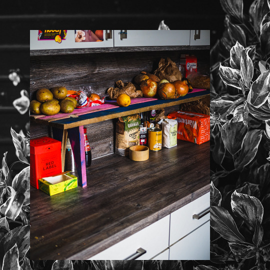

with the time that lockdown is offering, I’ve finally had the time to build a shelf for our undersized student kitchen. We have very limited cupboard space to store our foods and goods, I especially have numerous jars of many contents. There was a rudimentary plank ‘trough’ of sorts built by Arran but I found it to not be too practical: used too much material for very limited extra space. So for months now, in the back of my mind I’ve been planning up models and ideas for a new more efficient shelf. I knew I wished to reuse the re-purposed palette wood and had an extra plank in storage. that gave me four planks equal in length, yet one had some weird cuts on one ends so I would use that to create the legs, giving me a limit on the height of the shelf.
For a bit of perspective, I’ve made benches, shelves, tables and bike ramps out of wood previously and never really draw up my ideas as I’ve never really used/had access to precise machinery and standard materials. either by choice or necessity, I mostly use hand tools, not even powertools, and recycled materials. This means I always need to be aware of not only the materials imperfections but also mine. So there’s always a little play of wriggle room for error and adjustment, something a detailed plan would not grant. This project would be no different. I wanted to push myself further and try not to use any screws or nails to hold it together: only wood glue and joins.
I took some measurements of the kitchen, what would be stored on the bench and the wood itself, spent some time figuring out the optimal height I could get out of the wood for the legs allowing for structural integrity and storage clearance, then sawed everything by hand, chiseled out the joins ( having to sand with the saw as I didn’t have any sandpaper), glued it up and whacked it into shape with a mallet all in the space of a few hours. The paint job was halfly an already existing feature from it’s previous form so I simply extended that, leaving some raw bits of wood as a wink to it’s old profession as a palette.
The joints were a little loose on some of the first few as I didn’t want to splinter the wood along it’s grain when assembling but made them tighter on the successive ones, the wood glue doing it’s job securing the slightly less snug.
0 notes