
harrysnelldesignresearch
Harry Snell Design Research
86 posts
Don't wanna be here? Send us removal request.
Last Seen Blogs

ravingramblings
Mumblings and musings

imarebellbitch
Forbidden-km

epixium
the epixium room


of-monsters-and-daydreams
Permanent Daydreamer
Text
I forgot to reply to this -
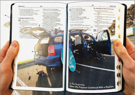
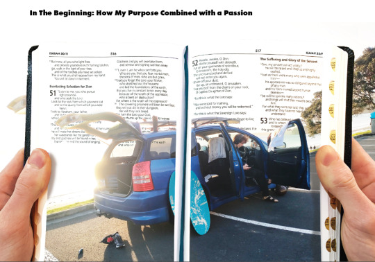
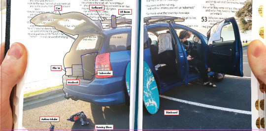
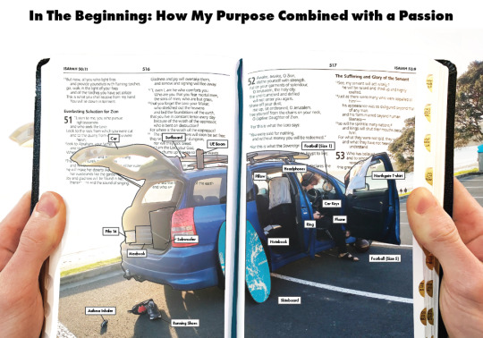
I liked the idea of the boot opening but I thought it didnt quite work as the Bible was spread horizontally and it would be difficult to make it look like the boot was opening - i also found it wouldnt be that significant to me as I wasnt sure how the boot opening could relate to anything besides the fact my car was in the poster
I also added all the images into the text pieces as in the critique i only had 3 up on the other page
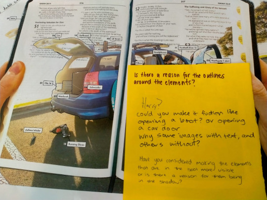
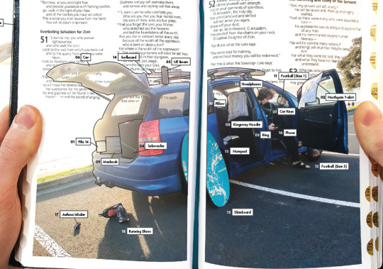
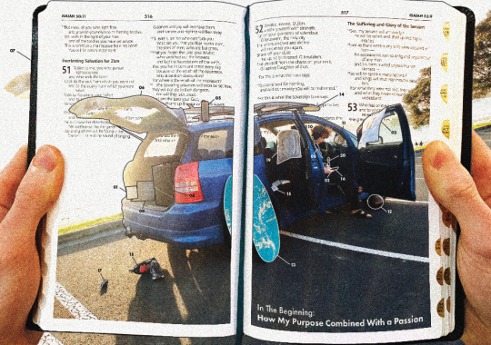
I would have loved for the objects that werent that visible to be made more visible but I couldnt edit them to make this happen - and settled for a use of outline around the objects in order to demonstrate the actual shape and also an image of the object in the paragraph on the other page
0 notes
Text
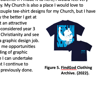
I added in FindGod clothing into the essay as I had seen lots of people wearing therre tee shirts recently and I also rebered i talked about it in my formative presentation. They inspire me as these are modern Christian design and I find them cool as, ifeel i dont find ,any christian design amazing and it seems outdated so this is inspiring and seeing how well it is doing - this inspires me to see if I can use graphic design to make some of my own shirts for my church and can use the level 7 facilities to help for this
0 notes
Text
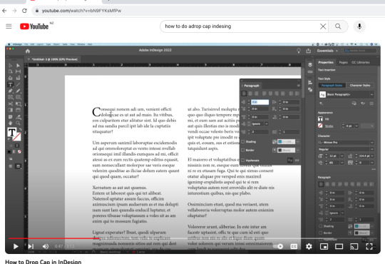
Used a youtube tutorial to learn how to drop cap - made the single digit nubers have a zero so it looked more in balance
0 notes
Text
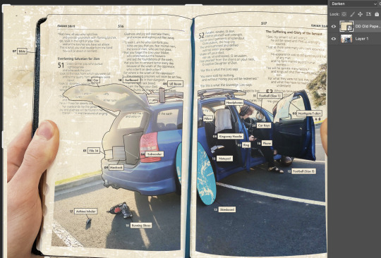
The adjustments made : i added a grain effect over the image as this was something i have done in any of my spotify playlist covers.
I also added an overlay of a yellowy sand and this gave the photo a warmer feeling to it and evidence of the overlay left behind some sand tracks which i thought created a cool texture
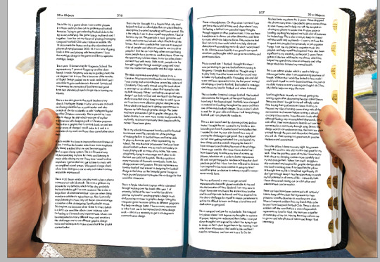
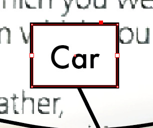
I also thought it was too busy with the text being placed next to the objects as well as the numbering system so i removed it and left the numbers with no box around them as it looked a bit weird when the box sixe had to increase for the double digit numbers
I added a title from my essay to provide some more context to the photo and aligning with the Bible a bit more.
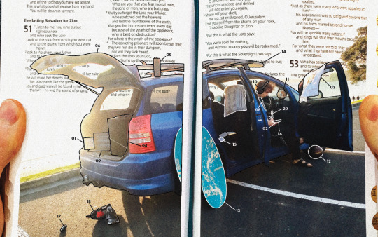
Because I value balance and order I adjusted the numbers so they were the same spacing away from the lines that connected them to the object outlines
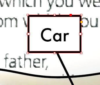
i made the objects have outlines as some were hard to see in the photo as the sun is behind - I made a black threshhold on photoshop to isolate the images shadows and left them next to the paragraphs they fit with to give people an idea of what the object looks like - I also replicated the bible stlye by making the numbering be larger and take up 2 lines in the paragraphs - also boldened the word when it was first mentioned to give another way of identifying which object goes with which paragraph
0 notes
Text
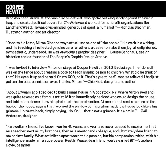
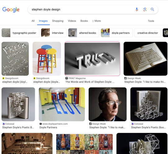
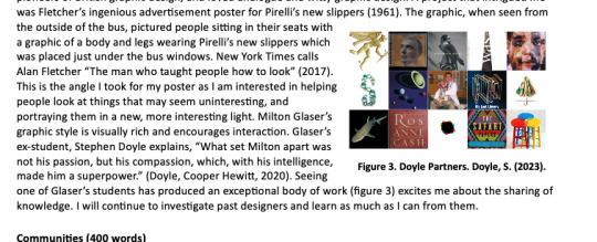
Stephen Doyle - Milton Glasers student and his amazing works - love his ability to see design opportunites in everyday objects and create something very interesting - and very tied to what Milto nwould teach him
0 notes
Text
-potential idea is to remodernise the Bible - change the text and layout ? but also need to show that it is a Bible and its layout is very prominant
0 notes
Text
Tried placing photo/graphic down lower so that there could be possiblity for a title at the top - liking idea of some sort of bauhaus font / replicating similar angles and forms to show my love for that.
Dont mind the idea of siplistic and clean labels of the objects - super easy to understand and the outlining of the objects is needed as some objects are not amazingly visibile from the photo which is unfortunate
Increased the brightness of the bible page so that it would go with the background and sort of blend together which is working well as it creates a less harsh divide between the bible graphic and the behind photo
Have tried to make it look as realistic as possible but could experiement abstract effects but will have to align a purpose for it , but I do like using effects in my own work so that could work but not sure if it would work with Bible style.
Cut out backgorund of sky in the photo to reveal scripture in the Bible and remade the titles for the top of the Bible to ensure people are given the idea that it is a Bible not just a normak book - I also changed the colouring of the bookmark ribbon to blue as this represents the ocean and the coastline which has been a large part of my life and I enjoy the coast very much
Making sure there is even spacing for the letters to sit in the box for the labelling, I do enjoy organisation and structure which I want to show through this methodical approach of labelling
0 notes
Text
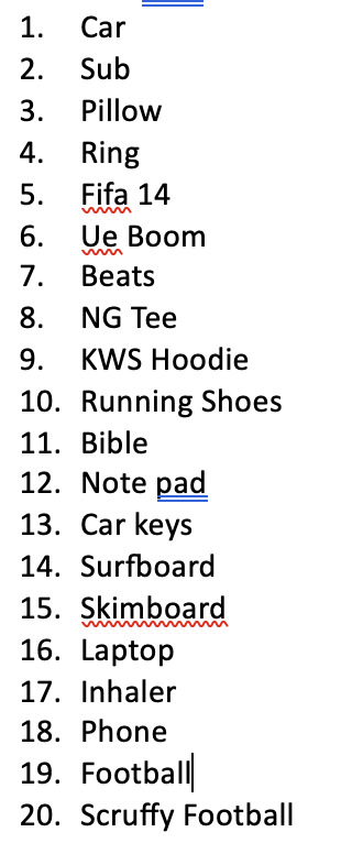
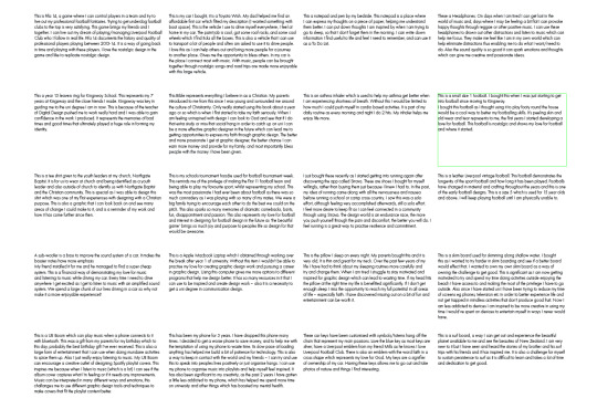
Wrote down 20 objects then went to previous document where I wrote down the unpacking of the objects - created a grid for the paragraphs - used a 4x5 and fit them all in
Will see what i will end up doing with them , was just a good way to be able to get rid of unneccessary sentences and rechange words to make paragraphs make more sense - keeping grid consisten with poster and making it reflect it.
0 notes
Text
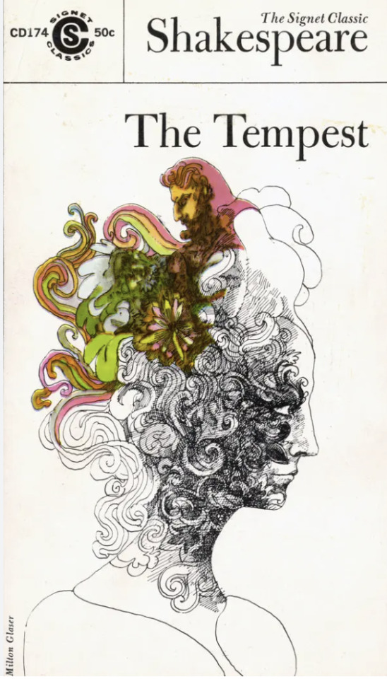
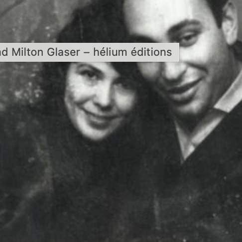
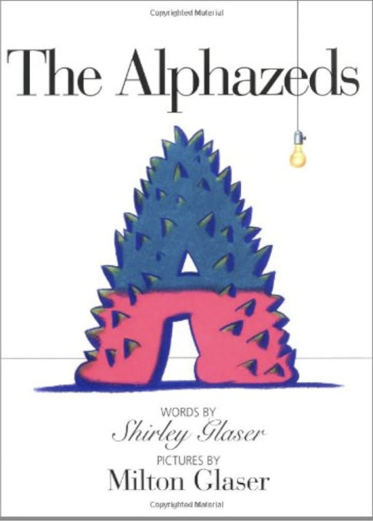
Some cool as deisgns I hadnt seen of Miltons before - also so cool how him and his wife could work together and create a kids sotry book - he would do the illustrations and she would write the narrative. Cool lil combination, shared a similar passion of communicating through print
Love the retro style
0 notes
Text
Loved researching more into Milton , would have loved for him to be my teacher, I watched a youtube video of him which has ultimately inspired me to wathc more graphic designers on youtube as you can learn valuable input from them. Main take away I took from the video with Milton was that if you dont back you designs, no one else will. This inspiring as i have to back my designs nad be honest if i feel a design is good quality, and try and sell it to others .
Found it sick as seeing his student become an awesome graphic designer - would loved to have been taught by him. He seems to have such a unique way of looking at design adn can create ideas out of everyday objects just by thunking differently.
He is so insanely good at painting and graphic drawings as well - I dont have that gift but I am keen to try and better myself at cartoons and photoshops photo editied which could help me produce similar owrks to him
0 notes
Text

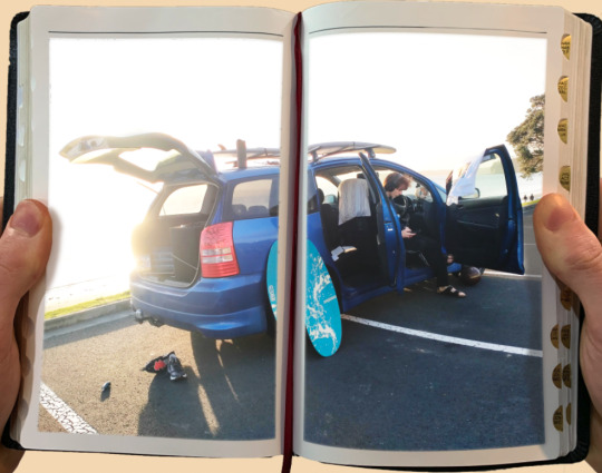
Progress so far : Deciding to put photo onto page of bible opened - have an eleemnt of personalness as my own hands are in there. The background will be the sea/ocean in the original picuture as it will hopefully look like i am looking through the book/using it as a lens to see what I should be doing with my life when I use these objects - use the Bible as a guide to live my life and especially with these things that I hold a bit closer to my heart.
Learning there is fine line between getting to caught up in the object eg surfing and when I bring God into it eg thank you Lord for this swag as earth and scenery I can experience, it alwasy make me feel more internally greatful adn satisfied that I can thank some one/God for the swag place that Earth can be
0 notes
Text
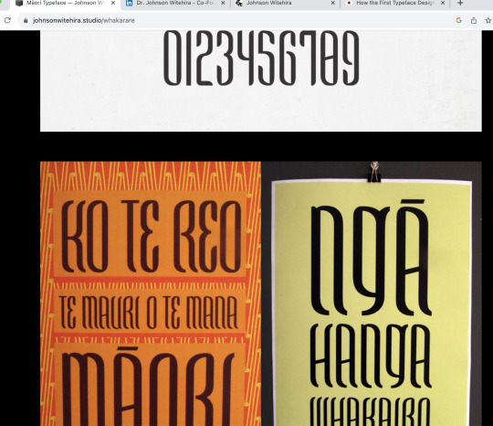
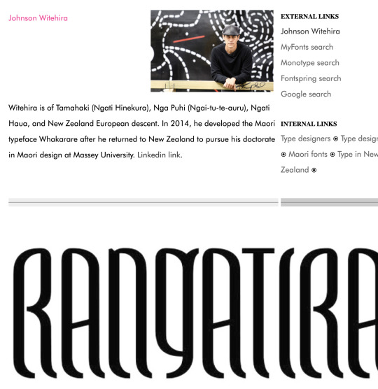
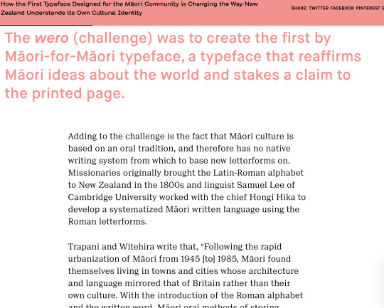
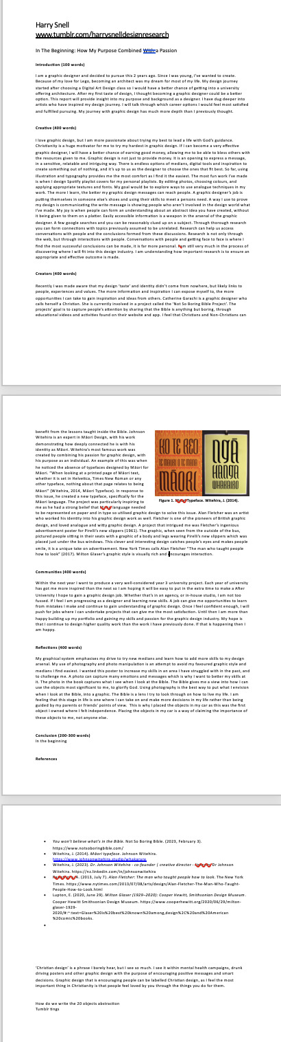
I found Johnsons Witehira's background interesting and how he got to where he was. He was a past AUT lecture and is gifted not only in deisng but in achedimic researching and has won awards for both. He is internationally recognised which is awesome as NZ is a small place.
His drive to represent Maori in many medians is awesome and he stands up for what he believes in and communicates his thoughs very effectively, which leaks into his graphic deesign abilities.
Witehira further indents the importance of research to graphic design as you need to understand contexts, history, stats and peoples opinions to form an accurate opinion or a design that can get through to many people.
0 notes
Text
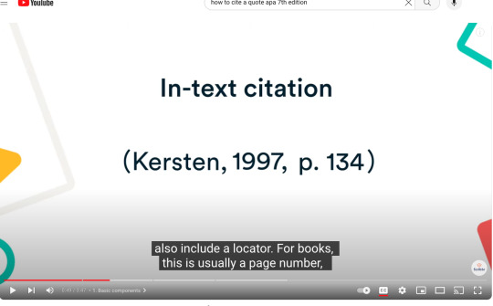
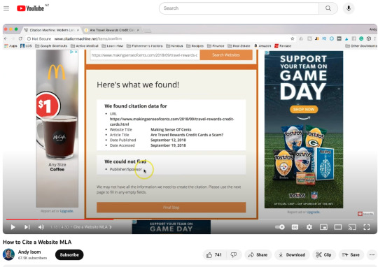
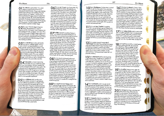
I used https://www.citethisforme.com/ and searched youtube videos on how I can reference APA style accurately for websites, photos, and quotes.
Found this useful as I had no prior knowledge on how to use
Above is it in action in my essay.
0 notes
Text
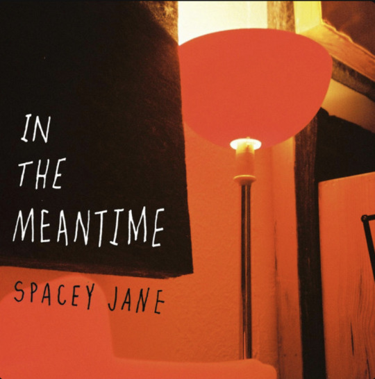
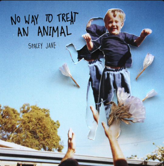
Spacey Jane early graphic design represented their chaotic free energy
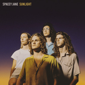
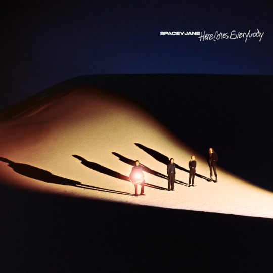
Now they are more established and want to present a more sophisticated identity to their gnarly surfer band style as they have progressed
Very polished look and simplistic - clearyl represents their beach background
0 notes
Text
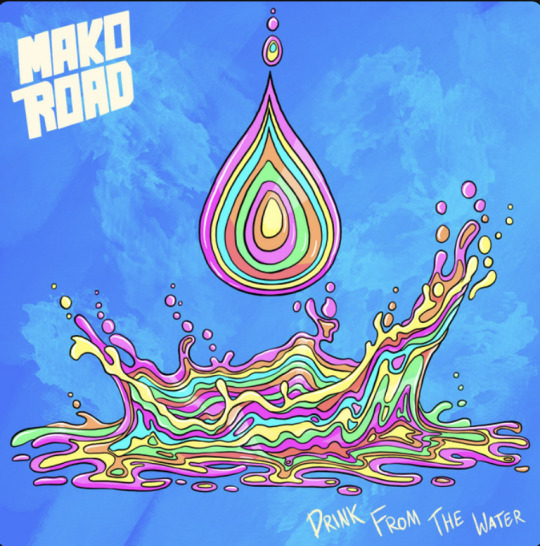
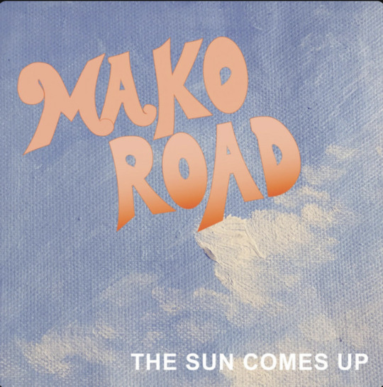
Mako Road Band Research
From humble origins as a Canterbury University covers band, Mako Road have remarkably quickly become a force to be reckoned with, a staple act on annual summer festival lineups and selling out their own tour gigs in just hours.
“We just started playing covers during student events and we sorta got to a point where we were seeing a lot of successful bands coming out of Dunedin, and they were playing festivals and releasing music and people were really into it. We were like, ‘Man we could try this.’
“Rhian wrote our first song, The Sun Comes Up [recorded and mixed by Jaine back in 2017], and it got a lot of attention straight away which was incredibly lucky for us. We recorded in a garage, CJ was YouTubing how to mix songs! We put it up and were like, ‘Let’s do a Christchurch release party.’ Then we booked a show in Wellington and people actually bought tickets… and we were like ‘Oh man, let’s keep doing this.’ And somehow we’ve ended up here!”
“The album is a big step for a band, it’s almost like a rite of passage, and we were trying to write an album for ages. We were kind of struggling with it initially, our writing process is pretty haphazard, we’ve always got ideas floating around. We booked a bach on the edge of Lake Taupo which was beautiful, really isolated ourselves, and booked studio time, and then wrote the album and went straight into the studio 10 days later.”
“Our approach is to just release it, play it live. We’re so live orientated, the recording thing’s almost like a fun experience. Writing music’s always the best part, but it’s the live performances that are our thing.”
“I think that’s the perpetual thing for musicians, as well for anybody who goes through that, they’re just wanting to get straight back onto that creative process. But we’re stoked that it’s finally out there and that people are going to listen to it.”
“That’s your core source of interaction with people, and music is about that connection and interaction. I think that’s the thing that has got artists reeling after Covid, it’s that they’re missing that in-person interaction. It’s such a crucial element to what we try to do, and what I think every musician cherishes about their music career is the playing live element. It’s a surreal experience and it’s something I don’t think I’ll ever get used to.
“I remember at RnV we were looking out before we were on and there wasn’t much happening. We went backstage to warm up and when I came back out the crowd was just like all the way up the hill! I felt like I had my stomach in my throat the whole set, it just felt like chaos, like un-bottled chaos, like I couldn’t even really recall the set I just remember sitting there just trying not to freak out and not fuck up my parts!”
Despite already having over half a million monthly Spotify listeners and live shows frantically selling out, Mako Road are most definitely still down to earth, vibrant former students doing what they do best; creating tunes and playing them to excited crowds full of new and established fans.
Insights
Mako Road come from humble begins as a student band performing at student events and then got a lot of attention after releasing their own song.
Were from Dunedin, New Zealand
Used a getaway to focus and bring ideas together to form an album
Prefer Live performances
Love the creative process and want to get straight into it again after finding success
Core interaction with people is through concerts
Was super suprised by large crowd and got nervous as
"Despite already having over half a million monthly Spotify listeners and live shows frantically selling out, Mako Road are most definitely still down to earth, vibrant former students doing what they do best; creating tunes and playing them to excited crowds full of new and established fans." This is swag and love the culture in this genre of music as everyone is just laid back and honest
0 notes
Text
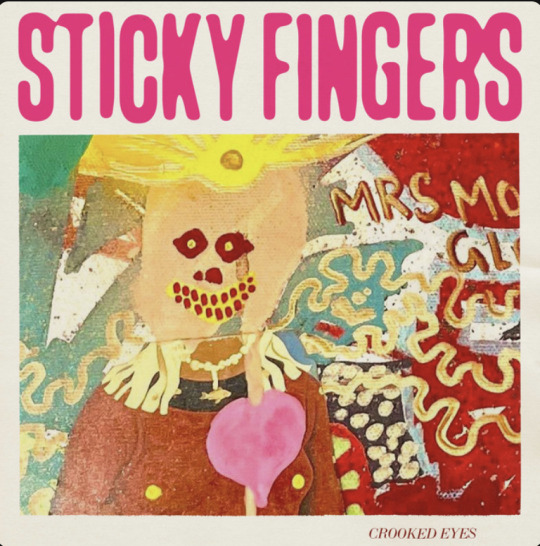
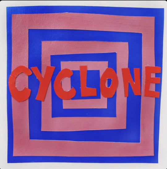
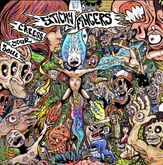
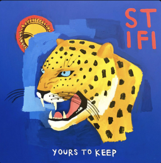
These are album covers from sticky fingers artist which is an indie rock band. I am researching into these indie rock bands as they are often asociated with beaches and surfing and the clothing they wear I try to replicate there style. I do this as i am wanting to go for a laid back, happy summery style. I also heavily listen to this type of music and feel at peace and happy when I do and it is a large part of my identity as it seeps into my music taste, style and hobbies.
1st cover: Enjoy the text at top in condensed font and very messy and fonky playful painting with different messy paint brush splots creating meanin into a person
2nd cover: Analouge style - messy uneven cutting of the lettering fits the vibe and background behind lots of indie bands (start out as boy band in high schoo and then become successful), this cover is for a freestyled/originally written acoustic song by Stick Fingers and this captures this raw look - colours dark blue and red work well in contrast and the paley red with with rim to cover helps inside pop
3rd cover: Texture and depth created with different shades of blue under tiger head and the covering of sun graphic which represents the vibe of their music. Tiger allows colour of yellow to enter album cover which again fits summer vibe. Type at bottom has lettering with different sizing of lettering, raw but smooth appearance, looks painted on.
4th cover: Chaotice mesh of many illustrations all interacting with each other , if i had more time i would have worked out how to improve my illustration skills and tried to replicate something like this with all my objects, very wack and loose drawings, writing has rough and different sized lengths and it placed on a pirate flag can see the lawlessness and freedom of the music.
0 notes
Text
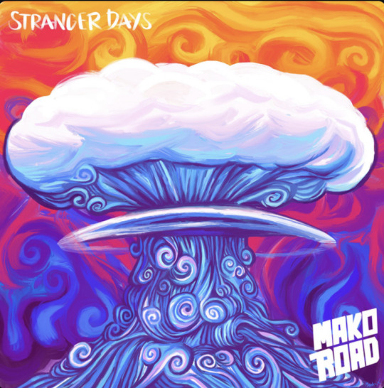
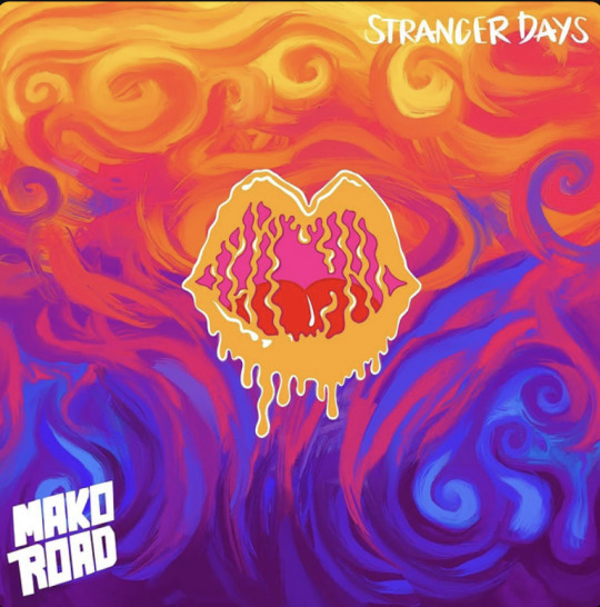
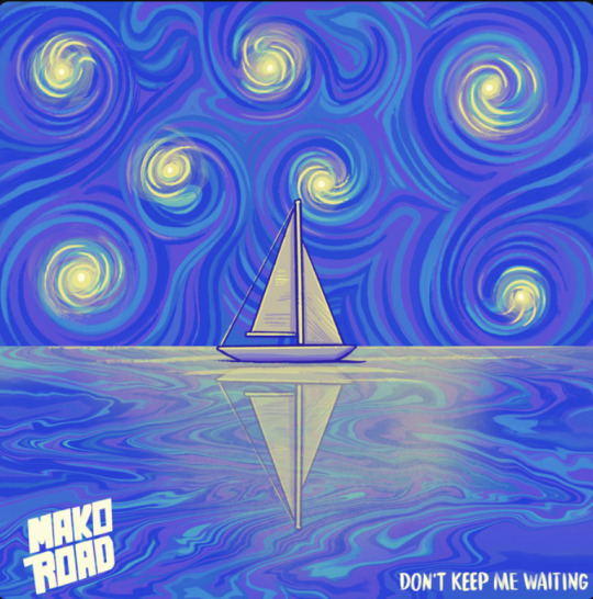
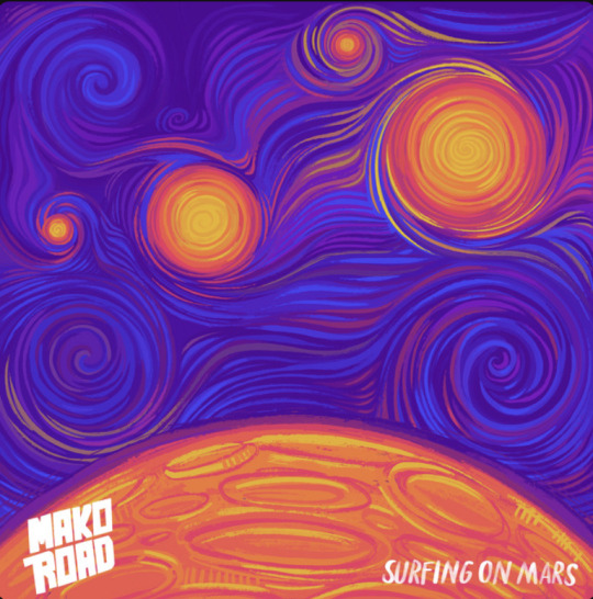
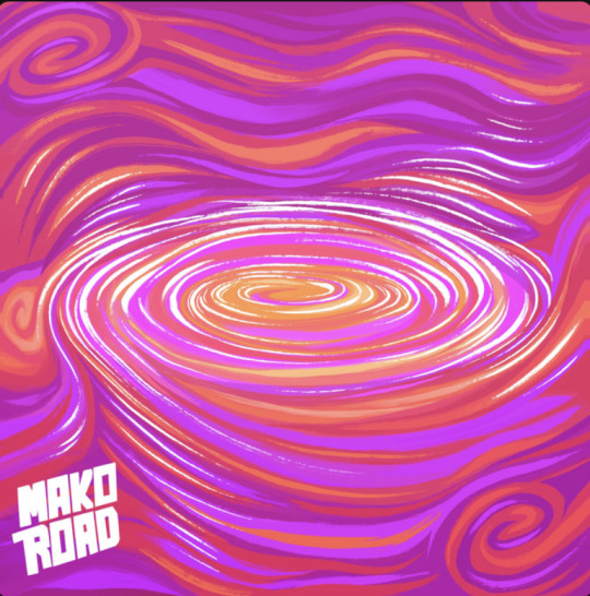
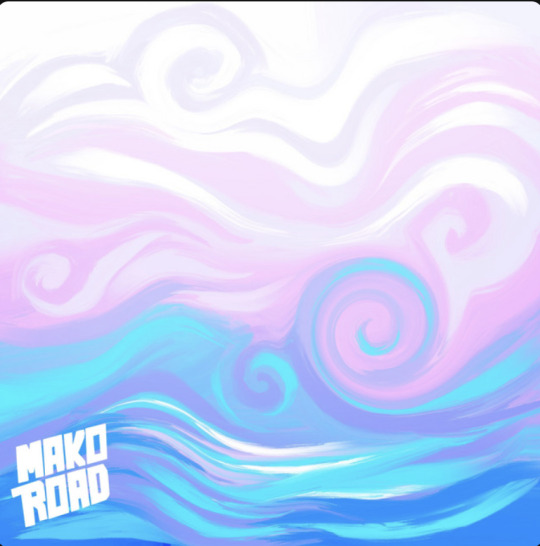
I love the flowly lines as they fit with the waves of the beach.
This music is happy and summer music - indie rock
Vibrant colours mixing and forming together - typography looks very handdrawn and cartoon styles as well
Looks very analogue in the process these have been made - either painting or collage or cartoon which has been drawn on illustrator very summery colours - always a happy colour eg pink red orange purple
Type is fun and handrawn , unique lettering
0 notes