
hannahmgander
Hannah Gander
AUB Vis-Com 2018-2021
1000 posts
Don't wanna be here? Send us removal request.
Last Seen Blogs

superhillmoorefan-blog
Blogs

viviendodelcuentopodcast
Viviendo del cuento

top10worldthings-blog
Untitled

unnecessary-stimulus
Half-Asian Full Throttle

candidovinicius13-blog
Sem título
Text
FMP - Final Evaluation
This project was a test of my versatility, creativity and understanding of a completely new subject to explore. Bearing this in mind, all kinds of research from experimentation to the internet contributed to the formation of my project, with emphasis on technical findings like type anatomy, papers about letter identification and ciphers. The prospect of expanding my skill in the typographic field, as well as investigating something I barely knew anything about was a great motivation to sustain focus and consistently produce work.
I don’t think I have ever produced quite as much development before as I have with this project, being particularly enthusiastic for this content and expanding skill. Every component of the project went through design changes influenced by tutor feedback, peer feedback and personal choice. The project also developed as my confidence did, which has sky rocketed over the duration of this FMP. I have surprised myself with my time management this unit, being particularly organised and passionate for staying focused and creating all the time. I may have applied for the extension but time management was not a contributing factor, rather my insistence for printing out my project and making the whole experience of it abundantly clear, while practicing a healthy routine for mental health. Being the final project of my degree, I did not believe in cutting corners, hence the extension to make sure what I submit is a high standard.
I treated feedback as research; taking all opinions into consideration, applying the content to my project and then ultimately deciding to follow it if I thought it was appropriate. I found myself applying for sign up tutorials more frequently this project, in order to gain as much recommendation and research points as I could, meaning I also had more chances to reject suggestions if I believed necessary. The 2020/21 situation being what it is, I still believe I could have learnt more about type making if there were active sessions- I’m aware I can ask for advice, and I did, but it’s hard to know what to ask for help with when you are missing some fundamental points, which often happens when self-teaching an abundant topic like type. Saying this, I have learnt a lot about type anatomy, language, exclusivity in communication, considering new practice and much more in both visual communication and theory.
As for improvement on the project I think the work is good for where it is, but I fully intend on revisiting this work and developing it for the future. I think ‘improvements’ mean different things when considering perspective as well, for example if you are thinking from a learning objective view, or passionate design project. If I’m working purely for marks then perhaps there are areas to improve I haven’t seen, but for satisfaction in my up-to-date skill I don’t see any gaps in practice.
This has been 15 weeks of incredibly hard work and commitment and I am completely proud of myself and everybody else in the course.
1 note
·
View note


Photo


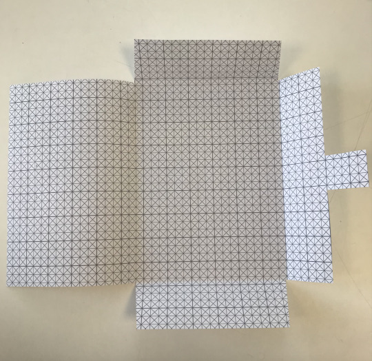
FMP - Resizing posters and the envelope
Through my own error, I made the posters with he folding system too large, but the fourth image attached is the renewed version that fits the size of the envelope.
As for the envelope, it now allows for more to be stacked inside and is more appropriate for the four included posters. It still fits to the measurements of a letterbox, fulfilling this as an original consideration.
0 notes
Photo


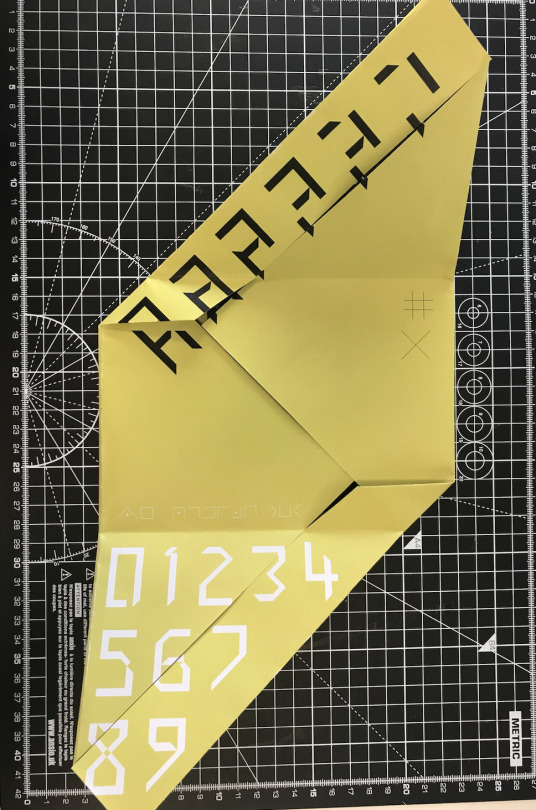
FMP - Printing the posters (due to be folded regularly) plus a picture of the inside of the more intricate poster, large scale.
0 notes
Photo

FMP - New, simpler poster design. To be used for the inside of the fold up posters, or perhaps as one side of a regular poster
0 notes
Link
FMP - the link to my type specimen on Issuu. I can't figure out how to get the insert in there/to show up but this illustrates my final version.
0 notes
Video
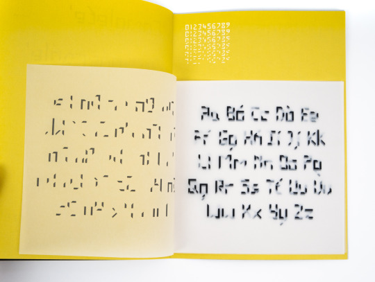
FMP - The final digital type specimen
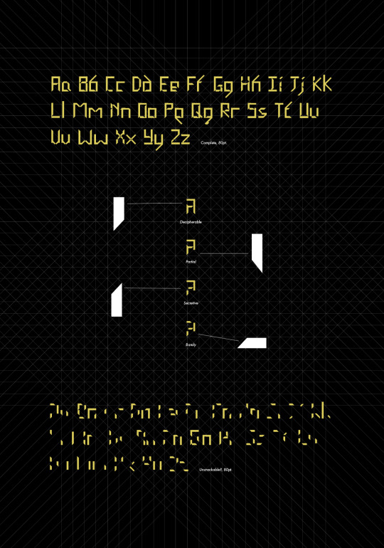
(Tracing paper insert of full alphabet in 6 different weight meant to be within the chartreuse spread with numbers on)
0 notes
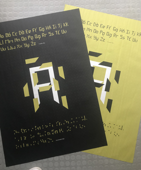
Photo

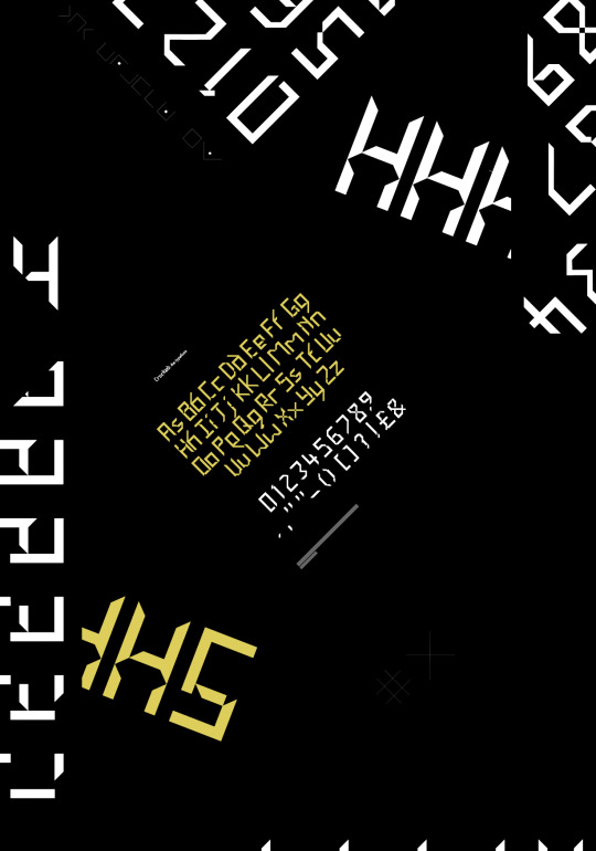

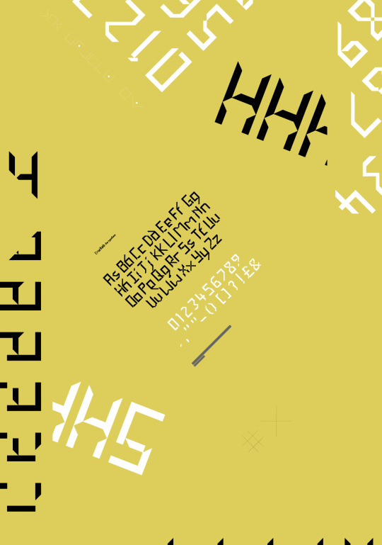
FMP - The final poster
2 different designs, both in 2 alternate colours
left images are the front, right images are the back
4 posters in total
First 2 (first 4 images attached) are folded in a concertina
Other 2 (last 4 images attached) are folded in the complicated way that reveals the design as its folded
0 notes
Text
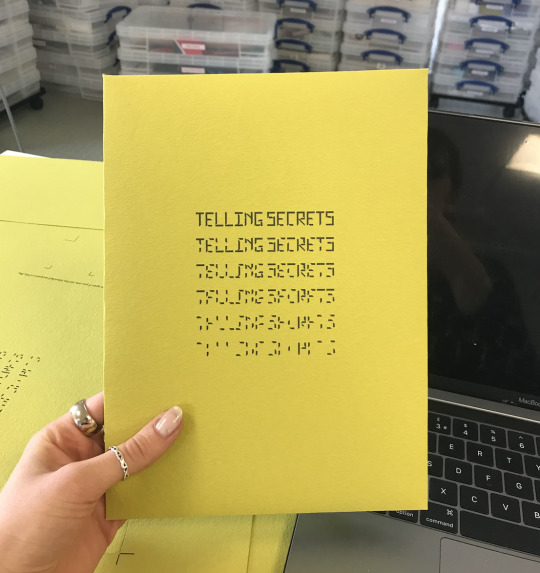
FMP - Project Summary
Post completing the project I want to list the contents of the Final Major project and the rationale behind them for clarity (and personal satisfaction):
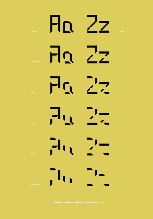
The main event of the project; The typeface called ‘Cracked’
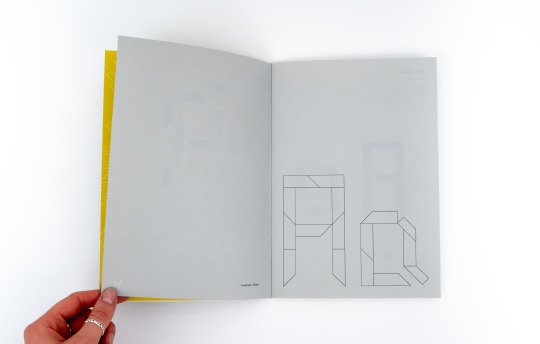
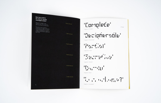
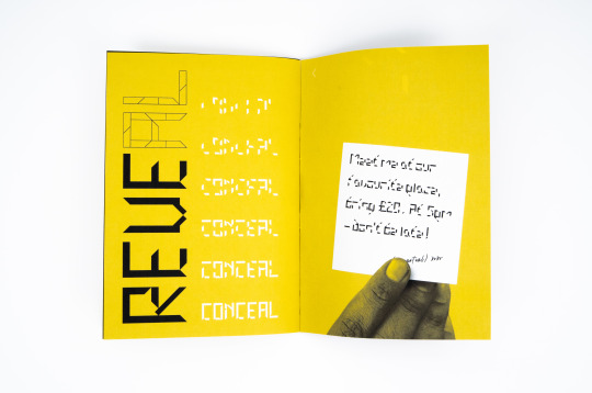
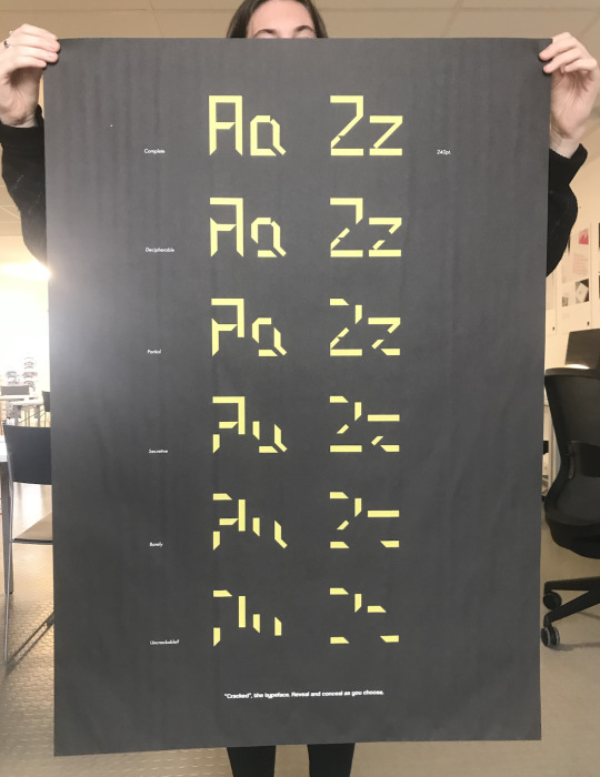
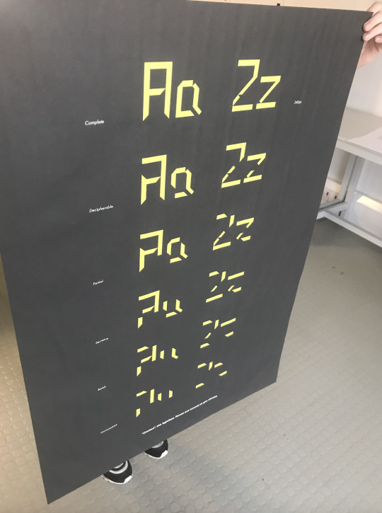
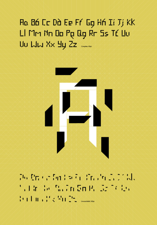
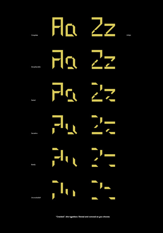
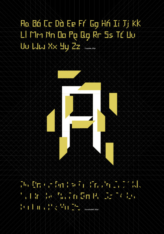
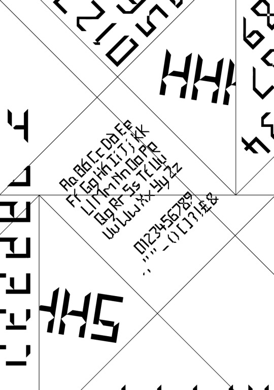
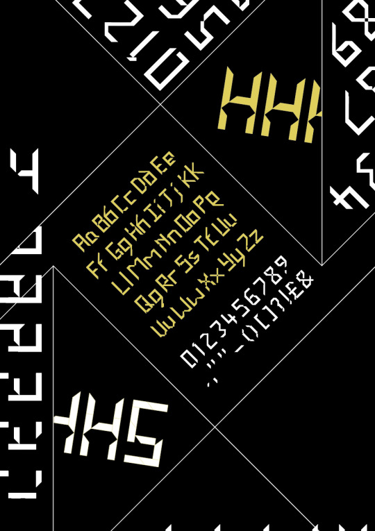
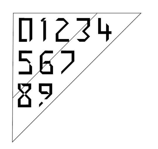
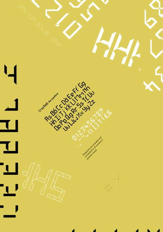
> This typeface and its 6 weights decreasing in legibility in order to be used in different levels of ‘secrecy’ for sending messages. The letterforms were created using a grid that was formed by repetition of the lines within a pigpen cipher. The grid was used to determine the shape and size of the uniform pieces used to build the letters. These pieces are then used to transform the letters and how they’re read. This all comes from the research and investigation into language and exclusivity, how letters and alphabets could be considered as codes themselves, especially if distorted.
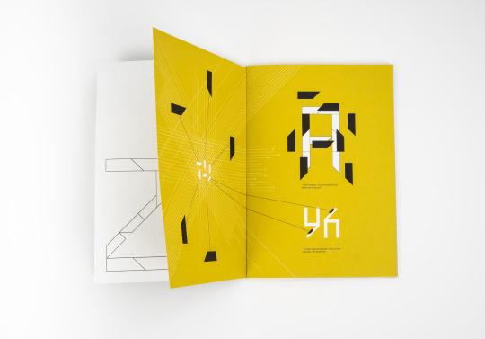
The Type Specimen
> A visual representation and explanation of the typeface, highlighting the structure and formation of the letters and how to use it. Including a playful insert that displays the A-Z of all weights and 2 hidden messages throughout.
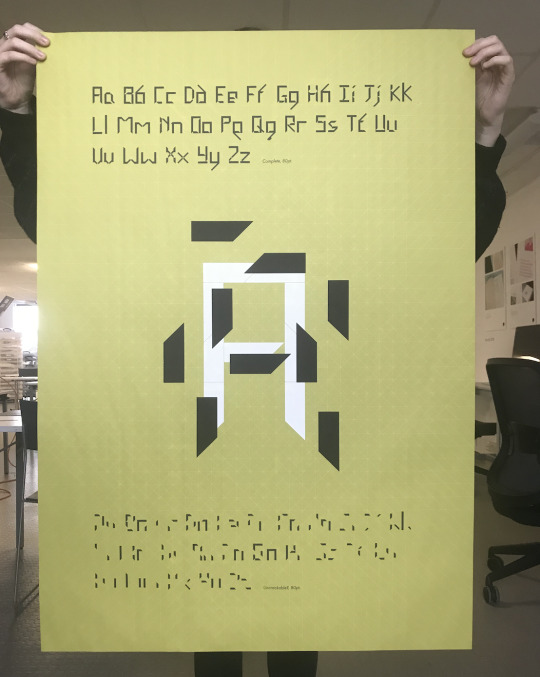
The posters
> there are 4 posters included in the envelope with the type specimen, 2 different designs in alternating colours. These are included in a way to promote the sharing of the designs and therefore the idea- encouraging the use of the encipher-able typeface. One design is folded in a complicated way that alters how you read the type, ultimately echoing the rationale of the typeface, then the other is large scale and alludes to the capabilities of the type, encouraging further investigation/conversation.
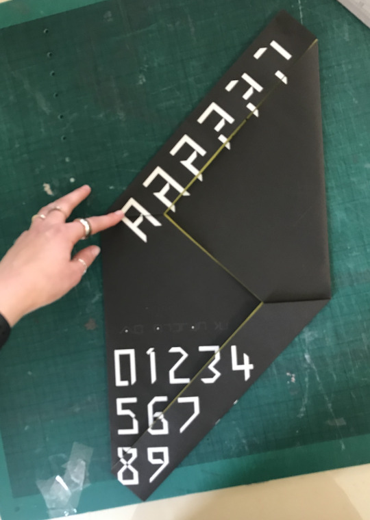
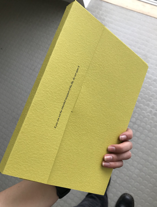
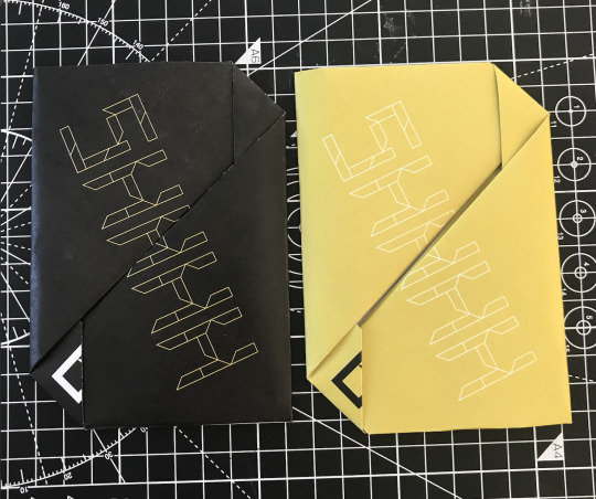
The envelope to hold it all together
> A mysterious/confidential style file that includes the grid used everywhere else. Small enough to fit through a letterbox but big enough to include a range of content. Included to enhance the experience of the whole project and represent the collaboration of all pieces together.
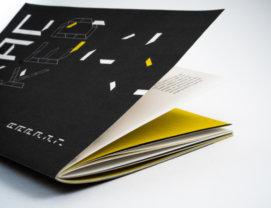
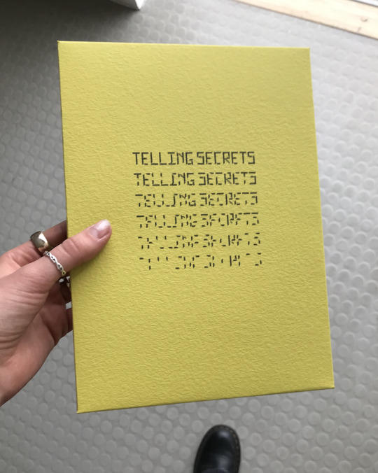
The Process Book
> Separate but relevant. Designed as a case file of different sized documents within, concluding the project with outcome photography and similar design to the main project.
0 notes
Video
FMP - Trial video of interaction with the envelope and how to view contents
0 notes
Photo


FMP - Envelope printed on the chosen paper, folded and placed with the type specimen to test how cohesive it is. I think it came out really well and the ‘experience’ of all pieces together will be really successful.
0 notes
Video
FMP - Poster interaction video
Issues to work on:
-The posters need to be a fair amount bigger, closer to A2
-The orientation is off - when opening to view the full poster on the inside, you shouldn't have to turn the poster
- There are two options for inside content as shown at the end of the video, but they are both quite overwhelming in design- perhaps I can come up with 2 more/alternative.
- I showed these to Hannah and she suggested that I go back to having a simple poster folded in 4 that show the sky elements of the concept. I will try and remake all of these options.
0 notes
Photo

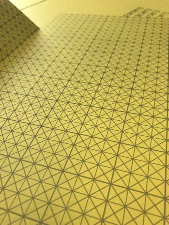
FMP - Test print of the envelope with the grid as the pattern; successful and will be used for the final outcome.
0 notes

Photo


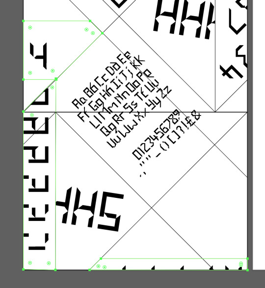
FMP - The process of building the foldable poster. It’s quite complicated but once I found a system (sigh) of combining the outlines of the areas with design in, putting type in those and then splitting then up again, I was able to design it easily.
0 notes
Photo


FMP - Fold up poster test 3
Larger scale, no lines and alphabet on the back adjusted with a description added. More successful and the lines still match up.
Whole poster will need to be slightly bigger if fitting the envelope snugly.
0 notes
Photo


FMP - Foldable poster trial 2
2 x colour options (opposites)
better:
alphabet on the back improved
better aligning
issues:
‘shhh’ too bare?
received recommendations from others that I should put more on there/add some more information.
The poster also need information inside which is the next task
0 notes