
greenmadeit
green ˚ ༘✶ ⋆。💚 (taylor's version)
EN: a gifmaker called green (she/her). please buy me a coffe!
PT: uma gifmaker chamada green/verde (ela/dela) por favor, compra um cafézinho pra mim!
174 posts
Don't wanna be here? Send us removal request.
Last Seen Blogs
x-ethan-lxndry-l0v3r-x
.ethanlxndryl0v3r.


snapbackisback
Snapback Is Back
heretherebedork
Honor the crumbs!!

nupuracademy-blog
Nupur Gupta Academy
Text
yet another gif coloring tutorial
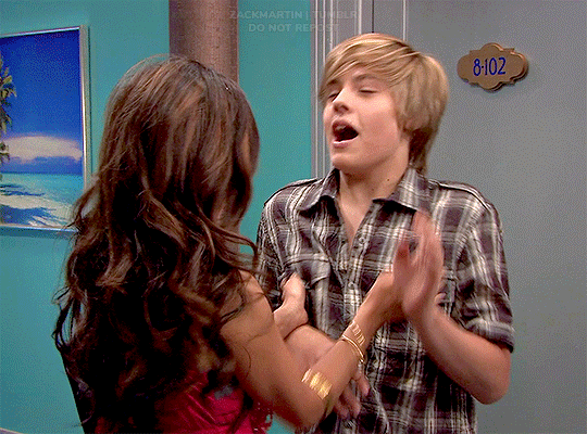
Okay, so, I posted a coloring tutorial for one of my moots a few years ago on my main, @zackmartin (I believe I've since deleted it) but that was the technique I was using when I started making gifs 7ish years ago, and I’ve since updated my routine so I decided to post a new tutorial with my new technique.
I'm going to show you how I achieved this:
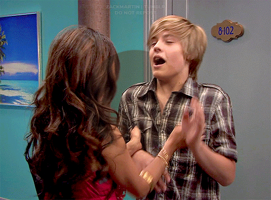
I'm using Photoshop for this. I'll try to make this as detailed as possible so it's beginner-friendly, but you do at least need to know how to make and export a gif. If you have any questions, don't hesitate to reach out! just be aware, this tutorial really image-heavy
A few notes before I begin: 1) this is like, the bare minimum most basic way to color a gif. This is what I’d be doing if I was giffing a scene and that’s it. If you’re interested in different coloring styles (like my suite life episode series) then let me know!
2) When coloring gifs with POC, you need to make sure not to change their skin color by making them too light, too orange, too yellow etc. The JATP source blog posted a masterpost of different tutorials to teach you how to color gifs in different ways (like with the pastel coloring for instance) without whitewashing/orangewashing POC. But, honestly there’s a ton of tutorials out there that show you how to avoid this if you do a little digging. NO EXCUSES!
Anyway, let's get started! Before I do the coloring, I ofc make my gif, crop it, set the frame rate, resize, and sharpen. (you can find my sharpening tutorial HERE)
I. BRIGHTENING
(as a quick note, I don't focus much on London's skin tone during this stage, because I'm going to fix it during later steps)
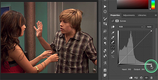
The first thing I do is white balance using a curves layer. To do this, I click the little circle thing in the toolbar below the layers, and then click curves like so (you'll do this every time you want to add a new layer):

And then I click the bottom eyedropper tool on the left-hand side:
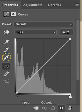
Then I click the lightest white part of the gif. (I’m not sure how to explain this well, but it basically white balances that spot to make it pure white. Like, if I clicked on the gold part of London's bracelet, then the whole gif would turn out really blue because it would be trying to white balance the gold) (hopefully that makes at least a little bit of sense)
Anyway, there’s a trick I use to find the lightest part of the gif; hold down the option key (or alt if you’re on windows) and while you’re holding down the option key, drag the little white arrow on the right-hand side:
(i apologize for the quality of the screenshots, tumblr keeps destroying them :/ let me know if I need to clarify anything)
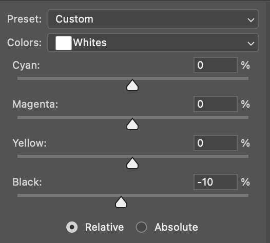
Then I use another curves layer to do the same thing with but with the blacks. So, I add another curves layer, and then click the eyedropper tool at the top this time:
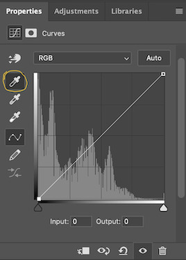
And then I click the darkest, black part of the gif. You can use the same trick by holding the option/alt key and dragging the triangle on the left-hand side:

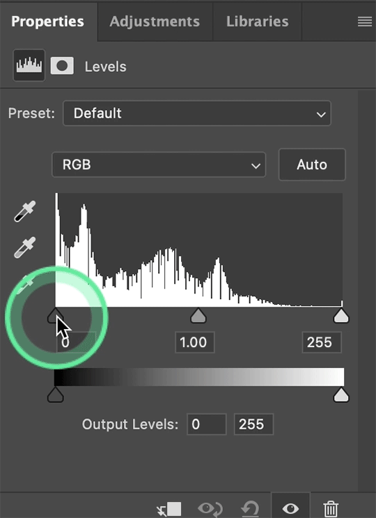
Next, I add a levels layer. I drag the middle lever thing to the left, and the left lever to the right. (I don’t usually touch the little lever thing on the far-right, but it’s really up to personal preference. I learned to color gifs by basically messing around with settings, so I’d recommend doing the same and just seeing what you like best):
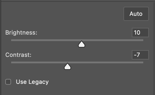
Finally, if I want to go even brighter, I usually add a brightness/contrast layer. I typically turn up the brightness a bit, and turn down the contrast. But, since I brightened a lot with the curves and levels, I usually don’t go that far. These were the settings I used for this particular gif (even though I'm going to share most of the settings that I used, I wouldn't recommend using the exact same ones on your own gif as it'll really depend on the scene you're using):
II. VIBRANCE
Now I add a vibrance layer. I like my gifs to be bright and vibrant, so I usually turn up the vibrance, and turn down the saturation a bit. These are the settings I used for this particular gif:
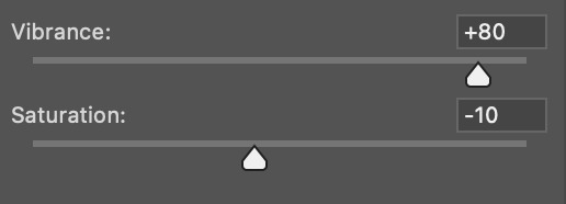
And this is what the gif looks like so far with just brightening it up a bit and adding vibrance (it might look a bit too bright right now, but I'm going to fix that in later steps):
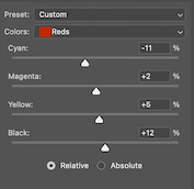
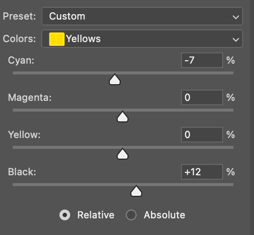
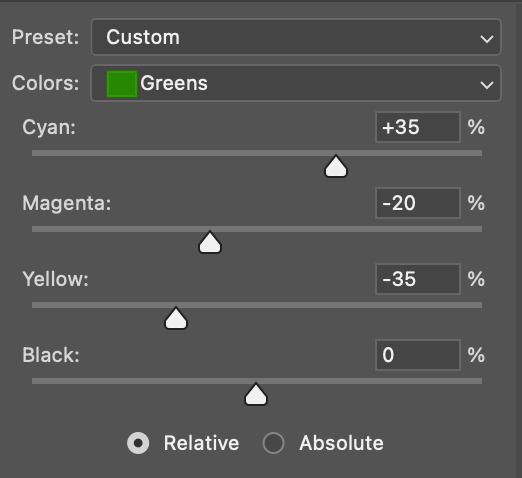
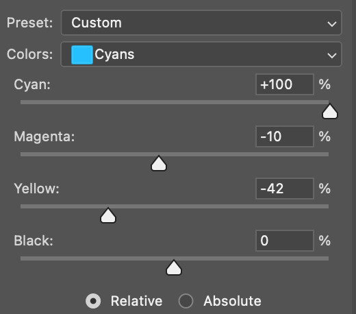
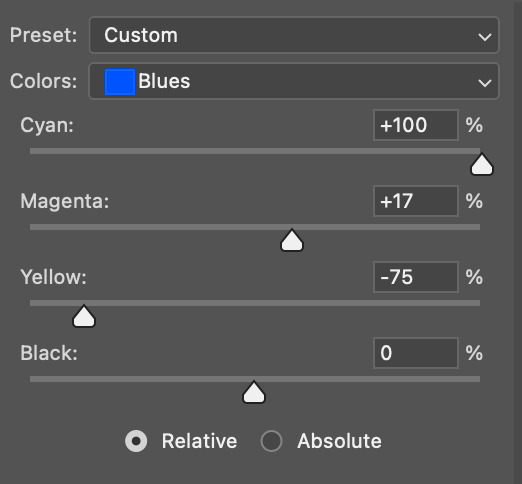
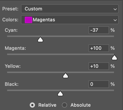
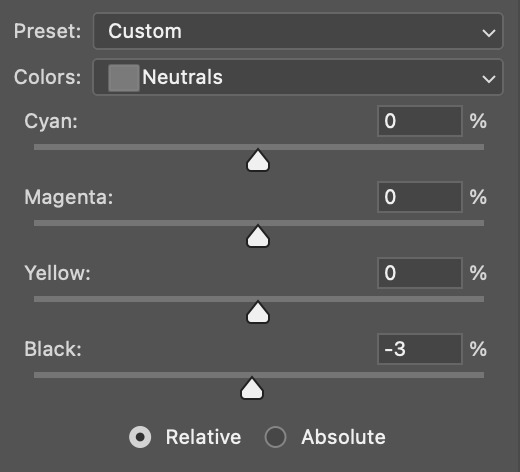
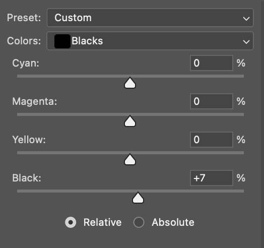
III. SELECTIVE COLOR
Now, I add a selective color layer. The reds and yellows typically affect skin tones, so this is where I'll start to fix London's. These are the settings I used for this gif (I usually wouldn't change all of the colors, but this is just one of those situations where they happened to be present in the scene I'm giffing):
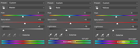
IV. HUE/SATURATION
now I add a hue/saturation layer. I typically turn up the master saturation to +10 and the lightness between +3 - +5 regardless of the gif. Then if I still need to fix skin tones, I'll mess around with the reds and yellows. These are the settings I used:
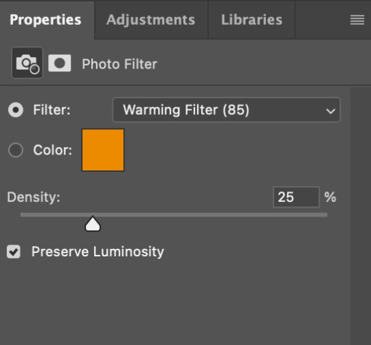
V. PHOTO FILTER
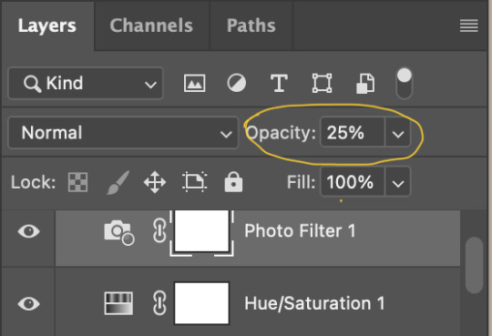
Next, I add a photo filter. I usually stick with the default one, I keep the layer set to normal, and I turn the opacity down to 25%:
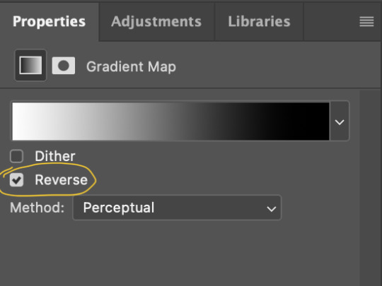
VI. B&W GRADIENT MAP
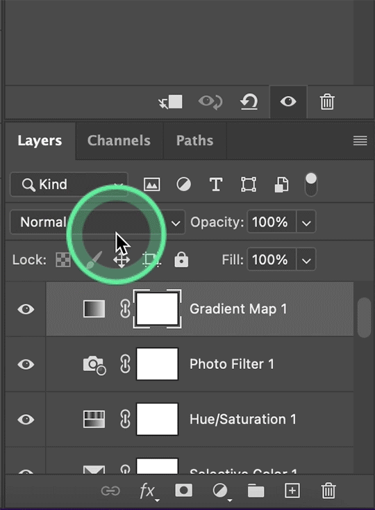
finally, I add a black & white gradient map, and I click the little box to reverse it:
Then I set the layer to soft light and I turn the opacity down, between 10% - 20% depending on the gif:
A lot of times, I'll stop here. If I'm satisfied with the way the gif looks, and London's skin isn't too pale/orange/yellow etc, then I could just add my watermark, export and be done. But, there a few other optional steps I might take if I'm still not quite happy with it.
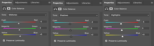
VII. OPTIONAL
Usually the next thing I'll add if I've decided to keep going is a color balance layer. It obviously does as it says, helps balance out the colors, but some gifmakers also like their gifs to have like, a reddish tint or a bluish tint or what have you, so this can help with that too. I wanted to balance out the reddish/yellowish tint, so these are the settings I used:
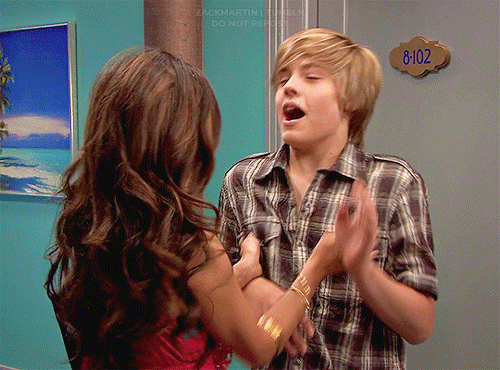
and this was the gif before the color balance:
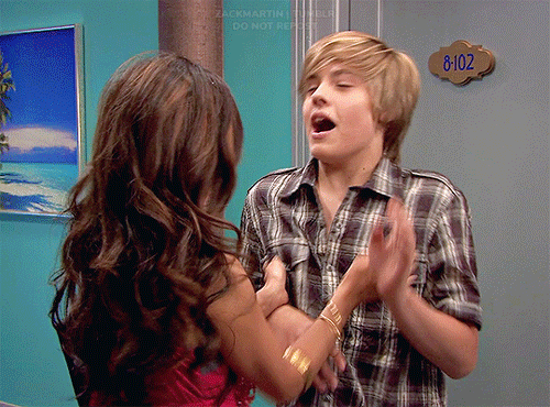
and after:
And if I want to play around with the colors a bit more, or fix the skin tones further, I might add another selective color layer or a hue/saturation layer (or both, depending).
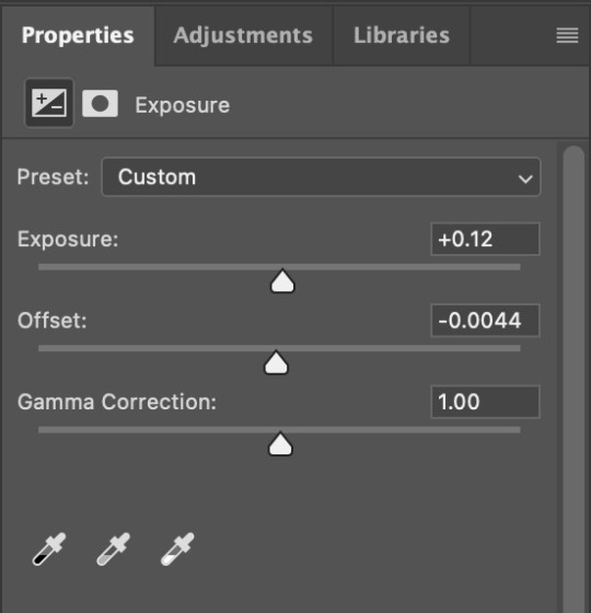
Rarely, I might add an exposure layer. (I added one to this gif for the purposes of this tutorial). These are the settings I used for that:
And if the gif came out a bit too bright, I might add another brightness/contrast layer, except this time I would turn down the brightness and turn up the contrast (again, I did that with this gif for the purposes of this tutorial).
And, that's pretty much it! This is my finished gif!
Like I said earlier, I pretty much learned how to color by messing around in photoshop, so I would really recommend playing with the different layers and settings for yourself, as well as checking out other coloring tutorials and other gifmakers methods and see what you like and what you don't. And finally, the best thing you can do is just,,, practice. I've been gifmaking for about seven years, but I feel like I didn't really become decent at it until this year
Again, If you have any questions let me know! and feel free to tag me in your creations! #userzackmartin 💕
44 notes
·
View notes
Text
count everything, including dorms, moving between houses on a single campus/compound, etc.
if you were/are homeless/couch surfing, count each location where you stayed at least a week.
16K notes
·
View notes
Text
ꜱᴇʀɢɪᴏ ɢᴜɪᴢᴇ ᵘᵖᵈᵃᵗᵉ
EN: In the source link you will find 133 267 gifs of Sergio Guizé in his role as José “Zé” Paulino / José Mendes on the telenovela Mar do Sertão (e001-005). They were made by me, by scratch, so please, don’t claim as your own. Besides that, feel free to use it as you want.
Contents: kissing, horse, injured, snake.

PT: No link da source você vai encontrar 133 267 gifs da Sergio Guizé no seu papel como José “Zé” Paulino / José Mendes na telenovela Mar do Sertão (e001-005). Eles foram feitos por mim do zero, então por favor, não os use como se fossem seus. Fora isso, fica a vontade pra usar como quiser.
Conteúdos: beijo, cavalo, ferimento, cobra.
please consider buying me a coffe!
#olderfcs#brhunts#fcxdirectory#gifsociety#tasksweekly#supportcontentcreators#gifpackshq#thegifpackreblogs#brazilianfcs#brazilian fc#sergio guizé#sergio guizé gif pack#sergio guizé gif hunt#gif pack#gif hunt#rp gifs#rp resources#kissing#horse#injured#snake
25 notes
·
View notes
Note
hey! tudo bem?? não sei se você ainda está aceitando sugestões, mas se sim, gostaria de sugerir um gif pack da larissa manoela no filme "tá escrito"! obrigada desde já
Amei a sugestão, brotinho! Já coloquei na lista de sugestões, só não prometo quando vem.

0 notes
Text
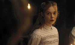
ᴇʟʟᴇ ꜰᴀɴɴɪɴɢ
EN: Right here - or in the source link - you will find 120 gifs of Elle Fanning in her role as Alicia in the movie The Beguiled. They were made by me, by scratch, so please, don’t claim as your own. Besides that, feel free to use it as you want.
Contents: kissing.
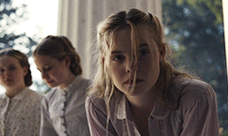
PT: Aqui mesmo - ou no link da source - você vai encontrar 120 gifs da Elle Fanning no seu papel como Alicia no filme The Beguiled. Eles foram feitos por mim do zero, então por favor, não os use como se fossem seus. Além disso, fica a vontade pra usar como quiser.
Conteúdos: beijo.
please consider buying me a coffe!
#thegifpackreblogs#supportcontentcreators#gifsociety#fcxdirectory#gifpackshq#elle fanning#elle fanning gif pack#elle fanning gif hunt#gif pack#gif hunt#rp gifs#rp resources#kissing
4 notes
·
View notes
Text
what does your blood taste like to a vampire
23K notes
·
View notes
Note
te amo green que fez gif do pessoal de mar do sertão te amo 🥹🥰
Que isso, assim fico até com vergonha. 💚 Logo menos vem um update nos gifs do Sérgio Guizé e depois disso vou dar uma pausinha em Mar do Sertão (mas algum dia eu retomo). Porém, não vou deixar de gifar novelas, espero que goste das próximas também.

0 notes
Text
ɪꜱᴀᴅᴏʀᴀ ᴄʀᴜᴢ ᵘᵖᵈᵃᵗᵉ
EN: Right here - or in the source link you will find 297 402 gifs of Isadora Cruz in her role as Maria Cândido “Candoca” dos Anjos on the telenovela Mar do Sertão (e001-005). They were made by me, by scratch, so please, don’t claim as your own. Besides that, feel free to use it as you want.
Contents: kissing, horse, knife, goat birth, swiming, bike.

PT: Aqui mesmo - ou no link da source você vai encontrar 297 402 gifs da Isadora Cruz no seu papel como Maria Cândida “Candoca” dos Anjos na telenovela Mar do Sertão (e001-005). Eles foram feitos por mim do zero, então por favor, não os use como se fossem seus. Fora isso, fica a vontade pra usar como quiser.
Conteúdos: beijo, cavalo, faca, parto de cabra, nado, bicicleta.

please consider buying me a coffe!
#gifpackshq#thegifpackreblogs#gifsociety#brhunts#tasksweekly#fcxdirectory#supportcontentcreators#isadora cruz#isadora cruz gif pack#isadora cruz gif hunt#rp gifs#brazilian fc#gif pack#gif hunt#rp resources#kissing#horse#knife#goat birth#swiming#bike
26 notes
·
View notes
Text
ᴊᴏꜱᴇ ᴅᴇ ᴀʙʀᴇᴜ
EN: Right here - or in the source link you will find 103 gifs of José de Abreu in his role as Colonel Tertúlio Aguiar on the telenovela Mar do Sertão (e001-005). They were made by me, by scratch, so please, don’t claim as your own. Besides that, feel free to use it as you want.
Contents: -

PT: Aqui mesmo - ou no link da source você vai encontrar 103 gifs do José de Abreu no seu papel como Coronel Tertúlio Aguiar na telenovela Mar do Sertão (e001-005). Eles foram feitos por mim do zero, então por favor, não os use como se fossem seus. Fora isso, fica a vontade pra usar como quiser.
Conteúdos: -


please consider buying me a coffe!
#olderFCs#SupportContentCreators#brhunts#tasksweekly#gifsociety#gifpackshq#fcxdirectory#thegifpackreblogs#jose de abreu#jose de abreu gif pack#jose de abreu gif hunt#rp br#brazilian fc#gif pack#gif hunt#rp resources#rp gifs
26 notes
·
View notes
Text
ᴍᴀʀɪᴀɴᴀ ꜱᴇɴᴀ
EN: Right here - or in the source link you will find 115 gifs of Mariana Sena in her role as Maria Lorena Gusmão on the telenovela Mar do Sertão (e001-005). They were made by me, by scratch, so please, don’t claim as your own. Besides that, feel free to use it as you want.
Contents: catholic religious practices, fighting.
PT: Aqui mesmo - ou no link da source você vai encontrar 115 gifs da Mariana Sena no seu papel como Maria Lorena Gusmão na telenovela Mar do Sertão (e001-005). Eles foram feitos por mim do zero, então por favor, não os use como se fossem seus. Fora isso, fica a vontade pra usar como quiser.
Conteúdos: práticas religiosas católicas, luta.
please consider buying me a coffe!
#SupportContentCreators#brhunts#fcxdirectory#thegifpackreblogs#tasksweekly#gifsociety#gifpackshq#mariana sena#mariana sena gif hunt#mariana sena gif pack#gif hunt#gif pack#rp br#brazilian fc#rp resources#rp gifs#black fc#catholic religious practices#fighting
20 notes
·
View notes
Text
ᴇɴʀɪQᴜᴇ ᴅɪᴀᴢ
EN: Right here - or in the source link you will find 147 gifs of Enrique Díaz in his role as Francisco Itamar “Timbó” Miroel Timbó on the telenovela Mar do Sertão (e001-005). They were made by me, by scratch, so please, don’t claim as your own. Besides that, feel free to use it as you want.
Contents: fire gun, donkey, wall painting.

PT: Aqui mesmo - ou no link da source você vai encontrar 147 gifs do Enrique Díaz no seu papel como Francisco Itamar “Timbó” Miroel Timbó na telenovela Mar do Sertão (e001-0005). Eles foram feitos por mim do zero, então por favor, não os use como se fossem seus. Fora isso, fica a vontade pra usar como quiser.
Conteúdos: arma de fogo, burro, pintando parede.


please consider buying me a coffe!
#olderFCs#brhunts#thegifpackreblogs#fcxdirectory#gifsociety#SupportContentCreators#gifpackshq#tasksweekly#enrique diaz#enrique diaz gif hunt#enrique diaz gif pack#gif pack#gif hunt#rp br#brazilian fc#rp gifs#rp resources#fire gun#donkey#wall painting
26 notes
·
View notes


Text
#eu faço um trabalho muito bom segurando minha lingua num geral; mas cara as vezes é dificil#entao eu vou aproveitar esse post e todo o babado que ta acontecendo pra postar aqui; nas minhas tags; bem quietinha; os meus 20 centavos#de acordo com essa pesquisa informal; a maioria do tumblr é não binario e tem mais gente trans do que cis;#dito isso; da pra entender o porque que as causas lgbt causam tanto barulho né? porque que as pessoas perdem as estribeiras quando se sente#agredidas de alguma forma#no momento que eu to olhando a pesquisa; +/- 17% das pessoas que responderam sao cis#isso significa que; quando você fala ou faz algo transfobico; você esta ofendendo +/- 83% da nossa comunidade no tumblr#eu julgo ser um numero bem significativo; o suficiente pra alguém repensar em fazer alguma coisa quando é acusado de transfobia#o interessante dessa pesquisa também é entender que; em uma comunidade tão grande; não tem como 3 pessoas falarem por todos;#não importa o quanto de barulho eles façam#eles nao sao os portadores dos direitos trans; nem os que definem o que é ou não é transfobico; 3 pessoas não representa 83% de 815 votos#enfim; só é algo que faz refletir#se você chegou até aqui; vota e rebloga ai também; é importante esse tipo de informação
2K notes
·
View notes
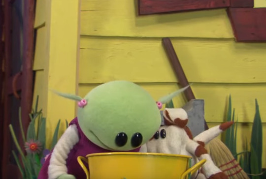
Photo
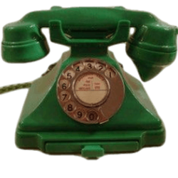
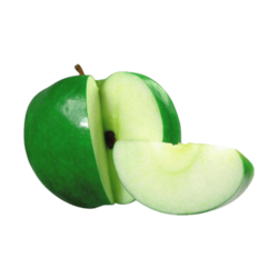
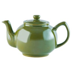
— ★ VARIOUS GREEN OBJECTS !
》》 below you will find faceless dash icons of several green objects. please note — these pictures do not belong to me, i just edited them.
Keep reading
185 notes
·
View notes