
Last Seen Blogs

lizasplanner
I Love All Things Planner!
corviescrittoi
diario di una lettrice superflua
aphroditesswan
stef

datingair964
The best dating sites

lockedsissy83
Locked And Dressed
Text
Final Design for my Poster side:


here is my final design for my poster side, It first started off with just the word ‘typografika 24′ and with the 2 colours that i chose. I decided to change the opacity to make it look more effective and more in-depth. I still seemed quite empty so I added a repetition of typografika 24 in-between, I also decided to add the circle patterns on the side just to complete an compliment the poster and it turned out very nice.
When I went to go print out my poster, it came out very pixelated, I don't really know the reason behind this, but i did import it from photoshop onto InDesign so i feel like that plays a massive part on my it came out pixelated..
but apart from that, i am happy with the final turnout design of my poster for ‘TYPOGRAFIKA 24′.
0 notes
Text
Final Design: 16 page Brochure side...


Here is my final design product for my 16 page brochure side
I made a lot of changes to it, firstly I decided to scratch the checked pages patterned design because it seemed a bit off to me and i wanted a more simple yet eye-pleasing brochure background, so i decided to stick to 1 colour and made a brighter/lighter tone of orange as the background. I also wanted to leave the name borders for the designers because it really complimented the brochure. Overall I liked how the circle patterns, text formations, letters and fonts and felt like they all fitted and complimented each other perfectly..
There are a few mistakes and things that i wanted to change such as the spacing, midway cut offs of text, uneven borders and other little mistakes. But overall I really like the final product of my 16 page brochure design.
0 notes
Text
Final Map ideated & refined:

here is the map that i created on photoshop and imported it into InDesign.
This is my final concept for my brochure and I thought it turned out great.. I missed a few small details and tweaks before such as adding the different streets/places so i had to go back into photoshop to re-do it all over again.
But overall the City Campus map turned out very nice especially with the change of colour tones and the baby Blue lines that make it stick out..
0 notes
Text
pattern ideations:

I did a few circle patterns around my brochure and changed the opacity on some of th circles to give it more depth, they turned out very nice and really complimented my brochure. I had to do a few changes and adjustments by making the circle not touch the text or intervene with the text but it seemed to clash perfectly with it so I just left it as it was...
0 notes
Text
16 page brochure front & back cover:


this is my final product of my front and back cover..
I made a few changes, as the previous ideation that i created didn't quite work out due to the colours being to powerful and dark, So i wanted to use lighter tones of the 2 colours I chose (Blue & Orange) for my front and back cover to make it look more visually pleasing and cleaner. I also used quite a lot of opacity changing with the text just to give the “Typografika” more depth and it turned out much better than before..
0 notes
Text
Quick sketch-up concept for my 16 page brochure side:

here was my first planned out sketch up for my brochure, I stuck with some of the concepts and ideations, but i decided to scratch and reformat most of the pages due to my sketch not going to plan.
I decided instead, to make the designer pages all in 2 rows and the rest of the information to fill up the space on my brochure. I stuck with the same text format/structure but I made a few adjustments to make it look more cleaner and simple..
0 notes
Text
outlining the map of City campus:
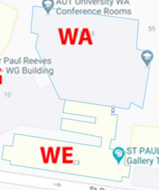
I did this awhile back but forgot to upload this..
I used photoshop to create a brief visual representation of the city campus map. I outlined the map by using the line tool it making the colour baby blue just to go with the complimentary colours that I chosen. The line was very helpful and allowed me to get every single corner. I previously used the brush tool but the lines were very uneven and unsmooth, so the line tool worked perfect for outlining the map...
0 notes
Text
more formatting for my 16 page brochure side:

Did some more formatting along with adding in the annual conference section and keynote speakers and workshops section at the bottom. I had a few problems while formatting my designer pages such as the tables looking a bit cramped up with the texts, so i thought id make 2 separate pages for them and they turned it good...
0 notes
Text
First 8 pages of my folded brochure:

Here are my designer pages that I created on InDesign. I was having a few problems with formatting the texts for each of the designers, but i eventually fitted in most of the texts. One mistake that i could've fixed would be the words being chopped off mid sentence, i didn't really know how to fix that so I just continued t reformat the text.
I also added In the first letter/initials of each designers name in their sections and found it very cool and simple to add so i just left it. Other than that I really liked how i formatted my texts and images for the designers...
Designer image references:
https://www.the10sonsofmanu.com/joseph-churchward-qsm-1923-2013/
https://graffica.info/revista-graffica-11-tobias-frere-jones/
https://www.fraugerlach.de/contact
https://typeand.net/2015/
https://www.fontshop.com/designers/carol-twombly/
https://www.granshan.com/veronika-burian
https://jfontana.fr/about/mentors
https://www.manamoana.co.nz/mi/artist/dr-johnson-witehira-2/
0 notes
Text
First plan out for my 16 page brochure side:

For my first initial plan of my 16 page brochure, I decided to go with a checked pattern ideation. I did this just to test what it would look like, and how i would feel about it. My plan for this section was to also incorporate opposing coloured border lines for the different designers names, I wanted to use the lines as like a sub-heading/underline idea...
Based off of my first ideation for my 16 page brochure, I really liked it so i decided to choose 2 light tone complimentary colours: blue and orange. I thought the colours worked really well together so i decided to stick with it...
0 notes
Text
Research Gathering on guest speakers:
Joseph Churchward:
Joseph Churchward is a Samoan-born New Zealand graphic designer and typographer He was born on 20 August 1933 in Apia, Western Samoa, the only child of Mary Coe and George Charles Churchward. Mary was of Tongan, Samoan and Scottish descent, the granddaughter of an American whaler.
Joseph Churchward was an internationally renowned typeface designer whose work graced record covers, billboards, newspapers and popular literature such as posters and brochures around the world, both during his lifetime and beyond.
Tobias Frere Jones:
Tobias Frere-Jones established himself as one of the world’s leading typeface designers, creating some of the most widely used typefaces, including Interstate, Poynter Old-style, Whitney, Gotham, Surveyor, Tungsten and Retina.
He joined the faculty of the Yale University School of Art in 1996 and has lectured throughout the United States, Europe and Australia. His work is in the permanent collections of the Victoria & Albert Museum in London and the Museum of Modern Art in New York.
Verena Gerlach:
Verena Gerlach founded her studio for graphic design, type design, and typography in Berlin. Since 2006, she has worked as a freelance book designer for art book publishers, museums, and artists. She started lecturing in type design and typography in 2003, and she now gives lectures and workshops all over the globe. Besides designing corporate fonts for global companies, she also is working on the typographic production for international, contemporary artists.
Nadine Chahine:
Dr. Nadine Chahine is an award winning Lebanese type designer. She has an MA in Typeface Design from the University of Reading, UK, and a PhD from Leiden University, The Netherlands. Nadine’s research focus is on eye movement and legibility studies for the Arabic, Latin, and Chinese scripts.
he has numerous awards including two Awards for Excellence in Type Design from the Type Directors Club in New York in 2008 and 2011. Her typefaces include: the best-selling Frutiger Arabic, Neue Helvetica Arabic, Univers Next Arabic, Palatino and Palatino Sans Arabic, and Koufiya.
Carol Twombly:
Carol Twombly, born in 1959 in Concord Massachusetts, started her artistic endeavors as a sculpture artist at Rhode Island School of Design. After seeing the practical appeal of the field of graphic design, she switched from sculpture to graphic design.
Carol worked for many years as a graphic designer. She took part in a digital typography program at Stanford University which allowed her to study for a Master of Science degree. From there she won the Morisawa gold prize for her Latin typographic design.
Veronica Burian:
Veronika Burian studied Industrial Design in Munich and worked in that capacity in Vienna and Milan over a few years. Discovering her true passion for type, she graduated in 2003 with distinction from the MA in Typeface Design course in Reading, UK.
Veronika Burian is a type designer and the co-founder of the independent type foundry TypeTogether with José Scaglione, publishing award-winning typefaces and collaborating on tailored typefaces for a variety of clients.
Jessica Hische:
Jessica Hische grew up in Pennsylvania. She currently lives in San Francisco, where she works as a letterer, illustrator, type designer, and relentless procrastiworker. she is a designer, illustrator and typographer living in San Francisco. She has worked with clients such as Wes Anderson, Dave Eggers, Penguin Books, The New York Times, Tiffany & Co., OXFAM America, McSweeney’s, American Express, Target, Victoria’s Secret, Chronicle Books, Nike, Samsung, and Wired Magazine.
Johnson Witehira:
Johnson Witehira is a leading indigenous designer, researcher and consultant. His design projects consider how customary Māori knowledge and ways of thinking can be applied in contemporary settings.
His creative works extend across designed communications, digital, interiors, urban design, product design and public artworks. As a co-creative director at Indigenous Design and Innovation Aotearoa (IDIA) he now applies his design expertise to work with businesses, community groups, and Government agencies to instigate design solutions that effect positive change in people, practice and place.
0 notes