
Last Seen Blogs

lilenaart
Love and Nature

alexandrajump
Jump

kvngjesse-blog
𝐒𝐀𝐃𝐃𝐄𝐑𝐃𝐀𝐙𝐄.

adastra121
Untitled
isikgozlu
remains to be seen
Text
Reflection
Through the creation of this brochure, I have learned so many new skills that I hadn’t known previously. I have learnt about the use of paragraph styles, Hierarchy, and Colour, and learning how to properly turn a 72ppi image into a 300ppi image.
The feedback from my formative was really helpful as I had a fresh set of eyes looking at my work. I was asked to change the colours of my brochure as they gave off “lollipop” vibes. Following along from this I ran into a few issues with the yellow/pink colours as I had tested out white on the yellow which was too light and eligible, while the black was too harsh. I also had to change the formatting of my type and images so each of the speaker panels was more cohesive. But I was very grateful to have gotten the feedback then instead of later on.
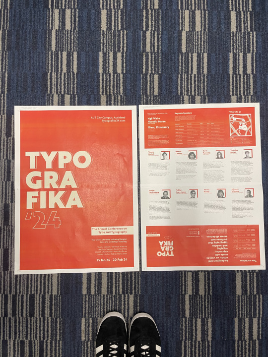
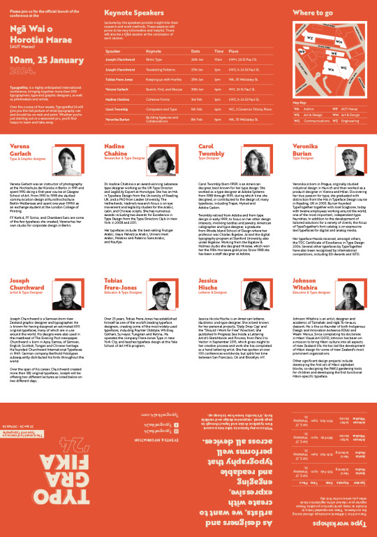
Following from this I began by changing the colour of the brochure to an orange and cream colour palette. The reasoning behind this was orange is associated with attention-grabbing, and inviting, while also relating back to NZ which has a warm and welcoming atmosphere. While cream is associated with sophistication and is soothing - hopefully, was a good move😆 I felt that this created a more sophisticated look and I was able to put cream type on top of the orange. I changed the hierarchy of the poster information as I learnt that people read from left to right and top to bottom. I had also formatted my speaker's images + type so they all presented the same.
Overall I’m happy with how my final brochure turned out. I have developed so many new Adobe skills that I hadn't known previously that I will be definitely using in future assessments.
0 notes
Video
This is my updated way of folding my brochure on a tiny scale 😁
0 notes


Text
Practice Print A3
This was a test print on A3 which helped me to see if any type was eligible and if anything needed to change. I also noticed that the colour of the orange was very different to on screen but I think it works well in contrast with the cream type.
0 notes
Text
Layout changes
Before:
I had 2 of the keynote speakers at the top next to the about panel. I didn't really think this layout worked as it doesn't flow as nicely.

After:
I changed the panels around so that the 8 speakers were in 2 rows. I felt that this looked more cohesive.
I also changed the back panel to be next to the front cover instead.
I felt that having the about at the top left followed along by the keynote speakers and map flow better.
The reason for having the quote panel next to the type workshop panel was because it was about type and I thought it related nicely.
0 notes
Photo


Using the pen tool in class to create curved lines which helped us to create the map.
0 notes
Text
Reviewing Images
Before submitting I came across this image that was 72ppi so I changed it to 300ppi.

0 notes
Text
Refining Layout
This was my first layout of the content for brochure side:
Things I noticed:
- My back cover did not work in that placement
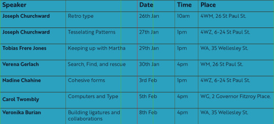
- Possibly move the keynote speaker's table at the top - easier to read
- My tables were white and not cream
- Bring down the type on the cover

Poster:
- Change leading - bring closer together
- Names in corner may be too small

Refining layout of brochure side:
- I think having 2 rows where the speaker's faces make it more coherent and flows better
- Having the map next to the keynote speaker's table makes more sense
- Need to flip the bottom right 2 panels as once folded they don’t read the right way.

0 notes
Text
Aligning type in grid


I found this tool to be super helpful in aligning my type in the grid. This is something new that I had learnt.
This was my previous layout which was not aligned right

0 notes
Text
Map design
This was my initial process of how I created the map for my brochure. In illustrator, I used the pen tool.

Redesigned map:
I refined my lines and added more details such as street names, and colours.

0 notes
Text
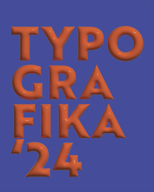
Poster Iterations
I decided to create more iterations using my chosen typeface and colour palette. Im quite liking the 6th or 7th one at the moment but will try and refine them to see if I could use

0 notes
Text
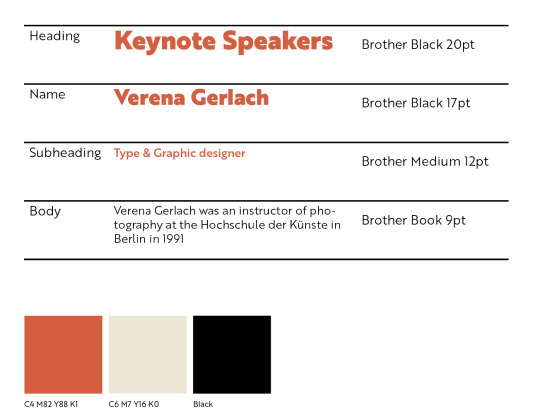
Refined Type + Colour
These are the final type choices I have made along with my colour palette swatch.
Colour:
I decided to completely change my colour palette as I ran into a few challenges and decided to act on them. I changed into an orange, cream, black, and white colour palette as I felt that these colours complement each other nicely.
Orange:
Associated with optimism and energy attention-grabbing, friendly and inviting. I thought that this colour would represent the type conference well as this is meant to be a fun, informative conference where type workshops take place. I also thought that orange reflects the warm and welcoming atmosphere of NZ.
Originally I had pink and yellowy orange. I was told that this didn't really fit with the typograpkia conference event. I also thought that the colour pink may skew the audience as pink is often referred to as a female colour. And this event is meant for everyone so I decided to change the colours.
Cream:
I decided to pair the colour cream with orange as I not only think they work well together but through researching, I found that cream is associated with a sense of sophistication, as well as is quite a soothing colour.
Website: https://www.adobe.com/creativecloud/design/hub/guides/meaning-of-orange-in-design
0 notes
Text
Playing around
I was honestly feeling unmotivated with what I have produced so far and decided to test something totally different that may help to spark motivation. I came across a tutorial on how to create 3D inflated text. I actually really liked how these looked but decided that there wasn't much reasoning behind an inflated type.

0 notes
Text
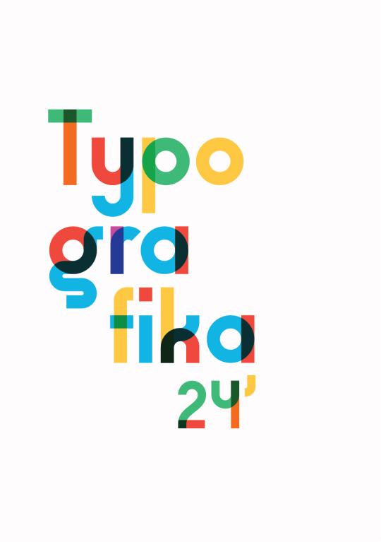
Poster concept
This was a poster that I had created using a typeface that I had come across. This was just a test that I wanted to try that may help spark new ideas but I won't be using this for my final.
0 notes
Text
Issue with colour
From the feedback that I had received about my colour choices I decided to come up with ways it could work.
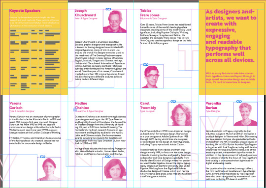
Grid with keynote speakers in black. I received feedback that the black is too harsh on the yellow background.
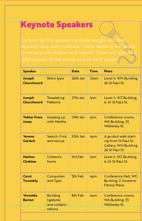
I also tested out with white instead, but was told white on yellow is a NO haha

This was my first poster concept. I was told to work on my hierarchy of the information which I totally agree with

I decided to play around with it and came up with this where the type is no longer white on the yellow making it easier to read. In all honesty, I'm not a fan. Im finding it challenging to come up with a way I can use these colours and make the information legible.

0 notes
Text
Grids
I have found using grids to be so helpful and useful when knowing where to place information and images.
This is the grid structure I will be using:
0 notes
Text
Playing with gradient
I wanted to test out a gradient but not too sure if it works

0 notes