grad602-catherinepascual
GRAD602/51 - Catherine Pascual
90 posts
Don't wanna be here? Send us removal request.
Last Seen Blogs

tina-loves-newt
Tina loves Newt.
iyiseyleroldubirden
bir delinin saçmalamaları♫

mindfullofyoga
A mind full of yoga.
sarzy07
Slay-rah

e-made-a-thing
E with the bad Knees
Text
Final Post BROSKIS LETS GO
AAAAAAAAAAAAAAAAAHHHHHHHH and I’m officially done!!! I swear I say this every time, but this project was SUCH a time crunch and it was an interesting experience to say the least. Group work was probably the more difficult part of the entire project but I’ve definitely taken some lessons under my belt regarding leadership. I’ve met really cool people already and I’m excited to learn from everyone in the rest of this semester. I realised the value of grid systems and learned different methods of categorisation. My indesign skills were further sharpened thanks to the feedback of my teachers.
Creating a solid design system was actually so much fun - I found so much inspiration in my environments and online and experienced many eureka moments. The last bit was stressful but I actually really enjoyed the process and I think that growth only came from hardships.
But yeah. I’m running on 2 hours of sleep. But I put everything into this (while trying to maintain my health hehe) and I’m super satisfied with the end result :)))
I hope you enjoyed this particular journey, it was a wild one, u might have witnessed me slowly descend into madness but hey, I always bounce back and in the end, it worked out all good.
Until next time,
Catherine
0 notes
Text
AAAAAAAAAAHHHHHHH
^lol I tried to capture the confetti BUT IM DONE AHHH
0 notes
Text
Last bits and bobs
^just quickly changed the names so they sound cooler heehee!
0 notes
Text
Mornin’ broskis
It’s the day of the submission!!!!!! Aahhh I’m so excited and relieved hehe it’s like I’m dropping off my kid at their first day of school. Also I had little sleep so my next posts might sound a little delirious.
^spending some time adjusting the kerning of the body paragraphs to give a little more breathing space.
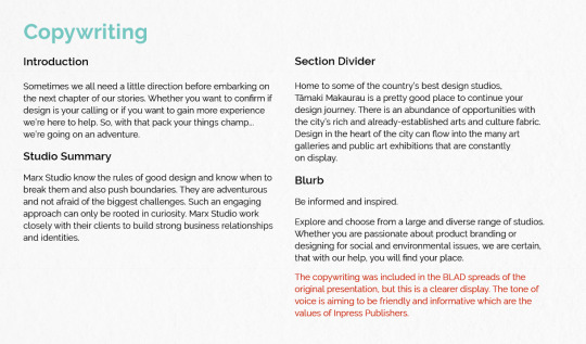
Copywriting Addition
Instagram Icon + Mockup
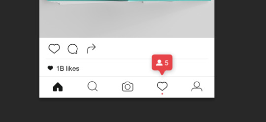
^hehehheheh
oml i think im almost done
0 notes
Text
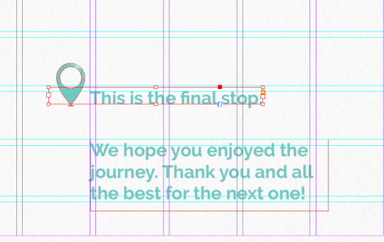
Final slides my broskis
^thought this was a cute way to finish off the presentation! ties everything together y’know :))
0 notes
Text
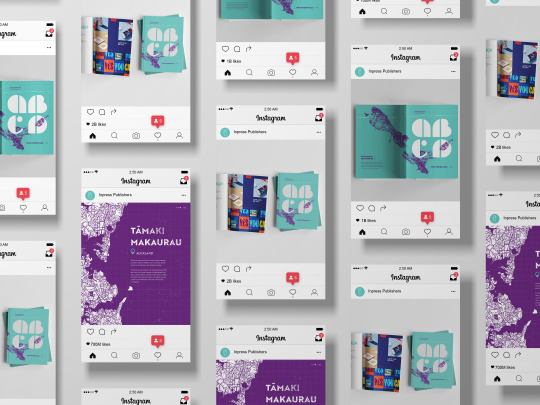
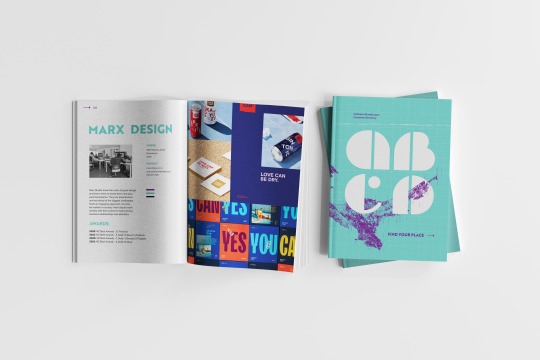
Mockups
I really think mockups make everything look 10x cooler and even though im running on fumes, I wanna do this!
0 notes
Text
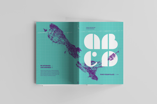
Visual elements
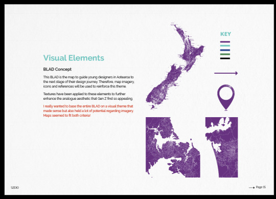
^talking about all the map-related visuals I used throughout the BLAD
0 notes
Text
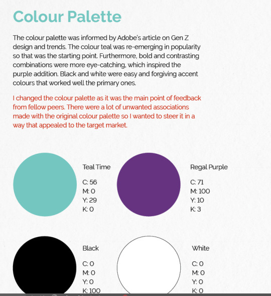
Typography
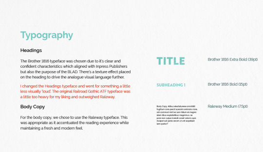
^justifying typeface choices.
0 notes
Text
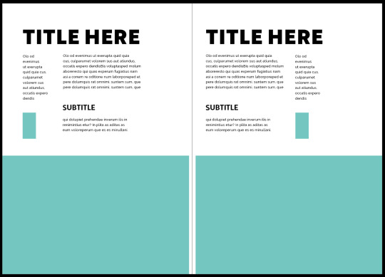
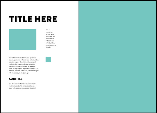
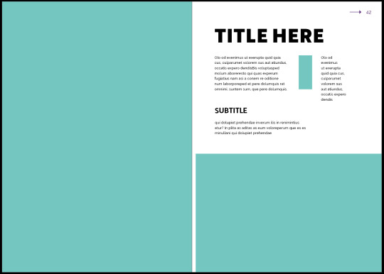
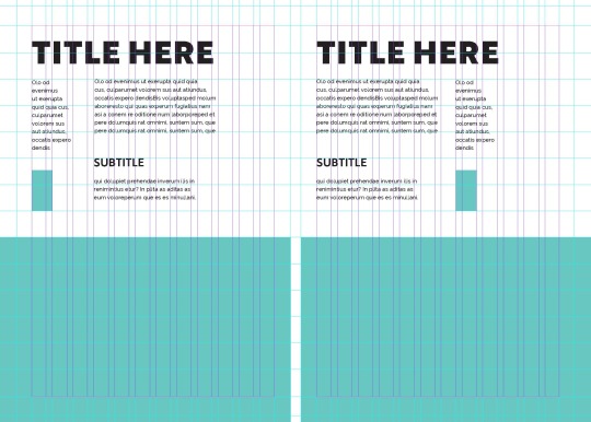
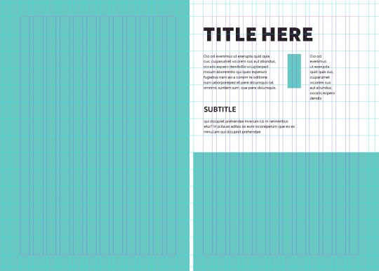
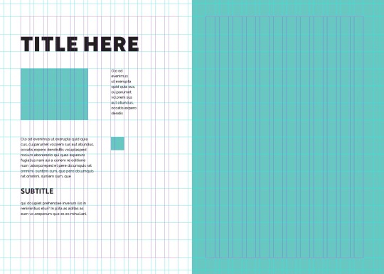
Simplified Grid Layouts for the presentation
Took the existing BLAD layouts and simplified it just to show the viewer how the grid can be used.
0 notes
Text
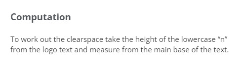
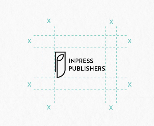
Clear space around the wordmark/logo
Never too late to learn new stuff hehe, the rest of the presentation is just copying and pasting my tumblr reflections.
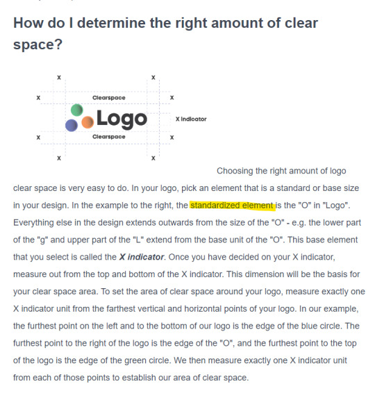
What is clear space and why is it important?
https://uptimeinstitute.com/about-ui/logo-brand-guidelines
Whenever you use the logo, it should be surrounded with clear space to ensure its visibility and impact. No graphic elements of any kind should invade this zone.
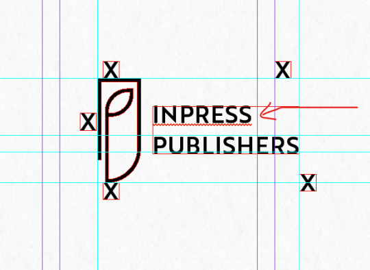
^the standardised element in this wordmark comes from all the capital letters which will be of the same height!
hmmm seems too close...
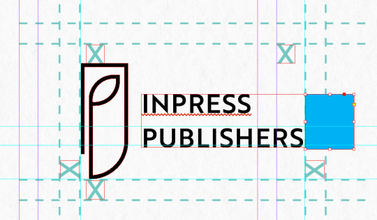
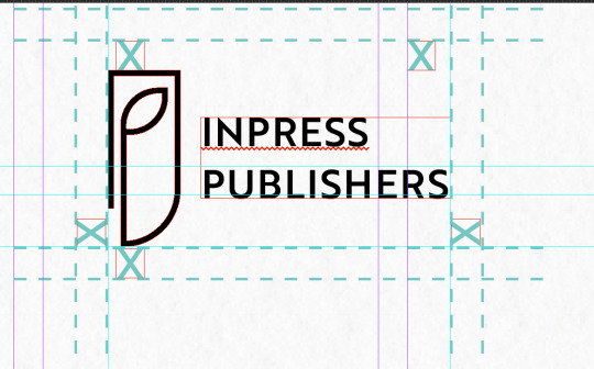
I think the standardised space should be the space of the 2 lines of “Inpress Publishers”
^much much better!!
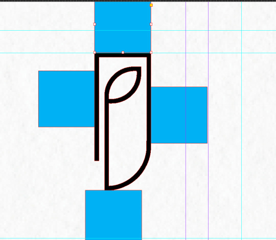
^standardised x from the width of the logo
^easy peasy bruv!
0 notes
Text
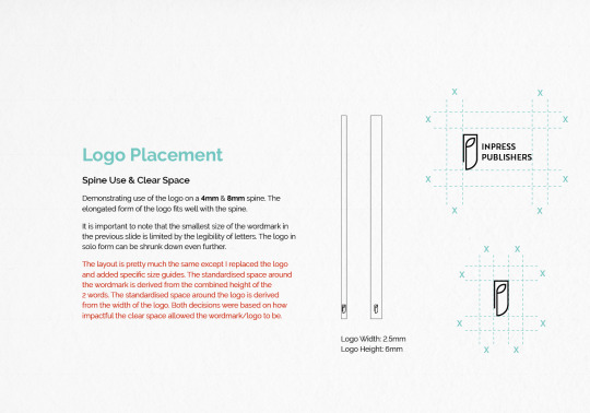
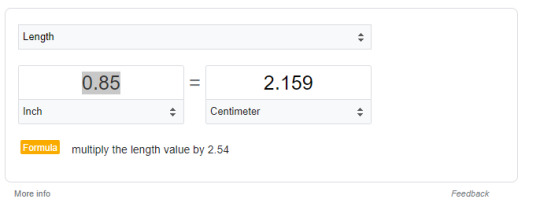
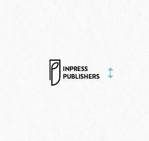
Tweaks to the logo - wordmark
I used the Brother typeface for the wordmark but I want to give limits as to how small or large they can go:
https://identity.stanford.edu/visual-identity/stanford-logos/wordmarks/#:~:text=Make%20it%20large%20enough%20to%20read.&text=Always%20make%20the%20wordmark%20at,attention%20to%20the%20minimum%20size.
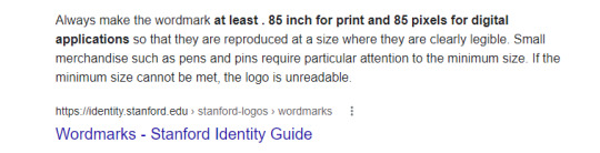
https://ualr.edu/communications/logos-and-marks/wordmark-minimum-size/
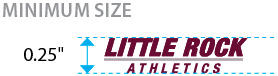
^smallest size
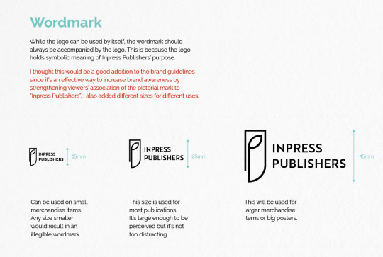
^i referred to the sizes I used in the final BLAD
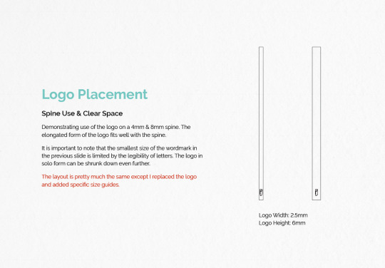
^used the same format for the spine!
0 notes
Text
Presentation Set Up
wait i just realised that i didn’t tell y’all how im approaching this - so I created a separate document which is basically the entire presentation revised - and because it’s quite different from the original one, I’m going to just add this updated presentation right after u go through the original one - if that makes sense haha

^but yeah, i spent some time setting this up and labelling each slide - adding in slides, changing the order of other etc etc. i also think it’s important to remind myself of these questions: What did you change? What did you keep the same? What did you add? And why? I think for you viewers, it’s important to follow my thought process so that you better understand my design decisions.
Also, I’m optimistic I’ll get this done and I won’t have to pull an all nighter - and it’s really because I’ve recorded all my thoughts here and I just need to neatly format that into the presentation! Feeling heaapps better hehe anyways, back to it!
0 notes
Text
Presentation Development continued
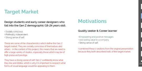
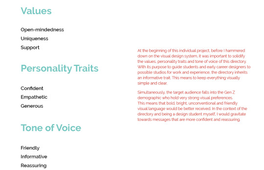
^further explaining what these traits mean and what it means for the BLAD.
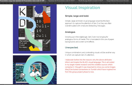
^added visual inspiration and then talked about how that influenced the BLAD’s visual language.
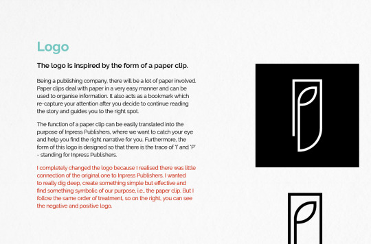
^logo all done and explained!!
0 notes
Text
Why do I keep coming up with good ideas right before submission
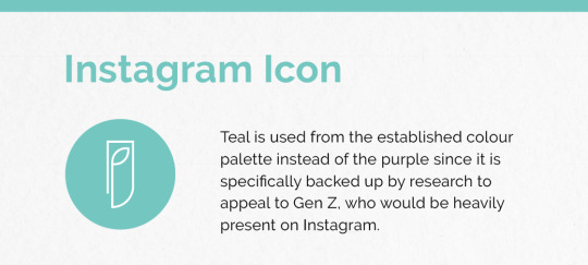
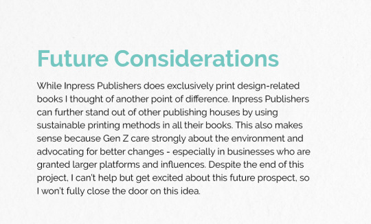
I just remembered earlier into the semester, Paul was talking about points of difference for the brand. While Inpress Publishers does exclusively print design-related books I thought of an extra thing that could make them stand out. My friend mentioned that the revised logo (below) resembled a leaf and man oh man, that made me think of sustainability - Inpress Publishers can stand out by using sustainable printing methods in all their books ughh and this also makes sense because Gen Z care strongly about the environment oml do I add this in - idk because I didn’t include it in the BLAD. Might just leave it, but it’s a good further consideration.

Okay I’m just gonna add a slide at the end of future considerations so I can include this in the presentation at least.
0 notes
Text
About S2DIO
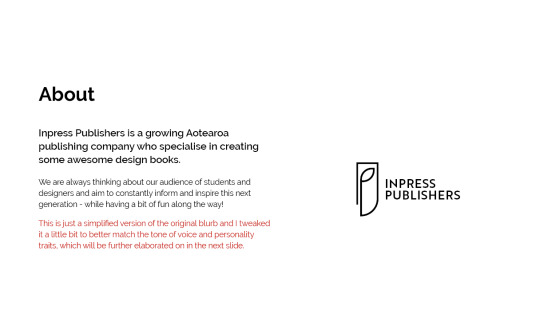
^here I start to introduce the tone of voice and personality which I established earlier on in this individual project.
^it was really easy to talk about this addition - literal copy and paste from one of my Tumblr posts to explain everything!
0 notes
Text
S2DIO logo
There’s not much I really changed about the S2DIO logo - I think the only thing I realised was that it was in the theme of the BLAD and I want to keep it quite neutral to let the work shine.
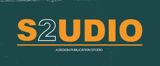
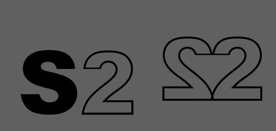
^did some logo experimenting but I don’t really dig any of them so I won’t even bother - KISS - Keep It Stupid Simple

0 notes