Last Seen Blogs

steam-beasts
You know what? Fuck you *Gives your engines legs*

isammiiboo
That Filipino GIRL !

briquesmorts
briques morts

rudyrichardscustom
Rudy & Richard's Custom Upholstery

kanyepluscomics
Kanye + Comics


Text
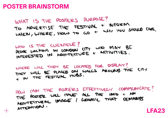
DESIGNERS RATIONALE
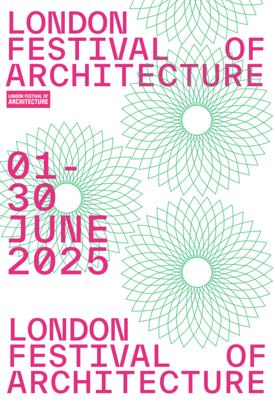
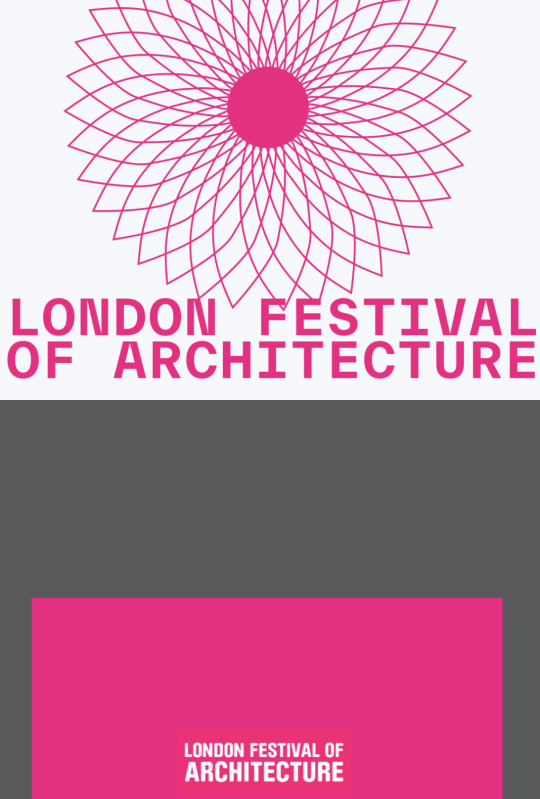
This Branding Project held a great brief which challenged me and gave me a lot to push for. The initial response to the brief, was to choose a festival that I believed would challenge me and force me to think outside of my current understanding and knowledge. This is why in my eyes a music festival would have been too easy. I came to the conclusion to choose ‘London Festival of Architecture’ or LFOA in short. I believed to choose a festival that is based on symbols, iconography and grids is right down my lane of a design movement and styles I like. I am a designer that really loves Grids and Typography and want to grow in those areas by the time I leave University. I chose this specific festival for that reason aswell as Architecture being a topic I would love to learn more about but lacked present understanding. This would force me into researching and looking into different ideologies and beliefs that Architects hold dearly that I could then incorporate within my rebrand.
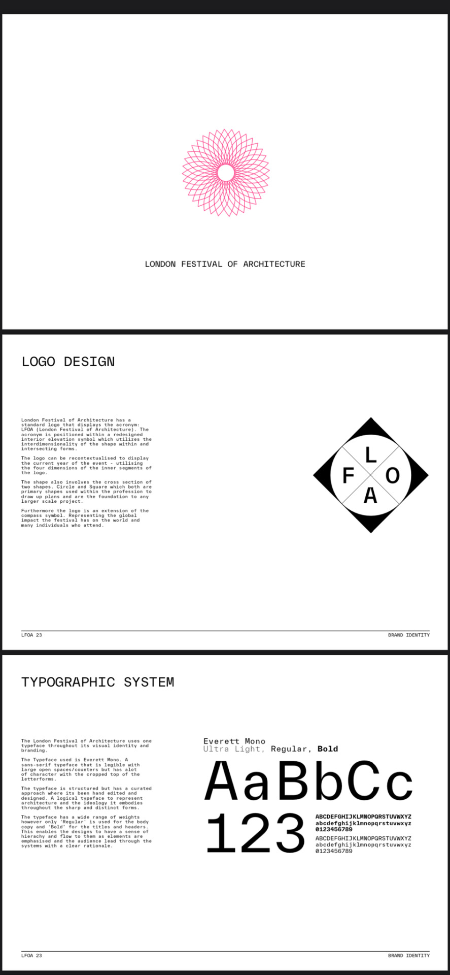
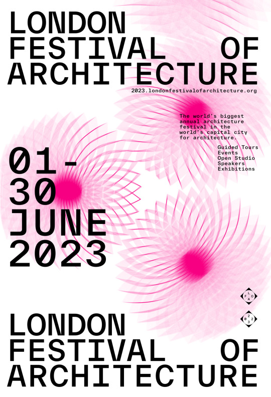
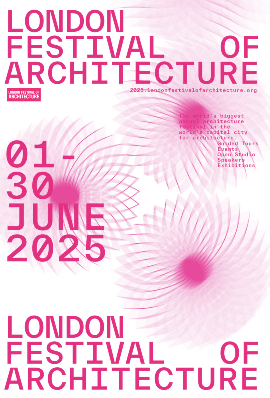
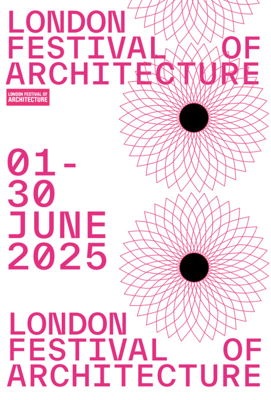
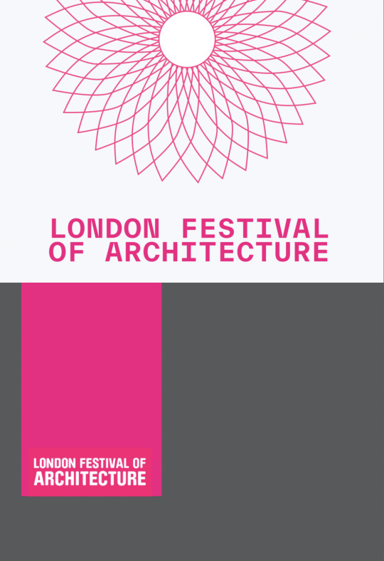
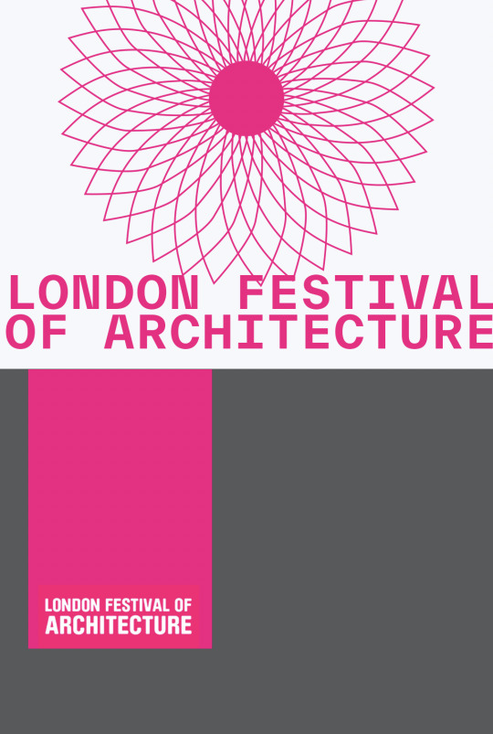
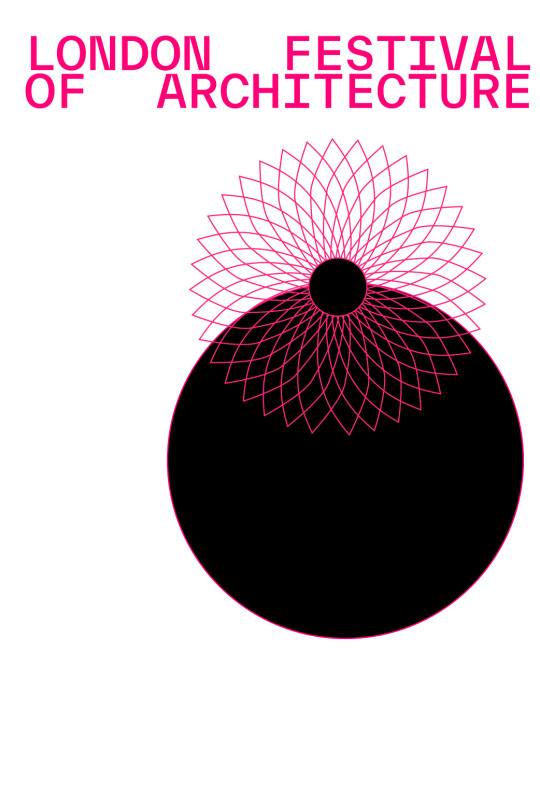
I began rebranding already with a given logo. I did however have a choice in colour, typography and any iconography/imagery. I very much enjoyed the pink colour as it stood out form the rest of the colours in a city environment, however to make the colour pallete more gender neutral I chose to make the secondary colour black, for type and the background. My choice of typeface was TWK Everett which was a structured sans -serif typeface that had small characteristics which made it super unique. Example of those characteristics is the shortened apex and cropped bottom and top of the letterforms.
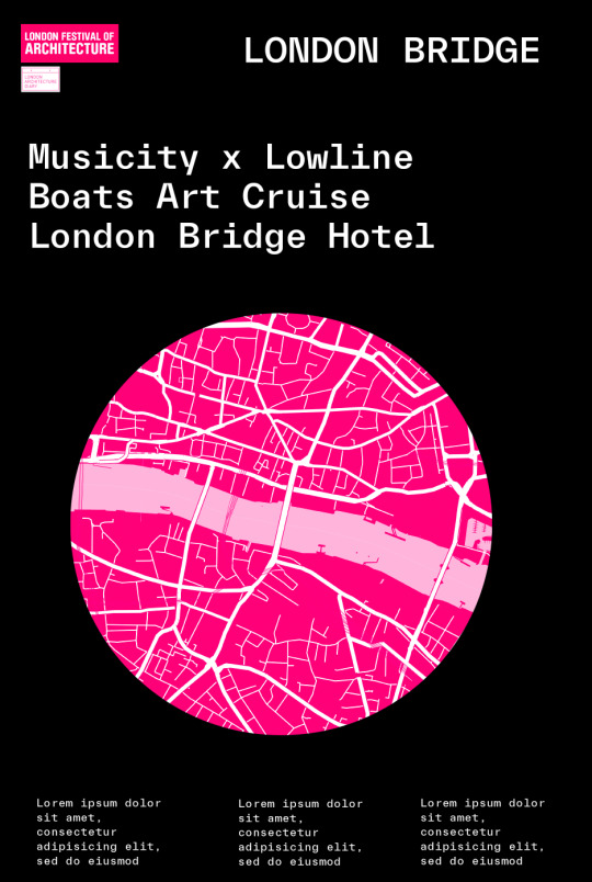
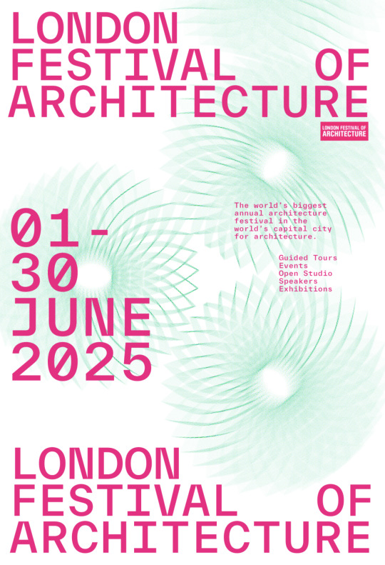
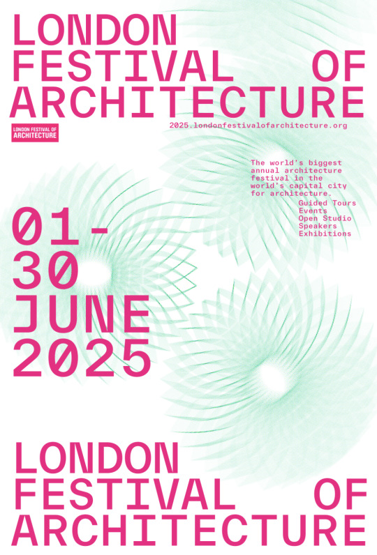
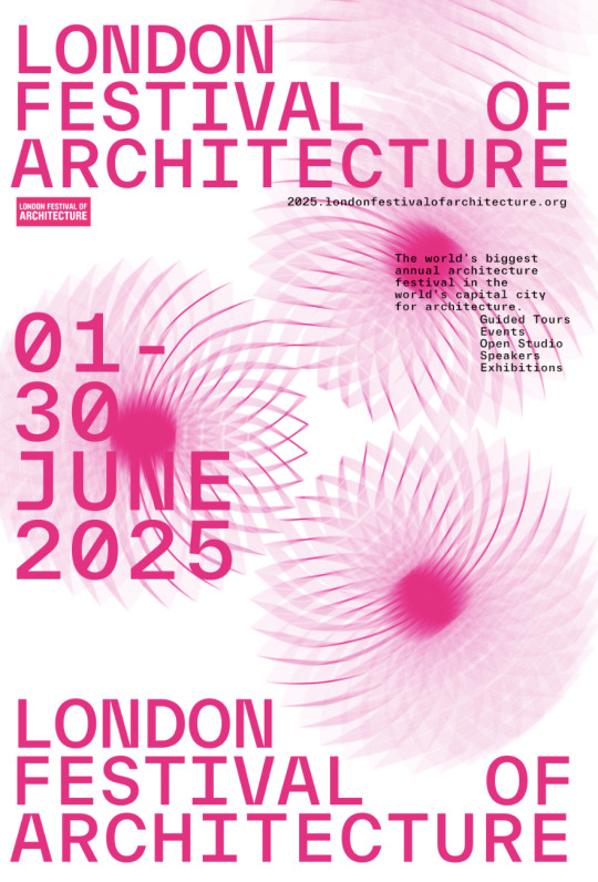
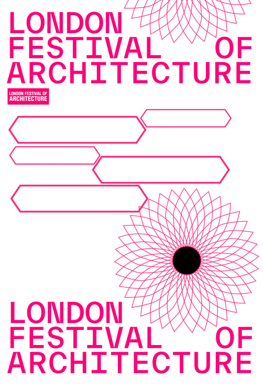
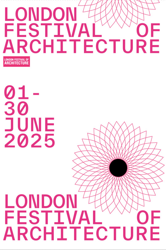
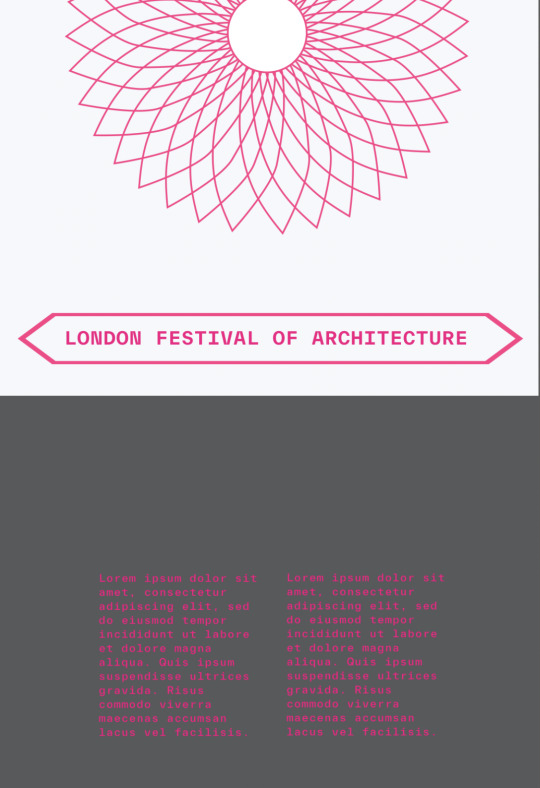
Once I came up with the branding I moved onto making the collateral, throughout the collateral I used Grid Systems inspired by architecture and Josef Muller Brockmann’s Grid Systems book I own. Furthermore I used the Londons famous Gherkin Building and took a architectural plan I found of the brids eye view. I then re designed the shape of the roof to make a symbol which I used as the visual Imagery for the 2023 festival.
All the collateral used the iconography and the Festivals theme of systems to emphasise this specific idea. A-lot of my imagery and iconography was re-developed and recontextualised pre-existing icons familiar to architects. I however added my own spin on them and placed them in a new environment which would assist in way-finding (cropping the elevation symbols to make an arrow). By doing so the whole festival embodied the theme of systems through its imagery which would resonate with architects, while introducing these systems to the public.
0 notes
Text
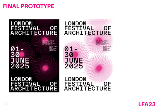

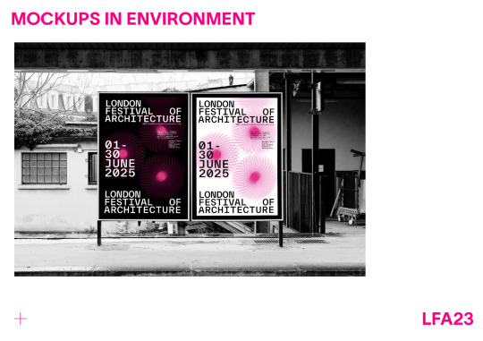

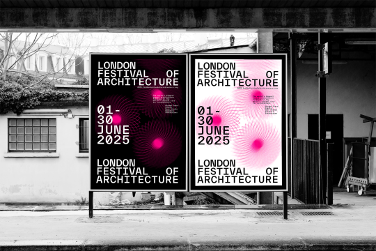
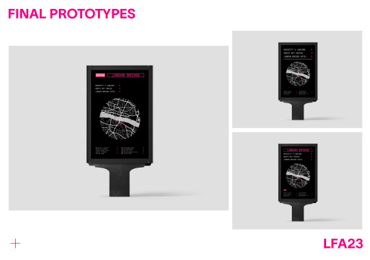
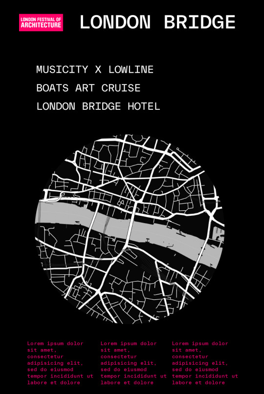
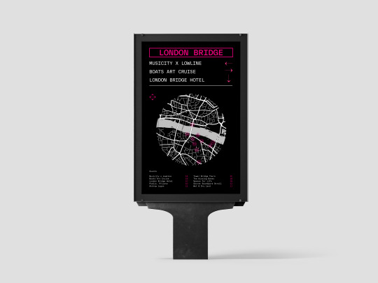
Final Prototypes & Mockup in Functional Environment
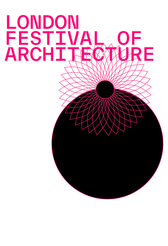
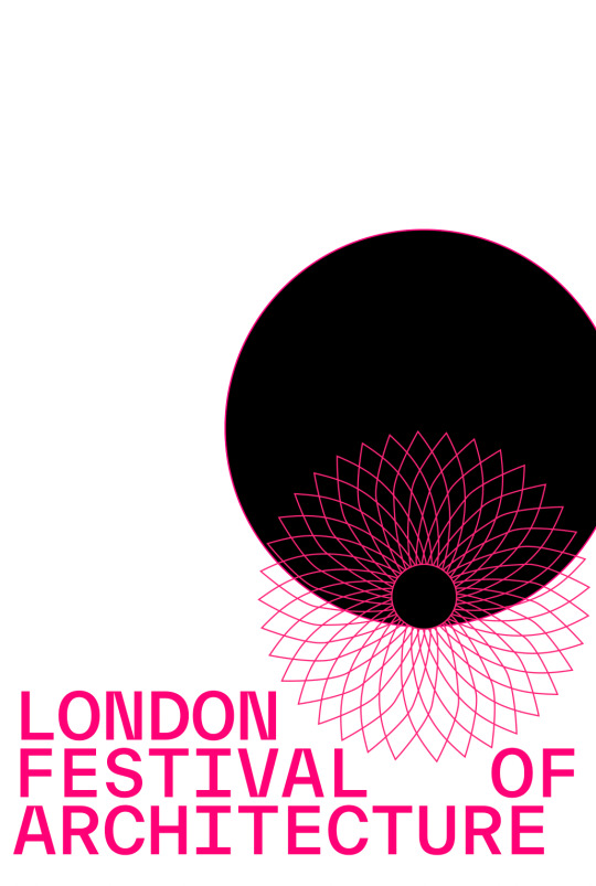
Once I was happy with my design I placed the poster in a functional environment to see how it would look and be appropriately interacted with. By doing so I was able to visualise what a citizen or person of the public would think, see and do upon first seeing the poster.
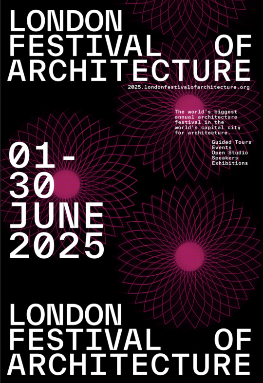
For example I can see that the typography works functionally as a stark contrast the background of the poster. This propels the type forward and gives the information the forefront of the page. What I am fond of within this composition, is that the pink Gherkin symbol through image manipulation become the focal point that grabs the publics attention- the strong bright pink - draws you in which then contrasted with the negative space the text than takes the lead and directs the audience through the composition.
By placing the poster on a large scaled billboard was deliberate choice that would make the informations and body type on the poster to be as accessible and legible as possible. This way someone walking by could just as easily read and gather the info on the website and events.
Due to the tight turnaround of this project I wasn’t able to carry on exploring, however if I was to further develop this I would create an animated version for a digital billboard where the type moved onto the page and the gherkin symbol went from a static symbol and then revolved around the centre axis to create a blurred image.
0 notes
Text


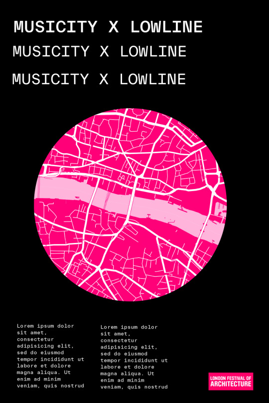
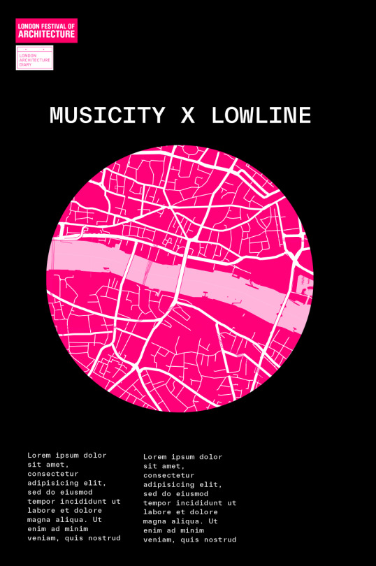
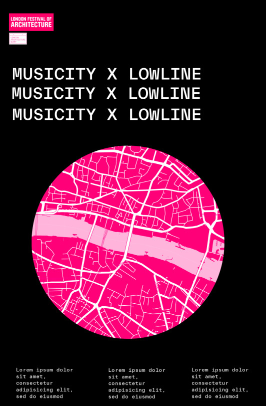
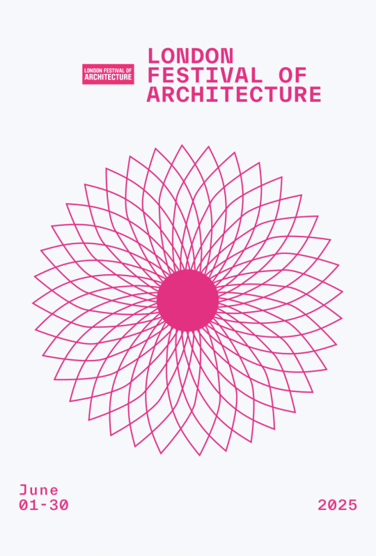
Gherkin Symbol - Ideation and Illustration.
When I was creating the iconography for the branding, I knew I wanted to create a symbol/icon that would be the main visual element within the branding for the 2023 festival. At that point of time I was looks through Architectural plans and symbols/visual language and keys that architects used to gain inspiration. I learnt how to read a architects map and then hit a brick wall. I decided to go on Behance where I was scrolling through and fell upon a series of designs that used famous building architecture to create patterns on a canvas. I took this ideology and applied the thinking to my own design. I started looking for architectural sites within London. I was considering the London eye, tower bridge but then I saw the gherkin and its interesting forms not only from the side profile but also birds eye view. I found an architectural plan and used it as a reference as I illustrated the symbol with a pen tool. I then ideated with weight of the strokes and centre circle.
Since as far as I can remember I have always loved a circle symbol/icon throughout my work - this being on the premise of its balance and visual tension with other horizontal (x-axis) imagery and type. This juxtaposition provides for great visual aesthetic and depth within a composition. Hence my choice in the top profile over a side profile. Circle Imagery are also easy to place in different collateral and spaces due to its flexible and symmetrical nature. This way I can allow myself the most space for experimentation and possibilities.
0 notes
Text


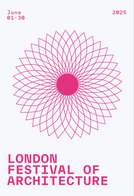
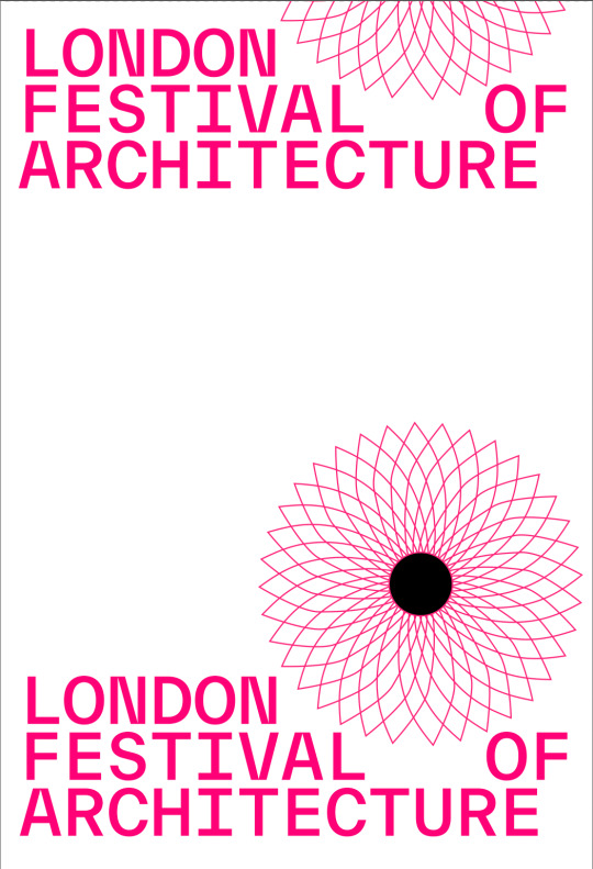
Iteration 04
Once I conducted my concept sketches I took my favourite ideas and recreated them as quick mockups on the computer. With the quick mockups I could see how the different elements worked together in relationship with each other - size, proximity, balance. From there I narrowed down on a single design and began developing and iterating that one. I chose this one due to its simplistic grid structure and legibility to read. Both from a distance and up-close, I began experimenting with image making and how I could manipulate the Gherkin Symbol, to make the design more visually interesting and appealing, modern, futuristic and exciting - the very characteristics of architecture and where it was moving within the industry. I further ideated the position and layout of the typography settling on left aligned right skewed. I manually adjusted the ‘OF” so that the top and bottom of the composition had a heavy weight and closed off the composition - almost trapping the content inside, and keeping the audiences focus in the middle.
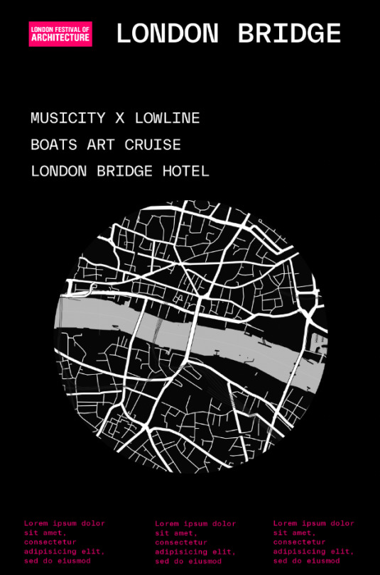
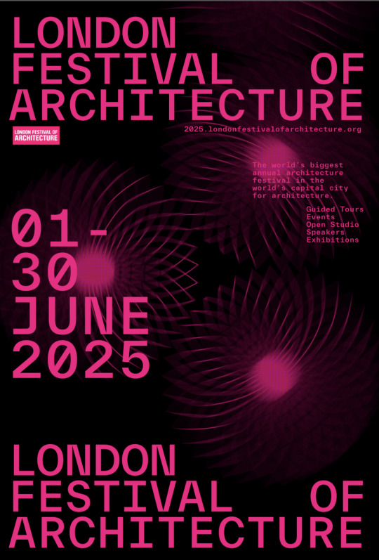
I decided to also create an option which could be inverted to white background and black text, for situations when the sun goes down or when placed on a black wall or building. In different areas and circumstances this would provide as a great alternative to the official.
1 note
·
View note


Photo

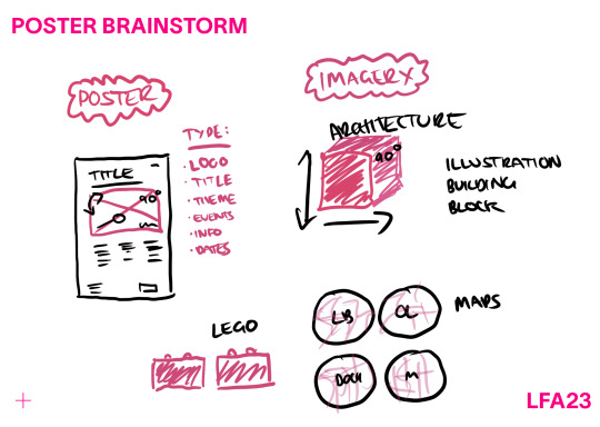
Concept Sketches
Every-time I begin a design I always go through the process of doing some concept sketches. I do this for the specific reason to maximise my opportunities and push myself to make at-least 10 different concepts. I like this as I have to think really hard when I get past the first 4 about ways I can push the layouts and position of elements. Afterwards I am able to pick between all the concepts and choose the elements I like the most and flick back and fourth between my favourite parts to create the prototypes and further more throughout the ideation. Above I circled my favourite sketches which I recreated digitally and ideated to produce the final outcome.
0 notes
Photo

Moodboard
As seen above alot of my visual references came from posters or visual imagery that used grid systems and strong layout and placement of typography. I used this as architectural designs use strong gird layouts and have interesting forms like the imagery and patterns used within the background of the posters above. I pulled inspiration from these images and used the layouts, and placement of text as a key inspiration within my concept sketches while putting my own spin on them. One thing I was interested by within all these images was the way they used their type. Whether it was manipulated or centered with left alligned. Each design brought its own spin to the posters which gave it character and context.
0 notes
Photo
Braindump & Initial Sketches — First Ideas when thinking about Poster
0 notes
Photo
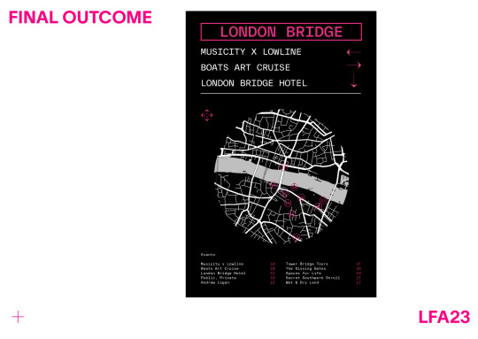


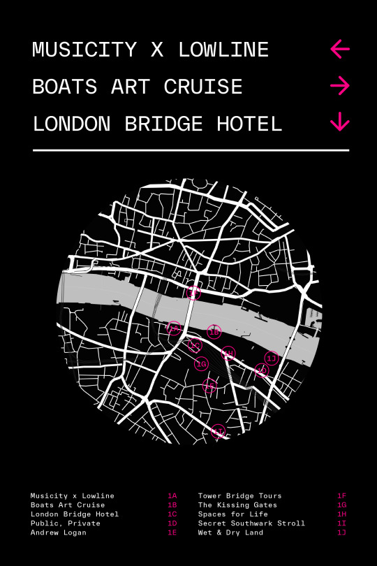
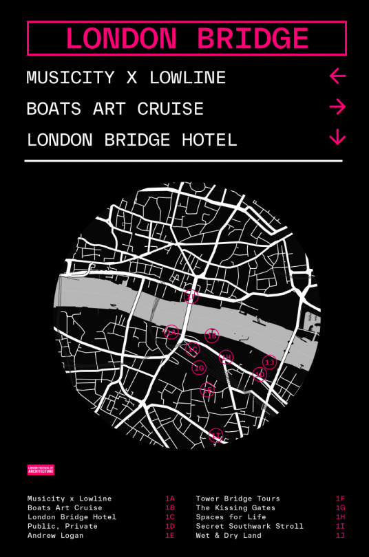
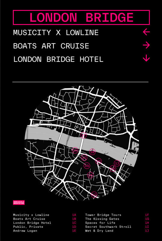
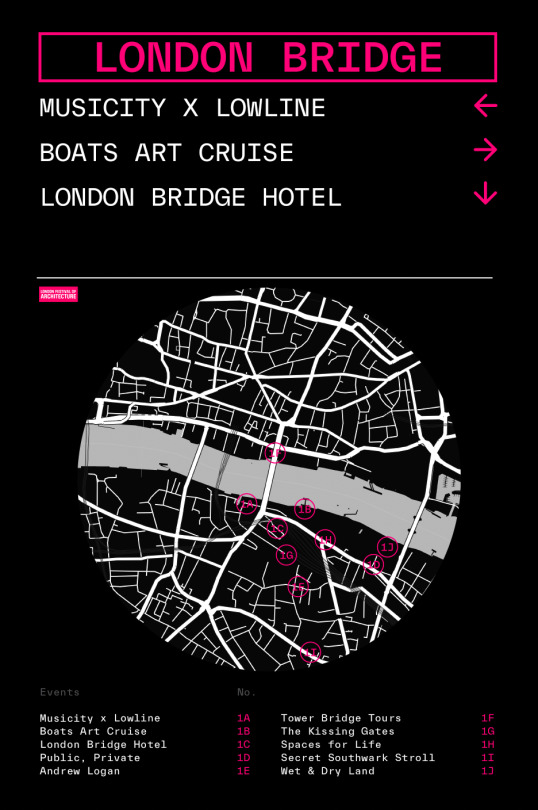
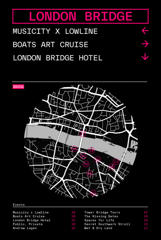
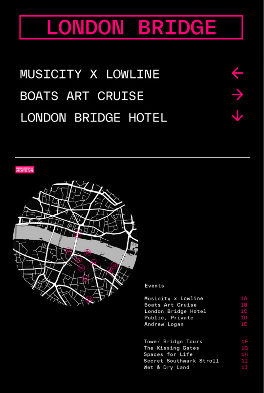
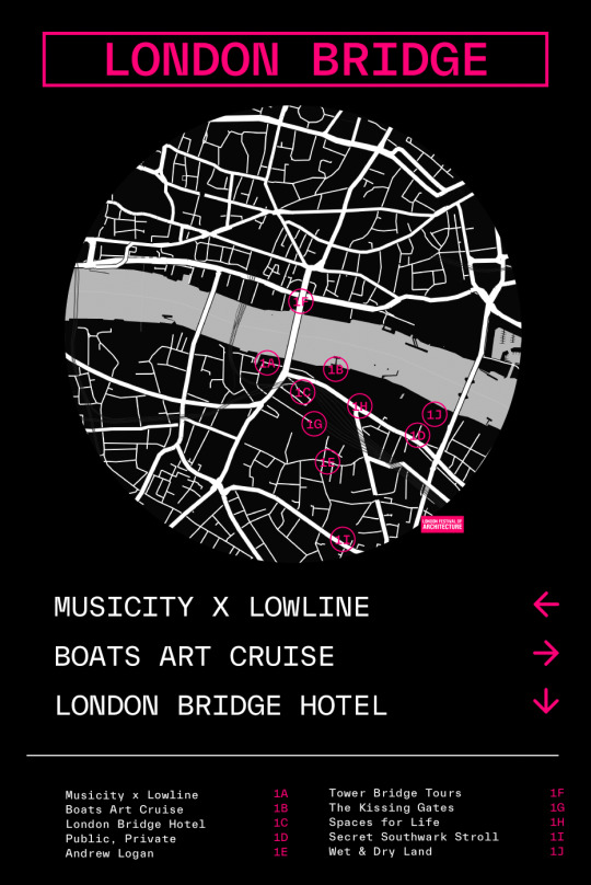
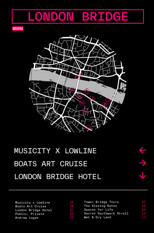
Wayfinding Final Outcome & Environmental Context
When I made the final adjustments to the way finding design and system I decided to test it within its functional environment to see if it was fit for purpose. Once seeing it within the board I could imagine the design within the context of London CIty. The bright pink and clear colour palette communicate effectively what the brand is.
The last minute changes I made within this design was changing the arrows into arrows designed by deconstructing the logo. Pulling the corners of the pink square and cropping them and adding a rounded line to construct my own unique arrow. This was a good decision because the final outcome tied the style and aesthetic with the rest of the design system.
The circle map was an intentional choice that draws the audience in due to its balanced open shape/form. Its light map lines and details become the focus of attention and the pink accent, providing context, directions and valuable information.
Each Festival Hub within the city would have their own styled wayfinding board with a map and the events happening over the period displayed. This way each map is catered to the area and the person specific position allowing them to understand where events are within proximity and in relationship to their current position.
0 notes