
grad503-harrietneradt
GRAD 503 Harriet Neradt
32 posts
Don't wanna be here? Send us removal request.
Last Seen Blogs

realathenaqueen
Athena Queen
clownmothman
Just A Dork Who Makes Art

fluffyeddybear
The Prince of Hulle Granz Cathedral
frogs-on-logs
welcome to the bog
Text
Annotations of text, image, and layout choices and decisions.
Reflection of process and learning curve.
0 notes


Text
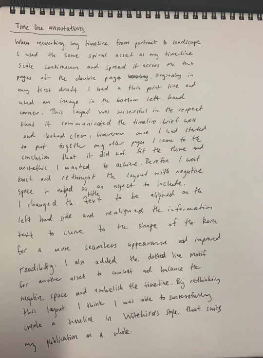
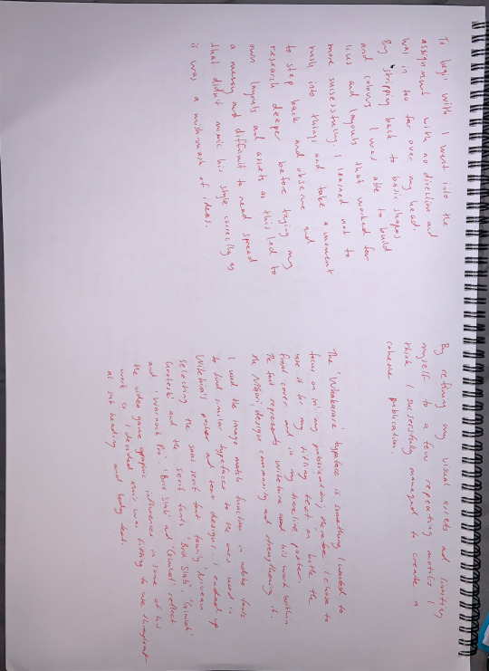
Reworked Timeline Iterations
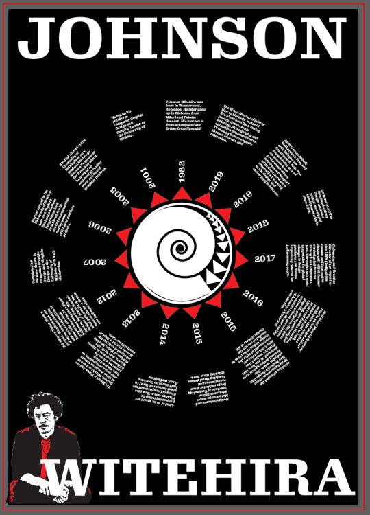
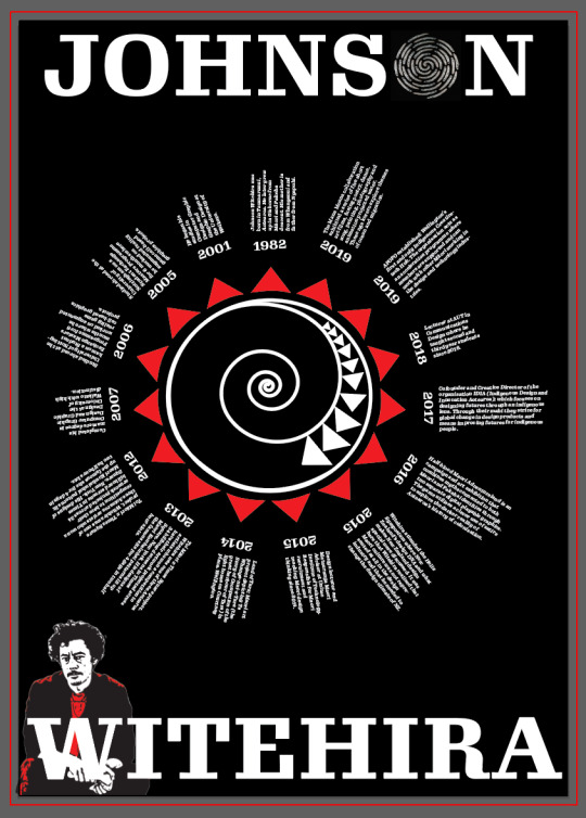
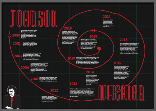
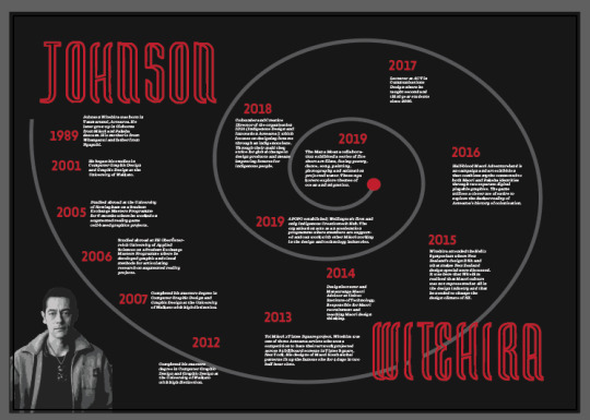
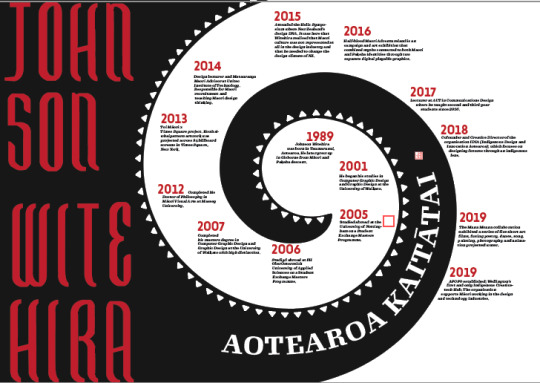
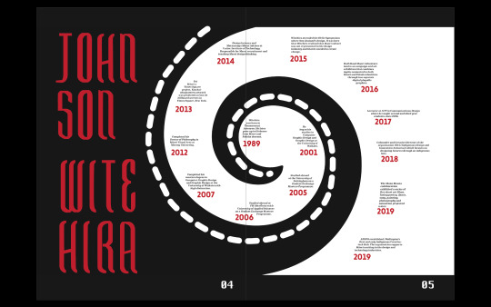
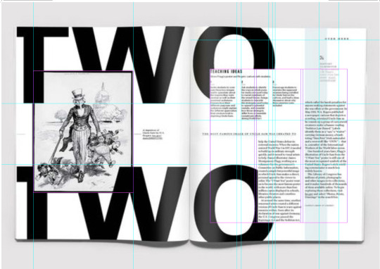
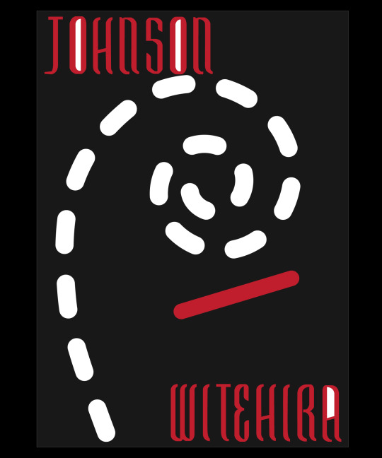
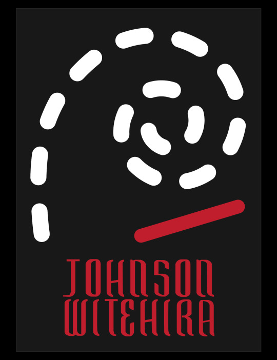
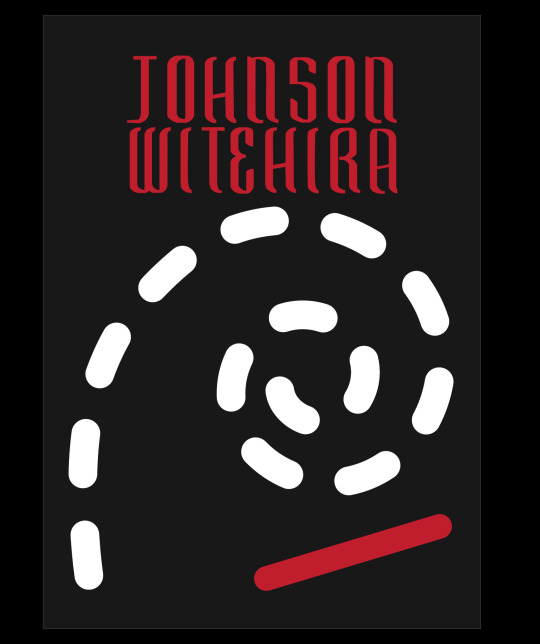
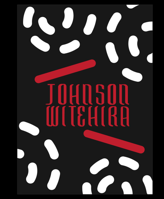
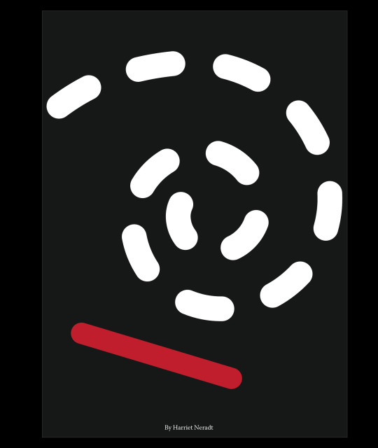
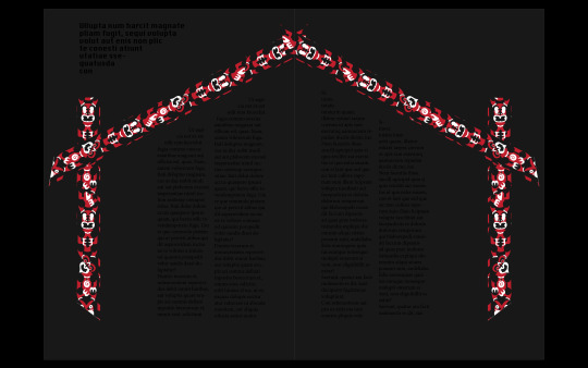
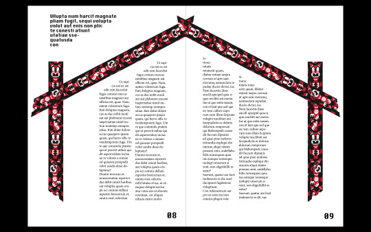
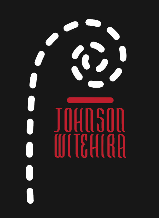
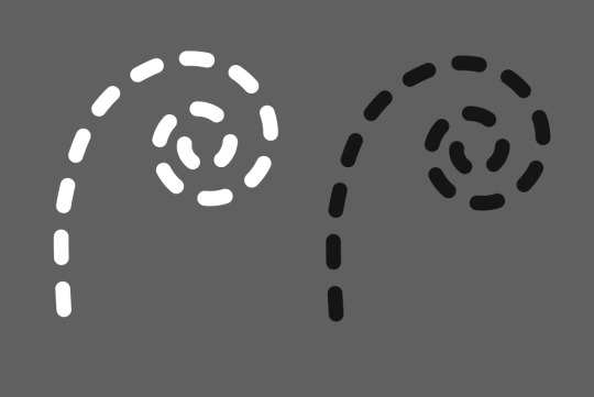
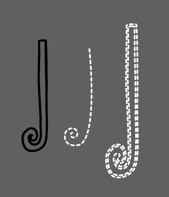
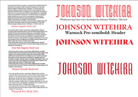
With the feedback I received from the formative assignment I simplified and refined my timeline poster as well as adjusted the orientation to be landscape. I traced Witehira's Whakarare typeface with the pen tool in illustrator as it is not a typeface available to use and decided this was appropriate to use for title text. The subtext typeface used is gimlet which mimics 80s video game text; this style reflects the influences in much of Witehira's work. The dotted spiral line mimics the aesthetic that I chose as a theme for the entire publication making to have a sense of cohesiveness. Through different iterations, I was able to highlight issues and assets that were not successful to settle on my final design. I curved the subtext to mimic the koru shape to withhold the imagery and not break up the design. The use of negative space reflects the design of the rest of the publication as well as allowing rest for the eye. Witehira often used block colour a negative space amongst his busy pattern work.
0 notes
Text
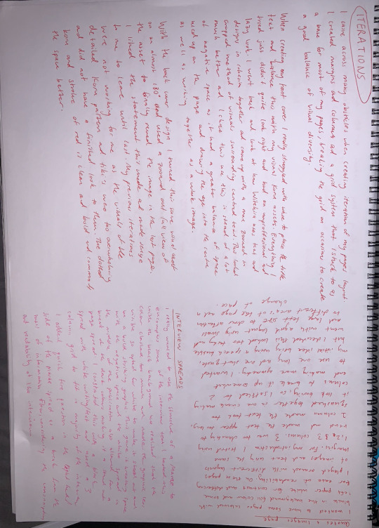
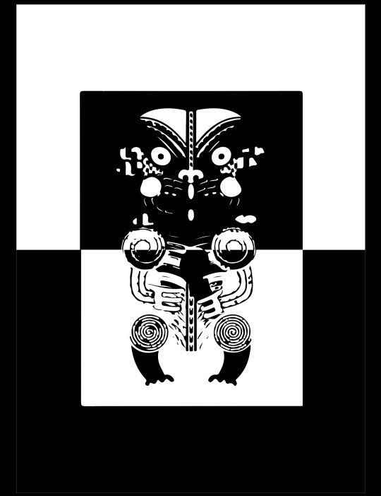
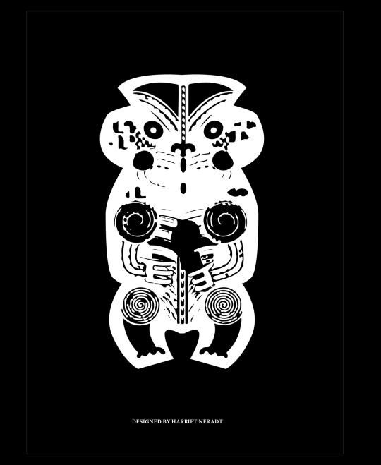
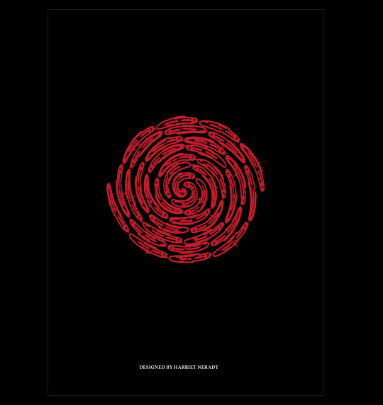
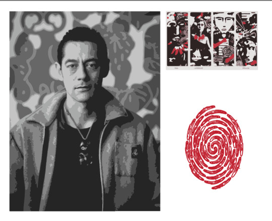
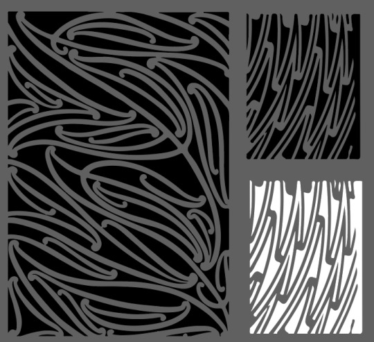
Pattern Extended
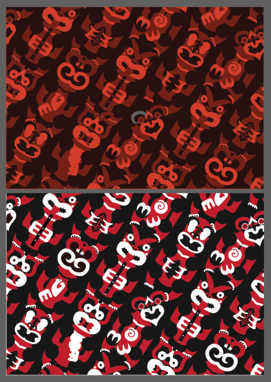

I wanted to refine my pattern choice to use in my 12-page publication so went further into my research of Witehira's work. I found a design where he had a very minimalistic style (image above) with the traditional colours of red, white, and black used. I liked the negative space created by the black background and the evenly spaced dashed line work contrasted against the solid red lines. I thought this work was very successful and therefore decided to make some iterations with my own designs using the pen tool in illustrator to create my assets.
As well as this I found this tight-knit tiki pattern which I wanted to use repeating throughout my publication. I adjusted to colours to suit the very limited colour scheme I chose for my publication.
0 notes
Text
Pattern

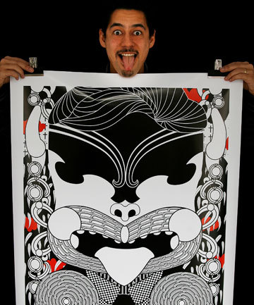
At the root of all of Witehira's designs lies pattern. This fundamental aspect of his work dictates much of the outcome of his style. I replicated some of these using different shapes and colours studying the kowhaiwhai patterns.
Kowhaiwhai patterns are usually displayed upon ridgepoles and illustrate the whakapapa of the iwi. Nature is often the inspiration for these beautiful and stunning patterns which are often found on the rafters of the meeting houses.
The tiki represents power, knowlegde, wisdom, prosperity and many other strong attributes that are aspired to have. The hei-tiki represents Hine-te-iwaiwa, a celebrated ancestress associated with fertility and the virtuous qualities of Māori womanhood.
Koru represents growth and new beginnings.
0 notes
Text
Asset design and testing
I looked at Witehira's designs and begun with directly replcating them with different titles and type to begin to get a sense of his distinct style and observe the methods he uses to create his designs in order to create my own.
Through this process, I realised that some of his designs are very complex and busy and this was a bit startling to look at especially for a publication brief so I decided to simplify things and took at look at some of his more minimalistic designs.
0 notes
Text
Publication script assets
503 draft script bespoke publication
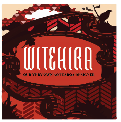
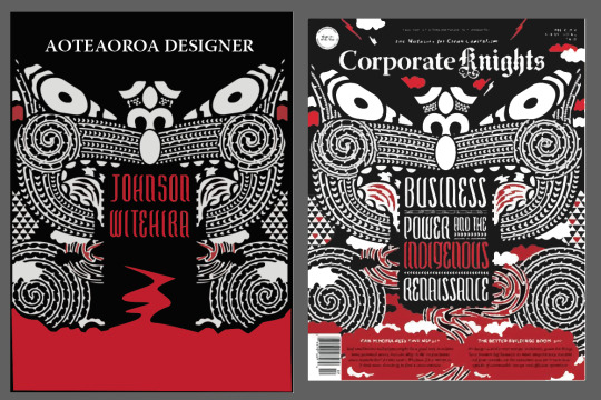
Page 1 front cover design
Page 2 quotes and images
Page 3 intro min 150 words
Page 4-5 reworked timeline poster design
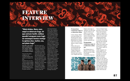
Page 6-10 feature article/ interview
Page 11 references
Page 12 back cover design
Introduction:
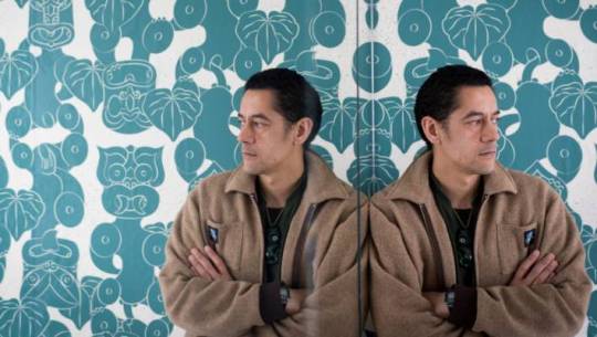
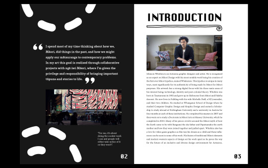
Johnson Witehira is an Aotearoa graphic designer and artist. He is recognised as an expert on Māori Design with his most notable work being his creation of the first ever Māori typeface, named Whakarare. This typeface is unique in many ways, most significantly for its authenticity of being made by Māori for Māori purposes. His artwork has a strong digital focus with his three main areas of his interest being; technology, identity and post-colonial theory. Witehira was born in Taumarunui in 1982 and grew up in Gisbourne from Māori and Pakeha descent. He now lives in Feilding with his wife Michelle Duff, a NZ journalist, and their two children. He studied at Whanganui School of Design where he studied Computer Graphic Design and Graphic Design and earned a Scholarship to study abroad at Nottingham University and a university in Austria for four months at each of these institutions. He completed his masters in 2007 and then went on to study a Doctorate in Māori Arts at Massey University, which he completed in 2013. Many of his pieces revolve around the Māori myth of how the Earth came to be with Ranganui the sky father and Papatuanuku the earth mother and how they were joined together and pulled apart. Witehira also has a love for video game graphics as this was his dream as a child and these influences can be seen in some of his work. His fusion of traditional Māori elements and modern western aspects of design set his work apart as he paves the way for the future of an inclusive and diverse design environment for Aotearoa.
Interview:https://www.thebigidea.nz/stories/tane-lives-at-art-in-the-dark
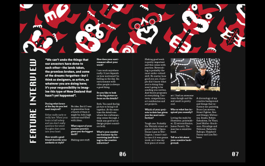
During what hours of the day do you feel most inspired?
Either really early or really late. When your brain is half asleep and you don’t really question the weird thoughts that come into your head.
How would a good friend describe your aesthetic or style?
No idea. But if I was to generalise from a bunch of them it might be, bold, high contrast and filled with ideas.
What aspect of your creative practice gives you the biggest thrill?
Making new stuff.
How does your environment affect your work?
I can work anywhere really. It just depends on how motivated I’m feeling on the day. An environment with other people is always a good thing.
Do you like to look at the big picture or focus on the details?
Both. You need the big picture to bring it all together. At the same time the details are where the craftsmanship comes through. I think any good art or design project considers both.
What's your number one business tip for surviving (and thriving) in the creative industries?
Making good work is pretty important and this comes with practice. Networking is probably the most under-valued skill. No matter how good you are, if people don’t know what you’re doing they aren’t going to be sending you invites. And throw proposals at everything. Contests, competitions, art residencies and art projects.
Which of your projects to date has given you the most satisfaction?
Tough one. Probably the Waituhi street art project down Opera House Lane in Wellington. I wasn’t really sure if it was gonna work, as it was my first piece of street art. I had an awesome team though and the end result is pretty cool.
Who or what has inspired you recently?
Loving the mahi by illustrator, printmaker, DJ extraordinaire, James Paratii. The man has a sensitive hand.
Tell us a bit about your creative background.
A chronology of my creative background and things that influence me: painting, Bruce Lee movies, Street Fighter, Ren and Stimpy, Wolverine, Quake, Robyn Kahukiwa, Da Vinci, Josef Muller-Brockman, Hiroshige and Hokusai, Raharuhi Rukupo, Shepherd Fairey and Lisa Reihana.
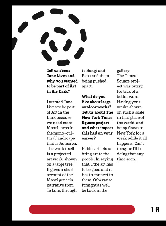
Tell us about Tane Lives and why you wanted to be part of Art in the Dark?
I wanted Tane Lives to be part of Art in the Dark because we need more Maori-ness in the mono-cultural landscape that is Aotearoa. The work itself is a projected art work, shown on a large tree It gives a short account of the Maori genesis narrative from Te kore, through to Rangi and Papa and them being pushed apart.
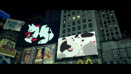
What do you like about large outdoor works? Tell us about The New York Times Square project and what impact this had on your career?
Public art lets us bring art to the people. In saying that, I the art has to be good and it has to connect to them. Otherwise it might as well be back in the gallery.
The Times Square project was buzzy, for lack of a better word. Having your works shown on such a scale in that place of the world, and being flown to New York for a week while it all happens. Can’t imagine I’ll be doing that anytime soon.
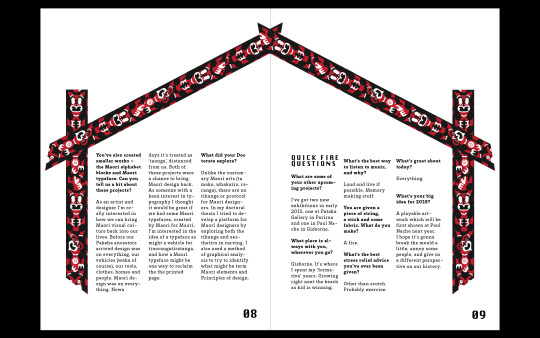
You’ve also created smaller works – the Maori alphabet blocks and Maori typeface. Can you tell us a bit about these projects?
As an artist and designer I’m really interested in how we can bring Maori visual culture back into our lives. Before our Pakeha ancestors arrived design was on everything, our vehicles (waka of course), our tools, clothes, homes and people. Maori design was on everything. Nowadays it’s treated as ‘taonga’, distanced from us. Both of these projects were a chance to bring Maori design back.
As someone with a keen interest in typography I thought it would be great if we had some Maori typefaces, created by Maori for Maori. I’m interested in the idea of a typeface as might a vehicle for tinorangatiratanga, and how a Maori typeface might be one way to reclaim the the printed page.
What did your Doctorate explore?
Unlike the customary Maori arts (ta moko, whakairo, raranga), there are no tikanga or protocol for Maori designers. In my doctoral thesis I tried to develop a platform for Maori designers by exploring both the tikanga and aesthetics in carving. I also used a method of graphical analysis to try to identify what might be term Maori elements and Principles of design.
What are some of your other upcoming projects?
I’ve got two new exhibitions in early 2015, one at Pataka Gallery in Porirua and one in Paul Nache in Gisborne.
What place is always with you, wherever you go?
Gisborne. It’s where I spent my ‘formative’ years. Growing right next the beach as kid is winning.
What's the best way to listen to music, and why?
Loud and live if possible. Memory making stuff
You are given a piece of string, a stick and some fabric. What do you make?
A fire.
What's the best stress relief advice you've ever been given?
Other than scotch. Probably exercise.
What’s great abouxxt today?
Everything
What’s your big idea for 2015?
A playable artwork which will be first shown at Paul Nache next year. I hope it’s gonna break the mould a little, annoy some people, and give us a different perspective on our history.
Overview:
Quotes:
“For me, it's about doing the coolest work I can and people will either take notice of it or they won’t.”
“Some people hate commuting but I enjoy having that time to draw and think, and I get a lot of my ideas when I'm travelling.”
“I spend most of my time thinking about how we, Māori, did things in the past, and how we might apply our mātauranga (knowledge) to contemporary problems. In my art this goal is realised through collaborative projects with ngā iwi (tribes) Māori, where I’m given the privilege and responsibility of bringing important tūpuna (ancestors) and stories to life.”
We can't undo the things that our ancestors have done to each other—the lands taken, the promises broken, and some of the dreams forgotten—but I think as designers, as artists, as whatever you are doing here; it's your responsibility to imagine this type of New Zealand that hasn't yet happened.
Images:
Select typefaces:
Gimlet
Whakarare, titles
Brix slab
Warnock
Niveau grotesk, caption titles
0 notes
Text
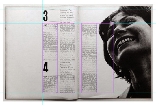
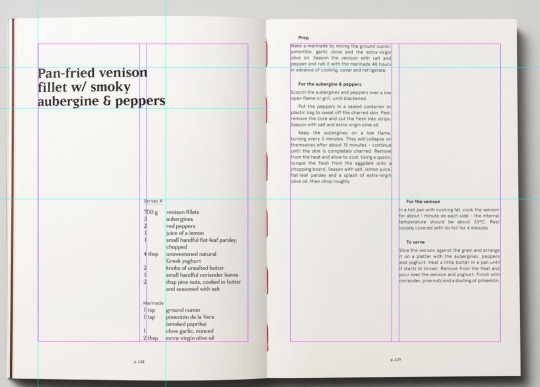
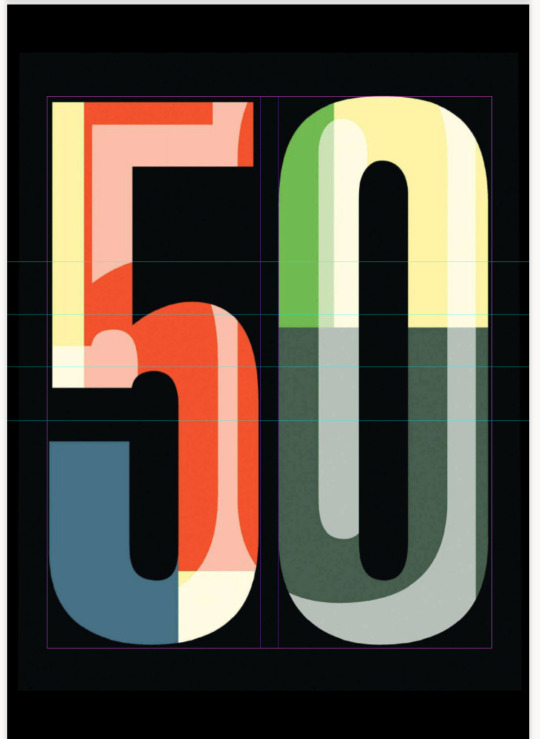
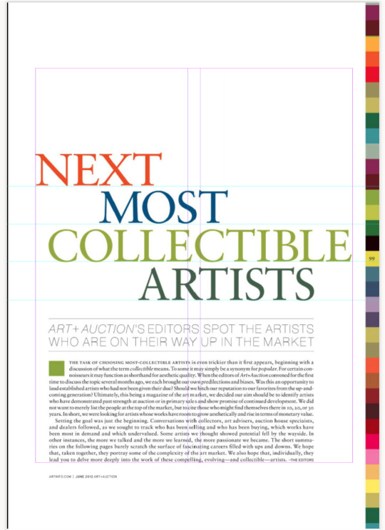
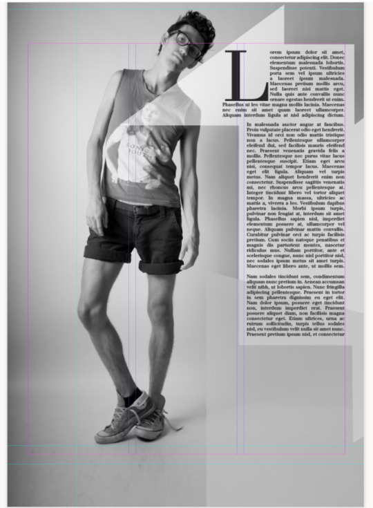
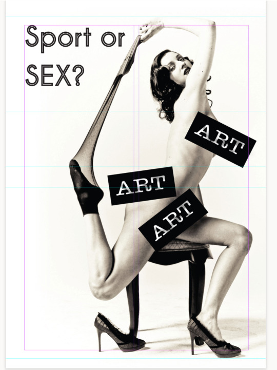
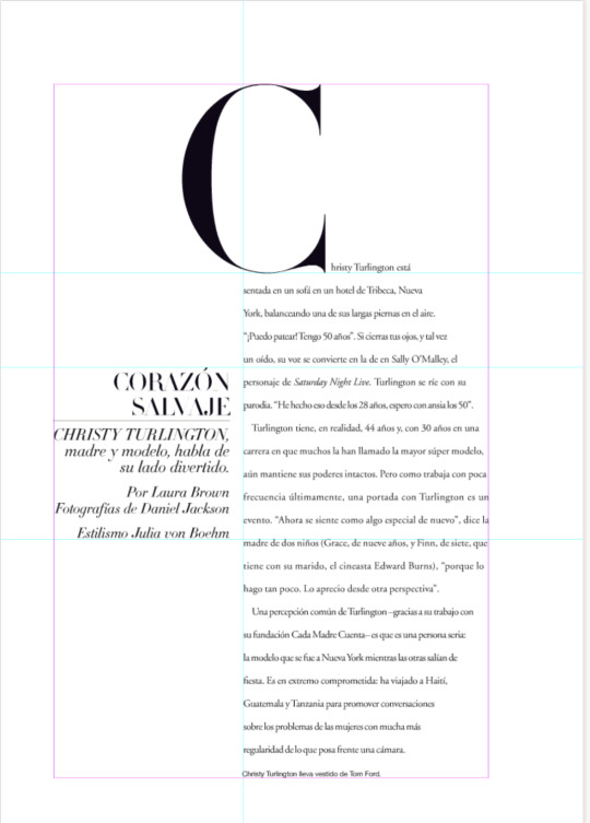
WEEK 7: Where's the grid? Exercise
I learned how to use margins and grids in the layout toolbar which allowed me to make cohesive designs with the same margins and measurements. This helped me make clean designs that were successful and professional-looking.
Columns and rows can also be created using this tool, this helped me align my assets and continue using grid theory.
0 notes
Text
Witehira notes extended
-always has an interest in art, ever since childhood he was always drawing
-middle of 5 children
-creative and artistic upbringing
-doctorate in Maori art, Maori visual culture into contemporary art
“Because if you look at most of our spaces – our homes, offices, the bus we get to work – they don't reflect Māori culture or who we are as a people. So that's my focus in everything I do, from designing typefaces to large art installations.
My work can't be pigeon-holed – I'm not just an artist and I didn't go to art school but I've come through the design field. Because of that, I think like a designer – everything has to have a reason, it has to be well-researched and functional.”
His designs reflect his vernacular
Enjoys variety in his projects, eg designed a playground in West Auckland, working with an engineer friend to design kids' toys, and a digital art installation.
“For me, it's about doing the coolest work I can and people will either take notice of it or they won’t.”
“Some people hate commuting but I enjoy having that time to draw and think, and I get a lot of my ideas when I'm travelling.”
He is inspired by the narrative of how Rangi and Papatuanuku were pushed apart
Hone Tuwhare’s poem ‘We who live in darkness’
We, Who Live in Darkness
by Hone Tuwhare
It had been a long time of it
wriggling and squirming in the swamp of night.
And what was time, anyway? Black intensities
of black on black on black feeding on itself?
Something immense? Immeasureless?
No more.
There just had to be a beginning somehow.
For on reaching the top of a slow rise suddenly
eyes I never knew I possessed were stung by it
forcing me to hide my face in the earth.
It was light, my brothers. Light.
A most beautiful sight infiltered past
the armpit hairs of the father. Why, I could
even see to count all the fingers of my hands
held out to it; see the stain—the clutch of
good earth on them.
But then he moved.
And darkness came down even more oppressively
it seemed and I drew back tense; angry.
Brothers, let us kill him—push him off.
Interview from below article:
During what hours of the day do you feel most inspired?
Either really early or really late. When your brain is half asleep and you don’t really question the weird thoughts that come into your head.
How would a good friend describe your aesthetic or style?
No idea. But if I was to generalise from a bunch of them it might be, bold, high contrast and filled with ideas.
What aspect of your creative practice gives you the biggest thrill?
Making new stuff.
How does your environment affect your work?
I can work anywhere really. It just depends on how motivated I’m feeling on the day. An environment with other people is always a good thing.
Do you like to look at the big picture or focus on the details?
Both. You need the big picture to bring it all together. At the same time the details are where the craftsmanship comes through. I think any good art or design project considers both.
What's your number one business tip for surviving (and thriving) in the creative industries?
Making good work is pretty important and this comes with practice. Networking is probably the most under-valued skill. No matter how good you are, if people don’t know what you’re doing they aren’t going to be sending you invites. And throw proposals at everything. Contests, competitions, art residencies and art projects.
Which of your projects to date has given you the most satisfaction?
Tough one. Probably the Waituhi street art project down Opera House Lane in Wellington. I wasn’t really sure if it was gonna work, as it was my first piece of street art. I had an awesome team though and the end result is pretty cool.
Who or what has inspired you recently?
Loving the mahi by illustrator, printmaker, DJ extraordinaire, James Paratii. The man has a sensitive hand.
Tell us a bit about your creative background.
A chronology of my creative background and things that influence me: painting, Bruce Lee movies, Street Fighter, Ren and Stimpy, Wolverine, Quake, Robyn Kahukiwa, Da Vinci, Josef Muller-Brockman, Hiroshige and Hokusai, Raharuhi Rukupo, Shepherd Fairey and Lisa Reihana.
Tell us about Tane Lives and why you wanted to be part of Art in the Dark?
I wanted Tane Lives to be part of Art in the Dark because we need more Maori-ness in the mono-cultural landscape that is Aotearoa. The work itself is a projected art work, shown on a large tree It gives a short account of the Maori genesis narrative from Te kore, through to Rangi and Papa and them being pushed apart.
What do you like about large outdoor works? Tell us about The New York Times Square project and what impact this had on your career?
Public art lets us bring art to the people. In saying that, I the art has to be good and it has to connect to them. Otherwise it might as well be back in the gallery.
The Times Square project was buzzy, for lack of a better word. Having your works shown on such a scale in that place of the world, and being flown to New York for a week while it all happens. Can’t imagine I’ll be doing that anytime soon.
You’ve also created smaller works – the Maori alphabet blocks and Maori typeface. Can you tell us a bit about these projects?
As an artist and designer I’m really interested in how we can bring Maori visual culture back into our lives. Before our Pakeha ancestors arrived design was on everything, our vehicles (waka of course), our tools, clothes, homes and people. Maori design was on everything. Nowadays it’s treated as ‘taonga’, distanced from us. Both of these projects were a chance to bring Maori design back.
As someone with a keen interest in typography I thought it would be great if we had some Maori typefaces, created by Maori for Maori. I’m interested in the idea of a typeface as might a vehicle for tinorangatiratanga, and how a Maori typeface might be one way to reclaim the the printed page.
What did your Doctorate explore?
Unlike the customary Maori arts (ta moko, whakairo, raranga), there are no tikanga or protocol for Maori designers. In my doctoral thesis I tried to develop a platform for Maori designers by exploring both the tikanga and aesthetics in carving. I also used a method of graphical analysis to try to identify what might be term Maori elements and Principles of design.
What are some of your other upcoming projects?
I’ve got two new exhibitions in early 2015, one at Pataka Gallery in Porirua and one in Paul Nache in Gisborne.
What place is always with you, wherever you go?
Gisborne. It’s where I spent my ‘formative’ years. Growing right next the beach as kid is winning.
What's the best way to listen to music, and why?
Loud and live if possible. Memory making stuff
You are given a piece of string, a stick and some fabric. What do you make?
A fire.
What's the best stress relief advice you've ever been given?
Other than scotch. Probably exercise.
What’s great about today?
Everything
What’s your big idea for 2015?
A playable artwork which will be first shown at Paul Nache next year. I hope it’s gonna break the mould a little, annoy some people, and give us different perspective on our history.
WITEHIRA’S ARTISTIC INFLUENCES TO RESEARCH FURTHER
-James Paratii
-painting
-Bruce Lee movies
-Street Fighter
-Ren and Stimpy
-Wolverine
-Quake
-Robyn Kahukiwa
-Da Vinci
-Josef Muller-Brockman
-Hiroshige and Hokusai
-Raharuhi Rukupo
-Shepherd Fairey
-Lisa Reihana
0 notes
Text
GRIDS
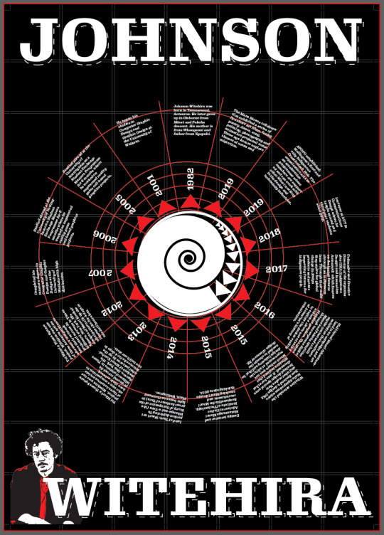
I used a polar grid as well as a regular grid to aline my work evenly.
0 notes