
Last Seen Blogs

illasfkk
JESUS CHRIST
IS MY
COUSIN

speechimprovementcenter
Speech Improvement Center

toystore2u-blog
Toystore2u

dfskpakistan
DFSK Pakistan

myprettylittletwistedworld
Call me Poison Ivy
Text
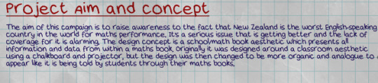
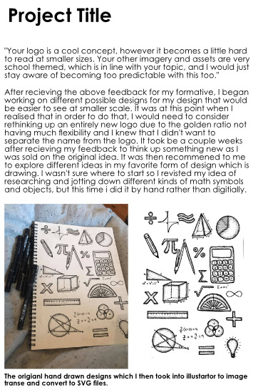
Project Development
Translation:
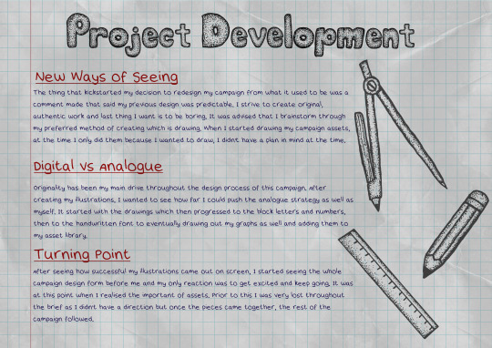
I didn’t realize until after creating this page how effected I was by the predictable comment I got in my feedback and how that word alone is what fired up my decision to redesign this campaign . I wasn’t insulted or upset but I knew immediately that that was the last time something of mine would be referred to as predictable.
Another thing that I noticed was that I did the exact same thing last semester for the Self Matters brief which was submit something that I was obviously very lost on and was completely digitally created for a formative and then do a 180 and do the entire thing by hand instead and create an entirely different thing that has little to no resemblance to what it was to begin with. I think I am starting to understand how I work and how my ideas are formed and that is through an ungodly amount of trial and error and approximately 4-5months of said trial and error before I know what I’m doing. This realization is a catch 22 because it takes me months to understand what I’m doing, and then literally 1-3 weeks to redesign, refine and present an entirely new concept, but at the same time now I know how I work and its exciting to see when and where along the way I'm going to inevitably flip and hatch some complete out of left field idea.
0 notes

Text
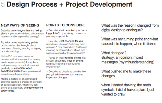
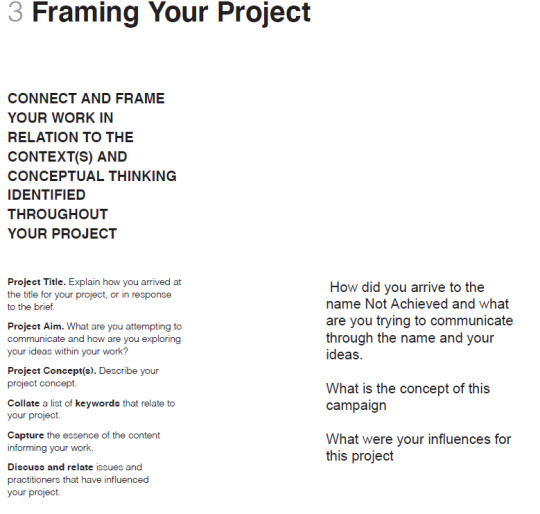
Framing Your Project.
This is the original layout I had initially planned for my third slide and after my one-on-one session, I can confirm that I had done it wrong. However thanks to the feedback, I have managed a step in the right direction.

The new one
Step one:
Translation
The main problem I had while planning my PD and throughout this whole semester really, was understanding the brief. It’s often very wordy, a bit ambiguous in places and just not a fun time in general when trying to understand it. It was broken down a bit for me during my one-on-one which was really helpful so the first thing I did after that was go through the PDF and translate it so I could understand it and get a grasp on what was required.
First thing I did was bring back in the maths book paper and open my asset library. It was here when I realized the other reason for creating all our assets was for the creation of this PD and I'll admit that I am embarrassed that it’s taken me this long for something to click.

I used the translations I made to the PDF as sentence starters/questions that I answered. The font used is my handwritten font. The only digital aspects of this is the grid lines in the background and the lighting adjustments to bring the paper to life. I wasn’t sure how I wanted to place my drawings. At first I considered just one as the main focused but then thought that it might draw too much attention or seem unrelated to my idea.
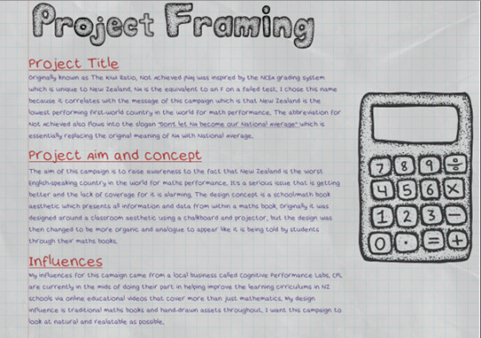
Then I tried centering the content and using the pencil doodle as bullet points but I decided against it because I thought it looked tacky and a bit too childlike.
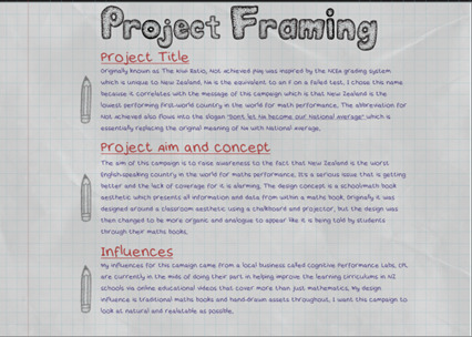
Eventually, after adjusting and readjusting and adding and deleting, I settled on the busy doodle aesthetic that is found throughout my campaign. There wasn’t any reason why I didn’t do it to begin with, I was simply testing out different options and found my way back to the original which I can only assume is a positive considering it’s what I’ve done up until now so no point changing.
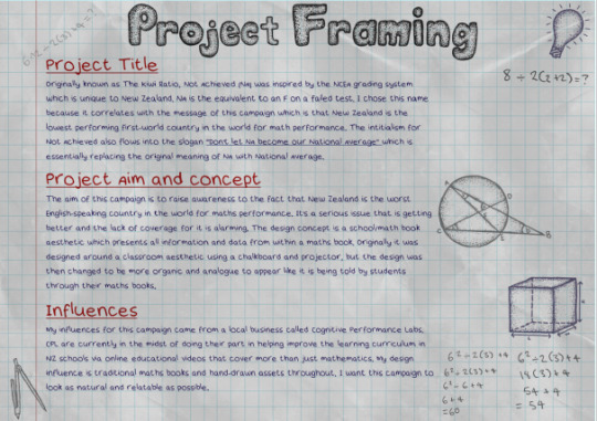
Technical stuff:
Due to the grid in the background, I had to ensure that the text wasn’t clashing with it. Originally the text looked like this:
Now personally, this is exactly what my books looked like, (tight writing) but for the sake of the design layout, I adjusted the leading and tracking so the words fit comfortably on each line and were slightly separated for easy reading.

0 notes
Text
Campaign Title Evolution
After my last one-on-one session regarding the Project Document, I can confirm I have over thought it again and included too much unnecessary information regarding the development of my campaign title, but rather than deleting it, I’m going to transfer it from there and onto my blog. It’s a repeat of what’s already been mentioned but all condensed into one post.


0 notes
Text
Project Document planning
So far I’ve set up my PD layout and have gone through the provided PDF that shows the requirements for each page and I have essentially copy and pasted each of those guidelines onto their corresponding pages to get a better understanding of what it required for each page. My reason behind this is I understand things better if I write them out myself and it also provides an example to myself as to what my strengths and weaknesses are throughout the PD. So far the parts that I am comfortable with are the design processes that need to be explained whereas the parts that I will be needing clarification on are mostly focused on the Making Connections page because none of that makes sense but will discuss in my one-on one.
0 notes
Text
Stickers!
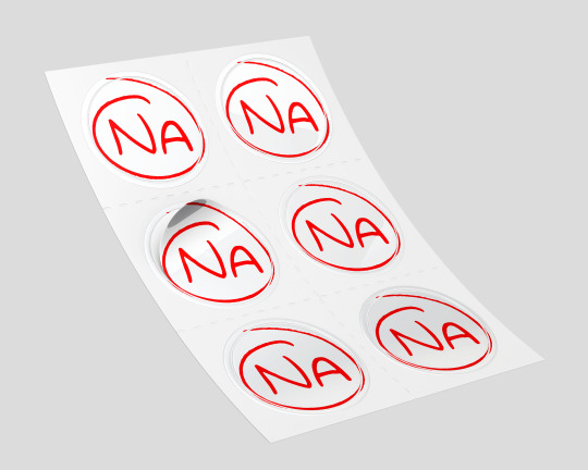
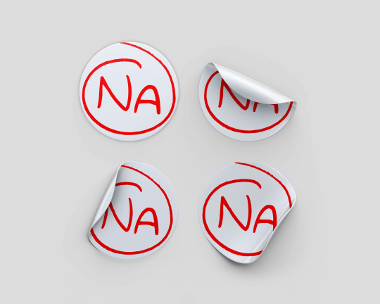
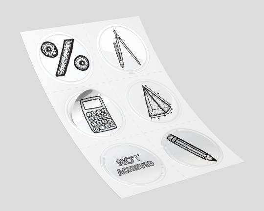
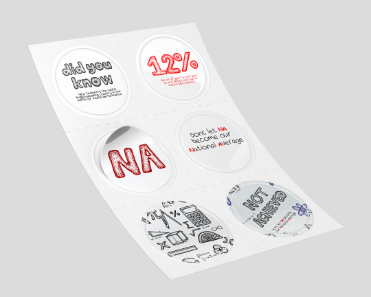

At first when I started making these sticker mock ups, I originally just wanted sticker versions of the doodle assets but then I thought maybe I could bring in the infographics too and make make info-stickers! The reason why I think this is an effective idea is because I personally love stickers and think they sometimes get more traction than some posters because of things like sticker bombing. When I was in school, I had stickers all over my books, my laptop and I even sticker bombed my last car
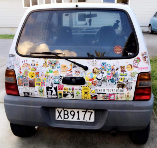
And as you can imagine, I drew some attention on the roads so the idea that if these campaign stickers were also part of it, then that itself gains awareness, possibly even faster than posters (not including the back of the bus) because its a constant moving advertisement.
0 notes
Text
Collateral
I had already made a post about the starting stages of my collateral development however it’s disappeared along with my screenshot of the steps taken towards what I was making so all I can do now is post what I have made and explain them.
iPhone Case:
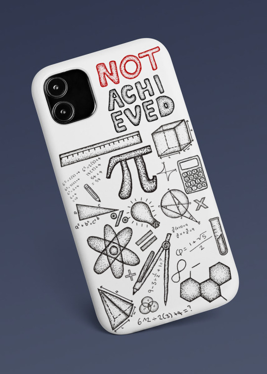
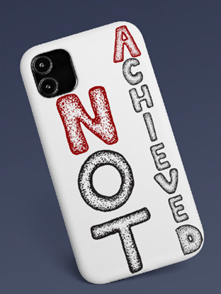
The idea behind the phone cases was I wanted something that was relevant to gen z but was also considered an aesthetic. The first design I wanted it to have a sticker bomb affect/doodle page affect. I also wanted to include the name of the campaign for obvious reason, but I wanted the attention to be more on the doodles than the name itself. My brother said he wasn’t sure if people would want to have “Not Achieved” written on their things for the sole purpose of people not wanting to have association with being “bad” at something or failing something but personally I think it has a bit of an edge to it and also the fact that someone might not want to be associated with failing at something is more reason for the message of this campaign to be heard because the issue at hand is swept under the rug due to it being such an unknown yet serious issue and should be spoken about and mentioned in conversation, which is another aspect of this idea as it is a conversation starter due to it not being a conventional iPhone case and would need to be explained to people who don’t know of the campaign and therefore spreading awareness.
(template found at https://www.rawpixel.com/image/2755108/free-illustration-png-phone-case-mockup)
Pencil Case:
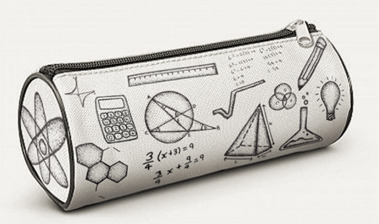
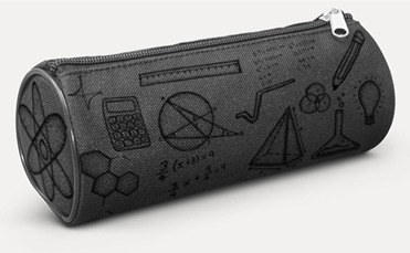
I wanted to make something that would have some sort of relation to school and school supplies. So, by creating a pencil case with the asset doodles all over gives you that school feel and school aesthetic but can also function as some sort of awareness when in school and be seen and used as a reminder of the issue at hand. It might not necessarily be a motivator of sort to help reduce the issue but it keeps the message as surface level and harder to sweep under the rug when there are reminders scattered throughout schools and homes.
(template found at https://www.primoproducts.co.nz/promotional-products/stationery/pencils-and-accessories/radius-pencil-case/?gclid=CjwKCAjw8KmLBhB8EiwAQbqNoLj-XZaeASMrKbelaUkvZnax4U_G9V4tGcs_HfFTAIyHYF6cuYRULRoCUhgQAvD_BwE)
Hat:

Like the iPhone case, I wanted to make something else that can relate to gen z and kick start a conversation about its meaning and origin and also similar to the pencil case, it’s something that can be worn in schools and as home by students and stands as a reminder for the issue at hand.
(template found at https://www.alibaba.com/product-detail/Quick-drying-caps-for-mens-curves_62025166662.html).
Donation Box:
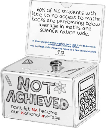
Other than raising awareness to my campaign issue, I thought that the best way I could create something that could help with he prevention and improvement of the issue would be to raising funding for math books for lower decile schools and low-income families. Considering one of the factors for the plummeting results in maths and science in NZ schools is because of the lack of access to necessary school supplies in school. To avoid creating issues such as demanding for funding, which ventures down the protest route, I’d rather creating some sort of non-profit organization that collects money from the public that is then uses to supply school books to those in needs. The place I visualise these donation boxes to be located would be places like Warehouse Stationary, Gordon Harris, The Warehouse, Paper Plus, Whitcoulls, school reception areas, uniform stores, other stationary stores, and any other places that have some sort of link to school and stationary supplies. The reason behind that is because not only do these places have links to students and schools, but families often spend money here and when it comes to the start of the school year, school supplies are at the top of parents and teachers to-do lists so hopefully when paying for school supplies, they see the donation box and message behind it and drop a dollar or two towards the cause for those who aren’t as fortunate.
(template found at https://www.google.com/imgres?imgurl=https://m.media-amazon.com/images/I/51T%2BPlNgksL._AC_SX425_.jpg&imgrefurl=https://www.amazon.com/MaxGear-Acrylic-Donation-Suggestion-Container/dp/B07ZNS9LSY&h=512&w=425&tbnid=cRmQ6u8pnQOS2M&tbnh=246&tbnw=204&usg=AI4_-kS7k2xPrx-4uiG2hSCH4m4k6JRtbg&vet=1&docid=ufNVfau_r2HpUM&itg=1&hl=en)
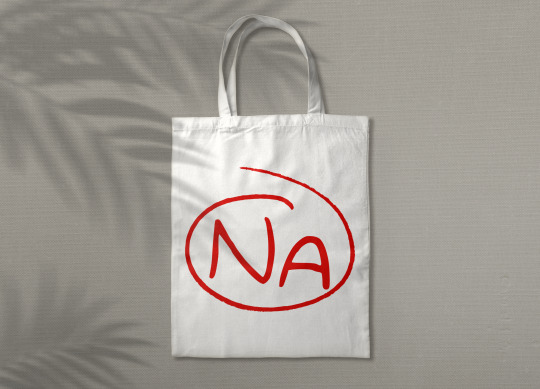
Tote Bags:

Bus and Bus Stops:
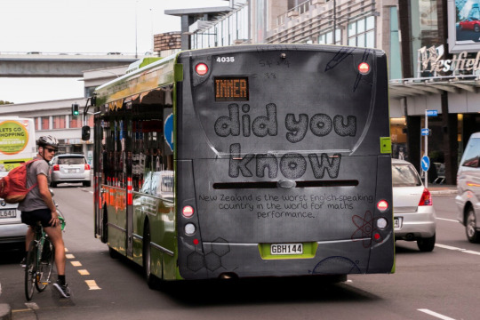
These collaterals are focuses purely on the idea of bringing awareness to the issue at hand and to inform the general public and give them access to the information and where to find the information (fb and insta)
(back of bus image found at https://www.oab.co.nz/products/buses)
(bus stop sign from freepik.com)
And finally, the purpose behind the collateral is another form of fundraising money towards supplying schools and homes with math books. So a percentage of profit made off the items goes to the Not Achieved cause.
0 notes
Text
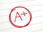
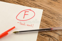
Campaign Logo Design
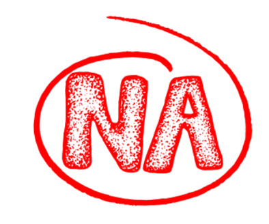
The idea behind my potential logo is something like the traditional style of paper grading. An example is like the following images I have found from the internet:
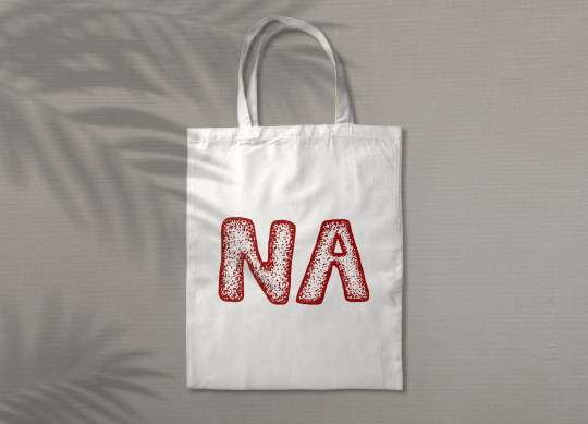
But to relate it to my campaign, I’d like to play with the initials of the campaign name Not Achieved and basically do the same thing with those letters and the red circle. I have drawn my own circle to keep up with the original hand drawn aspects of my assets.
Concept One:
My first idea was to use the asset library alphabet to be ablet o connect the logo style with the campaign design style but the contrast between the smooth circle and the stippled letters clashes more than I intended.
Concept 2:
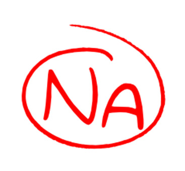
This one works a lot better. It’s my handwritten font that I converted into a text file which is the same font that makes up all written content for my collateral. This was works better because the smoothness of the circle and the letters match as well as having that organic aesthetic with the handwritten letters.
Not much iteration really when into the logo design purely because it was an idea that I had that was very easy and quick to execute. I also don’t want to change it because one, I am happy with how it turned out and think it was successful and two, it makes a great profile picture for social media considering my two options are facebook and Instagram and both of these platforms have round profile picture frames. Like my previous idea, the design was cut off and didn’t fit the frame whereas now with this newly developed one, I think it works much better.
I can also further the use of this logo and put it towards other colateral such as phone cases and hates to go with the other things made using the doodle assets.
0 notes
Text
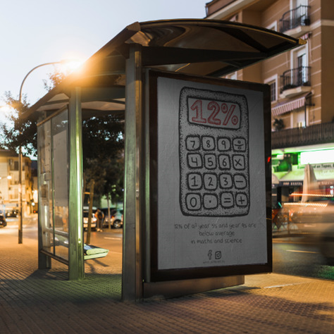
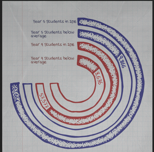
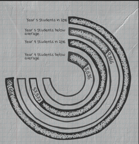
Infographic 3
I’ve chosen to start redesigning this infographic. It was mentioned in my feedback to be aware and work on the about of body text I include with my posters.
First thing I wanted to do was find a different graph to represent my data, only because I want to show the use of more than one graph in my overall work.
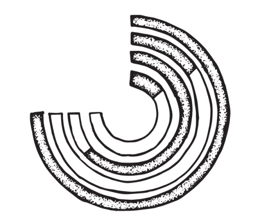
Using the data visualization catalogue website I chose the Radial bar chart. My reasoning behind this is I think a solid shaped graph works best for symmetry and hierarchy in an infographic
First thing I did was create a radial bar chart online to use as a reference image for drawing out my graph.
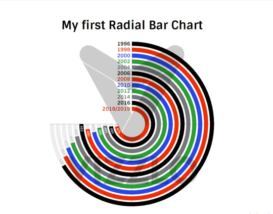
I was going to use different information for this graph but after putting it together, there was too much information for this type of chart, it got too confusing to read and busy to look at, leading to be changing statistics
Hence why choosing the mentioned infographic to redesign, the information from that one presents clearly on a radial chart.
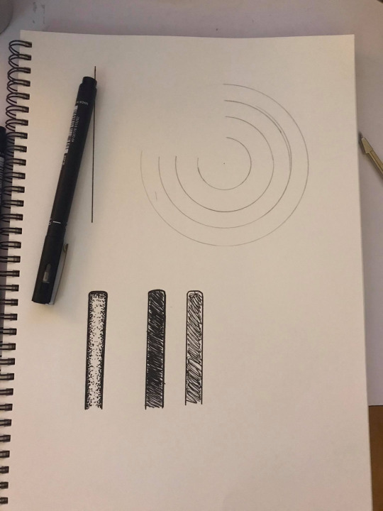
The starting process of drawing out the graph. I also decided to draw different versions of bars for any potential bar graphs I make.
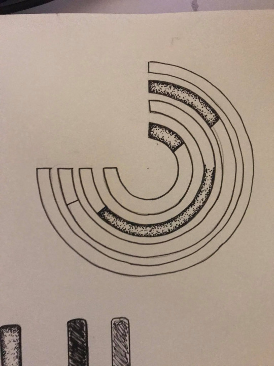
I chose not to use any form of ruler or protractor to make my circles as I wanted them to seem as natural and hand done as possible.
Vectorized graph - the newest addition to the asset library.
First draft, getting a feel of the graph now digitized. Colour was a hard detail to settle on for this graph. I’m not a fan of the blue and red together like this but I also didn’t want it to be one whole colour.
I considered black and grey, grey showing the year 5 information and black showing the year 9. I prefer the categorized color scheme but not black and white as its too dark and a bit glum

Same idea, but this time with the blue. Still not quiet what I was hoping for which is something more prominent and differentiating between the two.
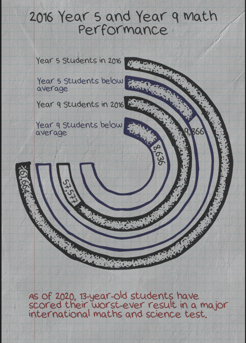
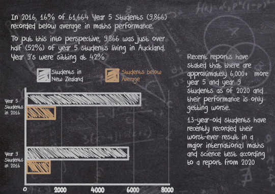
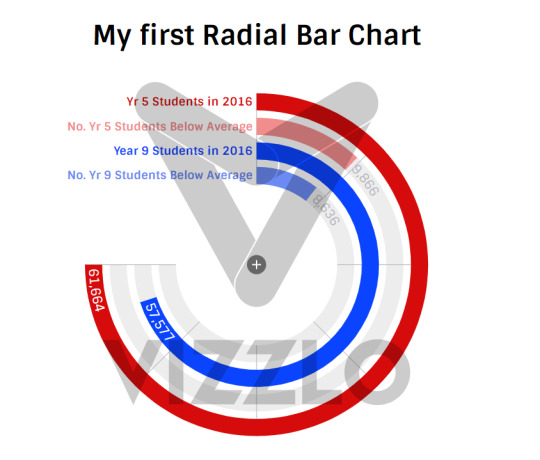
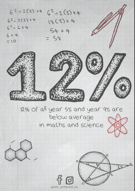
Added a title and a bit of factual information. The statistics and the written information are two different parts of my finding (they weren’t presented together) but I chose the written information for this poster and I wasn’t sure if statistics from 2016 would be very relevant but when paired with current news, they show a timeline.
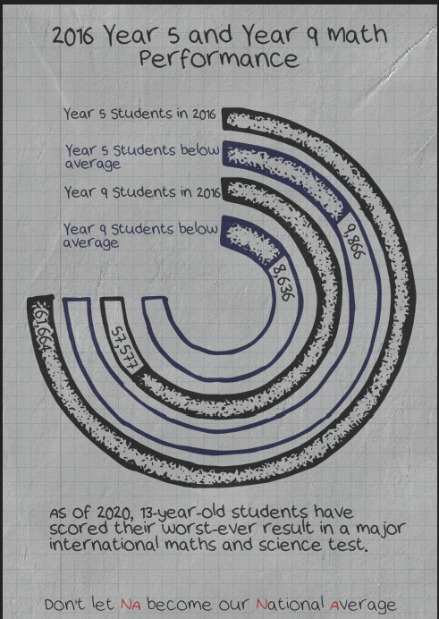
I wanted to incorporate my slogan into this infographic as well so i rearranged some colours so the NA’s were the only thing in red, which led me to the next idea...
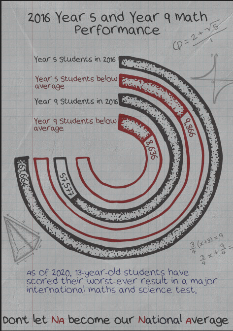
In order to show a connection between the NA and the number of students performing below average, I made them the same colour and I chose red because of its sense of urgency.
I also added the signature doodles around the edges and dropped them to a low opacity so they came across more as pencil than pen. I also didn’t want it to be too distracting.
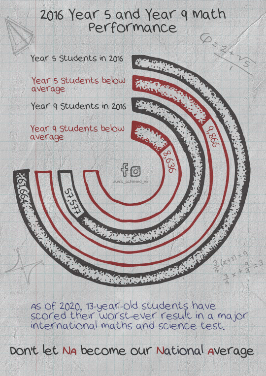
This is the final outcome. I enhanced the brightness slightly as well as rearranged the doodles around to break up the image a bit. I also included my social media link. I’ve decided against using a QR code for these infographics as I don’t want the page getting to crowded with drawings but still want the drawings to get the attention they need.
0 notes
Text
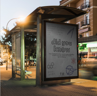
Infographic 1 and 2
I didn’t have too many drafts while creating these two infographics as they were the inspiration behind most of my assets.
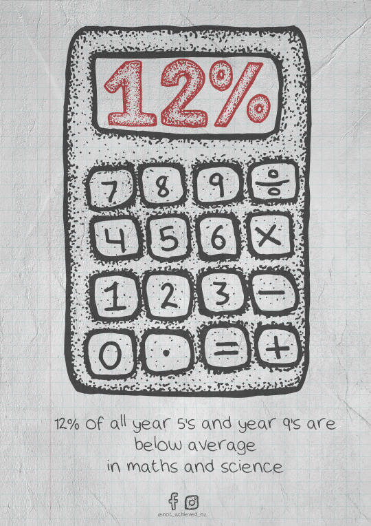
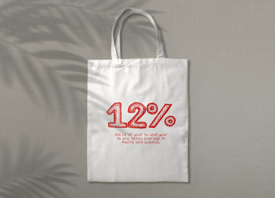
This is the final design for this infographic. When I drew the calculator, I deliberately left the screen blank so I could use it as a frame for text. I wasn’t sure which statistic I was going to use but I new it was going to be a percentage. I’m pleased with how well it came together. I am aware of the risks of settling with one of your original ideas but I think I got lucky with this one.
I did try it with out the calculator to get any other possible ideas out the way and also because I wanted to incorporate my doodles with the images.

I was momentarily leaning towards this design more than the calculator due to the busyness of it but I still feel like the calculator works best as a statistical infographic
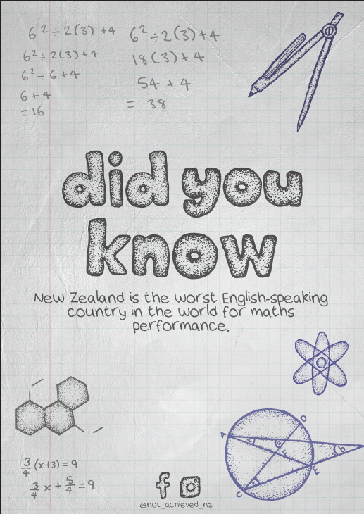
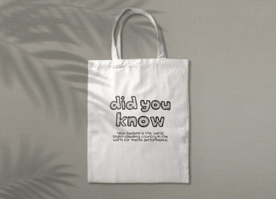
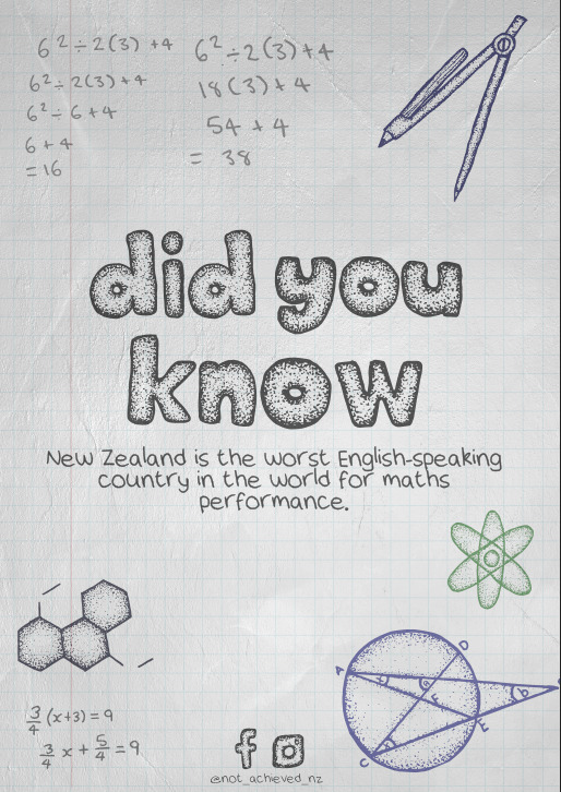
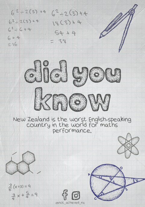
So instead I decided to use this design for my “did you know” poster remake. This version doesn’t seem as crowded as the previous now that there aren’t any numbers involved and instead look like another school book drawing. All assets on this page are drawn by hand, and the background was made digitally
I went through a few different colour palette variations, trying to find the most balanced combination.

This is the final design. I’m still seeing how I feel about the red atom drawing, not sure if I prefer it in grey like a pencil but will let it sit for a while.
0 notes
Text
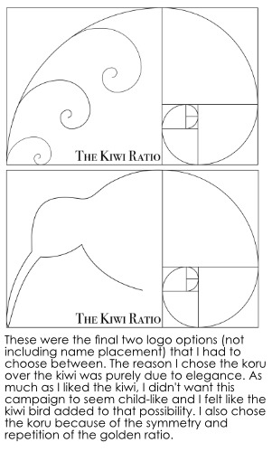
Campaign 2.0
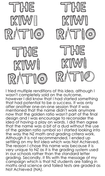
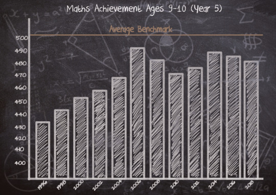
I stayed back for a third opinion on Wednesday regarding my new campaign development and it was mentioned that the name The Kiwi Ratio doesn’t really fit or bring much light or attention to what my campaign topic is and after reflecting back on my formative presentation compared to now, i guess I understand it. Without the Golden Ratio to use as a play on words then it’s bit of a dud.
This was a mock up idea for a possible poster that I presented on Wednesday. The idea is to design it like a doodle in a maths book. I created the blue gird for the background using the pen tool and placed them on top of a photo of a piece of paper.
I was asked to think of some other key terms used to describe New Zealand’s math results and thought of the term Below Average.
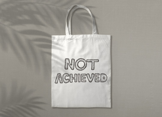
I considered Below Average as a name until I thought of Not Achieved.
Short, simple but striking.
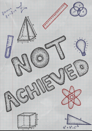
I had to angle the title a bit to fit the Achieved but i think it bring more natural aspect to it.
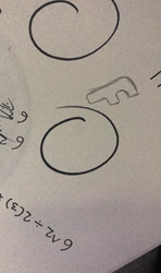
I’ve been having issued with the O i drew, it reminded me too much of a donut and since making that observation, i couldn’t unsee it. I then thought of the red circle that most teacher draw around the final grade on a test paper

For some reason I thought there was a line through the circle and only after drawing it, scanning it, vectorizing it, and placing it did I then realize that I kind of missed the mark. I think I was subconsciously thinking of a no entry sign, something that symbolizes a negative aspect.
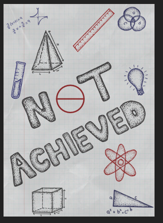
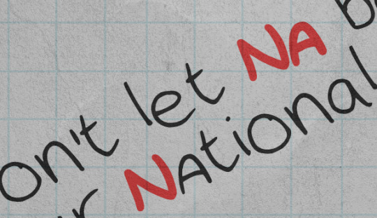
I also then started thinking of a slogan. Since deciding on the name Not Achieved I wanted to some how play around with the NA that is graded on failed tests. I was excited to find that National Average and Not Achieved share the same two letters and decided to play off of that.
It is a bit hard to portray what I was thinking which is NA standing for National Average and NZ students Not Achieving their tests and with the National Average being below average the NA = Not Achieve/National Average.
I also wrote the NA in red, like they’re done usually on test papers.
The slogan is also written using my handwriting font
I tried making the NA in the title red as well for the same reason.

Trying different possible layouts. I tried making the NA stand out more
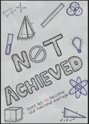
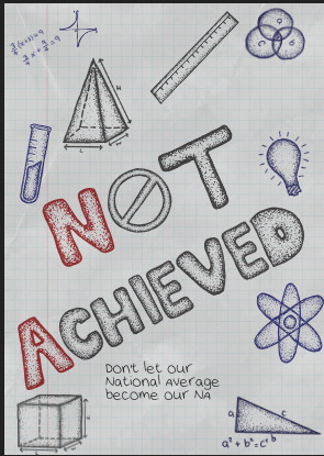
After a while I also then decided to switch the slogan around so it was a bit more concise and changed it to Dont let NA become out National Average.
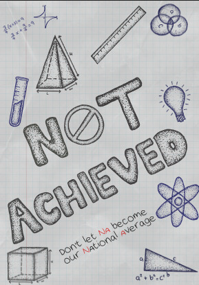
In fear of the idea still being missed, I thought it would be better if I highlighted the NA in both NA and national average to show a link between the two.
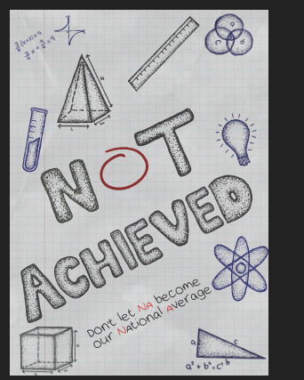
The O wasn’t working for me again so I tried doing the original idea of the red circle
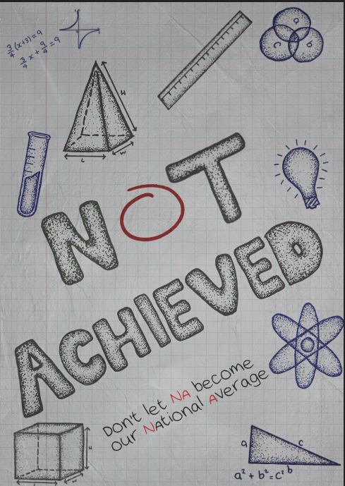
Still unsure about the O at this point but I took a break and focused on the texture of the image instead. I added a paper texture to the image and played around with the lighting a bit to make it look like it was truly written by hand in a book. It is a little grey and washed out but I’m not sure if I like it yet or not, a bit of both. But it was also at this point when I decided that the O had to go.
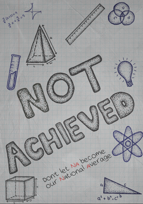
I redrew the O and although im still seeing a donut, I think thats something im going to have to get over.
I added a bit of noise the the NA’s as well as increased the stroke to make them a bit more punchy
I liked the look of the small equation in the top left corner so I added some more. I also wrote these out on paper (i found the equations online) and then scanned them in just like the doodles.
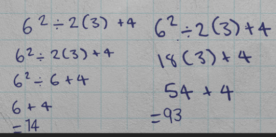
I also changed the equations slightly so that most of them are wrong.
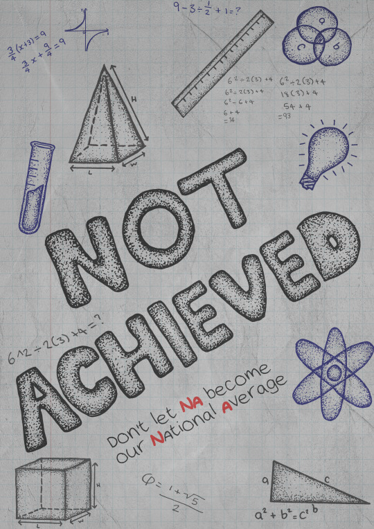
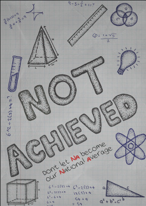
This is the fianal design so far for this poster.
I’m not sure if I think it is too busy but it works with the drawing style and achieved that doodle look that I was after.
0 notes
Text
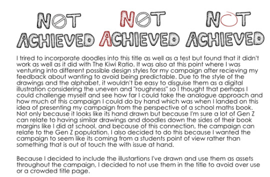
Interim Critiques.
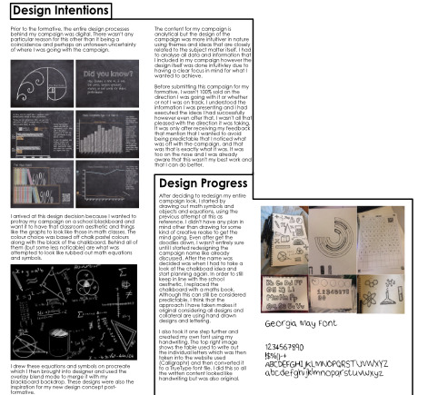
A brief summary of what I said during my interim critiques is that I have decided to take a different approach to my campaign and base my theme on a student work book. My reasoning behind this is because my formative feedback mentioned to be aware of becoming to predictable with my imagery and visual assets. This did confuse me to begin with because my campaign is school themed so my assets would be school themed too. I was a bit deflated by that to begin with because I didn’t understand until after some clarification on my feedback, explaining that I didn’t want to be too on the nose with my assets, i.e chalk boards, classrooms etc, and what I personally took from that was that if I was to obvious with it, I’m only really stunting myself due to predictability coinciding with unoriginality.
However, even after having this realization I found myself back to square one with no real direction. I had mentioned during a one on one feedback session that my preferred form of creativity and thinking is drawing so I was advised to do just that.
The only thought I had at that point was just to redraw my assets, but this time on paper. The following image is a digital drawing I did on procreate for my original campaign design. I used this image as a background for my graphs and posters but I added a blur to it to make it appear dusted out.
Something I notice now, looking back at this image compared to my new ones, other than this one being digital and the other being analogue is that I can see the lack of confidence and understanding in these drawings. I did the whole thing in maybe 5 minutes. I wasn’t exactly sure where I was going with it or what I planned on doing with it but instead just wanted to have something to show. I didn’t even plan on breaking these assets up as individuals - the only idea I had for this design was that it was going to be some kind of chalkboard backdrop and that was the extent of it.
I didn’t have any particular plan in mind when I started drawing these assets, nor was this art style a deliberate choice, it is just my way of drawing (analogue, my digital drawing style is something completely different)
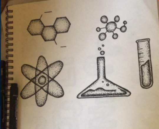
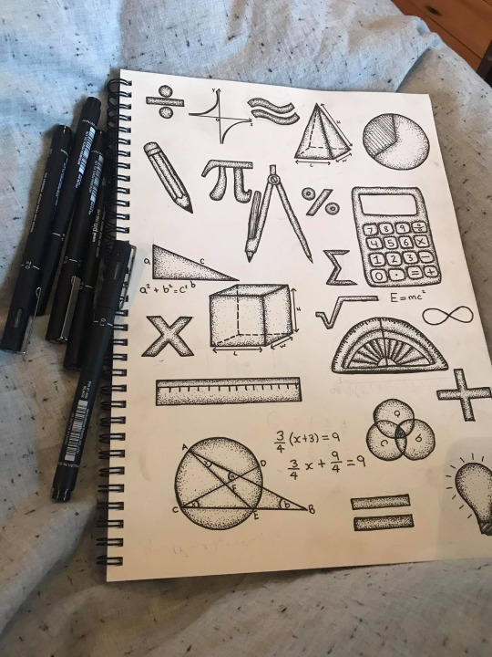
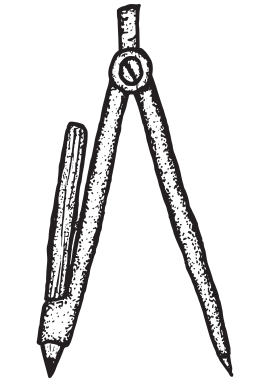
The very first asset I drew was the compass and that’s what kickstarted an inkling of an idea.
I was informed in my formative feedback that my logo was hard to read at a smaller size so that was the first step in redesigning. At this point I didn’t plan on hand drawing everything but I did want to draw a compass in the shape of an A which I could then use in my (still to be determined at the time) new campaign logo/title.
After drawing the compass, I spent the rest of the day drawing the rest of the assets. I took reference from my previous procreate drawing as well as math/science icons and symbols that I found on Pinterest and google.
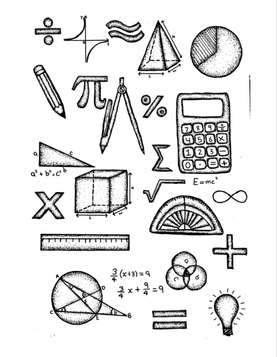
Once I was done with drawing the assets shown, I started thinking of what I can do with them which was when I thought about a students work book. As a teenager the margins of all my books were filled with drawings like these and that was when I decided that I am going to design my campaign with hand drawn aspects and display my information and everything else included in the campaign like a students work book.
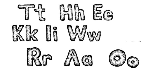
My first focus was to redesign my title/logo. As you can see, I originally wrote out only the letters for the title and this was so I could start playing around with how to lay it out.
These are just a few ideas I had about possible title layouts, playing around with doodles and letters
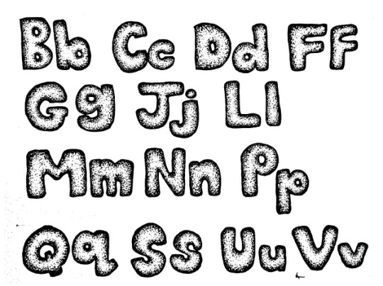
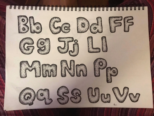
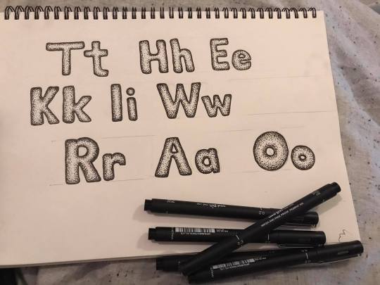
After seeing how well the title letters worked together, I thought it would be best if I did the whole alphabet just incase I wanted to make a header for a poster or graph of some sort.
The idea behind this was when I was in school, I’d always waste time writing out big block letters for unnecessary titles in my books, and I know I'm not the only one who did and I wanted to include that nostalgic feel.
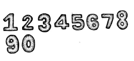
At this point I thought I may as well include numbers too because I’ve committed to it now. I had an idea for a infographic showing a percentage of some kind with these numbers
Now that I was aware of the angle I was taking with my campaign design I had to start thinking about how I was going to put it together and what other assets I would need if I wanted to continue down the hand drawn style.
Looking at the letters I had created I thought about making a font as well, the main reason behind this was more so a challenge for myself. If I wanted to fully commit to creating every asset of my campaign by hand, then surely that means I need to make my own font too!
The feedback I received during the interim critique sessions were mostly positive I think. My progress so far was referred to as a “big jump” which was a bit ambiguous, I’m not entirely sure if that’s a jump forward, backwards or just up but I’ll like to take it as a positive.
Other feedback I received was to consider more variety with my color pallet which I can 100% agree with. I do want to avoid any bold bright colours as I would like to stick within the range of a work book but I will definitely incorporate blue and red pen ink along with the back. I plan on just adjusting the colours of my vector assets to red, blue or black so I don’t have to consider redrawing the same designs in different colours.
Another thing that was mentioned was that the compass A seemed too thin compared to the rest of the title letters. I do agree with that however I’m a bit on the fence about changing it because I do want the compass to stand out as a compass rather than it disappear into the shape of an A but I will still adjust the stroke on the drawing and see how it works out.
Overall I am pleased with my progress and can ease up a bit now that I have a direction.
0 notes
Text
More Assets
I decided it would be best if I drew the whole alphabet just incase I needed more letters.
More doodles

So far I have 81 assets and will just gradually add to them as I go. For now I’m going to start putting together some infographics using these assets as well as my handwritten font. I’m not sure yet on a plan but will plan as I go. I mentioned in our interim critique sessions that I plan on hand drawing my graphs and scanning them in. Ill be using the data visualization catalogue as reference for my graphs.
0 notes
Text
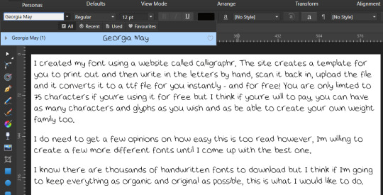
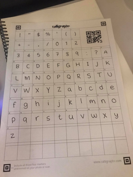
Font Creation
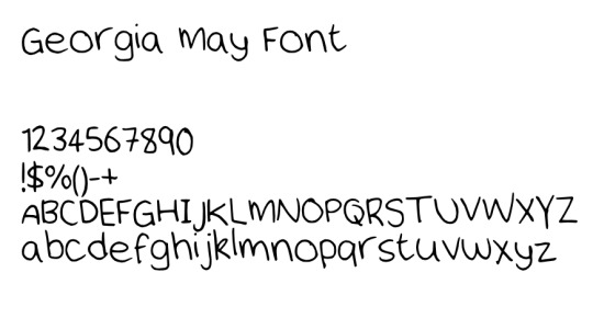
I made this font using a website called Calligraphr - I don’t have all the characters but I have the basics. I will be using this for any text that isn’t a title or part of imagery. I think I will also create the rest of the alphabet is the same style that I made The Kiwi Ratio letters, and this way I can use it for other headlines or titles.

My reasoning behind creating my own font is like I’ve said in previous posts - I would like this campaign to look as organic as possible if I plan to continue with the idea of basing it off a school work book, and seeing as I have creating all the other assets so far, I may as well keep going so when it comes to putting it all together, the only digital part about it is the software used to put it together
0 notes
Text
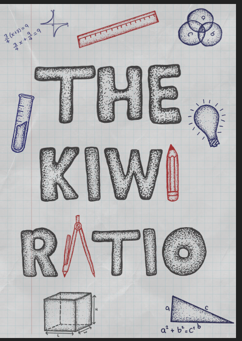
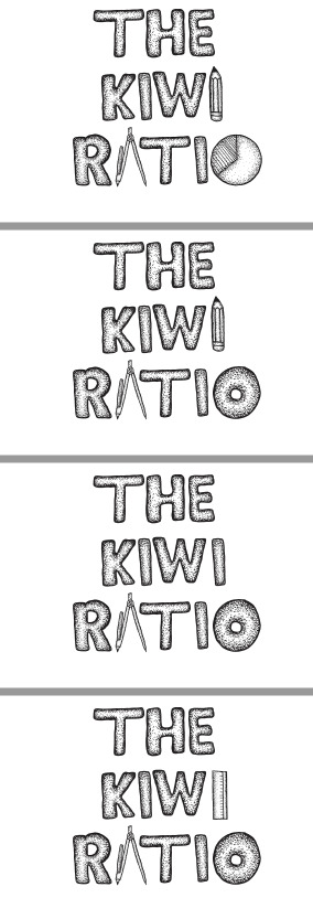
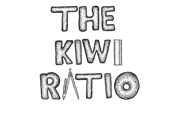
Title development
As promised, I’ve drawn out the letters for my ‘The Kiwi Ratio’ title, image traced and converted to SVG files. In order to use the compass for the A, it will need to be in capitals but I’ve drawn lowercase to play around with.
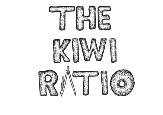
I’m really pleased with how this has come out. The letters are easy to read, it matches the possible new theme and has opened up more possibilities and ways for me to take this campaign. While putting this together, I decided that (if i can figure it out) I plan to also make my own font for the rest of the written content. By the looks of it, nearly my entire campaign will be made organically and brought to life digitally.
While putting this together, I also tried playing around with my visual assets to see if i can bring them into the title, for this one i replaced the second i in Kiwi with a ruler.
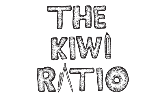
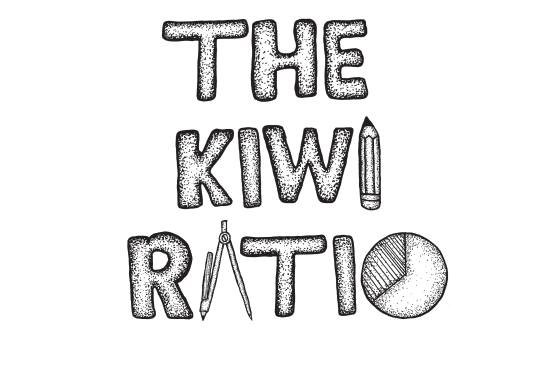
A pencil..
I want to avoid the title getting too busy with illustrations in order for it to seem more mature, but of course I don’t want to steer away from the doodle aspect.
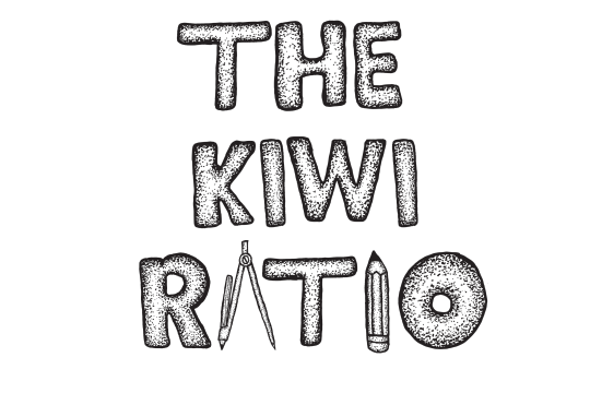
There are clearly many ways I can take this title page. I can’t think of any other math related objects and symbols to draw to add to this, hopefully more will come to me.
I also had an idea of what a possible infographic/graph could look like in this style so I also added drew up some numbers.

(I was busy drawing variations of pie charts when I had the idea)
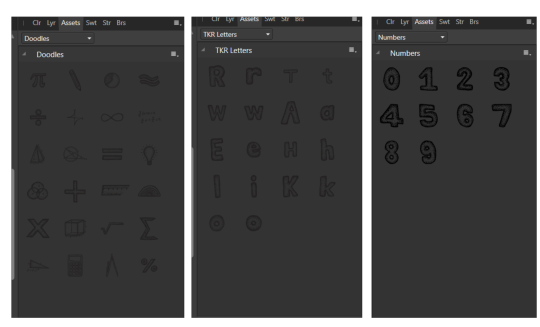
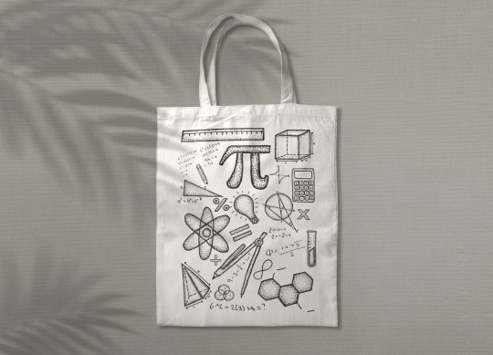
Currently all the illustrations in my asset library.
0 notes
Text
My art style and inspiration
I have a very different art style depending on the medium I’m working with. Digitally, my work is often very clean whereas when working analogue, its rougher. When comparing my first campaign attempt, I can see the mentality behind it when looking at my art style.
Digital Example:
I tried making this image as realistic as possible with no knowledge on how to even do that so although it’s an alright drawing, it’s not realistic at all.

Because I only started drawing nearly a year ago and learning how to use photoshop this year, I don’t know enough about bringing realism to an image without the use of real elements.
Before even considering doing it by hand, I tried creating hand drawn elements digitally. No matter what kind of pen I used, or overlaying texture or background, without extensive photoshop knowledge, it is still going to look digital.

The attempt is there but the execution is a hit and a miss. Even though a lot of what I created for my first campaign draft was original and done digitally by hand, I couldn’t capture that organic essence that I was after. Everything seemed to be floating around each other rather than working with each other.
Analogue Example:
Now when comparing my digital work to my analogue work, even I can agree that there is a lot more character and personality in these than there are in my digital drawings. And character and originality was my main focus and the essence I’ve been trying to capture in my campaign.

So for this campaign, instead of putting myself through the agonizing pain of trying to teach myself photoshop in record time, I’m going to work with what I can successfully execute myself which is hand drawn assets which capture the essence of originality and character which is what I want my campaign to be.
I did tone it down a bit when creating these assets because I want them to come across as doodles rather than illustrations because doodles are often related to the need to relieve boredom and frustration and is a form of stress relief which I can personally say is how I felt in maths class, especially because I was one of the students who fell behind and didn’t know what was going on half the time.
Inspiration:
The doodle idea was a straight forward idea that came to mind when thinking of a school book, however I did take a scroll through https://wallsheaven.com/photos/education-doodle which has hundreds of purchasable doodles which is where I got some of my inspiration from. I didn’t go completely nuts with it though because I didn’t want to overcrowd or take way from the message behind my campaign.
0 notes
Text
CAMPAIGN 2.0 Asset Library
I’ve found it hard to get creative with my topic as its not exactly a visual issue so creating assets for it has been hard. I decided to revisit my idea of the chalk board with math elements written on it but this time instead of drawing them digitally, I’ve drawn them by hand. I’ve drawn them they way that I have because that’s my way of drawing analogue compared to digitally. There was so reason behind dawning them this way other than it being the only way I know how to or am comfortable doing. I didn’t have any goal in mind while drawing them but as I was doing it, I noticed that my drawing style doesn’t is different compared to whatever one would consider maths to be which was then what reminded me of the drawings and doodles I personally did in the margins of my books in school which has now drawn me to the idea of possibly changing my campaign style from being presented on a chalk board in a classroom (kind of like from a teachers perspective) and instead base my campaign style around the theme of a students book and from a students perspective. I’m not sure how it’s going to work out but I’ve always preferred the results of my analog work to my digital work. In order for this to seem as organic as possible, I’m going to try and hand drawn the majority of my campaign assets and just put them together digitally.

So far these are the math icons and elements I’ve drawn so far. But please excuse the protractor (the lemon wedge), that was a dud.
I tried keeping them as “doodly” as possible to fit the idea that they are scruffy drawings in a book. I don’t have a plan yet on where I’m going to take the campaign with the new idea, but I imagined these drawings scattered throughout, not necessarily being part of whatever page their on but rather just background designs.
I do however plan on using the compas drawing as part of my soon to be decided new logo/campaign title.
If I want to go with a more organic look, I will need to redesign my Kiwi Ratio title as its very clean and symmetrical. I’m thinking of replacing the A in the word Ratio with this drawing and hand draw the rest of the title. Will see how it goes.
0 notes