
Last Seen Blogs
letssimptogether
❤️your local slasher whore❤️

fem-the-artist
Continuing To Be Fem
yurokiku
yuroki

askfloridanthotticus
Sup I’m Florida
tashoper20
TasHoper
Text
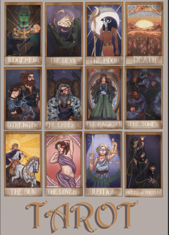
A2 Poster
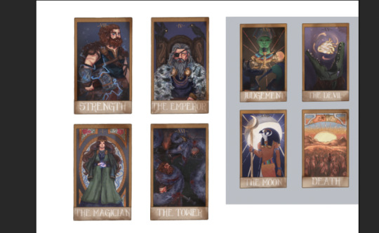
For this mock-up of the poster, I just took the screen shots of the cards form my blog (because the quality doesn't have to be perfect) and roughly positioned them where I wanted them.
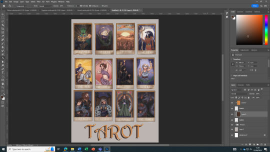


I then experimented with different fonts for the title. I tried to the one that I was going to originally use for the text (metro photograph) on the cards just to see if I could incorporate it into this project because I liked it but sadly it had the same problem that made it not work for the cards, it was too thin. After ruling out that font, I stuck to the one I used originally in the mock-up as it went surprisingly well with the cards and the overall vibe of the poster.
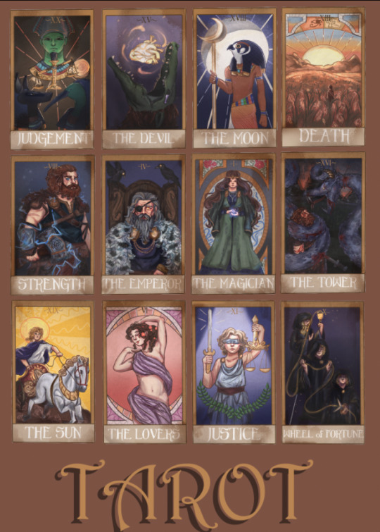
For the actual poster, I used the png's of the cards. One mistake that I made was spending a long time erasing the background colour form the original illustration. After a while I decided to stop doing that and find a way to do it quickly and accurately. I did this by selecting the cards with the object selection tool and duplicating the now selected cards meaning the duplicated cards don't have the background.
Finished poster:
0 notes

Text
Weathering the cards
I started by comparing different textures at different intensities. For the texture I went with a more grainy one opposed to one like paper folds and stains as they could obscure my illustration which is the main part of my project. Although the difference is difficult to see on these pictures I ended up going for the the option on the right.


To make the grain more interesting a added a multiplied colour layer on top of it to make it less of a while and more of a aged, off-white.
This is a before and after comparison of what the texture looks like before the layers been put on "multiply"
After the texture was put onto the cards I decided to lessen it's intensity in some areas for some variation. I did this by using a soft eraser tool to make sure the rubbed out ares don't look too blunt compared the rest of the weathering.
This is the texture I used:
I then thought I could add some extra weathering on top of the existing texture I just put on. I did this by using a pencil-like brush and a darker colour, making sure to only put it on the areas I think would get the most damaged/weathered (the corners and edges of the cards).
0 notes
Text
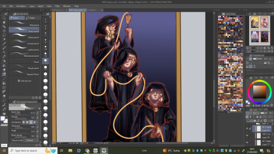
Adding font
Experimenting with different colours


Because I had already played around with different fonts and chose the one I wanted to use, this process was quicker to do.
0 notes
Text
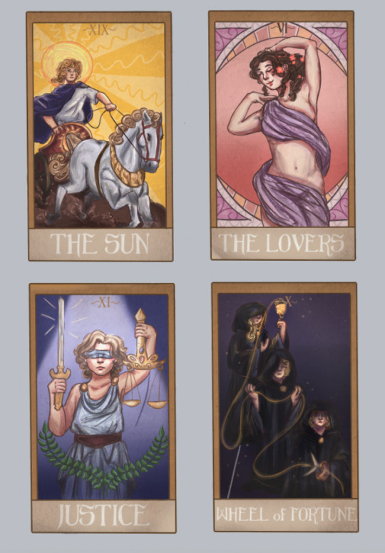
Drawing "The Wheel of fortune"
Started by mapping out the characters from the pencil sketch I had originally done. With this design I knew I needed to rework the characters (like add more details).

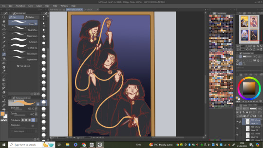
(flat colours)
With this cards shading I wanted to be quite dramatic with the shadows as I wanted to portray the fates as mysterious beings. That being said, its was quite difficult to match the same amount of detail in the other pieces as I had made the desiccation to make this cards colours dark.


After I had shaded everything, I moved onto the string of fate. In order for it to standout from the rest of piece I added some glow to it which I also incorporated onto some parts of the robes/cloaks as a form of highlight. This helped with creating more ambience within the card and to give it an otherworldly feel.
0 notes
Text
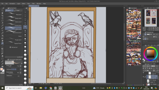
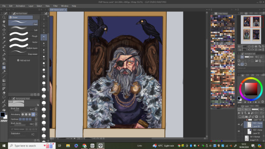
Drawing "The Emperor" card
I stated with the sketch making sure to make changes to the size and placement of Odin as I had made him too far down the card in my original sketch.


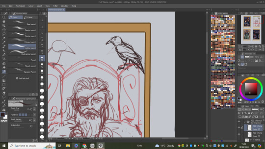

After getting the main sketch of Odin down I got to doing the other aspects of the design like the chair he is sitting in and his ravens which may actually look more similar to crows because that's what I used for the reference (although it's difficult to tell them apart).

(flat colours)


I then started shading the piece in order of layers. When I got to the chair, I thought about adding an engraving of his name in Viking runes but when I tried to find how, all the sources looked at were giving me different ways of writing it so instead of my potentially getting it wrong I decided not to do it.

0 notes
Text
A2 poster ideas

The two designs I stared are the ones I like the most. All of these designs could work as the poster but I did't really want to go down the "horror movie" route which is what ideas 3 and 6 look like to me. I think having some/all of the cards set out will look fine on a poster because of how much detail is in the cards and I don't think I need to add anything else to my idea as I think it speaks for it's self.
0 notes
Text
Font trials
I first tried out different fonts with one of the cards too see which one looks the best. The one I originally thought would work really well (metro photograph) ended up being to delicate and thin for the card making it harder to see than the other fonts.

After picking a different font that works better (seen bellow) I took that and applied it to cards from the other mythologies to see if it was compatible with their designs and styles which I think it is.
0 notes
Text
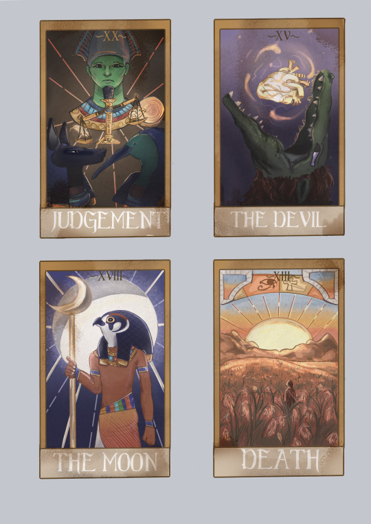
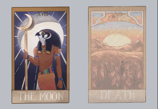
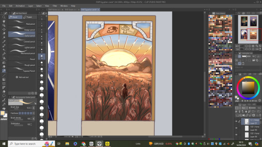
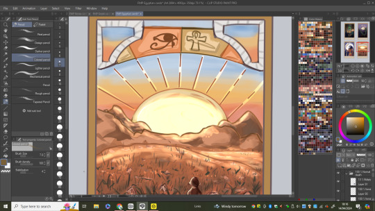
Drawing the "Death" card
I started with the sketching process which was quite straight forward as I didn't need to change any aspects of the original design.


(flat colours)
I started the colouring by adding gradients to the field (going dark for the foreground and lighter for the background). I also added in the sunset sky as well as shading the mountains and the sun. For this card, I wasn't completely sure on how I was going to colour it as it's quite different to the previous Egyptian cards in this set as its not a God its more of a landscape/scene.
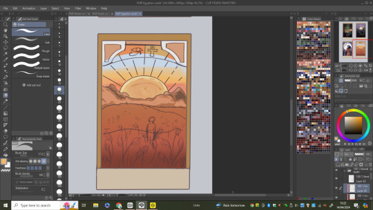
Once I had put down the base shading I then added some reflected light from the sun on mountains and the fields further back. After doing that I moved on to drawing the reeds and this process was difficult as I had try and do them in a similar style to how Iv'e done everything else in the piece so far. After working on the reeds for a while I finally got them to look how I wanted which didn't involve too much detail to ,make sure they tie into the simplistic colouring of everything else.

With the reeds and the rest of the landscape done I move onto the top "border" sections. With this I knew I wanted to colour some of the sections so I went with the colours that I used in the sunset which ended up tying the parts of the design together really well.
0 notes
Text
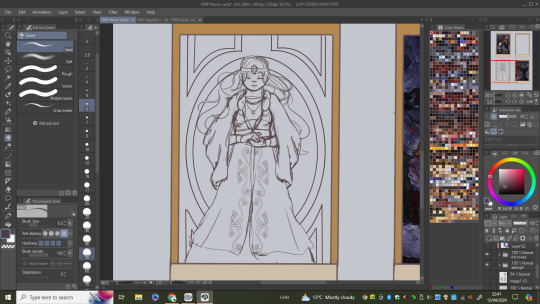
Drawing "The Magician" card
I started by sketching over Freya and getting all her details in.
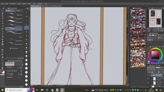
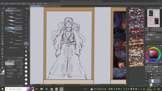
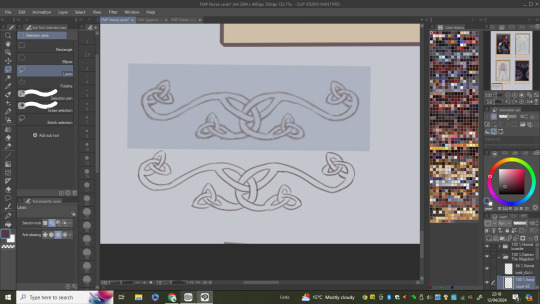
To make it easier I decided I would use and trace over the Celtic knot I had drawn when I had done her design sheet so I basically did the same process of copy and pasting I did for that drawing.

(flat colours)
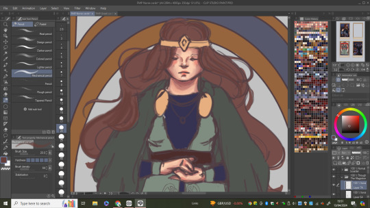
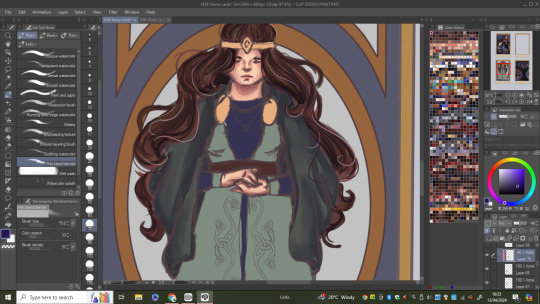
I then began working my way through, shading all the elements of the character although I spent a little more time on the dress as I had to hand draw a pattern on it which I found quite fun.

I then turned my attention to the background which is similar to the one I did for "The Lovers" card as it also drawn inspiration from art Nouveau. For the top sections I decided to draw some flowers and vines and in the middle I did some wiggly blue lines that kind of remind me of magic which helps tie into the name of the card.

To further expand on the magic idea, I added some glow and lines around her hands to try and represent some sort of magical energy.
0 notes
Text
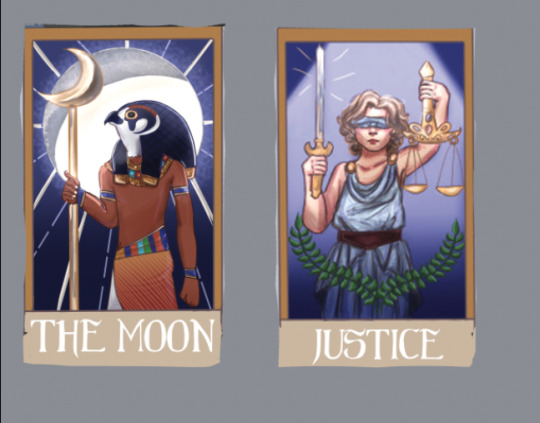
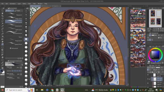
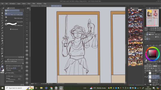
Drawing the "Justice" card
I started this card like I've done any other, by tracing my original pencil sketch (or in this case pen). There wasn't much to change in this design as I had already went in a changed the cards composition early on.

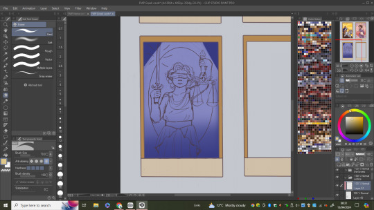
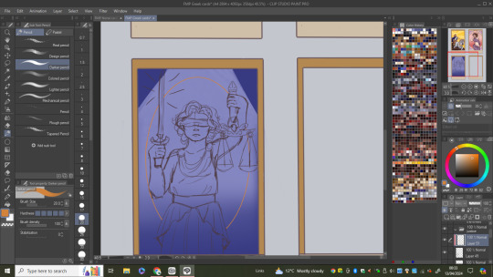
Instead of going straight into the flat colours I decided to play around with how I would do the background as I didn't have any idea on what I could do. I started by filling the whole thing in a dark blue and adding a oval in the centre then adding a spotlight type thing to give her a sense of importance. I then tried to give the oval some colour but it ended up not going with the spotlight idea so I scraped the idea of doing them together and just did one of the ideas.
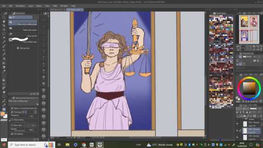
(flat colours)

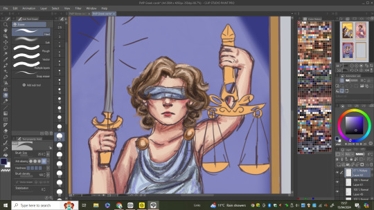
Went on to shading each section of her making sure to continue using the colouring style/ methods I have previously used in this card set. One change I made during this was the colours of her outfit as I just thought pink wan't the best colour to use as Iv'e already used it in one of the cards already so I changed it to a light blue.
When working on Themis's hair I made sure to shade it with the light source in mind making sure it'll look right when I get around to adding it properly


I finally moved onto the last bits of the cards which included colouring the sword and scales as well as adding two olive branches just to add a little more interest into the design (olive branches are a symbol of piece and often are seen with symbols of justice). With that being done I added the lighting working on her being sure to highlight the aspects of the design that are getting hit by the light source.
0 notes
Text
Drawing "The Moon" card
Started by the using my pencil sketch to sketch over so I can developed the rest of the design digitally.

(flat colours)

I added gradient shading to most parts of the drawing to give him a sleek look as well as going in with a slightly darker colour to bring more depth into the shadows.

I then moved onto the many moon's, trying to add surface texture to the ones in the background to mimic its surface. What I wanted to achieve with the background moon is I wanted it to look like two moons in one as the shadowed area is supposed to look like it could be a crescent moon.
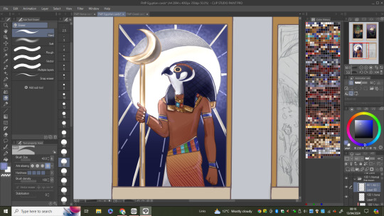
One of the last things I did was making the moon glow which I did by using a layer mode called "add (glow)", being sure to highlight the character appropriately.
0 notes
Text
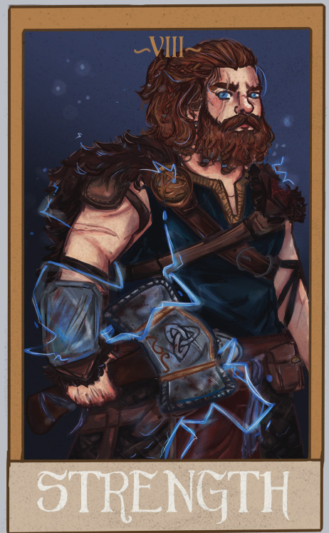
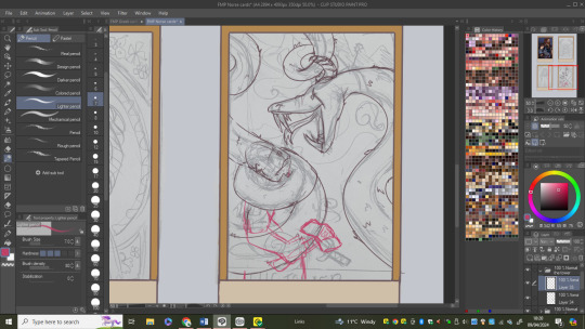
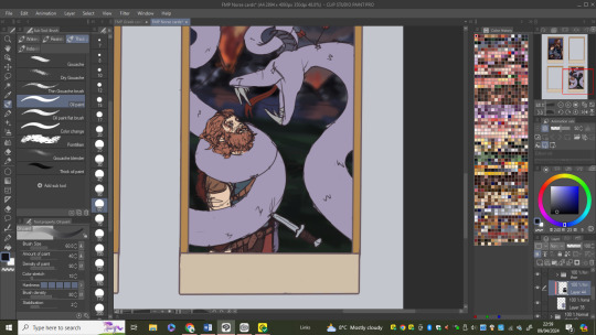
Drawing the "The Tower"
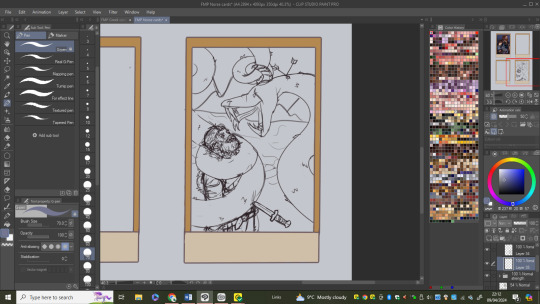
I started by tracing over my pencil sketch, having to change a couple things like the scale of Jormungandr and the background as well as roughly sketching Thor's pose.

After I was happy with how jormungandr looked I moved onto Thor and his details. I contemplated changing his position a tiny bit by giving him his hammer but I decided not to as it covered an element in the design I wanted to keep. When adding his features and design I used my previous card ("Strength") to help with how things looked and his specific colours.
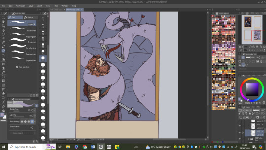
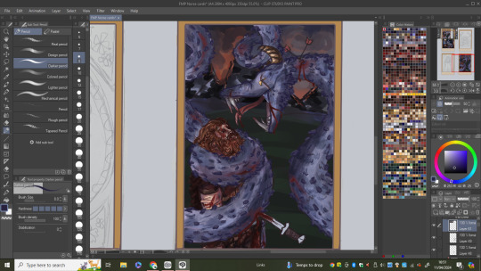
(flat colours)
Before going into shading and rendering the characters, I thought it would be best if I got the background out the way as its not my favourite element to do. I did this by just simply blocking in the colours and shapes that will make up the mountains and the fire/smoke as I don't want these elements to be too overly detailed. I also experimented in blurring the background to draw the viewers attention on the characters in the foreground but I didn't like how flat it make it look.

I then shaded Thor which was quite difficult because of the size of him and how dark I accidentally made his values. Although at the time I didn't know how to fix the muddy and similar values on Thor I did find a solution that makes his skin stand out from the other parts of his design making him easer to distinguish.
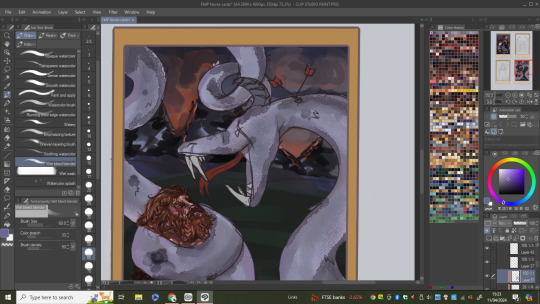
Moving onto Jormungandr, I made sure to add lots of texture to him as I originally made him quite sooth which didn't give the effect I wanted. By adding scales and more shading details I made him look less like and oversized snake and more like a otherworldly reptile. I also made sure to add some battle wounds to both of them as they both end up dying in ragnarok and it helps to too show the story and action in the scene.

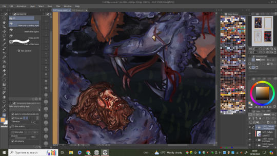
Like I said previously I ended up fixing the problem with Thors colours by adding a "overlay" layer over his skin to make it more warm toned which now contrasts with the cool tones in the rest of the piece.
0 notes


Text
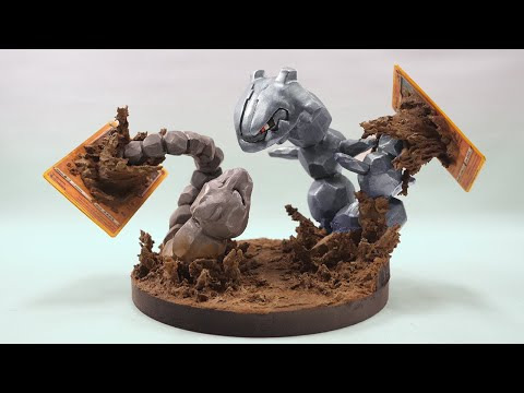
North of the border
This creator mainly works on 3D models made out of materials like scuply and cos-clay but he has a series of pieces that incorporates Pokemon cards into his designs. What I really like about these sculptures is how the card and the Pokemon interact with each other and how unique the overall idea and execution is.
youtube

One of the things I find really cool is how he mostly uses the cards like a portal for the Pokemon to come out of and into our world. The extra detail he puts into the cards helps reinforce this effect as he adds things like leaves and mud coming out the cards along with the characters to almost blend the two elements together and show the movement in the piece (especially in the muddy piece).

0 notes
Text
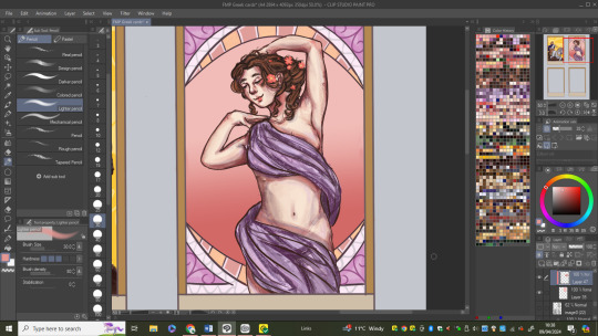
Drawing "The Lovers" card
Like all these cards, I began by tracing over the sketch I had done on paper being sure to check the sketch looks how it did in the original traditional sketch but digital.
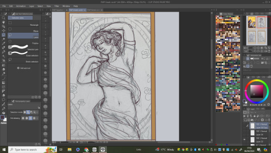
I then sketched out the design that will be the background. To get the most symmetrical out come I ended up using the shape tools and then copy and pasting each part I drew to get an art Nouveau inspired pattern.


(flat colours)
After I laded down the flat colours, I got to shading her skin using the same set of pencil brushes I had uses for "The sun" card. With this card however I had to uses the brushes in a slightly different ways for them to have a similar effect as this design relies on the character as being the main point of focus.
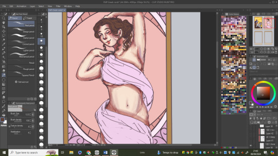
I then moved my attention to the fabric wrapped around her making sure to add wrinkles that are coherent with the flow of the material. Whilst doing this however it was brought my attention that one of Aphrodite's arms wasn't right and needed to be changed for the position to look nice and humanly possible. What I had ended up doing was making the arm too thick and the elbow joint to sharp leaving her arm at an almost 90 degree angle which wasn't right. I fixed this by slimming down the arm and softening the angles and overall outline of the arm. This helped by giving the arm more structure and depth as I then went in and shade were was needed.
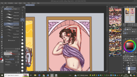
After that I coloured the hair and was sure to add lots of textures from the different pencil brushes I used. I also decided to add some flowers to her hair for some extra flair and because I think it suites her.

I then moved on to colouring and adding details to the background being sure to stick to a colour palette of pinks and light reds as those colours reflect the meaning and name of the card and the Goddess. This is one of the first cards that has a background that is heavily inspired by Alphonse Mucha and the art Nouveau movement as this is the first deity and design I felt would suit this kind of design choice.
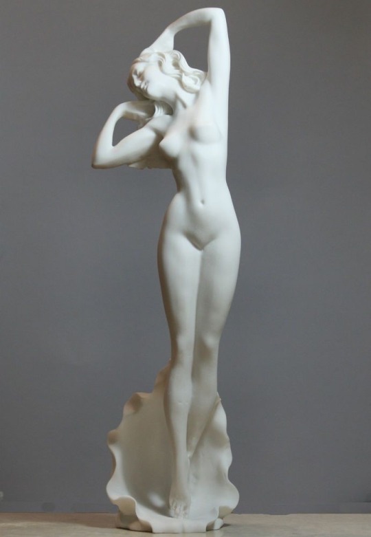
References/pose inspiration
Although this card was done a while ago, I realised as I was working the last card that the layer that had all of the rendering I did on her hair had disappeared. As frustrating as this was I needed to fix it as quickly as possible so I found a way that meant I didn't have redraw all of that hair again. Because I had taken a screen shot of the finished hair I was able to paste that into Clip Studio and put that in the place of the layer I lost. After doing that I gave the copied hair some touch ups to make up for the decrease in quality (because it's a screen shot).
0 notes
Text
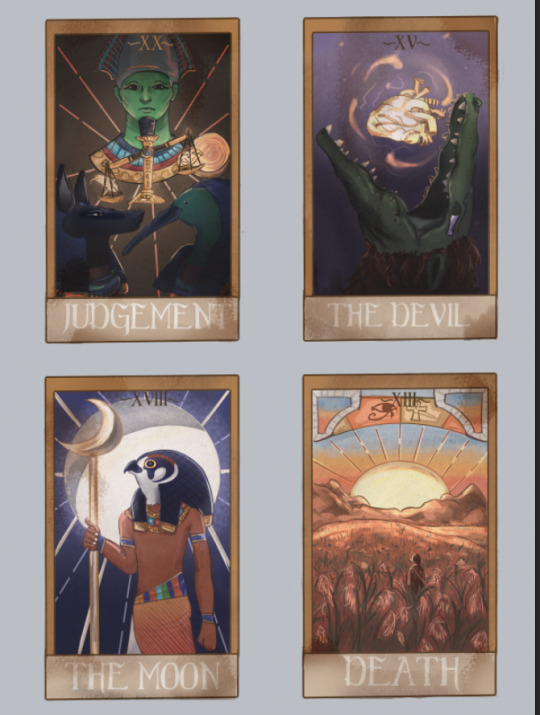
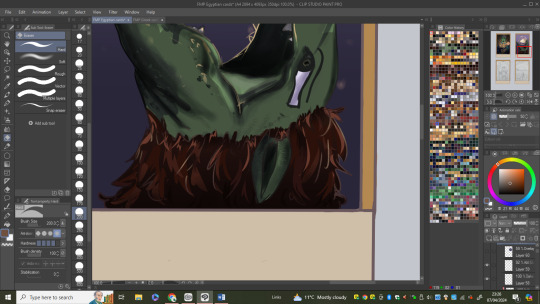
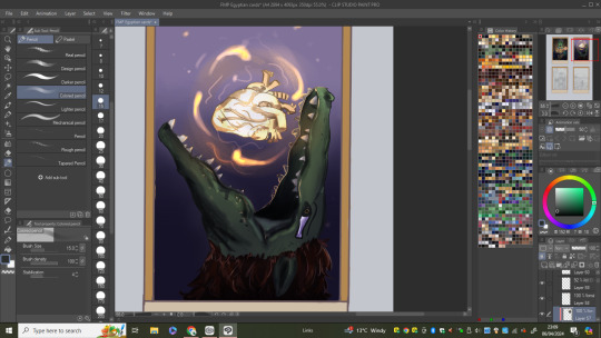
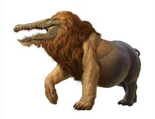
Drawing "The Devil" card
I began by tracing over my original sketch, being sure to double check everything looked as it should with references.
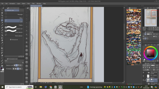
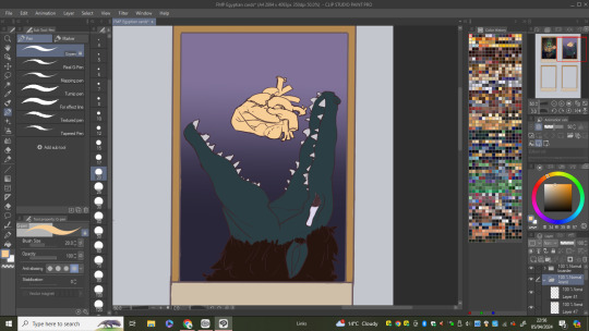
I then laid down the flat colours and added a gradient to the background as I wanted it to look as if Ammit was emerging from hell (the duat).
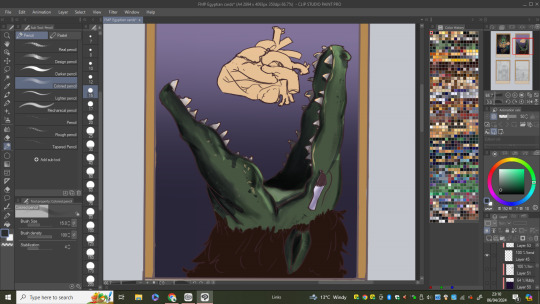
I then went onto shade the "skin" layer (in this case scales) and I did this using similar tools and methods to what I did for the "judgment" card leaving her with an overall cell shaded finish. I also changed the colour of the scales as the first one I tried was too dark so I opted for a lighter more dusty green.
I used the same method I had used for her scales for her main/fur which I think gave a really nice effect in showing the detail and highlighting in the hair.
I then moved onto the heart which I tried to make as identical to the one in the judgment card as I could (but with more detail as it's one of the main components of the piece) because those cards represent the stages of getting into the after life so I thought it made sense that the heart was drawn and coloured in the sames sort of way. I also made it glow in a similar way to how I did in the other card but its more intense in this drawing.
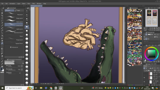
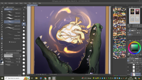
After that, I finished by colouring the sketch lines so they matched the drawing now and worked with the light source by reflecting the hearts glow and parts being in shadow. When that was done the last step was to add a "overlay" layer on top of everything to really give the effect that Ammit is coming out the dark.
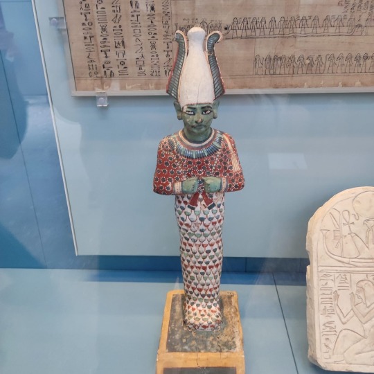
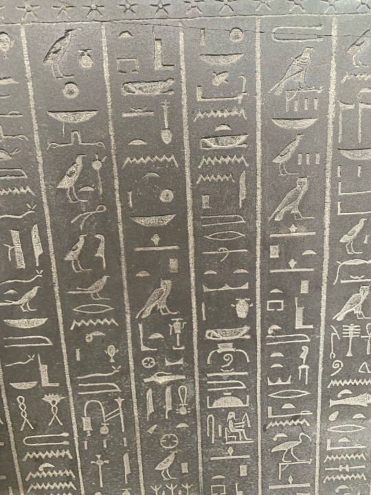
Design inspiration:
0 notes