
Last Seen Blogs

wegnant
Evan

mythoughts2205
Just My Thoughts

the-smashor
Gunvolt 3 is fine, your standards were too high
nottackylockscreens
Not Tacky Lockscreens

vpr1ncessv-blog
a pause in the wind
Text
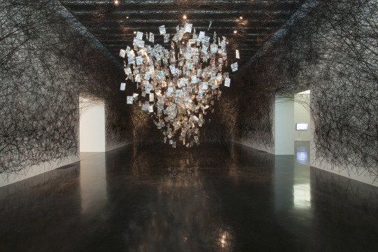
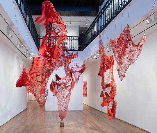
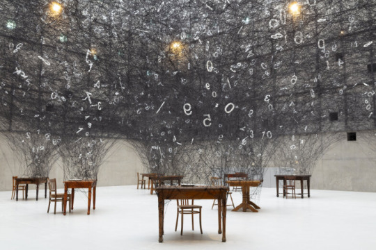
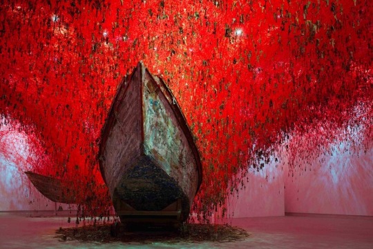
Chiharu Shiota
Chiharu Shiota is a Japanese performance and installation artist who was born in Osaka Japan and now lives and works in Berlin. She is recognised for her huge room-spanning webs of hoses and threads. She links these abstract works with concrete everyday objects such as window frames, dresses, keys, shoes and suitcases. Shiota confronts fundamental human concerns such as death, relationships and life. Colours and materials have strong meanings in Shiota’s work where she uses red threads to signify human relationships. For example in her work ‘state of being spiral” 2017 The red thread represents the widely-held East Asian belief that the colour binds people together through lineage. Shiota states that places really matter in her work also as she is strongly interested in psycho geography, which is the relationships between psyche and space. We can see this in her work where Shiota explores human existence through creating absent dimensions in her installations.
‘The key in the hand’ 2015
‘The key in the hand’ includes more than 50,000 keys hanging from a cloud of woven string. This web of thread turns the roof into a huge complex labyrinth. There are two rustic boats underneath the centre of the veil of keys. This installation ‘seeks to explore the notion of memory, using tens of thousands of keys collated from people across the globe in its realisation.’ Shiota explains that “keys are familiar and very valuable things that protect important people and spaces in our lives. They also inspire us to open the door to unknown worlds.”
0 notes
Text
COMPARE AND CONTRAST
SIMILARLITIES
Both of these awarded artists are well known and from the UK. They are also both influenced by architectures and structural forms.
DIFFERENCES
Coley likes to take architectures as it is and remakes it as smaller versions of itself. Whereas, Parker takes architectures and deconstructs/ remakes them in her own way.
0 notes
Text
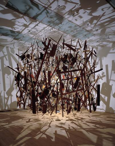
Cornelia Parker
Cornelia Parker is an English visual artist, and is best known for her installation art and sculpture. Parker has been recognised for her successes and received recognition by winning artist of the year, elected to the Royal Academy of Arts, appointed officer of the OBE and many more. The theme of destruction recurs in Parker’s work as she is inspired by “cartoon deaths”
One of Cornelia Parkers most iconic work is from 1991, ‘Cold Dark Matter : An Exploded View.
This work is the results of an exploded shed and the remains put back together resulting in the viewer seeing this piece as if it was in the middle of the blast. she includes tools, children's toys, her belongings and collected objects. The remaining fragments where arranged in a cube where it combines stillness and order against violence and chaos. Parker felt this piece was very meaningful to her because its natural form of a shed can be seen as safety and refuge but she destroys and rebirths it in a new space and form of her own work.

0 notes
Text
Nathan Coley
Nathan Coley is a Contemporary Scottish artist. And is well known for his sculptural work and how it relates to public spaces and architecture. He views himself as someone who makes objects and works from a wide range of medias including photography, sculpture and film. Coley is fascinated with how places can be injected with meaning and expresses his curiosity on how we can relate to architectures and public spaces.
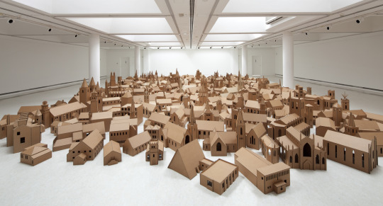
One of Nathan Coley's most iconic works of art is in 2004 when the artist constructed a series of scaled down, carboard replicas of all the 286 religious buildings in Edinburgh. Coley often uses forms that are almost immediately recognisable and abstracts the architecture from the world.
0 notes
Text
COMPARE AND CONTRAST
SIMILARITIES
Hannah Hoch and Kurt Schwitters where both German and involved in the Dada group. With both of them being involved in Dada, they where influenced on what materials to use in their work; both collected everyday items/ papers and used them in their collages. Kurt schwitters was actually a big influence to Hannah Hoch and you can see the similarities of layerings from their collages.
DIFFERENCES
There are not a lot of differences between these artists. However, Hannah Hoch directs her work to critique the failures of the German Goverment and other political issues, she’s also a feminist and directs her work at this issue also. Kurt Schwitters used his work to display the rapidly changing world. However, this could be seen as a similarity as they both use their work to highlight issues in the world.
0 notes
Text
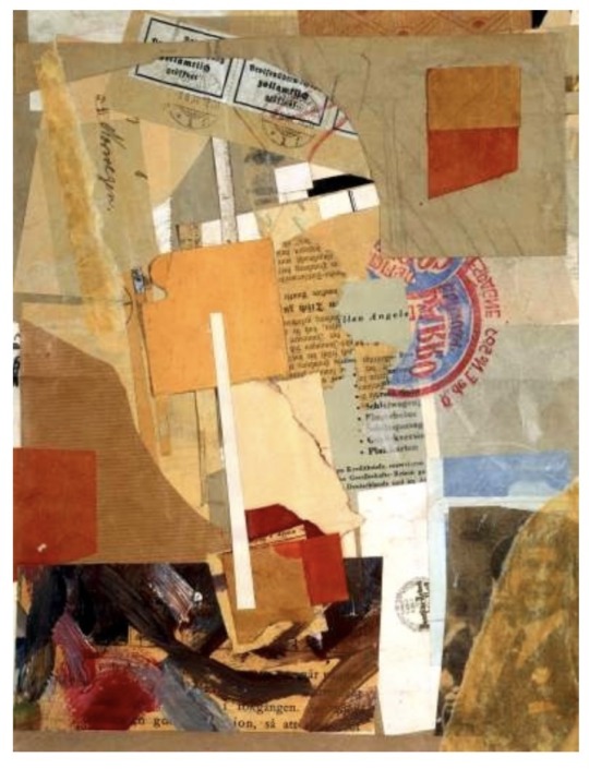
HANNAH HOCH
Hannah Hoch was a German feminist Dada artist born in 1889. She is best well known known for her work during the Weimar period where she was one of the originators of photomontage. The Weimar period was the period taken place after Wolrd War I, where Germany’s new government launched until Nazi Germany formed. Hoch recombined images and text from mass media to critique political and popular cultures. Such as the roles of women and the failings of the German government, but often focused her crustisism more direct on gender issues. Some of her inspiration came from the collage work of Pablo Picassso and fellow Dada member kurt schwitters. In Hoch’s work you can see a shared similar layering style with those artists.
“Cut with the kitchen knife through the last Weimar beer-belly” 1919-20
This collage reflected Hannah Hoch’s views of the social and political issues in Germany. The specifications of “beer belly” makes it clear this piece is a social analysis directed to gender issues. This collage contains cut out pieces of images and texts found in newspapers, magazines, advertisements, journals and layered and stuck them in some sort of language that made sense to her.
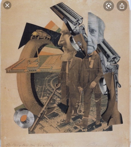
“High finance” 1923
In this collage the viewer is presented with two disproportionate large and mismatched heads of two banker figures. One of the bankers’ heads is split in half with two shotguns behind which look like they are being aimed at the banker. The composition is arranged carefully and made from every day objects such as papers, newspapers and magazine cut outs.
0 notes
Text
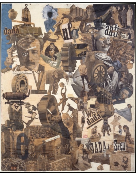
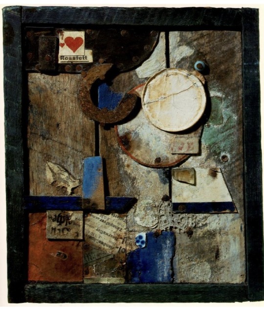
KURT SCHWITTERS
kurt swchitters was a German artist who was born in 1887. He worked in several artistic areas and media’s such as poetry, sound, sculpture, painting, graphic design and many other genres that came to be known as installation art. Schwitters was involved in Dadaism, this art movement group formed during the First Wolrd War and sort of used their art to protest against war and share their anti-war believes. Schwitters is best known for his Merz and Merzabu works, which involves a collage of typography, sound poetry and found objects like magazine clippings, waste material, recycled items. He used these items to show how rapid the world is changing.
He studied art at the Dresden Academy and then was recruited into the German Army in World War I. He was excused from active duties as he had epilepsy. So, he worked in a machine factory, this experience inspired him in his work for using all differnet objects and materials.
“Opened by Customs” 1937-8
This collage is made up of oil paints, printed paper, graphite and paper. These papers have been cut and torn from a variety of sources such as parcel paper, labels, texts from books and a printed list of travel- related words in German such as “ baggage insurance.” The complexed layers of this collage could suggest a variety of emotions and ideas the artist had while creating this collage.
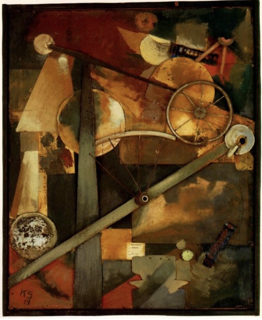
“Relief in Relief” 1942-5
In this collage we see again everyday life objects used. This influence was caused by his involvement in the Dada movement, this allowed him to develop distinct forms of collage combining all these everyday materials. In this collage he used bus tickets, labels and many more sources. Mediums that where included was oil paint on wood and plaster.
0 notes
Text
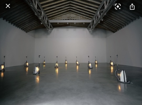
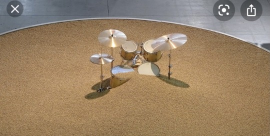
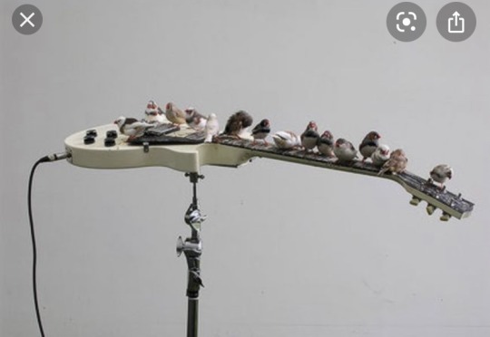
Celeste Boursier-Mougenot
Celeste Boursier-Mougenot is a modern French sound artist who has won worldwide recognition with his acoustic installations. He was born in 1961 and began his career as a musician. He worked as a composer in 1985 to 1994 for ‘The avant-garde Rambert theatre company,’ from then he began producing sound installations for galleries. Celeste Boursier-Mougenot is well known for collaborating his sounds with diverse objects such as live birds, kitchenware, vacuum cleaners and merges them with different environments. However, he still combines musical instruments in some of his work.
‘From Here to Ear’
This was produced in 1999, and involved Zebra finches (birds) and electric guitars. The technique Boursier Mougenot has used has allowed nature to translate sounds through the behaviour of birds. For example in one video a bird was poking the wires with a branch and created a variety of sounds; the finches flutter in the room and perch onto the guitar strings as if they were telephone pole wires, while this happens Boursier Mougenot writes down the sounds made by the birds.
‘Videodrones’
This is a nonconventional piece of work made in 2001 and was shown on five screens in exhibition space and allowed the audience to view everyday details of real times of streets, sidewalks, movement of transport and pedestrians. Creating a cluster of sounds.
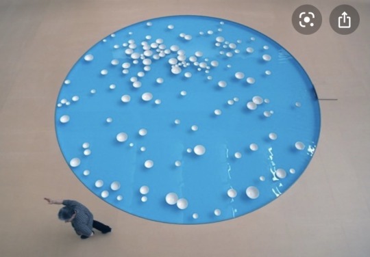
‘cilinamen v.3′
in an exhibition in 2012 Boursier Mougenot added floating glass bowls to a pool of water. As they float the bowls clink together. The french artist describes it as “dream like,” as the bowls are moved by an invisible force. The bowls unexpectedly make a soundscape of masculinity. we see his approach of natural environments/ elements such as water merge with peculiar musical objects such as bowls.
0 notes
Text
COMPARE AND CONTRAST
SIMILARITIES
The similarities that Peter Doig and Carol Rhodes face is that they are both in some way influenced by their childhood home, they are both Scottish and are both landscape artists. Both of their work contains some sort of nature whether it be trees, forrest’s or fields. They are both also seen as abstract painters.
DIFFERENCES
Differences that Peter Doig and Carol Rhodes have is that in their paintings Rhodes creates her landscapes unpeopled where Doig has figures in his. Doig’s perspective in his paintings is usually always eye level whereas Rhodes landscapes are Ariel view. Both of their colour palettes are quite different as well, Doig uses quite unusual colours at times and uses dark and some bold colours and Rhodes uses quite soft colours almost pastel like. However in Doig’s painting “blotter” his colour scheme contains some soft purples and lilacs that can be seen as a similarity in some of Rhodes work.
0 notes
Text
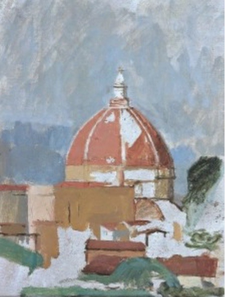
PETER DOIG
Peter Doig is a Scottish artist and one of the most famous living figurative painters. He was born in the Scottish capital of Edinburgh in 1962. He spent his childhood in Canada and moved back to London in 1979 where he studied fine art at Wimbledon school of art and also studied at Chelsea school of art. He set up a studio at the Caribbean contemporary arts centre back in 2002. And has also been a professor of fine art in Germany.
Many of Peter Doig’s work are landscapes which are quite abstract and contain snowy scenes which can be reflected back on his time in Canada with cold winter weather.Doig gets his references from photos, newspapers and movie scenes. However, they are not painted in an overly photorealist style. He take his source material and then wanders in his paintings as if it’s his own personal language.
A few of Peter Doig’s most iconic/well known pieces include:
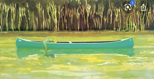
“Canoe lake”
This piece was made in 1997 and features a canoe floating a unique figure down a quiet lake. The colours used in this painting is sickly and acidic yellows and greens. This piece is one of seven paintings that feature a canoe, in Doig’s work canoes represent his time in Canada. Doig is fascinated with reflection in his photos and are shown a lot in his paintings where the objects are mirrored in a mystical way.
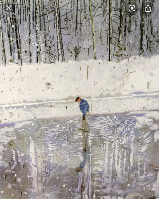
“Blotter”
This painting was made in 1993 and contains a gloved figure in a winter frosted surrounding. This also represents Doig’s childhood home of Canada featuring the snowy atmosphere in this painting. Behind the figure is a darkening forrest but as we follow to the middle of the painting the viewers eye is met with calming Greys, purples and blues in the reflection of the ice and water. The colour scheme used in this piece creates a cold and calm perspective in the painting.
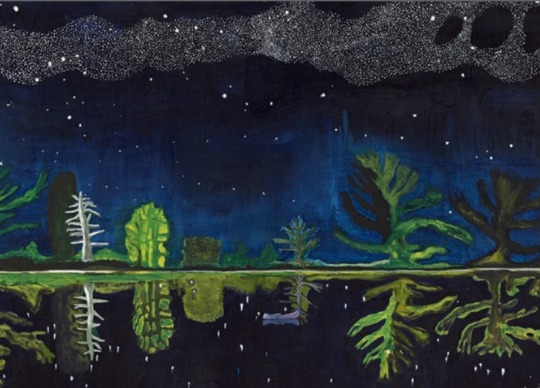
“Milky Way”
This piece was produced in 1990. It features a black and blue skyscape with a clouded Milky Way which is reflected by the river in an almost mystical way. A tiny canoe is spotted and surrounded by alien like coral, this emphasises the paintings proportions almost like this is from another world or dream like. This piece could also relate to Van Gogh’s “starry night” with the colours used and setting of the sky.
0 notes
Text
CAROL RHODES
Carol Rhodes was a Scottish artist well known for her drawings and paintings of unpeopled landscapes. She was born in the Scottish capital of Edinburgh In 1959. She spent her infant years in India and then moved Back to Scotland in her teens; where she studied fine art at the Glasgow School of art and then progressed her interest of Ariel perspectives with suburban landscapes. She also had strong political views around issues with feminism and social justice.
Carol Rhodes visited India a lot when she was older and was influenced by the colours and density of detail, this is then reflected in her work. She was also influenced by man made landscapes like waste areas, refineries and electricity generators which can be seen in her work. Rhodes worked slowly and concentrated in her paintings using oil paints.
A few of Carol Rhodes most iconic/well known pieces include:
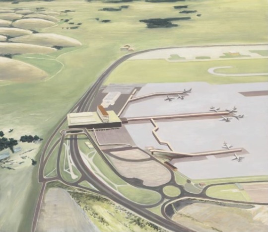
“Airport”
This piece was made in 1995, and like most Rhodes’ work it’s perspective is from an Ariel view. This painting includes calm fields surrounding what looks like an empty airport. No planes are taking off and makes the viewer think about whether the airport is abandoned or with the Ariel view are we on a plane that’s just took off? This piece contains soft pastel like colours that add a calming effect to the overall observation to the painting.
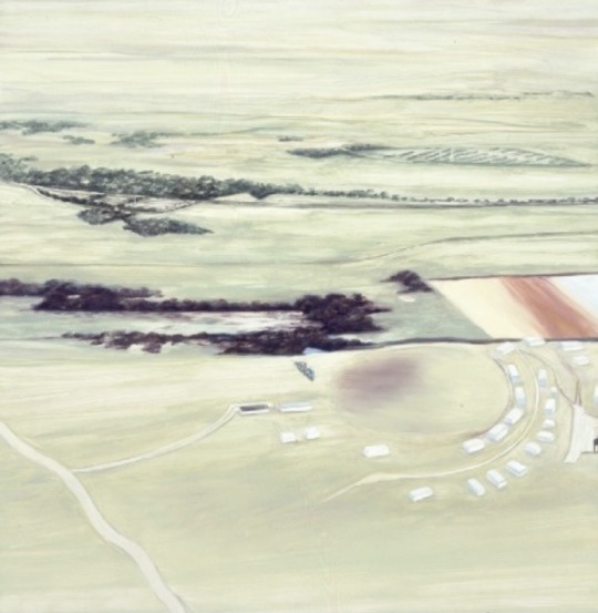
“Caravans”
This painting was made in 1997, and is also Ariel view, purposely some aspects and details are clear in this piece but most aren’t which creates a abstraction perspective. This work allows us to relive or think about our own experiences of a caravan holiday and include them into the painting as If you where there.
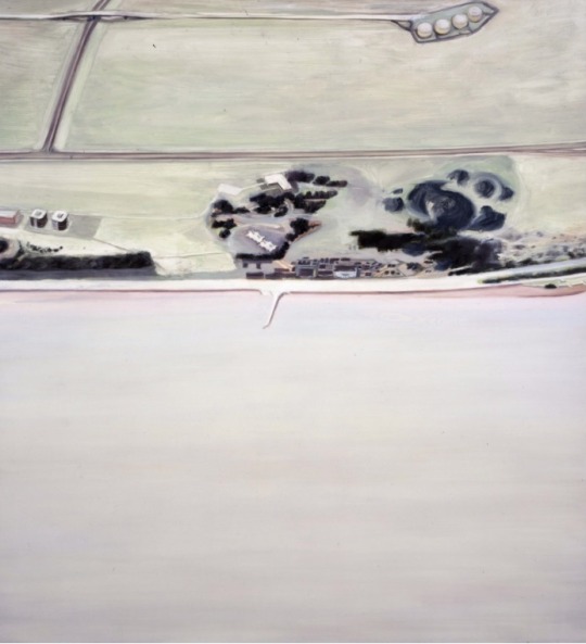
“Sea and Land”
This piece was made in 1996. This painting is also unpeopled and includes a pale landscape with cool fields and a grey calm sea. Due to no people on the shore and the colour scheme the viewer thinks about is it coming into winter or is it a cloudy overcast day? From the Ariel perspective we also think about whether we are seeing this landscape from a seagulls perspective flying over the shore. A lot of Rhodes paintings seem familiar to one another with calm fields and soft colours which gives Rhodes work a cool perspective.
3 notes
·
View notes
Photo
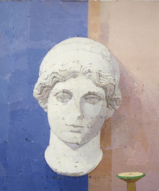
EUAN UGLOW
Euan Uglow was a British painter who was best recognised for his still life and nude paintings, and was influenced by artist William Coldstream who also created still life’s and portraits. Uglow used a certain technique where he would place plumb lines and strings used as spacial points in his work. These marks would then reflect in his paintings using thin coloured brushstrokes or a pencil.
1 note
·
View note
Photo
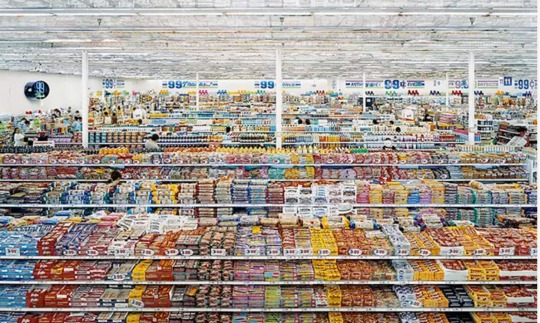
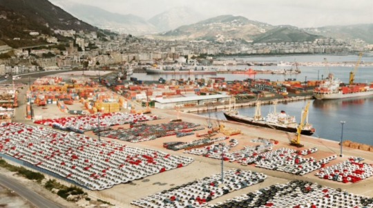
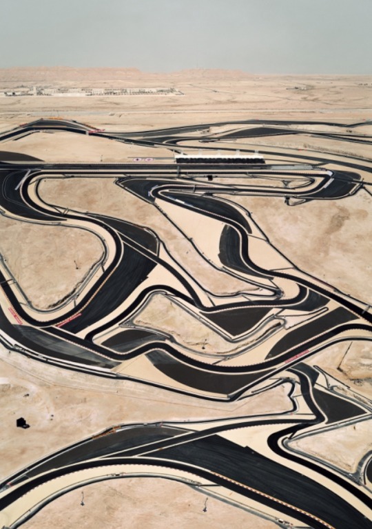
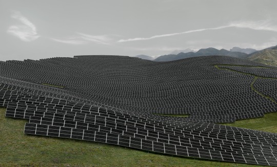
ANDREAS GURSKY
Andreas Gursky is a German photographer who is well recognised for capturing the modern world through different industries, landscapes and architectures snapped from high points of view. His influences have been said to come from Bernd and Hilla Beecher, who’s photography is inflicted by modernism. Gursky also find his inspiration through his own visual experiences.
Gursky’s techniques include digital editing and retouching; and also uses high levels of computing to create large scales of his photography.
1 note
·
View note