Last Seen Blogs
sunnyfuneral
Hannibal is an autistic trans woman
waywardcoww
My My My... What we have here, Cariño
hotbabesusa
HotbabesUSA
we-dance-alone
I Stan The Night Running Tour
softbunniie-blog
✿ star gazer ✿
Text
Sense of Place Evaluation
I thouroughly enjoyed this week long project and am very happy with my final outcome. It’s given me a project that has involved a lot of craft, and definately something I am going to use in my portfolio.
I really enjoyed the craft involved and the challenge of making a book that was fully waterproof and floatable.
It was also interesting tackling such a serious issue. I am really behind design for good and ethical work so this was a good challenge.
If I were to tackle this project again, I would have maybe printing something in the exterior of the book. Such a the title ‘no sense of place’. The title was taken from the breif, and could actually be expanded on too.
I do think I would like to photograph the book on the actual sea. Hopefully post hand in I will be able to arrange a shoot.
Iverall avery enjoyable week project. One of my favourites to date.
6 notes
·
View notes


Photo


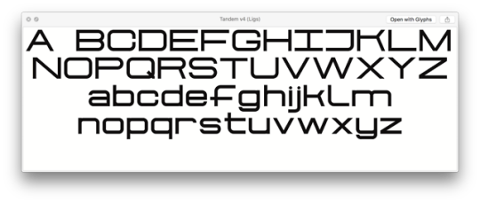


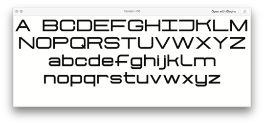
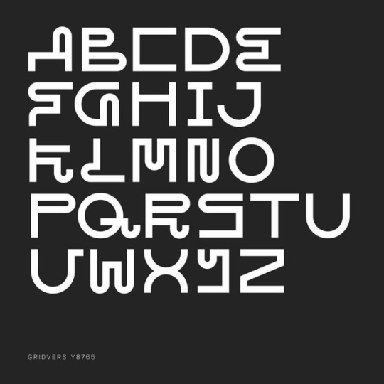
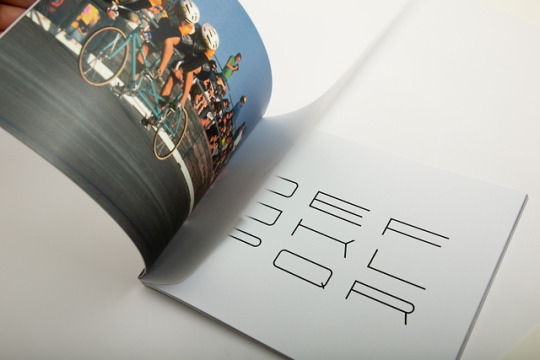
Some typeface version development. Sadly ligatures are hidden when you export a font. The ligatures are the most interesting part of my typeface.
0 notes
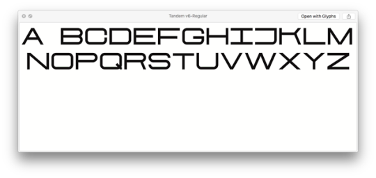
Photo

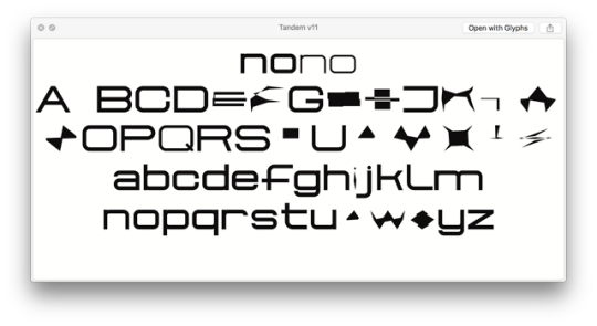
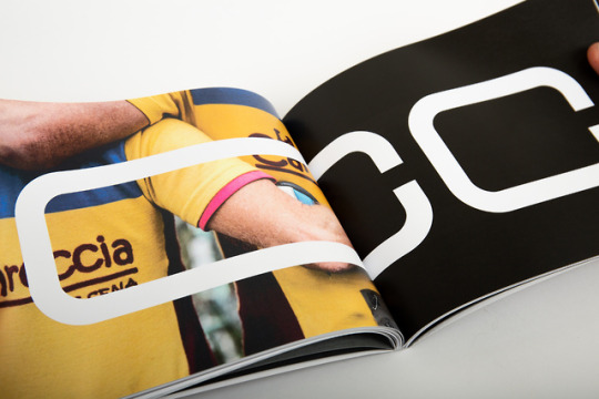
A failed export of The Taandem Typeface. Amused me a little as it says ‘no no’ to begin with. Still, some interesting glyphs..
0 notes
Link
0 notes
Link
0 notes
Text
FMP Evaluation
My FMP took a while to get going. This was understandable due to the fact I decided to enter into ISTD, a competition that, though was a lot of work, completely paid off.
I think I might have the tendency to put too much pressure on a project when I want it to go really well. This is what was happening towards the beginning of my FMP. As I wanted it to be some of my best work to date, I pondered for a while to find an idea I liked. I decided to pick up a project from the past, something quite strange and out there, but really interesting to me, and just run with it.
When referring back to my synopsis of study, written towards the beginning of the project, I wrote “I have always really liked the idea of designing my own typeface. It’s something I have never done but always wanted to try. Personally, I would find it particularly fulfilling to graduate university having designed a typeface.” followed by “I really like the idea of finding a piece of research, medium or method that does not have great relation to type and combining the two”. I think I have achieved both these main points.
I have thoroughly enjoyed my final major project, and I am very happy with my final outcomes. I’m really glad that I have now been able to make my own typeface, one that is conceptual, but still useable. This is something I have always wanted to do, and I have enjoyed every minute.
I was pleasantly surprised with my time management. I really thought I would be falling behind due to ISTD; it did not seem to disrupt me too much. My final outcomes were finished in good time, so I was able to organize my body of work and fill in anything I might have missed. I was even able to print and bind my process book for the deadline, which I am proud of.
If I were to tackle this project again, I think my starting point for my typeface might be different. Although, I am very happy with my outcome and concept, I think the physical aspect of the tandem could have been pushed further. Whether this be the way the type curves, or the way it slants, etc. I would have also like to create a letter out of steel tubing to mimic the bike frame. This can be done for the show, yet would have been nice to have for hand in. Lastly, I would have liked to create an animation explaining my concept. Although the idea is easy to get, I think the added medium of an animation would have helped the viewer understand the ligatures and how the typeface works.
I also think this might be a project that will develop further, post hand in; as it will be used in our Graduate show. I am happy to keep working on it, to make it the best it can be.
Overall, a very enjoyable project and a good one for the portfolio. I’m glad I’ve ended the course on a project I have enjoyed so much. I will be very sad to leave but am excited for the future.
0 notes

Photo


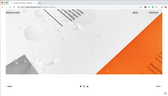
Final Website
I have gone for a very simplistic, portfolio style website. After a lot of reworking and a helpful tutorial with Rich I am finally happy with the outcome. It is easy to navigate, works well and I think showcases my work well.
0 notes


Photo

To reshoot or not...
Think the yellow might be a little pungent
0 notes


Video
vimeo
Stretching A - AA Experiment
This could work well as part of a series that presents the doubling letters.
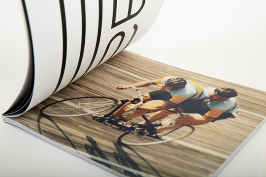
The video of the race is from the 1960 Olympics. The whole typeface could be showcased over this four-minute period.
Credit: Thanks for the help Ben x
0 notes