
enhanceddigitalinnovation2
Enhanced Digital Innovation Part Two
65 posts
Don't wanna be here? Send us removal request.
Last Seen Blogs

scottmemelordstrashpile
Scott Memelord's Trash Pile

reumacshot-this
Reumac's Tumblr
beansforwhat
🪶 SNAKE BOY ARC 🎭

ren-from-mars
it's just a ride!

ethanlaguna
Untitled
Text
Finishing Statement:
This brief was probably one of my favourite team briefs we have done so far. It’s aim with E3 was to ensure that Odeon has returning customers by using digital, marketing and technology to establish that Odeon are the forefront of the cinema experience. This was with the goal to fill the new 3257 seats available at the new Odeon at Manchester’s Northern Quarter.
The brief meant we had to look at what the future of their sustainability is as a cinematic experience. This is as a result of consumers looking for other alternatives, likes its competitors: Netflix and YouTube etc. taking audiences against the big screen. This means the brief needs to target all audiences not just one demographic therefore it’s of great importance to create a solution which will suit all demographics.
I was put in a team with Jordan and Sophie…I really feel this was a really good team. Our communication was always in touch using a group chat on Facebook Messenger and also Trello as a point of call as to what tasks need to be done. I feel the work was also split out evenly and we all had the same kind of workload to get the project done.
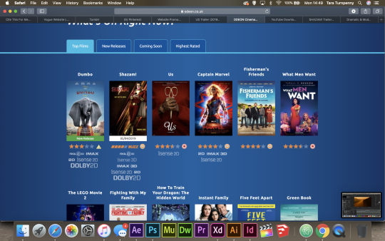
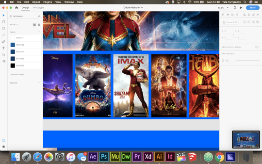
Our solution to this brief was to rebrand the website and app for Odeon. We felt the previous rebranding was only half finished and wasn’t implemented into the current website or app. We also felt that cart abandonment was a huge factor as to why people weren’t using the website and purchasing tickets from it. It had so many pathways, cluttered photos and adverts it was hard to know where you were in the website, especially for the older demographics. Therefore we wanted to make this user journey as easy as possible and with a more modern user interface. More so, we felt the buttons to watch trailers within the website didn’t make it appealing to actually watch them within the website but prompted people to go to an external site such as YouTube to access them. Therefore, we wanted to also make the journey to watch trailers more appealing.
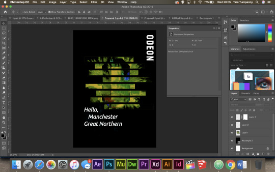
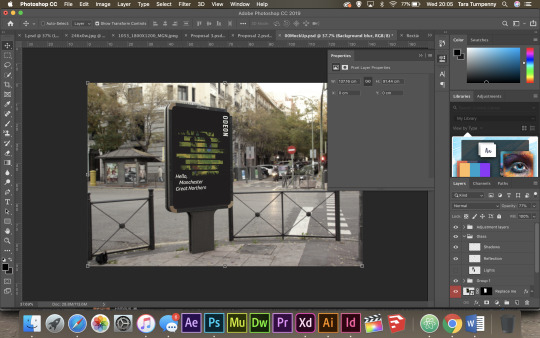
In addition this this, we would hope that the new website and app would make it easier and more accessible for the older demographic, whom we found are going to the cinema less often than younger demographics. Therefore, we wanted to also integrate localised marketing and print campaigns within our solution. We decided to maintain the “Hello Manchester, Great Northern” but with some tweaks. Firstly, I changed the O to have a block effect, this will be consistent with the layout of the website, and also it will have the original Odeon logo on the poster as well so people know 100% what company the poster is about. More so, additional posters were also made which could be placed within Manchester Arndale, the Trafford Centre and around Piccadilly to try to encourage more demographics to visit Odeon over the other cinemas. Furthermore, as part of this new marketing strategy, a moving image was also created to market the trailer aspect of the website. This could be used within social media along with the print campaigns to again, further the engagement rates with people seeing these campaigns.
Although I was team leader within this brief, I feel as though this team worked how any team should work rather than feeling like an extra weight has been put on you for being put the leader. This time being leader I didn’t feel like I had to drag my team with me, they were already with me. I felt this was a breath of fresh air and it made the project run a lot more smoothly compared to previous ones. We made sure each of us had all of the work and assets available to produce our tasks, and I didn’t feel as though I was waiting around for pieces of work at all. They were already there ready. This made team work a lot more enjoyable and honestly although I know I’m going to run into situations where the team doesn’t function as well as it should in the future once I leave university, I wish all teams were like this as it makes the project a lot easier to handle.
I feel the distribution of work was equal, with me working on strategy research, UI elements, marketing and social media whilst also having to produce presentations for both pitches. Whilst Sophie worked on the App and helped me with some marketing and Jordan working on the website. I feel all these roles all tied together to create the final product. We all had a vision and we made that vision work.
Overall, this was a really enjoyable brief.
0 notes
Text
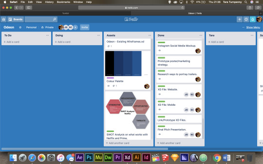
Update to Trello at this final stage:
Below you can see the current Trello. As you can see, all in which we wanted to complete has been done and achieved.
Through this, we also used Facebook Messenger to communicate with each other as to sending files over which were too big to upload to this Trello board.
0 notes
Text
Final Presentation Pitch Day:
Today was the final pitch for the E3 Odeon brief.
I overall thought it was well minus a technical difficulty at the beginning.
Our group all worked together to showcase our work we produced and it ran smoothly as we had planned. I really enjoyed presenting this brief as I felt we created a good clear product as a solution to this brief and this made presenting a lot easier due to great communication skills and team work.
0 notes
Text
Team Pitch Presentations
Bonnie, Josh, Lucas and James:
Clear on the roles of each team member has.
Research on Odeon as a brand and what they offer compared to the competitors.
Visual representations of statistics.
Competitors of the Odeon and their statistics of what they offer.
Great Northern as an environment and what is already there.
Backwards engineering of the app.
Sitemap of the new app.
Personas
Izzy, Justin and Heather:
Breakdown from 2d floor plan through to 3d.
Ted talks.
Kiosk design.
Physical model.
Poster Design and Research of existing ones.
Inspiration taken to create the posters.
Ewan, Fin and Holly:
Stylesheets.
Focus groups to find out primary research from Odeon.
3D Renders.
0 notes
Text
Creating the Final Pitch Presentation:
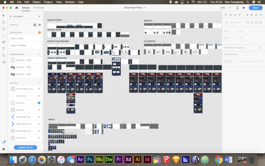
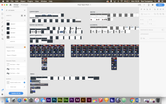
With most of the products completed, I began creating the final pitch for this brief ready for next weeks presentation. This way the template and animations for the presentation will be complete and all we would need to do is add the remaining content onto the slides.
Here you can see the running order and functionality of the presentation on how it will flow. These are majority on timers meaning there’s less time spent on the computer trying to change the slide, and more for talking and the animations between slides to take place.
I then began adding content including the team, the brief and the concept of what we are producing within our team:
I repeated this, splitting the sections up with different colors from the color palette and then adding the finished products within the presentation.
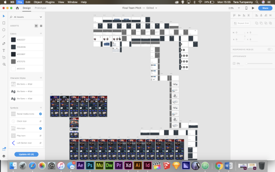
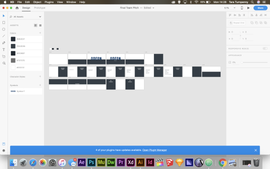
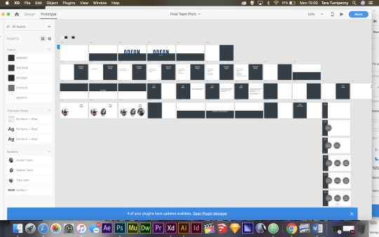
I then soon realized the work space on Adobe XD was getting messy and meant I wasn't able to fit the actual website art boards within my presentation art board, also it was made hard to see actually where each slide led to within the prototype section.
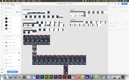
I began labeling each section and splitting it up individually so you can locate them easily within the Adobe XD art board.
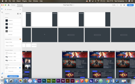
I then added a search animation which goes before the website walkthrough:
0 notes
Text
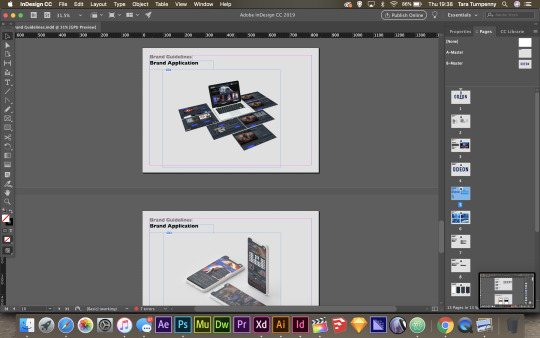
Mockups of Finalised Brand Guidelines:
I then went ahead and added the branding guidelines to mockups, similar to how I did it within the design specialism brief ready to place within the presentation .


0 notes
Text
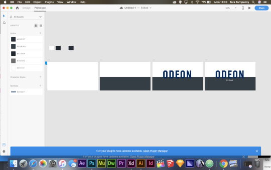
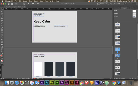
Completing the Brand Guidelines:
Now that most of the products are nearing completion, I have the available resources to fill the branding guidelines for our rebranding of the Odeon website.
I now had access to the new font being used and color palette:
I also added the icons being used with the website and mobile application, as well as how these branding guidelines are being applied within social media and how they should be posted within these sites.
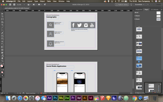
Here is the brand guidelines being applied to both the website and the responsive mobile website:
0 notes
Video
Social Media campaign placed within Instagram:
*Please note*
FAIR USE:
Copyright Disclaimer Under Section 107 of the Copyright Act 1976, allowance is made for “fair use” for purposes such as criticism, comment, news reporting, teaching, scholarship, and research. Fair use is a use permitted by copyright statute that might otherwise be infringing. Non-profit, educational or personal use tips the balance in favor of fair use. I do therefore, not take credit for the audio and videos used within this video and credit fully those rightful owners of the content used to product this video. I do not own the videos or audio used, nor do I earn a profit from uploading this video. It is for entertainment purposes only.
0 notes
Text
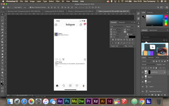
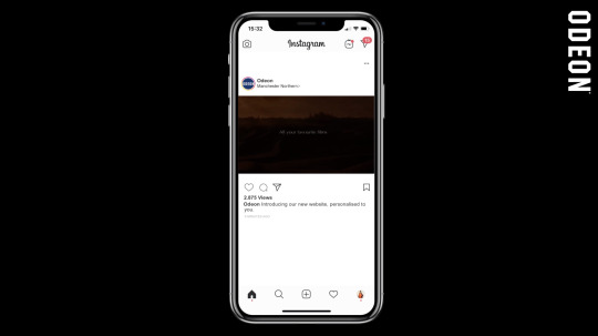
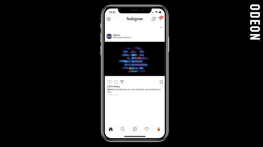
Creating the Social Media Assets:
I then needed to create mockups to represent how the social media campaigns would look. I decided to use Instagram for this; (see statistics above).
Therefore, I screen shotted Instagram from my phone and began using the Instagram UI kit to fill in the various details to make it fit with Odeon.
Once I’d completed this, I placed it within the mockup iPhone ready to be placed within After Effects.
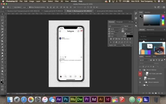
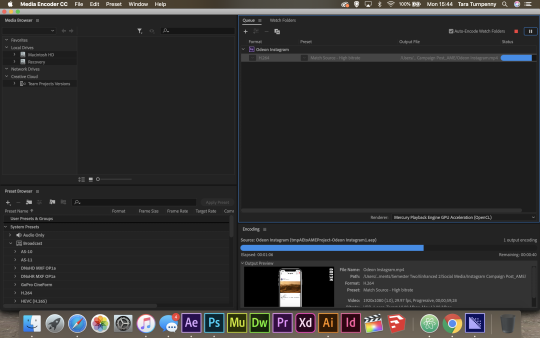
This is where I placed the phone into After Effects and placed the campaign within the Instagram post. I also added the Odeon logo to the side for presentation purposes.
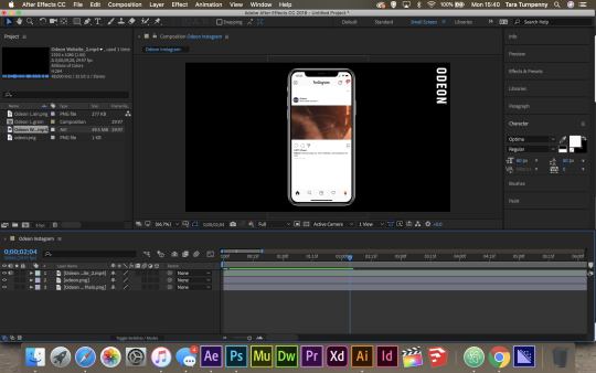
This was then exported via Media Encoder for the best quality render.
Here are some screen shots of this moving image mockup: (See video above and attached within the hand in folder).
0 notes
Video
Here is the finalised Moving Image piece.
*Please note*
FAIR USE:
Copyright Disclaimer Under Section 107 of the Copyright Act 1976, allowance is made for "fair use" for purposes such as criticism, comment, news reporting, teaching, scholarship, and research. Fair use is a use permitted by copyright statute that might otherwise be infringing. Non-profit, educational or personal use tips the balance in favor of fair use. I do therefore, not take credit for the audio and videos used within this video and credit fully those rightful owners of the content used to product this video. I do not own the videos or audio used, nor do I earn a profit from uploading this video. It is for entertainment purposes only.
0 notes
Text
Creating the Moving Image:
As shown on previous blog posts, finding audio for this moving image piece was probably one of the most challenging parts. After watching various (many) trailer music examples, I decided I really liked a song used in the Alita Battle Angel trailer:
youtube
As I thought this is something in which could be recognisable to consumers who have watched the trailer, and is up to date within todays cinema showings, I wanted to use it within my moving image.
This as well as the existing Odeon Ident sound track were both placed together, and I felt they sounded nice together.
For the moving image I wanted to incorporate the content of a website within the video, therefore I went to the Odeon page to see the films in which are being released to get up to date footage.
I also went onto our slices created for the website to get the films off of these to get a visual consistency throughout.
After placing various pieces of footages into After Effects, I created a montage of clips in which fitted suitably with the sound placed within the project.

I wanted to add text “all of your favourite films, right here, at Odeon.com.” as the slogan for the marketing moving image as shown below. This fit nicely within the video.
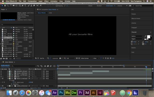
To end the video, the updated branding of the line which represent the bookcase structure of the website was added within its own animation.

0 notes
Text
Dolby Sound:
Whilst doing research for audio to use within the moving image, I noticed a came across a company called ‘Dolby’ a lot.
“Dolby Digital is the name for audio compression technologies developed by Dolby Laboratories. Originally named Dolby Stereo Digital until 1994, except for Dolby TrueHD, the audio compression is lossy. The first use of Dolby Digital was to provide digital sound in cinemas from 35mm film prints; today, it is now also used for other applications such as TV broadcast, radio broadcast via satellite, digital video streaming, DVDs, Blu-ray discs and game consoles.” -Wikipedia
Dolby and Cinema:
What I figured through research is that Dolby actually do a lot of the sound work for Cinemas as well as their own cinema chains pre shows because of their quality surround sound systems and visual sounds, a lot of cinemas use them to create the pre shows.
Below are some examples of work by Dolby:
youtube
youtube
youtube
0 notes
Text
Examples of Pre Show Sound:
I wanted to have some examples of Pre Show’s within Cinema as this was the kind of theme in which I was aiming for to bring across in social media marketing; therefore I needed inspiration and to take a look at what other competitors do:
Dolby Cinema:
youtube
Universe:
youtube
Vue Cinema:
youtube
McCoy Miniplex Pre Show:
youtube
0 notes
Text
Creating the Logo Animation:
When refining this existing logo created by Odeon to represent the book case structure of the website and the variety of films defined by each line; I always envisioned turning this into an animation where the ones come in on themselves. Therefore, when creating my moving image piece I wanted to begin with this animation in which I can then use across platforms.
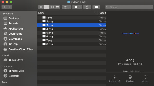
I first needed to separate the lines to be able to work with them individually.
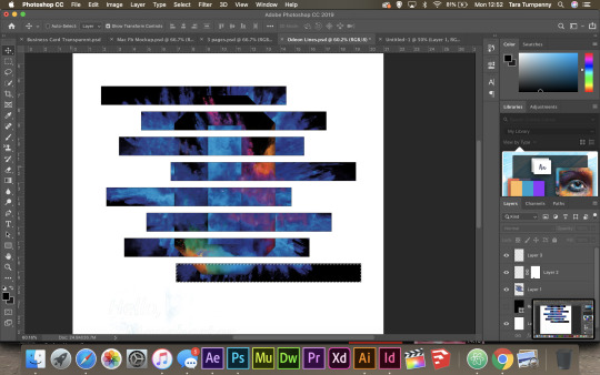
Here you can see them as individual pieces within a folder ready to be pulled into After Effects:
0 notes
Text
Examples of Website Promotional Videos:
When creating the moving image for the Odeon promotion in line with this brief, I wanted to have a look at existing material that is out there for the promotion of a new website launch:
youtube
youtube
youtube
0 notes
Text
Creating Brand Guidelines for the Odeon Brief:
As part as rebranding the website and mobile site, I felt it was necessary to create a brand guideline for the project in which the whole team can refer to:

I decided to create the guidelines within Indesign to then be able to export it as a PDF.
0 notes
Text
Manchester Colours:
Another way in which I could localise to Manchester more so is with the use of colour. Manchester is known for it’s bee which is Yellow, therefore, I thought there could be a possible chance to bring in this colour scheme to localise the campaign for Odeon to Manchester.
I therefore adjusted the posters to have a look at what it would look like with the yellow colour scheme:
To get a better picture of what it could potentially look like on the streets as a campaign I placed it within a mockup. It is here when I thought about reconsidering...
0 notes