Text
Final Project
https://emilydaub.weebly.com/blog/advanced-typography-final-project
0 notes
Text
Electronic Business Card
https://emilydaub.weebly.com/blog/barbra-kruger-homage-electronic-business-card
0 notes
Text
Book Cover
https://emilydaub.weebly.com/blog/book-cover-with-hated-typeface
0 notes
Text
Poem
https://emilydaub.weebly.com/blog/poem-exersise
0 notes
Text
Online Business Card
http://creative.colorado.edu/~emda9545/web/advanced-typography-card/electronic-business-card.html
0 notes
Text
Project 2, Version 2 Presentation
https://emilydaub.weebly.com/blog/project-2-disposable-cups
0 notes
Text
International Typographic Style Business Card
http://emilydaub.weebly.com/blog/international-typographic-style-business-card
0 notes
Text
MAL Hunt
It won’t let me post photos from my laptop, and I renamed them all to correspond with where they are on the list... And I do not have the patience to do all this on my phone, so here is a link to my blog, where the MAL Hunt lives.
http://emilydaub.weebly.com/blog/mal-hunt
0 notes
Text
History of Typography
Up to this point, we have been exploring the history of printing and typography. Has this changed your appreciation for printing today? Has it influenced how you approach typography or design?
I have always been interested in the history of the things I like, which include mostly just objects: particularly clothing and stuff we use... like chairs and buildings. I took History of Design, History of Fashion, and history is mentioned in every single TAM class that I have taken in my time at CU, and I liked to think that I have learned a lot. However, in this class, I haven't really learned anything new that colors my perspective on design or has any particular influence on how I design now. I watched the Linotype documentary and haven't heard a new name, although I did learn small new tidbit like Gill San's creator's incest, but those haven't dramatically changed my perspective. Learning design history doesn't really change the way I work, but I make more decision more consciously. The more examples I see help me develop my aesthetic. I like Swiss/International Typographic style, and type-heavy everything. I hate unconsidered decoration and people trying to be too deep about stuff. Many artists try to make feelings, particularly negative feeling, so much bigger than they are and bigger than they deserve to be. It is self-indulgent and juvenile. I find this is design classes a lot, the fuzzy line between designer and artist. Sometimes design is art, and sometimes art is design, and other times they are both their own categories and don't need to be mixed. This perspective has come from learning about history and seeing what stands the test of time.
0 notes
Text
Font hunt / third times the charm
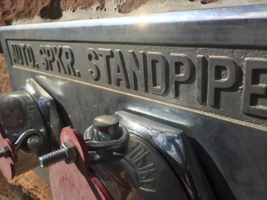
I think this is DIN or a variation on it. The only small difference is that the R leg in the photo is attached to the intersection between the bowl and leg, rather than in the DIN I know, where the leg is only attached to the bowl of the R. The biggest defining factor here is the squareness to the bowls of the D and P. Below is an Example of DIN from my laptop.

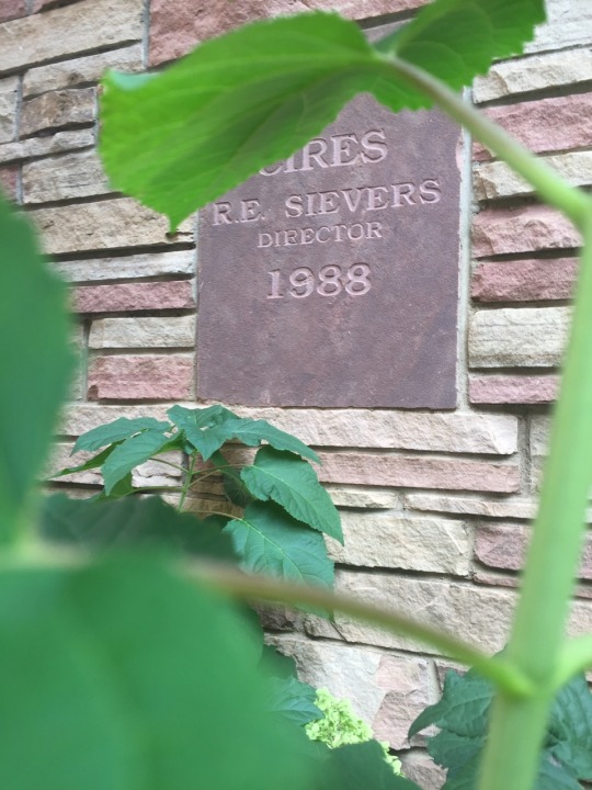
No idea, but I like it.
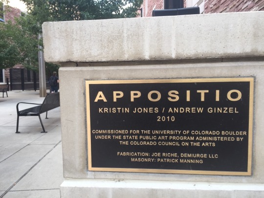
I had a hard time identifying this and I’m not sure if I’m correct... My best guess is Univers, from the 1, having a more straight top part, and the R leg in “Kristen” being straighter than in Helvetica. But I don’t think it’s Avenir or Futura because the letters aren’t round enough.
Also, is that title stretched? The side of the Os in the title look wider than the top and bottom.

I think this is some version of Clarendon because of the little flare on the leg of the R leg, the serif shape, and its slab serif nature.
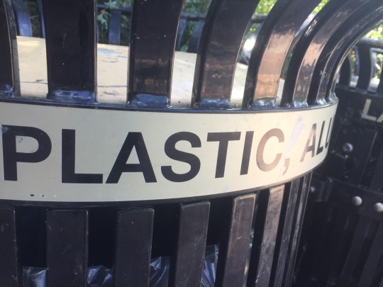
Helveticaaaa! (sing it like the Activiaaaa commercial)

This is good old Times New Roman. You can tell from the middle acceder in the capital W, the shape of the series, the flat R and the closed 6 counter/bowl.
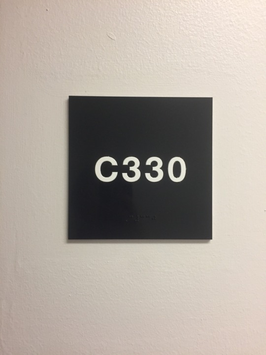
Helvetica: that C!

With a little googling, I couldn’t figure out which it is, but I like its functional nature and condensed-ness.

Helvetica again! Also the Cs and Rs and CU using mostly Helvetica.
0 notes
Text
Type Cymes: the words
Tumblr wouldn’t let me up load photos on the web gui, and I am not into typing that much on my phone. So here are the words that should go with the pictures in the previous post.
___
When I first started thinking about writing about why type crimes are bad, I had to stop and think more than I expected I would. It was just something I assumed and picked up on in the world. Some typefaces are shit. Drop shadows are trash, proper punctuation is important. There are things that, similar to how to set a table, I think most people should know but don't.
So to answer the question is that same as that of a mother to an irritating string of "why?" I don't know, that's just the way it is!
But then I did some research to find out why the things I know are wrong, and problematic in typography, are considered abominable by people who know more stuff than me.
I will address the list here, which address the primary type crimes, but not all of them.
10. Computer styling: Typefaces are designed for their readability and personality. When you distort the typeface, you distort both of those attributes. If you need something shorter, taller, wider or narrower, choose a font family able to support those needs.
9. TOO MANY SIGNALS: Every indicator for text, such as red, bold, underline, and italics, have their own meaning. Using too many signals confuses readers.
8. Orphans and widows: Orphans and widows make text harder to read by breaking it up. Having to look for the rest of the sentence you're reading jilts the pace of reading the text, disrupting the content's message.
The next two I will combine
7 & 6. Using Dummy quotes, hanging quotes, and correct hyphens: Just use the right punctuation. You don't say "you;re" because it's wrong. Or type phone numbers 1&234&567&8910.
5 & 4. Poorly justified type and bag rags: Large spaces between words and bad rags also just make text hard to read.
3. Kerning: Bad kerning affects the understanding of words because letters need to be read as individual words because other you end up with some monstrosities like the ones here.
http://thefw.com/18-extremely-unfortunate-choices-of-font/
2. Drop shadow & debossed text: I still don't understand why this is awful other than because it looks tacky. Possibly it's over use? For all other type crimes, if I did a little research, I got some logic behind the reason for the type crime, but not for this one.
1. Bad type faces: Some typefaces are designed poorly, like Papyrus, and some came about for purposes that they no longer serve, like Comic Sans. Similar to using the correct punctuation, use a type face designed for readability (a "good" typeface), and then don't fuck with it. And you should be good.
And that's all.
0 notes
Photo




Timber is making tumbler not fun.
0 notes
Text
Monogram
I struggled a bit with this. The objective: create a monogram that uses a type face that represents us and it also laser cuttable.
First, I had trouble deciding the type face.
Overall, I am Helvetica: simplistic, unaffected, and utilitarian. I like DIN fonts, but they can also feel a little too angular. I also like Futura, but it's sharp As and Ms and perfectly round Ramona Quimby Os turn me off. But some days, I'm Didot.

Next, I wanted to figure out which parts of my full, given name I should or have to incorporate into a monogram. I looked up a bunch of etiquette blogs, where they detailed, based on an individuals gender and partnership status, the appropriate monogram. My full, legal name is Emily Elisabeth Daub (yes, Elisabeth with an s). As a SWF (single white female), I can either use my full initials (EED), first and last (ED), or just first (E). I despise capital Es. In type, capital Es are unbalanced given their lack of vertical symmetry. Cursive Es that we learn in grade school look like humpback old men. I also don't particularly like capital Ds either, but I can technically drop that.

I started playing around with Helvetica (see row 2 in the second photo). Everything I was coming up with that I liked and felt like was faithful to the type, and my personality wouldn't come out well with the laser cutter. I tried tying the eye of the e to the solid part of the cut, but it no longer looked enough like Helvetica.
*On the lower left, I was playing around a bit. If my partner, Jackson, and I were to have a dinner party where we got monogrammed anything, this would be the monogram appropriate. I think etiquette is both horrible and fantastic. Horrible, because etiquette institutionalizes my existence as a thing to own, but fantastic because I love rules.

After a lot of playing around, I settled on the last the one in this last picture. I wanted to use Helvetica because it best represents me, and I did not find a better solution that portrayed me using the other fonts I tried.
*pdf of laser cuttable file attached to post.
0 notes
Text
De Saussure & Typography
Wow! That was one of the most difficult things to read. I preface this whole writing with my dislike of reading—not of books, literature, or story telling, but of the actual act of reading—and the simultaneous appreciate for typography. Typography makes art out of a graceless, clumsy, time-consuming act. You may agree or disagree with this, but my opinion colors my view of language and typography.
In this post, I will explore the connection between the concept of language explained Part 1 of De Saussure's General Linguistics and typography as I currently understand it. First, in the reading, De Saussure defines language and speech as entirely different entities, which makes sense. Massively oversimplified, speech is the sounds made, and language is how it makes sense. Speech signs (noises make at one point by a human voice box) combined with language make written words.
Typography is, by definition, the "style and appearance of printed matter" (Google). To My understanding of typography specifies typography as the appearance of printed numbers and letters used in communication (as opposed to illustrations and photographs). Also, as I am a bit dyslexic (it wasn't till I was around 8 or 9 that I could read at average grade level), so I have always taken to seeing numbers and letters more as shapes than as representing anything in particular. To me, typography is the beauty found in forms used to communicate concepts.
So how does language relate to typography? Language the exterior process of a brain creating an idea and translating it, so the idea is understood by another person who shares the language. The model used by De Saussure is a person receives language, form a concept from it, creates a new concept to respond, makes that into language, and speaks it to the other person. With that in mind, De Saussure concludes that "language is not complete in any speaker, but sits only within a collectivity." Meaning, no person has a language but is only useful if other people understand the language.
De Saussure later argues at one point that "people pay more attention to visual impressions because they are simply sharper and more lasting than aural impressions." Despite a lack of evidence to support this point, we can take it as true for the sake of simplicity. If visual signs are more impactful to people, there needs to be a system to communicate that. In the reading, De Saussure acknowledges the existence of two systems: ideographs, the encompass concepts in one sign, and phonetic—which we use in english—composing words out of symbols that represent sounds.
Written text, consisting of letters, describe the sound signs that compose phonetically represented language. Letters are shapes that represent sounds, and typography is the appearance of those letter in space. Typography is important to language because to communicate with other people in the society without speech, it must be written. To write the language, we need typography.
I have a connotation that when we use the word "typography," we assume that typography will be good. Like Comic Sans isn't typography. It is. It is just bad typography. Comic Sans in a style and appearance of printed matter, but again, not a good one. As designers, it is our job to use typography for good, to communicate, so our thought-babies (and those of people who hire us) in a manner that the other literate humans that share our method of concept processing understand our ideas.
*I said nothing about how written language differs from speech because, despite the quite phenomenal ball of yarn that subjects it, I think a person is better to read General Linguistics than to listen to my ill-informed opinions on the matter.
0 notes
Photo


Front and back, back to front. Given the binaries given to us, this is what Campbell and I created. I was kind of hopping it would be a guessing game, where you were given secret binaries, and then didn't communicate with your partner, and then put you transparencies together and then people would have to guess your binaries... but it's wasn't. with the game in mind, I tried to think of things that were "front," so like with most projects, I googled what the consensus for front is on the wide interwebzz. I thought weather fronts were an interesting way to create a fill in the blank. I figured I could use As and Ds and bits of 1s to create the images of the fronts (since drawing was a no no), and so the top right photo is what I can up with. At the end, I thought it would be fun to have two halves of our project, that when or together as their binaries, wouldn't look like their parts, so I put the front half of numbers at the bottom of the page (as a second composition, to help people understand 'front'), and Campbell out there back half of the numbers, and then they would line up! Long story short I thought this would be a fun game.
0 notes

