
Last Seen Blogs

doingthingsfordaddy
Come Play

mayormaow
Mayor of Vale

epocasbagliata
Epoca Sbagliata
doingthingsfordaddy
Come Play
mariielouu-blog1
Unspoken
Text
Final Evaluation
I explored a range of different techniques and learnt many new techniques including Hapa Zome, eco-dying, fabric dying etc. The most effective technique that I explored was lino print; this is something that I am really interested in as you can get a range of textured designs. Print was my main technique that I used as I printed wallpapers and cushion covers. Throughout the project I look at a wide range of artists including, Vivien prideaux, Nancy Wolff and Hilary Waters. They influenced my work and gave me ideas for different materials and techniques to use. I also learnt how to edit magazine covers using photoshop which was useful when editing my final photoshoot images and creating a final interior magazine cover. The artists that inspired me for editing covers were Hattie Stewart and Ana Strumf. I loved their bold, intense, colourful and patterned designs. The techniques I explored throughout the project met the purpose of the proposal as I used a range of natural materials, used natural materials to dye fabric, print with and sew into. I also gathered all my inspiration from nature, specifically leaves and trees.
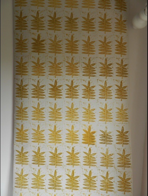
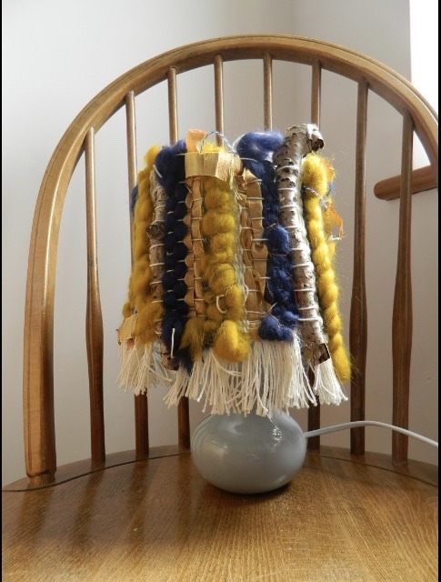
I didn't come across many problems throughout the project, however when making my final outcomes I made a large cushion. I made the back pieces slightly too small so they did not overlap that much at the back. To overcome this problem I attached a button and elastic to the back so it could be fastened up to close the back up. On one of my final wallpaper lengths one of the leaf prints went slightly wrong however when you look at the length all together you don't notice. I couldn't find a large lampshade in a charity shop, so I have created a smaller weaved lamp shade which was still really effective and looked really nice on the wooden side table. When photographing my final pieces I came across a few problems, my wallpapers wouldn't stay on the wall long enough for me to photograph them and because the wall is curved at the bottom I couldn't place the furniture where I wanted them. I then ran out of time because the photo studio was booked up so I had to create a backdrop in the workshop to photograph my final piece which worked really well and I was happy with the results. The point of my work is to raise awareness for deforestation, to make people fall in love with leafy patterns and want to include them in their houses more often. My fmp could be further developed by making a small rug to be on the floor in front of the chair as this would create a sense of warmth to the interior setting as well as bring in some more soft furnishings.
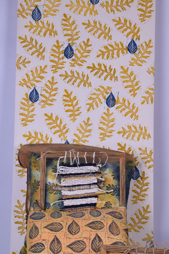
My final outcomes have turned out really well and all are finished to a high standard. I have created two wallpaper lengths of different designs, two cushion covers, a small lampshade, and my best wall hangings and fabric samples have also been displayed alongside my interiors. I have displayed all of these interiors in a professional interior set up and photographed them as you would see them in an interior magazine. I wanted to bring the outside in and I have definitely achieved that with the leafy patterns throughout my interiors and weaving the natural materials through my weaved pieces. I wanted to raise awareness of deforestation and make people realize how precious trees are, when they look at my work and make them want to help stop the global deforestation issue.
I planned my time very well, I managed to get a lot of work done very quickly as I work at a fast pace, so my schedule changed as Ii finished my final pieces early and then only had to finish off write up work and make sure my sample sketchbook was presented nicely. I also made sure that I had the right materials for each day and which tasks and interiors I was going to make. When I got feedback and targets I would work towards them and achieve them each time to make my work stronger. This helped me to develop my work throughout the project to make sure I had enough research, sampling etc. being critical of your own work as well as getting critical feedback allows you to refine your ideas to get a successful and high quality outcome. This has impacted on my work because when talking with tutors it inspires more ideas and further sampling that I could explore, which then I might find a sample I think is more effective than a previous one I have created. I think I challenged myself relatively well in previous projects. I have only made one outcome, however with this project I created a few final outcome interiors to really showcase the techniques and skills that I have learnt. I have learnt that I can push myself and make a lot of outcomes quickly which means I can push my skills and techniques to create more complicated and intricate pieces which I will do in future projects.
0 notes
Text
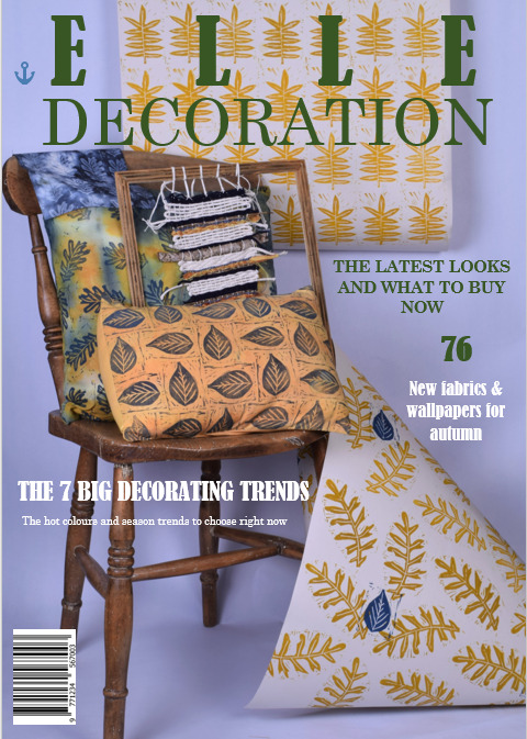
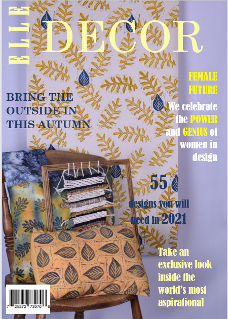
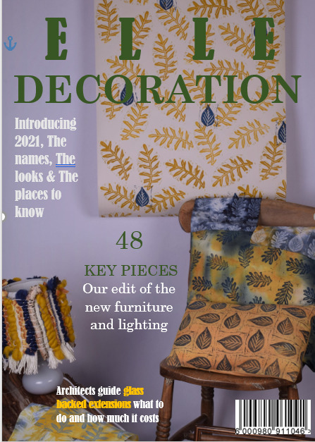
Edited magazine covers
I have edited some of the images that I took to create some magazine covers, I used the internet to search up Elle decoration covers and get inspiration. I included the title in the style of the well known magazine, what's included in the magazine and barcodes to make it look as professional as possible. I carefully thought about the font, considering the size, colour and style and whether or not to use all capitals to create a bold design and stand out to the readers. I did all of this editing digitally using Microsoft word as i did it at home and didn't have photoshop. this alternative was an easy, quick and effective method to use.
0 notes
Text
Final photoshoot images
I have took some major images of my interiors which include close ups of my wallpaper lengths and images of my weaved lampshade that I created. I didn’t have access to the photo studio so I had to create a range of photos how I could. I have previously created a small backdrop at college and o create some creative images that were then edited to create magazine covers. With these images I edited them to change the brightness and to make the patterns on the wallpaper stand out.
0 notes
Text
My final photoshoot
I have took some high quality photo's of my work, with all my interiors which I created as well as some of samples included to show off some of my best work. I came across some problems when photographing my final pieces, I went into the photography studio and started to present my work however the wallpapers kept falling off the wall and because the curved part at the bottom of the wall I couldn't place the furniture exactly where I wanted them. I then ran out of time before the next person had the studio booked, so I decided to try again later however when returning to the photo studio I was told that it was booked up until Wednesday. So to solve the problem we created an area in the workshop to photograph my interiors, we set the backdrop up, placed the lights in front and adjusted them so that I could get a really clear image. The backdrops width wasn't very wide so I couldn't present my interiors how I originally wanted as a full interior set up. I have presented them in a more creative way whilst also trying to get a professional magazine cover effect. I am really happy with the outcomes and coming across this problem allowed me to explore and experiment with alternative ways which I could photograph my interiors. I am also going to try at home ways I can present my interiors so that I can get a wide range of images and then select the ones that I think work the best.
0 notes
Text
Considering my target audience
I can see my collection of interiors working with a brand that cares about the environment and the materials in which their products are made of. I can see having my collection within next home, Marks & Spencer’s home section and if Seasalt Cornwall was to expand into interiors my collection would work well with them as they work a lot with Lino and print. My audience which this product would attract would be of all ages, someone who is fascinated with nature, someone that cares about the environment and deforestation and anyone who is looking to brighten up their home and bring the outside in to their interiors.


0 notes
Text
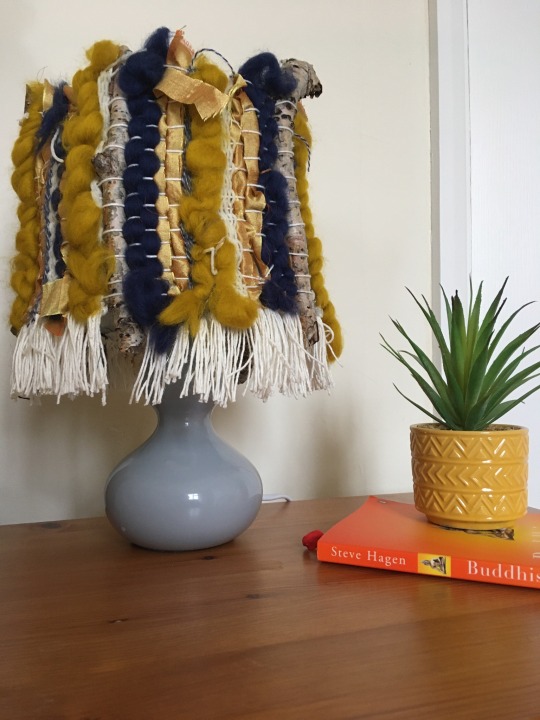
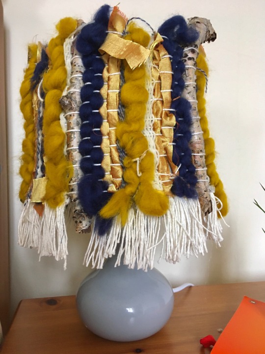
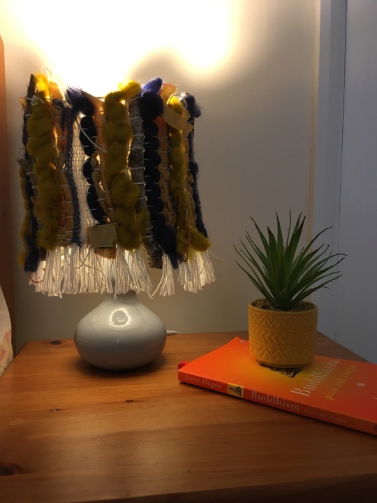
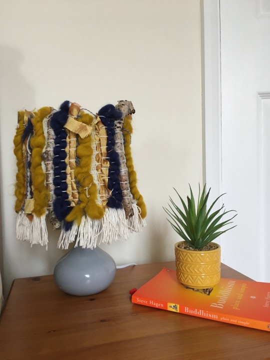
Final lampshade outcome
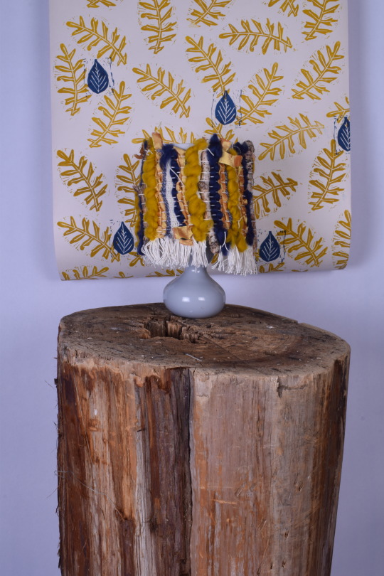
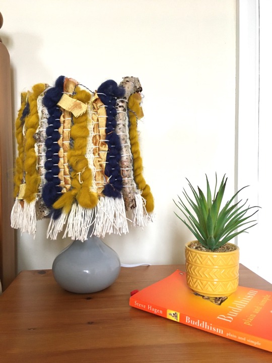
This is my final weaved lampshade, that will be included in my final photoshoot with the rest of the interior pieces I have made. I am really pleased with this outcome I love how it focuses on textures the most, it creates a really interesting lampshade. It is bringing in a more tactile piece to the interior setting, I am really pleased that I have shown off a range of different techniques to create my interiors.
0 notes
Text
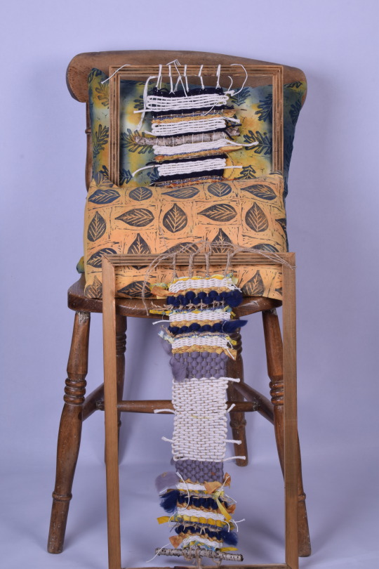
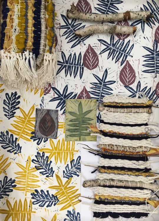
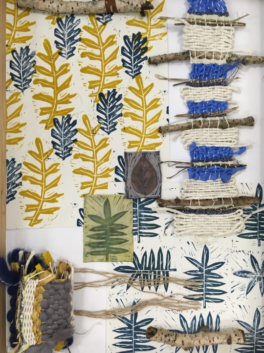
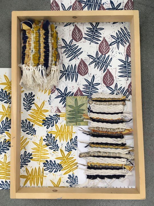
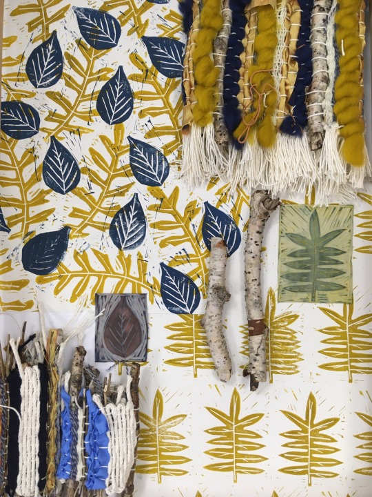
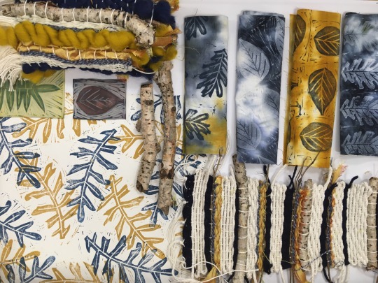
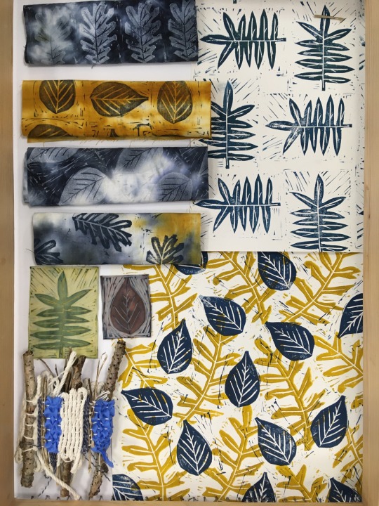
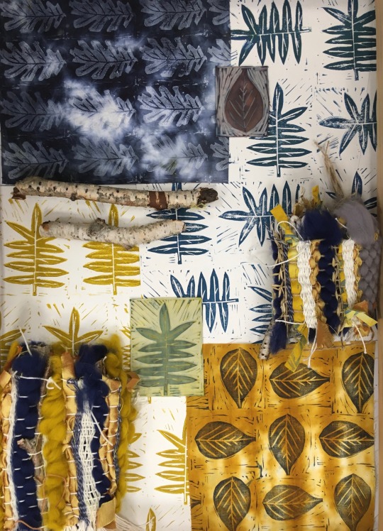
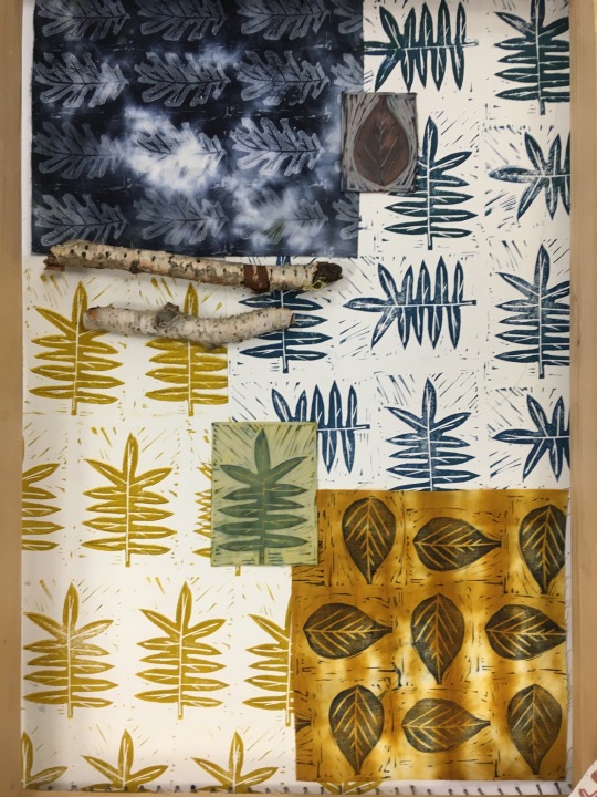
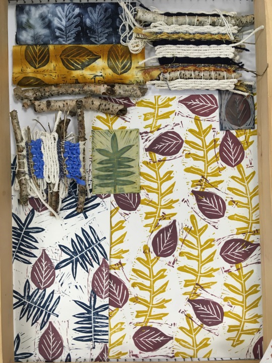
Visualisation Of Techniques And Samples
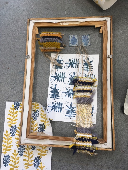
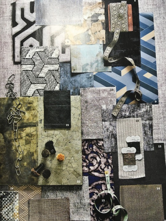
I have visualised my wallpaper samples, weaves, and cushion cover fabric samples together, as well as including materials that have been used including sticks and my Lino cut pieces. Visualising all of them together like this has created a collection of vision/mood boards, making tases have created some really exiting and visually pleasing outcomes. I tested out various different ways seeing which prints, samples and placements worked best, I rolled weaves up to create a compacted area that still showed all the textures and colours used. Most of my samples have the same colour pallet which links them all in together and they all compliment each other really well. I love how creating these small boards allowed to show all the different textures, patterns, details and ideas in one place, it creates a little snapshot of the project and what has been created.
One of the boards which I thought was really successful is the one where I had four of my cushion cover samples folded up, all displayed next to each other. Having two wallpapers samples in each board works really well as it shows how my wallpapers form a collection. I used a wooden frame to outline these boards, which is seen in some of my photos and then some of my photos I chose to zoom in on to create a vision/mood board that you would see professionally.
0 notes
Text
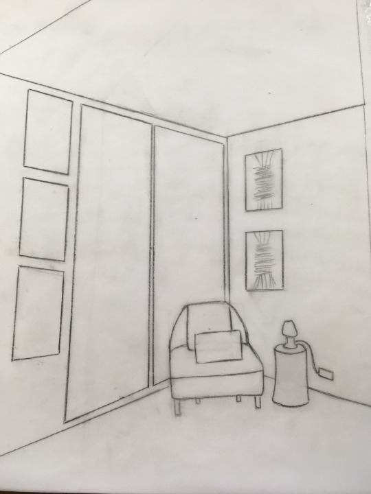
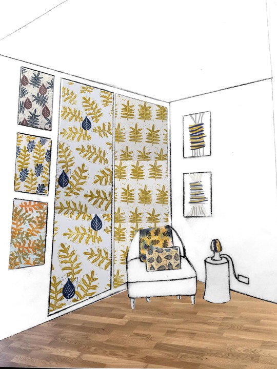
Creating digital mock-ups
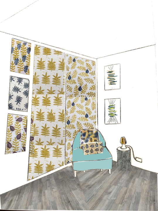
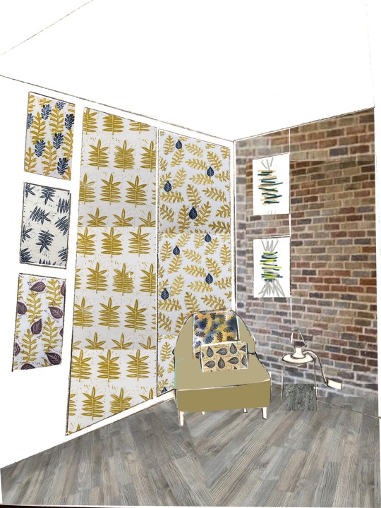
I have create some digital mock-ups to show off my ideas and to see how everything will look professionally. I started off by looking through interior magazines to find a interior setting that was similar to how I wanted mine to be presented. I found an interior that had a corner with a chair and small table the side of it the rest of the interiors I could adjust to fit my design ideas. I traced over the image, drawing the walls, ceiling, floors and any interiors that I wanted to be included. I then added the outlines of my wallpaper lengths, wallpaper samples, wall hangings etc. This was then ready to be transferred into photoshop.
I created a really clear digital mock-up up design, this shows and gives me a good idea about how this will actually present it. I used photoshop to digitally edit my image that I had drawn and drop my interiors into the desired sections. First off all I changed the levels on the image so that the black lines were darker and the white was clearer so you could see that contrast. I then used the select tool to select areas and then cut them. I chose the image that I wanted to drop into the setting and copied the image over. I then resized the image to create the perfect scale got each interior piece. I added a wooden floor to see how I could edit my photographs of my interior to create a successful magazine cover.
0 notes
Text
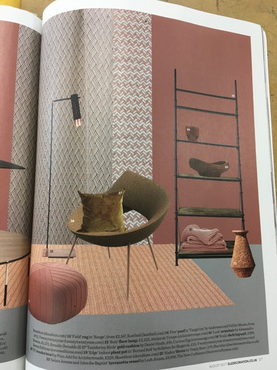
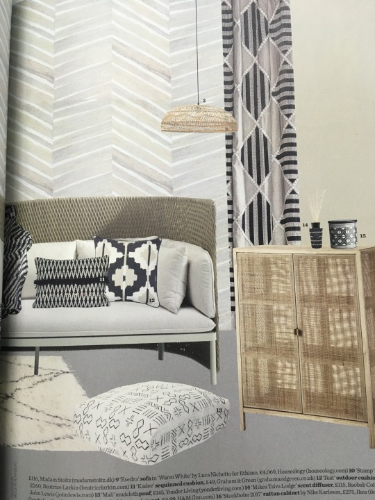
Magazine covers inspiration
I’ve looked at a range of magazines covers to see how they are presented and edited to look professional and effective. I have looked at the different fonts of writing that they use and how they are places on the cover, the writing is always bold and normally runs along the top which is the name of the magazine. Then on the magazines cover there is smaller details including what topics there are in the magazines, barcodes smaller writing promoting the interiors etc. These are all stuff which I can include on my magazine cover when I edit my interior photoshoot photos. The colours are also well thought out the text needs to compliment the interiors on the page so when existing my photos I will use text colours that are the same as my interiors.
0 notes
Text
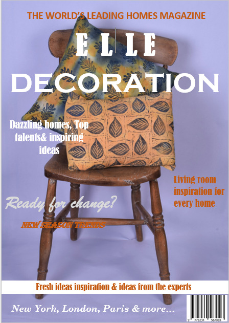
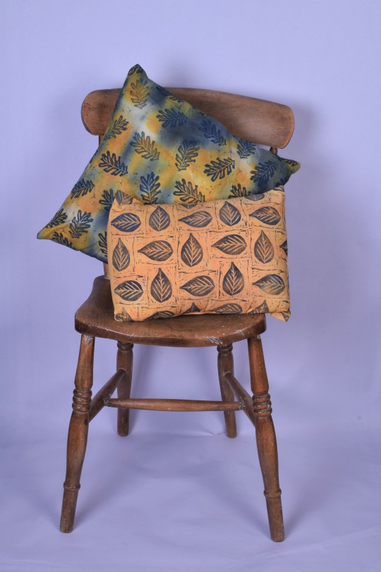
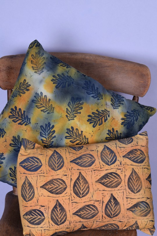
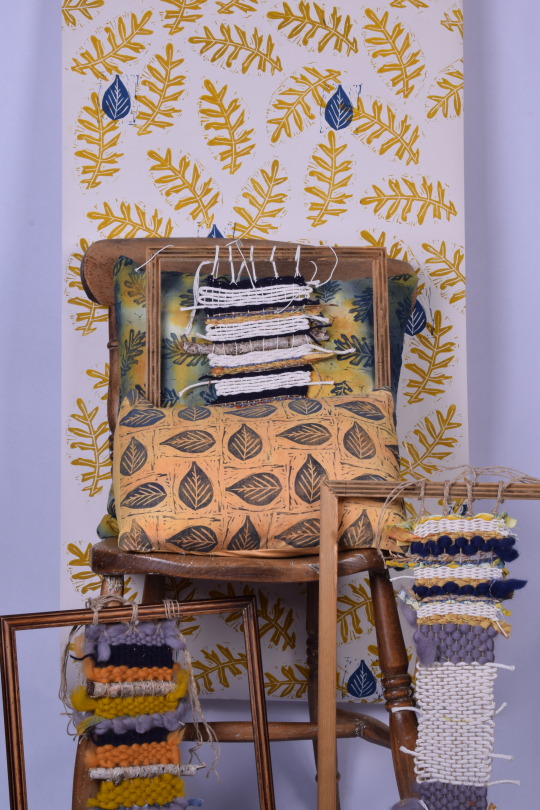
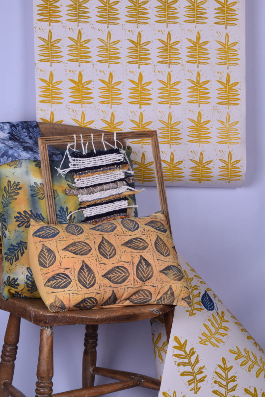
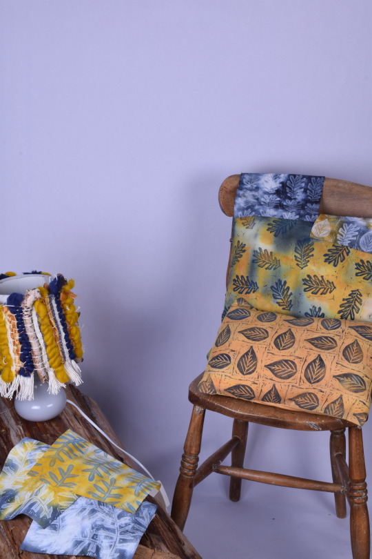
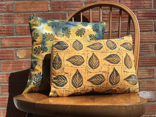
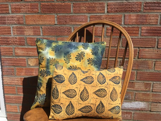
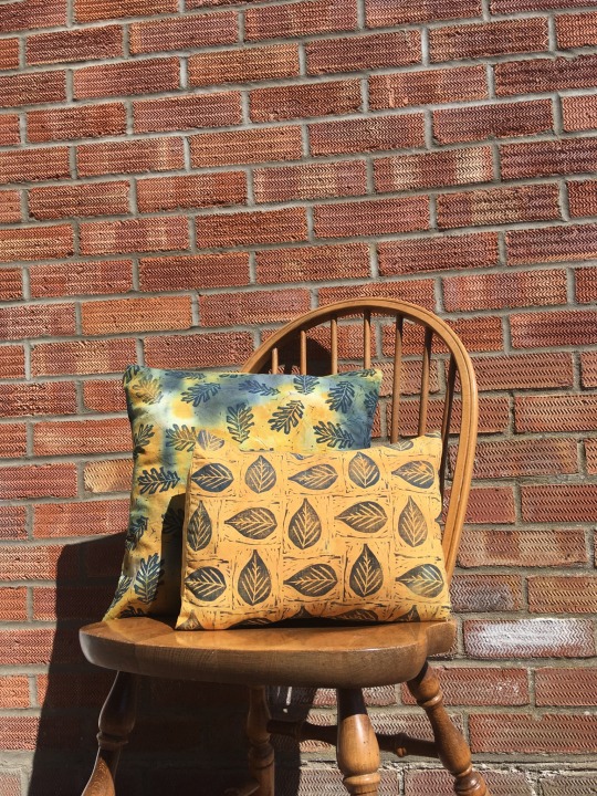
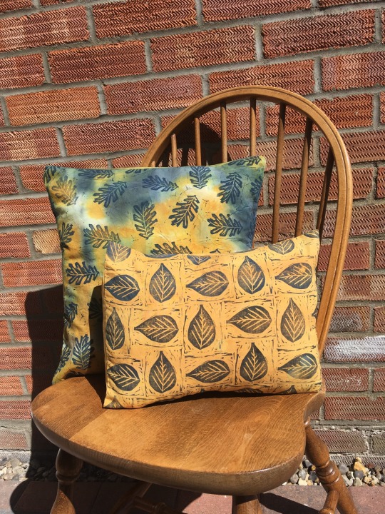
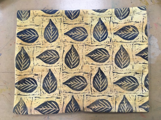
My final cushion covers
These are my final cushion covers presented on a wooden chair which is what they will be on when I present them with my other interiors. I decided to put them in front of a brick wall because it creates a textured but simple background and I thought it worked really well. The rust colours of the brick complimented my cushion covers really well. I am really pleased with my final cushions and both the larger and smaller one look nice next to each other. Varying the scale of cushion definitely worked well as it creates interest rather than them being the same size.
0 notes
Text
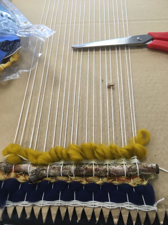
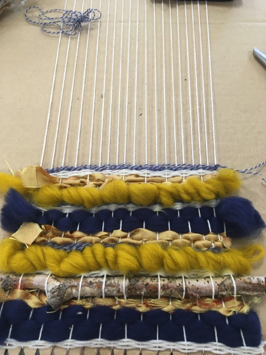
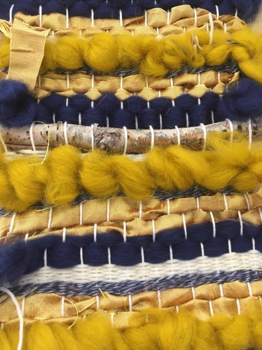
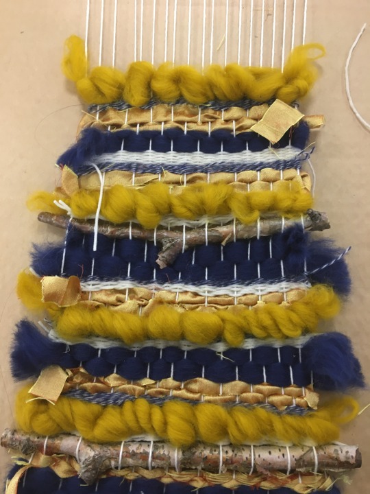
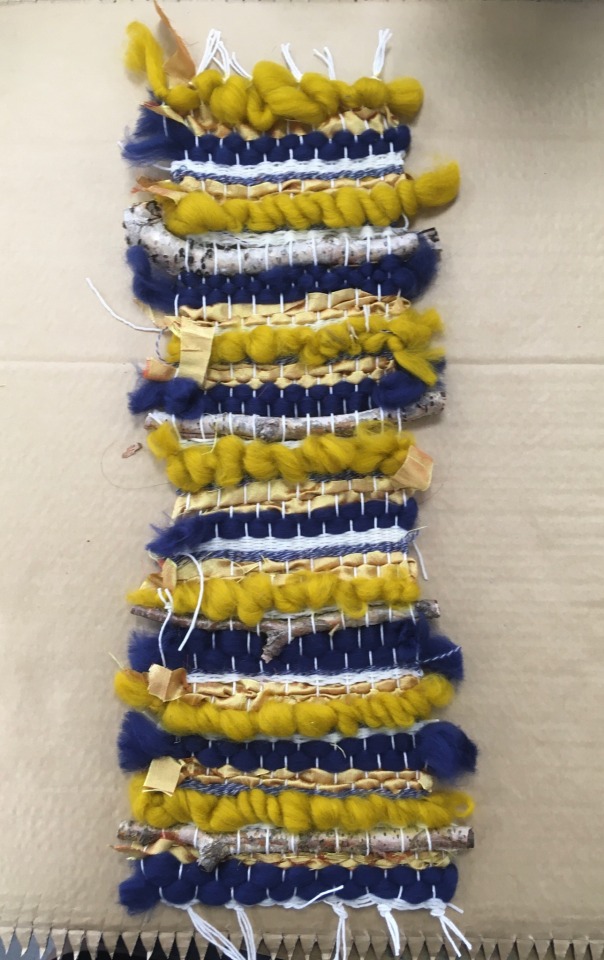
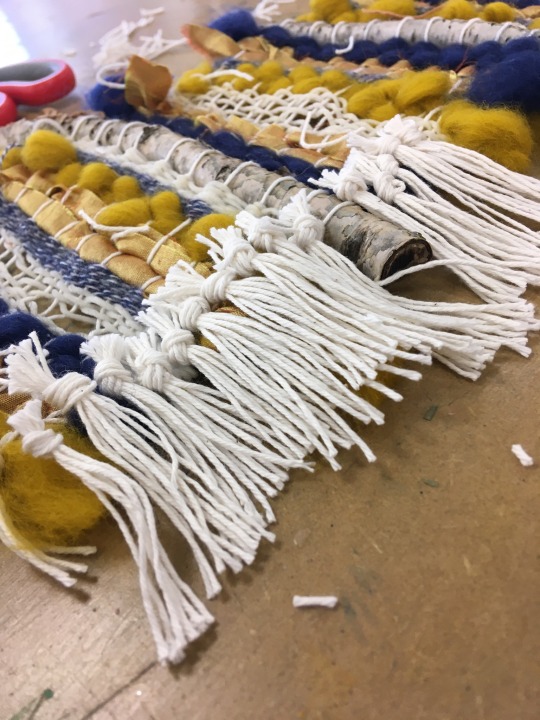
Creating my weaved lamp shade
I have created my weave length that will be created into a lamp shade. Once joined and placed around a lamp this will be another interior piece to my collection. I used a range of materials including, string, twigs, fabric and wool. Having a range of materials creates a range of textures which was really effective, the main colours that I used were dark blue and ochre so that I continued my colour theme through this interior piece as well. Once I had completed the weave I then stitched some of the area together to separate some of the threads to create holes. These holes that I created will be the gaps where the light will shine through the lamp shade. The final thing that I did was add textured tassels along the edge to make the width of the weave bigger and to also create interest along the side.
0 notes
Text
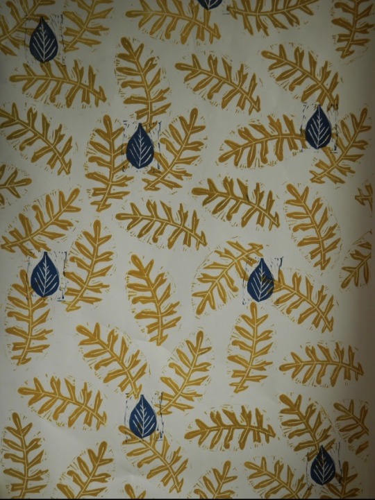
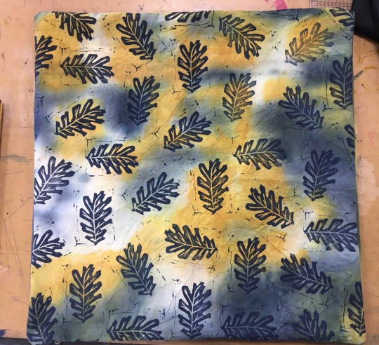
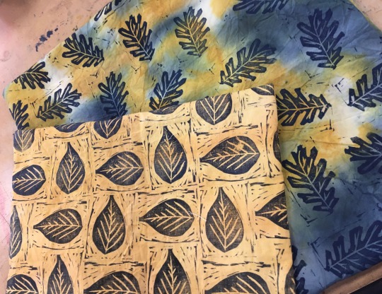
Printing over a few of my previous samples
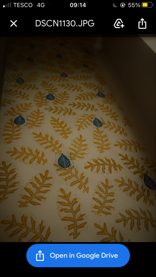
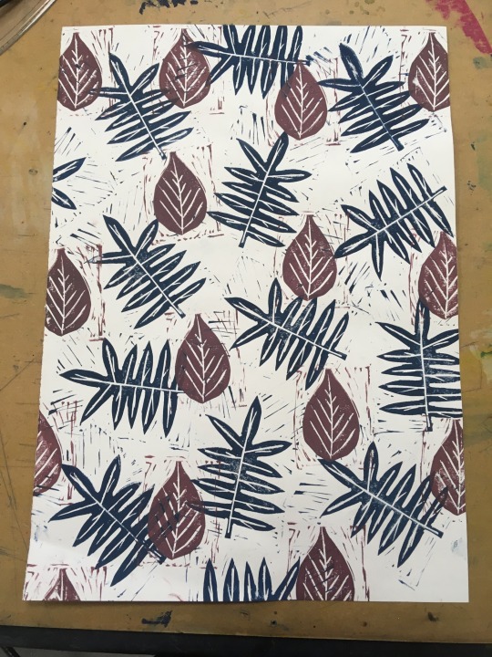
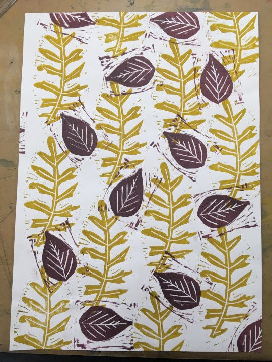
I have developed a couple of my wallpaper samples, so that I have shown a wide variety of colour throughout abs mixing layouts and shapes of leaves. I worked over the top of both of these samples with a rich dark pinky purple shade, this added interest to the designs and made them less simple. For the first sample that I worked over I used a more arranged layout whereas in the second sample I used a scattered composition. Out of the the two samples I think the blue and purple sample worked the most because the colours complimented each other really well and created a design that was unique and effective. I really like how this one turned out. I am going to cut down all of my samples so that they look like they have been cut off a roll and making sure that the design covers the whole area of the paper.
0 notes
Text
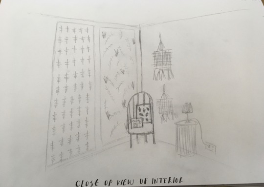
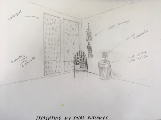
Initial sketches for presenting my interiors
I have created some quick initial interior sketches, I looked through interior magazines to find the type of set up I wanted. I then used tracing paper to trace the walls and floor so that I could get the main scales right. Then I started to free hand sketch the wallpapers, wallhangings, chair, cushions and the side table with the lamp. I then added hints of colour with watercolour to show how the colour scheme will work.
I then created a second drawing to show how I was going to present my wallpapers. I showed the idea of the plain or brick wall as the backdrop, and then the wallpaper being held up to show a large section of the wallpaper.
0 notes
Text
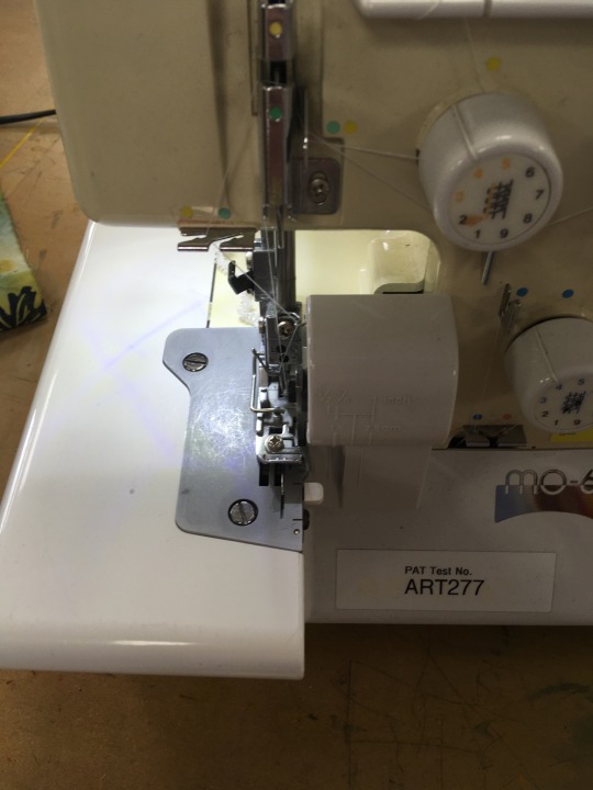
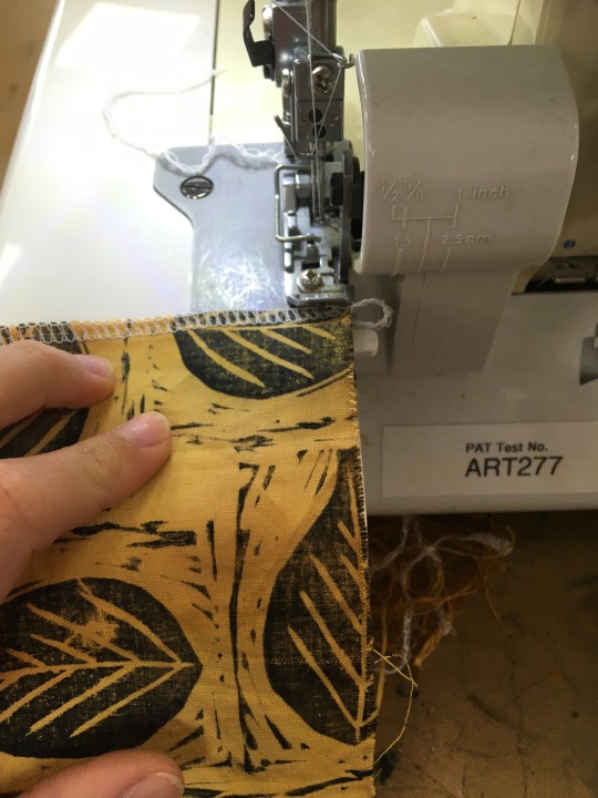
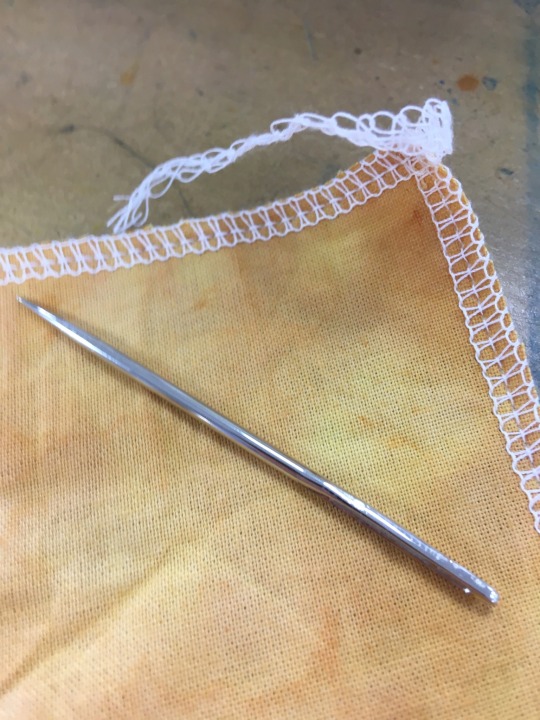
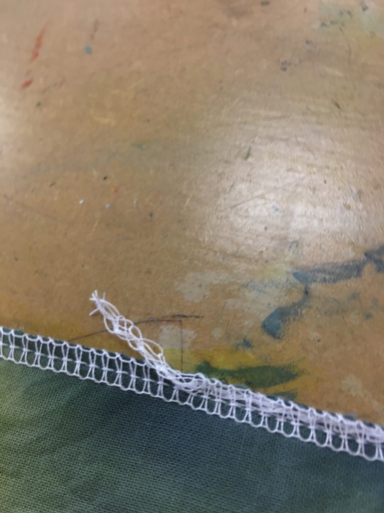
Making up my cushion covers
I have made up both of my cushion covers, so that they are all ready to be presented. I started off by using the over locker to overlock every side of my fabric pieces, once they had all been done I then tucked the tails of stitching into the stitching that had been created on the fabric. Tucking the tails in makes sure that the stitching won’t come undone at a later date. I then hemmed the sides of each cushion where the overlap would be on the back of the cushion covers. I then used a Benina Sport sewing machine to sew along the hem. I then placed the right sides together, pinned around the edges and sewed all the way around the cushion. I then turned them the right way out and used a thick needle to push out the corners to get them as crisp as I possibly could.
The smaller cushion had a good sized overlap at the back, however the large cushion for some reason I had cut it slightly to small and the two fabric sides were only just overlapping. However because this is on the back it won’t be seen when I photograph my interiors. If I was to make these cushion covers again I would make sure that both back pieces are bigger enough in width to overlap enough.
0 notes
Text
Quick initial ideas for presentation
I have took some initial photos of how u could present my materials and interiors. The first image is showing how I could visualise the textures and processes that I have done, using an old wooden frame is a really effective way of creating a statement. I definitely want to use a frame to showcase these elements, the frame doesn’t have to be perfect it can have things stapled to it, scratches, marks etc. The more worn the better as it adds texture, and makes it more interesting to the audience. When trying this out quickly I laid my weaves out, as well as rolling them up, included my cut Lino pieces, and wallpaper samples that I have printed. This also allows me to see how all of my interior look together and see if they compliment each other nicely.
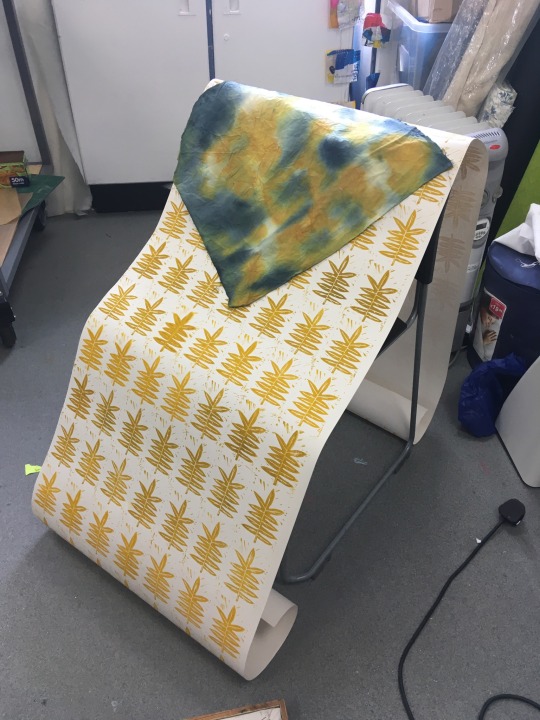
Another thing I quickly presented wall my wallpaper length, I draped this over the chair and this allowed a great area of the wallpaper to be seen. I then draped a piece of dyed fabric over the top to hint of what the cushion cover could look like on the chair with it. When displaying the wallpaper on the chair u would have to way it down some how with a weight so that it creates some shaping, once my cushion cover is made I can place that leaning up against the back of the chair, which will showcase two of my interiors together.
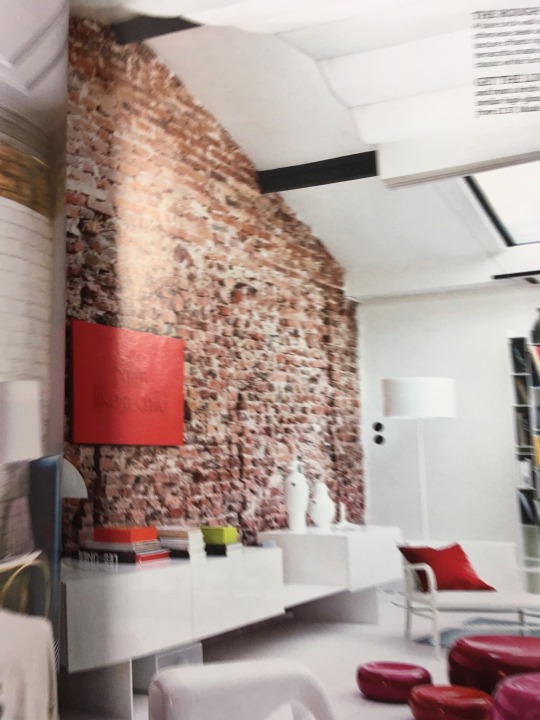
Another thing that could be a possible way to display my wallpapers is to have someone holding it up against a brick or plain wall. Then taking the photo from a far distance so only the wallpaper can be seen and so there is nothing distracting in the set up.
0 notes
Text
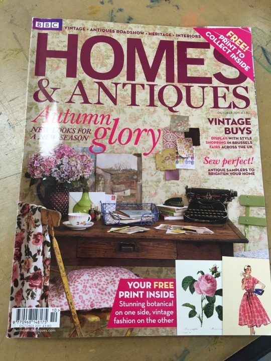
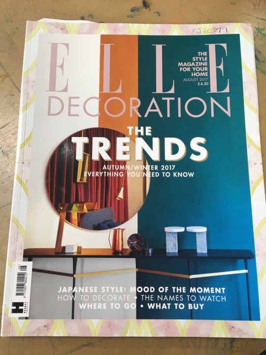
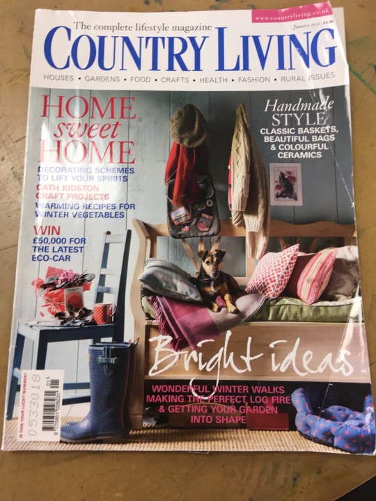
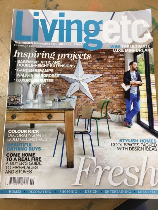
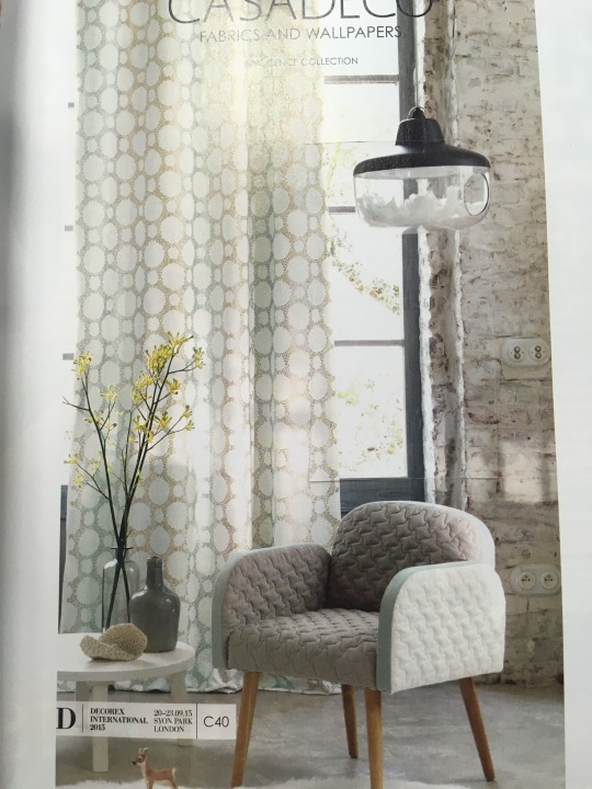
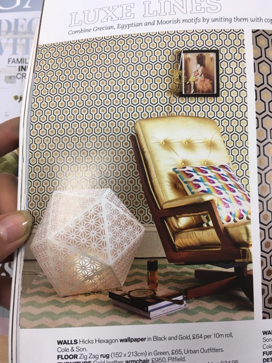
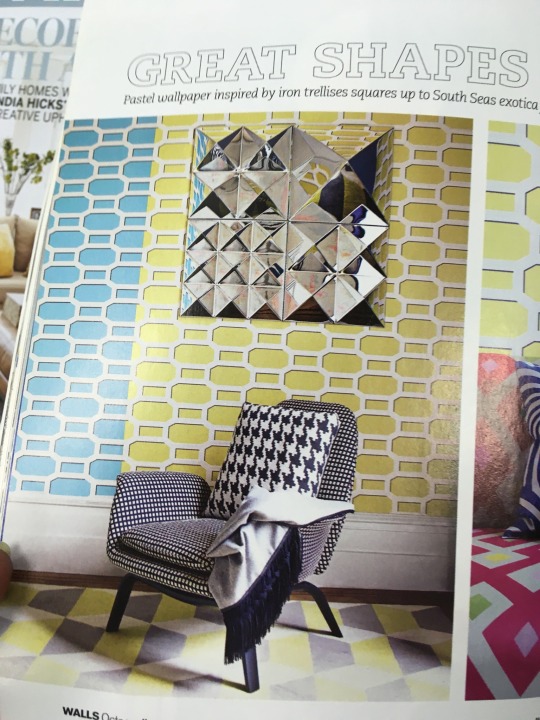
How interiors are presented
I have looked through various interior magazines including Elle home etc. To see how interiors have been presented and displayed, I want to present my interior pieces in the most effective way possible which is why I have seen how other people have done this and see what approach works best. In a lot of the interior set ups they have placed the chair in the middle of the photo as a sort of focal point and then added details to the side of it for expample a coffee table or small side table. I am going to recreate this by using a tree stump that is in the art department I can then place my lampshade on here with the light shining out into the setting. Adding small details like flowers, magazines, books, cups etc. Can really transform the photo and make it look like the area is practical and lived in rather than just the interiors placed in front of a blank backdrop.
I also looked how materials and key elements of the project/ interiors have been presented. They can be presented in a type of mood board, showcasing the textures patterns and details close up which you might not necessarily see when looking from a far distance. Overlapping and building up these elements can create a really interesting and visually pleasing way to display things. This is something I am definitely going to experiment with to get some effective photographs for my digital website and submission. I am going to look through a load more interior design magazines to get more inspiration, I am also going to experiment with presenting my interiors in different ways before I make up my mind which ones are the best images.
0 notes
Text
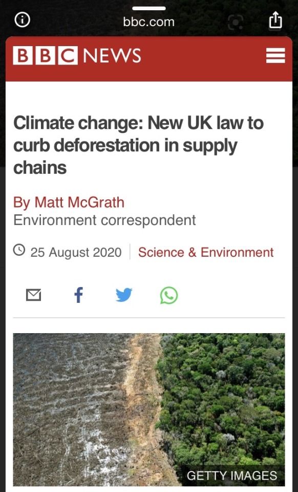
Climate change: New UK law to curb deforestation in supply chains
UK businesses will have to show that their products and supply lines are free from illegal deforestation, under government plans. Companies would have top show where commodities such as cocoa, soy, rubber and palm oil originated from. It will be illegal to use products that fail to comply with the laws to protect forests and nature. According to a new survey from WWF 67% of British consumers want the government to do more to tackle the issue. the cutting down of trees and the cleaning of land, usually for agriculture is responsible for 11% of global greenhouse emmisons. The UK government now says it wants to address this issue by introducing a law to ensure that the supply chains of larger companies and the products they sell are free from illegal deforestation. Companies would have to ensure that commodities such as palm and soy were produced in line with local laws protecting forests and other natural ecosystems.
My work will hopefully reflect how special all types of trees and their leaves. I wanted the nature inspired patterns to draw attention to the audiences eye and make them think about nature and how precious it is. Adding nature inspired patterns into very day interiors will hopefully make people realise how beautiful nature is and how we should protect it at all costs. If there are no trees, leaves, wildlife, habitats, forests, woodlands, weeds, flowers etc. Then there will be no nature to get inspiration from for art and textiles. Trees being cut down will effect a lot more than the habitats, and climate change.
0 notes