
Last Seen Blogs

goldatronic
glitter && gold
sparezo
Sparezo

kitandfelix
It's For The Best

eharly
Untitled

ohcheck86
Untitled
Text
course reflection
This course has been a great learning process, solidifying both my major change and future path. I enjoyed getting a lot of in-process feedback from Professor Khalili and classmates, and I feel that this made me more comfortable and confident in my own creative process. I loved the setting of a working studio, especially getting to tune into conversations other people were having about their work and learn from those comments. I would highly recommend Professor Khalili to anyone taking this course, as she takes it way beyond an intro course and meets every student at their current level. She’s super inspiring and I have so much respect for her!
I enjoyed being pushed out of my comfort zone by some of the projects, and creating results that are much different than I would’ve expected. I loved critique days, especially seeing other people’s approaches to the projects left me feeling very inspired. It was important to get outside of my own perspective and expand my vocabulary.
My favorite projects were the type abstraction and logo. The type was particularly challenging for me, but I learned to step away from the project and then experiment more to create something new and unusual. I have always loved simplifying information and presenting it creatively, and the process of the logos was just that. Working on paper for the majority of the project and only going to the computer once the final product was in mind worked really well for this project. This project was a good reminder that ideas are best formed by hand. Overall, I’m very thankful I chose this minor and am looking forward to Type II in the spring!
1 note
·
View note
Text
blog post 6
The section about programming in the text reminded me of an alumni who recently came to my infographics class. She works in complex data visualization and uses code to make most of her final design pieces. I found the connection between programming and design that Mark Webster drew very interesting. I found the section on schooling very informative and helpful. As of right now, I am exploring options of continuing education or going straight into my career. Their take on schooling and what to look for in a design school will definitely help guide my search.
I found the critique of the logo project quite inspiring. I liked seeing other classmate's work, especially since we didn't see as much process in this project. Some of the logos really stood out in their use of style and detail to emphasize the character's disposition. Since making the logos flow coherently together was one of my goals in this project, I was happy that the class noticed this and that it was successful.
Project 5 was fun! I liked the process of finding objects and thinking of ones that might have very different semantics. The typeface definitely took some time to determine, as I wanted to keep it simple to downplay the bold purses. If I were to add to this project, I might play around with the formatting and organization of the objects, as it would be interesting to see if there is another way to organize them.
I found the day at the library super inspiring. I took a lot of pictures, and felt that using physical books as inspiration was helpful. Both the content and layouts were helpful. I noticed that some books had a succinct style (one of the books on Amsterdam design in particular, and the white "Designing Design") whereas some others deviated from a theme/layout more frequently.
1 note
·
View note
Text
blog post five
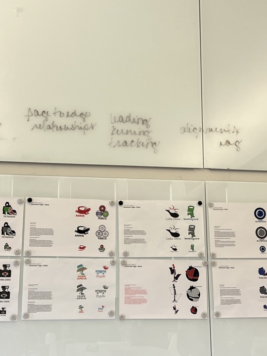
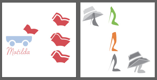
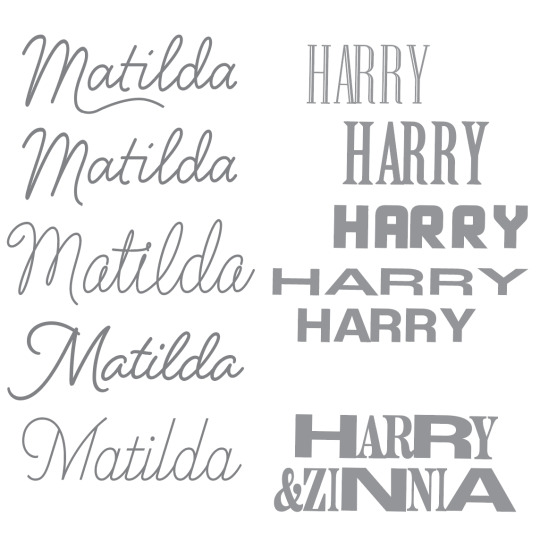
In the past two weeks, I worked on refining the logos. I added aspects that connected Matilda’s mark with Harry and Zinnia’s, such as refining the heel, and having the white space similar widths between the marks. Some of the refinements/process are shown in the image below, although there were many more iterations to get to the final product. This process was quite tedious, as I felt there was always more refining to do. I thoroughly enjoyed the process though, and I feel that my final marks are more representative of the characters. In this, I was able to include an aspect of the ribbon twisting, one of my original ideas for Matilda. I also added a stroke around the Harry and Zinnia logo, both to add a third color and to emphasize the childish nature of the couple. Since I had such a clear idea of typeface for both logos, finding the right type was challenging. I went through Adobe fonts and tried out many typefaces, with a few of the largest contenders below, before I found a typeface that I settled on. This part of the process took trial and error, and time, as I found a lot of fonts that I liked but didn’t fit for the project.
I find it interesting how flexible and adaptive the design industry is – mostly, out of necessity. It’s interesting to decode which parts of a design should be kept and which should be updated, remodeled, and refurbished to meet the digital needs. The implementation of digital media also has different purposes, where an app can provide totally different information and layout compared to the same company’s magazine. I also thought it was interesting the connection between designer and entrepreneur – it was a similar theme throughout the individuals being interviewed that a successful company often begins with a design-brain.
1 note
·
View note
Text
blog post four
The concept matrixes were challenging but produced interesting results. I liked trying a different way of idea brainstorm and would consider using this method again. I thought it was especially useful for Harry and Zinnia’s mark, as I took a piece of each character and meshed them together. I also found it easy to render 16 sketches from this giant pile of ideas, where in past assignments I did not practice as much divergent thinking.
The mood board is a convenient grouping of ideas and I have been keeping them in my line of sight as I work. I’ve found this very helpful, especially since sometimes my brain gets carried away from my original idea or project. It’s a good framework to follow.
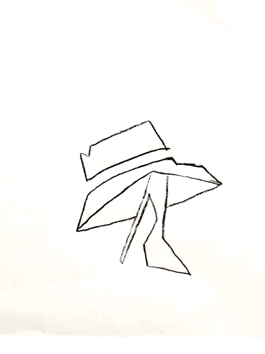
Choosing one of the sketches to move forward with was more difficult, especially for Matilda. I plan on taking a few of the sketches into Illustrator to see what possibilities arise when they are in digital form. I have a feeling that some are going to transfer stronger to digital compared to others.
I think it is interesting how applicable the foundation of graphic design is to many different fields. I think it suits the field well that designers are sort-of investigating and creating their own careers. I think that the integration of new medias and industries provides for so much growth in a design career. I strongly agreed with this quote: “Truth be told, there are very few domains in which the input of graphic designers doesn’t enhance the result and elevate the conversation”. I thought it was funny when one of the interviewees said that he was against 3D type and logos – something I’ve seen a lot of recently on social media and in branding and is a trend right now. Another quote that I liked said not to worry as much about what you want to do as who you want to work for. This makes a lot of sense – inspiring people make for better ideas and work!

1 note
·
View note
Text
blog post three
In this week's reading, I appreciated how thorough the text was in showing various design careers. Among the ones listed in 120-184, I found the branding and packaging design, editorial design, and social innovation most interesting. I really enjoyed the work of Susanna Shannan and the way it was bold and typographic. Even something as daily/a staple as a newspaper can be well designed and innovative. Something else that resonated with me was the idea of bringing positive change through a career in design. Since images and words together are most remembered by people, it only makes sense that powerful messages can be explored through design. I also liked the work of Craig Frazier a lot. His illustrations are quite simplistic compared to others in this chapter, but they have a cohesive theme and in their optical illusions, show interaction with man and his surrounding world.
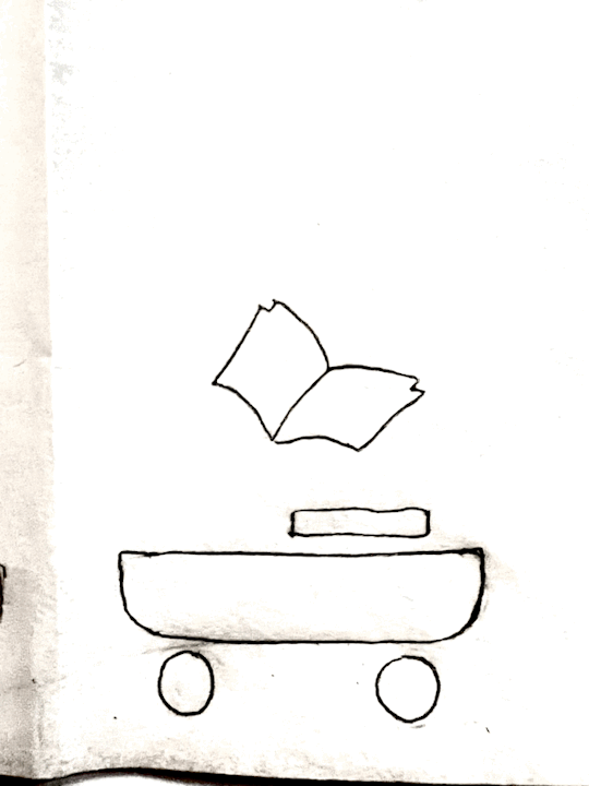
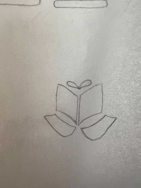
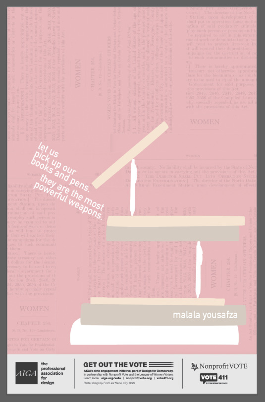
I began this project with a very clear sense of how I wanted to visually represent the quote. My chosen quote was from Malala Yousafzai, "Let us pick up our books and pens. They are the most powerful weapons". I liked the contrast in this quote between peace and war, and the focus on female empowerment. I used reference images of my own books and pen to construct the illustration below. I wanted to keep the poster minimal, as books and pens are some of the most foundational items for individuals in countries that require education.
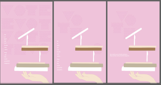
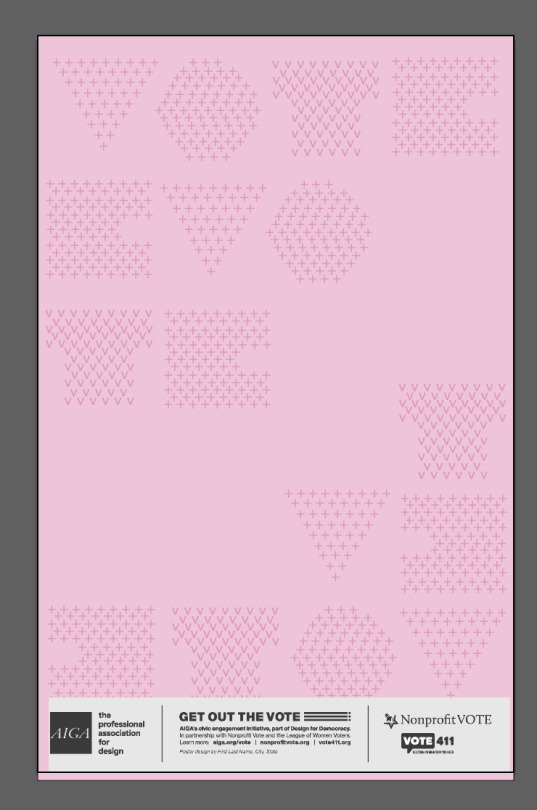
All this time, I kept playing with this image and idea (The image above), and I came to a final piece, as shown below. However, during this process I also began to start an idea with the "VOTE" letters in the background. The compilation of checks and V's was an idea from my original sketches, but I placed them to form geometric letters. I also had the outlined geometric forms I used to create the letters on a separate art board. These letters were interesting so I developed this idea alongside the books and pens (also I was getting increasingly uninspired by my first idea).
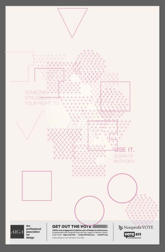
While playing around, I had the idea to combine the geometric forms and letters made from ++. I wanted a "scramble" effect, and the visual effect of layered objects. After experimenting, I found this idea really compelling. So compelling that I changed quotes! I found one of the quotes that included the word "VOTE", as that was already in my poster. I thought the quote shared a similar message, hence continuing with my choice of color scheme and style. I found it simple to integrate the quote into my illustration, emphasizing the most important part - "USE IT". It definitely took a while to get to this idea - but sometimes that is how the creative process goes!
1 note
·
View note
Text
blog post two
I really appreciated Pierre di Scuillo’s work in making signs that were out of the ordinary and had design sense. Something I noticed while travelling in Amsterdam and Copenhagen was the continual presence of aesthetically pleasing objects. Buildings, signs, posters, advertisements, and even physical spaces all looked polished, visually appealing, and interesting. There is some intelligence in whoever hired designers to contribute to everyday surroundings – it really makes for a more convenient and aesthetically pleasing life.
I thought it was interesting how Jose Fresneda said that he was nervous while looking at Justin’s portfolio, a fellow student in his grad program. I love how they ended up becoming partners in a studio – what better way to react to someone’s work you love than to work with them! I feel like usually there is a reason why you are pulled so strongly or intimidated by someone’s work: it shares elements of what you value and strive for in your own design. I think embracing other talented individuals instead of competing can be key.
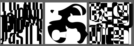
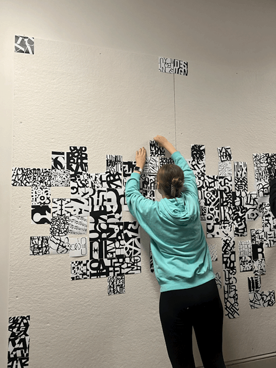
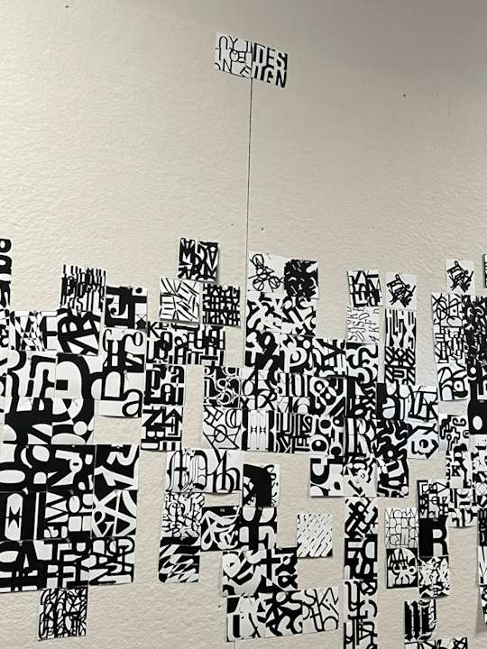
The project these past two weeks was somewhat difficult but very informative to nuances of type. I struggled at first in manipulating type in a way that felt abstract and new. For some reason, sometimes the simplest tasks can be very challenging. During the critique in class, I enjoyed getting feedback on my pieces. Using this feedback, I played more with the center square that has Arial Black typeface. I chose to “crop in” on a spot I liked, and then layered more letters around this sweet spot. Similarly, I cropped into the upper left corner of the rightmost square. I then recombined a few letters to create larger “blocks” of black and white in the outer corners.
My final pieces stand well individually, but I think there is some disconnect when the three are placed together. I think that the left upper square is my strongest of the 3 (Typeface: Ainsdale). The different “weights”, with more negative space in the lower right and upper left corners and a denser pairing of letters in the left-center area creates an interesting contrast. The play between vertical lines of the typeface and the diagonal cuts makes for interesting movement.
When placed in a larger group, I think my squares (besides the “C” one) used smaller type size than most. Many squares used negative space and more dense, blocky text. While my pieces contain negative space, it is more evenly distributed in the square. I’d say my pieces with smaller typography lose some voice when placed with “louder”, bolder squares that draw one’s eye immediately. In this way, I think the "C" square (Typeface: Arial Black) is most eye-catching in a larger mural. I see some squares that have similar themes to my squares, but none that look super similar. Looking closer at other people’s work, I’ve seen some very inspiring plays with negative space, discontinuous lines, and shapes.
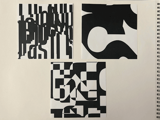
Progress before in-class critique:
Project individually printed and collaborative:
1 note
·
View note
Text
blog post one
The reading this week was very inspiring and informative. I definitely noted the importance of having a well-versed LinkedIn profile for job searches in design and having an interactive and online portfolio linking successful projects. The decision between working for yourself or working for someone else is something I have thought about a lot recently - and I appreciated seeing experts who have been on both sides of the industry. Another point I thought was interesting was the importance of typography in low-budget projects.
Artificial intelligence really brought me outside of my comfort zone regarding these images. I would have personally chosen wildly different images to represent these quotes but in working within the confines of AI, I ended up finding and layering images that not only looked really visually interesting, but were totally unexpected compared to other work I've created. With more time, I would have loved to continue plugging in different phrases and seeing what images resurfaced, as the images I used were found after only a few searches.
I chose to manipulate both of the images. For the mind image, I layered a cutout of the main graphic element multiple times, slightly off-centered. I liked how this created a fuzzy and cascading effect, further exemplifying the meaning of the text. In the watering can image, I layered 2 images on top of each other with the "Lighten" blend mode in Photoshop. I then adjusted exposure, saturation, hue, and brightness.
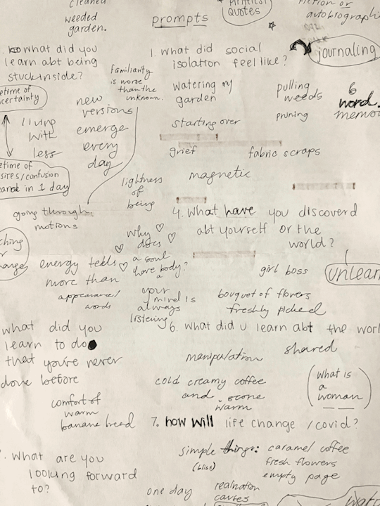
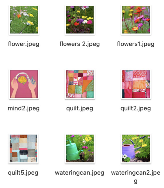
brainstorming 6 word memoirs / AI generated photos, some of which I used
2 notes
·
View notes