Photo


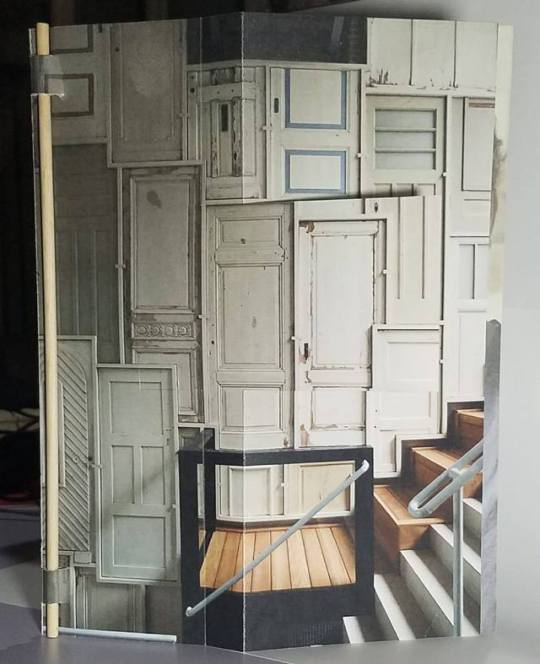
Above are my favorite concepts that I came up with for the Dutch Folio project centered on Piet Hein Eek and his “Recycled, Reused, and Recycled“ products and designs.
Podcast Response
This was a super interesting concept to end the blog posts with for the semester. I had no clue that these architectural remnants had a name, Thomassons, sweet name for such a piece people often ignore. This blog post leads me back to a theater in my hometown where I spent many nights with friends. The whole side of the building that backed up to the alley was filled with these Thomassons, I assume at one time the building had gone through some sort of renovation but what was left behind was doorways, windows, fire escapes etc… that were blocked up and left for aesthetic. I feel like knowing the name and some background behind this specific feature will have me looking at building facades in a new light. If I had to key in on the debate I don’t agree with how they got the name, multiple team switches could mean he was on his way out of the sport and a whole new team dynamic like that could throw someone off their game, so I could see where the family is coming from.
Reading Response
The readings of the week was one that anyone could benefit from it really dives in to the uses of color and how to best maximize the value you draw out of your palette. It hints on using color within your typography to set it apart or to highlight a certain portion. Using different color shapes to segment information or using it to code information. All of these variations of color usage are something I will look to in the future for my designs since I feel like no one ever really masters the use of color, it is something that can constantly change and develop as the technology and field develops.
1 note
·
View note
Photo

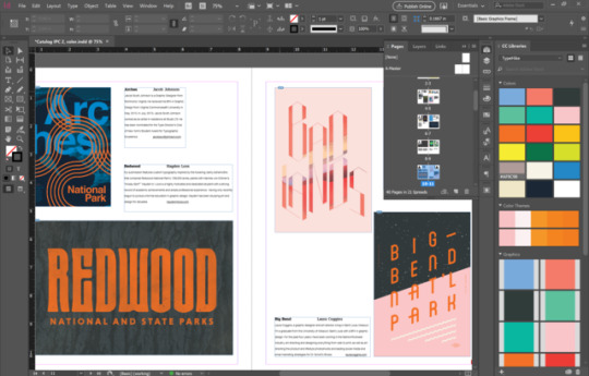
While I am happy with almost all of my designs and concepts there are small things I'm tweaking and doing so many iterations to find the best fit.
Podcast response
This was an interesting podcast to say the least, Massimo Vignelli is one of the greats in the design world nowadays. This coupled with the Helvetica documentary we watched gives us a good luck at this man. I think my favorite part is when they discuss the digital age and its advancements versus his way of design. This man who is still working in such a technologically advance age relies on old fashioned pencil and paper, he has got so good at sketching out designs that he sticks to that relying on others he works with of the younger generation to use the software. I also like his stance on design the idea of forceful versus limpy. Forceful is the types of design that evoke emotion it looks to engage or receive something from the designer, while limpy design is pale in color and has meaningless decorations that don’t matter. I completely understand where he is coming from in terms of commercial art like the ads and packaging that is everywhere I can see where limpy design gets in the way and detracts. Their polishing a turd.
Reading Response
The text for this week dealt with the “decoration” of design and how to make it work. When working with charts and statistics there are ways to make such a bland boring topic interesting to look at. With charts you can illustrate the icons and the overall chart you create so its more pleasing to the eye. Then while plotting points instead of a simple dot you could go with an icon that resembles the group you tested. The last few ideas come in the ideas of colors how they work and a palette you create to keep them consistent and going out of the boundaries you create for a more interesting aesthetic.
1 note
·
View note
Video
Podcast Response
Lisa Congdon joins Debbie Millman this week and this one was the most off the wall guest we’ve heard. She started as a history major, worked as a teacher, eventually a Congressional intern and finally switching to the field of art and design later on in life. Something that does intrigue me and often makes me think is how many well-known designers or just popular designers of today genuinely started with the purpose of being a designer and how many later came to that decision later in life. She is also another one of the podcast guests to land on the topic of debt and how making money in the art field can be challenging at times and does cause the stress that I am sure many graphic designers or artists in general feel at some time in their life. Something that I thought was awesome and could be a very peaceful job was her time illustrating all age coloring books! Who would have thought that was a career that someone in the design field could break into. I hope to one day have a fun job that I enjoy each day and may even bring joy to others upon completion of each of those projects.
Reading Response
The reading of the week covers a few connected ideas like how a grid can cluster ideas or divide ideas depending on how you used it along with website layout and how even if the writing is a language one doesn’t comprehend there is a way to communicate what you need with things that are universally known like numbered steps and division. What I found funny from this reading in relation to the current project is that over the last weekend we were researching our Dutch designers and before the computer helped to translate the text I still managed to navigate the sites based on some imagery and common knowledge about how websites are generally laid out.
1 note
·
View note
Text
Podcast Response
This week’s guest Anil Dash joins the Design Matters discussion on technology and culture how they play off one another and their relationship. To think what my future career path would be like without the use of technology is a marvel in and of itself. I know that from other classes in the past design has been around for a while starting with hand drawn illustrations and printmaking based designs. It just seems like such a daunting task to think about. An interesting question that was asked of Anil was something along the lines of what do you think that the future will think of when they look back on our technology? Will they see it as prehistoric technology compared to what they will have in the future. Not only is the tech advancing but the rate at which the younger generation, like my little brothers age, is absorbing technological knowledge. There have been times where my brother shows my dad things on the iPad or iPhone that he had no clue about. That alone amazes me. I am sure that the older generation of designers looks at the tools we have nowadays and are unsure how we do what we do. The correlation in all of this is that each generation of designers whether they look back on the old schoolers or look forward to the up and comers we must all respect each other’s abilities and tools.
Reading Response
This week’s reading was more on the overcrowding of the pages and how you let designs breathe and work together to give them the best aesthetic appeal. At times I struggle with columns and how to use them. At times I leave my line lengths to long because I don’t feel like there is enough real estate to fill columns but this ends up looking worse off then small columns. Then at other times I do make columns but I don’t format them correctly and my spacing is off. The constant struggle of good graphic design and how to accurately portray your ideas and designs.
1 note
·
View note
Text
Podcast Response
Mark Brickey chose to discuss Paul Frank on his podcast of Adventures in Design. Mark discusses that these characters that Frank creates come across as his friends, then what he sees in the characters are somehow reminiscent of what he would ideally like to see in the people around him. The talk and idea of goals came up later and when asked Frank spoke of the fact that the amount of money that he made never crossed his mind and never controlled him. For me personally money seems to be the only thing that I can think about, whether it be paying for school, bills, buying a car etc. the list goes on and money is everything. Causing insurmountable stress but what Brickey talks about next couldn’t be truer. The discussion moves to doing what you love and that will be payment enough, seeing the beautiful art you made refreshes any doubt you may have conjured in yourself. Paul Frank leaves you with the mentality that pride in your work is far more important than the amount of money you can compile.
Reading Response
The reading for this week was heavily discussing color and its effect it might have on one’s design. For me color is sometimes one of the biggest struggles I face in a design. A project like Type Hike was easier for me because the color palette was handled to us but my thought is that with this upcoming Dutch folio project that I might have a chance to inject some uses of color and possibly get it right the first time, without much alteration to my original color scheme. I’ll have to wait and see what designer I choose and see the color of their work if there is any.
1 note
·
View note
Text
Response to Project 1
What do I say and where do I start with this project... Well I am glad it is finally over the sleepless nights can subside for now. In terms of my skills, the design itself and my progress? Well I like where I started at and where I am now. This project being the first of the semester was a chance for me to see what I could change from last year in terms of what I struggled with. My problems were with color usage and type hierarchy in combination with one another. I feel that as if I have greatly improved in those areas this time around. I started in a good place with my text setup with the size and spacing I think I only had to edit my text once. The color palette, while it was given to us, it was up to us with how we used it. I kept it simple used the Type Hike logo colors for my page markers and then I feel that my choice in paper paired well with the tan of the color palette. All around I am pleased with what I have put together and want to thank my fellow designers for a fun and enlightening critique with great feedback all around.
2 notes
·
View notes
Photo
Process Image
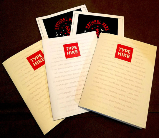
Prints on Prints on Prints...just trying to get it right, also I'm broke.
Podcast Response
This week’s podcast touched on a few subjects that I found interesting. It talked of other podcasts which until this class was a medium I never really touched on, glad I finally have. In larger terms they touched on book cover design and one in particular designing a book cover for a world renown author, Dan Brown, and designing a limited-edition book cover with no monetary compensation. Instead you would get the “networking” by being tagged and quoted for your work alongside these bigger names. They then moved on to buying a book by its cover or simply off of the packaging or labels for certain products, like books and wine or whiskey. While everyone says that you should never judge a book by its cover that’s exactly what we do and how we as designers help the author sell books. Yes their name being attached to the story helps if they’re a famous writer, but initially we pick up a book or even buy it because we like the cover and that is what draws us in first. Something that I hadn’t really thought of was when they touched on the idea of “teaching writing as design or teaching design as writing.” A way for designers to become better writers. I think as students a lot of the body copy or writing for our projects is provided for us if not its something we borrow from the subject of the project. For example, in a website redesign or this Type Hike project we borrow the existing wordage or borrow it from the original sources. I would love to learn to be a better writer, which I learned not only from my design classes but also from the advertising class I am taking where it requires us to work on our writing and how we describe things or sell things.
Reading Response
The reading offered some insight although most of this we have been taught whether from our professors, through each other’s critiques or just picked up along the way. It talks of ways to use your base grid as a jumping off point before manipulating the grid whether through typography, photos or lines.
0 notes
Photo

Process Image
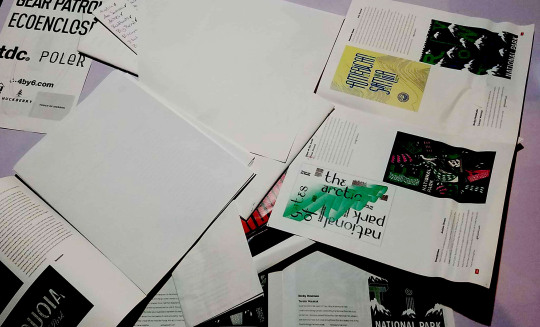
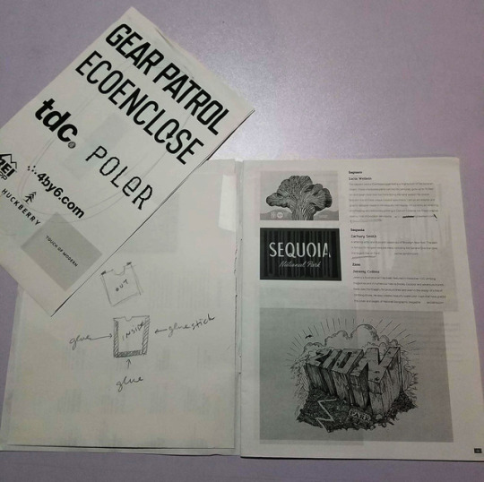
It’s coming along, prints on prints on prints. Lots of dummy making anything I can do to see what the finished product might look like. Editing is key and I'm almost to a point where I'm happy with the body copy set up. Now I'm just working on the cover and pocket problems I'm having.
0 notes
Text
Podcast Response
One of the things that she hit on that I wish I would have got was the moment when she realized that graphic design was what she wanted to do, she had an aunt who was dating a designer and that career field spoke to her. Me personally I never really got that moment, but somehow ultimately decided on graphic design. In terms of her blog and the general act of blogging I approve. I know podcasts and blogs are somewhat different but what I have learned through this class is that I do enjoy blog posts especially art related ones. I follow a couple illustrators and just general art people on YouTube who started with tutorials and switched to vlogs, with the artist vlog you tend to see a lot more than just their art projects. This goes along with her line about putting out to much information in blogs it does on the other hand give you a look into the artists life that you won’t get with everyone.
Reading Response
The text touched on how to effectively use the columns or grid setup that you create, ways that you could enhance your project or draw attention to a specific point. One thing that I think I struggled with when first designing the catalog was pacing. I made so many different “types” of layouts that none of them looked cohesive I feel like I am almost there though. I am just struggling with the last couple of pages where all the posters are of the same orientation and make it difficult to place on a page in a beautiful way.
0 notes
Photo

Process Image
Podcast Response
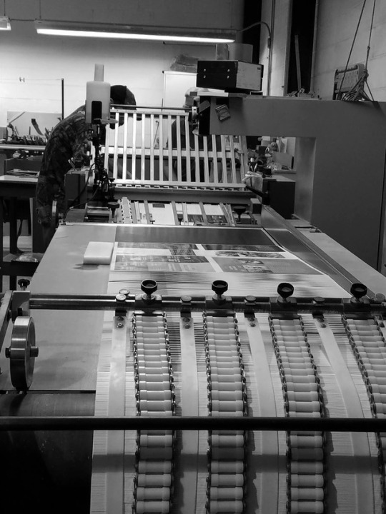
These gentlemen are a hoot to listen to. That being said let me just start that this is one of the few podcasts that grabbed my attention right away. I love logos and logo design and the fact that they started with beer logos and bashing frat boys instantly had me laughing and enjoying the talk. Also as a Target employee I love that they bashed Wal-Mart’s sticky floors. So if we want to give opinions and how we feel about the two types of logos. I get that the redesign for Philz is more professional and looks cleaner, but for some reason I like the look of the old Philz Coffee. I like logos that have more personality and give you more emotion for the company. I just feel like quite a few logos for company businesses have a circular shape and this new Philz does the same thing. The original logo might seen like its wonky, but I find it a little more appealing. In my opinion. This man is adamant about typeface versus fonts. Another fun thing this week was the visit to the Welch Printing shop. We got to see all aspects of how a print shop runs. We never see our files past our screens once we hand it over, so to know that a lot of what we do could slow down the printers or cause our projects to be delayed and pushed backward in the “ticket line†then we need to take better care with our planning. Some of the interesting stuff was the machines that do the folding and the little business card printer. All in all a great day for designers. In terms of the reading, these beginning pages are pretty basic, setting up grids and labeling the different parts. Along with that they show different types of grids like multi-columns and hierarchical grids as ways of setting up the page layouts.
1 note
·
View note
Text
Podcast Response
Steven Heller’s talk this week was on his trials as a young designer and when he would make political based designs the types of backlash and feelings that would come of it. I think the most crucial part that stuck with me in the talk was about 24 minutes in when Debbie Millman asked flipped his “Rants and Raves” question back on him. She asked him something along the lines of the power of posters in earlier design periods versus posters now. He felt that posters still have, if not more, capacity to sway the audience to believe something or side with something. In the case of the TypeHike exhibits and project as a whole these two things directly correspond with one another. The TypeHike just started out as something to raise a little money and garner awareness for the NPS anniversary, but it has swayed people and gained much more ground than anticipated.
Reading Response
“the designer rises above the uniformity implied by its structure and uses it to create a dynamic visual narrative of parts that will sustain interest page after page.” This quote in the opening pages of the text really resonated with me, I feel like I struggle with just setting up the grid and even then I take that grid and stick to close to it, I don't know the ins and outs of when to break the grid and when to reel it back in. Therefore, I feel like my pacing sometimes lacks and the viewers interest might taper off.
0 notes
Photo

Process Image
This week was fun but tricky for me, I didn’t get to speak with Meena yet on my concepts hoping they go over well. I will be tweaking it from the image pictured.
Podcast Response
The podcast of choice for this week was one by Michael Bierut and Jessica Helfand, there discussion begins with the use of letterheads versus daily emails. In this day and age I feel letters are a luxury, while we as millennials have learned how to address and write letters, the younger generation might miss out on such teachings. Emails are so intertwined into education and society that we find ourselves checking our inboxes multiple times a day. If I had to refer to a stack of letter or wait for the mail to come everyday for communications it would slow down the process. A little of a side note but I found it hilarious that on the way to school today they were interviewing a kid who won AGT and she kept thinking they were receiving letters because her dad had printed out the emails, she had two concerns: why would you send letters for such important info and who prints out emails?
Some of the other subjects they touched on regarding circular app design and Wonder Woman. In terms of the app design it is something so miniscule that you don’t realize it until you start looking deeper, I think over half of my apps are circular in their design with the other half being squares or triangles. As to why they are leaning towards the circular design that eludes me. The critique of the Wonder Woman was weird to me they looked at it for its historical accuracy not just the pure entertainment factor, they go into her look and how she’s portrayed I was into more for the comic book accuracy and excitement. Yet another interesting podcast.
1 note
·
View note
Photo
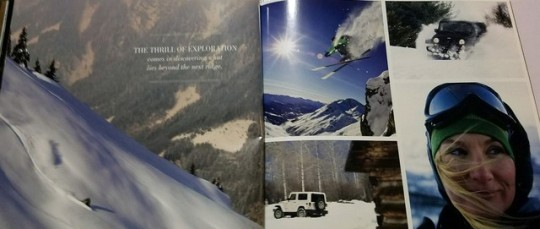

The first week had us learning about our first project, designing a catalog for TypeHike, so we brought in examples of catalogs.
Response 1
The design matters podcast was different than what I had expected from a podcast in my book forms class. I thought it would be just design elements, but what I liked about the podcast and what came as a surprise was how they linked it to their personal lives and how the two aspects played off of each other. Some of the words of advice they spoke of was how doing this dating experiment caused them to break free from what was normal and safe for them, they had to put themselves out there more than they were accustomed to. A lot of the time I feel like while my designs tend to be loud I play it safe a lot and don’t go for what seems crazy. Like in my personal time I have been talking for a few years now about how I want to start designing and printing shirts for my friends and I maybe one day making it into a brand of our own. Instead, what I find myself doing is just talking about it. I don’t break down and start doing it instead I make excuses for myself before I even start or try. How do I know I can’t afford it or how do I know I won’t have time to create designs if I never even tried in the first place? Didn’t think I would take that much away from the podcast hope the rest are as good and insightful.
0 notes
Photo

Project 2
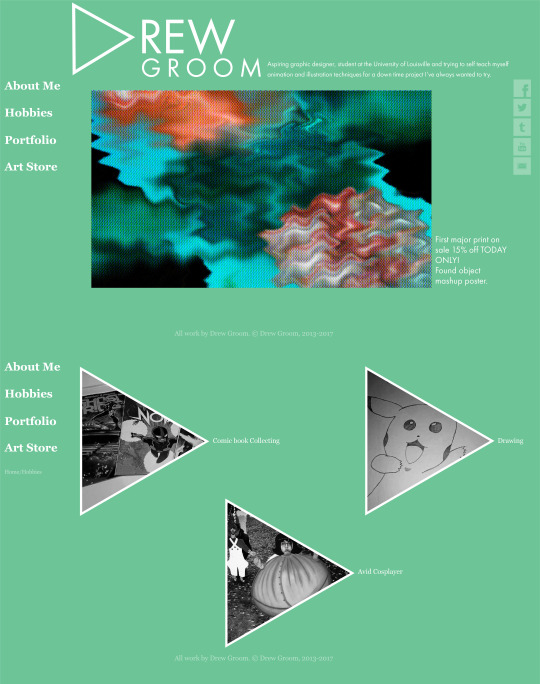
With our first go at creating a website I had some issues mostly with alignment and consistency. I”m pretty sure it happened with how I decided to set up my artboards while trying to construct the document. In the future I will just need to pay more attention to my construction lines and use more of a set grid I think that will help overall with the issues that I was having. The first layout I had come up with was what I intended on showing, but the more I kept looking at it I felt it was too simple and I needed to spice things up a little. The green one was my second attempt can’t decide which one I like better.
0 notes
Photo

Process12
Final blog post comes to a close and for my final process why not show the process book spreads showcasing my progression. This is a very rough first draft of my spreads and drastically changed for the better before I left campus.
“Design it like an index card. -Meena Khalili”
1 note
·
View note
Photo
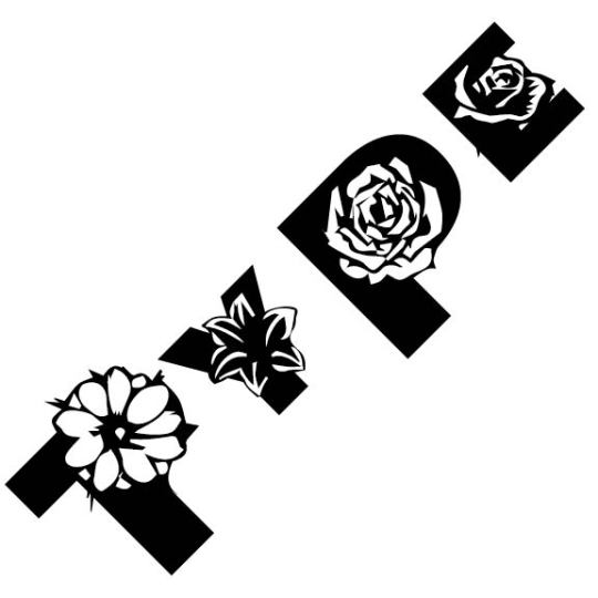
Snippet12 and Response12
This week’s final readings were very interesting to say the least. It was a chapter with spreads full of experimental type design that showcased some very interesting individual works and groups of works. The first few pages of the chapter were some of my favorite pieces its simple one or two letter compositions with a single color or no color overlapped with white shapes or other letters. Compositions like these always were my favorite projects to work on in the intro class last semester. These ones, in particular, incorporated a single letter with a type of flower that allowed for more negative space but kept the initial letterform intact. To the right of the flower letters were the made up glyphs that could be related to our remaking language project in their appeal and aesthetics. Following that were some interesting photo type montages with a single drawn letterform that mimicked the flow of the photo shape or appeal. To me the most interesting designs in this chapter were the ones on page 201, showing sequential typographic forms in space and typography and image transformations. When the “HRY” got kerned closer and closer then overlapping and morphing into a key. Then vice versa in the bottom photo where the key gets zoomed in on closer and closer to the grooves of the key mimicking the “A” letterform. For a majority of this class we have lived and died by the grid for our designs and layouts and while each project I have more fun experimenting I have never got to do something as wild and crazy as the pieces showed and diagramed in this particular chapter. Moving forward in the program I hope to try and be a little more experimental while maintaining legibility and readability in my pieces.
2P�p(v�
0 notes
