desn512-shanaflett
DESN512_ShanaFlett
AUT design
57 posts
Don't wanna be here? Send us removal request.
Last Seen Blogs

nichebitch
hold on..

symptom99
Без названия

messageinabottom
Not An Accident

trxforsale-blog
Untitled
ramzawrites
I write I think?
Text
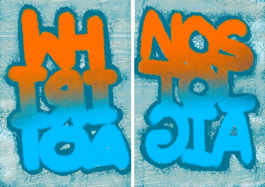
This artist is using a push and pull motion. This is displayed by the text and how the text is moving from side to side. This motion adds depth by doing exactly what the text says, push, pull. I think this design works very well because the massage is clear and straight to the point.
I think I could take inspiration from this design. The words I chose for my posters are childhood memories and Whiritoa. I could using a pushing and pulling motion to symbolise how you can't get rid of one of those words without the other, saying both are strongly connected to each other and no matter how hard you push or pull they will never leave each other.
They have created a zooming in motion by transforming the text from regular to bold. They have also created a wave motion by the order the letters transform. This motion adds almost a rhythmic hypnotic effect making the text look as if it is snoring or snoozing. This adds depth into the associations the word snooze has in our heads. I think the motion works very well in this design but it think the timing could be a bit better in the loop.
I don't think I will take much inspiration from this design I could have the same kind of rhythmic design for mine to represent the flowing waves of the ocean because my posters are based off of a beach. The bold to thin text probably wont help me much to show a theme in my design.
This artists design uses a twisting/swiping motion. This is very effective for the design because of the text being to word describing the motion. I don't think it adds too much meaning or depth because its very obvious what the motion for the text would be. I think the motion does work for this design because it shows that you can swipe and swipe and it will never stop.
This poster doesn't inspire me much but I can take aspects that will lead me to think and dig deeper. For example the rotating in a wave like motion inspires me to create some kind of tumbling animation for my design.
0 notes
Text
0 notes
Text

Learning about grids, parent pages and styles.
Practice pitch deck.
0 notes
Text
Reflective writing
Research skills Key areas in research that help inspire and extend my designs are from other students around me and Pinterest. Looking at other students' work and talking to them, helps me to see other areas I could try to look into for my poster designs, and by talking to them, they can give me tips to create better designs. Going on Pinterest it helps me to see a variety of really cool designs and different techniques I could be using in my designs. I also would look up YouTube videos to learn how to use the different software. I could improve my research more by talking to my teachers more so they can give a more professional look into things.
Creative Process
I tried many different design ideas. I would start by figuring out the main idea that I wanted for the poster and then I would do a quick sketch on Procreate. Procreate helps me to visualise what the final poster might look like without spending hours on one design. This process is very quick so I can get out many ideas quickly. I on occasion printed out my favourite designs and saw what they looked like in person. I would then put my favourite/ most successful designs into InDesign and play around with all the different tools. Some of my strengths that come from my design process are getting out lots of different design ideas, but my weakness is self-doubt. Because although I may be putting a lot of designs out there, I am not happy with most of them.
Decision making
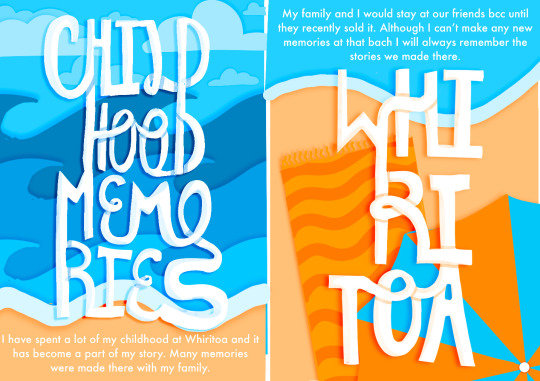
How I decided to choose the theme of my posters because I wanted to make something fun and not serious. The way I did this was by picking something from my childhood. What I chose was my childhood memories at Whiritoa. I chose this because my memories of that place are very positive and also because it connects to the brief of Whiritoa being a beach in Aotearoa. One thing I found hard was deciding what words to put on my poster. I went kind of generic but I think that is okay because children have simple minds. At some points, I was stuck to come up with better ideas so I had a look on Pinterest and picked some elements from other posters and experimented with them. Since my posters are based on my memories from my childhood of a beach, I chose the colours blue and orange.
Challenges
I had many challenges going into this assignment, one was learning InDesign. It is similar but very different to Illustrator so I had to adjust to using the software. I also struggled with coming up with ideas that looked cool but were readable and clear as to what the theme was. The last poster I made I like the best but I still think I can push myself to create a better design. One insight they suggest for me for the rest of my semester is to brainstorm better. A couple of skills I need to improve is InDesign and refining my creative process.
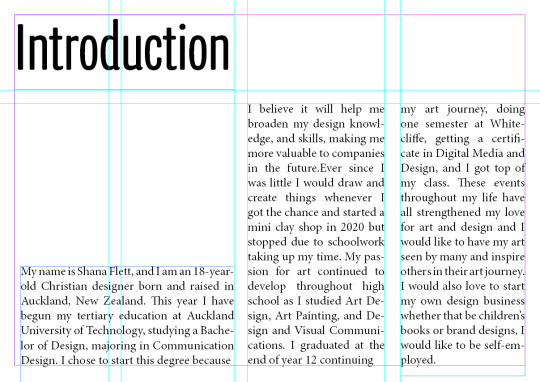
My name is Shana Flett, and I am an 18-year-old Christian designer born and raised in Auckland, New Zealand. This year I have begun my tertiary education at Auckland University of Technology, studying a Bachelor of Design, majoring in Communication Design. I chose to start this degree because it will help me broaden my design knowledge and skills.
0 notes


Text
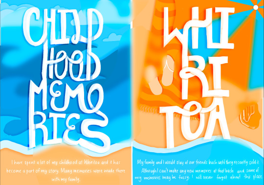

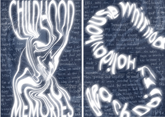
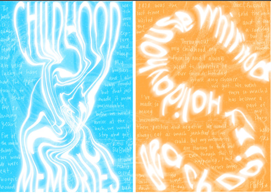
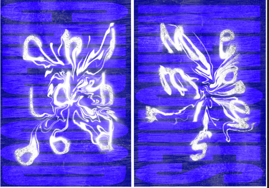
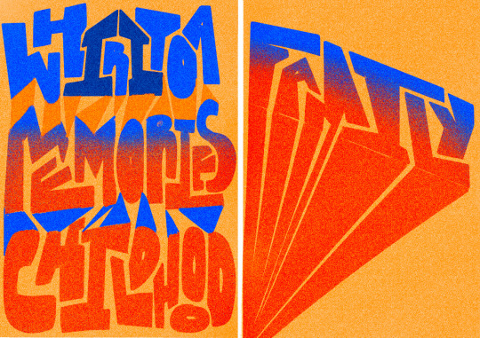
The second poster has blurry pieces. This is to represent that memories fade and it gets harder to remember but the clear parts are to say that you won’t ever forget fully the memories you made from your childhood.
Not supposed to use illustrations so idk about this design
0 notes
Text
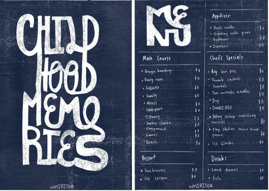
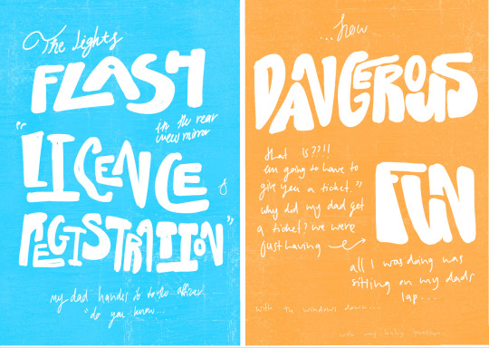
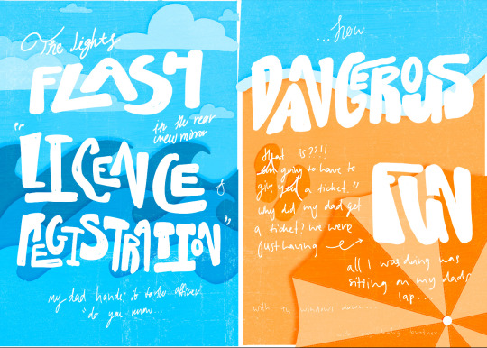
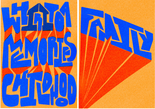
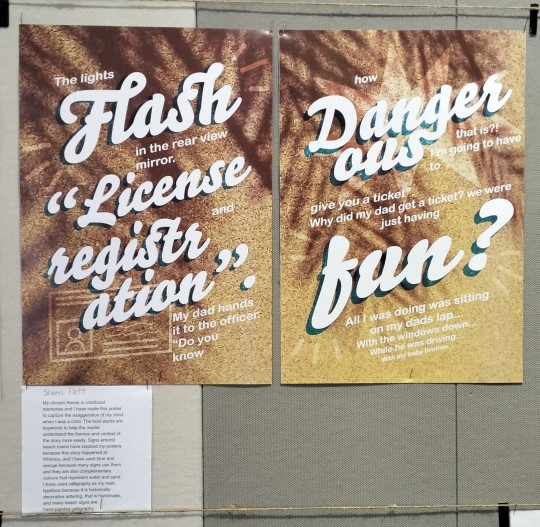
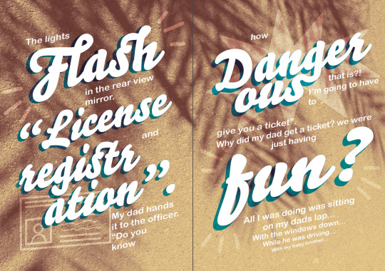
The first poster is supposed to be a menu. The menu side has different memories from Whiritoa and they are all $0. This is a metaphor to say that my memories are priceless.
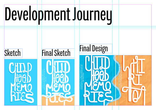
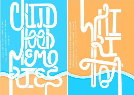
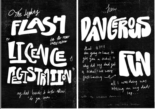
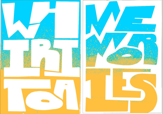
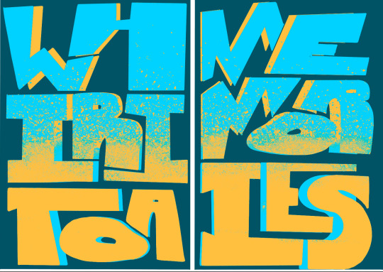
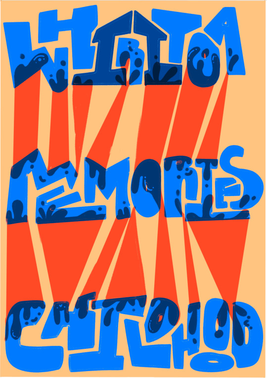
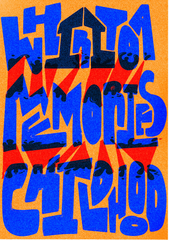
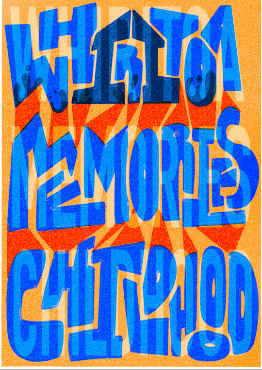
The other posters have a cursive handwriting contrasting big blocky letters. The blocky letters fit into one another and make the word hard to read. This is done on purpose to show how a situation like the story can be confusing and hard to understand for a child. The letters aren’t perfect to show that I didn’t think the situation was serious, and they fit together almost thought it was a game, like Tetris. The cursive handwriting is to show it’s from someone’s perspective and they are writing this as if it was a story for a school project. The cursive also shows that this is still a grown up situation that children shouldn’t be in.
0 notes
Text
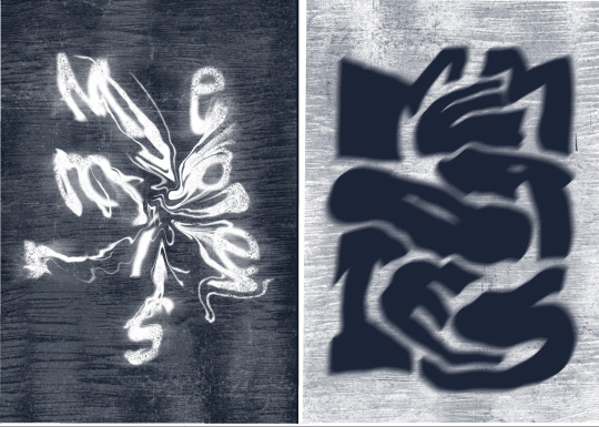
This is a bit spooky and not the right vibe for childhood memories
0 notes
Text
I was going for building blocks for a child but it is a bit harsh and doesn’t come across as friendly, bubbly or like something you would want to remember.
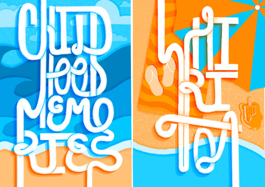
I also made it look kind of like a comic because I would always read comics at Whiritoa.
0 notes
Text
This is my poster displayed in the hallway 💪🙂
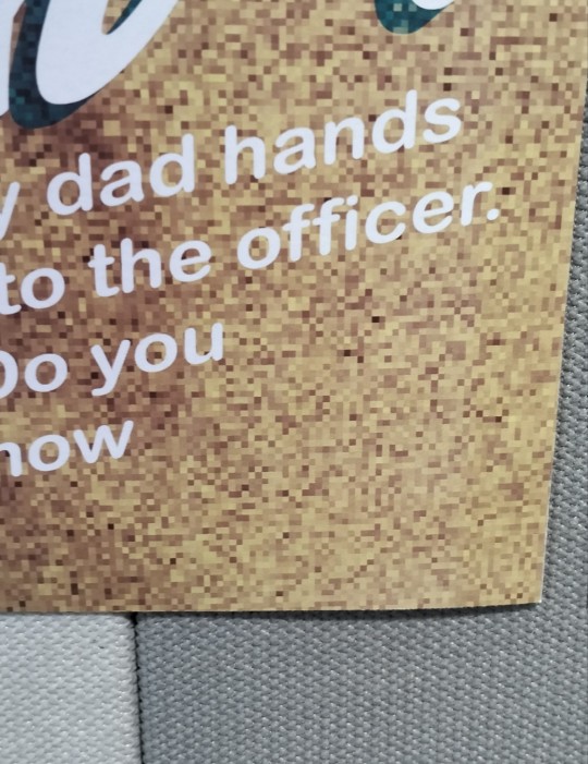
For some reason when transferring my files from my computer to onedrive to the school computers the background came out pixelated!?? I will need to figure out why this has happened.
Also I made this poster in CMYK but when I save it as a pdf it saves as RGB so it looks completely different online. I will also need to fix that in the future.
0 notes
Text
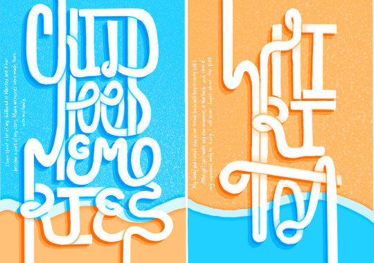
FINAL (for now...)
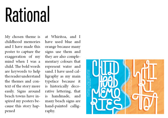
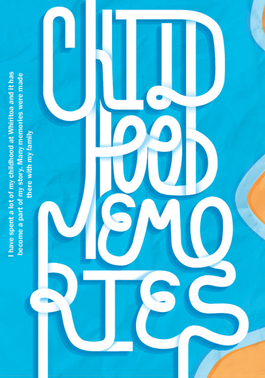
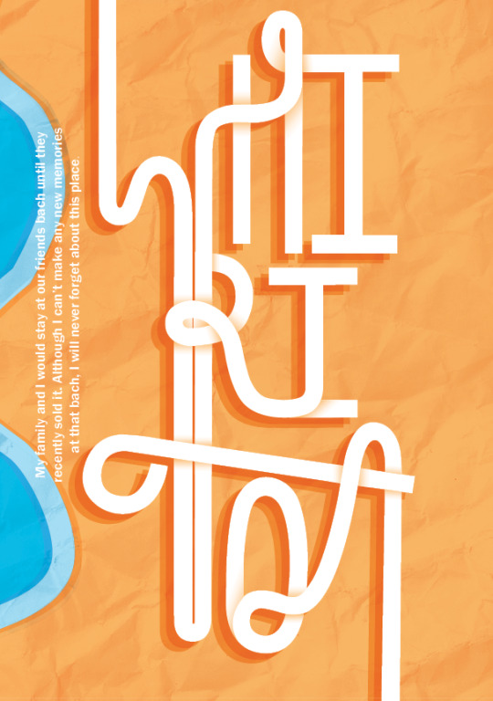
Rational:
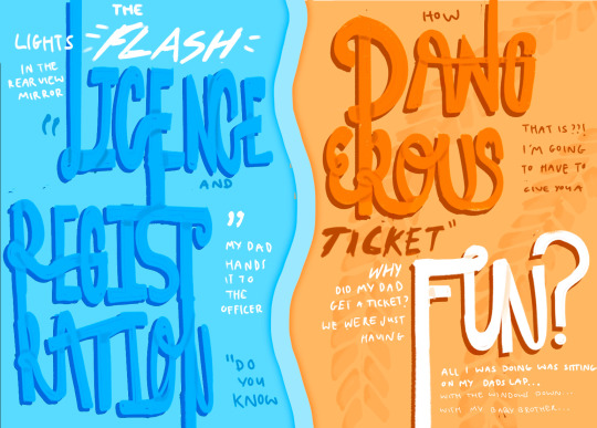
My chosen theme is childhood memories and I have made this poster to capture the exaggeration of my mind when I was a child. The bold words are keywords to help the reader understand the themes and context of the story more easily. Signs around beach towns have inspired my posters because this story happened at Whiritoa, and I have used blue and orange because many signs use them and they are also complementary colours that represent water and sand. I have used calligraphy as my main typeface because it is historically decorative lettering, that is handmade, and many beach signs are hand-painted calligraphy.
0 notes