
Last Seen Blogs

cuvepaciw
Untitled
mery89
StrayKidsNoona143
shadoedseptmbr
Days of Lead and Gold

ramipobimora
Untitled

Text
Genshin Impact’s Secondary Systems and alternative scenarios
Secondary Systems
Gacha System:
The Gacha System within Genshin is much like any other Gacha game’s. Players are encouraged to use premium currency either purchased or gained through normal gameplay to have a chance at receiving rare new units or weapons. In addition to the monthly rate up featured character and weapon banners, there is a standard banner that is always available with a select pool of characters and weapons the player always has access to.

The Serenitea Pot:
The Serenitea Pot, also known as the Housing System is a feature that allows players to decorate their own “realm” in any way they see fit. Players are able to earn recipes for furniture and craft them within this magical teapot to express themselves as well as earn realm currency and other rewards depending on how fully decorated their pot is. This currency can be exchanged for more furniture items or recipes as well as other rare materials that can make regular gameplay outside of this mode easier as well. Any characters the player has can also be placed within the pot for additional friendship EXP and unique dialogue.

Secondary VS. Primary classification arguments
Genshin Impact’s most notable system would have to be its Gacha system and while some may argue that this system is integral to the gameplay, an opposing argument can be made that this can be treated as completely optional.
Large Spenders (“Whales”) often see this system as a primary system while those who choose to ignore it (Free to Play/F2P) see it as a secondary system.
Of course, there are middle of the road individuals who may spend a small amount of money now and then to participate in the gacha but even then it is not an integral part of gameplay as it has no effect on story or progression.
The game provides many characters for free and it is up to the player to build up their stats to be strong regardless of whether or not they spend money.
On the other hand, The Serenitea Pot is an often ignored feature by most players who care more about combat or story but is a beloved feature by the more creative types of players.
It is typically viewed as a secondary system to those more interested in combat, questing, and story
To those who love games like the Sims or Animal Crossing, the features the Serenitea Pot provides allows players to live out their dollhouse dreams and can act as a primary system
Those who use the additional QOL features the Serenitea Pot provides such as extra friendship EXP and rare materials may also view it as a primary system in the same way one would view the other “dailies” they have to do within the game as a primary system
Regardless of the arguments, its safe to say that there are certainly Genshin fans that will find a way to play the game in whatever way they wish whether or not it is intended by Mihoyo themselves.
Alternative Secondary System Ideas
One of the most desired Secondary Systems within Genshin Impact right now is additional content to do in between major story updates. While there exists one major endgame challenge: The Spiral Abyss, It would be beneficial for all players if there was more content to be done at any level of gameplay. Something that would solve this is a Guild System. Many other online gacha games already have similar systems in place that allow several users to band together for a common goal whether that be defeating raid bosses or sharing resources amongst each other. Introducing this Guild System as an optional secondary system would be a great addition to the slightly lacking current co-op system in place as well as provide user’s additional content to do in between larger updates.

[Genshin Guild System Mockup Images by Saxabi on HoYoLAB]
0 notes
Text
Stardew Valley’s Core Systems and their Interactions
Main Systems
Movement:
Players can move on an 8 directional axis throughout the game with certain objects being impassable that the player must go around (bodies of water, rocks, buildings, etc). Players are unable to jump and are restricted to the 2D plane.

Movement is a key system of the game as it is what allows the player to do everything else in the game with parts being completely inaccessible without it.
Even though the game is grid based, players can move in four main directions with diagonals also available if the player presses two movement buttons at once or use a joystick (for example, pressing the up and right buttons at the same time will cause the player to move up at an angle). This is important for the player to easily and quickly navigate around the map as opposed to being confined to traditional grid based movement which is slower. Player speed can also be adjusted under various circumstances (such as consuming a certain type of food) which allows the player further control of their movement. All of this is essential as Stardew is a game where the amount the player can do is limited by the length of the in game days; Making movement something the player can easily do without much worry allows the player to focus on the more complicated aspects of the gameplay instead.
Environment Manipulation:
Environmental Manipulation refers to many things in Stardew Valley but most notably the ability to affect the environment to your liking. Players are able to chop trees, mine rocks, hoe ground, place objects, and grow crops on their farmland. The player has access to a variety of tools that allow them to do tasks that affect the environment. Axes are used for chopping trees, hoes are for digging up farmland, watering cans for watering crops, pickaxes for breaking rocks, and scythes for cutting grass/weeds and harvesting certain kinds of crops. Many of these tools can be upgrades to give the player more control over the environment over the course of gameplay. Players are also able to affect land outside of their specific farmland as they can chop trees or place objects within the town and other areas

Environmental Manipulation as a result is essential to the Stardew experience.
Some of the key mechanics within Environment Manipulation is farming, the main loop of Stardew is planting seeds and watering them throughout the seasons in order to grow crops that the player can then sell to afford to expand their production overtime. Without directly being able to affect the environment or only having a small area the player can farm in, it removes player freedom. Environment Manipulation allows the player to customize their farm layout to their liking whether that be for aesthetic reasons or efficiency. By having the player’s ability to terraform also increase overtime with the existence of tool upgrades also gives the player something to strive towards and gain a sense of accomplishment as they are playing since tasks will be much harder at the beginning and become easier over time
Relationships:
The player is able to form relationships with the various NPCs in the game and even romance a handful of them. The relationship system allows the player to form bonds with the characters and as a result gain new recipes or items that may assist them on their farm. The most common way to gain affection points within a relationship in the game is to talk to the character each day and give them a gift.

Relationships are a staple part of the gameplay of Stardew and are very hard to completely avoid even if the player goes out of their way to be a hermit.
The relationship system allows the player to form emotional bonds with the NPCs in the game as well as gain insight on the story of the game and the backstories of all of the characters. Certain characters have liked and disliked gifts and it is up to the player to discover what those are on their playthrough. Having preferences be something the player must figure out, it adds to the replayability aspect of the game since returning players will be able to remember what certain characters preferences are.
Interactions
Movement interacts with nearly every other system within Stardew Valley as the player must move to gather objects, mine, chop trees, plant seeds, water plants, harvest crops, or even walk to town to communicate with NPCS.

1 note
·
View note
Text

One of the main features of Pokemon Sword and Shield is the dynamax mechanic in which your pokemon can become massive and tower over your opponents. This feature is an excellent example of scale and proportion used to quite literally add a dynamic element to an intense scene.
The pikachu in this screenshot from the game is incredibly large compared to what it normally appears as. This is exemplified by the use of Human Scale as the normal playable character is contrasted with the larger than life gigantamax pikachu. This helps the audience visualize just how much larger pikachu is by giving us a sense of human scale in comparison. Relatively, pikachu is far larger than the human character which establishes contrast between the two. Hierarchy also comes into play as when a pokemon is dynamaxed and much larger than their opponets, they also become much stronger and more difficult to defeat.
Scale and proportion are important elements to design and aesthetics, without them we wouldnt be able to have depth, dynamic scenes, or different sized objects all together.
Scale & Proportions Glossary
Scale
Scale is the size of one object in relation to other objects in a design.
— a certain relative or proportionate size or extent (A human is 7.5 heads tall.)
— a standard of measurement or estimation (The UFO was as big as a football field.)
— point of reference by which to gauge or rate (My puppy is twice as big as your chihuahua.)
Aspect Ratio
Aspect Ratio refers to the proportions of the height and width of an image. It defines its overall shape, and it is usually shown as W:H (W is the width and H is the height).
Geometry
Spheres, cubes, cylinders can be used to build more complex objects.
Hierarchy
Arranged according to importance or power. What’s bigger or taller is often more important or harder to kill.
Human Scale
Human scale sets the stage for the story happening to human-sized characters.
Proportions
The size of the parts compared to the whole. Relativity.
Ratio
A ratio tells us what proportions mean to each other. Measuring one thing in terms of another. That monster is twice the size of the human. Their ratio is 2 to 1.
Relative
How objects appear in context with each other
0 notes
Text

Emphasis is an important tool in creating scenes that draw in a user’s attention. This is very notable especially in movie posters such as the promotional poster for Destiny Deoxys shown above. Thanks to emphasis, the important details are highlighted to the audience and their interest is piqued.
One of the largest examples of emphasis in this poster is the use of Focal Point. Deoxys, the pokemon in the top center serves as the focal point of the poster as it is what draws the audience’s eye the most. It is larger than anything else which plays into its important role in the film. Going in line with that, the Placement of Deoxys as well as the film title is also important as it is in the center and is guranteed to be one of the first places a person looks, emphasizing their importance. Lastly, Subordination can be seen in the other figures in the poster as they are placed at the bottom and are at a far smaller scale than Deoxys, highlighting that they are subordinate in level of importance.
Emphasis can be used in many ways from simple to complex, but above all else it is useful for making the most important details in a scene stick out and drawing in the attention of the audience.
Emphasis Glossary
Emphasis
Pow! Something in a scene dominates. In other words, the designer gives visual priority to part of a scene in order to draw the eye there first.
Contrast
Contrast in size, color, texture can make one thing stand out from the many things around it.
Focal Point
The focal point demands attention, it is accentuated, contrasted -- the star or the most prominent component of a scene.
Isolation
Feature a single element alone, away from other elements to create emphasis.
One Element
Eliminate everything else in the composition and the thing that’s left will grab the attention such as a bold title or symbol.
Placement
Position your most important design component in a place to grab attention, such as the center of a poster.
Subordination
The focal point has the visual power while other elements of the scene are subordinate.
Wholeover Parts
Sometimes we don’t want the eye to go somewhere specifically such as in an establishing shot at the beginning of a story. We want to show an overview of the environment before we jump into the story. We might look at a map with lots of details. The whole map is the important thing. When we select a place on the map to visit, then that spot becomes the focal point and the Emphasis shifts from the whole to the specific. Another example is that the whole game is more important than its levels.
0 notes
Text

One of the best examples of contrast in the Pokemon series is none other than the Black and White games. Not only are they contrasting in their design elements but in fan interpretation and opinion as well. It’s thanks to contrast that they are able to stand the test of time as being unique experiences.
In this piece of promotional art work for Black and White, Contrast is immedietly prevalent. Specifically, light and dark colors are used as well as conceptual contrast. The pokemon Black legendary is a white dragon whereas the White legendary is a black dragon. Having these sharply contrasting elements is known as High Contrast as the white is in direct opposition with the black and vice versa. It defies expectatons and provides a sense of interest for the audience. Asymmetrical contrast is also visible in this art work as all of the elements are mirrored yet distinctly different from one another in terms of color and shape. It is made clear the two characters share a connection in some way but their stark differences create an implicit sense of conflict between the two.
Contrast, in its many forms can truly make a game stand out from the crowd. It is the sheer amount of contrast present in these two games, not only from each other, but from other games in the series as well that truly set them apart as being unique.
Contrast Glossary
Contrast
Contrast refers to the arrangement of opposite elements (light vs. dark colors, rough vs. smooth textures, large vs. small shapes, etc.) in a composition so as to create visual interest, excitement and drama. Contrast creates variety within a unit, draws the eye to a focal point, creates a sense of adventure or mystery. Contrast is a unifier. Value contrast is when a character or object has a strong darks and lights compared to the scene around it. Size contrast is a gigantic space cruiser compared to much smaller fighters.
Symmetrical
Symmetrical is a form of balance in which both sides of the axis are the same, a mirror image of each other, creating stability and formality. In visual storytelling the symmetrical formal balance is often contrasted with the dynamic action of asymmetrical configurations. For example, the formal balance and discipline on the Death Star in Star Wars is contrasted with the diversity of the different rebel cells and militias from across the galaxy. The dynamic contrasting rhythms and visuals of the dark side contrasted with the Jedi and rebel alliance has kept the franchise going for decades.
Asymmetrical
Asymmetrical balance is a dynamic compositional strategy in which each side of the axis are distinctly different yet belong to the same story.
High Contrast
High Contrast is strong dissimilarity such as black letters on a white background. The high contrast setting is an accessibility feature built into interfaces to assist people with vision impairment. In visual perception of the real world, contrast is determined by the difference in the color and brightness of the object and other objects within the same field of view. Because the human visual system is more sensitive to contrast than absolute luminance, we can perceivethe world similarly regardless of the huge changes in illumination over the day or from place to place.
Low Contrast
Low Contrast means a minimum of contrast between light and dark, so that the image is either predominantly dark or predominantly light. The sun sets, dusk sets in and in the gloom there is low contrast in the landscape.
Contrasting camera angles
Part of your story is how you show as well as how you tell. The camera is your audience’s view of your story and should be well planned to reveal the story in the most effective way possible.
0 notes
Text
youtube
Rhythm finds itself used in several forms of art, especially at the intersection of visuals and audio. As seen in this cutscene from Pokemon Emerald, we can see how the rhythm of the scene is used skillfully to create a compelling story.
The cutscene has several forms of Rhythm, the first example of which being the rain and thunder as a form of Audio Rhythm. The sound of crashing rain and harsh thunder creates a recognizeable pattern that plays into the tension of the scene. Next, as the scene transitions so does the rhythm as a piece of music that features an organ begins to play. This piece of audio has a Progressive Rhythm as the audio evolves over time, becoming more intense and dire until it reaches its penultimate. At this point it finishes with a powerful cry from Rayquaza and initiates the Repeating Rhythm of Kyogre and Groudon descent back to their slumbers. The sound of crashing waves and shaking earth is layered together to create this repeating rhythm.
As seen here, rhythm is an immensely powerful tool that when used smartly, can influence an entire scene to create a more compelling narrative.
Rhythm Glossary
Rhythm
Rhythm is caused by patterns in movement. What are those footsteps in the dark room? Are they slow or fast? Running or sneaking up on you? Rhythm controls the pace of action in yourstory. Rhythm can be repeated character types, weapons, or color strategies. We see and hear rhythm throughout nature as well as in our digital environment. Rhythm organizes units into patterns. Rhythm is created through repetition, alternation, and progression.
Alternating
Alternating rhythm is a form of repetition and is predictable. We switch back and forth from one thing to another like a tennis match. Alternating rhythm can create tension, suchas switching close up head shots of one character arguing with another.
Audio Rhythm
Sounds that create patterns such breathing or shooting rounds of ammo.
Conceptual Rhythm
Intensifies, moves along, or calms the story. Conceptual rhythm coordinates visual and audio rhythm with the pace of your story.
Contrasting Rhythms
Contrasting Rhythms are two or more sounds or motions at obviously different tempos. Legato means music in a smooth flowing manner, without breaks between notes or a smooth flowing motion.
Poly rhythmic patterns
Poly rhythmic patterns are the use of simultaneous contrasting rhythms. A battle scene has many (poly) rhythms such as big guns, small guns, shouts, rumbles, footsteps, and explosions.
Progressive rhythm
Progressive rhythm is a pattern that changes over time to more or less intensity. Progressive rhythm makes us feel that something is in an evolving state of change. We can tell when the battle is heating up by the rhythm of the sounds and the actions of the characters running toward or away from the fighting
Repeating
The same thing again and again gives us a feeling of predictability
Rhythm and motion
When a motion repeats, speeds up, slows down it creates a rhythm. The rhythm of tai chi is slow. The rhythm of Kung Fu is fast. Staccato derives from the Italian verb staccare, meaning "to detach," and can now describe anything - not just sounds - made, done, or happening in an abrupt or disjointed way.
Visual Rhythm
When motifs such as lines or shapes repeat visual rhythm forms.
0 notes
Text

Pokémon is often famous for its unity in the sense that despite having hundreds of creatures to collect, you can almost always identify which ones go together in evolution families or pairings. This is incredibly notable in this promotional art featuring the eeveelutions.
Several unifying strategies are used in this composition in order to push the idea that all of these different Pokémon are connected in a way. Repetition can be seen used throughout the designs of all of the eeveelutions as they all share features among them such as long ears, 4 legged, and cat-like. There is also Conceptual Unity in the fact that each of these eeveelutions have a specific color associated with them to match their type. You associate blue with water and green with grass so just by glancing youre able to guess with certainty which eeveelutions goes with which type (especially if you have prior knowledge of the pokémon series) while acknowledging they share a connection with one another. This also goes with the fact Contrast is used in these designs as some eeveelutions directly seem to be in opposition of one another in terms of design such as glaceon and leafeon or espeon and umbreon. This furthers their sense of unity as while they seem to be opposites it stregthens the connection they have with one another.
All of these combined make it clear that through the use of unifying strategies, specific elements in a group design can still be unique while maintaining a close bond to the other designs in the group.
Unity Glossary
Unity
Unity is an entity that is a systematic whole. A fusion or union of parts in harmony to create a oneness. A game is a unity based on a fusion of levels.
Alignment
A common axis creates relationship, the line up creates meaning. Alignment in games can help you find your way on the map or aim true with your weapon. Alignment of troops or vessels indicates organizational strength. Maps are visually aligned with the edge ofthe frame. Your stats are aligned in a table.
Beat Boards
Beat Boards are used to illustrate major story points before the rest of the storyboard is completed. Beat boards are a series of single drawings that depict key focal points in a scene. Beat Boards can be compared to a children's book illustration because an individual picture shows a complex story. Beat boards can serve in art direction to indicate how the shot is staged and show color strategies, using shapes and colors, but are not detailed sketches. Making sure the beat boards relate to each other creates unity.
Composition
Composition is the arrangement of visual elements within a shot. The three basic shot compositions in filmmaking are long-shot, medium-shot, and close-up.
Conceptual unity
A palm tree, an ocean beach, and a beer unify around the concept of 'vacation'
Contrast
Contrast creates variety within a unit, draws the eye to a focal point, creates drama. Contrast is a unifier. Contrast is when a character or object has a strong darks and lights compared to the scene around it. Size contrast is a gigantic space cruiser compared to much smaller fighters.
Proximity
Proximity closer distances connect elements and far apart elements create separation and sometimes magnetism
Repetition
Repetition things that look alike relate to each other. Shapes or colors that recur in the image create rhythm and recognizable situations.
Unifying Strategies
Designers manipulate contrast, repetition, alignment and proximity to create visual unity and to pull a story along.
Visual unity
Visual unity is a group of repeating or similar elements that create balance or form a structure
0 notes
Text

Points in their simplest are the building blocks of art as they make up the smallest visual component of a piece; However, “points” in a more general sense have far greater reaching meanings and it is often in games we are able to see those alternative meanings the most clearly.
The gif is a scene from one of the most climactic moments of Pokemon Platinum and much like many other games of the same series, it is made up entirely out of Pixels. Artists digitally created the world of Pokemon Platinum by arranging electronic hues and values on the screen of the Nintendo DS. When viewed up close they may only appear as small squares of color but when zoomed out, an entire image is able to be seen. Another point, in the broader sense, is the Focal Point which in this case is the legendary pokemon, Giratina found in the center of the map. He is the largest character on screen and sits at the end of the only path the player can take. In the case of Platinum, it is entering the Distortion world and fighting Giratina that is The Point of No Return where the fate of the entire game’s world rests on whether or not you have the strength to capture or defeat this pokemon and you cannot go back. Additionally, there is also “The Point” of Platinum which is to defeat the evil team, capture the legendary pokemon, and become the champion, a formula familiar to any pokemon fan.
On the surface, a point may seem simple, but without points, more complex forms of design would simply not be possible. Points also can be more than what they appear and refer to more abstract topics as seen in the world of game design. It is thanks to points we are able to create complex and compelling designs and experiences
Point Glossary
Point
Point is the smallest visual component.
Pixel
Pixel is a recently invented word. The word "pixel" was first published in 1965 by Frederic C. Billingsley of Jet Propulsion Laboratory to describe the picture elements of video images from space probes to the Moon and Mars. A pixel is the basic unit of programmable color on a computer display. Think of it as a logical - rather than aphysical - unit. The physical size of a pixel depends on how you've set the resolution for the display screen. Each visual composition on your screen is made of thousands of illuminated points of hue and value.
Focal point
Focal point is the feature of a design or work of art that is the most interesting orimportant or the most strongly emphasized.
The Point
The Point is what a player will tell a friend about the game if they like it. The point is the mission or a moving target.
The point of no return
The point of no return (PNR or PONR) is the point beyond which one must continue on one's current course of action because turning back is dangerous, physically impossible or difficult, or prohibitively expensive. The point of no return can be a calculated point during a continuous action (such as in aviation). A particular irreversibleaction (such as setting off an explosion or signing a contract) can be a point of no return.
0 notes
Text

Pattern and texture often go together in a piece and that sentiment could not be more true in this piece of concept art from Little Big Planet. Here we can how the interplay between texture and pattern can give a piece a unique quality that would have not otherwise been achieved.
Pattern plays a large role throughout this piece, from the clothing of the sack boy to the hills in the distance, there is a rich plethora of different shapes and colors being used together. Much like a quilt, the hills are made up of multiple patterns that are Collaged together to achieve a specific whimsical feel not unlike that of a children’s storybook. Texture also plays a large role in this piece in the few instances where pattern is not being utilized. Visual texture is seen on the ground as it emulates the texture of its real life counterpart, giving the impression of actual freshly cut grass. Visual texture is also seen in the skin of the sackboy as it features a unique corkboard like texture that helps it stand out from the patterened clothes.
Pattern and texture while different, have characteristics that make them play well with one another. And it is when they are used together that designers can create rich imagery and even a sense of whimsy and playfulness in a piece.
Pattern & Texture Glossary
Pattern
Pattern is an arrangement, configuration, array, formation, guide, matrix of repeated forms. Patterns create rhythm and can be used to predict and organize design elements such as using a grid. In Software development patterns are conventions for describing and documenting recurring design decisions within a given context.
Alternating pattern
Alternating pattern means to occur in succession, such as day alternating with night. To pass back and forth from one state, action, or place to another such as alternate between happiness
Chiaroscuro
Chiaroscuro is a technique of painting or drawing using a predictable sequence of light and shade to achieve a three-dimensional quality. From the wayback machine: [1680–90; < Italian, =chiaro bright (< Latin clārus) + oscuro dark (< Latin obscūrus)]. Chiaroscuro has been digitized to give depth and dimension in every 3-D video game or animation object.
Collage
Collage is a technique of an art production, primarily used in the visual arts, where the artwork is made from an assemblage of different forms, thus creating a new whole. Collage is a prototyping process used to assemble colors, textures, silhouettes and other assets to test ideas, colors, size relationships.
Gradient
Gradient is continuous change, darkening, lightening, increasing or decreasing color saturation. A gradient is created when two or more different colors are layered to paint one element while gradually fading between the hues or values.
Grid
Grid means a rectangular system of coordinates used in locating the principal elements of a plan.and depression.
Progressive patterns
Progressive patterns create active change, momentum by shifting in a direction, increasing, escalating, or accelerating.
Radial balanced patterns
Radial balanced patterns are based on a circle with its design extending from its center. A few examples of radial balance are; a star, the iris in one's eyes, and a wheel with spokes.
Texture
Texture of something is the way that it feels when you touch it, how smooth or rough it is. The texture of an object depends on the unique structure of its molecules. Fur may feel soft or coarse, metal may be oiled and shiney or rusted and rough.
Tactile
Tactile textures are physical, touchable textures that you can actually feel on your skin in the real world, like when you pet a cat or dog.
Texture mapping
Texture mapping is a process in which a two-dimensional surface, a texture map, is wrapped around a three-dimensional object. When wrapped, the 3-D object acquires a visual surface texture. Texture maps create high frequency detail, surface texture, or color information on a computer-generated graphic or 3D model.
Visual texture
Visual texture is an illusion of texture. Pixels or traditional drawing and painting media can be manipulated to give the impression of texture, while the surface actually remains smooth and flat. The texture on an ancient wall, a vehicle, or a creature's scaly or slimy skin increases the immersiveness of a game. Texture artist is a career path. Texture artists are close observers as they collect, organize, and use textures to create believable surfaces.
0 notes
Text

Motion is something that can be difficult to capture in still images. However, artists are still able to achieve the illusion of it using good techniques as seen as in this concept art from Little Big Planet. By utilizing motion techniques, the pieces are able to come to life despite being still images.
The most noticeable example of motion being used can be seen in the right set of concept images which depict the sackboy falling from a great distance and hitting the ground. As he falls, his outline is blurred as the designer utilized Motion Blur to give the illusion of high speed that our eyes cannot capture. Thus, we view sackboy as falling as opposed to floating in midair. On the left set of images we canalso see motion in action as sackboy is set on fire. In the bottom set we see him lean forward in a form of Anticipated Action that causes us to expect him to fall. Going in tandem with the anticipated action, we see a faint line leading to the next image of him on the ground, a form of Camera Motion that acts as a cue to where the motion is heading in a storyboard or concept art.
Due to the dramatized sense of motion achieved in this set of images, the scene achieves a playful feel and has a sense of liveliness to it despite being still images. It’s thanks to motion techniques such as the ones used in this that designers are able to achieve vitality in a flat piece of art.
Motion Glossary
Motion
Motion is action, reaction, energy, what’s happening, gestures, dynamics, mobility, exertion, labor, and progress through space. Motion varies with your story. Motion indicators In storyboards are arrows, blurred lines, smears, zooms in and out. Your character is dramatized and embodied as a personality through gestural actions.
180-Degree Rule
In filmmaking, the 180-degree rule is a basic guideline regarding the on-screen spatial relationship between a character and another character or object within a scene. By keeping the camera on one side of an imaginary axis between two characters, the first character is always framed right of the second character. Moving the camera over the axis is called jumping the line or crossing the line; breaking the 180-degree rule by shooting on all sides is known as shooting in the round.
Anticipated Action
A dramatic action frozen in time, the tension mounts, we feel anticipation. We expect the sword to swing or the finger to pull the trigger or the couple to kiss.
Camera Motion
Arrows are standard cues, a simple and recognizable way to show motion or progression in a storyboard
Kinesthetic Empathy
A player’s actual movement when responding to action in a game. Leaning into a curve in a driving game is kinesthetic empathy.
Line of Action
Line of action is an artistic concept, an invisible line that captures the thrust and vitality of the movement. The line of action can be drawn by artists as the first element to capture or exaggerate the pose. Tip: Create the line of action as layer one so that you don’t down play the pose. When you have the full energy of the drawing delete the action line layer.
Motion Blur
When your eyes or objects are in motion, the image will suffer from motion blur, resulting in an inability to resolve details. To cope with this, humans generally alternate between saccades (quick eye movements) and fixation (focusing on a single point). How is this biological situation useful in storyboard drawing? How do storyboard artists use motion blur? How does a smear function in animated motion?
Optical Movement
Optical movement is an optical illusion. Although the image is not moving, it appears to move. To see examples search “Op Art”.
Stillness
Stillness is calm, quiet, inaction, and peace. Stillness is the opposite of motion. It can be used to contrast with motion.
Visual ways to suggest motion
Before there were moving pictures, artists developed ways to indicate motion. These techniques are used today to quickly indicate motion. Blurred outlines is one technique, and repeating parts of a figure is another way. A figure may seem to be moving if their figure is cropped by the frame of the composition.
3 notes
·
View notes
Text

Depth and space go hand in hand and together can make a flat piece of art feel truly three dimensional as seen in this piece of concept art for Bloodborne. This game is known for its stunning visuals, realistic graphics, and immersive world and story and It is this feeling of immersion that is truly captured thanks to the use of space and depth.
Atmospheric perspective like we mentioned a few posts back involves color as well as being a technique used to achieve depth. Its the process of slightly tinting objects that are further in the background to be closer to the color of the sky. In this art work we can see buildings tinted shades of orange and brown to match the fog filled dusk sky which makes the space of the scene feel as though it extends much further back. Buildings are also Overlapped with each other which not only makes the scene appear more busy but also helps achieve depth as overlapping objects creates an implicit 3D space that our mind then perceives. Lastly, multple point Linear Perspective is also utilized in this composition as we can see the upper edges of buildings appear to travel in diagonal lines inwards towards the center of the canvas and the horizon which further adds to the depth of the piece.
In conclusion we can see how artists use techniques based around space and depth to create an immersive and realistic 3D scene that both pulls audiences in and engages their senses. Without space and depth, artwork would simply fall flat (literally.)
Space/Depth Glossary
Space
Space is an area, expanse, territory, distance or range. Variable spaces expand orcontract as our stories unfold. A closeup has a short range. A wide shot covers a lot ofterritory.
Atmospheric Perspective
Value contrast and color saturation decrease with distance. Brightness increases asobjects fade further into the background. In addition, objects such as mountains may appear more blue (or whatever the color of the sky is).
Diagonal Shapes
Diagonal shapes pull the eye in a direction to create the illusion of depth. If the diagonalis going back like a railroad track or fence-line the eye will follow it into the perceived distance.
Elliptical Perspective
An ellipse is an oval shape. Elliptical perspective provides visual clues to the location of curved surfaces in space. Look straight down on a glass of water. The rim of the glassis a circle. Move the glass to the side, the rim now appears as an ellipse. Line up the rimat your exact eye level, the ellipse now appears as a straight line.
Foreground, Middleground, & Background
The 3 treatments of objects in space support design to achieve depth. This template for placing and sizing objects in the picture plane shows variations on the foreground, middleground, and background configurations.
Foreshortening
Foreshortening is when an object's dimensions appear shorter when angled toward theviewer. At the same time the part coming toward the viewer is enlarged.
Linear Perspective
Linear Perspective is a system used by artists in which the relative size, shape, and position of objects are determined by drawn or imagined lines converging at a point on the horizon.
Overlapping
Overlap is when part of one object is obscured by another object. The obscuring object appears to be in front.
S-Curve or Winding Path
In an image of a landscape, S-curve or winding path will draw the eye of the viewer into a perceived distance.
Size relationships
Objects appear smaller as their distance from the observer increases.
Transparency or Opacity
Transparency or opacity is when we feel like we can see objects through a glassy,gauzy, smoky, or dusty layer. The transparent/opacity adjustment affects the saturation and color of objects to give a feel of depth.
Vertical Position
Vertical position places objects higher up in the composition to appear further away.
Volume
Volume is the amount, expanse, extent, magnitude, size, aggregate, bulk, dimensions,or mass of an object. The volume variable indicates the amount of territory needed foreach object in a scene.
0 notes
Text

Value, much like color plays a very important role in designing a piece to feel realistic which can be important in immersive games such as The Elder Scrolls: Skyrim, where today’s concept art is from.
We can see that this piece uses Light and Dark heavily throughout it as the main colors in it are variations of gray which falls between white and black. Its thanks to the usage of grays here that we can more closely view the relationship value has on creating a sense of realism in this piece. Darker grays approaching blacks are used in the shadows and lighter grays approaching white are usd for highlights and in areas that are directly exposed to sunlight or another light source which creates the effect of Value and Space. Lastly we can see Value as Emphasis used for the forge and stone bird’s beak which is illuminated by lighter values and surrounded by darker ones which emphasizes it as the focal point of the design and creates a sense of realism and depth.
In conclusion we can see how value is one of the most important components to a successful design because of its essential role in creating volume and depth (which we will look at more next time!) which allows designers to capture the realism found in the real world.
Value Glossary
Value in design
Value in design is lightness or darkness on a scale of white to black (with white being the highest value and black being the lowest value). Value is widely considered to be one of the most important variables to the success of a design.
Chiaroscuro
Chiaroscuro (English: kee-AR-ə-SKOOR-oh, -SKEWR-, Italian:; Italian for "light-dark"), is the use of strong contrasts between light and dark with bold contrasts affecting a whole composition. Chiaroscuro is a technical term for the use of contrasts of light to achieve a sense of volume in modelling three-dimensional objects and figures.
Light and dark
Light and dark - Every element in your design has a value from 1% black (almost white) to 100% black. Value is relative to everything in the composition. Every color has an underlying value somewhere between white and black.
Value as emphasis
Value as emphasis happens when a strong contrast in value draws attention to itself such as on this ancient Greek vase illustrating value contrast in the service of visual storytelling.
Value and space
Value and space - Designers use dark and light values to create the illusion of light as it falls on objects. Value is used to create the illusion of highlights and shadows. Highlights and shadows combine to create the illusion of a light source. The pattern of light and dark can create dimension, volume, and mass.
Value patterns
Value patterns appear regularly in the world, in human-made design, and even in abstract ideas such as stories. The elements of a pattern repeat in a predictable manner. Night and day is a value pattern common in stories.
0 notes
Text

In design, colors play an important role in crafting atmosphere for a locale. In the case of this concept art for the Isle of Armor expansion for Pokemon Sword and Shield, the colors are used to flesh out the atmosphere and create depth.
An Analagous color scheme with a majority of blues, teals, and greens is used and the saturated blues here evoke a sense of vibrancy as well as relaxation for the coast, supported by the appearance of Slowpoke (a regularly regarded “lazy” pokemon) relaxing in and by the water. Overall the color temperature and scheme is Cool which pairs well with the sea side setting. White in the cliffs helps contrast the vibrance of the water and green grass in order to strengthen its brightness. Color to Show Depth is also utilized as darker blues are used to create the appearance of depth and shadows compared to the lighter parts of the ocean that are fully exposed to sunlight. For mountains in the distance, they are tinted more dark blue and slightly less saturated to create the effect of atmospheric perspective which further add to the depth of the piece.
Overall we can see colors play an important part in ensuring a piece achieves a certain atmosphere the artist intended and has a level of depth that immerses viewers into it.
Color Glossary
Visible light spectrum
Visible light spectrum is the segment of the electromagnetic spectrum that the humaneye can view. This range of wavelengths is called visible light. Typically, the human eyecan detect wavelengths from 380 to 700 nanometers.
Color Psychology
Color psychology is the study of the effect that colors have on emotions, behavior and feelings of people.
Color Systems
Color systems classify color and analyse their effects.
● The additive color system is used for colors of light such as light emitted from computers, phone screens, and projectors. Red, green, and blue are the primary colors
● The subtractive color system is used for pigments such as ink, dye, and paint. Cyan, magenta, and yellow are the primary colors.
Color to Show Depth
Change in Color is to use color to separate the foreground, midground, and background planes to create the illusion of depth and is commonly used in animation.
Color Wheel
The color wheel, or color circle, arranges a pattern of hues around a circle. There are several versions of the color wheel or color circle. The circle connects relationships between hues to illustrate color strategies. (see 12 Chromatic Strategies)
Local Color
Local color is the natural color of an object unmodified by adding unrealistic light andshadow or any other distortion. The color that the eye observes is altered by lighting conditions such as time of day or the surrounding environment. The local color of a lemon is yellow.
Palettes
The definition of a palette is the range of colors used in a particular composition or byany person who uses color such as an artist, house painter or interior decorator. An example of a palette is Vincent Van Gogh’s limited palette of hues in his Starry Night painting. Starry Night’s palette is a variety of blues, greens and yellows. Close up video of Starry Night lets you come closer than you could at the Museum of Modern Art.
Properties of Color
Properties of color are hue, saturation, and brightness.The H, S, and B in the Photoshop Color Panel stand for hue, saturation, and brightness.
● Hue is the named color around the color circle such as red, orange, green,yellow, violet, and blue.
● Saturation is the intensity or purity of a hue. Fire engine red is more highlysaturated than brick red or the color of red wine.
● Brightness is the perceived intensity of light coming from a source such as a screen. On a color screen, brightness is the average of the red, green and bluepixels on the screen. Brightness is important to both color perception and batterylife on mobile devices. Brightness of a screen can be adjusted.
Symbolism of Color
Symbolism of color in art and anthropology refers to the use of color as a symbol invarious cultures. There is great diversity in the use of colors and their associations. Diversity in color symbolism occurs because color meanings and symbolism occur onan individual, cultural and universal basis. Color symbolism is also context-dependentand changes over time
12 Color Strategies
1. Monochromatic means variations of a single hue such as a light blue and a darkblue or a greenish aqua blue and a lavender blue.
2. A chromatic color strategy integrates variations of black, white, gray, and a fullrange of neutrals.
3. Full Spectrum Strategy represents the full circle of spectral colors byincorporating at least five of the base hues.
4. In the Achromatic/Chromatic Mix strategy Achromatic colors dominate thecomposition with a chromatic hue accent.
5. Warm/Cool: Contrasting ‘temperatures’ of warm & cool. Cool colors appear onthe green/blue/violet side of the color wheel. The colors on the red/orange/yellowside of the color wheel are called warm. Emphasis is on the contrast betweenwarm and cool achromatics: brown - gold (warm), grays - silver (cool)
6. Saturation Similarities/Saturation Contrast
● Saturation Similarities: Hues may vary in this strategy, but all colorsmust have the same or very similar saturations.
● Saturation Contrast: Hues may vary but all colors must have significantcontrast of saturation.
7. Value Similarities/Value Contrast
● Value Similarities: Hues may vary in this strategy, but all colors have thesame or very close values.
● Value Contrast: Black (or dark desaturated hues) contrast with white (orvery desaturated tints of hues). The Value Contrast strategy demonstratesstrong distinction of value with the strongest example being between blackand white.
8. Complementary Dyad creates a strong hue contrast. Complementary hues arelocated directly opposite each other on the color circle.
9. Split Complementary strategies are based on two complements. To create asplit complementary color strategy select one hue and contrast it with the hueson either side of its complement, such as Red & YellowGreen/BlueGreen.
10. A Tetrad strategy uses four equilateral hues from the color circle, such as Red, Orange, Green, Blue.
11. A Triad strategy uses three equilaterally balanced hues from the color circle,such as primary, secondary, or tertiary.
12. Analogous strategies collect 2 or 3 neighboring hues on the color circle.
1 note
·
View note
Text
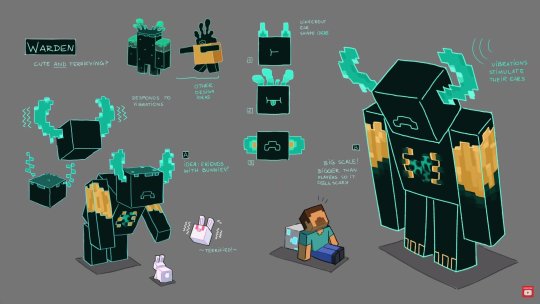
Shapes are an important part of design as they are the building blocks (no pun intended) of larger more complex structures. By breaking things down into shapes we are able to more easily identify the features that make up a characters appearance.
In the latest Minecraft live, they revealed the newest mob that will be added to the game, the Warden. Much like other creatures in Minecraft it is made up of Rectilinear pieces to fit into the blocky world of the game. Despite this, there is still a level of Biomorphism in the creatures ears as they are inspired by a new block coming in this update, sculk growths, which appear to be a type of cave fungus. The ears, while pixelated, have a free form organic-like structure reminiscient of fungi. These components combined help achieve a very unique Silhouette for the mob unlike anything else thus far. A pillar of the new update is contrast, so the design team sought out to create something with a brand new yet easily identifiable shape compared to things already in the game.
In summary, shapes are the key components in what makes a character and it is by identifying these specific shapes we are able to understand how designers can create unique characters.
Shape Glossary
Shape
Shape is the external form or appearance characteristic of someone or something; the outline of an area or figure. As a verb, to shape is to give a particular form. As artists, we shape our characters outward appearance by using shapes.
Abstract Shapes and Abstraction (see Non-objective Shapes)
Abstract means no recognizable objects. Abstraction is a sliding scale from realism to completely non representational. Abstract shapes can be used in backgrounds and textures.
Biomorphic
Biomorphic is a free-form pattern or design with a shape suggestive of a living organism, especially an amoeba or protozoan.
Curvilinear Shapes
Curvilinear shapes are s-curves. Curvilinear shapes inform Jessica Rabbit’s characterdesign and can represent a winding river vanishing into the distance.
Distortion
Distortion is exaggeration, contortion, reform, slant, twist, or warp in ways that departfrom reality. Look at the Minecraft Human body example. The figure of the Minecraft character is distorted by the shape of the blocks.
Idealism
Idealism asserts that the physical world is less important than the mind or the spirit which shapes and animates it. Idealists choose the soul, the mind, or the psyche overthe body, the material, and the historical. When ideals (of appearance, or proportion forexample) regulate the way an artist represents the world, her work can be described as Idealistic. The leading artists of the High Renaissance - Leonardo, Raphael and Michelangelo - are all associated with varying forms of Idealism, as were ancient Greek sculptors.
Non-objective Shapes (see Abstract Shapes)
Non-objective shapes have no object as a reference and no recognizable subjectmatter. Non-objective shapes are often used to simplify design shapes. Geometric shapes such as a triangle, square, and circle are abstract until you put them together to represent a house or a smiley face. One Minecraft block, away from the game, is a non-objective shape. Inside the game that same block, depending on it’s color and texture could represent a part of a landscape, sheep, or sword. The block as part of a character or environment inside the game would no longer be abstract.
Positive and Negative Shapes
Positive space is the subject, focal point, or areas of high interest in any composition. Negative space is the area around the areas of interest. All compositions balance positive and negative space. Yes, stuff in the negative space can point to the focal pointto make it most obvious. Positive and negative create a whole. Every composition is acombination of positive and negative space. Wield the positive and negative spaces with control and story-telling magic to become a design master.
Realism or Naturalism
Realism, or naturalism, attempts to represent subject matter truthfully, without artificialityor exotic or supernatural elements. In the visual arts, illusionistic realism strives for the accurate depiction of life forms, perspective, and the details of light and colour.
Rectilinear Shapes
Rectilinear is a boxy shape made with straight lines. For example, the screen you are looking at is a rectilinear shape filled with little square pixels, and pixels are also rectilinear. A storyboard is a series of drawings in a linear set of rectilinear frames.
Representational
Representational means objects that players can name. The object represents something from the real world, or something that has the verisimilitude of realism. A cartoon bunny can represent a rabbit without being realistic. Representational is a sliding scale from realism to almost abstract. 2 dots and a curve can be arranged into an abstract pattern or they can be arranged into an emoji that represents a smiley face.
Silhouette
Silhouette is a profile or shape that is easy to identify.
Squash and Stretch
Squash and stretch are shapes profiles that emphasize motion. The stretched positionshows the form in an extended condition. When you do a sit up your belly squashes and your back stretches.
1 note
·
View note
Text
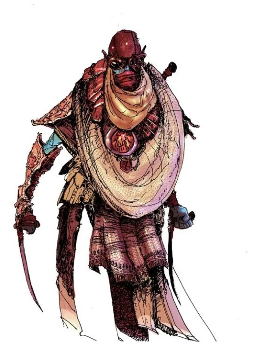
Lines are used everywhere in design; Specifically in concept art lines can be used to plan out ideas and rough out designs.
In this piece of Morrowind concept art illustrating a member of the Morag Tong, we can investigate how line is strategically used by the artist. Line Weight is seen to be noticeably thin in order to go with the somewhat realistic style. Thick lines pair well with highly stylized or cartoonish illustrations whereas thin lines pair better with realism. We can see also that between the layers of clothing the artist has drawn several groups of lines clumped together to create shadows through Line as Value which adds depth. Throughout the piece you can see Lost and Found Lines especially in the clothing in order to give the appearance and texture of fabric further adding to the realism.
In summary, lines are used here in concept art to build up the art direction of a game and overall feel that is trying to be achieved.
Line Glossary
Contour Lines
Contour lines indicate the edge around an object or the changes in volume within anobject. Contour lines dramatize changes of plane within the form. The curve of a beltaround the waist is a contour line.
Diagonal Lines
Diagonal Lines are useful to draw the eye into a composition such as toward thevanishing points. Three common types of diagonals are
1) actual diagonal lines
2) objects placed diagonally in a scene
3) a diagonal line created by the viewpoint such as the Dutch tilt.
Dutch Tilt
Dutch Tilt (known as a dutch angle, canted angle, or oblique angle) is a type of camerashot that has a noticeable tilt on the camera’s “x-axis.” The Dutch tilt camera techniquewas introduced by German Expressionists in the 1920s. Directors often use a Dutch angle to signal to the viewer that something is wrong,disorienting, or unsettling.
Explicit Lines
Explicit means clear, direct, and obvious. If a drawing is easy to read it may be that the lines are explicit, clean, with efficient use of variety.
Gesture Lines
Gesture Lines capture motion, such as in an action pose when gesture drawings areused in storyboards.
Implied Lines
Implied lines in 3-D scenes a line in a scene that is not physically there but is suggested by points in the art. Implied lines suggest the edges of an object or planes within an object. The line may be broken such as a dotted line, it may be defined by value, color, or texture, or it may not be visible at all. With implied lines, our brain interprets that a line exists.
Line as Value
Line As Value has a long history. Artists have used line drawings to create value, or shading, and to achieve the impression of volume.
Line of Action (Also see motion)
Line of action is an imaginary line that extends through the main action of the figure. When you draw an action figure you can capture the line of action on one layer then draw the figure drawing on another layer.
Line Quality
Line quality is the espressive essence of lines. Varying the line quality makes objects appear more 3-dimensional and exciting. Range in line quality heightens descriptive and suggestive potential. A single line can change in darkness and width, can vanish all together to mentally reconnect later on an edge.
Line Weight
Line weight refers to the thickness or thinness of a line.
Lost and Found Lines
We don’t really need a strong contour line around every part of an object because our brain will fill in the blank where the edge disappears. When a line fades out and then restarts further along the edge it is called a lost and found line.
Psychic Lines
Psychic lines are invisible. Psychic lines form between characters or between a gun and a target, or a hand pointing in a direction. There is no real line yet we feel a line. Eyes looking in a direction, especially characters looking at each other create a psychic line.
0 notes