
des1014thibaultn
Design Principles
I will post here my progression of my understanding of the design principles
4 posts
Don't wanna be here? Send us removal request.
Last Seen Blogs

gta-5-newest-cheats-i1
👑 gta 5 newest cheats (trainer 100% working) 9KN

kashifrazasworld
Kashif raza
penelopemiles
Penelope Miles
bane-of-brooklyn
I don't think I can live without you

nyctofilex
rasberry 🌹
Text
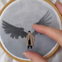
Escher Tessellation create on Adobe Illustrator.
0 notes
Text

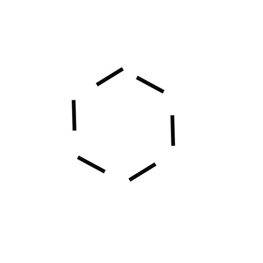
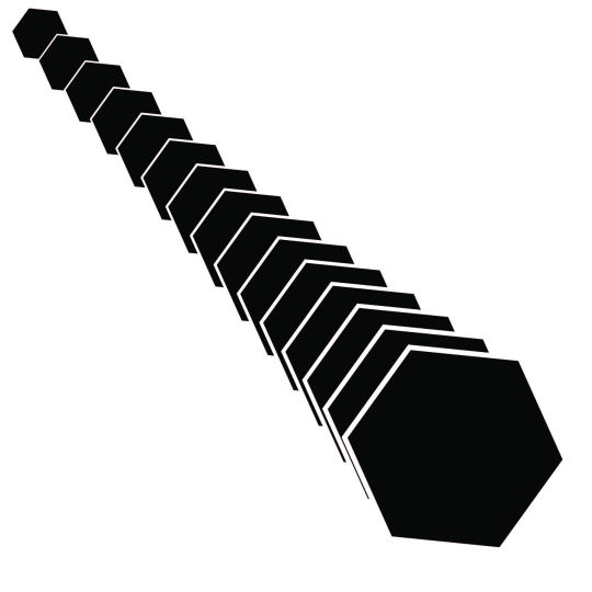
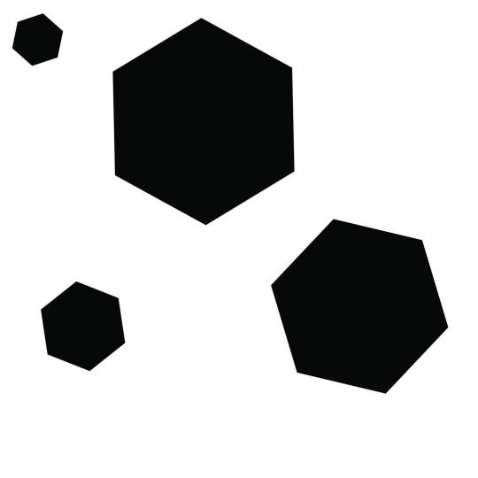
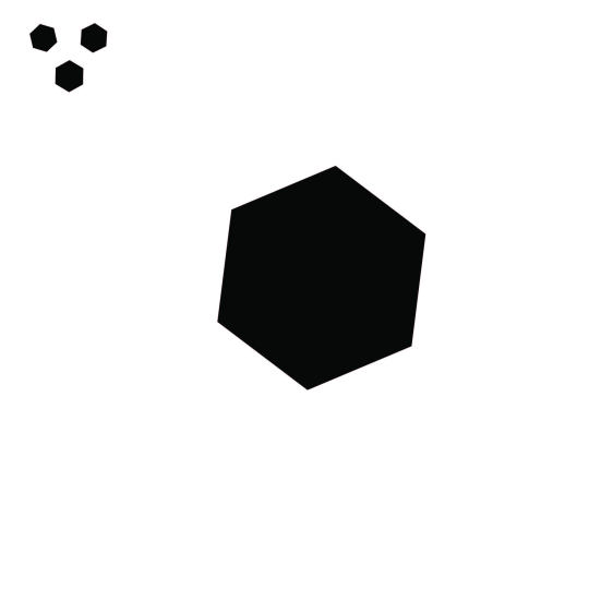
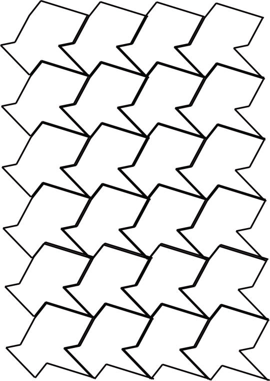
Geometric images showing Gestalt principles
0 notes
Text
Gestalts principles through M.C Escher work
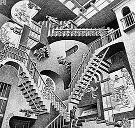
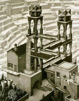
Relativity (1953)
In this illustration made by M.C Escher named “Relativity”, we can see a considerable reference to the Gestalt principles, here one of the principles named symmetry and order is clearly present in this example by the three different angles that the illustration was made.
Even if the stairs and characters doesn’t seem to be equal and entirely similar, the structure and symmetry shaping by the 3 different point of perspective, leave the spectator questioning whether or not, the design invite us to turn our head in different angles in order to compare each scene and actions omnipresent into this art piece.
“Symmetry and order” is a powerful way making the ambiguous or complex mechanism simpler for the audience to understand, it’s a following order of the law of symmetry.
Perspective and relativity are two really close ideas, sharing a meaning of “point of view”, this term can be analyze in our everyday life, same as this picture, if you rotate it, the meaning and the scene change as much as the relativity does when we have to face different situation, it’s mainly up to our ourselves and “point of view” to change or not, our way of thinking.
Waterfall (1961)
In this different example, named “Waterfall” by M.C Escher, the Gestalt principle mainly used the continuation, laws of continuity are substructure by our eyes, the way we consciously or unconsciously chose a smoother path to end our road.
But sometimes, artist used those exact same laws of continuity to make us confuse on the fact there is not only one smother way or path, this example above express a continuous line surrounded by different type of structure but it seems that the line change whether we looking on it from the bottom or the top. A real illusion of depth indicating a visual paradox that leaves us perplex toward the sense of this image.
It's a clever mechanism to confront the proportion of each elements present on the picture, they sort of all convoying into the same goal.
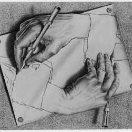
Drawing hands (1948)
For this last artwork, one of M.C Escher masterpiece named “Drawing Hands” creating in 1948, is another type of illusion based essentially on similarity and proximity, those two different principles are really in ad equation one to another giving a considerable impression on the audience.
One of the first effect after seeing such a unique picture, I do feel that those two hands are feeding each other’s, if we are following the logic above, the existence of one hand is depending on the other one, but that fact can also be pointing out by the proximity and similarity principles.
In those examples, you need a referencing object similar and close to the other one in order to establish structure and interpretation. Those same two hands are so similar and close to each other, that even the way they look seems unreal or nearly created in a non-human ingenuity.
As a result, a paradox leave the public questioning himself on the impact and dependence of entity link into each other and the result coming from it. Those sorts of meaning are present all around us, living organism depending on each other for surviving purposes are a good example.
0 notes
Text
Design of principles Font
Hello Everyone,
Today I’m going to talk about how a font uses the principle of consistency to develop a unique font style?
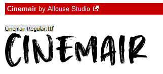
For this precise question, I will use the following font style named “Cinemair” by Allouse Studio,
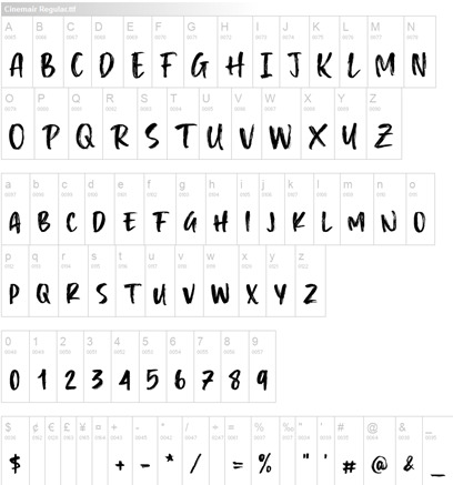
When I had a quick look through this font, I by the same time save the alphabet letter as a representative way of showing a singular consistency as presented below:
In order for me to identify the unique style of this font, I need to describe the principle of consistency in the first place, the principles of consistency express a continue pattern of element or style, where we can assimilate those entity to a specific ideas, representation or composition that would ultimately defining them.
It’s a really practical and useful way to assimilate for example a band to his product by following a specific marking or ornamentation that allow the public to easily recognize a famous brand, trademark or various label.
In this particular example, the font style is a genuine form of design principle, we literally find it across all of our different documents, email writing and all sort of writing expression.
Here, the letters are sharing a similar shapes and gradient colouring, the stroke of this font is quite unique because of the special effects present on the letters. The stem of each letter is anchored and distinct through every line and reflect the consistency of the font.
The hairline is accentuate by darker stroke and lines, the finishing airflow of each letter are homogeneous top to bottom reinforcing once more the consistency and identity of the Font itself.
The shape of bowl illustrate by the curves of few designed letters such as : d, b , o, D or B are presenting the same form and pattern, the counter of those letters attach to the transparent space enclosed inside a letterform is following the same thread and fortify the design of principles to avoid confusion between different font.
As a result of those visual elements, design and consistency allow the user to gain a smother experience and in the same time improving his learning skills towards the font that will be used.
1 note
·
View note