Last Seen Blogs
tinpei-utau
tinpei

pixelcoblog
PixelcoBlog
fernandoferfer
Sin título
jomadis
Jomadis
anarchblamke
65 year young penis

Photo
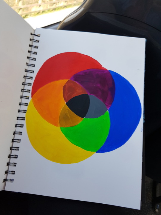


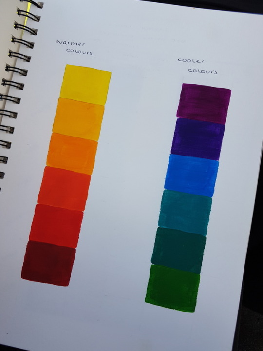
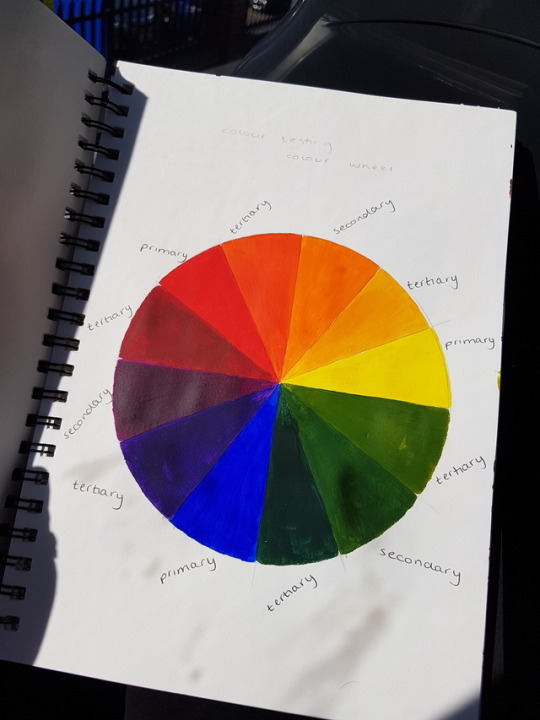
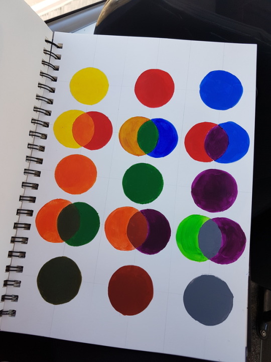
Here is all my work focusing on colour theory. I wanted to do this as a workshop because I knew I needed to add alot of colour and I wanted to make sure I was experienced enough before started my final. I manly focused on the basic colour theory so I could get a good understanding of all the colours after this I then moved on to the warmer and cooler colours and learned what colour and how we associate colours with moods as well as productivity. I created a grid of 6 colours to see what shades I could get within the colour such as crayola has succeeded in when creating there numerous colour collection. I achieved this by adding a tone, a shade and a tint these were black, white and grey. I then moved onto showing how the primary colours mixed with the secondary or tertiary colours can create surprising colours themselves. I felt like this workshop went well and prepared me alot to create my final piece.
1 note
·
View note
Photo


Here is all my work focusing on colour theory. I wanted to do this as a workshop because I knew I needed to add alot of colour and I wanted to make sure I was experienced enough before started my final. I manly focused on the basic colour theory so I could get a good understanding of all the colours after this I then moved on to the warmer and cooler colours and learned what colour and how we associate colours with moods as well as productivity. I created a grid of 6 colours to see what shades I could get within the colour such as crayola has succeeded in when creating there numerous colour collection. I achieved this by adding a tone, a shade and a tint these were black, white and grey. I then moved onto showing how the primary colours mixed with the secondary or tertiary colours can create surprising colours themselves. I felt like this workshop went well and prepared me alot to create my final piece.
0 notes
Text
BCU Visual Communication Contextual Studies
L5 Contemporary Research Practice (runs alongside VIS5026 - Investigating Contemporary Practice)
Research Proposal Template
Deadline: 21/03/17
PLEASE INSERT YOUR OWN TEXT INTO THE SPACES BELOW THE FOLLOWING:-
1. Area of Research/Working Title
The area I plan to go into after completing 6 years at University is Art Therapy. I’ve started to investigate this already as I wanted to make sure this course (Viscom Illustration) would count for my requirements for my next University. I decided to take this route as I’ve always wanted and been able to help people but I also wanted to involve my passion for art, as I was a child I had to go into hospital for an operation whilst I was there in recovery there was a room we could go to, to take our minds off the situation. Whilst I was there I spent my time with a woman who spoke to me about my situation but had me paint whilst I spoke to her which was a way to make it easier to talk about.
This has stuck with me because looking back at it, it’s a good way to get children to talk or being able to help people who might not know how to talk about what they are going through or may not want too.
I’m looking into and have attended events to become a volunteer at the Children’s Hospital Birmingham as well as having a lead role at scouts, this is a requirement for the course, but I’m also in contact with someone who have choose the same route as me and will be able to help me with it, I plan on getting into contact with more people as it’ll help me with evidence and research.
2. Primary Research Plan 1 [150-200 words]
The first thing I’m going to do to move further in this position is to completely research the requirements and needs to continue doing my course, I know that the course would need to be approved by an official company. By knowing this I plan on talking to the University and seeing if they can give me a break down/brief of the course so I’m able to see if it’s the right one.
I also plan on researching the official company to see what is the best way I could do this and see what it is expected to complete this course. This way it’s going to help me and prepare me for when I’m able to get to that stage.
I think research for my first step is going to help a lot as I’ll know exactly what I need and what I’ll can research as well as ask when it comes to speaking to people. Knowledge is key for this type of communication as I don’t want to speak to someone about it and not knowing anything.
3. Primary Research Plan 2 [150-200 words]
I plan on speaking to multiple people for my second stage that way I can gather a lot of evidence as well as truth about the course and how it’s going. I’m currently speaking to a student who is studying Art Therapy in Germany. What I would like to do is speak to as much student studying art therapy as possible to bring up my confidence in the subject as well as giving me as much information as I could, I would like to get it from different universities as well for personal use so I can see which university is the best.
After this is I would like to talk to an Art Therapist and ask about her progress as well as the experience its given her, I’m also planning on speaking to an Art Therapist working in Private that way I can see what route is better for me as I’m interested in working in Private.
I’m thinking about doing surveys or interviews for each student that way I can even answers and when it comes to comparing the universities it’s going to be a lot easier and a lot fairer.
After doing this I would want an Art Therapies input that way they can tell me what the better route is and what will prepare me the best for this career.
4. Primary Research Plan 3 [150-200 words]
Research three is going to be all about gaining the experience and how to go about to do it. Because the Art Therapy course needs a years’ worth of volunteer work, in either nursing/social work or in a therapeutic environment. This would need to be as local as possible whilst studying at university and having a job. So I would need to do even more research into volunteer work as its specific, I know that the Children’s Hospital has days were you can apply to volunteer and if you do you’ll get invited to an open day were you then fill out a form choosing where and what you would like to volunteer for.
So because of this research would need to go into it planning the dates and sending applications off if it’s needed. This might even include setting up or going to group events and even visiting the place to get a better understanding and get to know the people and better the knowledge ready for the application or event.
5. Reading List
BAAT – British Association of Art Therapists - http://www.baat.org/Careers-Training
Health Careers – Entry Requirements and Training (Art Therapists) - https://www.healthcareers.nhs.uk
Umedy – Online Art Therapy Course - https://www.udemy.com
University of Chester – Art Therapy Ma - https://www.chester.ac.uk
University of East London – Art Psychotherapy Courses - https://artspsychotherapy.org/therapy-courses/
University of Derby – Ma Art Therapy - https://www.derby.ac.uk
University of Hertfordshire – MA Art Therapy - http://www.herts.ac.uk/courses/ma-art-therapy
University of Roehampton – Art Psychotherapy MA - https://www.postgraduatesearch.com
6. Chapter Structure
Chapter One – Research
· Requirements – This includes requirements/needs/volunteer work that is needed or preferred for the chosen course
· Universities – Collecting 5 to 6 examples of Universities that offer this course. Refer back to first bullet point if different universities need different requirements.
· Approval – Research what approval the Course or you needs for the chosen career. Research what the course needs to be approved. If there’s extra payment to be made.
· Top Five – From bullet point 2 choose your top five universities.
Chapter Two – Communication
· Choose between 5 top Universities – From your top 5 chosen compare all of them (150 – 200 words) for each university explaining why you would want to go to that University, Why wouldn’t you want to go there, How the site is and if it’s the right University for you and why.
· Questions – After researching the Universities’ you should find out enough information to create a question sheet containing 15 to 20 questions about the University and the course.
· Leads – With those 15 to 20 questions either get into contact with a student studying that course or someone working at the University that can help you find out even more about that course.
Chapter Three – Truth
· Questions – If you have succeeded in speaking to the University or speaking to a Student then you should be able to make up more questions (if needed but recommended) when it comes to speaking to an Art Therapist.
· Meeting – Because you’re looking into Art Therapy its best to get into contact with an Art Therapist. (make sure they’re okay with it). See if you can talk over the phone or meet in person.
· Essay – Now that you’ve gathered information about the Universities, the Course, Student life and about the career, write out an essay containing (500 to 1000 words) explaining your process what has gone your way what hasn’t gone right, and how you feel about it after finding out the information.
7. Abstract [150-250 words]
This research project is going to focus on the background research. After this project you should have enough knowledge and enough confidence when approaching and applying for this course. The main idea behind this project is to fully understand everything about the Course and Career as well as gaining the confidence to move forward and to take chances with this course. Because this is a MA Course it’ll be a good idea to organize all of the research and information starting from the very basics to the more complex extra work you could do. This way you’ll be able to sort all the work out correctly.
These next steps from this project is too go off and apply to universities and apply for work experience or volunteer work. You shouldn’t need any more research or need to do anything else after this Project as the main reason behind this project is too get you ready for the next steps giving you enough time to sort through all the information you have making sure the work is up to its highest standards as it can be so you shouldn’t need to rush around or stress about gaining the right knowledge.
As applying for a Masters course or and getting interviews can be nerving and stressful this Project will help you put you on the right track hopefully giving you the confidence you need for the course and the confidence for the upcoming interviews.
0 notes
Photo


Here are the paintings ill be using for inspiration for my other final, to show the crazy and random ideas he had.
0 notes
Photo
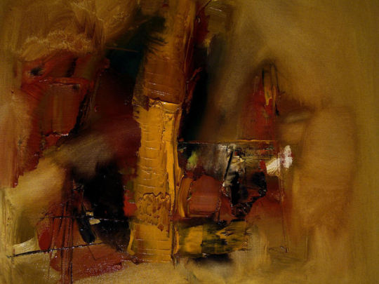


These are some of the Inspiration pieces ill be using for my Daunting picture.
0 notes
Text
Daunting
adjective
seeming difficult to deal with in prospect; intimidating."a daunting task"synonyms:intimidating, formidable, disconcerting, unnerving, unsettling, dismaying;
0 notes
Photo


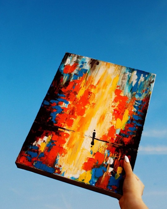
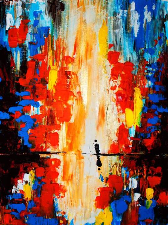
For this project i’ve decided to be risky and stray away from my comfort zone and use different materials and different techniques.
An example is for my first painting I want to do it in a Abstract style and using nothing but a palette knife, limiting myself to three strokes/movements each time I place it onto the canvas. I learnt of this idea after watching the BBC Painting Show, it was to stop the Artists mixing the colours and have it stray away from the palette knife look. The “look” i’m referring too is the “bumpy” or “3D” look it gives the painting.
This technique I plan on using for my second painting, this is the “dabbing” method. I’ve been quite intimidated by this technique as I’ve seen artists such as Monet or Van Gogh use it to a extent.However I wanted to give this a go after watching it on the BBC Painting Show, the Artist made it look quite easy as after his worked looked so beautiful with all the layers created by the Dabbing Technique. I decided to do this method on a painting (this is shown in my previous paintings).
0 notes
Photo
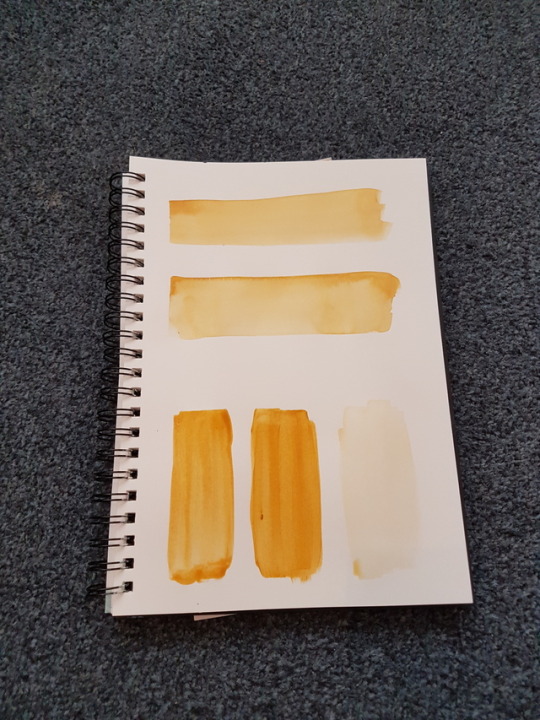
Here is the start of my colour testing. The top two using watercolour and the bottom three using acrylic. What I've done here is changed the amount of water used in each test. The top one using 1 part water 1 part water colour giving it a equal mix of the two I felt like this was the better trial out of the watercolours as the colour was held perfectly throughout. However the second test was 2 part water 1 part watercolour, this was to see if I could create a wash look. This didn't turn out as well as I had hoped as the colour was patchy and uneven. With the acrylic tests it went (left to right) 1 part water 1 part acrylic to 2 parts water 1 part acrylic then go 3 parts water to 1 part acrylic. The first two look almost identical as the colour didn't change just the constancy of how it went onto the paper. However the 3 parts water 1 part acrylic looks like a watercolour however the colour didn't hold as well as I had hoped. For the background for my daunting picture I will be using watercolour 1 part water 1 part watercolour as the colour held the best and there weren't any streaks or uneven parts. This colour testing was successful as I was going to us acrylic thankfully this showed me that watercolour was the better choice.
0 notes
Text
The struggle
I'm struggling with this project so much due to timing and research. Because I'm creating abstract paintings I don't know how to convey this through trialling and research, mean while I've been looking at artists as well as colour testing. I have a idea in my head on how I want my final to look but I don't know how show it in my book without painting the picture.
0 notes
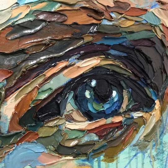
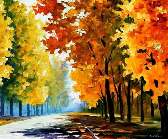
Photo
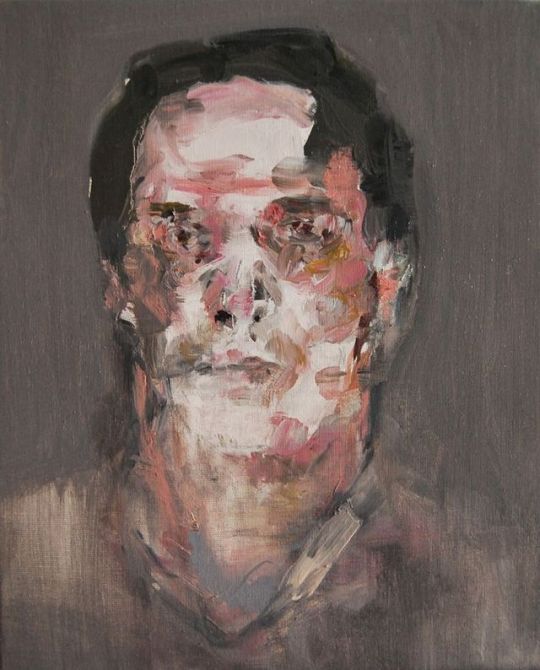

These are some of the work I've been looking at for the daunting part of my final. I wanted to use the picture on the left as inspiration as I thought it would be good since I haven't seen the guy I'm doing my project about. So I thought having a portrait with no face would be quite moving and hold a story on its own. However going through my research I realised that I'll probably be doing something like the picture on the right as I want to be bringing more abstract art into this project. And have the movement of the paint to create a daunting feel instead of creating a drawing.
8 notes
·
View notes
Photo

Here is a trial and error painting using the technique of dabbing. I've seen this technique used so many times with several artists. However whenever I see the technique used I was intimidated by it and thought I could never been good at it. But with this project because I plan to go towards abstract art and thinking about the movement I can create with the painting instead of painting a picture I might as well give it a go. This painting took me several hours as I realised I needed to do layers to create the look as it wasn't about mixing the paints but instead overlapping each other to create a blending look. I really love how this has turned out for a first try and I've fallen in love with the technique I want to continue using this through out my work and for one of my final pieces.
21 notes
·
View notes


Text
Originally my partner was going to be doing her section in card and id be doing mine in black and white drawing maybe adding water colour running through each scene. However when it came to doing it and learning that my partner wanted to use silhouettes and not have a lot of detail in it. I thought this would be a great chance to experiment with colours and using card, a material I haven’t used by choice before.
I wasn’t on using water colour and black and white throughout the animation as me and my partner came to a wall when it came to adding our work together and trying to make our very different styles fit together so it would run smoother because I wasn’t sure and having a background in both black and white as well as water colour I choose not to do research behind it. Instead I googled it to see how I could incorporate the two styles together.


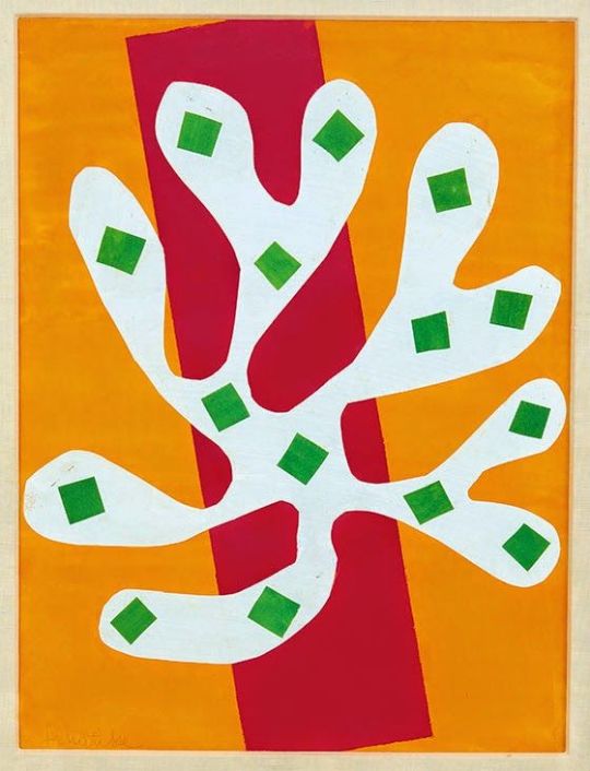
As you can see I didn’t want the painting to be washed out and full of colour, however after choosing to do card and silhouettes I wanted to be more interesting when it came to Colour Experiments. I used matisse as a inspiration for this as his work isn’t always clean and cut as well as him being well known artist for working with card. So Matisse was really my inspiration for this whole project.
0 notes
Text
Evaluation
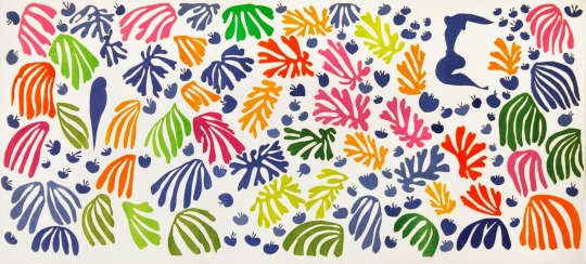
When it came to picking this project I thought it would be something that I could get a higher skill in and not finding it really difficult. I was looking for to the collaboration as it meant I could study and possibly learn another style of art from my partner, when I found out that Suzanne was going to be my partner I was relieved as it meant we could skip past the awkwardness of not knowing each other and getting on with the ideas and setting each other tasks. At the start we worked individually as I did not know what Suzanne was doing for research and she did not know what I was doing. I did find this project overwhelming as I did not know where to start and what to do for it, so for the first couple of weeks I was doing as much research as I could and then timing how long each sentence was so we could do for each animation and how long it needed to be. I think this was us only putting off actually starting the Animation as we were almost afraid of doing it because we did not know how to do it. For myself I found this difficult because at first it did not feel like Suzanne was doing as much work as I was especially when it came to doing the presentations, I did not want to talk to the tutors about this as it could just that she was nervous to do it. Even though me and Suzanne work very differently and have very different styles we had the same feeling towards the work which was nice because I could always reassure her when needed and she could do the same for me our passion grew for the animation when it was all piecing together and we were getting quite excited when we saw it with the audio and all the transitions that made our animation looked more professional. We spoke about what style we wanted for it and we both agreed that we wanted it to look different from the other groups and thought everyone would be making theirs look really clean cut and smooth but since we were doing stop motion we wanted to make it look stop motion and that it was our first time doing animation as we thought it would make the animation more artistic. This meant we kept the bad lighting and the gaps in between each scene. I wanted to involve my typography in this video because I liked how the words would pop up as the person was saying them, however I knew what style I wanted it to be and how I wanted it to appear on the screen, I decided to make these first as that was I could see how much time I had left to do the rest of my scenes at first I was going to keep this font black as it could be a neutral colour and not take away from anything else that was happening on the screen. Suzanne uses a lot of colour in her work and that’s exactly what I wanted in this piece, I wanted the animation to be filled with different colours so I decided that Suzanne could pick the colour palette as I would of just stuck with black and white and the odd colour here and there, this was a difficult task for me as this was the most colour I’ve used in one of my pieces and I am not usually fond of colour as black is more easier to use and I can do a lot with black as it’s an colour that can easily be paired with anything if I wanted too. I used an App to help me create these pieces which was Pic Pac and this helped me as it took a capture of the screen every second of recording. The more animation I did and the more work I pushed myself to do the easier it got and the more comfortable doing this and because of this I did not feel overwhelmed or scared of what I needed to do. I really enjoyed doing this Project because it taught me how to use different software’s to do animation and helped me to use more colour in my work and get comfortable with it, I knew what colours I wanted to use as Suzanne sent me her colour palette so I decided to make collages with each colour including one darker shade and one lighter shade I used matisse as an inspiration for this idea and this was possibly the better and interesting way of showing my experiment with the colours. If I were to do his project again I would pick a software and a App that I know would work best for me and learn it so when it came to taking the images for the stop motion and creating the animation it would be a lot easier as I would know what did what and how to do it, I would also sort the colour palette and materials we wanted to use first so I could just get straight into it instead of doing all the written work first this then would allow me more time to do more to my Animation and eventually learn how to achieve that clean cut finish and how to make it run smoothly throughout the whole thing. However saying this I am really happy with how the Animation turned out and how well my style and Suzanne’s style worked together, even though it’s the same material and same colour I still think you can see the difference between each other’s work, though I do feel that if we were to do this again we could sort out the lighting to make it better and brighter to make it look more like an animation instead of making it look like we took pictures and stuck them together.
0 notes
