
cunninghamc-blog1
Mastery Journal
Christine Cunningham has lived in Kentucky for twenty plus years. She has recently completed her Bachelor Degree in Graphic Design and is now working on her Master's in Media Design. After graduating she intends to take a dive into the Graphic Design.
[email protected]
[email protected]
https://www.behance.net/christine_cunningham
58 posts
Don't wanna be here? Send us removal request.
Last Seen Blogs
xlily-maexx
Lily

clairenatural
shattered at the altar of winchester

warinwilderness
Warinwilderness

john-wick-4-m-thai-sub
จอห์น วิค 4 : แรงกว่านรก 【
Text
Week 4 | Professional Practice
For my final post for my Mastery Journal for this class, I would like to identify three key takeaways for this course. One, the importance of practicing ethical and moral reasoning and the means of how to avoid them. Two, the attention that should be paid to Copyright Laws. Three, the relevance of having an agreement between the client and creator before beginning any design work.
Advertising has a strong influence on shaping behavior, understand life, and values in today’s world. Advertising is meant to inform and persuade an audience and designers should be careful about being selective about the values and attitudes that can be fostered by unethical advertisements. For example, the absence of certain racial and ethnic groups can cause problems for individual viewers about their image and identity and can be misleading and frustrating to them. As a professional designer; it is of the utmost importance not have a harmful impact on individuals or society, respect different cultures, not lie, and be able to support claims with evidence and facts.
Understanding that copyright is a right to control reproduction and commercial exploitation of works is very important. Knowing when you are working with a client, they may want to own your copyright of your designs gives you as a designer the chance to specify how your designs will be used, the client’s intentions for using your work, and compensation to you as a designer for them being able to use your works. Learning about what classifies as copyright infringement and means to avoid using someone’s work without their permission will be beneficial information for me to practice as I enter into the design industry. Knowing how to go about obtaining licenses and permission to reuse works of others and what constitutes infringement will aid me in not accidentally misusing another person’s works.
Having an agreement or contract between the designer, the client, and creator will protect you and do the same for the customer or creator. An agreement or contract with one another will prevent any misunderstanding about the process, timeline, deliverables, payment, or other aspects of the project. An explicit agreement will eliminate any assumptions that may be made about the scope of your work, expectations, role, and deliverables. Developing an agreement or contract is something that I will be doing not only to protect myself but assure that everyone involved understands the scope of the process and is in agreement.
0 notes
Text
Week 3 | Professional Practice
Week three consisted of a discussion post about the ethical and moral reasoning that I uncovered when writing my research paper that connected with the AIGA publication Design Business and Ethics, how they can be avoided by being followed by AIGA guidelines and identifying which three guidelines stood out to me as being the most important. A peer review of a classmate’s post was given, and a final post of what was learned on the same topic was written. A peer review response post was given to a classmate on their initial draft of their experience map, and my final experience map was submitted.
Ethical and moral issues that I uncovered in writing my expository essay included truth in advertising, original work belongs to the creator, and that a license needs to be obtained to use a font that is not on your computer. I learned that ads are not allowed to be misleading or dishonest and that advertisers need to be able to support their claims with evidence and not cause injury to the consumer. Knowledge of copyright laws for using works created by another artist was gained and how to legally go about using a font designed by someone else was studied.
The AIGA publication also provided me with guidelines that I can take to avoid creating unethical works. Taking an ethical approach as a designer is not to lie, mislead or create and advertisement for clients that cannot be supported by evidence. Better understanding that the Federal Trade Commission says “that an ad must be truthful, not misleading, and, when appropriate, backed by scientific evidence” (Truth in Advertising, n.d) equipped me with the knowledge that as designer we need to be innovative about how to creating ads which are meaningful and send an honest message to the consumer.
The three guidelines that stood out to me as being most important and ones that I need to be aware of as I enter the design industry were licensing of fonts, copyright laws about the usage of “talents” work, and that people can be dishonest or misleading in the advertising industry. Learning that licensing is required for using fonts and the different ways “talents” are negotiated was extremely beneficial for me. It is evident that many limitations apply to both areas and that before designing anything agreements should be drawn up and signed to protect not only you as a designer but the client and creator as well. The truth in advertising was somewhat of a shock for me to uncover. I would have never thought that someone would be dishonest or misleading to make a dollar. I am glad that this has been brought to my attention and this will be something that I will watch for when designing for a client.
A peer review post to a classmate suggested that additional evidence to support her findings would have been beneficial in her post | essay and made her discussion post | paper stronger. An example of how to use consequences to make an explanation stronger was given to her for future reference along with a suggestion of how to be more persuasive by supporting her claims with facts and research.
The final post asked us to explain what we learned and what information we would take with us as we enter the professional industry. My answer to this question was “being aware of the moral and ethical issues that exist within the industry prepared me with information of the things I should avoid and provided me with guidelines for successfully protecting myself in the design industry. Reading about the copyright laws indicated that I need remain familiar with regulations to present myself professionally and avoid violating laws with clients and creators. Learning about written agreements provided excellent examples of means that I can use that will ensure that I as a designer, the client, and creator are all on the same page as we move forward with works.”
The final steps for finishing my experience map was done, a review of a peer’s map was done, and suggestions for professor and classmates were taken into consideration before a final version of experience map was submitted.
Final Version of Experience Map

References
(2016, March 11). Retrieved from http://www.ftclaw.com/2016/03/bogus-weight-loss-claims-lead-ftc-settlement/
Design Business and Ethics. (2017, May 25). Retrieved from http://www.aiga.org/design-business-and-ethics
Frost, S. (n.d.). The Disadvantages of Advertising to Kids. Retrieved from http://smallbusiness.chron.com/disadvantages-advertising-kids-25801.html
(n.d.). Retrieved from http://pathosethoslogos.com/persuasive-writing
Truth in Advertising. (n.d.). Retrieved from https://www.ftc.gov/news-events/media-resources/truth-advertising
0 notes
Text
Week 2 | Professional Practice
During week two of Professional Practice, a discussion post was done about copyright issues. In this post, we identified legal problems that can occur when media designers do not abide by the copyright laws when incorporating images created by other artists, how to protect your works from being used by others, and the copyright issues designers should be concerned about when answering an RFP (Request for Proposal). The publication from AIGA titled Design Business and Ethics and Creative Truths by Brad Weaver alerted me to the importance of not using copyrighted materials without the permission of the creator and the consequences we as designers can encounter if we do. Guidelines were provided for drafting agreements between yourself, the client, and the creator to ensure that everyone has the same understanding of work and to prevent any misunderstanding of how to use work from the creator.
Means to protect your work were also explained. Again, the importance of an agreement was mentioned, and it was recommended that one should be drawn up between yourself and the client to prevent the reproduction of your finals works. How to go about obtaining a copyright was explained, and the use of copyright symbol and registration process was discussed. The ramification of someone using your creations and the process of how to address someone who is using designs was also learned.
The concerns of answering an RFP (Request for Proposal) was described and readings provided information on things to look for in a written agreement like clauses of how works will be used, reproduced, and who will retain ownership of designs. The stealing of “ideas” was discussed and the risk a designer can encounter when their ideas are stolen from a client and given to another artist who may be less expensive. Means were provided to incorporate an additional clause in contract or agreement before the presenting of ideas to a client to avoid this happening.
A response post was written to one of the classmates in the class to present additional legal issues that can arise when using others copyrighted works and ways that they can go about avoiding them. More examples were given to peer about ways they can protect their designs, and the importance of content in a contract or agreement to protect themselves from someone stealing their works.
The final discussion post was an opportunity to tell about how I will use information from materials as I enter the professional industry as a Media Designer. I found the information in the AIGA publication very realistic, and I gained a better understanding of how a client goes about selecting a designer to work for them. The article provided insights into where organizations look for designers and an explanation of what should be included in the Design Brief from the client. A better understanding of copyright laws equipment’s me with the knowledge needed to obtain an appropriate license of copyrighted materials and the model given for an agreement for design provides me with a model I can use before taking on work from a client. Brad Weaver’s book Creative Truths discussed how to start your own business as a designer. I found this book an excellent roadmap of tips to get your own business up and going and one that I will reference as I start up my own business. The article from AIGA provided knowledge that I will need to know when working with clients and I enjoyed learning about it from a customer’s perspective. The AIGA site is also an excellent way to post your works and get in contact with clients looking for designers.
Our second assignment “Creating an Experience Map” was a two-week project to create a human-centered, holistic view of my journey through the Media Design MFA program. During the first week, a draft was created using a guide from Adaptive Path’s Guide to Experience Mapping and included segments of the three semesters, sticky notes that explained what I did, how I felt, and how I thought over the past twelve months. A draft experience map was designed in illustrator for professor and classmate peer review.
Post-It Notes | Doing, Thinking, and Feeling
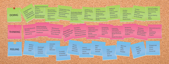
Sketch for Theme of Experience Map

Rough Draft of Experience Map

References
An Author’s Artist Reputation Under the Copyright Act of 1976. (1979). Harvard Law Review, 92 (7), 1490
AIGA. (2009). Design business & ethics. AIGA. Retrieved from https://www.scribd.com/document/47555891/Design-Business-and-Ethics#download
Lowell, M. M., Francisco, S., Ago, 1. H., Perkins, S., Angeles, L., & L. (n.d.). Design Business and Ethics. Retrieved from http://www.aiga.org/design-business-and-ethics
Weaver, B. (2016). Creative truth: start and build a profitable design business. Boca Raton, FL: CRC Press, Taylor & Francis Group, A Chapman & Hall Book.
0 notes
Text
Week 1 | Professional Practice
During week one of Professional Practice class, we reflected on the development of our thesis presentation and the feedback from the Design Committee in a discussion post. In our initial post, we identified the strongest areas of our presentation determined by reviewers and sectors that needed to be improved. My strongest areas for the thesis presentation determined by the committee were; advanced connections made with instructional materials and solutions, demonstration of multiple approaches, and uniqueness of designs created. My weakest areas were; the link was not working for the parallax site not working, the explanations of decision decisions, and the ability to write more in depth about the design. A personal evaluation of the thesis presentation was also done to identify which areas I felt were the strongest. My assessment of the thesis presentation showed that Connecting, Synthesizing, Transforming, and Problem Solving were my strongest areas in the thesis presentation. Support for this choice was given to the use of instructional materials, research, and the learning of guideline and models that could be incorporated into my creative process. Collaboration with a classmate post was done to voice whether we agreed with the Design Committee’s assessment and the self-evaluation of their thesis project. We were also given the opportunity to suggest areas that we felt could be improved in this section of the discussion board. Our final post was a reflection post on the experience we gained in the process of creating a thesis presentation website and a chance to tell how we felt about having it reviewed by Design Committee and classmates.
An expository essay was written to raise awareness of issues that will arise as we graduate and enter into the professional industry. The practicing of moral reasoning and ethics was the focus of the paper and readings from Wally Snyder, and Clifford Christians were resources used for the paper. The purpose of the paper was to explain the importance of honesty, and the practice of high-level ethics as dominant practices as a media designer and to illustrate some of the consequences a media designer can be faced with for practicing unethical practices. Examples from readings and outside research were presented to support the impact unethical practices have on consumers and the effects that organizations will feel when consumers do not believe in their advertising. A case study of social media blogger was discussed, and guidelines were identified to ensure a blogger was using moral reasoning and ethical practices in the designing of their blog. The impact that moral reasoning and ethics in the media design profession was discussed and the effects it has on a company’s brand was addressed. Writing the paper and reading the instructional materials help me gain a better understanding of how consumers feel about advertisements and influences they have in today’s world of advertising. Materials provided a direction for me as a designer to create ads that will aid in reestablishing the trust between advertisers, companies, and consumers.
References
A. (2016, September 05). Unethical Advertisements. Retrieved from https://bohatala.com/unethical-advertisements/
Berkowitz, D. (2016, December 16). Why 2017 Must Be the Year Marketers and Media Rebuild Trust. Retrieved from http://www.adweek.com/brand-marketing/why-2017-must-be-year- marketers-and-media-rebuild-trust-175069/
Christians, C. G. (2016). Media ethics: cases and moral reasoning. New York, NY: Routledge.
Code of Ethics for Bloggers, Social Media and Content Creators. (n.d.). Retrieved from https://mor10.com/code-of-ethics-for-bloggers-social-media-and-content-creators/
Frost, S. (n.d.). The Disadvantages of Advertising to Kids. Retrieved from http://smallbusiness.chron.com/disadvantages-advertising-kids-25801.html
Snyder, W. (2011, September 01). Making the Case for Enhanced Advertising Ethics. Retrieved from http://www.journalofadvertisingresearch.com/content/51/3/477
0 notes
Text
Month 11 | Thesis: Presentation of Design Solution
Week 2 through 4- In the remaining three weeks of this class, I worked on developing a Thesis presentation website. The objective of the presentation was to tell a story about projects that I have designed over the past ten months in a way that would intrigue and interest viewers. The website was not only about using words to explain my design process but was about including visual examples of works and connecting them to my designs.
Four categories were provided that have been used all year for grading work, and I was select to projects that demonstrated the definition of each DLO. An extensive amount of writing describing my process for each of my designs revealed that I am beginning to understand how to write effectively about my work. This process will be beneficial for me in the Design Industry when explaining the direction I chose to create for client's objective and has built my confidence level up to for the designs I have created.
I believe this is one of the hardest projects that I have had to complete in the Mastery Program. Staying focused on the single DLO's and trying to avoid explaining a step by step process was difficult for me. The suggestion from my professor to create an outline and focus on the words highlighted in red on assignment instructions helped me in completing the project.
Although I feel like I managed my time well for this project, I believe that if I had more time to work on it, I would have been happier with the end results. Having been ill from November until the end of March did not help either, and it showed when coming to pull all the material together for the presentation. I would like to have had more time to develop them to a higher level.
My Thesis presentation can be viewed at this link:
christine02051963.wixsite.com/thesis-presentation
0 notes
Text
Month 11 | Thesis: Presentation of Design Solutions
Week 1- Week one was about writing a research paper from the reading Martin Sykes, Nicklos Malik, and Mark West book “Stories that Move Mountains: Storytelling and Visual Designs for Persuasive Presentations.” The paper was written to analyzes how incorporating core learning, and decision-making styles for the book would characterize, interpret, and reveal the importance of understanding the composition of the target audience. The CAST model was explained, and means were identified to test the success of the story within a presentation. The techniques studied this week will provide guidelines for strategies of how to use storytelling as a process for presenting media design projects in a way that is engaging, persuasive, and memorable to viewers.
References
Sykes, M., Malik, A. N., & West, M. D. (2013). Stories that move mountains storytelling and visual design for persuasive presentations. Chichester: Wiley.
0 notes
Text
Month 10 | Measuring Design Effectiveness
Week 4-The final week of this course consisted of polishing up part one of our Research Paper, writing part two, editing work for our Adobe Behance page, providing peer feedback review, and posting in our Mastery Journal.
The writing of part two of the research paper included increasing the body of the document to incorporate the results received from the survey conducted on Survey Monkey. Here we were asked to explain what we learned from conducting a study and asked if we would improve our work based on the suggestions received from the target audience. An evaluation of the questions posed was analyzed, and an assessment was given to the validity of said questions asked. Said items were modified and will be incorporated into projects that are currently being refined on my personal Behance page before it is referenced. A conclusion was composed bringing the paper into full circle with a summary of the introduction and body to provide closure to topics that were discussed in the paper. References were annotated, a title page, abstract, header, footer, and APA formatting were done to complete the paper.
Also, editing and objectives were outlined to bring my Behance page to the level it needs to be at for the upcoming month. Examples from this week's readings were incorporated into my goals, and peer review was given to a classmate about the revisions made on her page.
References
Andreas Rampitsch illustration storyboards graft design wien. (n.d.). from http://www.andreasrampitsch.com/
Beaird, J. (2007). The principles of beautiful web design. Collingwood, Australia: Site Point Pty.
Collins, H. (2017). Creative research: the theory and practice of research for the creative industries. Place of publication not identified: Fairchild Books.
Hey, I’m Claire. (n.d.). Retrieved from http://www.vanityclaire.com/#home
How Male and Female Survey Respondents are Different. (n.d.). Retrieved from https://www.surveygizmo.com/survey-blog/male-vs-female-survey-respondents-as- different-as-x-and-y/
O'Grady, J. V., & O'Grady, K. V. (2009). A designer's research manual: succeed in design by knowing your clients and what they really need. Beverly, MA: Rockport.
Ravenel, M. (2016, March 09). 6 Steps To Creating A Knockout Online Portfolio. Retrieved from http://99u.com/articles/7127/6-steps-to-creating-a-knockout-online-portfolio
Ryan, M. (2015, February 3). Why you should include your process in your portfolio. Retrieved from https://getflywheel.com/layout/include-process-portfolio/
0 notes
Text
Month 10 | Measuring Design Effectiveness
Weeks 2 & 3-During week two of our class, our drafted questionnaire was posted on a discussion board to allow peer feedback from classmates and professor to evaluate the questions and rationales presented. The purpose of this review was to receive information that would aid in the refining of questions before they were sent out to respondents for replies. Following the discussion questions were then narrowed down from fifteen to the ten and compiled into a Survey Monkey Template. Included in the questionnaire was an introductory paragraph explaining the purpose of the designs and the reason for the survey. Included in the poll was a link to my personal Behance page for recipients of the survey to review my works related to the study. The questionnaire was sent out to 25 females, and 25 males of the intended target audience and only 24 were received back despite several reminders being sent out. An analyze of the data was completed, and a summary of the results was written answering these questions: Which responses were anticipated and which weren't? What was the overall impression of your designs from the target audience?
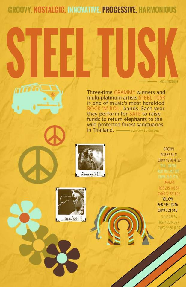
During the third week of this class, we also began writing part one of a research paper that would be completed in week four. The objective of this paper is to share my individual design solutions for the Steel Tusk Campaign and compare | confirm them to the results received from the questionnaire. Part One consisted of writing an introduction to explain the purpose of the event, a problem statement to uncover issues I was concerned about, a thesis, and a detailed description of my process for designing the deliverables for the selected project,
References:
Andreas Rampitsch illustration storyboards grafikdesign wien. (n.d.). from http://www.andreasrampitsch.com/
Beaird, J. (2007). The principles of beautiful web design. Collingwood, Australia: Site Point Pty.
Collins, H. (2017). Creative research: the theory and practice of research for the creative industries. Place of publication not identified: Fairchild Books.
Hey, I’m Claire. (n.d.). Retrieved from http://www.vanityclaire.com/#home
How Male and Female Survey Respondents are Different. (n.d.). Retrieved from https://www.surveygizmo.com/survey-blog/male-vs-female-survey-respondents-as-different-as-x-and-y/
O'Grady, J. V., & O'Grady, K. V. (2009). A designer's research manual: succeed in design by knowing your clients and what they really need. Beverly, MA: Rockport.
0 notes
Text
Month 10 | Measuring Design Effectiveness
Week 1-During week one of this class, a media project was selected from a previous class that we had completed and readings were done to develop a questionnaire to measure the success of the designs from the chosen target audience. I selected the Steel Tusk non-profit charity concert event for the plight of elephants to be evaluated in this questionnaire. The focus of my questions was to measure the effectiveness of the design for the purpose of the event even though a few issues were demographic based on confirming selected audience. My objective for these designs was to create designs that drew the largest audience and would result in the most significant yield of donations for the cause. Questions drafted were supported with a rationale based on readings for this assignment and additional research materials.
References:
Best, K. (2006). Design management: managing design strategy, process, and implementation. AVA Academia Publishing.
Collins, H. (2017). Creative research: the theory and practice of research for the creative industries. Place of publication not identified: Fairchild Books.
Entertainment Logo, Design, Maker, Vector, Free, Generator. (n.d.). Retrieved from https://www.graphicsprings.com/blog/view/the-5-most-important-things-to-know-about-designing-a-logo
Grauss, A. (2014, April 13). The SMART Way to Create Fundraising Goals. Retrieved from https://www.classy.org/blog/the-smart-way-to-create-fundraising-goals/.
O'Grady, J. V., & O'Grady, K. V. (2009). A designer's research manual: succeed in design by knowing your clients and what they need. Gloucester, MA: Rockport.
Rand, S. (2015, February 07). 24 Things to Consider When Designing and Developing a Website. Retrieved from http://www.socialmediatoday.com/content/24-things-consider- when-designing-and-developing-website.
Stone, T. L. (2013, September 12). Next steps. Retrieved from https://www.lynda.com/Design-Business-tutorials/Next-steps/114320/148466-4.html?autoplay=true
0 notes
Text
Month 9 | Multi-Platform Delivery
Week 4-Goals for this review were to add a navigational menu, populate links, make adjustments to remaining images (old-timey look), make improvements from suggested feedback for both the promotional video and parallax website.
The following enhancements were made to parallax website and promotional video for Steel Tusk. Font colors were changed to contrast against the background, a navigational menu was added, pictures were altered to be consistent with others, the logo was added at both the beginning and end of each project, and a section was added for calls to action versus images of the band.
Vector images were created (included) to add as images in negative space for the final version.
Goals for Final Revision (Revision 4)
Re-animate logo | Add music
Add old-timey feel to concert videos in the promotional video so that text will be legible and consistent with the design of the website.
Populate read more links
Include vector images in both projects.
Incorporate improvements | suggestions from Professor suggestions.
youtube
Week 4-Promotional Video (Revision 3) | Steel Tusk
youtube
Week 4-Parallax Website (Revision 3) | Steel Tusk
0 notes
Text
Month 9 | Multi-Platform Delivery
Week 3 (Revision 2)-The objective for this change was to make adjustments to video footage| images in After Effects and Photoshop so they would be more consistent with the Polaroid pictures of the band members. By adjusting the photos and video footage to an "old timey" feel the mood of the website is now in line with the era of the music genre and original color scheme can be used.
Peer feedback was requested in regards to the adjusts of the background videos and color scheme from mood board, if the bright yellow background a distraction versus the silhouetted elephant video footage, and whether the logo should be animated or static Was the animated logo and video footage too much for the home page.
youtube
0 notes
Text
Month 9 | Multi-Platform Delivery
Week 3-The objective for this revision is to create a “live” parallax website from mood board | static web design comp and continue to work refining the elephant promo video. Additional time will be taken to research different means to work with silhouettes in elephant video and ways to work in color scheme in both projects with an old-timey look.
References
Aleya, I. (2011, October 18). HOW TO CREATE AN OLD FILM LOOK USING AFTER EFFECTS. Retrieved from https://www.youtube.com/watch?v=zZted8NDWE8
30 Fantastic Examples of Parallax Scrolling Websites. (2015, August 27). Retrieved from https://webdesignledger.com/examples-of-parallax-scrolling-websites/
Davis, I. (2016, March 31). Make your Website Stand Out Using Parallax with a Twist. Retrieved from https://www.customermagnetism.com/blog/website-stand-parallax-twist/
Fun with Silhouettes in Photoshop. (2017, February 05). Retrieved from http://www.photoshopessentials.com/photo-effects/silhouettes/
How TO - Parallax Scrolling. (n.d.). Retrieved from https://www.w3schools.com/howto/howto_css_parallax.asp
Smith-Miller, K. (2016, September 13). Double Exposures in Photoshop | Photography Tutorial. Retrieved from http://www.kimsmithmiller.com/photography-tips-tutorials/double-exposures-in-photoshop/
Website Builders Comparison Chart: Find the Ultimate Site Creator. (n.d.). Retrieved from http://www.top10bestwebsitebuilders.com/comparison
Mood Board | Steel Tusk
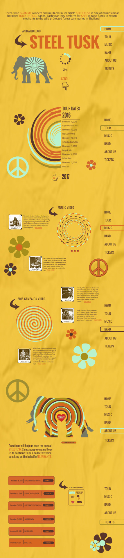
Week 3-Parallax Website Comp | Steel Tusk
youtube
Week 3-Promotional Video | Steel Tusk
youtube
Week 3-Parallax Website | Steel Tusk (Video is jerky because it is a screen recording done in Quicktime. This will disappear once the site is completed and published live.
0 notes
Text
Month 9 | Multi-Platform Delivery
Week 2-Personal assessment of the reviews and another look at the original version of the Rainy Day Toys presentation had me wondering if the cover slide of the tangram was too complicated for children aged 1 to 4. I started questioning if it needed to be changed to something simpler, which gave me an idea for a different version of this project that I felt I needed to explore. Additionally, Keynote slides seemed to be too busy, and three slides were paired down to one. The combination of all the information into one slide will allow sufficient viewer time to digest information on slides, pay attention narration, and not be overwhelmed with too much to read. Logo | Typography exploration and color palette slides were combined into one. The key attributes slide was modified to communicate the importance of interactive play and reading as learning tools for children. Putting more emphasis on the parents and grandparents being the target audience and the ones purchasing the products.
More peer feedback suggested that the texture used for the wooden blocks be adjusted to give each wooden block a realistic wooden grain and some alternations to the animated logo. (Ease in & out, sun coming out from behind clouds).
youtube
Original Animated Logo | Rainy Day Toys
youtube
Modified Animated Logo | Rainy Day Toys
youtube
Modified Rainy Day Toys Presentation (Version 1)
youtube
New idea for Rainy Day Toys (Version 2)
Instructor feedback has been requested from Professor to complete Revision 3, and 4 for this assignment and new versions will be posted as the project is updated.
Are the goals for Version 1 (educational | target audience parents and grandparents) and Version 2 (simple | target audience children) unique and should additional time be spent experimenting with this new direction?
Thoughts on adding sound effects | music to animated logo and presentation to establish a mood | tone for the project?
Is the cover slide for Version 1 of the tangram to complicated for children in the age range 1 to 4 or should it remain since the target audience is the parents and grandparents?
Clarification of what “replacement of stock photography” meant from Design Committee review?
0 notes
Text
Month 9 | Multi-Platform Delivery
Week 1-Week One of class consisted of writing a research paper from reading Hillman Curtis’s book
“MITV: Process, Inspiration and Practice for the New Media Designer.” In the paper, we were supposed to address the following: what inspiration means to the creative and innovative designer, how Hillman Curtis’s ideas can be used for seeking inspiration and identify strategies that would be helpful to me personally as an artist. Additional research was done to further evaluate the practices Curtis implements to other designers to determine whether the same results were achievable with his courses of action.
Due to illness, the past two months have been tough for me, and I have struggled meeting deadlines and meeting the objectives that I outlined in month one of this process. My intentions were to double up projects the first two weeks of this course and refine others in the last two weeks. This objective was not obtained, and new goals have been set, and professors have been reached out to for assistance in completing over the next several weeks.
The Design Committee suggestions for the two presentations were to clean up design, add motion graphics, replace stock photos, and fix the glitches in narration. Personal goals were to experience with different colored backgrounds, implement new ideas, and seek inspiration from other like presentations to set them apart from others.
Peer feedback was requested in regards to the two versions of the animated Rainy Days Toys Logo. Recommendations for tips for cleaning up the presentations, typography choices, thoughts about adding music and sound effects, clarification of what the design committee meant by replacing stock photography, and if the white background would benefit by being changed to a color one were asked.
References:
6 Ways to find the right soundtrack for your video. (2015, September 15). Retrieved from http://www.sparkol.com/engage/6-ways-to-find-the-right-soundtrack-for-your-video/
Acosta, A. (2016, October 21). How and Where To Find Inspiration And New Ideas. Retrieved from http://vanseodesign.com/whatever/inspiration-and-new-ideas/
Barry-Kaufmann, S. (2014, July 23). Why Inspiration Matters. Retrievedhttps://hbr.org/2011/11/why-inspiration-matters
Best, K. (2006). Design management: managing design strategy, process, and implementation. Switzerland: AVA Publishing.
Bradley, S. (2010, December 16). How To Gather Inspiration and Generate Ideas. Retrieved From http://vanseodesign.com/web-design/inspiration-ideas/
Dolan, T. (2012, September 30). Inspiration and its place in the design process. Retrieved from http://whiteboard.is/inspiration-and-its-place-in-the-creative-process/
Curtis, Hillman. MTIV: Process, Inspiration, and Practice for the New Media Designer, 1/e Vitalsource eBook for Full Sail University. Pearson Learning Solutions, 12/2011. VitalBook file.
Keynote Design. (n.d.). Retrieved from https://www.pinterest.com/explore/keynote-design/
LaBarre, S. (2015, May 01). What Is Innovative Design? 7 Designers And Thinkers Weigh In. Retrieved from https://www.fastcodesign.com/3044432/innovation-by-design/what-is-innovative-design-7-designers-and-thinkers-weigh-in
Neumeier, M. (2005). The Brand Gap. New Riders
Rivers, D. (2014, April 30). Recording narration. Retrieved from https://www.lynda.com/iWork-tutorials/Recording-narration/157029/171671-4.html
Wilson, M. (2017, February 07). Dropbox Lands One of Google's Top Designers. Retrieved from https://www.fastcodesign.com/3067968/dropbox-lands-one-of-googles-top-designers
youtube
youtube
0 notes
Text
Month 8 | Design Integration
Week 4-The plan for this revision four was to remain focused on creating a lenticular ad for one of the three testimonial ads, pair down the copy and chose fonts that would complement the overall design of the project. Revision three provided direction for this design. The objective for this advertisement is to take two images and combine them into one picture creating an optical illusion for the viewer. Where one image will be seen with a woman with a black eye at the other angle without.
References
Ariadna, C. D. (n.d.). Blog. Retrieved from http://www.3dlenticularfactory.com/en/blog-post/Art-in-Motion-3D-Lenticular-1
(n.d.). Retrieved from http://ad-plus.com/lenticular/2013/08/21/dulles-international-airport/
Robson, C. (2013, April 15). Lenticular Street Art by Roa. Retrieved from http://www.thisiscolossal.com/2013/04/lenticular-street-art-by-road
Jan. 31, 11:15 pm EST
0 notes
Video
youtube
youtube
Week 4-In Video one, pictures were combined, placed on Bill Board, and lines added to demonstrate how the optical illusion will take place when viewing the billboard from different directions.
In Video two, a demonstration is given of how the lenticular advertisement was composed of the changing images.
0 notes
Photo


Week 4-One image was chosen and modified with PhotoShop to add a
bruise on woman’s shoulder and a black eye. The text was paired down,
and a new headline was created.
0 notes