
ckurashima-acmwo-capstone
Capstone - Art Portfolio Website
12 posts
Don't wanna be here? Send us removal request.
Last Seen Blogs
viktoriakayfans
Viktoria Kay
vatanizmtr
🇹🇷 SELİM 𐱅𐰇𐰼𐰰 🇹🇷

motivationalkaka
Untitled

blover19-blog
EreMin
Text
Final Reflection Video
youtube
I would like to thank everyone who have helped and supported me throughout my capstone project! I greatly appreciated all the assistance and help you have provided for me. I hope you do well on your future endeavors!
- Carter Kurashima
0 notes
Text


Progress Report #9
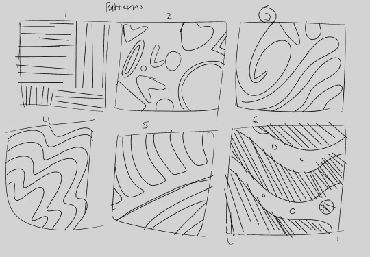
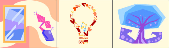
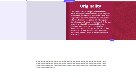
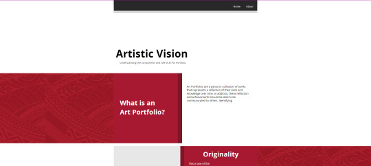
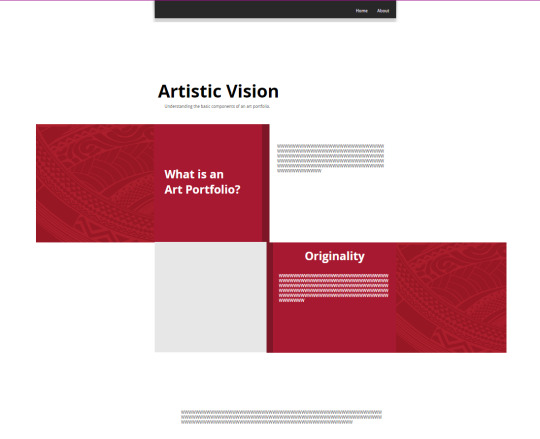
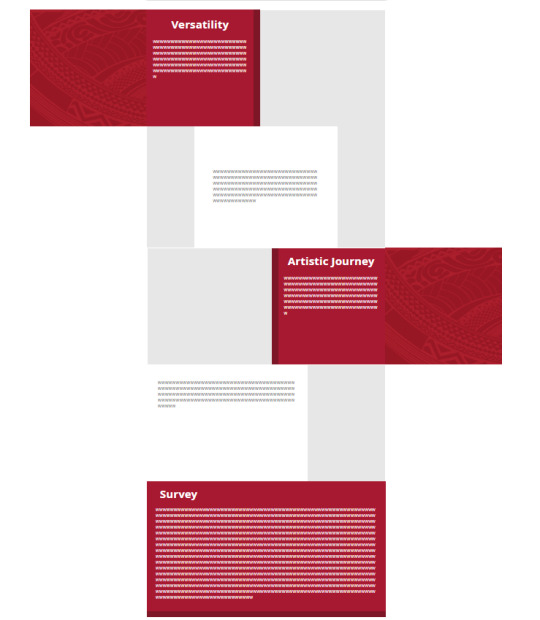
Since the previous post has rushed over a lot of the process due to my lack of updating the blog, I will use this report to go more into depth on the processes while introducing new things that I have done today below. For the section illustrations, I wanted to follow what I initially had in mind from my Mood Board. The one I struggled the most in representing is originality. I wanted to emulate that idea of merging existing things and making it their own piece of work. I initially drafted the cone-like structure next to the light bulbs, but realized that it would fit much better in representing variety. I then decided to follow the lightbulb idea and merge it with what I had from my page background illustration.
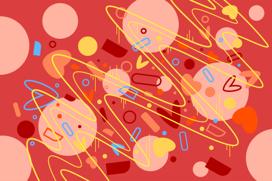
For my page background, I wanted to emulate the idea of doodling and sketching. After experimenting with different style and color, I decided to follow my first sketch and play around with the shapes from the second and fourth. Exporting the image as a Wix page background was my main struggle for this step. The required image size needed to fill up the whole page was not clear. I have tried researching and found minimal results from my attempts. I then decided to do a trial by error to see the image boundaries.
Similar to my intentions with my page background, I wanted my pattern to be doodle-like. I decided to do my third sketch that emulates thick brush strokes. Unlike the previous obstacles, I did not have any struggles other than image sizes when importing it on Wix and through mobile.


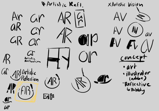
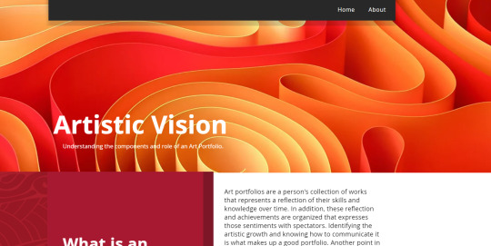
What I have done today was designing my website logo and thumbnail. I followed my concepts from the previous works I have made and experimented with the initials with my title. At first, my title was "Artistic Vision", which I have decided to change it to "Artistic Reflection". I felt that reflection fits with what my website is all about; a source of information that introduces art portfolios in a different light. After playing around with the initials, I've chosen the highlighted one from my sketch. The design follows the doodle style I am going for. I then created it through Adobe Illustrator and designed a thumbnail page for it.
Now that I have had some time to breathe, I feel like I'm closer to the finish line than I had initially thought. I'm not planning on adding new pages since adding more stuff could distract myself from polishing what I have right now. For some reason, the containers and sections that I have made to be adjacent keeps on leaving tiny gaps whenever I come back to the editing after a break or two. I also want to make sure the website is functioning well. I have already published the website and tested out the link on my own computer. For now, I will keep an eye on small errors or mistakes until the end of the semester.
0 notes
Text
Progress Report #8:
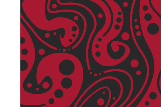
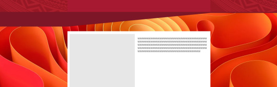
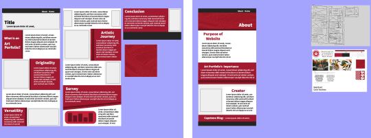
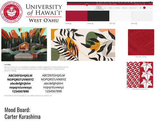
Hello! A lot of stuff happened since the last two weeks. I was able to communicate with UHWO's Design and Communication office and ask them about the design motifs and color scheme. I learned that the kapa design is also for official use only and the color scheme should not be too close to UHWO's Brand for my capstone project. With that in mind, I created my own pattern and page background using analogous colors and limiting the type of red related to the school's brand. Implementing the page background in the website has brought up some issues of readability for the white title or text without a rectangle behind. I had to make changes by creating a gradient to emulate a shadow transition.
I also designed images related to the sections, updated the survey graphs, and implemented my website design in a mobile format. The mobile format was a huge obstacle to overcome since the amount of space available from Wix's website editor shortens by a lot. I had to change and simplify my layout for it to be an easier viewing experience to mobile users. Those changes however, limited the amount of variation I used to make my website more visually appealing.
Despite all this, there are still plenty more things to do in order to finish this project. I still need to design a website thumbnail and create a logo that best fits with what my project is about. My current mindset right now is to get it finished as soon as possible before the deadline comes in. However, I do feel a bit happy I was able to get these things done and keep up the momentum.
0 notes
Text
Progress Report #7:
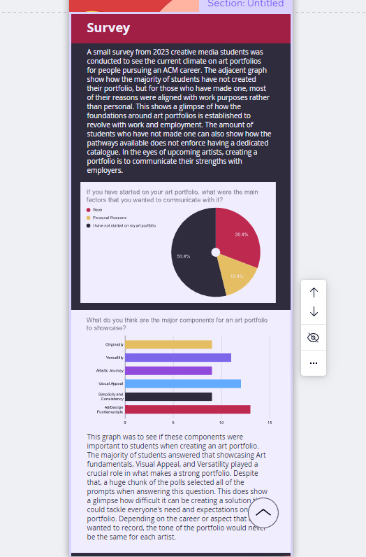
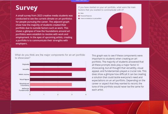
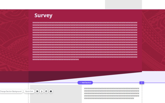
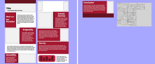
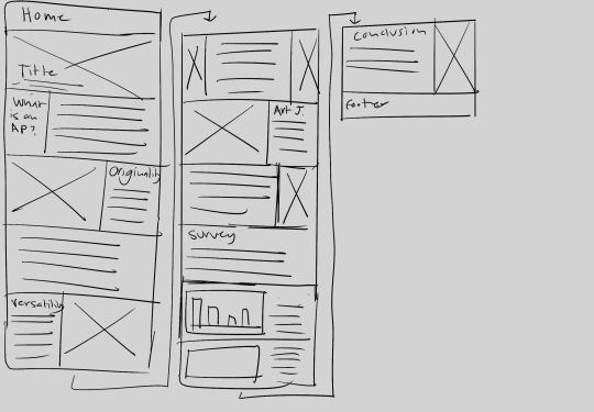
I have finished the rough text layout for the home page and started to create the layout for the About page that I drafted in Adobe Illustrator. Looking back how I initially set up the placement for the survey section felt a bit off because of how they were disconnected into two different sections, which made me decide to combine them into one. I have also created graphs based on the current result of my Art Portfolio survey. The amount that have participated is a bit low and I am unsure how to expand my reach to students within my demographic outside of my enrolled class. However, due to the current timeline, I may need to ignore that and put my attention to the illustrations.
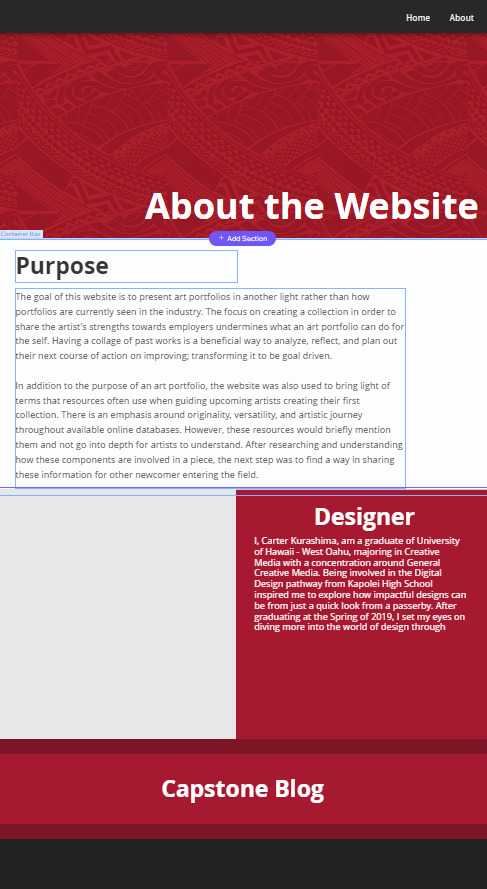
The About page that I have created is more simple compared to the main page. After reviewing what I have, I noticed how zooming out of the website reveals shapes that overlapped what I have displayed at 100% zoom. I am unsure what to do to solve that problem. Maybe purposely capping the edges with a different color to imply that the borders were intentionally placed that way while avoiding the need to extend the shape all the way to the website's sides.
With these things in mind, I need to figure out ways to make this page more clean and enter the next phase like the illustrations.
0 notes
Text
Progress Report #6:
I am still working on the text for my home page, but there were some technical difficulties while I was reviewing the page in preview. The UI design when selecting sections in editor mode hides pixels near the edge which leaves small empty gaps between them. In addition, stretching and scaling relies solely on the mouse which does not always lead to precision. This has been a reoccurring situation where I would make some changes with the shapes and container available, but end up re-editing them because of uneven sizes or gaps between sections. Another thing that I tried to work on was the parallax motion on the homepage. The page felt a bit static and had an unprofessional tone to it. At first, I tried to change the background for adjacent sections, but it wouldn't be a continuous image. I then looked up if there was a parallax option and found out through wix FAQs. I'm using a sample image to see how it performs and it does solve what I was initially feeling before the changes. With that in mind, if I were to take this direction, I would not know the exact dimension for the page since the length changes depending on the amount of sections. I would have to create a template by myself and test if it would lead to pixelation or not.
0 notes
Text
Progress Report 5:
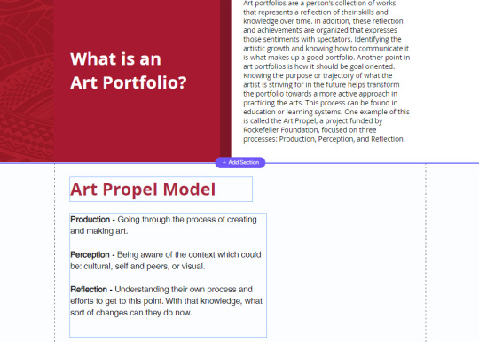
I'm still working on the written portion for each section, but I got the majority for the three components I presented from my research paper. After reviewing what I have right now, I am currently thinking of making the empty sections between originality, versatility, and artistic journey a one line summarization of the previous section. I hope this would help conclude what the overall section is about. Another thing that I added to the website was a section about the Art Propel Model which was something I have found during my research. This model is centered around artistic growth and process being applied to art portfolio. I was hoping that introducing this model as its own section would best establish what the website will be sharing. For now, I'll continue working on the written content for the rest of the website and later on try sketch out a kapa pattern design and the about page.
0 notes
Text

Progress Report #4:
From the previous report, I tried to figure out if I can change the shapes that holds the text similar to what I had in mind from my draft. Although I couldn't edit the shapes with anchor point, I thought I could upload an image with the shape I want and overlap it to make it seamless. However, another obstacle came up in which I can not overlap the shape between two website sections. I then tried to put it in one section and make the space imply that there is overlapping. Although it did work, I realized that the dark red color I have used between Illustrator and Wix are different. I realized that the hex color I used between draft and sketch had different value despite using a guideline for UHWO brand color.
Another realization I have was how the background asset I used does not completely fill the outside space. The picture below shows me duplicating the kapa sample to see if this is the direction I want to go through. I will have to design my own pattern soon and need to take the dimensions in account. As I was filling up spaces, I tried adding some written content for the beginning sections. I am not sure whether or not I should make the content detailed or simple with another page that dives deeper with each section. For now, I will make the content simple, but can be used as a stand alone without needing any extensions from other pages.
0 notes
Text

Progress Report #3:
After making the previous report, I realized that I would be transferring these ideas into the Wix website editor and was not sure if my draft would work outside of the Adobe Illustrator program. Using the editor was a bit uncomfortable and also limited compared to what I used to be able to do on Illustrator. There are no anchor points I can freely edit the shapes with and for some reason, overlapping shapes or text together would automatically group them. This became more frustrating when I had no clue on how to separate them. However, I figured it out overtime and continue on with recreating my sketch. Another thing that I have realized was the website formatting. There are usually an excess of space on the sides for content that is optional which I did not consider beforehand. Although the sketch wouldn't change that much, I have extra space to make the design more appealing. With that in mind, I will try to experiment with what I can do to add on my website design.
0 notes
Text
Progress Report #2:
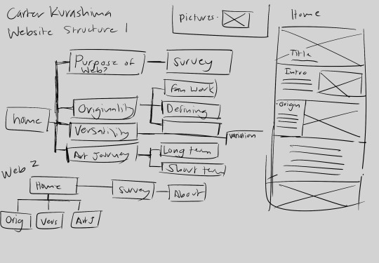
Hello again! I am currently drafting the wireframe and experimenting with what I initially planned out for the vision of my website. It was to be similar with the branding of UHWO due to my target demographic being UHWO CM major students. After researching about UHWO's brand identity, I tried to apply the format with what I have sketched out beforehand. However, copying the design based off the sketch I made felt stagnate. I then made some attempts to change the shape of the sections or add overlapping boxes to see if that has improved the visual appeal or not.
Looking back at my progress made me wonder if I should stay within the UHWO format or experiment with some other design not explicitly stated within it's identity. In my mood board, I initially picked out some vector designs since it felt like it would fit with the artistic theme of my project, but may not fit with UHWO's formatting. Maybe I can experiment with line art similar to the one shown below since it doesn't feel too intrusive to the school's brand.
0 notes
Text
Progress Report #1:
Hi everyone, my initial plan for this project is to create a website that showcases my research. Currently, these are my rough drafts for my wireframe and timeline. I am thinking of either adding another page for repurposing some of my pages to apply my research. Since my problem or concept is so abstract, I'm having a bit of trouble organizing what I want to say on my website. I was hoping to have a separate page about your thoughts on the topic. Therefore, I made a google form that I posted in hopes you guys can fill it out.
0 notes
Text
Hi everyone! If you can please fill out this form so I may have your thoughts on art portfolios. Any help would be appreciated. Thank you.
0 notes
Text
youtube
Introduction Video
For Fall 2023 Senior Capstone Project
2 notes
·
View notes