charlotte-rmit
charlotte barry
communication design - rmit
67 posts
Don't wanna be here? Send us removal request.
Last Seen Blogs

robbypanggabean89
Robby Prima Panggabean

atiwebcuba-blog
Informática y electrónica...
all54321
I Love Drawing And Writing Things
robbypanggabean89
Robby Prima Panggabean
medhasree
follow approach
Photo
Thank you!! xo
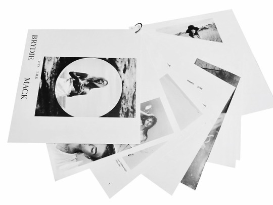
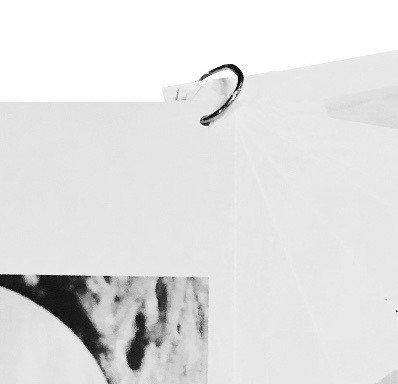
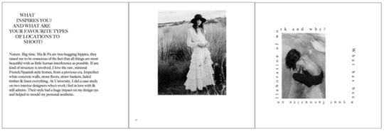
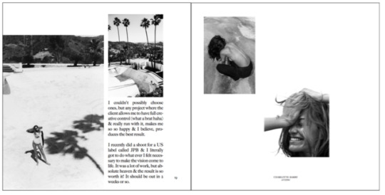
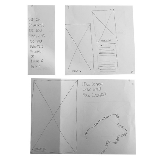
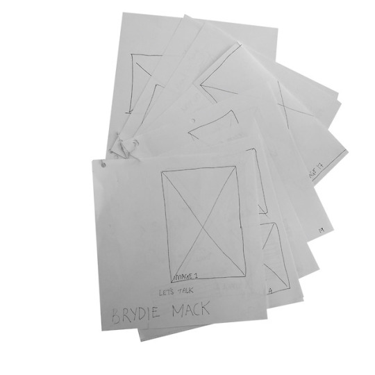
Ask me anything project! Final presentation, ’Let’s talk Brydie Mack’.
Well, after losing my WHOLE document because silly me didn’t save it.. who would have thought printing was going to be the worst / hardest part!! Unfortunately I didn’t acknowledge that i needed to ‘flip and alternate’ my design so the pages matched up when printed landscape double sided. This meant the guidelines included on each page to display the hole-punch placement were not meeting up. :(
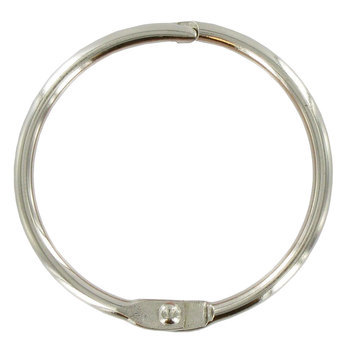
ANYWAY, despite all of this negativity hehehe I really enjoyed this assessment and I’m surprisingly very happy with my final outcome. I believe this zine/mini booklet represents Brydie Mack’s photography and aesthetic quite well. She described her own style as candid, fun, nonchalant and raw, so i tired to incorporate that into my presentation. Selected black and white images have been utilised on white backgrounds and printed on white Uncoated 300gsm paper. I incorporated a variety of different sized and shaped pieces of paper - square 297x297 being the main template, and to bind my book i used a silver metal ring to hold the pages together.
15 notes
·
View notes
Text
Friday 25th was sadly our last comm design class! Thank you so much to Andy and Karen for making every lecture and workshop interesting and enjoyable!!
0 notes
Video
FINALLY handing in our assessments !! WOOH @allegrajenkins
3 notes
·
View notes
Photo
Ask me anything project! Final presentation, ’Let’s talk Brydie Mack’.
Well, after losing my WHOLE document because silly me didn’t save it.. who would have thought printing was going to be the worst / hardest part!! Unfortunately I didn’t acknowledge that i needed to ‘flip and alternate’ my design so the pages matched up when printed landscape double sided. This meant the guidelines included on each page to display the hole-punch placement were not meeting up. :(
ANYWAY, despite all of this negativity hehehe I really enjoyed this assessment and I’m surprisingly very happy with my final outcome. I believe this zine/mini booklet represents Brydie Mack’s photography and aesthetic quite well. She described her own style as candid, fun, nonchalant and raw, so i tired to incorporate that into my presentation. Selected black and white images have been utilised on white backgrounds and printed on white Uncoated 300gsm paper. I incorporated a variety of different sized and shaped pieces of paper - square 297x297 being the main template, and to bind my book i used a silver metal ring to hold the pages together.
15 notes
·
View notes
Photo
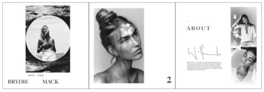
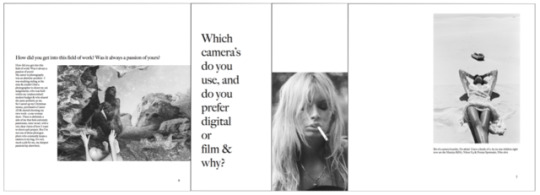
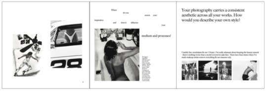
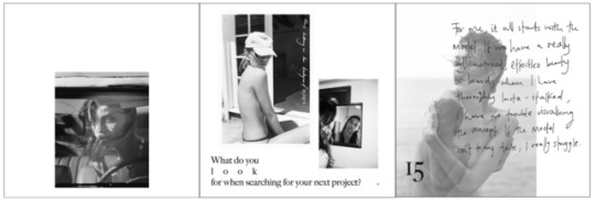
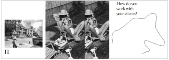
YAY! Its almost finished. I’m really happy with the final outcome. I think all the images i’ve selected work quite well together and represent Brydie Mack’s aesthetic and personality of her work. I tried to find images that make sense with the questions asked and her answers. For example - Byrdie’s biggest source of inspiration comes from Helmut Newton, Hans Feurer & Gilles Bensimon’s style of work. And because of this I chose images of her work that look that most similar to their style of work.
5 notes
·
View notes
Photo
Another change...
I’ve decided to incorporate a variety of different size pieces of paper within my booklet. Hopefully this makes it look a bit more interesting.
Im binding my pages together with a metal silver ring.
1 note
·
View note
Photo
This is my final presentation mock up design. Here, i’ve decided to use only square size paper (297mm x 297mm) allowing me to use an A3 size paper that i can cut down after printing. I want my design to look clean and bare (using a minimalist approach) with only white backgrounds. I’m considering only using black and white images (sourced on http://wolfcubchronicles.com/ with permission from Brydie Mack). I’m finally happy with my design and ready to make it!!! Wooh
1 note
·
View note
Photo
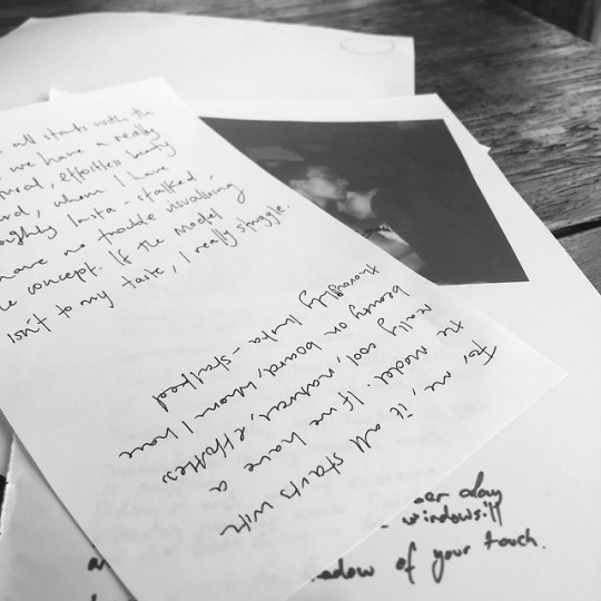
MAKING A MESS.... Wrapping my head around my final presentation. So many different methods and layouts to consider. However, i’ve decided to use a square sized / layout paper booklet. I can’t wait to jump on Indesign and get it started.
5 notes
·
View notes
Text
Week 11 Workshop
During week 11s workshop we were given some very helpful tips by Andy and Karen on InDesign to help us create out final presentations. This was very helpful as I haven’t used this application much in the past.
Click ‘W’ - Preview for printing.
Click ‘T’ - Text tool
Page ‘A’ - Set as the master document (title, photos, body text, guides)
Recommended dpi 240 - 300 (High res) much better quality for printing purposes.
Ctrl + D - Insert/place images into containers (photo frames)
2 notes
·
View notes
Photo
This is very interesting. Great post.
WEEK 11 LECTURE:
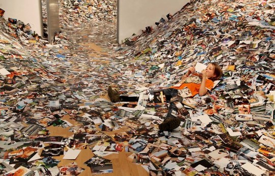
This week we discussed the future of design and what our role is as designers. Erik Kessel’s ‘24 Hrs in Photos’ demonstrates how the internet and its users are bombarded with countless images everyday. This provokes the question of whether or not your imagery is going to have a lasting impression or if it’s just going to get quickly lost and consumed unless it’s done for the greater community.
16 notes
·
View notes
Photo
This is just amazing!!!


WHAT THE ‘F’
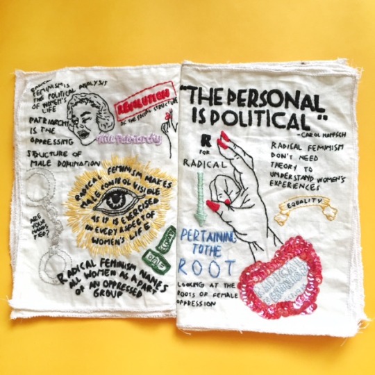
Crafts, illustration, and textile design piece by graphic designer Claudia Aksha of Jakarta, Indonesia
“The name Girls Gone Wild is chosen for this zine because it resembles how radical feminists were in the past, which is out of the norm and have no fear. And this zine will fully talk about radical feminism and the impact of radical feminism in the 21st century. Girls Gone Wild Zine is a little bit different from other feminism zine because GGW Zine criticize feminism (not in a bad way). GGW Zine criticize what feminism or feminist today often to forget and missed in today’s context. GGW Zine is straightforward, sarcastic and out of the feminist norm. GGW Zine is still a feminist zine, just in a different way.
The materials chosen for this zine is very unconventional, it’s not like how zine is normally produced. The reason behind it is because I wanted to discusses radical feminism in a radical way which is going outside the norm of how a zine should be.”
5K notes
·
View notes
Photo
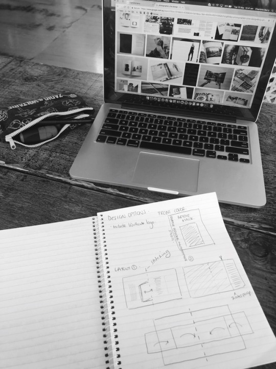
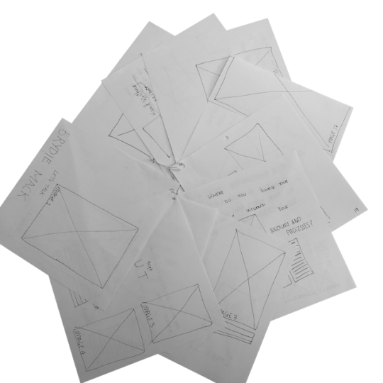
Doing some research and sketching out some ideas for my final zine design.
2 notes
·
View notes
Photo
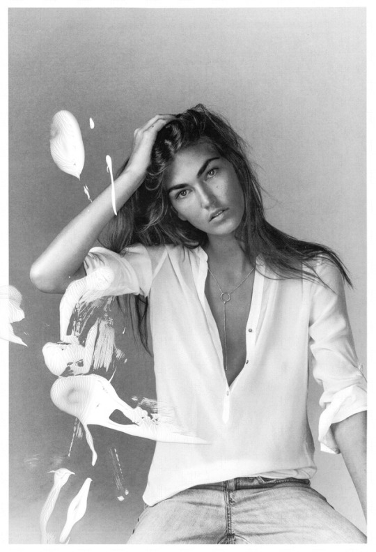
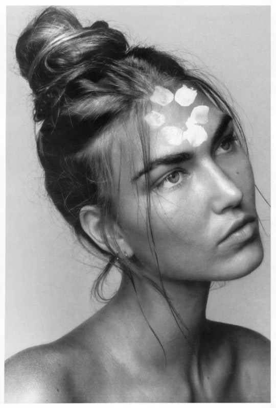
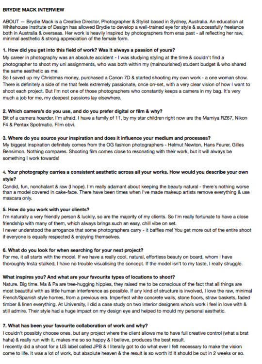
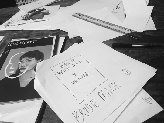
ABOUT —BRYDIE MACK
Brydie Mack is a Creative Director, Photographer & Stylist based in Sydney, Australia. An education at Whitehouse Institute of Design has allowed Brydie to develop a well-trained eye for style & successfully freelance both in Australia & overseas. Her work is heavily inspired by photographers from eras past - all reflecting her raw, minimal aesthetic & strong appreciation of the female form.
3 notes
·
View notes
Photo
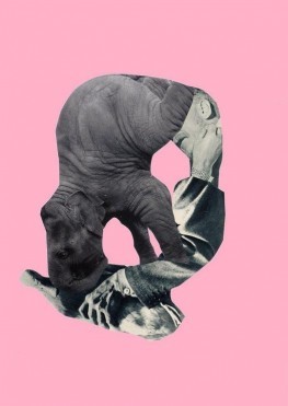
Inside the spirited collage worlds of Sergei Sviatchenko - Really interesting article! https://www.calvertjournal.com/features/show/6768/sergei-sviatchenko-collage-rick-poynor
3 notes
·
View notes