
cathshaylergdc-blog
Cath Shayler Design
graphic design / art direction
38 posts
Don't wanna be here? Send us removal request.
Last Seen Blogs
limitllex-blog
LeX
ticci-toby-rp
Rp Blog
xtsutsu-blog
i am not a robot
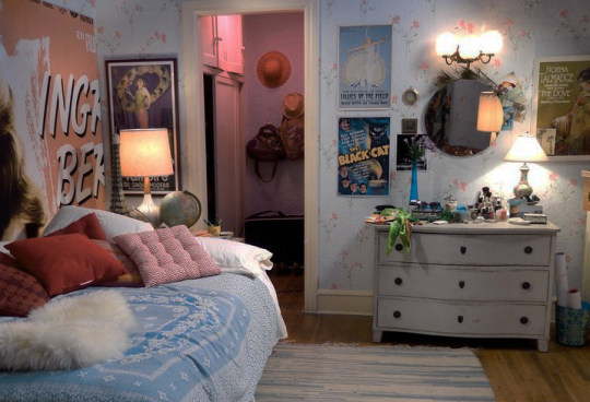
yourethepeachestomygeorgia
baby angel
rosesgrownbytheseaside
rose’s vanity
Photo

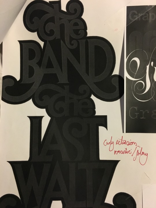
Bold Type
To spark inspiration for the bold type project, I basically just went to the library and collected a pile of all the type books possible.
Then photocopied my favourite fonts and attempted to annotate figuring out what I liked about them. This left me with a massive pile of photocopies of completely different fonts. I’m sure in some way this process was beneficial to me - but mostly it seemed like a big waste of time and print credits.
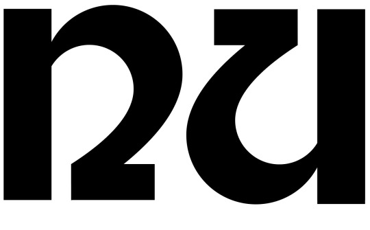
From the pile of scans, these two fonts stood out to me the most
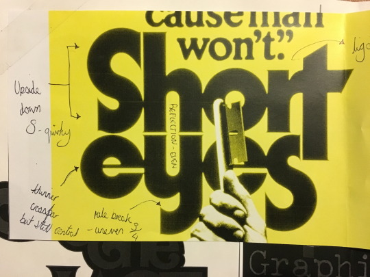
I liked how this font initially seems strict to basic type rules. However upon a closer look you see that the S are unbalanced. The lower half of the Y is cut short of the normal, and the crossbar on the E is unusually thin. All whilst keeping even widths throughout.
This design kept catching my eye amongst the others. The letter forms seemed flirty and film like. Classy but almost tacky at the same time. After this discovery I looked out in the rest of the books for similar font styles

^ focus on faded grey font in the back - curvy and linked.
From looking a these fonts I started to get the feel of some sort of tacky 70′s dating shows. The type of thing classically mimicked in the black eyed peas’ don't funk with my heart music video.
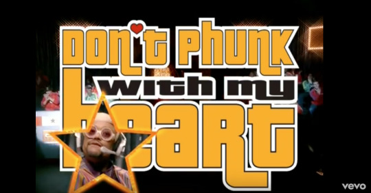
Although this font is nothing like the pictured above. The setting massively interested me, and got me thinking about how I could create a type of font to compliment the tacky dating setting


First Attempts
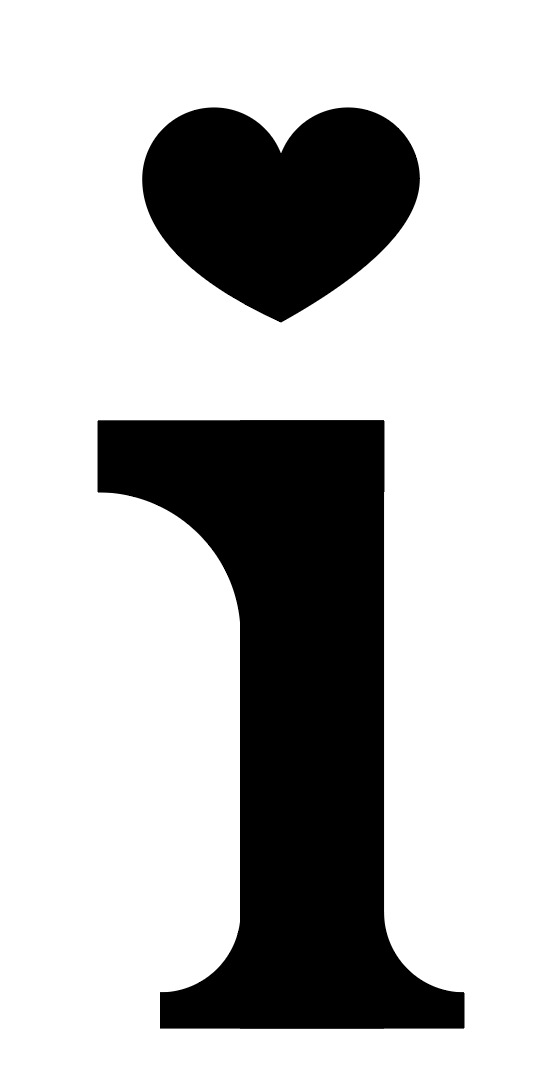
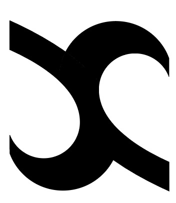
Initially I wanted the font to be a serif with some 3D detail and heart features, which worked nicely for the i but became difficult when I tried to make other letters look interesting.
Heart shape structure pictured above
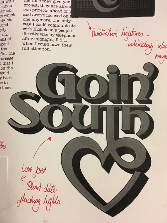
I then experimented trying to make an N using the same heart shape structure from the I with a ‘foot’ (unsure of technical term). These turned out looking quite similar to the N in the Goin’ South poster (pictured earlier)

However this turned out looking a bit too clunky and arabic looking when applied to other letters. So I experimented a little more

bad

worse

terrible
Further Developments

I then decided to remove the foot, creating a more curvy letter. From here I experimented applying this pattern to a number of different letter variations.

Alphabet First Attempt
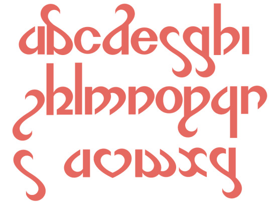
It was at this point where eI began to notice that my alphabet looked a bit arabic. Also that it had moved away from my initial date show idea. And also that the majority of my letters were a bit rubbish.

Further development / a very stressful image.
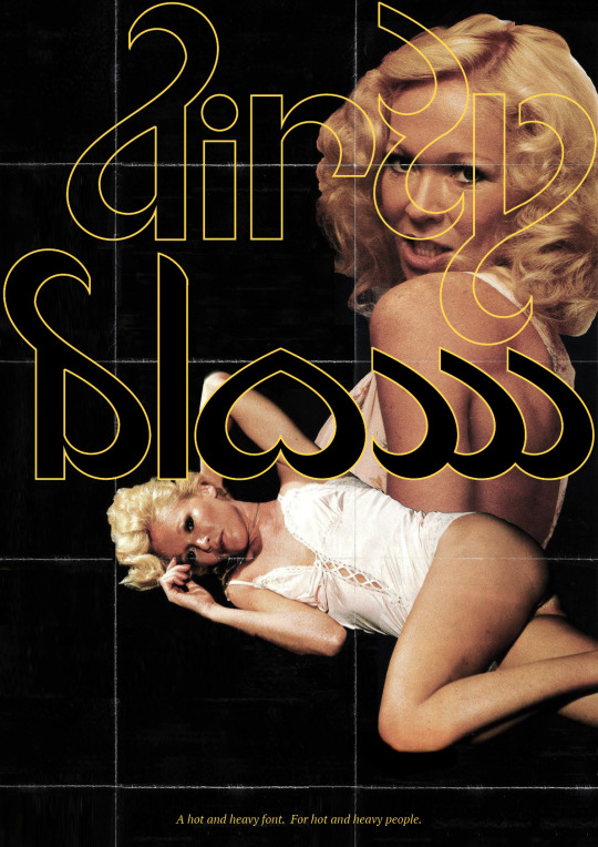
At this point it was suggested to me that I ditch the whole date show idea and go full blown 70s porn video tape.

Some inspiration
Final Outcomes


0 notes
Photo
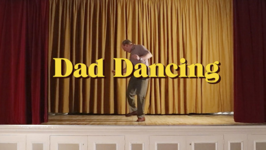
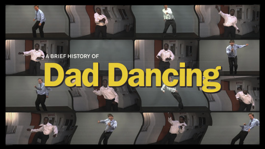
FMP - A Brief History of Dad Dancing
Week 1
Easter boredom cabin fever combined with excessive amounts of time spent with my family over the past few weeks lead to the development of the following spotify playlist.

Something that started off as a silly joke with my dad soon turned into discussions of dad dancing and the weirdness of it all. I found myself listening to Dire Straits picturing a professionally shot music video featuring a group of dad aged men dancing terribly.
From here I started thinking about how I could take the idea of dad dancing and somehow turn it into an interesting project - more than just filming a group of men dad dancing in a white studio.
Initial ideas:
Dads dancing a choreographed routine to dad music
Dads dancing a choreographed routine to very not dad music
A printed guide of dad dance moves along with song suggestions
How to dad dance. A step by step guide similar to the 16 x 9 project.
Dad dancing mockumentary
From the initial ideas I started to go with the documentary idea - but present it as a trailer for a full length motion picture. Reducing the project to a trailer format would allow me to get a range of ideas in without anything becoming too dry and lengthy. Also it was a perfect excuse to use the slow dramatic intro to Dire Straits’ Money for Nothing within a project.
Development of idea:
Average trailer length is 2 minutes 30 seconds
Typical trailer intro: From the studio that brought you ‘I Lollipop Lady’ and ‘A beginners guide to buffet preparation’
Perhaps might have a sense of alternate reality where dad dancing is a huge phenomenon all sprung from one man at one family party ‘ years ago’
End of video - advertisement for how to kit with VHS and booklet
SOCKS AND SANDALS
Personalised mug - worlds best dad
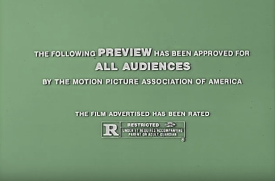
PG trailer ident


Documentary style slow zoom in of images of album artworks etc.
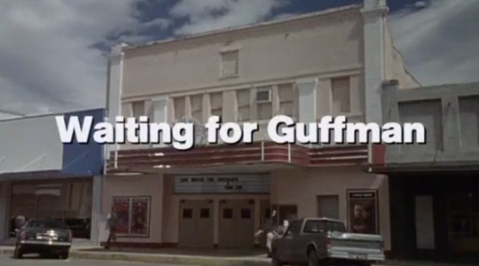
Retro title inspo - Waiting for Guffman
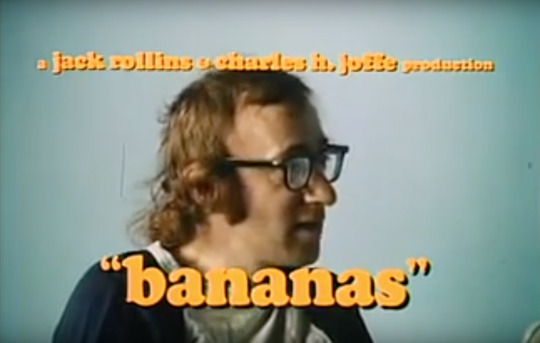
Retro title inspo - Woody Allen Bananas

Lonely Boy music video - Aside from the obvious brilliance, I really like the mise en scene in this video. The muted colours with a terracotta feature make it all seem very dad-ish and the setting seems to have a very old working mens club feel. I feel I would like to have a similar setting to this for my film. Perhaps in a family party setting for the scene of the first recorded dad dance.
Week 2
After my idea was approved in the crit I made it my main focus to organise a shoot date, place and actors. Since i already had 4 dad dancing volunteers back at home - my dad, 2 uncles and friend of the family, I decided it would be a good idea to shoot my film back up north - working mens club city.
Location option 1
Driffield Masonic Lodge

Bad pics, but the only available two on the internet. This place looks good and is really close to where I live. Brown also so would go with my colour scheme.
Location Option 2
Darby and Joan Hall Cottingham


This place looks pretty much perfect - and is cheaper than the previous. I have contacted them enquiring about booking.
Further Development of Idea
Possible intro phrases (text or voiceover) “Since the dawn of time” “Now. Their story will be told” “In a world/ in a land/ in a time” “One man changed everything/ changed the dance floor forever”
Interview clip “I don't know where it came from, or what inspired him. It just... happened”
Interview clip “Bands started making music specifically for us dad dancers” - slow fades of album artworks seen previously
Fake newspaper articles on the phenomenon
Images of protest? ‘We’re not dad’s but we like to dad dance’
Ballet training scene - quite billy elliot. Timed counting 1 2 3 1 2 3 but dad dancing, not ballet.
After my first crit, it was suggested that I drop the ‘a brief history’ and just leave it at ‘Dad Dancing’
Week 3
STORYBOARD
vimeo
This week was all about organising my family/cast of the video. And making sure they all knew what would be going on on my shoot at the weekend. I put together a storyboard video along with a bunch of clips I’d got together for the dancers as dad dance inspiration. “dad danspiration”
youtube
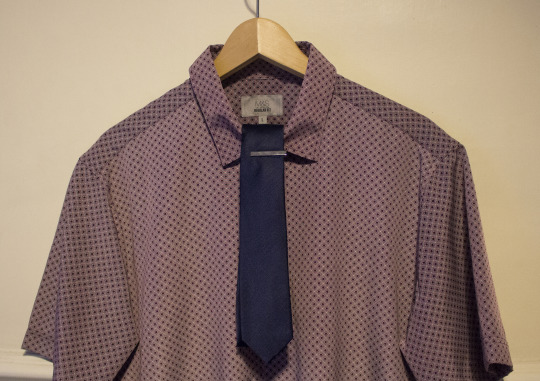
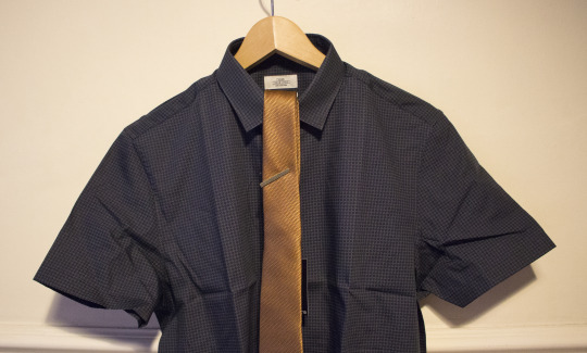
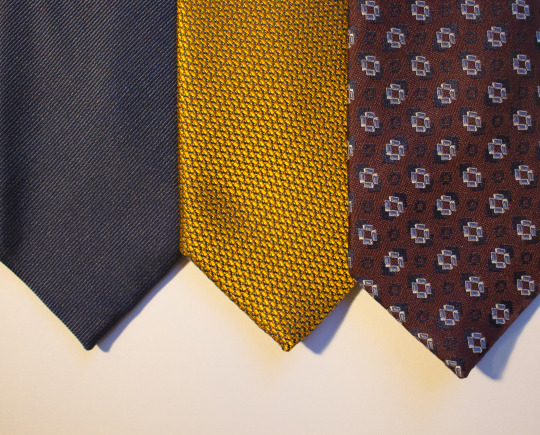
I also sent out a PDF outlining the colour scheme of the video, to make sure everyone was colour coordinated. Unfortunately most people didn’t own clothes in fitting with my colour scheme. So I had to buy new stuff to return after the shoot.
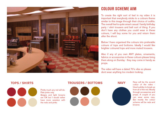


Very important sandals


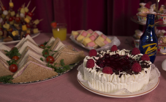
Since one of my scenes outlined in the storyboard was a 70s style buffet, my family agreed to help me put this together. Here is a moodpboard I sent to them for inspiration.
Shooting Plan
I also put a shooting plan together using the images from my storyboard to help form a more organised plan for the day.


Week 4
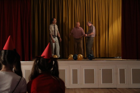
The Shoot
Managed to get through the day without anything going horrendously wrong.
youtube


(before)

(after)

(My auntie hanging stood on a ladder holding up the disco ball tied to a long pole poking through the curtain)
Some Unused Things
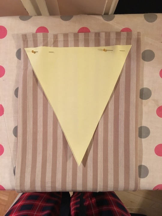
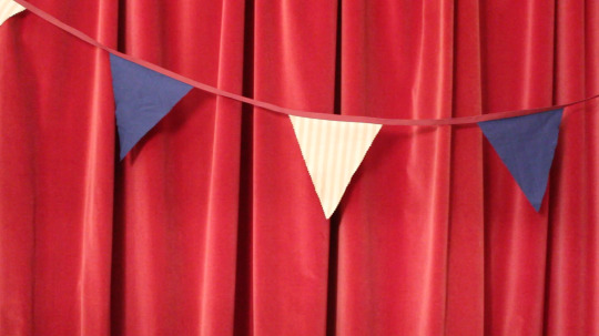
The Bunting
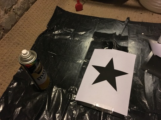
I made some of my own bunting for the shoot in fitting with the colour scheme. However, when we got to the shoot, there were no big open area of wall to put it up where it would look good.

Sandra
This was meant to be the opening shot of my video (as pictured in the storyboard). Sandra was acting as the wife of the first ever dad dancer reminiscing about that night. However, when it came to editing, the clip didn't really seem to work.
youtube
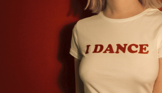
I Dance... Like a Dad T shirts
Another thing shown in my storyboard that didn’t really work in the video when it came to life.

Jokes/Photoshop Details
Whilst I wanted my video to be believable as a trailer, I also wanted to add some subtle details within it that may have gone unnoticed on first watching.


Simon Grents - Closest name I could think of to rhyme with Nigel Bents

Unused Sandra clip features I Want to Break Free era Freddie Mercury hanging on her wall as decoration - A true dad rock classic
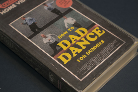
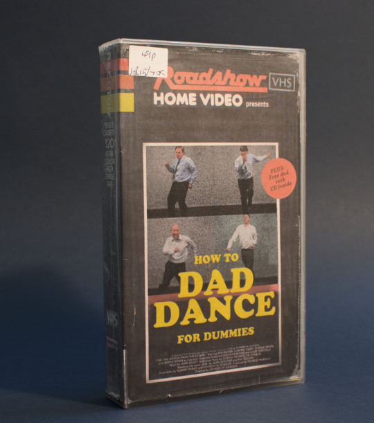
A video tape I made and photographed
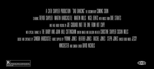
The trailer credits feature the names of everyone who helped me in the making of the video.
THE FINAL OUTCOME
vimeo
0 notes
Photo

Jonathan Barnbrook Guest Lecture Poster Design
This week I worked on a guest lecture poster design for Jonathan Barnbrook: Designer of Blackstar and Bowie's previous four albums / typographer and creative - From Bowie to Banksy. I tried to incorporate backstar into a serif font crossed with a spray painted other half.
(BTS) spray painting in the cellar - bad idea - bad ventilation
Final Outcome

My final design didn’t win the pitch, however I did get a mention that he liked my design but felt another design represented the title of the talk better
0 notes
Photo
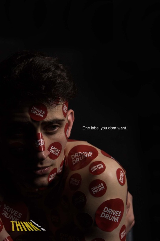
THINK - Week 1
Over the course of this week I have been trying to get ideas together for the YCN brief. My main goal was to fully analyse my audience and consider how I should approach the brief in their context. After an initial talk with our tutor, we decided as a group that we were going to go against the initial THINK strategies: dark, bloody adverts with victims flying over bars at 60mph and children narrating that their daddy killed someone.
I started thinking about the social stigmas surrounding drink driving. Since the first public campaign against it back in the 60s, the number of accidents caused by drunk drivers has dropped by over a half. These campaigns made drink driving socially unacceptable amongst older generations - I wanted to test out if there was a similar viewpoint in the 17 - 24 age category.

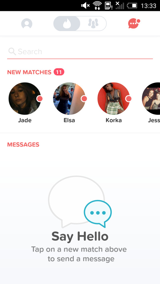
I sent out a group message to a ranged group of my 17-24 male friends asking them if they would allow me to use their profile photographs to create two fake tinder accounts. One for a safe driving persona, and one for a drink driving persona. Luckily I had a successful response with most of my friends agreeing to the experiment.
I experienced a minor hiccup after realising that in order to make separate tinder accounts for my friends, I would need 7 different phones. So to start off, I just made one. My friend Paul became Pablo. (Picassoh)
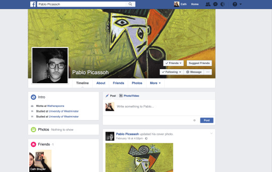
Fake Facebook account was needed in order to create a fake tinder profile.

Initial tinder profile. Pretty unrealistic as nobody would actually ever put this in their bio.

The safe driving account received 20 matches in 24 hours, and even a message of approval from one match...
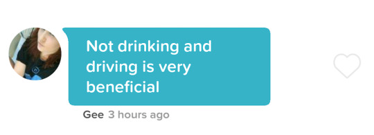
I then changed the tinder profile, keeping every aspect the same apart from changing the I don't drink and drive statement to ‘I drive drunk’

Giving the account another 24 hours drunk driving Pablo came back with 11 matches, nearly half of what he had received the previous night.
This proved successful as a first experiment on the idea of drink driving as a socially unacceptable thing. The response was good from my friends who wanted to take part, so I think I will further it making a couple more tinder accounts over longer time periods so I have more substantial research at the end of the project.
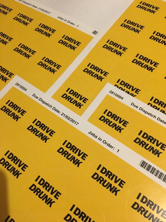
Along the same theme of social unacceptability, I have ordered some stickers with he statement ‘I DRIVE DRUNK’ printed on them.
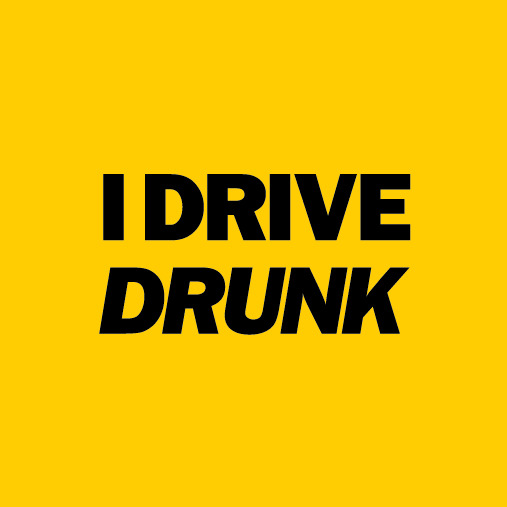
(Like that... but circular)
I plan to hand these out to members of the public next week as a social experiment - to see wether or not they would wear them. Hopefully they won’t, and i can continue a concept along the lines of ‘If you're embarrassed to broadcast it then why do it’.
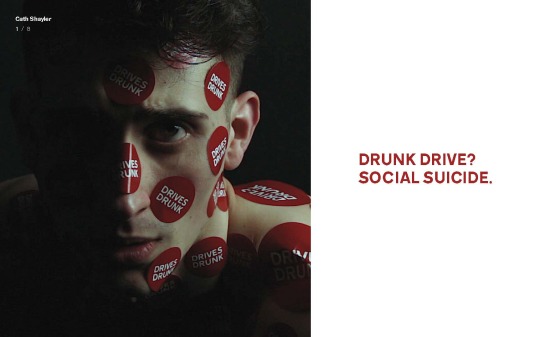
Strapline idea: Drink drive? Social suicide.
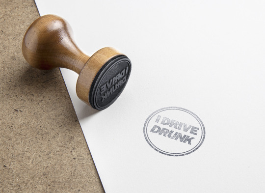
The sticker idea lead onto a possible advert concept, where upon entry to a club a boy is stamped with an ‘i drive drunk stamp’ the music goes off and all the chatter stops - a clear awkward vibe overcomes the whole scene.
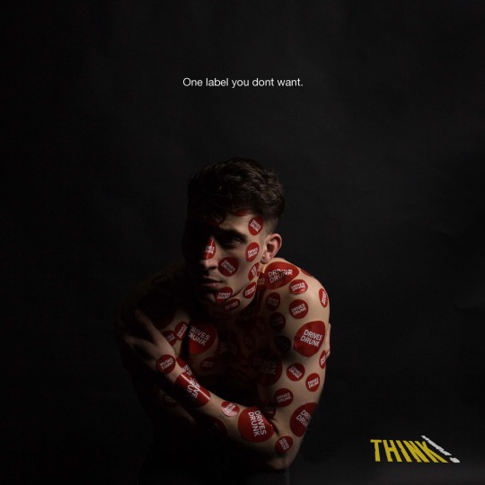
When presenting my ideas to the group it was clear that the concept of being revealed as a drunk driver to be something humiliating or embarrassing worked. I’m now thinking of taking this concept down a photographic route focusing on one male character. Perhaps named Dave. Dave Drivesdrunk. There will be a serious of portrait shots where dave is put in humiliating settings, however the humiliation is caused by the exposure of his drink driving.
Potential ideas:
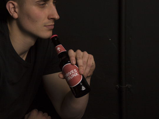
Beer bottle with a label and arrow pointing upwards saying ‘drives drunk’
Club entry stamps
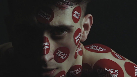
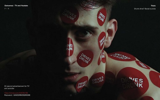
Simple face on portrait of Dave covered in ‘I drive drunk’ stickers
Perhaps an instagram account @davedrivesdrunk clearly friendless with personal style shots and selfieswith 0 likes
Standard nightmare of turning up naked to school - but instead of being naked... He is covered with i drive drunk stickers and stamps.
Week 2
This week my stickers arrived and I took to the streets of Hull to try and get people to wear (or preferably not wear) them. Overall this experiment turned out to be kind of a waste of time, as I didn’t really know wether or not people had worn the stickers or not. I linked to an instagram account on the back of the sticker - but nobody seemed to respond.
Despite this I carried on with the sticker idea - testing out what it would look like if one was completely covered in the stickers. An ‘inescapable label’ (lol)
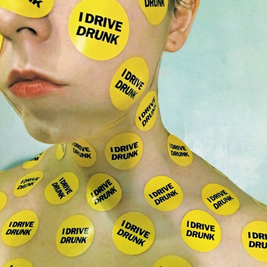
I felt the outcome of this experiment looked quite daunting and almost ‘surreal’. So decided to take this route further. Firstly, I redesigned my stickers to make them a bit more impactful.
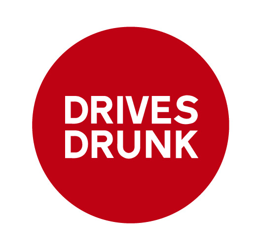
I used red to give more connotation of danger, and the british transport font to help the stickers resonate more with driving.

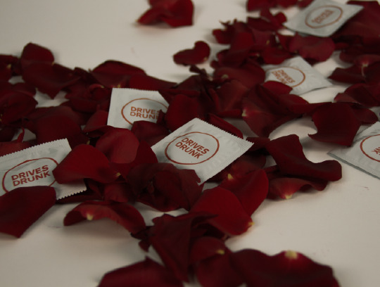
I then ordered a load of condoms with my design printed on them. Still to this day unsure why I did this?
My Actor
After posting around on some casting websites with no real luck, my friend recommended that I get in contact with one of her actor friends. Luckily he turned out to be perfect for the part, with a sort of ‘mainstream lad’ish look. But also quite a dark look about him.
Lewis Lilley - Showreel
vimeo
The Shoot
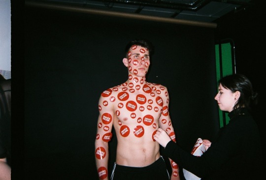
The shoot day was a lot of fun. There were a couple of problems; one being not having an access to a dolly (despite being told there would be one in the studio). Another being how abnormally tall my actor turned out to be - appearing taller than the backdrop in the shot, This meant we had to shoot him whilst kneeling on the floor. This didn’t really turn out to be such a bad thing in the end. It actually helped to make him look more vulnerable.

I also did some images featuring the condoms I got printed and a beer bottle marked ‘drives drunk’. However, these turned out a bit rubbish and don't really fit with the rest of my campaign - so I don’t think I’ll use them.
Bad Crit
After my crit I was told that my video outcome (linked below) worked quite well. However my print campaign did not. I was told that my posters looked like ‘A good album cover’ rather than an anti drink driving campaign (a compliment and an insult). Another comment was that my initial tinder research was strong, however it didn't seem to fit in with my campaign.
So to fix this i tried to incorporate the idea of social media and rejection into my campaign. The slowed down song ‘Getting to know you’ seemed to work quite well in my initial video to create a dark and eerie feel, so I continued this in the social media side. I made 2 videos using aftereffects picturing Dave Drivesdrunk in situations of rejection on social media - being swiped left on tinder and being a rejected friend request on Facebook.
Final Outcomes and YCN PDF


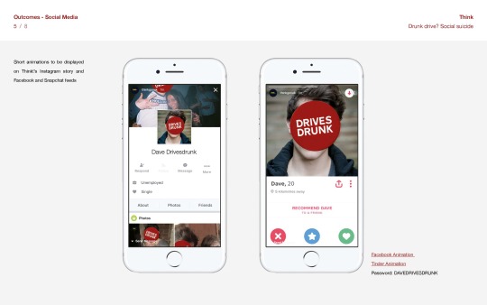

PASSWORD FOR ALL: DAVEDRIVESDRUNK
vimeo
vimeo
vimeo
0 notes
Photo

Editorial Project
EDITORIAL CONCEPT 1 - Phase Furnishings: The Space age
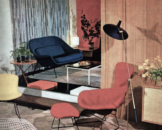
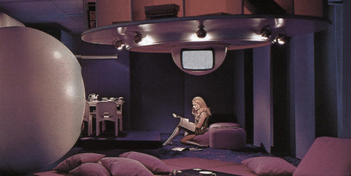
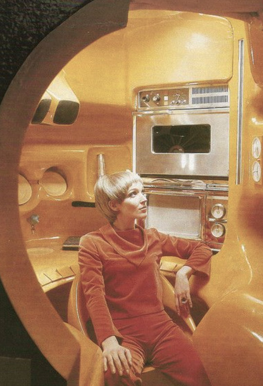
This editorial gives readers an insight into the homes and furnishings of a different design movement each month. The magazine will act as a sort of catalogue of furniture, the same items presented in the same order, with a changing theme each issue. This issue will be the space age. A design period that ran through from the late 50’s with the launch of Sputnik, through to the late 60s, when Neil Armstrong became the first man to walk on the moon. Space age design captured a feel of futuristic optimism, a true display of America’s confidence in its future as a leader in space flight and economic prosperity. This issue will show how designers expressed these themes through their furniture.

Audience and Tone
Phase furnishings will attract a constant readership of those interested in interior and furniture design. The magazine may even act as a collectible to some who would like a cross spread index of furniture from each era. The editorial will also attract an audience based on the theme of an issue, a space age fanatic who would buy this issue, may not be interested in next month’s focus on Art Nouveau
The tone of Phase Furnishings will be informative. The magazine will be as packed full with information about the design, function and designer of each item as possible. The kitsch gimmicky nature of Space Age furniture design may also add a slightly playful tone to the editorial.
Phase furnishings will also have an introduction page, with background information about the selected ‘phase’ and the events that lead up to it. Alongside this there will be an article on an interesting interior design aspect of the era. For the space age issue this feature will be on Braniff Airways and their ‘End of the plain plane’ advertising campaign launched in the late 60’s


EDITORIAL CONCEPT 2 - Hullture
This will be a new editorial launched in conjunction with the beginning of the City of Culture year in Hull. The city of culture is a designation given to a city in the united Kingdom for a period of one year. The aim of the initiative, which is administered by the Department for Culture, Media and Sport, is to use culture and creativity to bring communities together, start new dialogues and help artistic talent to grow.
The title is supposed to attract more visitors, increase media interest in the city and increase levels of professional artistic collaboration. This magazine will be released on a monthly basis with features on local artists, musicians and new businesses and events within the city. With a calendar promising a different event for each day of the year, there should be a lot for this editorial to cover.

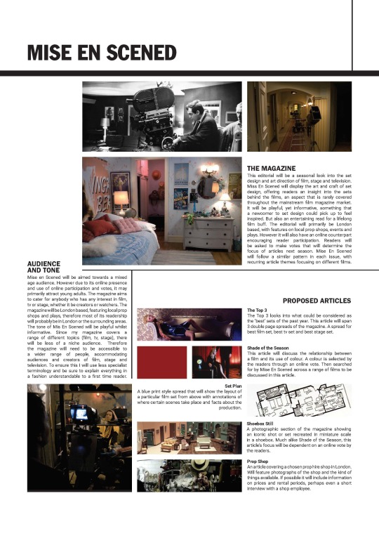
EDITORIAL IDEA 3 - Mise En Scened
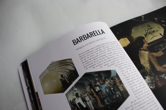
This editorial will be a seasonal look into the set design and art direction of film, stage and television. Miss En Scened will display the art and craft of set design, offering readers an insight into the sets behind the films, an aspect that is rarely covered throughout the mainstream film magazine market. It will be playful, yet informative, something that a newcomer to set design could pick up to feel inspired. But also an entertaining read for a lifelong film buff. The editorial will primarily be London based, with features on local prop shops, events and plays. However it will also have an online counterpart encouraging reader participation. Readers will be asked to make votes that will determine the focus of articles next season. Mise En Scened will follow a similar pattern in each issue, with recurring article themes focusing on different films.


Overall, I am really disappointed with my outcome for this project. It was useful as a brief to give me a realistic idea of time management. But overall, I think I lost a lot of enthusiasm for my idea half way through the project. The pages I produced towards the end, breaking out of the grid proved much more successful than my straightforward picture and text pages. But overall as a project, I just don't think i was creative enough.
0 notes
Photo

Final Layout Crit

I was told the black and white colouring on this was much more successful than the beige and green on my last attempt of the cover. It makes the magazine look a bit more modern.

Opening page for my article on the top 3 sets of 2016. I think I should maybe fill the up the left page with more images, as the balanced white space feels a bit wrong on the eye.

This page is a strong improvement from my previous layout
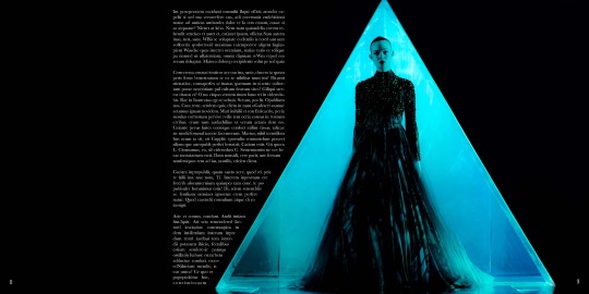
This page worked particularly well, due to the fact it breaks out of the constrained grid that I have used in my other layouts. To prevent my magazine from coming across too boring, I think I should make an effort to do this more throughout.

This layout is still unfinished. My tutors recommended uplifting the honeycomb shape seen in the image on the right, perhaps through illustrative methods.

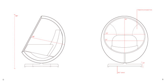

My tutors particularly liked this spread on the ball chair where I have done my own illustrations based off Eero Aarnio’s original ball chair sketches.
1 note
·
View note
Photo

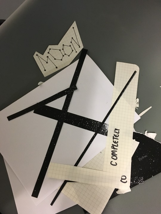
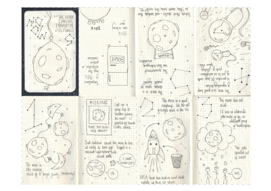
Make a Zine in a Day
Today we had a one day workshop to make a zine in a day. My zine was an hand illustrated piece - 5 Completely Believable Theories About the Moon. A playful look at the moon, poking fun at some people’s outlandish conspiracy theories about it.
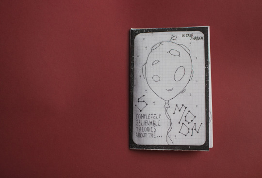
‘5 completely believable theories about the moon’

1. The moon is a missing child of a larger family (monomial). Lost on a group trip to another galaxy, the moon spiralled off towards heart’s course. Such distortion caused the moon to lose all ability to turn left. Trapped in a constant ambiturning circle around earth
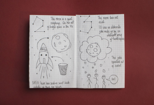
2. The moon is a giant scrapheap. We ran out of landfill space on earth back in the 90′s. NASA have been sending secret trash rockets up there for years.
3. The moon does not exist. It was an elaborate joke made up by a group of homosapiens. The joke spiralled out of control

4. The moon is a giant lump of regenerating cheese. It provides 28 days worth of food to an indigenous pack of floating space mice.
5. The moon is storage space for frozen legends. The government has been kidnapping celebrities. Faking their deaths and sending them to the moon since the early 90′s.
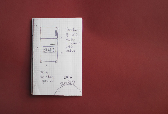
Temperatures of -158 degrees c keep the celebrities in pristine condition. 2016 was a busy year.
I really enjoyed this project, the strict timing forced me to be as creative as possible under pressure. It was also fun to do something more illustrative for once, I’m not the greatest at drawing, but I took this day as an opportunity to give it a go. Its clear that as the day went on my drawings decreased in quality.
I like the believable theories about the moon concept, and I think the writing part of this project would be a good thing to further in a different medium. Perhaps as a short film. Or maybe as a photographic zine with paper mache moons and collage. I am definitely considering furthering this as a side project once the magazine is over.

1 note
·
View note
Photo
Stack Magazines Event - Small Magazines, Big Ambition
Tonight we attended a stack magazines event at The Book Club in Shoreditch. The event celebrated the rise of small independent magazines through interviews with: Liv Siddall - editor of Rough Trade Magazine, Steven Gregor - ex editor of Gym Class Magazine, and Jack Self, editor of Real Review.
The event was really interesting and it was nice to see how 3 magazines so different in tone made use of their low budget set up to create interesting and distinctive titles. The most interesting part of the event for me, was Liv Saddel and her views on what a magazine should be. She spoke of how she hated the new trend of £16 polished and beautiful magazines and expressed how she believed that a magazine should be something you can pick up for a couple of pounds then maybe pass along to somebody else in public. I very much agreed with this concept, thinking back to my visit to Mag Culture and how polished and ‘book like’ the majority of the magazines seemed to be.
The talk definitely got me thinking, I reckon if it had been held a few weeks earlier and I had these sort of thoughts in my head at the beginning of the project, my outcome would have been very very different. However I still found it really beneficial, and if anything it has just made me more enthusiastic to try out a lower budget magazine / zine project in the future.
1 note
·
View note
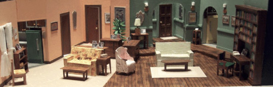
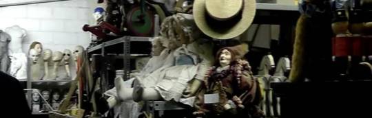
Photo

The Lacquer Chest - Prop Shop
One of the seasonly articles of Mise En Scened would be ‘Prop Shop’ a look into one of London’s prop rental businesses for film and television. For this I took a visit to Lacquer Chest in Notting Hill, a family run business that specialises in period props.
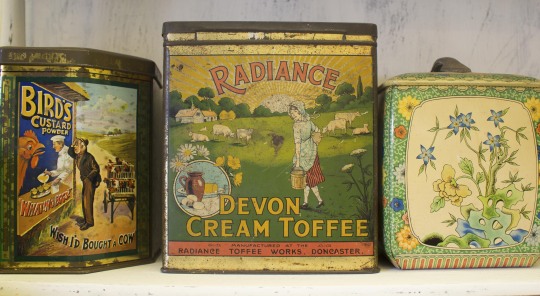

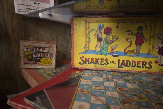
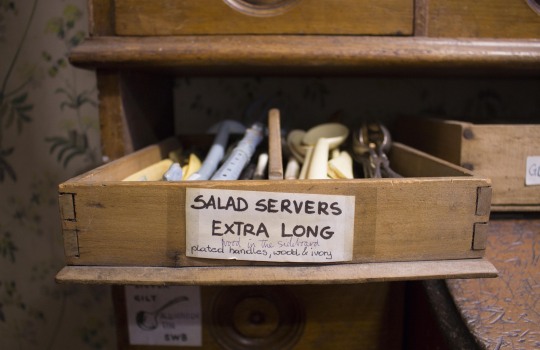
The shop, set up in a 5 storey town house is filled to the brim with all kinds of props ranging from a couple of pounds a week rental, to the hundreds. The shop mainly specialised in kitchenware used for photographs in food magazines. Jamie Oliver is one of their biggest customers. There was about 3 rooms filled with drawers of different colours of cutlery plates and glasses. Who ever knew so many different types of extra long salad servers could exist (image above).


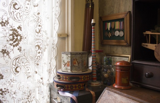
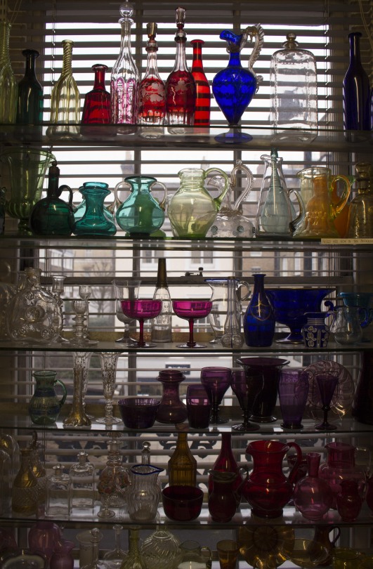
The shop is fully crammed with items. The above image is from the shop’s bathroom, still filled with props available for hire.


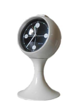
Clock envy
0 notes
Photo

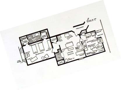
Mise En Scened - Initial Layouts and Flat Plan

Flat plan in progress. Admittedly it doesn't look too great at the moment, Its a struggle to plan out how something is going to look when you don’t know what the images are going to be like yet.

Above are my initial layout plans for the ‘top 3′ section of my magazine. To be honest they are both massive disasters, and to really communicative of the films. I have been panicking that my magazine will solely films stills, so attempted to do something creative with them. Somewhere along the way i managed to neglect the fact that the spreads look TERRIBLE.

My cut away cover idea is OK. But the colours make it seem a bit dated.
Overall, not feeling great about this project.
0 notes
Photo

EDITORIAL IDEA 3 - Mise En Scened
THE MAGAZINE
This editorial will be a seasonal look into the set design and art direction of film, stage and television. Miss En Scened will display the art and craft of set design, offering readers an insight into the sets behind the films, an aspect that is rarely covered throughout the mainstream film magazine market. It will be playful, yet informative, something that a newcomer to set design could pick up to feel inspired. But also an entertaining read for a lifelong film buff. The editorial will primarily be London based, with features on local prop shops, events and plays. However it will also have an online counterpart encouraging reader participation. Readers will be asked to make votes that will determine the focus of articles next season. Mise En Scened will follow a similar pattern in each issue, with recurring article themes focusing on different films.
AUDIENCE AND TONE
Mise en Scened will be aimed towards a mixed age audience. However due to its online presence and use of online participation and votes, it may primarily attract young adults. The magazine aims to cater for anybody who has any interest in film, tv or stage, whether it be creators or watchers. The magazine will be London based, featuring local prop shops and plays, therefore most of its readership will probably be in London or the surrounding areas.
The tone of Mis En Scened will be playful whilst informative. Since my magazine covers a range of different topics (film, tv, stage), there will be less of a niche audience. Therefore the magazine will need to be accessible to a wider range of people, accommodating audiences and creators of film, stage and television. To ensure this I will use less specialist terminology and be sure to explain everything in a fashion understandable to a first time reader.
PROPOSED ARTICLES
The Top 3
The Top 3 looks into what could be considered as the ‘best’ sets of the past year. This article will span 3 double page spreads of the magazine. A spread for best film set, best tv set and best stage set.
Shade of the Season
This article will discuss the relationship between a film and its use of colour. A colour is selected by the readers through an online vote. Then searched for by Mise En Scened across a range of films to be discussed in this article.
Set Plan
A blue print style spread that will show the layout of a particular film set from above with annotations of where certain scenes take place and facts about the production.
Shoebox Still
A photographic section of the magazine showing an iconic shot or set recreated in miniature scale in a shoebox. Much alike Shade of the Season, this article’s focus will be dependent on an online vote by the readers.
Prop Shop
An article covering a chosen prop hire shop in London. Will feature photographs of the shop and the kind of things available. If possible it will include information on prices and rental periods, perhaps even a short interview with a shop employee.
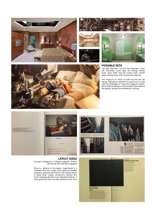
POSSIBLE SETS
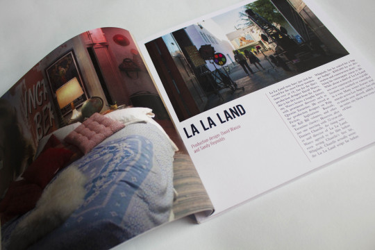
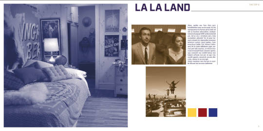
Mad Men, The Passenger, Anomalisa, The Shining, Harry Potter and the Cursed Child. The magazine will focus on both old and new set design. Features on current films such as La La Land and The Passenger will keep the magazine current. Whist older set design will be covered in the shade of the season, set plan and shoebox still articles.
LAYOUT IDEAS
Since my editorial will be largely image based, it is important that the images have space to breathe and partly speak for themselves. The layouts shown in these three images successfully achieve this whilst arranging the text in an interesting fashion. It looks good, but does not deter attention away from
2 notes
·
View notes
Photo

EDITORIAL CONCEPT 2 - Hullture
This will be a new editorial launched in conjunction with the beginning of the City of Culture year in Hull. The city of culture is a designation given to a city in the united Kingdom for a period of one year. The aim of the initiative, which is administered by the Department for Culture, Media and Sport, is to use culture and creativity to bring communities together, start new dialogues and help artistic talent to grow.
The title is supposed to attract more visitors, increase media interest in the city and increase levels of professional artistic collaboration. This magazine will be released on a monthly basis with features on local artists, musicians and new businesses and events within the city. With a calendar promising a different event for each day of the year, there should be a lot for this editorial to cover.
The Year Ahead
Opening article giving information about the city of culture title and things to look forward to later on in the year beyond this issue. Main focus being the Turner Prize at Ferens art Gallery at the end of the year.

Made in Hull
Map and guide to the opening week of the city of culture. Made in Hull is a 7 day event staged across the city centre, telling the story of the city through a series of commissions by local and international artists, the main event being a light projection show across the cities most beautiful buildings in Victoria Square
Spotlight
Monthly focus on a locally ran business. This month’s article will be on Thieving Harry’s.(pictured above) The cafe initially opened in 2011 as a ‘pop-up’ in an old warehouse in Hull’s former Fruit Market. Nearly six years and two pop up locations later, Thieving Harry’s is now a permanent fixture back behind the folding doors of its original warehouse location overlooking Hull Marina. Thieving Harry’s focuses on great food, speciality coffee, tea and freshly baked cakes and savouries, all served in a welcoming environment with some of the best views in Hull. The cafe also acts as a venue for local bands to hold small gigs

Fruit
(Pictured above). An issuely feature on the upcoming events at Fruitspace hull. A unique ex-warehouse cultural space on Humber Street in Hull. Fruit features live music gigs, comedy nights, theatre productions, local produce and vintage markets, cinema screenings, underground club nights, diverse festivals and much more.
Artist interviews
A selection of interviews and features on creatives from Hull and the surrounding area. This issue’s focus would be on Hull based artist and photographer Anna Bean (work pictured above). Her atmospheric photographs and theatrical installations throw viewers into a warped of world burlesque enchantment combined with dark eerie fairytales. This issue will discuss Anna’s latest event: Animal Magic, part of the Mad In Hull events week.
Audience and Tone
The main audience for the magazine will be the people of Hull and the East Yorkshire area. However the magazine may also attract readers who will be visiting the Hull to see the city of culture events. Due to the local nature of the magazine, it would probably only be available in shops around the hull area. The tone of the magazine will be quite casual, a friendly and local vibe will be created.
0 notes
Photo

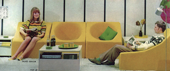
EDITORIAL CONCEPT 1 - Phase Furnishings:The Space age
the magazine.
This editorial gives readers an insight into the homes and furnishings of a different design movement each month. The magazine will act as a sort of catalogue of furniture, the same items presented in the same order, with a changing theme each issue. This issue will be the space age. A design period that ran through from the late 50’s with the launch of Sputnik, through to the late 60s, when Neil Armstrong became the first man to walk on the moon. Space age design captured a feel of futuristic optimism, a true display of America’s confidence in its future as a leader in space flight and economic prosperity. This issue will show how designers expressed these themes through their furniture.

audience and tone.
Phase furnishings will attract a constant readership of those interested in interior and furniture design. The magazine may even act as a collectible to some who would like a cross spread index of furniture from each era. The editorial will also attract an audience based on the theme of an issue, a space age fanatic who would buy this issue, may not be interested in next month’s focus on Art Nouveau
The tone of Phase Furnishings will be informative. The magazine will be as packed full with information about the design, function and designer of each item as possible. The kitsch gimmicky nature of Space Age furniture design may also add a slightly playful tone to the editorial.


the kitchen.
Featured items: Oven, fridge, microwave, flooring, kettle, chairs, table, cutlery, plates.
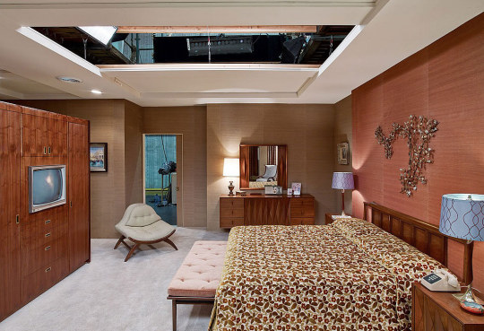
the bedroom.
Featured items: Bed, bedding, wardrobe, drawers, bedside table, lamp, mirror.
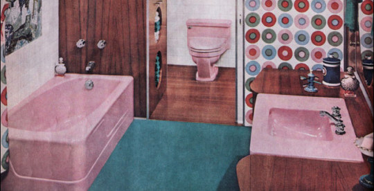
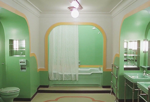
the bathroom.
Featured items: Bed, bedding, wardrobe, drawers, bedside table, lamp, mirror.

the living room.
Featured items: Sofa, chairs, tv, coffee table, cushions, rug, curtains, wallpaper, clock.

extras.
Phase furnishings will also have an introduction page, with background information about the selected ‘phase’ and the events that lead up to it. Alongside this there will be an article on an interesting interior design aspect of the era. For the space age issue this feature will be on Braniff Airways and their ‘End of the plain plane’ advertising campaign launched in the late 60’s

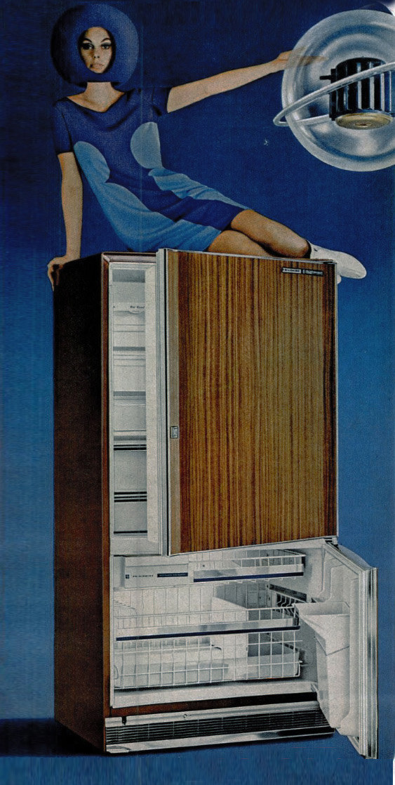
the frigidare power capsule.
The most powerful and the most compact fridge of the times. Up to 78% more powerful than previous frigidare units.
Does not use pistons, gadgets or connecting rods. It functions mainly using 3 moving parts sealed in steel and cushioned to reduce vibration, making the fridge silent.
Made from highly resistant materials ‘satellite’ type materials, which have resistance to wear and tear 4 times greater than highest grade steel.
Electric door opener allows you to open the fridge door with the slightest touch, perfect for it your hands are too full
Automatic ice maker fills, freezes and stores ice cubes automatically into a convenient plastic server
New vapour zone section keeps eggs, certain fruits and veg fresher for longer than previous models


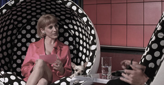
the ball chair.
Created by Finnish furniture designer Eero Aarnio in 1963.The Ball Chair is also known as the globe chair and is famous for its unconventional shape.
The chair is completely round, as is the single pedestal leg it stands and rotates on and the area cut out to accommodate the person sitting in it.
When that person sits down, he or she is completely surrounded by the chair, which acts as a sort of “room within a room.
Some designs had a red telephone installed in within the walls.
This ball chair design has been seen many times in film. The chair makes a guest appearances in Men in Black, Dazed and Confused, The Prisoner, Tommy and Mars Attacks.
layout inspiration.
Phase furnishings will follow a similar layout pattern for each page and each item of furniture, keeping a consistency throughout. Some colour schemes may vary depending on which room is in focus.
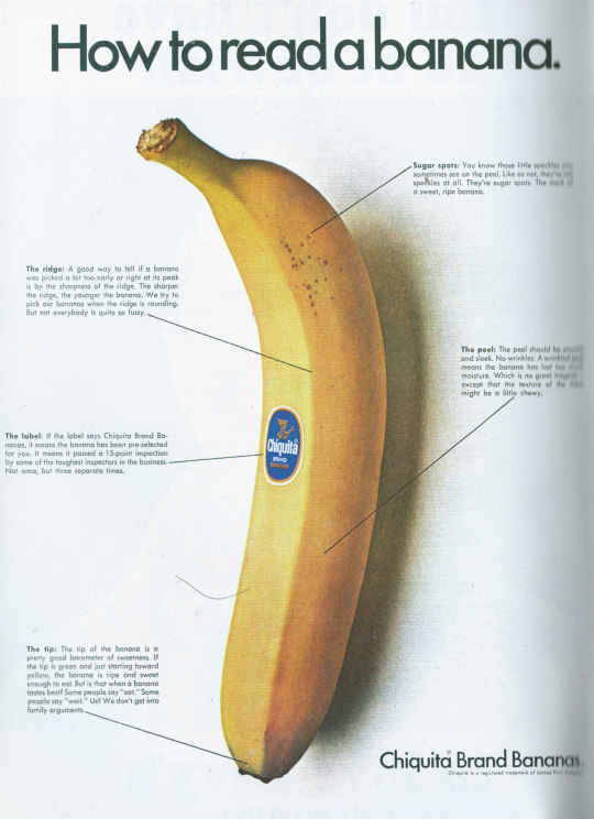
Although quite plain, I find the layout of this Chiquita Brand Banana advert really interesting. It is informative and easy for the reader to digest, with annotation lines pointing directly to the area of interest. A humorous tone is created thought the in depth analysis of something as small as a banana ridge. This is the sort of feel I would like to recreate within my magazine.
1 note
·
View note

Photo
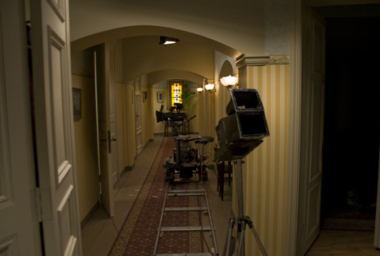
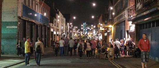
The Brixton Shoot Day - Behind the Scenes
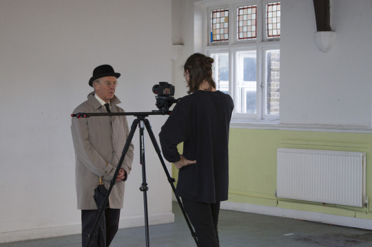
Close ops of Mr Roberts
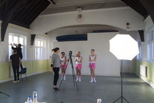
Correcting changes in lighting as the day progressed

0 notes
Photo

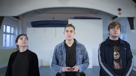
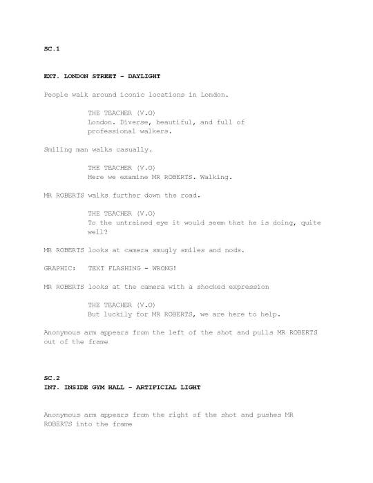
Here is the final script that we gave to the cast on the day of the shoot


0 notes
Photo
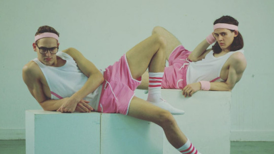
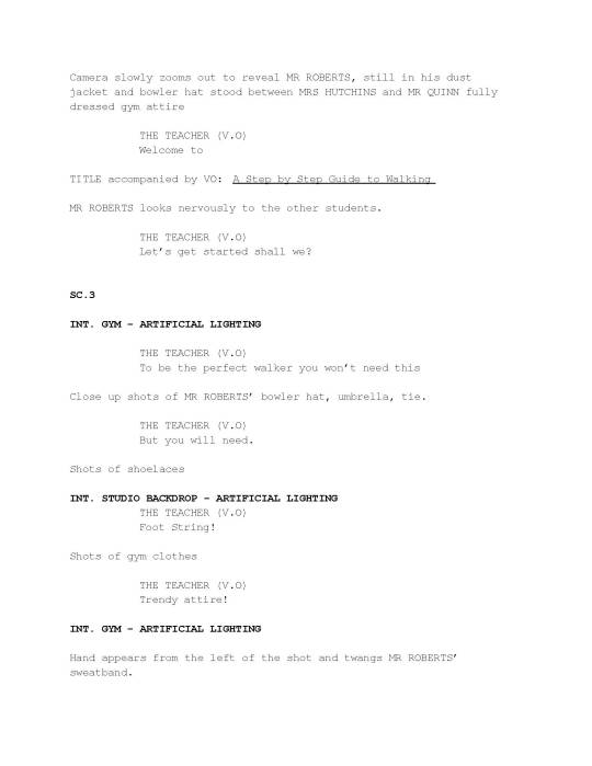
We tried to keep our costume as low budget and easy as possible. We bought the vests, shorts and socks. Then sewed pink stripes onto the vest and bought pink shoelaces for white shoes.
Its a shame that the correct pinks don’t all match exactly in shade. But hopefully this won't be noticeable on screen
0 notes