
Last Seen Blogs
myobsessedtrashcan
it's the FINAL BRAINCELL~

dataheights
Legion didn't die what are you talking about

jovojusomaha
Untitled
hockeydyke
Трус не играет в хоккей
midnightstarlightt
If I can’t have you, I’ll just live for you.
Photo
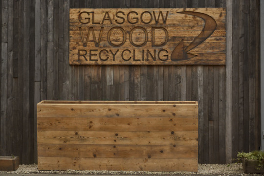
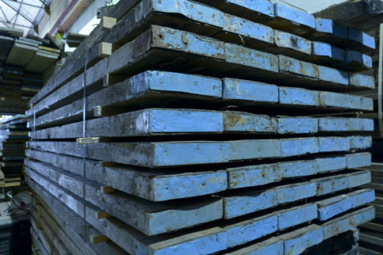
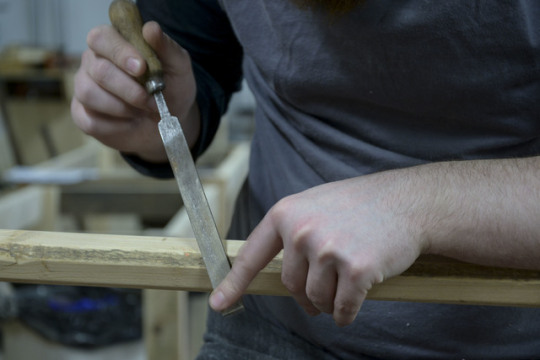
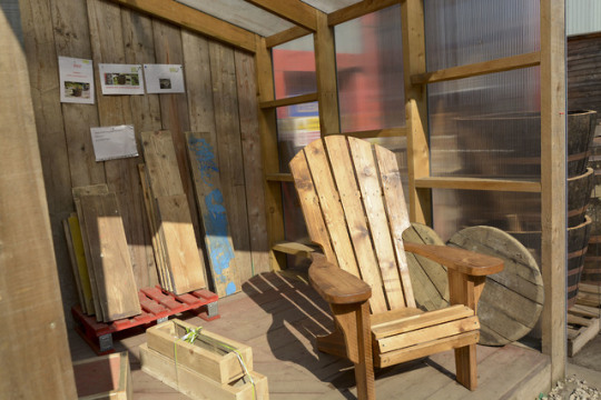
these are just a few of the many shots I took at Glasgow Wood Recycling (part of my climate justice project). in order to prevent old wood from going to landfill sites it is donated here to be made into bespoke furniture. Glasgow Wood Recycling work with schools in making safe play areas with re-used wood. with the work that they do and the conscious effort to upcycle wood Glasgow Wood Recycling have won many awards and are currently nominated for The Evening Times Streets Ahead Awards.
3 notes
·
View notes
Link
this is my photo story about Glasgow Wood Recycling. This is part of my climate justice project.
2 notes
·
View notes
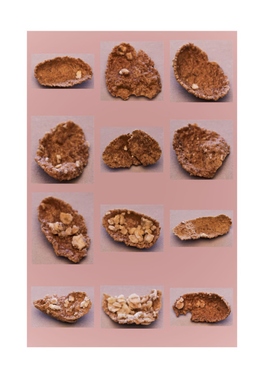
Photo


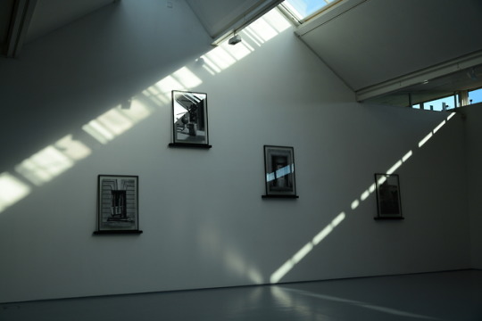
these are 2 images I like the most from the above contact sheet. the first image I like the steely reflection and the second image I like the light airy shadowy space.
9 notes
·
View notes
Text
SELF EVALUATION
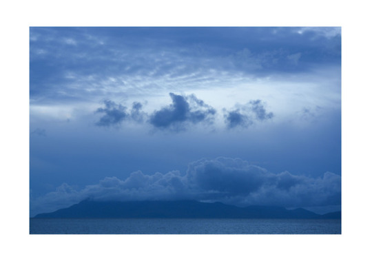
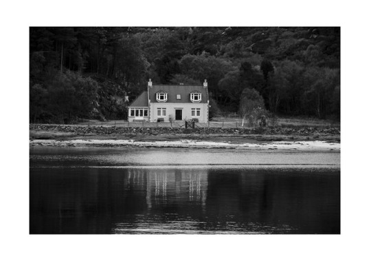
My first set of images for my HND portfolio were chosen for their dramatic appeal, atmospheric, moody and tranquil quality. They were effective in that they caught your eye and took on a different appearance than the actual image was meant to. For example, one of my images is of a seascape in Malaig, however, one of my fellow students thought the image had been shot from an aerial view when in actual fact it had been shot straight on. I made this particular image stand out more by adjusting the contrast. In doing this, it brought out the blues which added to the atmosphere of the image. With the other images, it was basic changes I made such as adjusting the contrast, clarity, exposure, white balance, shadows, temperature and the colour. In order for the correct adjustments to be made, a classmate advised, along with my lecturer on the best way to go. By making all of these adjustments, basic as they are, they allow for the image to take on a new life. I tend not to or try not to retouch too much as it could take away the purity of the image. As much as possible I strive to get it right in camera and then only slight adjustments are required.
For my second set of images, I decided to explore styles of photography that was not in my HND portfolio. These included,
· Macro
· Abstract
· Photo merge
· Typology
· Architectural
· Street
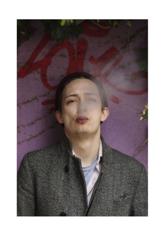
These styles were enjoyable to explore, and I have experimented with these in the past but wanted to do more of. Out of the six, I was pleased with the end product of macro, abstract, photo merge and architectural. Again, retouching was minimal, however, for the macro (which was a close up of an eye) I adjusted exposure, contrast and the clarity which enabled more texture and detail to be made visible. My street photography image was taken with a film camera, very minimal changes were made, mainly to exposure and contrast. With this set of images, there is not much in the way of atmosphere but rather an alternative way of viewing situations, objects.
When presenting my images there were placed in a A3 template via photoshop before taking to Deadly Digital for print. I had previously gone there before to explore the print paper options and had decided to go for Permajet oyster paper. This type of paper gave an indulgent look which I was quite impressed with, I felt the glossy paper was too shiny and the matte made images look bland and dull. I was impressed with my images and how professional they looked. When it was time to present them in order, I put what I felt was my strongest image at the front and finished with another strong image at the back. By presenting the images in this way the audience will more than likely remember these images more than the rest.
Overall, if I were to improve on any of the steps I have taken throughout the photographic journey with regards to retouching, I’m not sure that I would as I believe that you can run the risk of optimizing too much which would then completely take away the originality of the image; it is being stripped of its purity. It could also be the fact I am still not fully confident in the vast array of tools that can be used to improve an image. But then famous photographers from the past such as Ansel Adams who used film cameras did not require software manipulation. With regards to printing I would consider the use of different paper types; would certain images have a better impact on one paper over another. If I were to show a portfolio in the future I would like to use a portfolio book rather than box. It looks more professional and the prints can easily be removed from the ring binder.
2 notes
·
View notes
Photo

these are the second set of images for my portfolio,
macro
typology
street photography
abstract
architectural
photo merge
4 notes
·
View notes
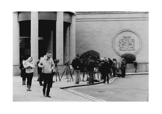
Text
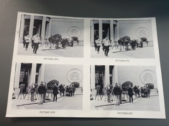
This is my contact sheet for my street photography image; one of my 6 further images.
#ncphotography #timetoshine #portfolio
1 note
·
View note
Photo

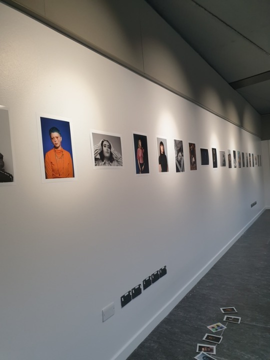
these images are the ones I used for my portfolio for my HND interview.
1 note
·
View note
Link
short video on how Many Ray accidently found Photograms.
0 notes
Photo

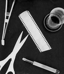
Man Ray was an American visual artist, most of his career was spent in Paris. Ray was a painter but was known for his photography; fashion and portrait. Man Ray was also know for his work with Photograms; a photographic print made by laying objects onto photographic paper and exposing it to light(http://www.tate.org.uk). Also known as camera - less photography. Ray’s images were more valuable to collectors than his actual artistic work (https://www.manray.et).
0 notes
Link
this is a video of Maisel’s aerial photography. the look of the landscape is completely altered by the hands of man.
1 note
·
View note
Photo
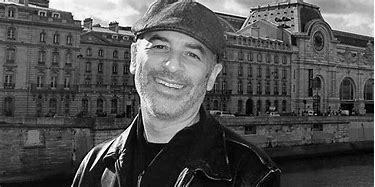
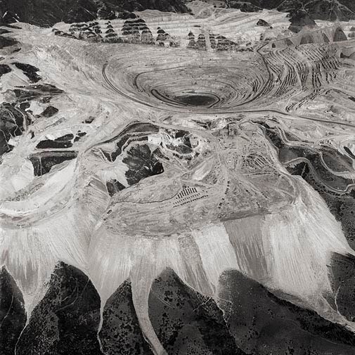
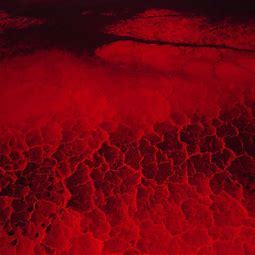
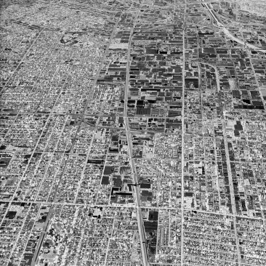
David Maisel was born in 1961. His work looks at the power of space by exploring landscapes that are hidden from view. Maisel has produced aerial photographs of landscapes which have been scarred by actions such as mining and military testing. In Maisel project Black Maps, images look at land which have been affected by deforestation and mining. Aerial photography was used to achieve the shots that Maisel desired. Other projects/series that Maisel has worked on (all looking at landscapes affected by man and taken from an aerial view) include Oblivion, The Lake Project (http://davidmaisel.com).
1 note
·
View note
Link
Our group’s social enterprise is nearly completed; some families have to get back to the group to advise of their favourite image to be professionally printed.
1 note
·
View note
Link
Sean’s presentation of our teams colour management active research today.
8 notes
·
View notes
Text
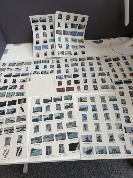

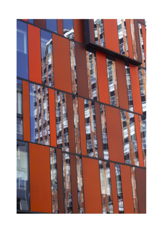
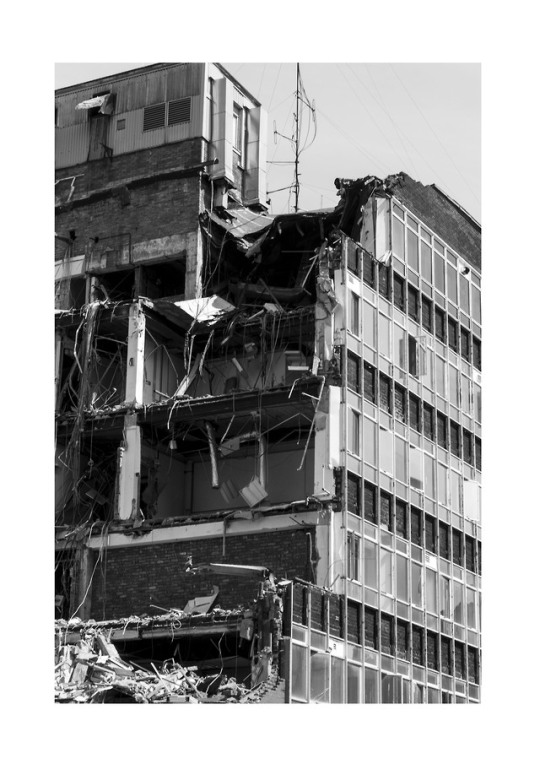
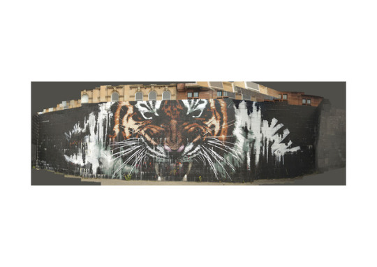
These are my contact sheets for both my abstract and architecture photography. One image will be picked from each and printed to go alongside my other printed images in my portfolio.
#ncphotography #portfolio timetoshine
3 notes
·
View notes
Text
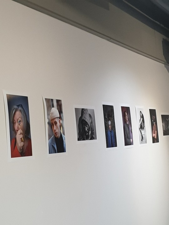
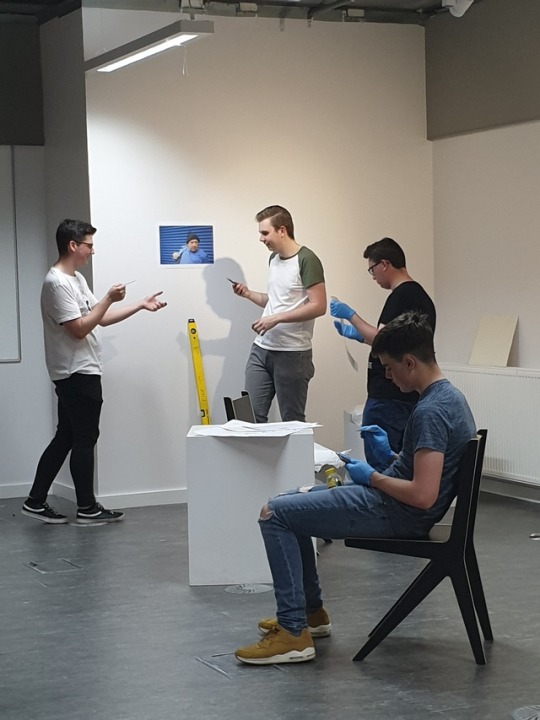
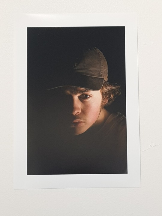
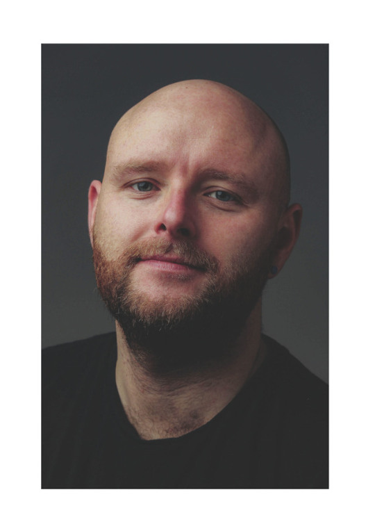
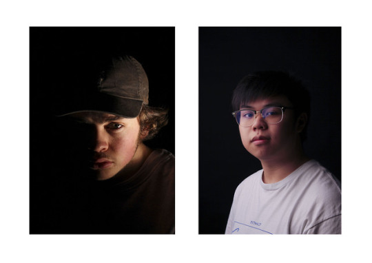
This is the set up A Mirrors Story. These are portrait images shot by NQ Photography students. The third image I shot of one of my fellow students.
#ncphotography #studio
1 note
·
View note
Photo
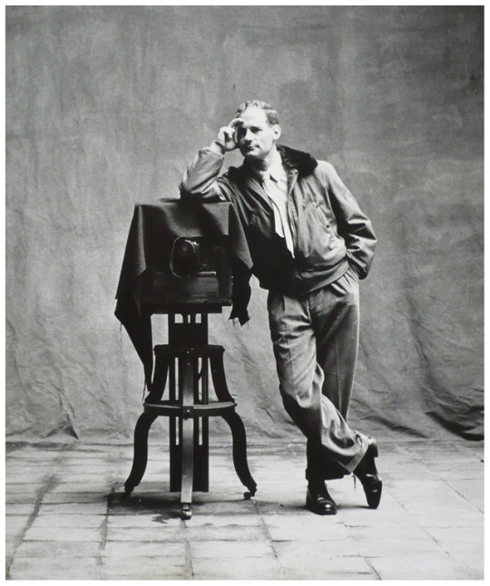
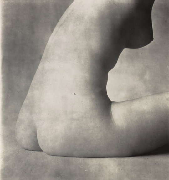
Irving Penn was an American photographer born in New Jersey (USA) on 16 June 1917, he past away on 7 October 2009 in New York (USA). Penn attended the Philadelphia Museum School of Industrial arts from 1934 to 1938. Irving was noted for his fashion and portrait photography. Irving worked for Vogue fashion magazine for more than 60 years (http://wwwirvingpenn.org). Penn was a private man and did not like the attention he received. Initially Penn went to Mexico to paint, this did not go to plan and as such returned to New York. In 1943 Penn was hired to work at Vogue, not as a photographer but as a associate to prepare layouts and to suggest ideas for covers to the magazine’s photographers (http://www.irvingpenn.org) Alexander Liberman (art director of Vogue) was impressed by Penn’s contact sheet from past travels that he encouraged Penn to delve deeper into photography, thus launching Penns photography career. Penn soon gained a reputation for both his still life and portraiture and was sent around the world doing fashion assignments. Penn soon discovered his passion for studio photography. Penn was also know for his nude photography however, they were seen to be to provocative and were not shown for many years.. Between 1949 – 50 is the period in which Penn would take these images, he had a unique way of developing the prints in which he would bleach and redevelop until they had a ethereal quality to them (http://wwwirvingpenn.org).
0 notes