cardistryartproject-blog
Cardistry Art Project
Anika weise's cardistry art project for school
15 posts
Don't wanna be here? Send us removal request.
Last Seen Blogs
bouneilly
Help girl. im artblocked

quirkphoto
Ally Quirk | Digital Photography

burjtv
Talk Shows I Current Affairs I News I Headlines I
onekingmamba
M A M B A
Text
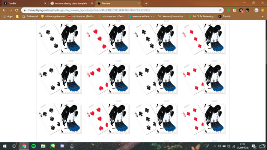
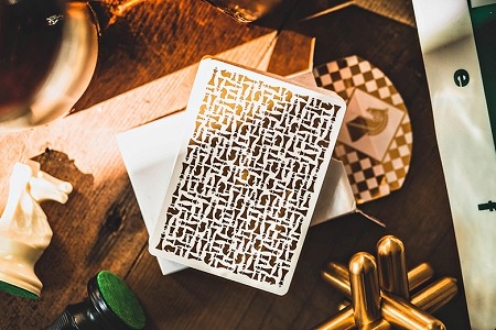
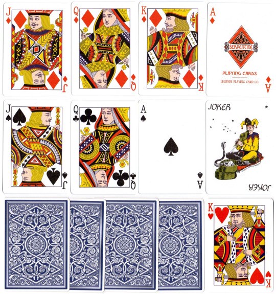
These are images of the website i will be using to print out my playing cards, the hardest part about using the program is that sometimes while uploading the image the background of the image would go black, I would them have to go back into my drawing program, create a new laywer and colour the background white and reupload the image to the website the thing liked about the website was using was that I could copy the faces of cards if I ever needed to, so I copied the king, queen, Jack and joker cards, it was very convenient and made things quicker, what I didn't like was that the website didn't allow me to have different backs for each card, it just allowed me to have one back for all the cards this is the reason why I wasn't able to have a marked deck
0 notes
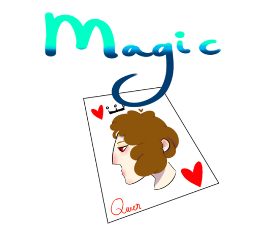
Text
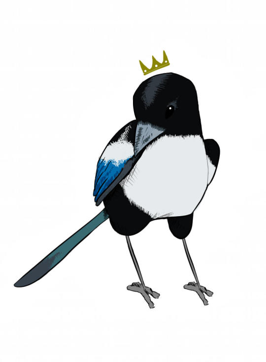
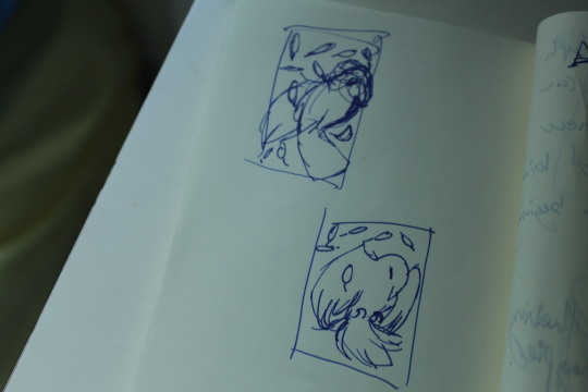
queen
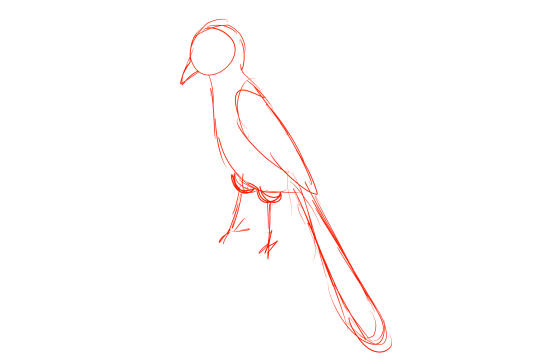
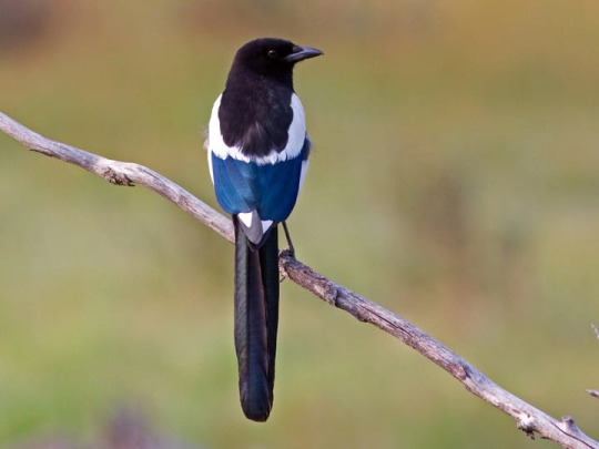
This is the queen I made. Originally she wasn’t gonna have her pose that she is in now and the first sketch ontop is what I started with, I’ve decided to use this pose because it was more natural and elegant for a bird like her. Female magpies are much smaller than males so i tried to make her smaller in size so it could be as realistic as possible. The feet are same as all my other drawings because i copied and pasted it I did it because one of my main issues are consistancy thrioughout my artwork and also the feet were hard to draw for me.
0 notes
Text
joker
This is the joker I made the concept behind it is that its a theiving magpie though playing cards have been here for quite a while jokers are a new addition it came in the 1860s. Jokers often have on the card a jester was an entertainer during the medieval and Renaissance eras the concept behind this joker is that lots of people believe that magpies steal even though they don't someone who believes false information is a fool and the fact that a thieving magpie isn't real putting it on something like a joker gives the idea that anyone who believes a thieving magpie is a fool
0 notes
Text
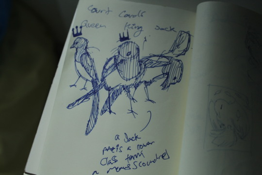
jack
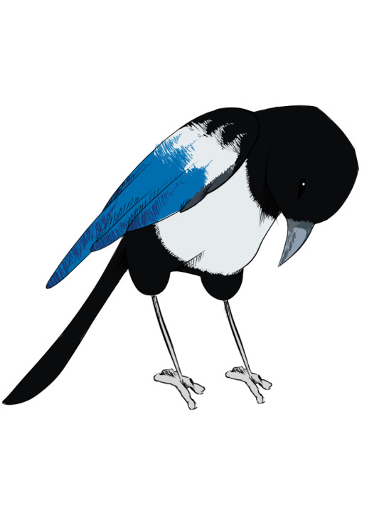
The jack is more playful than the two others, it's in a odd pose, the jack is a knave which is a dishonest man they are deceitful however it's also a name for a domestic male worker this magpie's head is down showing submission but it's eyes are looking upwards showing the magpie is deceitful because it's not truly submissing.
0 notes
Text
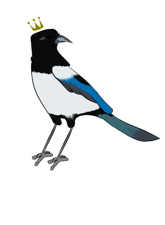
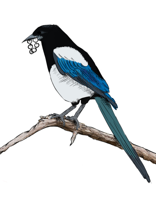
king
The king is made to show power this bird is looking directly at you most of the time in the animal world direct eye contact is a symbol of aggression as if it's ready to fight and conquer like a king. The magpie's body is close together it's wings aren't stretched out nor is its head and neck this gives the magpie a slightly bigger body than it would be if it wasn't in the pose, this makes the magpie look larger and more intimidating.
0 notes
Text
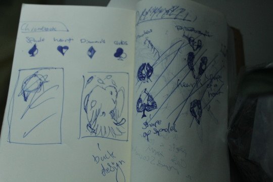
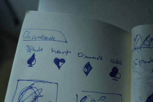
Design ideas
I have many design Ideas but I've currently set my mind on two ideas, the first idea is to have a playing cards with markings and have them with standard playing card faces or have no playing card markings with personally designed playing card faces.
for the playing cards with the markings I thought of two ideas, I could either have markings that indicate the suits, or have markings indicating the number.
The concept behind this design is the way that magpies grow their feathers
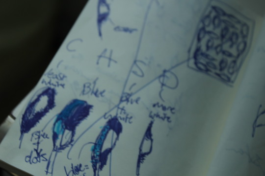
The marked feathers would be in the corner and the least white would be a clubs and ones with blue on the side and the white bit on the bottom was a hearts and the blue plus white on the top was a spades and the one with the most white was a diamonds then I decided to skip that idea deciding it would be too easy to spot and too noticeable, the second idea was to have to show the number instead of the suits and it would depend on which direction a feather was drawn/faced.
This method had suck with me because it followed similar rules to the knights playing cards though it took many tries to get a perfect counting system that works with any playing cards.
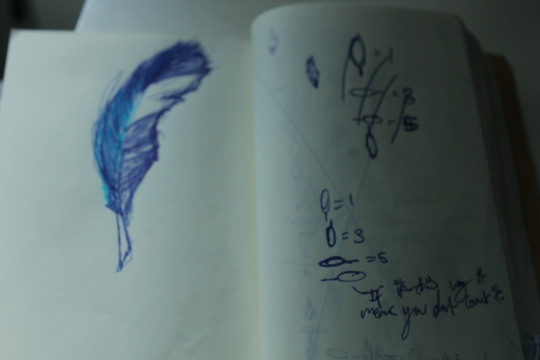
in the end I had a good system that works and also a good design that came along with it, first I tried with one big feather in the middle then feathers around it.
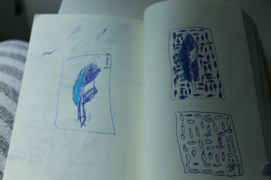
I asked my brother for his opinion and he said it looked random which in this case was good because it means the marking system wasn't too easy to spot then I decided to get rid of that design and go for something more simplistic which was to get rid of the big feather in the middle and just have bird feathers scattered about, I liked this because it was simple but I felt as if I may be copying a bit too much from the knights playing cards. So then I decided to have a picture of a magpie in mid flight with feathers surrounding it, the feathers in the top left corner will indicate what number it was.
This design is my final design as it sticks with the name of the deck, the magpie and it hides the marking system and has a more elegant design though currently this idea is just a simple sketch. This is the design for the deck of cards with standard faces, I've decided to make two decks. The other deck isn’t gonna have marked deck due to the fact it will have custom faces instead of standard faces. I’ve decided to make the court cards magpies.
The queen as a slightly more feminine look to the king who looks more menacing and up close this is supposed to represent how to king has more power and how to the king doesnt mind getting up close and personal. The queen looks more reserved and quiet, its not making direct I contact and is much smaller than the king in size, female magpies and male magpies has no difference other than size. This represents how females were supposed to act back in the days, They had to be reserved and quiet and to not talk unless spoken to. The jack is a bit more playful that the two, its positioned in an odd angle which shows what jacks represented back in the old days a jack was called a knave a knave is a dishonest man they are deceitful they also are a male domestic worker this is a very low class, the jack magpie’s head is pointed to the ground showing submission but its eyes are looking up also showing aggression as in many animal behaviours eye contact is a form of aggression.
one major issue I was having was constantly wanting to change the design and also the design looking too similar to another brand of playing cards, I want these cards to be as original as possible. First I was going to have the playing cards suits to be made up of feathers but a playing card called system 6 already done that.
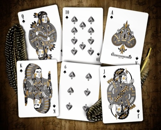
So then I looked at more playing cards for inspiration. What helped me settle on my final decision was the red wheel playing cards.
These playing cards helped me pick a design idea that also tie into magpies, the playing card pips, these pips are very interesting, normally playing card pips are one solid colour but these have two instead, this is a very unusual thing most playing card companies don’t do. This has helped me because I've decided to do something similar
Though I haven't made it exactly half of the pip where its a different colour its still similar, this is to emphasis the magpie aspect of the deck. magpies have black and white feathers this is supposed to show that.

This is good because there isn't a lot go white but it still noticeable these won't have a picture of a magpie on it but you can still see how it relates to a magpie and it gives it more spice and customisation.
0 notes
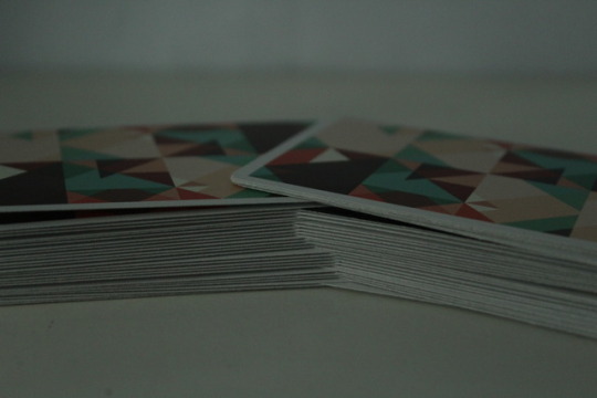
Photo
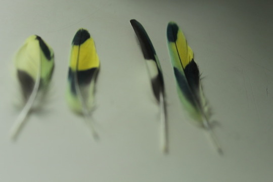

Photo of mango’s feathers, I chose to take these because they help me understand the way feathers look and work, there are 4 different types of feathers
Feathers with Vanes: Contour and Flight Feathers, Down, Filoplume, Semiplume, Bristle.
CONTOUR FEATHERS: CONTOUR FEATHERS COVER MOST OF THE SURFACE OF THE BIRD, PROVIDING A SMOOTH APPEARANCE. THEY PROTECT THE BIRD FROM SUN, WIND, RAIN, AND INJURY. OFTEN, THESE FEATHERS ARE BRIGHTLY COLORED AND HAVE DIFFERENT COLOR PATTERNS.
FLIGHT FEATHERS: FLIGHT FEATHERS ARE THE LARGE FEATHERS OF THE WING AND TAIL. FLIGHT FEATHERS OF THE WING ARE COLLECTIVELY KNOWN AS THE REMIGES.
Each feather is made from the protein Keratin. While keratin also makes up snake and lizard scales, it is a slightly different compound in birds. The colours on bird feathers are caused by a combination of the pigments and the placement of the pigments on the wings. Certain pigments like carotenoids produce yellows, and reds. Others like melanins produce the browns and grays. Blue and green plumage is very different because they have many pigments that produce them.
I feel like understand the way bird feather work will enhance the realism in my work and give me more context and understanding for example if I draw a flight feather I know to never make it too colour full as colourful feathers are often contour feathers.
0 notes
Photo
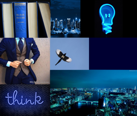
This is a Moodboard that I've created, it represents some aspect of my the design for the deck of cards I’ll be designing. The vision I have of this deck is that this is a type deck that you would take to somewhere fancy like a wedding or a dinner. I want this deck to be the type of deck that will be able to suit your style and will be able to complement a suit or a fancy dress. The magpie in the mood-board represents the name and the type of animal that is the key part of this deck, the name of this deck is bluebird, though I could have used an actual bluebird I decided to go with a magpie.
The reason I went with magpie is that they are a symbol of thievery though they don't actually steal themselves, they're seen as mysterious and are often associated with witchcraft. They are considered incredibly smart they are widely considered one of the most intelligent animals in the world and one of the only non-mammal species able to recognise itself in a mirror test.
The suit, neon signs and the books represent the intelligence of the magpie and also represent this deck because the magpie is intelligent and I want this deck to mimic a magpie and be intelligent too, so I'm going to add a marking system to represent the intelligence. Many cards also have to mark systems like the knights playing cards or the white lions.
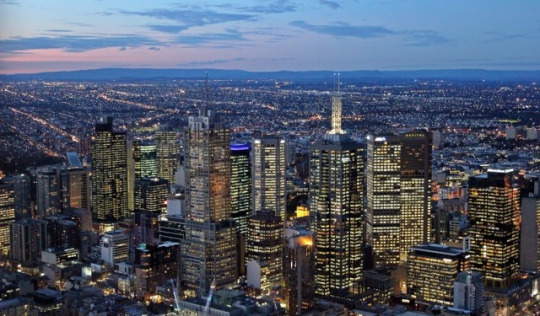
The city represents the vastness of the mind and its creativity, our mind can go as far as it wants the only limit is the human itself, there is no limits to creativity people say our mind is like a garden however I believe the mind is a city, a city that is constantly changing and adding a city has its pros and cons and each city is different one can be constantly filled with people and cars constantly racing and zooming by while the other is filled with silence couple of people walking by little cars on the street, a tranquil setting.
0 notes
Photo
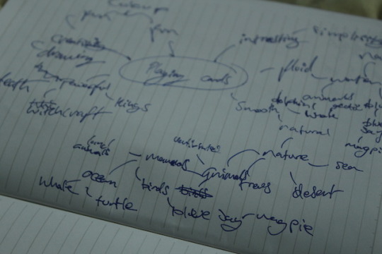
This is a spiderdiagram with playing cards in the middle. This is a way to help write and sort out my ideas and concepts for a deck of cards I'm going to be deciding. I’ve decided to choose nature as the theme and through exploring and thinking I've decided to base it of a type of bird called the magpie, this is sort of like a spin off from the deck called white lions by David Blaine.
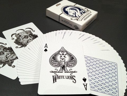
This deck is very special as there is a hidden marking system within the deck, I want to be able to have that within my deck I am designing too. And this deck is also based of my animal like the one I'm designing, however the animal that David Blaine chose is completely different from mine.
0 notes
Text
Daniel Madison-Bloodkings v2
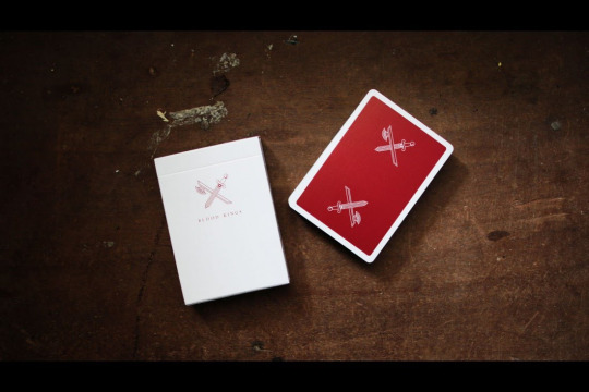
The blood kings are a very impressive deck, they have a nice simplistic and minimal design while hiding lots of meaning behind it. There is little thought in the tuck box as its blank but this gives looks of emphasis on the cards held inside. The cards are also very simple, with just a red back with the logo on. this is a contrast to the name of this deck which is kings, as kings are very wealthy and powerful and normally do stand out with his wealth and power. However the fact that the card backs are very simple this gives emphasis and makes the logo stand out. This logo represents a king, this king is ruthless and powerful, this king goes out and conquers this is the impression I get when looking at these cards, the colour red is intense and powerful, it has many different meanings, red means violence, battle, blood, fire, this paints a picture in our mind, about a king who likes to conquer and fight wars, about a king who has slain many this is about a king with passion and energy and violence and blood on his hands.
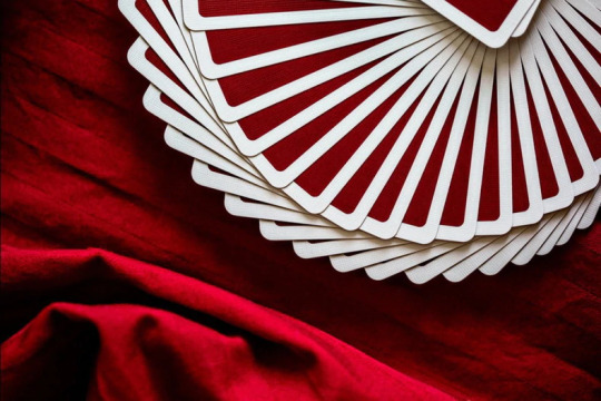
This deck is often next to red silk, silk is a thin, but strong fibre that silkworms produce when they are making their cocoons. It can be woven into a very soft and smooth fabric. This makes the deck look very strong, silk isn’t very thick and that can be linked up to the fact this deck isn’t very detailed however silk is strong like the deck itself, this deck has strong meanings and interpretations behind it.
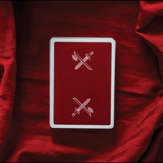
The fact that they chose red makes this deck very powerful, red is intense it provokes strong emotion and will within someone it causes excitement a man called Paul commented on this colour saying "I saw an episode of Law & Order: SVU last week where a lady (witness) had everything in her life red. Her apartment had red furnishings, kitchenware, art, curtains etc... her clothes were all red, her makeup was red too. Even though the red was everywhere it somehow interested me. I'm not sure why, but it stirred feelings of excitement for me. The interesting thing is I have never had an interest in red before, but after seeing her intense red 'life' I now want to achieve the same. Maybe not as extreme, but certainly more red in my life makes a great change in my daily moods and energy levels." -Paul this deck does the same thing, it makes people feel excited and impulsive this may be a marketing technique as someone is more likely going to buy this product if it makes them feel good emotions for example excitement.
0 notes
Text
Chris Ramsay artist research
Chris Ramsay is a magician who also makes youtube videos, he was born in Germany but currently lives in Canada. He has created two playing cards. The memento mori playing cards and the first playing cards, he has also performed and created tricks like the voodoo trick.
The first playing cards have a very pristine, clean and simplistic design. The back design is Chris Ramsay's logo with first gold foil stamped on the edge on the cards. This is a design technique used by playing card companies as when you spread the cards there is a line that shows this is very visually appealing and eye-catching
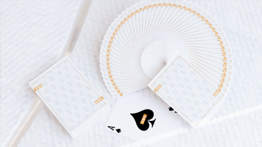
He says the reason why it’s called first is that ‘it is my first solo project, first deck with my very own name on it...it is a callback to the youtube community... some of the first comments (on his youtube videos) are usually ‘first’’
Personally, I think this deck is very appealing and usually says something about the person who owns a deck like this as a person’s possessions usually say something and give you some insight into their personality.
My favourite part of this deck is the main colour scheme which is black white and gold, this colour scheme gives the deck a very expensive look to it. as gold is expensive and white is associated with rich people this is because there were times when only rich people could afford 'clean' white bread and the lower class had to eat the standard 'dirty' brown bread and the richer people were more likely to wear white clothes as they could have them cleaned more frequently, had more of them to wear, and did not partake in tasks which were more likely to dirty them while poor people did the opposite, they wore dark clothes that could not stain as easily and that could retain heat.
‘it has sort of a Louis Vuitton look to it’ -Chris Ramsay
The memento mori playing cards are a different story, however, these cards represent something quite sinister, realistic and depressing about the world.
There is a lot of context and meaning behind these cards, in the ad card that is included in the memento mori Chris Ramsay writes a paragraph that gives us a lot of insights and meaning into his playing cards ‘....many historians believe that playing cards represent a deeper, esoteric meaning that each suit was one of the four seasons and the faces within the suits was the thirteen phases of the moon. The fifty-two cards in a deck represent fifty-two weeks of the year and together this would represent one year of your life. A constant reminder of our fleeting time on earth this is my memento mori- Chris Ramsay’
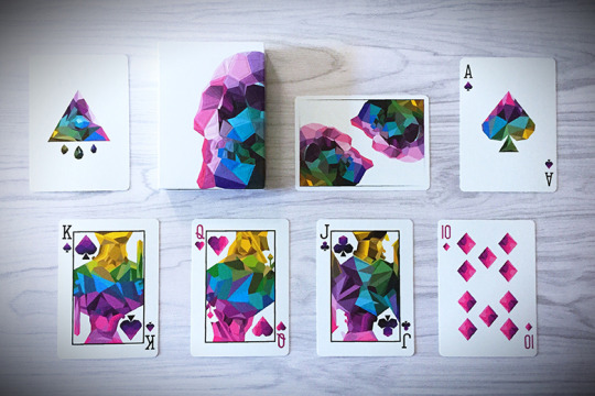
Memento mori means remeber your morality or remeber you must die this deck represents death and life, memento mori means remeber your morality on the ad card it tells us that a pack of cards represnts one year of our life and that we are losing time this message reminds us that we need to live our lives and make a name for ourselves we need to live we need to hurry up and do all we can because time is running out, however the memento mori cards tells us we need to slow down we are only human we need toio take breaks and that we a re not invincible we are not on top of the world and we’re not better than anyone else, we shoukld remeber our morality and our humanity these cards remind us that we are not better than anyone else, in the trailer for these cards it says ‘in the end it doesn’t make you better’ this reminds us that all our wwork and our life and all the effort we put in doesn’t make us better than the next person and our status in life doesnt mean anything because, in the end, it doesn’t matter for we are all equal in death. In ancient Rome, victorious military leaders were paraded through the streets to be celebrated by the people, to remind the military leaders that they were not better than anyone and to remind them of their morality a slave would be behind them whispering and telling the leaders ‘memento mori’ and how they were going to die one day.
My favourite thing about these cards is the design, it’s not too fancy but it’s not too simplistic it has a perfect balance, the colouring is beautiful and the low poly skull design is amazing.
0 notes
Text
Cardisrty
Cardistry, the name given to the performance art of card flourishing. It is very visually impressive and appears ti be very hard to execute. Dan and dave buck helped this art form flourish and helped startung it up and helped seperate card flourishing from card magic tricks and turned it into cardistry.
What makes cardistry beautiful isn’t only the tricks, but the playing cards used. Back in the days playing cards would have very complicated and repetive patterns at the back and a very simple and standard font and drawings for the card faces and court cards.
However in modern days card creators have moved away from the repeitive patterns and boring card faces and have become move creative, colourful with intresting designs and drawings, lots of cards have become more simplistic focusing more of design being the eye catcher while older cards focus on decks not being eyecatching as they mainly focus on the way they play.
lots of morden cards focus on having lots of colours while classic decks usually have one or to colours on their cards with primaey colous on the court cards and the deck.
These cards only use primsry colours execpt for the joker they also have consitant line art and no shading with very little details (except for the jokers).
There are lots of people who hav created fanatasic morden cards, chris ramsey, dan and dave buck and david blaine one of the many magcians who have created cards in their name.
0 notes
Photo
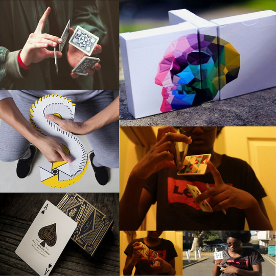
This is a moodpage on cardistry. This moodpage includes my favourite decks (the memento moris, Virtuoso, monarchs and sparkle point) and cardistry moves and me performing them.
0 notes
Photo
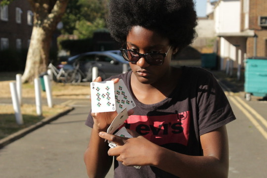
Images of me performing cardistry and pictures of my favourite deck of cards
0 notes