
Last Seen Blogs

wreniriis
🌱Luka ✸

zennyelsie
I Love Food, Travel And Fashion

anadytopmichelle
Curtains and Drapes For Home Decor

dirtykvdlpup
Unbetitelt

sapphire-scientist-a
Moved to sapphirescientist
Text
Week 12 - final reflection
I really wanted to focus on how Bierut and his work could influence mine, and how I could incorporate him into this project. Continuity and a seamless flow were also major aspects I was considering while making this. I started by going off my completed timeline, the colour and the red line element. I kept with this running theme of red lines because I was inspired by his work of integrating shapes to almost highlight the text by surrounding it in a way that brings attention to the text rather than itself. I tried to mimic his tactic of careful placement throughout the publication not only with the lines but also with the pictures. I used a lot of references and further research to give me a base idea and build on that from as close to his perspective as possible. Bierut’s style is minimalistic, he uses that as a way of making something powerful and punchy. With feedback, I saw how busy my work was. I was using different fonts for even body paragraphs and they didn’t line up in a way that looked clean. By fixing this and bringing in the margins I saw an immediate difference, appearing a lot more professional and making use of the white space. It also lets the text-align, which made it more pleasing to look at. I struggled with the front and back cover, taking a lot of time to create a design and arrange the text in a way I was happy with. I incorporated Bierut’s logos as I didn’t have much signage through my work and he creates them quite frequently, e.g MasterCard and the logos from a Yale poster I used. Overall, I felt satisfied and proud of the thought process I used when making it and how it turned out, I like the style and consistency of that, how I stuck to Michael Bierut's design theme by copying his texts even, and how I was able to make things work together. I am proud of the creativity in it with the placement of the text.
0 notes
Text
Week 12 - final edits
IMAGES - After test printing my publication, it made me aware of a few problems. I saw that the images I had in my work were a low (56) PPI. To remedy this, I got help and opened images on the web in a new tab, copied and pasted them onto a photoshop file and saved and placed that. Afterwards, I was left with a higher resolution and visually better photos.
ITERATIONS - I also noticed that the front and back covers did not work well together. To keep consistent and increase a flowing element I edited them first to the first two below images, showing the graphics in the corner. But once printing that and playing with the resolution I was unable to get it to good quality. I made the decision to remove those and rely on text for effectiveness.

Final -

TYPE -After seeing that my body paragraph text choice was a default typeface, although used by Bierut, I wanted to incorporate myself and him. I changed this to Geneva, a clean, easily read text that worked well with my publication. I chose this font following an extract from Bierut’s book on how he chooses his own fonts, one of them being “it just works.”
0 notes
Text
week 11 - reflection draft
I kept with a running theme of red lines because I was inspired by his work of integrating shapes to almost highlight the text by surrounding it in a way that brings attention to the text rather than itself. I tried to mimic his tactic of careful placement throughout the publication not only with the lines but also with the pictures. Bierut’s style is minimalistic, he uses that as a way of making something powerful and punchy. With feedback from my lecturer, I saw how busy my work was. I was using different fonts for even body paragraphs and they didn’t line up in a way that looked clean. By fixing this and bringing in the margins I saw an immediate difference, appearing a lot more professional and making use of the white space. It also lets the text-align, which made it more pleasing to look at. I struggled with the front and back cover, taking a lot of time to create a design and arrange the text in a way I was happy with. I incorporated Bierut’s logos as I didn’t have much signage through my work and he creates them quite frequently, e.g MasterCard and the logos from a Yale poster I used. Overall, I felt satisfied and proud of the thought process I used when making it and how it turned out, I like my consistency and how I was able to make things work together. I am proud of the creativity I weaved into it with the placement of the text and the oddness of it such as the layout of the quotes, I feel this made it stick out as Beirut does with minimal resources.
0 notes
Text
Week 11
Final assets -
Final article choice -
Best content and lengthwise. When putting the text in I was introduced to a body paragraph, this allowed me to imitate a paragraph style with text and size with speed. I practised with this and text inside margins to appear cleaner.
Final text choices - I have ended up going with Helvetica Bold for the headings and subheadings as Franklin gothic light was too thin, with a mix of impact and Hiragino Kaku Gothic Std for where it fits better.
minion variable concept for the more minor writing.
Final colour choices - For this publication I, as Bierut does, ran with a colour theme of black, grey, white and red ( some of his most used colours and biggest colour palette)
Feedback this week allowed me to cut down on business within my work. Edits to make:

Take away from feedback:
I need to make sure there are continuities throughout my work so it’s known as one flowing piece. I will use the red line idea from my timeline and stick with grids and margins - text sizing and fonts.
Remember Bierut’s style is minimalistic, clean and strong. Focus on Bieruts style and think about how that goes into your work.
1 note
·
View note
Text
Week 10
Today we went back over grids, guides margins etc. This really refreshed my memory and demonstrated the importance of grid help. It allows everything to become faster, more even and professional looking. We also went over parent pages, useful again for speed as it duplicates evenly onto other pages.
Using this information I was able to set up grids and guides on my own work, where I spotted problems and was able to fix them. I moved everything to sit in 10mm margins, and created a body copy paragraph to repeat the style of text throughout my whole booklet. This immediately brought things together positively and made things look more orderly and put together. I was advised to make use of the space, so I did and will continue to do so.


This week and last I have been focusing on creating my 12 page publication. Ive drawn off my examples and designers elements. Completing most of a first draft I am now editing those pages. Still with the front and back covers, as well as timeline to go.
FONTS:
After researching on bechance and matching the fonts on photoshop, I saw that Bierut used Helvetica bold for a heading in a poster and Minion Variable concept display in smaller text, I will follow this in my work. As well as Franklin Gothic light for subheadings, a font used by Bierut in the Yale posters. For my super bold text I’m going to use either Impact or Hiragino Kaku Gothic StdN as it gives the right effect.


0 notes
Text
Week 8 - indesign practise
I have spent some time on indesign this week, refreshing my skills and getting a digital visual idea of how my 12 page publication could look (without the articles/interviews) This is the first very rough draft i've come up with -

0 notes
Text
Week 8 - preparing
A large portion of the 12 page publication is the article/interview section, I have researched and created a list of possible options that go over both his life and tactics as a designer.
Possible articles/interviews -
https://eyeondesign.aiga.org/pentagrams-michael-bierut-geeks-out-over-the-color-theory-behind-the-new-mastercard-logo/
Most likely -
0 notes
Text
Week 8 - preparing
I have done a final draft sketch of what I would like my 12 page publication to look like after re-looking at Bierut's work and other elements/examples.
0 notes
Text
Week 8 - preparing
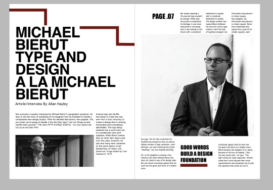
preparing for the 12 page publication, I looked over the brief and the contents needed for this project. What I picked out that I could research and collect now are the quotes and images of Michael Bierut I will be using and writing out an introduction i was happy with.
QUOTES - reference:


IMAGES -
I will need to edit these to fit the style of the work as well as resolution.


FINAL DRAFT INTRODUCTION -
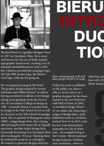
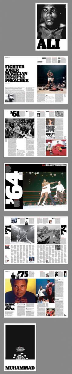
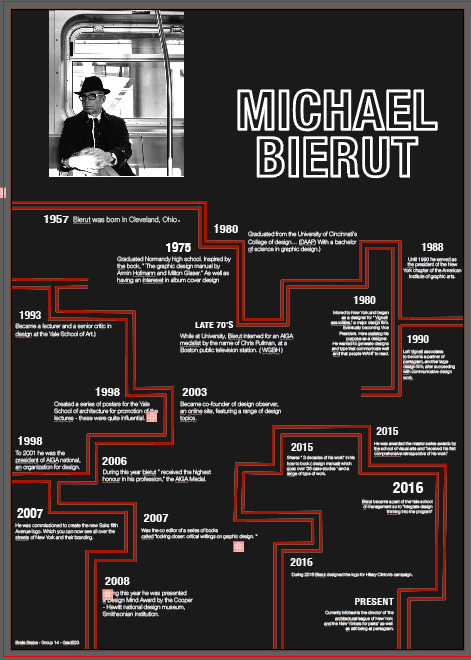
Michael Bierut is a graphic designer born in 1957 in Cleveland, Ohio. He is most well known for his use of bold, majorly typographic based work, creating a lot of instantly identifiable pieces such as Hillary Clintons presidential campaign logo, the Saks fifth avenue logo, the MasterCard logo, with the list going on.
He was inspired young by the book “ The graphic design manual by Armin Hofmann and Milton Glaser,” as well as having an interest in album cover design. Going on to graduate from the University of Cincinnati's College of design in 1980. Currently Bierut is a senior critic in design at the Yale School of Art as well as a lecturer at the Yale school of management. He is a partner at Pentagram (since 1990) , a large design firm, this coming after leaving his first major job at Vignelli associates, another major design firm. Eventually becoming Vice President there after working for 10 years. Working there he realised his purpose as a designer. He wanted to generate designs and type that communicate well and that people WANT to read.
Today his work is solidified in the public eye, deservedly so. In his career as a graphic designer he has been named to the Art Directors club Hall of Fame in 2003, co-founded ‘design observer’, an online site, featuring a range of design topics, published his work in a book he named ’how to’ in 2015, and has his work featured permanently in a list of museums. An example being in the Cooper- Hewitt national design museum, Smithsonian institution, where in 2008 they presented him with a Design Mind Award.
0 notes
Text
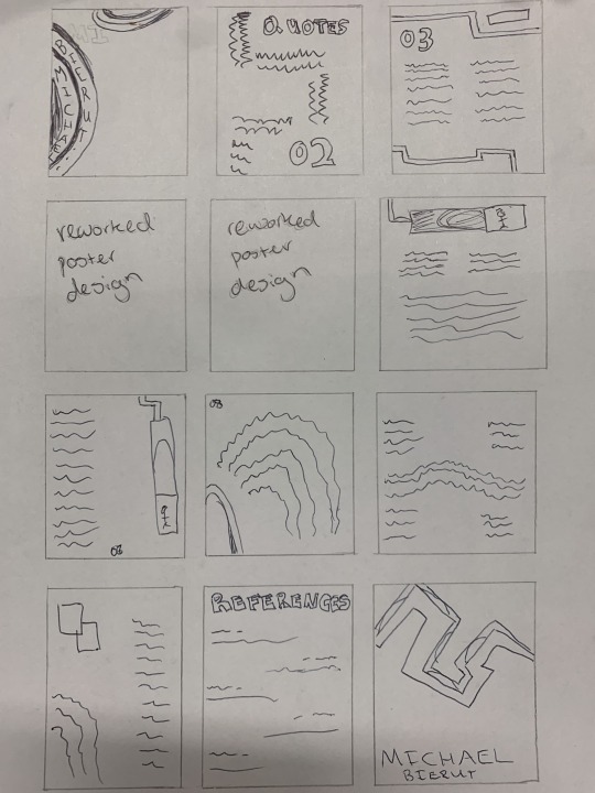
Mid sem
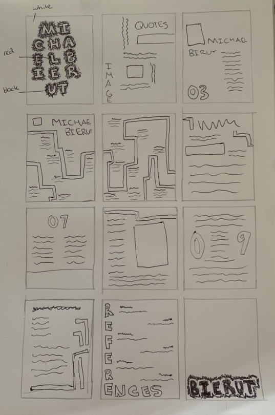
After completing our set ‘Wheres the grid’ task and uploading it to our teams channel, I set on to creating sketch ups of my twelve page publication design. I began by looking at images across the internet to gather ideas that work with my designers style of design. This allowed me to brainstorm and recap important elements Michael Bierut works with.
Here are 2 sets of 12 page sketches I have drafted. Honing in on his typographic and minimalist style.
The order:
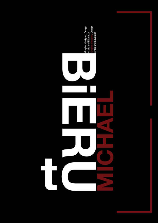
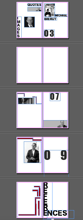
Page 1 - front cover design
Page 2 - quotes - images
Page 3 - introduction min 150 words
Pages 4 & 5 - Reworked timeline poster design
Pages 6/ 10 - feature article/interview
Page 11 - references
Page 12 - back cover design

FOUND IMAGES WITH RELEVANT ELEMENTS:


0 notes
Text
Self reflection - formative
The designer allocated to me has an incredible bold, attention grabbing style. I really enjoyed being able to create something with minimal added colour and illustration, as it’s not my usual style and I really had to focus on how I could communicate something well and have it look up to my standards without those things. I really had to explore his mostly consistent style and find elements that appealed to me, a timeline poster and Michael Bierut. I am happy with the design I created and the level of creativity I incorporated for the style I was following. However next time I would figure out how to minimise the text or just make it look less crowded! I had never used illustrator before this and attempted to apply the last few weeks of knowledge I was given. I feel I may have come up with some unconventional ways of solving the issues I faced that were more time consuming than if I had taken more notes and used the sources available to me better. I found it difficult to navigate my sources and also just create the correct file settings for this assignment. But I am still proud of the work I have produced and feel it represents my designer well and keeps in tune with his style. To improve my skills for next time I will learn how to navigate my sources on the platforms for AUT, and take the necessary notes for a successful assignment.
0 notes
Text
Timeline poster formative
Below is a screenshot of the final draft of my timeline poster on the graphic designer Michael Bierut. I used elements from different pieces of his work to form something that flowed as a timeline while representing Bierut. Sticking to his dominant colour palette and Helvetica Neue, a font he has used many times an example being in a poster he did for the Yale school of Architecture.
0 notes
Text
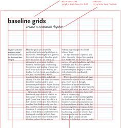
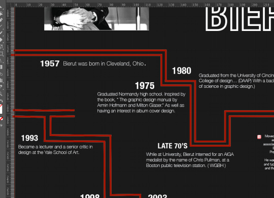
Grids
Before this timeline I had never used grids and had relied on my eye and rulers to create straight lines. Much of my poster being based on line work the squares of the grid and its size were incredibly helpful with creating my timeline poster and making sure it was even.
0 notes
Text
Final Colour Palette
Based off my research of Michael Bierut and his work I have settled on a grayscale colour palette with a pop of red to keep in tune with his work.

0 notes
Text
Typeface examples
I have made a list here of some of the typefaces Michael Bierut has used in some of his most well known text based works. This is to gain a selection of fonts that I could potentially use / base my choice off for my timeline, relating him into it.

0 notes
Text
How Bierut works
As most of my designers work is typographic and I am creating a timeline based on his work. I thought it would be interesting to think like him when picking my typefaces for this assessment.
An extract from his book "Now You See It and Other Essays on Design," shows Bierut's 13 ways of looking at and choosing a font for his different briefs. In short these being -------------------------
" 1. Because it works ---- Some typefaces are just perfect for certain things. I’ve specified exotic fonts for identity programs that work beautifully in headlines and even in text, but sooner or later you have to set that really tiny type at the bottom of the business reply card. This is what Franklin Gothic is for.
2. Because you like its history--- I was never a fan of Aldo Novarese’s Eurostile, but I came to love it while working on a monograph on Eero Saarinen: they both share an expressiveness peculiar to the postwar optimism of the 1950s.
3. Because you like its name--- a student redesigning the Tiffany & Co. identity. particularly disliked the font that was used, and I politely asked what it was. “Oh,” came the enthusiastic response, “that’s the best part! It’s called Tiffany!”
4. Because of who designed it----Once I was working on a project where the client group included architects. I picked Cheltenham, designed by an architect.
5. Because it was there --- Sometimes a typeface is already living on the premises when you show up, and it just seems mean to evict it.
6. Because they made you.
7. Because it reminds you of something----Whenever I want to make words look straightforward, conversational, and smart, I frequently consider Futura, upper- and lowercase. Because forty-five years ago, Helmut Krone decided to use Futura in Doyle Dane Bernbach’s advertising for Volkswagen
8. Because it’s beautiful.
9. Because it’s ugly --- The other day, I saw something in the office that really caught my eye. It was set in Bookman Swash Italic, and it looked great. Ugly, but great.
10. Because it’s boring---Tibor Kalman was fascinated with boring typefaces. “No, this one is too clever, this one is too interesting,” he kept saying when showed him the fonts I was proposing for his monograph. Anything but a boring typeface, he felt, got in the way of the ideas.
11. Because it’s special----In design, as in fashion, nothing beats bespoke tailoring.
12. Because you believe in it---A true fundamentalist requires a monotheistic worldview: one world, one typeface.
13. Because you can’t not."
ALL INFORMATION & REFERENCE FROM -
https://www.itsnicethat.com/articles/michael-bierut-now-you-see-it-and-other-essays-on-design-publication-061117
0 notes
Text
503 week 4 lecture notes
503 - week 4
Today we went over what a design process is, Ellen Lupton broke it down to 3 phases
Defining the problem, inventing ideas, creating form
The first bit of process can be messy and difficult but is important.
Brainstorming is a good ‘method for generating ideas to solve a design problem’ in a free thinking environment
To organise that information, mind mapping.
Narrow down and have a robust idea, then to create form
We have to make sure we Proof as we go, pick sections and grab them for review -
We went over the importance of the brief and where to easily source information - aut library. And the importance of documentation of our design process, it’s changes and variations and to visually communicate our ideas.
0 notes