Text
Blog 8
In documentary The Social Life Of Small Urban Spaces they explore the connection between the design of urban spaces and how this impacts their use. The Street Life Project, used 1970s New York City as their setting to explore how citizens utilized parks and other public spaces. The group conducted interviews and analyzed photographs to gather information. The information that was gathered gathered has helped in the culmination and organization of public spaces even years later.
Sanford Maine is a city in York County close to the New Hampshire border. It has a population for just over 20,000 people which is small compared to other cities but big in terms of Maine which is for the most part still rural. The public space that it under utilized in that community is Gowen Park.

Gowen Park is a large park right next to Sanford’s Junior High School. It is separated by a road in the middle with the upper part having a large hill with a gazebo on top. The lower half has a pavilion with tables to sit at and a hill with a tree on top to the left. Budding up again the back end of the park is an entrance to the Mousem Lake Trail. The park gets used mostly for sledding because the hill in the upper half has a big slope. But it goes underutilized for the rest of the year.

One big reason it is underutilized is because there is a lack of parking. It is next to both the junior high school and tennis courts so must of the available parking in the area is taken up by both those places. Most people that visit this area have to park on the street which clogs up the area and blocks the scenic views. But other than being close to the school it isn’t rear any major residential districts and borders a main road so it is hard to walk there.
The park offers places to picnic and for families to enjoy. Also the nearby trail is a great place to walk a pet or go on a hike. With it’s close proximity to the schools it is also a good place for teachers and students to go to have class outside.

Something that could invigorate this area is hosting more community events here. Most of the other parks in Sanford have playgrounds or basketball courts so they have built in activities but since this park is mostly open space it could do well to hold community functions. The large open space could hold a lot of people and something like a block party or small community organization’s event could easily fit here.
The gazebo is mostly empty but if they added more seating in or around the gazebo it could draw people in that use want to sit and enjoy the view. Also adding more signage about the trails and seating could help draw people in who enjoy outdoor activities. The Mousam Lake Trails run all over town so advertising them more could be a big draw in. Finally hosting sledding activities in the winter when the park is most used would help solidify why the park is so important to the community in the first place. For example the town could hold a sledding competition and hand out hot chocolate. Making some of these additions to this area could really help make this space more user and community friendly.
Sources
“The Social Life Of Small Urban Spaces.” Informal Science.
0 notes
Text
Blog 7
The first thing I noticed while watching the Film Amelie by Jean-Pierre Jeunet is the distinct visual style. It is reminiscent of how you can always tell a Tim Burton film by how dark the tones are. The same thing is happening with this film except instead of dark tones Jeunet uses warm tones infused with red and green hues.
Amelie is a film about shy cafe waitress Amelie and her quest to do good things to impact the lives of the people around her while simultaneously struggling with her own feelings of isolation.
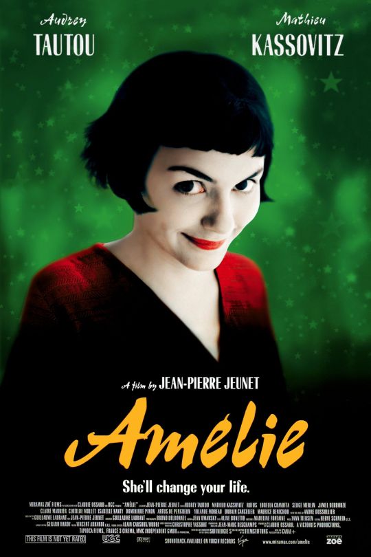
This movie has an excellent way of developing characters without telling you explicitly what their personality types are. For example in the beginning of the film we are introduced to a young Amelie and her parents. We begin to see how regimented her parents are right away by the way they organize their purses and toolboxes. Amelie is homeschooled so we can tell she is isolated from the outside world based on the props she uses to play with. These subtle clues tell us much more about the characters then would be told by explicitly laying out their personalities with a voice over or something of that nature.

The film’s use of symbolism and small details really pull the story together. This is done with scene setting, props, characters actions, and even the camera directions.
One part of the film I found very poignant were a few scenes close to the opening of the film when we first see Amelie in her apartment. In these scenes we see Amelie preparing tea in the kitchen. The camera angle gives us the illusion that we are not in the same room as her.
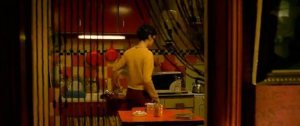
The camera has us viewing her first through her kitchen door then pans right so we see her through an interior window. Before this scene we had gotten some background information about her childhood but this is the first time we really get a feel for her as a character. By having the camera obstruct her from our view at points symbolizes that even though we know some things about her but there’s more we have to learn.

When she is finished preparing tea the camera stops panning. We then see Amelie noice something outside and peer out to look at it further. The camera then begins to zoom in through the window mirroring Amelie’s actions and giving the illusion that we are spying on her.

Windows are used a lot in this film to symbolize that we only get as much of the story as we are shown. Like in the next scene when Amelie closes the window as if to shut us the viewer out. This shows that she lets people in but only to a point she is comfortable with. We learn that she tends to push people away but with her unaffectionate parents it’s not hard to see why she is lacking in social skills at times.

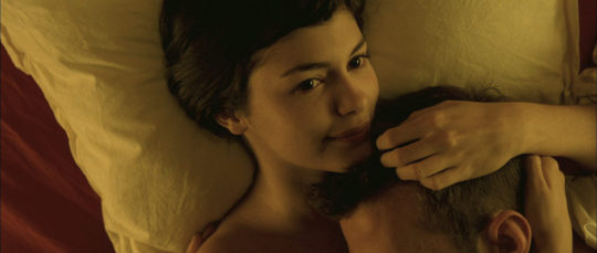
The characters change as the film progresses. Like Amelie starts off closed and in the scenes with her parts of her are usually hidden in some way. But by the end of the film you start to see more scenes where she isn’t obscured and wheres where she is close to people rather than closed off. The shot styles and the camera angles are used affectively to show the tone and the mood of the characters in this film.
0 notes
Text
Blog 6

The first photo I chose to analyze was by Bryan Anslem. The photo is of the aftermath of a tornado that passed through Beauregard, Alabama. What I found poignant about this photo is that it has an artistic chaos about it. All the insulation spread out and trapped in the trees really draws the views’ eye across the whole image. The scattered nature of the items in this picture give the viewer insight to the devastation after a tornado. The dull pink of the insulation look almost like snow or cotton candy. The lighting here is predominantly natural lighting which gives the picture authenticity. The photographer used this location because even thought the items are stagnant, it feels like it’s moving. The composition of this photo is effective because it captures the disarray of this time and how disoriented people who went through this tragedy must feel. It’s hard for someone who has never gone through a tornado to know what’s it’s like but this photo gives a good representation. It would make the viewer feel like that actually experienced it.

The second photo I chose was by Dawn Adams. The photo is of shadows on an American flag at a town hall meeting hosted by Kamala Harris. This photo is effective because it embodies a presidential candidate race. How voting it a duty towards ones’ country. The photo Cedar Raids Iowa which is a hotspot for candidates to visit when campaigning. The lighting is interesting because it is coming from the front but the photo is taken from the side. The shadows create figures on the flag which symbolizes America is made up of citizens. The colors and figures give the viewer the feelings patriotism.
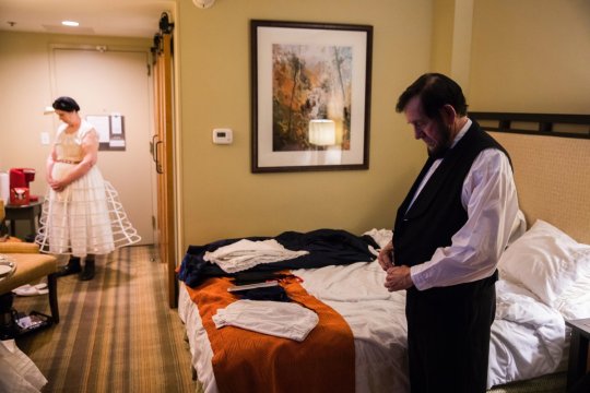
The third photo I chose was by Benjamin Norman. It’s a photo of Tom and Sue Wright getting into costume, they have been Mary and Abe Lincoln impersonators for 10 years. This piece is effective because it shows something not many people think about. People go an see these shows but rarely view the lives of the people that put them on. It Americana at it’s purest form. It was effective to just use mostly the hotel room lighting because it gives the image less of a staged look and more of a candid feel. The setting its self being a hotel room shows how much the subjects travel. This causes the viewer to get a glimpse at the subject’s lives if only just for a moment. The way the couple is standing and getting dressed separate shows a distance between them so maybe their relationship is strained. Also the fact that both subjects are looking down and away from the camera expresses a sense of sorrow or apathy for their job. This gives the viewer an overall somber feeling and it could cause the viewer to empathize with the subjects.

The fourth photo I chose was by Nanna Heitmann. The photo is of seven year old Nora playing with her mother’s barbies from the 80s. This photo shows the innocence of youth and how kinds will play with any toy no matter how old it is. The photo is taken from above with natural lighting with gives the viewer the ability to see all the dolls scattered around the girl. Barbie is an iconic toy so it would be easily recognizable and viewers would most likely have memories associated with the doll. The way Nora is posing makes it seem like she is thinking or daydreaming. The newest Barbie doll is the one laying across her chest so you can see she integrated her new toys with the old toys from her mother. The location of the photo is Taucha, Germany so even in Germany little girls play with Barbie dolls. Kids are growing up in an uncertain world right now but this photo shows that even through all that kids sometimes still need to be kids.

The lat photo I chose was by Krianne Johnson. The photo is of Rep. Alexandria Ocasio-Cortez and some of her staff walking in Queens. The photo is important because it humanizes Rep. Alexandria Ocasio-Cortez and makes her seem like an average woman rather than a congresswoman. The fact that the editor or photographer chose to make this image black and white works effectively in this instance because it draw the viewers eyes to the people rather than the scenery or what they’re wearing. If the photo wasn’t labeled and someone didn’t know who these people were it would just look like a photo of some New Yorkers drinking some coffee. This works in favor for the Ocasio-Cortez campaign because her message is that she is for the people and doesn’t take pac money. So painting her as just a New Yorker who drinks coffee like the rest of us just raises her likability. The smile on her face is effective too, a lot of times pictures of politicians can look serious but this photo just looks like the group is just having a lighthearted conversation. It really does well showing Rep. Alexandria Ocasio-Cortez’s youth and lightheartedness.
Sources:
https://time.com/longform/best-photojournalism-2019/
0 notes
Text
Blog 5
https://docs.google.com/presentation/d/161Tb0aaf1H7A95tpiQveLLiu9jBd2kjB5-UdSnb5N1k/edit?usp=sharing
*explanations in speaker notes section*
0 notes
Text
Street art and street artists have been around for hundreds of years and can even be linked back to cave painting done by neanderthals. Modern street art is often socially and politically charged. Politically and socially charged art isn’t always street art though, there is a lot of ways to get your message across like with graphic designs and print art like some of the artists I am going to look at. In this blog I will be looking at the work of Banksy, Diego Rivera, and Emory Douglas.
Banksy is street artist, political activist, and film maker based out of England. He have been active since the 1990s and his identity still remains anonymous. But it is speculated that Banksy could be either Robert Banks or Robin Gunningham. Banksy’s work is well know for it’s use of stenciling and depiction of rats.
It was difficult to choose just one work by Banksy because I personally believe a lot of their pieces are powerful but ultimately I was dawn towards the work he has done in Palestine. In 2017 Banksy open an large installation piece in Palestine called The Walled Off Hotel, it quickly became a tourist attraction and people can still stay there today. Inside this hotel you’ll find many works by Banksy like this one titled Love Wall (2018).

This piece was created on a replica of the separation wall that was built along the West Bank of Bethlehem. The piece features a young girl playing with a shape sorting toy, a popular toy that has shaped blocks that fit into corresponding shaped holes and comes with a mallet to hit the blocks into the holes. For the original toy the shapes are usually a circle, a square, and a diamond but in this depiction there is a square, a cross, and the star of David. The girl is holding a mallet but isn’t hitting the blocks with it. Behind the girl there is a heart cut out of the separation wall. In many of Banksy’s pieces everything is just a black outline with minimal shading save for the important aspects which are colored. Here the only colored items are the pink mallet, the green square block, The red crescent moon, and the blue star of David. These items stand out because most of them are religious symbols associated with the turmoil between Israel, Palestine, and The Holy Land. The girl seems more preoccupied with the heart backdrop which means she either created the hole herself or she is just more fond of that shape than the other shapes. Love is the symbol that is not included with the blocks so maybe it’s the missing piece.
2.
Emory Douglas was a member of the Black Panther Party and created designs for their newspaper. He was also employed as The Black Panther Party’s Minister of Culture from 1967 tunic the party disbanded in 1980. His artwork mainly described the plight of the black person as well as the ideals of the Black Panther Party.
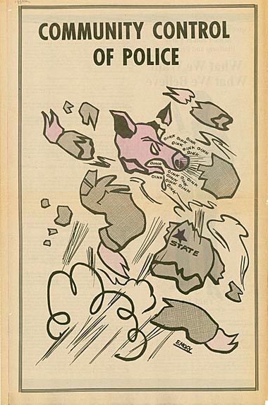
This piece is a simple image of a pig in a uniform that says “State” being blown up with the phrase “Community Control of Police” across the top of the page. Being as this was for the Black Panther magazine this was most likely a full page graphic. This graphic depicts the classic imagery of making police into pigs. Referring to police as “pigs” has been going on for quite some time, it’s mostly a reference to how cops are seen as dirty just like pigs are perceived. But the phrase also been linked to George Orwell’s novel Animal Farm where the police officers were depicted as pigs. In this piece Douglas is referencing the fact that black people are treated much harsher than their white counter parts and seemingly the only option is to get rid of police all together. I don’t think he literally means blow up police but I do think he means abolishing the institution of police all together. A central theory in the Black Panther Party was anti-police and the idea that they could take care of their own people without police presence.
3.
Diego Rivera was a Mexican muralist painter and husband to Frida Kahlo. He was also a vocal member of the Mexican communist party so a lot of his work is politely changed. His work often depicts common people doing manual labor or jobs. Flowers are also a common symbol in his work.

The piece I am looking at is titled “Alliance of the Peasant and the Industrial Worker” (1924). In this piece you can see 11 men, 4 on either side with two men in the center shaking and and one man behind them. The placement of the men in this mural is reminiscent of The Last Supper by Leonardo DaVinci. The 4 men on either side can be compared to the disciples with the man standing between them is depicted like Jesus. The two men shaking hands in the middle are assumed to be the peasant and the industrial worker as one is dressed in overall and the other in a poncho and sun hat. All the men in this painting are presumed to be of Mexican heritage. All the men are depicted floating over what appears to be a town or farm. Trees and a plow and roads can be seen below. Across the top of the piece there is a banner that reads “Aqvi se a explotar la terra no a los hombres” which translates to “here is to exploit the land not men”. This is in reference to industrial workers and farmers being exploited for the profit of their bosses when Rivera is depicting that only the land should be exploited or farmed not the workers. The handshake shows the solidarity between the industrial worker and the peasant.
Sources:
https://www.instagram.com/p/BueZXU6DVf4/?utm_source=ig_web_copy_link
http://theabsolutemag.com/wp-content/uploads/2015/03/emory_blackpanther-2.jpg
https://www.wikiart.org/en/diego-rivera/alliance-of-the-peasant-and-the-industrial-worker-1924
0 notes
Text
Blog #3
It is not uncommon to see typography and graphic designs mixed. You see the mixing of words and images everyday, whether it be in advertising or on social media. It is a vital way to get your message across when just images aren’t enough. Graphic design is often associated with print media but in these more modern times it has expanded to include motion pictures, television, and the internet. In this blog I will be looking at 3 different instances of the use of typography in graphic design and analyze the personal, technical, ethical, historical, and cultural perspectives.
1.
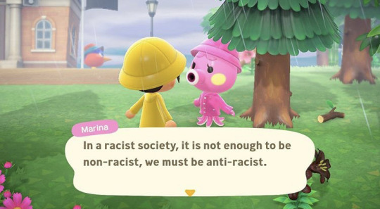
The first image I will be looking at is an image created by the Instagram page animarx.crossing. The original image is a screenshot from the very popular video game Animal Crossing: New Horizons but the creator took out the original character dialogue and replaced it with a quote from Angela Davis. The character featured here is Marina the octopus who is a fan favorite among players.
Personal: The text is in the middle of the image as if it were the actual dialogue in the game. This is to the advantage of the viewer because it displays like the game displays so if you are a player of this game or video games in general is would be easy to read. The colors in this image are bright and cheerful which adds to the jarring nature of the text. The unexpected nature of the juxtaposition between the text and image grabs peoples’ attention.
Historical: This image is definitely from the digital age. A big aspect of my generation is this notion of meme culture, memes are usually images with typography overlaid on top for either humorous or dramatic effect. These memes have become so prevalent in our society that they are used in advertising and even in magazines and other print media. Memes are often used to display complex social political ideas in a smaller more manageable format. This image does just that, it uses a recognizable popular image to make the complex ideas of Angela Davis and racism more palpable to the reader.
Technical: The text in this image is smaller and underneath the characters to indicate that it is dialogue. This technique has been used in images for a long time and is reminiscent of old cartoons in the newspaper. The image takes up the whole frame so it makes the viewer feel like they are in the conversation with the characters.
Ethical: This piece may seem a little hedonistic as the creator is trying to shock viewers and get their views on race across. The medium used to express these views is aimed at privileged people because they are able to play this video games and afford the system required to pay it. They are using their creations to get ideas about race to a demographic that might not have thought about those ideas.
Cultural: This image uses a grid approach and uses a modular design. It is separates the image and text with a box so you where the text begins and the image ends. This keeps the graphic organized and easy for the viewer to decipher.
2.

The next image I will be looking at is an advertisement for the popular insurance company Progressive. This ad features the longtime spokeswoman for the company, Flo. She appears to be on the phone texting and on the right side of the screen is text bubbles like the ones you’d see while texting on an iPhone.
Personal: The text in this image is all centered to the right of the character Flo. This ads to the flow of the image because most people read from left to right. The text displays how the company compares rates with other insurance companies by including text bubbles that read things like “progressive $$$” and “company A $$$”. There is also a text box at the bottom of this image for the viewer to ad their zip code if they would like proceed in getting and insurance quote.
Historical: This image can be classified as the digital age as it was designed to be either a side-bar ad or a pop-up ad for a website. You can also see the the smartphone the character is using dates the ad because she is using modern technology. It was designed to be widely distributed through the internet to get more viewers to see it and interact with it.
Technical: The typeface used in this image is predominately the same one used in most phones. This is done because the ad is aimed at a younger generation and that sort of font will be familiar to them and catch their eye. There is a use of emojis because in texting culture they are used to grab attention and get points across. This also gives a good breakup between the text and the images. The colors of this ad are muted but this is typical for most Progressive ads because they usually are mostly white with some navy blue accents.
Ethical: This ad falls under hedonism because it is explicitly made for marketing a product to you. It exploits youth culture as a way to market to a younger generation that might not seek out the product organically.
Cultural: The ad also uses a grid approach with a modular design because each section is blocked off. It is reminiscent of an actual text screen on a phone and is designed to give you those feelings.
3.
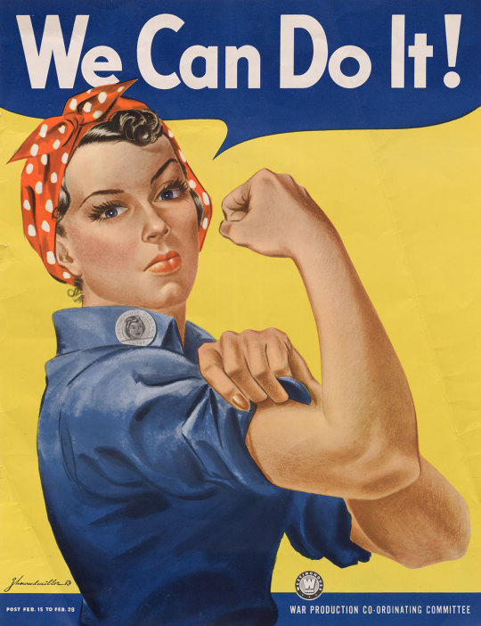
The third image I will be looking at is the famous World War II ad for the War Production Co-ordinating Committee featuring Rosie the Riveter. This ad features a woman, Rosie the Riveter, at the center making a muscle with her arm. The ad also features large text at the top that says “We Can Do It!”. This ad was run during WWII and was aimed at garnering women to help out and join the defense industries for the war effort.
Personal: The imagery of the woman at the center making a muscles is powerful because in most advertisements of that era women were seen as weak and subservient towards men. The woman depicted isn’t dressed in common feminine attire like a dress and makeup but instead she is dressed in work coveralls and a bandanna to distinguish that she is a working woman rather than a housewife. The words at the top of the image are surrounded by a speech bubble to indicate she is speaking them and the phrase includes an exclamation point at the end to signify she is either shouting or chanting the phrase.
Historical: This ad is in the artistic period. You can tell the illustration was made for mass production because it uses unsaturated primary colors, no color blending needed to be used when printing so they could print a lot of these ad in a shorter amount of time. There were many depictions of Rosie the Riveter during that time period but the most famous and the one I’m using here was by artist J. Howard Miller.
Technical: Since this piece was originally painted, the typeface is unique and doesn’t fully align with any modern ones you can get on your computer but since it’s release the font has been copied. The text is roughly the same size as the woman so they seem to be of the same amount of importance. The use of primary colors grab the viewers’ eye because it makes the image simple without too many complete hues. Red, yellow, white, and blue are colors everyone knows and describe. Also the use of red, white, and blue specifically give off the feeling of patriotism. It gives off the feeling that this woman is helping the fight for her country even if she isn’t directly in combat.
Ethical: This image is falls under both utilitarianism and hedonism because it is creating a useful and legible image while also pushing the commercial purpose of hiring for wartime production. This ad doesn’t promote a certain product but rather promotes the idea of patriotism and the strength of women.
Cultural: This image has an industrial feeling attached to it. The artist who created the piece was J. Howard Miller who was an American graphic artist. The depiction is believed to be based off a photograph of Geraldine Doyale. You can get that feeling from looking at this image, it has realistic relatable motif.
Sources:
https://www.instagram.com/p/CAxjMdNApIT/?utm_source=ig_web_copy_link
https://www.reddit.com/r/FellowKids/comments/7bisfj/this_progressive_ad/
https://www.britannica.com/topic/Rosie-the-Riveter
0 notes
Text
Blog 2
In the modern age where visual stimuli is everywhere you turn it it had to not become bombarded with images of gender stereotypes especially in advertising. I will be looking at 4 different ads and explain how each one perpetuates gender stereotypes. I will specifically be looking at ads geared towards men and how they perpetuate lifestyle choices, products, body types, and sometimes toxic masculinity.
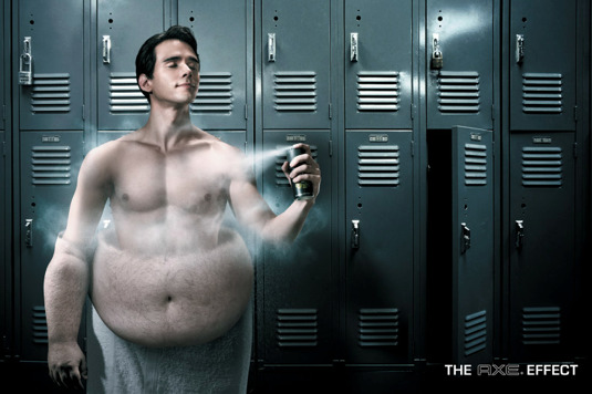
This first ad is for Axe brand body spray. We see a white male that looks to be in his 20s spraying himself with Axe body spray in a locker room. As he’s spraying himself you can see his body transforming from plus sized to thin with muscles. This ad is portraying that plus sized men are not as desirable as thin muscular men and if you use their product you will seem more attractive than you actually are. The background is a set of lockers making it seem the subject is in a locker room, locker rooms are a place where men are able to look at each other and judge each other on looks and muscle tone so setting the ad here already brings a negative connotation to men that may have had bad locker room experiences. This ad is perpetuating the stereotype than to be an adequate man you have to look a certain way.
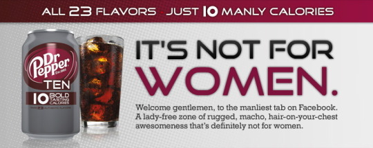
The next ad if for Dr. Pepper Ten soft drink. In big letters across the from it says “It’s not for Women” letting you know this soft drink is intended for men even though food and drinks can’t be gender specific. The ad explains that this drink is just “a manly 10 calories” though calories themselves can’t be either masculine or feminine because calories aren’t tangible and are just units of energy. The can even states the calories are “bold tasting” when thats impossible because calories are a unit of energy and therefor have no taste, it’s like saying you can taste the watts in a lightbulb. The ad then explains that this place is “lady-free, rugged, macho” and then mentions it’s not for women a second time. They exhaust the fact that the product is not for women and is lady-free. The font they use is in all capitals and is bold and masculine to appeal towards men, this is opposed to the regular Dr. Pepper line that has more of a vintage look and feel.

The third ad is for Miller Lite beer. In the center of the ad you can see a bottle of Miller Lite beer floating in some water with the words “Nectar of the Guys” overplayed on top. This makes no distinction to whom this product is intended for. The phrase tells us it’s for “guys” but it is also a reference to greek mythology and the nectar of the Gods which was divine drink that only Olympian Gods had. So the reference and subtext are equating “guys” to Gods and this beer to a divine drink. This again gives a beverage a gender specificity when food inherently cannot be gendered. The color scheme is also masculine with the blue background if you look at the two traditional stereotyped colors, blue for boys and pink for girls. This ad is saying that their drink is fit for Gods and by Gods they mean average guys.

The last ad is for Gucci’s fragrance called Guilty Black. In this ad you can see the Actor Chis Evans with a blonde woman seductively draped over him with a bottle of the perfume depicted in the corner. Noting that the perfume is covering some of the blonde model but there is nothing covering Chris Evans. The lighting from the upper left corner is green matching the color of the fragrance bottle and giving the scene a green tint and green gives the connotation of death and money. Chis Evans is looking directly at the viewer with a sensual stare while the model has her eyes closed. The model has red lipstick and red nail polish because that is the most appealing and sensual color for men and red gives off the feeling of desire and love. This ad is portraying that if you buy this product you will be like Chris Evans and get beautiful women to want you though a scent doesn’t change much about you other than your overall aroma.
0 notes
Text
Blog 1
Today I will be using the Illusionary perspective to analyze this military recruiting ad.

This ad contains five subjects that we can surmise are all involved in the Unites States army by their uniforms and the American flag places on the center subjects uniform. By the different outfits/uniforms the subjects are wearing the ad is portraying that there are many other jobs available in the U.S Army other than just combat. But the placement shows us that they are somewhat less important that the job of the center subject.
By the placement of the center subject you can assume he is a high ranking officer or leader of some kind because he is in the foreground and his image is slightly larger than the rest. Also his uniform has patches and advanced gear that gives the appearance of higher stature. He is also directly behind the words “What Your Warrior?” which adds to the tough feel of the subject. The center subject is the only one out of the five subjects that is directly looking at the viewer as to bring attention to the center of the graphic where the message and web address are.
The ad has a yellow overtone with clouds of dust along the left corner and grass in the right corner. This is done to give the feel of being in the desert in active combat. The most recent wars that involving the U.S Army have been in the middle east so the ad is trying to give the feeling of being there. There is just a yellow background with minimal detail as to not detract from the subjects.
There is only one subject with with a weapon but the weapon is facing down and away from focus so it can be seen as not the main focus of this ad. The laptop and science equipment are more in focus and are at eye level with the viewer to show they are career options as well. The fat that the subject with the weapon, subject with the laptop, and the subject with the science equipment are all relatively the same size and are inline with each other shows they are of the same importance.
Source: https://images04.military.com/sites/default/files/styles/full/public/2019-11/Army%20Recruiting%20Command%20graphic%20800.jpg?itok=ZI2pmSfa
1 note
·
View note