Text
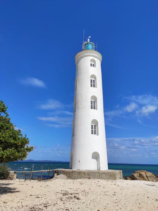
Cool Lighthouse ⚓️⛴
Marbel beach in Trincomalee, Sri Lanka is one of the nicest beach I’ve ever been in my life so far.
I took this picture without thinking too much, but now when I look at it, it has object centered which helps the picture to highlight the lighthouse. And because of the blue hues in the sky lighthouse emphasized nicely in the background.This picture is a good example for cool scheme picture which represents the second half of the color wheel.
6 notes
·
View notes
Text

Luxury Shapes & Colors 🟧 🔵 🟨 🟢
When I was walking down the Grafton street few days back, I immediately stopped when I saw this between the big windows of Brown Thomas. This was showcased on Hermès display. The horse which is included in the Hermès logo is clearly visible in this scarf design.
This picture is framed in thick blue stroke in a square shape. Inside that there is a leaf pattern kinda of a texture in white and blue. Which creates a beautiful depth and sort of 3D illusion for the horse and shapes around it. Also, there are different sizes of circles and squares.these shapes are in vibrant orange, blue and green. These shapes and colors creates a beautiful color and shape contrast to the design.the green color has nice shades as well.
3 notes
·
View notes
Text
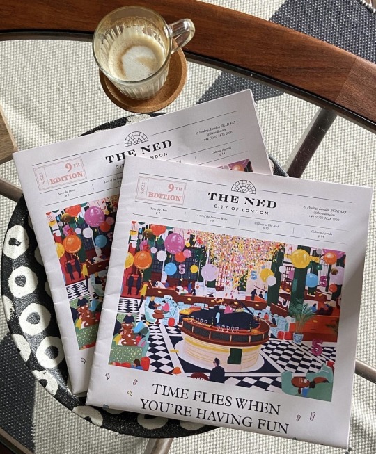
Newspapers for keep 🎀🪩
Katie Smith is the artist of this beautiful art piece. I’ve been following her on instagram for a while now. She’s an illustrator based on Glasgow.hee arts are really beautiful and colorful. As I have noticed her arts are inspired by the female beauty, life and nature, sunshine and plants. I believe she wants to convey positivity and happiness through her work by using vibrant colors in her arts. Also, most of her work she uses analogue colors and different kind of digital techniques throughout her art works.
As the new year just around the corner, I thought of this art work would be a nice touch to add to my visual diary. As a person always admire 70’s - 90’s era this picture gives me a vibe of new year celebration in a fancy hotel’s cafe & bar at a glance. However this picture represents an art work Katie smith did for the cover of “The Ned London hotel”to celebrate their 5th anniversary.
It’s clearly visible that she has used a vibrant color palette throughout the picture. The floor pattern in black white literally compliments and sort of highlights all the other colors in this picture. Also, she has used shadowing techniques like in 5 balloons and other places. It’s really compliments that how she has illustrated the patterns in sofas.
Katie Smith’s Instagram handle :
3 notes
·
View notes
Text
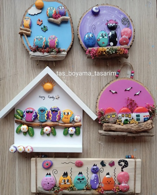
Pebble Arts 🪨🎨🖌
I have tired creating this pebble art as a gift for my parents wedding anniversary couple of years ago. It wasn’t this perfect but it was alright. I love pebble art as it’s quite unique one. Özlem Araz is one of my favorite pebble artists and this picture is a good reference for her work.
In this picture, these are some of her pebble artworks she has done. She has used different shapes and sizes of pebbles to match and create the scene she was supposed to create. Also she has used many bright colors to brings out the cheerful feeling to her arts. Even though she used bright colors there are many other arts that she only sticked into cool, warm, complementary and an analogous color schemes. I love how she has used many different textures for backgrounds like some arts she has used wooden textures and patterns incorporated into her arts and I believe using pebbles gives bit of 3D look and sort of lively look for the art.
Her Instagram handle:
3 notes
·
View notes
Text
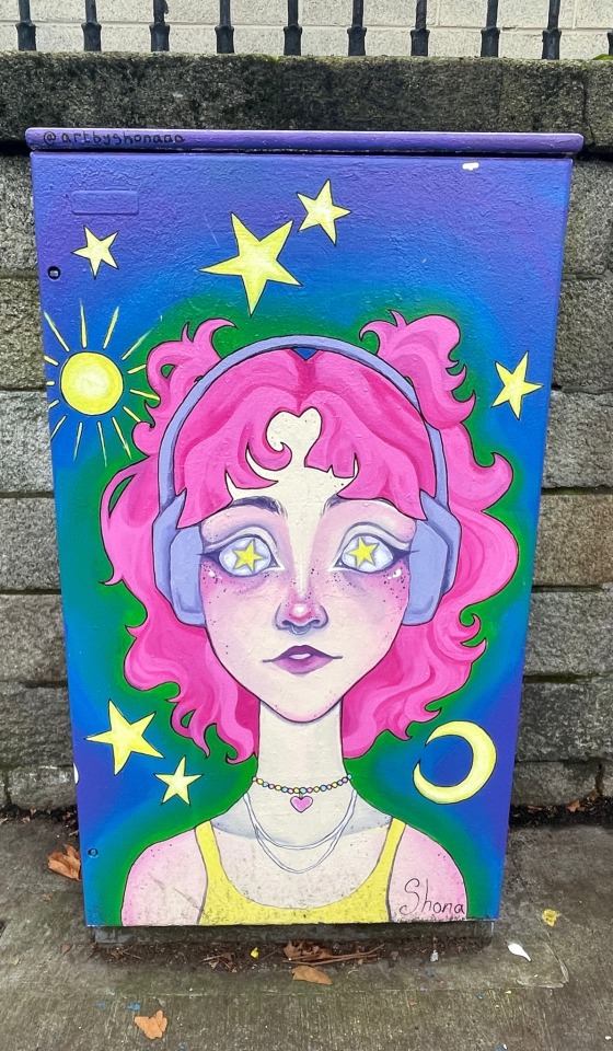
Girl Graffiti 👩🏼🌙⭐️☀️
I captured this street art few meters away from Griffith College. If I’m not mistaken I guess the artist name is Shona. The way I can interpret this art is that when you listen to a good music it will help you to escape from reality and give you a joyous feeling and take you out of this world
I love that the way artists used vibrant color pallet which gives a beautiful color contrast to the design. Also the way artist has placed sun, stars and moon gives a different meaning for the art in u opinion. By using shod wing techniques the artist created a realistic look of the pink hair.
2 notes
·
View notes
Text
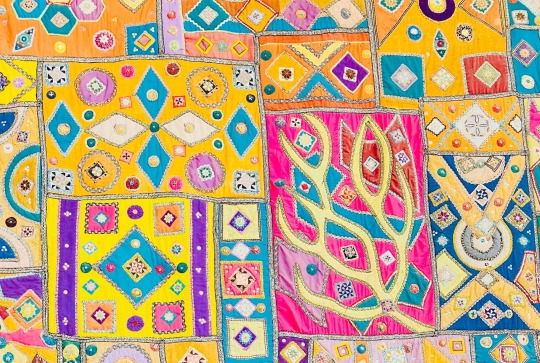
Colorful Patchwork 🎨
This a vibrant patchwork that I have captured in Sri Lanka. I don’t remember the location of this capture. Anyhow this patchwork is a unique as it was a huge wall hanging decoration. I have cropped out in order to get a proper proportion.
This picture represents different kind of shapes and beautiful vibrant colors and unique pattern.when it comes to contrast, it’s clearly viable that it has a pretty color contrast throughout the canvas. Also, different shape contrast as well which helps to create a nice pattern with some glittery combinations too.
3 notes
·
View notes
Text
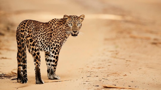
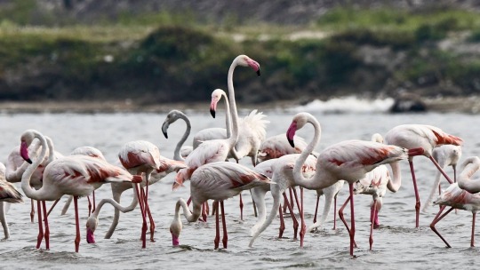
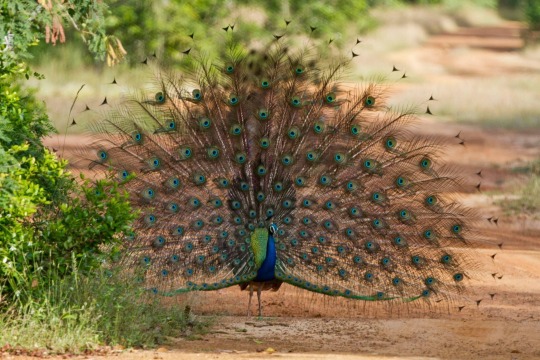

Love for the Wild Life Photography 🦚🐆🦩🐘
As a family tradition, we all go for safari trip twice a year. These photographs were captured during those trips even though I don’t recall the exact dates. “Yala National Park” is one of the biggest and famous place for safari in Sri Lanka and it is a sanctuary for many wild life animals like leopards, elephants, many types of birds etc. this park 979 square kilometers in size.
Leopard print pattern is one of the famous and oldest when it comes to pattern in fashion industry mainly. Also, peacock color palette peacock color gradient are famous in many industries nowadays. Flamingos are used in many digital arts , as a pattern , as a wallpaper also even the colors are inspired by many industries as well.
Especially peacock is mainly being used and inspire in Sri Lankan Airlines cabin crew uniform and most of the designs and marketing materials related to Sri Lankan Airlines.
3 notes
·
View notes
Text
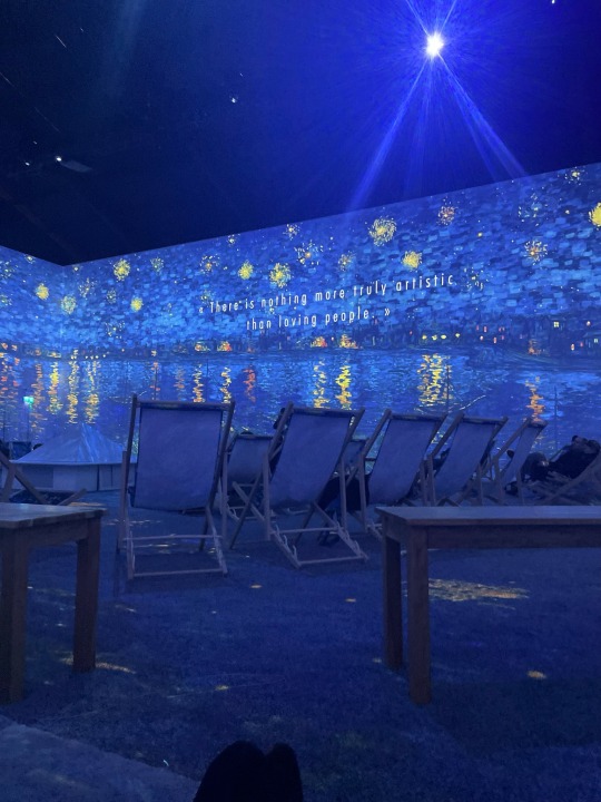

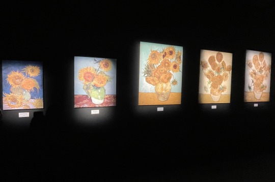
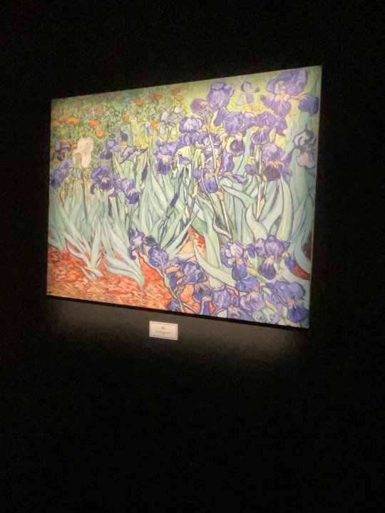
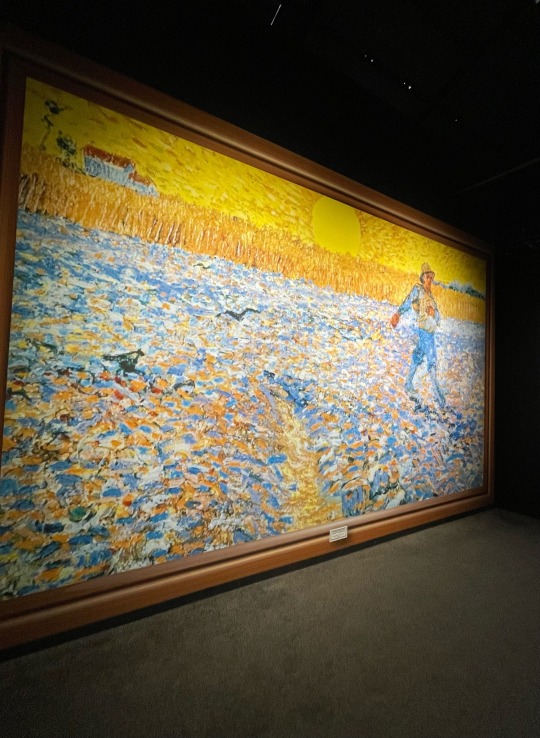
Vincent Van Gogh 🌙🌀
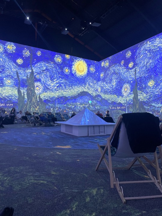
Vincebt Van Gogh is one of the famous dutch painter and a powerful influential character when it comes to the history of western art. Perosnally, he is one of y favourite painting artisit. i was lucky enough to attend and learn more about his life and his work during the Van Gogh exhibition which was at Dublin this april.
When i see Van Gogh's painting, there's a brilliant mix of emotions, colours, and techniques. His extraordinary brushwork and keen use of colour provide a dynamic visual experience that breaks traditional boundaries. His masterpieces demonstrate a deep mastery of design principles, use of composition and perspective to create powerful emotional responses.
One of my favourite paint of Van Gogh is, "The Starry Night". In this painting, his swirling, expressive strokes infuse energy into his landscapes, portraits, and still lifes, showcasing a unique synthesis of form and feeling. Through his visionary approach, van Gogh revolutionized the art world, leaving an indelible mark that continues to inspire and captivate designers and artists alike, serving as a testament to the power of creativity and innovation in art.
4 notes
·
View notes
Text

F • R • I • E • N • D • S Posters
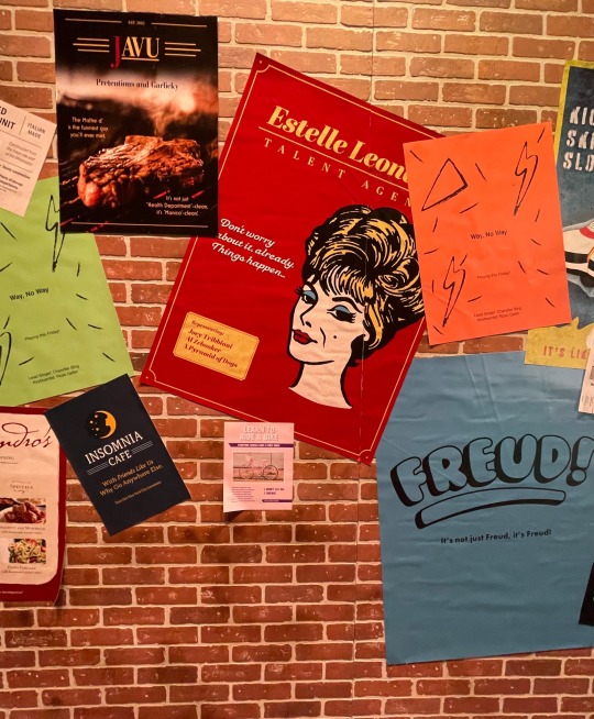
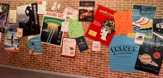
FRIENDS tv series one of the greatest and warmth sitcom I watch repeatedly. There are no words to explain how much this tv series helped to boost my mood and lift me up whenever I was going through some tough times in my life. Also I have learned many slangs by watching this tv series. For these reason this tv series has a special place in my life.
I captured these wall of posters when I visited the FRIENDS experience in Dublin during November. Each poster that is on the wall has its own nice design layout. Different kind of typography, color palettes, images, design elements and shapes are clearly visible in each poster. I believe these each posters represent special scenes in a particular episode of the series.
Finally, I would like to dedicate this post to Mathew Perry, one my favorite characters in friends who played “Chandler Bing”. His death was shock to the whole world. May he rest in peace.
5 notes
·
View notes
Text

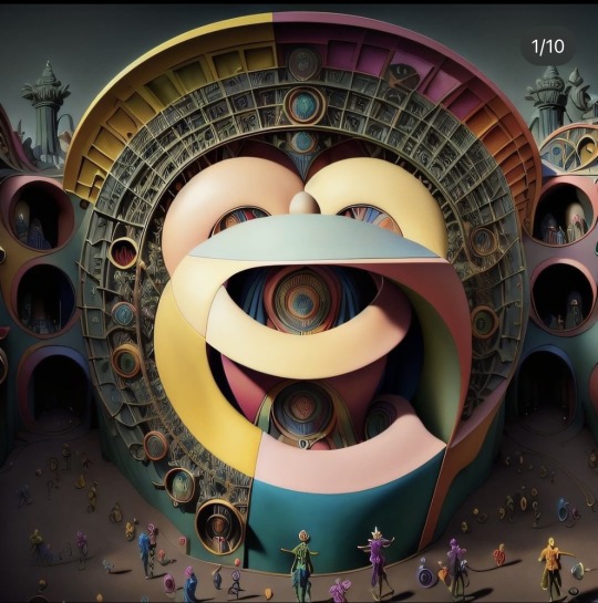
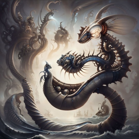
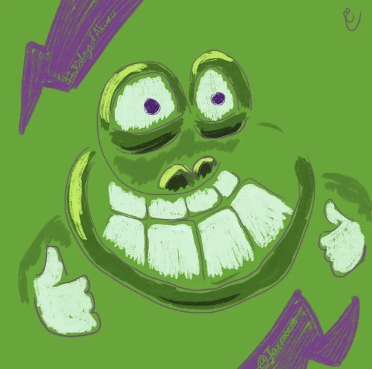
The "ළ" Digital Arts 🎭
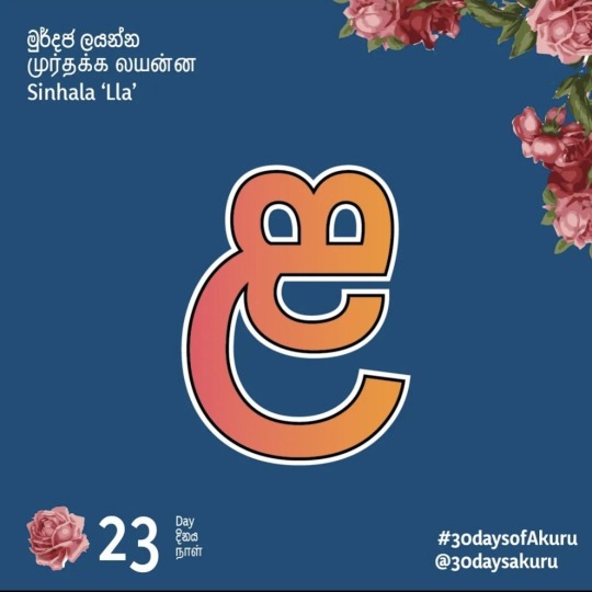
This is a letter from Sinhalese alphabet. Sinhalese alphabet has known as one of the most beautiful alphabets in the world. Sinhalese letters have close relationship Brahmi writing family.
These pictures are from a some sort of local competition of my country , where people generate arts (both human and AI generated) based on one of the character in Sinhalese alphabet and Tamil alphabet.In this case it’s the letter “ළ” which has been based for these artworks. I found this through instagram and it’s called “30 days of Akuru” which means 30 days of letters. After 30 days all the art works sent by different visual designers,typographers basically anyone who’s interested will be showcased through an exhibition.
I love how creativity goes miles ahead than generic way of writing. It’s amazing that different people came up with different ideas to recreate the letter. My favorite would be the one that in the green background and sort of gives a frog inspired art.
Here’s the link to checkout the rest of the letters.
2 notes
·
View notes
Text
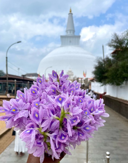
Spot the Color gradient 🌸🪻
I captured this picture when I was in Sri Lanka last year December. This is place is called "Ruwanweli Maha Saya" ("The Great Thupa") located in Anuradhapura, Sri Lanka.This is one of the prominent and holy place for all buddhist people since it's enshrining Lord Buddha's the relics.
I chose this particular picture because of these beautiful flower bouquet that I hold. The flowers bouquet act as the main object of this picture leaving other space blurred out. If you can look closely there’s a beautiful color gradient on these flowers with yellow, dark purple and shades of purple. It kind of remind me of a gradient that a peacock has.
3 notes
·
View notes
Text
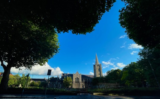
Natural Frame 🖼️
I captured this picture on a beautiful summer day back in august in front of St' Patrick Cathedral Park as i was passing by. For some reason whenever I pass St' Patrick Cathedral I don't forget to capture a photograph. Probably the reason must be that it sort of reminds me of Hogwarts in Harry Portter.
The main reason choosing this picture is, St' Patrick Cathedral is well centered as my main object in this picture while the trees creates a beautiful frame the main scene. I believe through the natural frame which comes from the trees, potrays a sense of depth of the picture.
3 notes
·
View notes
Text
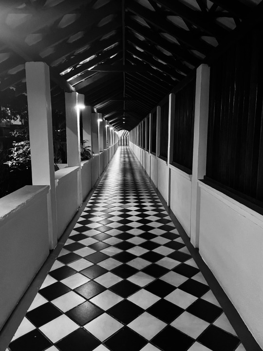
Retro Pattern ▫️▪️▫️▪️
This is one of the oldest hotel located in Kandy, Sri Lanka. This picture shows a pattern which repeats until the very end of the hallway. This tile pattern reminds me of the 80’s retro diner style.
The black and white tiles and the way that the tiles are laid out throughout the hall way creates the beautiful pattern.
5 notes
·
View notes
