
Last Seen Blogs

nyxxbattlesonlyfans
Nyx Battles (OF)

subbernaut
SUBTHiNG and design - SUBBERNAUT and gaming

midnightgospels
Untitled

muniasamy
Untitled

feminist-affirmations
Role Model


Text
Film + Architecture


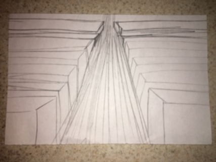
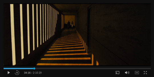

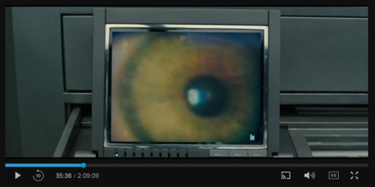
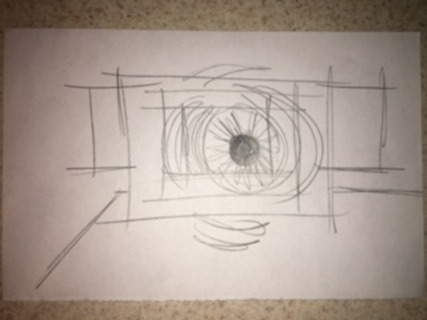


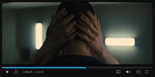

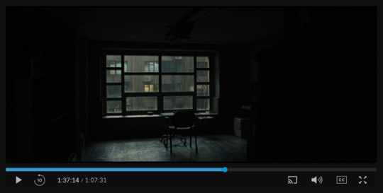


In this film, the architecture of the way in which it is filmed guides our eye to follow light and structure. There is a strong use of negative and positive space and the lens moves towards the light or pans out to show the light and dark picture. The use of the character placement in each scene orients the viewer, because without the scale of a person being present, the space would be undefinable as ‘large’ or ‘small’. There are many spatially interesting shots in this film, and some, such as the stair case shot, appear as an illusion and draw the viewer in. Architecturally, the film forces the viewer to take a closer look (maybe because of the symbolism of the objects being focused on). In the first scene, the negative space of the pupil allows the viewer to focus solely on the iris, which would be the negative space. The second has a tilted view on a bird’s eye view of a never-ending staircase, and makes the viewer feel like they are falling into the story because of the composition and lines involved. The third, mixes the architecture of design and involves elements such as wood and water, even though water is not present, and it is simply an illusion of light. The fourth scene uses negative and positive space to directly contrast one another, through the angles and the composition of light versus dark abruptly next to each other. This scene is a perfect example of vast space juxtaposed against hard lines, making the space feel more methodical and purposeful. The fifth scene I chose is interesting due to the nature of it being a repeat of the architecture of the first scene, except there are other elements added in to orient the viewer to feel as though they are slowly fading away from the scene. The sixth scene begins as a space that has no definition, and it is hard to make out exactly what the space’s purpose is until water begins to flow out of the structure. This orients the viewer and allows them to feel a sort of epiphany when the realization of the massive space strikes. The sixth scene is my favorite, as there is a mix between the human and the virtual, which is a common denominator in this film. The two factors are intertwined and constantly moving/ tricking the viewer to where the viewer no longer knows what is real and what is virtual (which is another reoccurring theme. The seventh image uses well known architectural structures such as furniture and windows to create a mood for the viewer of aloneness. The use of positive space and negative space creates a feeling of solitude and forces the viewers eye onto the chair positioned to where it is gazing out of the window. This feeling of aloneness and solitude sets the tone for the upcoming scenes. The last scene seems to be focused solely on the positive space, but the positive space illuminates’ certain sections of chaos in the negative space, which creates a sense of confusion and urgency as the light does not shift onto where the action is taking place. This creates an interesting yet different architectural space where the mood and the eye of the viewer is constantly shifting.
0 notes
Text
Blog 11 Dezeen
Blog 11 Dezeen

On a mountain summit 3,000 meters above sea level, architects Herzog and de Meuron have plans to create a restaurant and bar named Titilis that will situate on the swiss alps. From a design perspective, it is situated on the bank of a mountain and it blends seamlessly into the surroundings. In the second photo, the glass structure mimics the reflective nature of snow and offers tourists and beautiful outlook onto the mountainous surrounding area. It will be built around an existing cable car system, so sustainability is taken into account with this project.
"Our project on the Titlis belongs to a new generation of alpine architecture that aims to do justice to the breathtaking landscape by ensuring a corresponding architectural experience of the kind now familiar to us in our cities," said Herzog & de Meuron.
0 notes
Text
Design for business (Blog9.dezeen)
https://www.dezeen.com/2018/10/25/good-design-good-for-business-mckinsey-company-report/
I was instantly attracted to the title of an article titled “Good design is good for business” because of my background as a Retail and Consumer Sciences major and a Business Administration minor. Design should not be used merely as a tool to make things look pretty. Instead, it should be used as an asset by all levels of employees and especially accepted by administration. In todays society, design is a volume driver, and it attracts customers to the visual message the company is trying to send, which can further the customers interest and push them to learn more about the business and even invest in it. This article presented an interesting argument- design departments do not need to be isolated from the rest of the company. I have interned at a company where the design department is separate from the others, and I do agree that this does not allow employees to have a cohesive and complimentary idea on what the business should represent from a design perspective. If the business is not on the same page about what they should present to customers from a design perspective, they are unable to reach customers on a deeper level and often leave the customer confused. If a company can stand out against other similarly situated companies through design, they will often win customers over and build brand loyalty with them. Perfecting a company’s design action is the key to a strategic sustainable relationship between the business and the customer. Design can be a companies most valuable intangible product, and it should be a long lasting focus of businesses in today social media driven market.
0 notes
Text
Blog 8 Dezeen

https://www.thisiscolossal.com/2011/05/wang-yuyang-artificial-moon/
The city of Chengdu in China has big plans to launch an “artificial moon” which will be in the form of an illumination satellite. It will replicate a real moon, and the density of the light will reach as far as 50 miles. From a design perspective, it will illuminate the city without having to use street lights, and will enhance the natural lighting of the city, making it seem less apparent as a light source. This architectural installment will blend seamlessly into the night sky and will disguise its purpose all together. However, from a sustainability perspective, I have several added negative connotations to this installment. Although beautiful and attractive, how much will this cost to power? How economically friendly is the “artificial moon”? It will replace street lights, but are companies willing to discontinue their nightly signage to comply with the innovative idea? (I highly doubt it) Will it be solar powered? All of these architectural questions are sound in making sure that the installment serves its purpose. If it is not valid to decrease cost, increase sustainability, and support the polluted environment in China, then it poses as an oxymoron. If it is designed to blend in with the natural world and architecturally juxtaposes the artificial world, then it would make no sense to implement this costly and environmentally detrimental idea. My views on the installment are mixed, and I need more details about the production cost and benefits offered other than just providing attractive lighting.
https://www.dezeen.com/2018/10/19/artificial-moon-illumination-satellite-chengdu-china-technology/
0 notes
Text
Blog 7 (Dezeen)
https://www.dezeen.com/2018/10/12/lahdelma-mahlamaki-trigoni-helsinki-tower-masterplan-architecture-news/
Not only is the cluster of buildings located in Helsinki’s Pasila discrict appealing to look at, they also are filled with smart technology. They serve a purpose: preventing overlooking and blocking pesky light at different hours of the day. These buildings are strategically placed, and they offer lush roof yards, enticing lookout points, saunas, laundry service, and local shops.
I find this image and architectural style a unique take on the “birds eye view” concept. For onlookers within the city, the body of the building provides more space than a 4 cornered building- allowing for vegetation and landscaping around the base. For those above the skyline (probably in airplane) it gives a sense of excitement towards entering the city, and visually enhances tourists’ perspective of the city. This is an opportunity for the city to generate even more revenue, because the buildings become an attraction for travelers to engage in at eye level and birds eye view. The buildings reflect what they represent, innovation and technology. They do not forget the level of comfort that is normally missing from technologically advanced structures
0 notes
Text
Reindeer Cycles
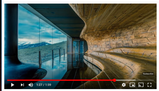
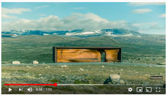

https://www.youtube.com/watch?v=IA-dsomgvoY
First Cycle
- Mountains
- Snow
- Fur
- Wood
- Grain
- Nails
- Fire
- Glass
- sky
Second Cycle
- charcoal glass
- green grass
- white mountains
- capped hills
Third Cycle
- swift clouds
- still street sign
- wandering people
- tranquil music
Fourth Cycle
- bison standing like statue
- climate changes
- vast amount of space
- train station that doesn’t belong
Fifth Cycle
- integration of the elements seen in the landscape into the space
- surroundings compliment the space perfectly
- earth, wind, fire
Sixth Cycle
- interaction between humanity and wilderness
- modern architectural integration of space
- views of rolling mountains and hills separated by thin glass
- space situated perfectly so that time is immeasurable
0 notes
Text
Lecture Review 1
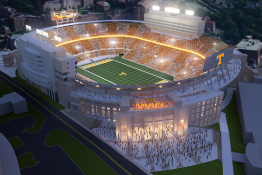
https://utsports.com/facilities/?id=8
https://www.guggenheim.org/about-us
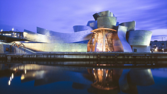
The lecture on Thursday August 30th was titled, “chaos, order, power”. Spaces and territories transform with action/ chaos, and it is the architecture and composition of a building that can serve the purpose of utilizing the space to house the action to the fullest degree. For example, a game space (like Neyland Stadium) houses the regulated game space composed of rules and boundaries. The architecture and nature of Neyland Stadium houses the event and the audience and allows for the space to change with action.
An image that conveyed the thesis of the lecture and was the most compelling to me was the Guggenheim Museum situated perfectly on the water. This was a modern example of how architecture can fit seamlessly into a chaotic environment, particularly through the complex collection of the museum that made the water and building a whole. The composition and structure of the Guggenheim Museum is contingent on the water that it sits on, and the asymmetrical balance mimics the pattern of water. Water is unpredictable, ever-changing, dependent upon time, and complex. These aspects of water are uninterrupted by the seamless fluidity of the shape of the modern museum. Since this building is more of a creative outlet, a modern style was best suited for the environment and chaos that surrounds it.
If the museum had been classical versus modern, it would not have complimented the vast surrounding water that occupied the surroundings. The classical version of architecture is absolute, timeless, symmetrical, geometrically precise, and the meaning is intrinsic and completely closed. Often this type of architecture is used in cities, in academic settings, and businesses. Unlike the modern style, which typically houses creative or chaotic individuals, the classical style would encase a setting which valued order.
0 notes
Text
a way of looking at things (blog.5)
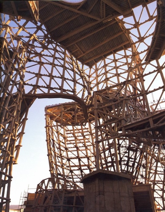
Guggenheim Museum Under Construction
http://flavorwire.com/315192/fascinating-construction-photos-of-world-famous-buildings-and-bridges/15
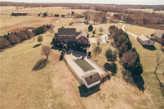
Aerial View of my Childhood Home
https://www.estately.com/listings/info/3470-catholic-church-rd--2#gallery
“Construction is the art of making a meaningful whole out of many parts”
This is the quote from Zumthor from A way of looking at things that resonated with my creative imagination. I am compelled to this excerpt because of the nature of construction, and the fact that so many minute parts can contribute to one large, unique structure. On campus, each building is elaborate and intricate in its own way, and the construction of the structure tells its own individual story to contribute to one larger story (academia). The construction of the buildings fit seamlessly into the land in which they were designed for, much like my childhood home. The architecture of my childhood home contributed to my growth as an individual. My home sat on a large lot with two ponds; one in the front and one in the back. As a child, my brother and I would let our imagination run wild. We would build forts in the forest, play on the land, explore the bodies of water, act out different scenes from our favorite movies, and this is where my creative career began. In my house, there was a craft studio and space to play. I was free, and the architecture and composition of the land with the house situated perfectly between the two ponds and forest allowed me to feel this way. My experiences as a child formed the architecture of mind to think in a manner which was free, unconventional, and spirited; much like the architecture of the land and house that I dwelled in.
0 notes
Text
The Guggenheim Museum (blog.2)
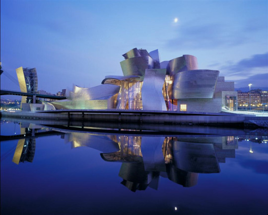
http://writing-the-wrongs.blogspot.com/2012/10/thoughts-on-gehrys-visit.html
I find the Guggenheim Museum not only visually beautiful but complex as well. The geometry is so diverse, and never ending. It mimics the idea of water, but juxtaposes the stillness of the water in front of it. This is a prime example of a piece of architecture that incorporates into its surrounding environment, and this instillation does that effortlessly and beautifully. The color palette allows the shapes to speak for itself, and the monstrosity of the building is elevated with the reflection of it into the surrounding water. It comes alive at night, and is breathtaking and vast.
0 notes
Text
The city Diomira (blog.4)

www.christiantate.co.uk/?p=362
The city Diomira that Calvino describes in Invisible Cities, juxtaposes nicely to the city Zemrude. In my last post, you will notice that the architecture of Zemrude was underwhelming. The city Zemrude was merely a vessel of transportation, and provided no type of excitement for its members in the form of structure and composition. Diomira, on the other hand, is a glimmering town that reminds me of the Emerald City from the Wizard of Oz, except gold not green. There is repetition in Diomira’s composition, noted by the 60 silver domes. Diomira reminds me of a city that never sleeps, filled with color and sound to support the dreams of those who dwell in the inspirational space.
0 notes
Text
The city Zemrude (blog.3)

https://www.behance.net/gallery/6547129/Invisible-Cities-(Zemrude)
The above image is an artists rendition of what they believe to be the invisibly city Zemrude that is described in the Cities and Eyes 2 excerpt of the reading Invisible Cities by Calvino. From the architecture I imagined from reading Calvino’s description of Zemrude, I would feel that the city space was crowded and overwhelming but simultaneously underwhelming. I do not picture there to be breathtaking structures, but instead the city is merely a vessel for citizens to move from point A to point B. The city swallows up those that dwell in it, and if you were looking at an aerial view of the city space, the humans would be a speck of life swallowed by big structures and the hustle and bustle of a city. It seems that the architecture of this imaginary city does not allow for a sense of community, and the only use of empty space is the streets. This city creates mundane, mindless, and repetitive actions from those that live in it, and I would expect the architecture to be the exact same.
0 notes
Text
The Juxtaposition of Neyland Stadium vs. Ayres Hall (Blog.1)

Neyland Stadium Aerial View
http://www.trippumbach.com/university-tennessee-athletics-department-economic-impact-community-benefit-study/

The Hill
https://www.math.utk.edu/images/thehill.jpg
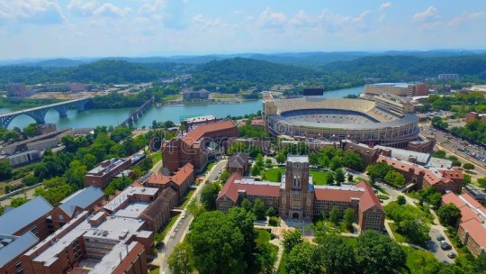
UT Campus from Above
https://www.dreamstime.com/stock-photo-ut-campus-above-overlooking-ayres-hall-neyland-stadium-tennessee-image74822542
In the observation of these images, combined with what I know about architecture, I am able to see the University of Tennessee campus in a new light. The use of space on campus signifies what is important to the University. In the first image, you see an aerial view of Neyland Stadium, which puts the monstrosity of the structure into perspective. A space designated strictly for a football game, Neyland houses a place for the event and huge audience. The space transforms with action, and signifies anticipation for the upcoming season when it is empty. As you can see, it is placed next to the river, which separates the territory between campus and the mountains. It is the first thing you would see driving across the bridge, and its surrounding environment showcases the importance of football to the University. It is a timeless marker of the celebration of camaraderie and athleticism. It is the largest structure on campus, and although renovations have been made over time, the structure remains solid and the colossal nature of the positioning and the size itself are eye catching and inspiring to those who see campus for the first time. If campus were a theme park, Neyland Stadium would be the Ferris wheel. The circular shape signifies unity, and the vast amount of space allows for chaos and support from fans.
Ayres, on the other hand, sits at the top of the Hill and presents a completely opposite value that the University upholds. With its collegiate gothic style, and its positioning on campus, the building blends seamlessly with the landscape and flow of land. The structure is embedded in the language the building is trying to present, which is the history of the University and the strength of academics. It sits at close to the same height as the stadium, and reiterates the idea that athletics and academics are both strong values of the university.
0 notes