
Last Seen Blogs


Text
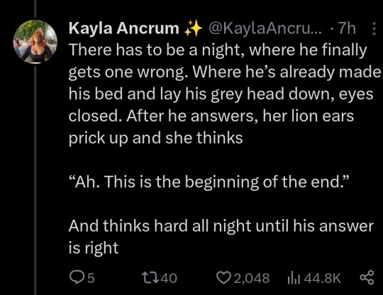
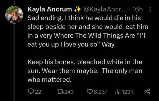
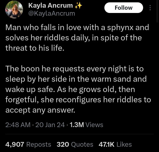
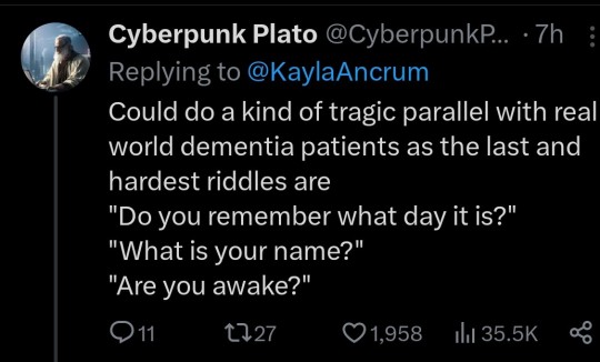
I’m sure someone has talked about this
But I’m reading the Daredevil 2011 comics and I want to draw attention to the paneling and visual queues used in this scene:

Aka: the scene where Matt decides to spend his last few bucks on an apology.
I actually (oddly) have a small background in studying and analizing comics as a medium for visual story telling and let me tell you WHY I love this issue in particular (Issue 22) and specifically the build up to these two panels.
1) at the very start we are given an in-detail look at how Matt deals with money and the difficulties he has to overcome using it. This is specifically done so that we know this last $20 Matt has? It’s important. It’s not just ‘empty bank account’ important (which is also established) but it’s ‘increased level of difficulty’ important. These first panels are used to tell us, what even Matt is going to be spending that $20 on, it’s going to be big.
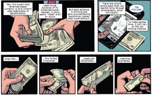
2) this is the convention we get right before we get Matt going to get the apology. This is very important because we are meant to associate this conversation with the apology mentioned in the next few pages. We are meant to have Kirsten at the front of our mind, meant to have Matt’s conflict with Kirsten at the front of our minds, when we get to this panel about buying an apology.

This is also VERY heavily implied art-wise by having Matt walking by a florist as he 'says it’ and that, THAT, is the beautiful visual story telling in TWO PANELS that I ADORE for this issue because this is what the comic sets up:
Matt is having money problems/money is just always a problem because Matt is blind and it’s difficult. But this last $20? It’s important.
Matt can’t get Kristen to answer his calls and they are having a 'thing’ that Spider-Man* gets dragged into.
Matt tells us (the reader) that he needs to buy an apology right after reminding us of this fight and conflict right as he is walking in front of a flower shop.
Subconsciously we are meant to think he’s going to buy flowers.
Subconsciously we and meant to think he is going to get flowers to apologize to Kristen (that women we see in the panel is a very conscious choice by the artists to put it mildly)
Subconsciously we are meant to think that this is going to be the issue signifying a change in Matt and Kristen’s relationship, highlighting her importance to him.
Subconsciously we are expecting the next panel to be Matt holding out a buque of roses.
But what do we get instead? We get a cut panel and we get Matt walking into the store next door.

(That little pink bit in the other panel? I obviously can’t say for sure but it seems very intentional. It is meant to give us a spacial awareness of where Matt is and the stores around him and to show us how significant Matt going to the bakery is. It shows us that the bakery is next to the flower shop and Matt isn’t even pause to 1) think about getting maybe more then one apology or 2) that that option didn’t even cross his mind even though he was just talking about/thinking about the other person he owes an apology to)
It’s beautiful. It is absolutely gorgeous. It uses a readers 'I know where this is going’ senses, feeds those senses/ideas and-
Gives us Foggy instead.
And this, this also shows us just how important Foggy is to Matt. That they would set all of this up. Draw all of this out. Make us think it’s going to be a romantic ending story.
And then give us this instead

I can tell you that this decision does a few things to set up for the next few issues but the most important thing that it sets up?
Foggy is VERY important to Matt.
VERY important.
And we are meant to remember that. Meant to understand just how important Foggy is, Foggy still is for the issues to come.
(I could Honestly probably dissect the crap out of this issue alone since there is A LOT going on with it in regards to Matt and Foggy’s relationship. Stilt-man (pfff) being another component but just…these TWO PANELS got me. It was beautiful)
74 notes
·
View notes
Text
just when i think all hope is lost, dan and phil play undertale come out of the shadows to save me
34 notes
·
View notes
Text
A little advice from someone studying extremist groups: if you’re in a social media environment where the daily ubiquitous message is that you have no hope of any kind of future and you can’t possibly achieve anything without a violent overthrow of society, you’re being radicalized, and not in the good way.
83K notes
·
View notes
Text


Here's my full DDE 2023 gift, since I didn't realize discord's image hosting would betray me so soon, oops. Image ID in alt text.
A Faerun dnd AU for @makzimaal !
It's nice to indulge in TWO obsessions at the same time haha
179 notes
·
View notes
Photo

Today (February 4th, 2019) marks the 55th anniversary of the publication of Daredevil #1! (As it turns out, the April cover date indicated when the issue should be taken off the shelves; I always thought it was the publication date. A big thank you to Kuljit Mithra at manwithoutfear.com for clarifying this!)
I’ve always loved the chaotic desperation of this cover. Daredevil #1 came out in 1964– a little over two years after the Fantastic Four’s introduction, and one year after Spider-Man’s– and it was a busy and new character-heavy time for Marvel. Clearly, not all of these new characters were going to be popular, and Stan Lee, Bill Everett, Jack Kirby, and everyone else involved in the creation of DD tried to pin onto Matt every winning attribute they could– and to reflect that effort on this cover of the first issue. It could not look more desperate. “You liked Spider-Man and the Fantastic Four, right? Right? Please buy this! Please! We promise it’s good!”
Fortunately, all things considered, it payed off, and Daredevil just celebrated the milestone of hitting issue #600 (not counting mini-series, annuals, etc.) this past year. Not too shabby. Happy birthday, Daredevil!
273 notes
·
View notes
Note
Sir is this true?

That is me on a trampoline. Your argument may well be valid.
14K notes
·
View notes
Text

Trying a new digital painting technique!!! Matt Murdock thank you for always being my test subject
313 notes
·
View notes

Text
The second you can start looking at daredevil through the lens of foggy as the main character then you get a weird dramatic and sad gay romance about just a normal guy who was in love with his best friend and gets thrown into an impossible situation and i think that’s better than anything else tbh
114 notes
·
View notes
Text
Kermit as Daredevil with Miss Piggy as Elektra.
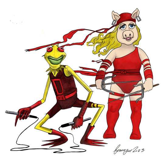
Credits: scoot_cooder (link to reddit)
105 notes
·
View notes
Text
matt murdock and peter parker have 11 senses between the two of them and not one is common sense.
2K notes
·
View notes