Text
RN Portfolio 7: Period Style

Art Nouveau Skull by Gleb Levonto
Dynamic curves creating a flowing design
Asymmetric, organic feel

Chrysler Building - Art Deco
Geometric forms
Stepped structures

Sydney Opera House
Modernist, Grandiose
3 notes
·
View notes
Photo
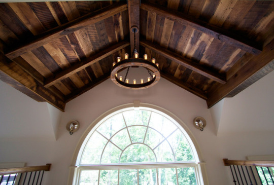
I didn’t have a picture of anything in my environment even remotely close to any of these styles, so I found this picture of a two story foyer entryway to a home and the dome shaped exposed beam ceiling. This adds height and airiness similar to the baroque area and dark wood similar to that used in the Renaissance
1 note
·
View note
Text
RN Portfolio 5-6
Renaissance
Villa Capra “La Rotonda”

By Marco Bagarella - Own work, CC BY-SA 3.0, https://commons.wikimedia.org/w/index.php?curid=10350077
Renaissance villa outside Vincenza, Italy.
Designed by Andrea Palladio
Solid, wide buildings
Strong visual connection to the grounds
Large windows
Baroque
St. Peter’s Basilica, Rome, Italy

New emphasis on height in buildings and interiors.
curvature heightening the sense of airiness and fluidity
explosion of ecclesiastical paintings
0 notes
Text
RN Portfolio 4: Scamper
Let’s look at a med/supply room. Below is one semi similar to what one looks like on my unit.

My issue with this is that all of the containers are blue. Yes, a not so bad shade, and visually its appealing and looks organized. However, in relation to Naccarella, 2016 “Nurses just want to get their work done” and “Design does matter”. Although the supply room looks beautiful, perhaps color coordinating and labeling each container could save time looking for supplies and be more functional for nurses.
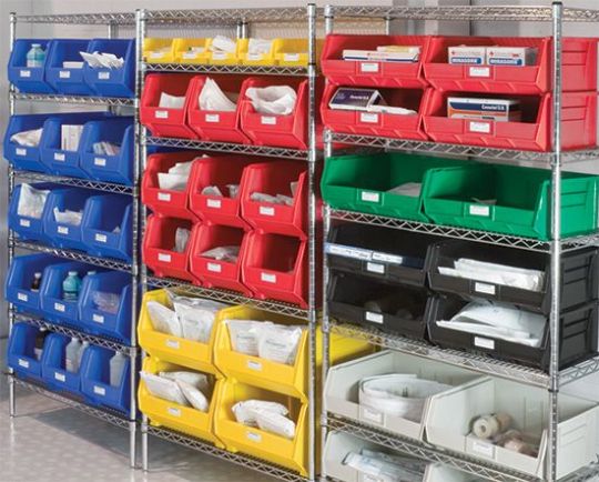
My thought process through SCAMPER was to substitute the bins for colored ones, combine like supplies by group/body system/procedure etc, adapt the team to the change, modify the supply room layout, take the layout organization to good use by going through supplies and removing expired or unusable equipment to make room and prevent any adverse events, elaborate the reason for the change and eliminate questions, rearrange supplies as needed to suit needs.
2 notes
·
View notes
Text
RN Portfolio 3: Elements
I chose Chapters 11 Color and Line and 15 Space and Motion.
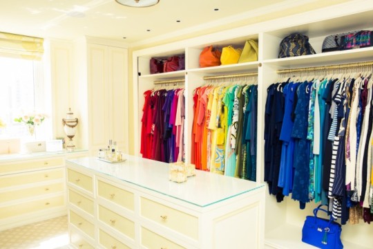
The first thing I thought of after watching the videos and reading about color was color coordination and the respect it gives to each and every individual color. I searched on google for color coordinated closets for quite a bit because I had a specific vision in mind about how distinct each color is represented. This gives me a sense of organization and ease of access.

When I think of lines, I immediately thought about mazes. I first looking at corn mazes but wasn’t satisfied with the rounded corners and lack of sharpness. When I hear “line” I think sharp corners, definition, purpose, cleanliness (clarity) even.

“Now, illustratively we have all these illusions of space”
Space to me means depth. I liked the use of the word illusion in the video. I immediately thought “find a picture that shows depth, 3D even”. Then I thought about sidewalk chalk artists. Creating the illusion of space and depth, increased surface area, in an already confined space.

I get easily motion sick, I can’t even rock in a rocking chair. This picture makes me queasy. Need I say more?
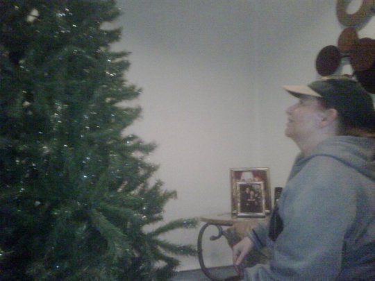


This is also based on the first part of the question on page 218. When I related design to a holiday I immediately thought about a Christmas tree. My favorite holiday is actually halloween. However, come November 1st, I’m all about Christmas and decorating and feeling warm and inviting. When I was a kid my parents made sure our Christmas’ were special and the spirit of Santa and the gift of giving was priority. As we grew into teenagers and they began to lose interest in holidays our traditions changed. We stopped making cookies, stop getting matching pajamas, we wouldn’t wake up early in the morning. They eventually stopped putting the Christmas tree up at all, it was a “waste of time”. The very first picture above is a picture of my mother almost 10 years ago staring at our Christmas tree one of the last years my parents would put it up. This is the only picture I have of my family’s tree growing up. That always made me sad. Now I have a baby, and I promised myself that I would always have a Christmas tree for her. One that she myself and her father can decorate with memories and beauty, color and coordination. A symbol of togetherness and that the holidays do mean something no matter how old anyone is. How distant anyone is. Plus, the satisfaction of the scent of the pine (if the tree is real) or the scent of dust (because it’s fake and has been sitting in a box in the basement for the last 11 months. The color coordination. The “remember when’s” when you see homemade ornaments. Th time and effort taken into decorating the tree with a vision and purpose. A symbol of family, of giving, of design.
2 notes
·
View notes
Text
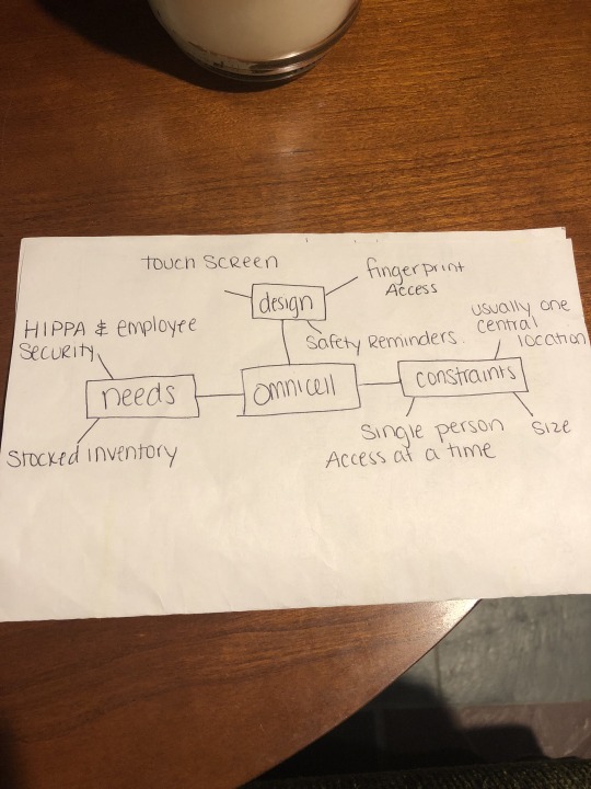
An Omnicell is the medication dispensing system that we use in my facility. Please see the concept map above for the omnicell’s benefits of design, needs, and constraints. The following is a picture is what the omnicell actually looks like.
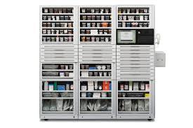
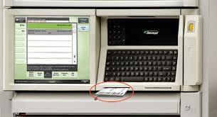
The benefits of this design include the fact that you can easily access your unit’s patient list via the keypad, fingerprint scanner, and touch screen. The keypad is easily legible and comfortable to the touch, the fingerprint scanner provides easy yet secure access, and the touchpad increases ease of access and also provides the patients information, list of active med orders, PRN medications, and due medications. The screen also provides med order information and a link to Lexicomp which is the database we use to look up medication information. The machine also indicates which draw specific medications are in with coordinated flashing lights to prevent any medication errors and prompts the user to count and waste narcotics at the time of dispense to prevent diversion.
To someone who has never seen an Omnicell before, I would describe it by saying its basically a pharmacy vending machine, you type in and click on the pertinent medications that you need and the machine prompts you to remove the appropriate medication from different secure drawers, shelves, and a refrigerator. I believe the preceeding and following pictures indicate the design and use of the Omnicell.
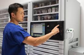
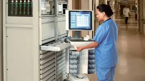
Three objects I could use to display to an audience would be a sample drawer with compartments, a sample key board, and a sample video tutorial briefly going over the touch screen and system design and features. I believe the drawers would be a great visual to see prior to purchase because it shows the ease of access and smart safety light features associated with each drawer and its security. A sample keyboard will further the comfort of access through the machine and allow consumers to feel the texture and quality of its design. The sample tutorial of the on screen features of the omnicell would be beneficial to show the ease of access and concurrent features associated with the system and medication administration and information.
In DiNardo 2015, I think the involvement of nursing could most definitely enhance the qualities of an omnicell. The omnicell is used primarily by nursing staff and who better to ask about improvements and updates than by the ones that use the device each and every shift each and every day. The input of nurses in design can improve accessibility, security, and functionality.
0 notes
Photo
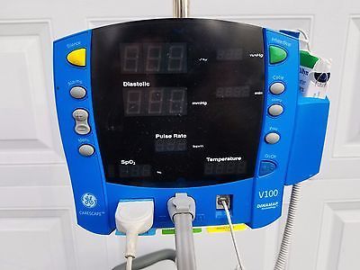
This is a picture of the dinamap I wish I had on my unit and what I believe would be the solution to a lot of my problems. The dinamaps we currently have on my unit are more outdated than this and do not have an oral thermometer attached. I work on a Heme/Onc unit that usually only takes an oral temperature unless contraindicated, for those patients we will do a temporal, also unless contraindicated. Currently, we have patient specific disposable thermometers that we bring to them and leave in the room that can easily get lost. Our current dinamaps are equipped with portable temporal thermometers and this is my biggest issue. Why can’t we get dinamaps similar to this so we are reminded to take all oral temperatures for better accuracy? Why are we even equipping our dinamaps with devices that we shouldn’t be using first-line? Having the thermometer built into the devices automatically increases accuracy of vital sign evaluation and ultimately their treatment. I would first identify this design flaw and also identify that an all inclusive design will enhance patient assessment accuracy. I would then substitute a more outdated design with a newer all inclusive design. Based on the hierarchy of design, the usability of this design is where it is now in my facility, with an updated change, the functionality and reliability of the product and the results it produces increases.
1 note
·
View note
Photo
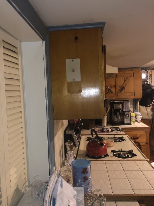
He is a picture of a telephone jack... in my kitchen... on the side of a cupboard. This outlet has bothered me for a very long time, and still does. Question 1) Why the kitchen? Question 2) Why not in the wall? Question 3) What would possess someone to put it on the side of a cupboard? At an elevation higher than eye level? None of this makes sense to me. Its not aesthetically pleasing or functional in my opinion. Even if I were to keep a house phone here in my kitchen, I would not be able to hide the wires in an aesthetically pleasing fashion as it is just so out of the way. Having wires hanging down and unsecured wouldn’t even be an option because of the gas stove a foot away and because of my curious cat who would love to chew on exposed wires. My current solution? Not putting a wire there or connecting a house phone because it would be dangerous and unappealing. Less is more in my opinion. Another potential solution? Don’t put a telephone jack at forehead level on the side of a cupboard in a kitchen... perhaps a wall or almost any other location in a home would be better suiting i’m sure.
1 note
·
View note